Product Design Unification Case Study, Part 2: “Burger-Driven” Framework
In the first part of the case study about Mail.Ru Group product design unification, I described our first approach — a mobile web framework. Aside from creating a unified visual style and interaction principles for a dozen services, we’ve also transformed our design process from the classic “prototype → design mock-up → HTML → implementation” approach for every screen, to a modern and more efficient framework-based approach.
In this second part I’ll show how we have improved the same technology to embody larger versions of these products and made our “Bootstrap on steroids” more powerful.
In the spring of 2012, our business unit acquired 11 content-based projects: Auto, Events Guide, Health, Horoscopes, Kids, Lady, Moto, News, Sports, TV, and Weather. Many of them are very successful in their market niche in Russia; however, they each have their own history, often with outsourced designs that led to inconsistencies.
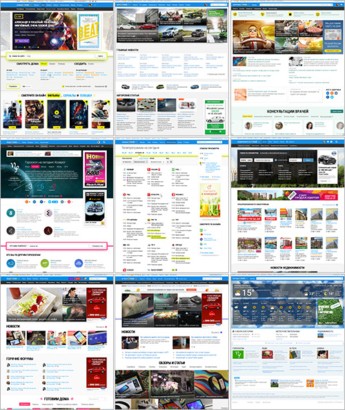
One of the main goals of our design team was to “get their acts together.” We had to systemize and unify visual and interaction design for the whole product line. Most people know that guidelines are the answer. They can bring a seamless experience to users, so people can go from one product to another without having to learn new methods of interaction. They also strengthen the brand and help the team to evolve and support products with less effort.
Design And Technology
Our experience has shown us that guidelines, as a static document, aren’t enough:
- They add one more step to the process, so we get a “guidelines → design → front-end code → implementation” workflow, and this workflow loses a lot of design detail on every transaction. It also generates a bunch of bugs along the way.
- Designers often say that developers rarely read documentation. But to be fair, designers also seldom refer to it, especially if several people are interacting. We’re all too busy… all the time!
- It’s impossible to make a design implementation completely accurate, especially when you’re launching several products at once. Moreover, a specification is often updated by itself — new patterns appear or better designs are found for old solutions. So the final implementation is almost perfect and the product line is almost identical; design implementation and guidelines are moving on parallel tracks. So where’s the reference design now? Yes, we all know the magic word “refactoring” but it becomes expensive when you have to do it all the time and for every product.
- It requires vast effort and takes a lot of time to keep the design quality high; and as a result, it becomes expensive and tiresome.
- Problems multiply if we need to significantly update a design. The need to start from the beginning, redesigning and controlling a design realization for every product, becomes necessary.
We need a blended solution of design and technology. Only if we move reference design from static documents to the implementation level can we shorten the production cycle to “prototype = design mockup = HTML → implementation”. Afterwards, a lot of difficulties with design implementation, enhancement and support would then go away.
Tiny Bootstraps Vs. Component-Based Systems
Many big companies are moving in this direction. It makes their lives easier and boosts business development. Good design can and should be produced faster and cheaper, and it’s definitely difficult to achieve manually. So what is this solution? There are two ways to go: a simpler approach, one in which we create our own “tiny Bootstrap”; or a more complicated solution, wherein we construct an entire component-based system.
The first way is cheaper and faster. We get instant profit from simplified support, inexpensive design experiments, and quick prototyping; even though we’re only using a predefined set of HTML/CSS styles that can be easily broken in a real product. This approach recently became very popular with a number of visionary articles from the likes of Mark Otto and Dave Rupert. More and more companies are now working in this fashion.
The second way requires much more effort. However, you are guaranteed quality design implementation and all the benefits of easy product updates. After many conversations, we’ve chosen this approach at Mail.Ru Group. It has five levels of maturity:
- Design principles are defined and put into CSS.
- All products use unified UI components.
- Live guidelines are created; they describe design principles and unified components; showing real-time implementation, not just screenshots.
- Prototyping is possible using components’ code from the live guidelines bypassing Axure, Photoshop, Sketch, and other tools.
- Design experiments can run on unified components in order to compare different approaches.
The approach of common UI components is not yet widely used; although there are some fantastic case studies, including Intuit’s Harmony ecosystem, Lonely Planet using Rizzo framework, and, of course, Polymer from Google, based on its material design language. Let’s take a look at what we did and how we managed to pull it off.
Product Needs
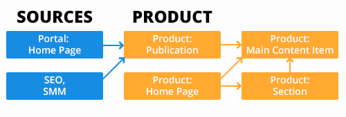
Historically, many services of Mail.Ru Group were aggregators of third-party content to a large extent. We have a huge user base that comes from popular interconnected products (e.g. webmail, our portal home page, messenger, etc.). A lot of these users also read news on general topics or specific subjects like cars or family and so on. The main attraction for a large portion of them is the portal home page. It lists and updates hot topics from all media sites, so users can read the news from there.
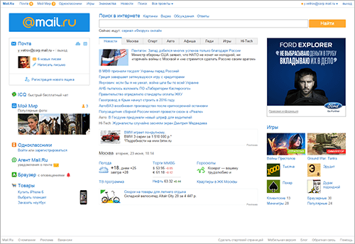
As a result, users go directly to an article page, bypassing the product’s home page. They often just close their browser tab and go back to the portal home page. Moreover, a lot of users don’t recognize at all that these articles come from different products; they just see it as one big news site.
One of the key tasks was lowering the dependence on the portal home page after content-based projects had become part of our business unit. To grow their audiences, product managers forced the creation of editorial content, put more effort into positioning and identity, and worked harder with SEO and social media marketing. It brought about a significant change.
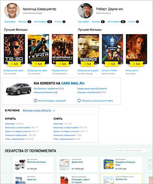
Another goal was to make users navigate further away from an article page; it’s a landing page for people coming from search engines, social networks, and the portal home page. The solution here was to show relevant content on the article page; for example, movies and actors for the Events Guide website, clinics and consultancies for Health, or used cars for the Auto magazine. It’s part of a wider goal to increase page views, as well as other basic metrics.
How We Did It, Part 1: Design
When we started work on our new Events Guide website at the end of 2012, we made it “burger-driven”; that is, a stack of containers or rows that were actively used in modern promo sites and on the mobile web. The idea was not as overrated back then as it is now.
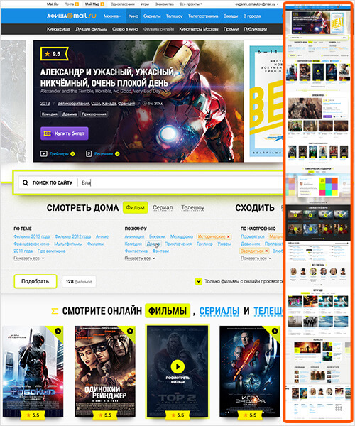
In contrast to the usual column-based approach, where content is squeezed into a “glass”, using “burgers” allowed us to have a magazine-like design with a lot of white space, large typography, and illustrations. Every container could have its own composition, allowing us to vary content presentation.
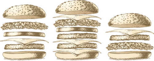
The most important idea here is the convenience of this structure. You can easily add or remove containers from the page; even swap them, too. It’s really simple to create a special project or a new page. Like a real burger, you just put your components between buns (the header and footer). A nice bonus is that managers can’t cheat anymore by telling you to place content in a column. They have to set priorities. What’s higher is more important.
Konstantin Weiss from Information Architects, talks about the benefits of the “burger”-like approach in his “containerist” concept:
- Stack. You can stack as many containers as you wish.
- Position. A container can be positioned at any place within the stack.
- Repeat. You can place more than one container of the same type into the same stack.
- Reuse. The same container can be used in many stacks. In each stack, the container’s position can be freely chosen.
- Conditions. Containers can have conditions. If they are met, the container is displayed. Conditions can refer to space, time, user, etc.
- Federation. The container can be displayed on any site, in any stack. The source can come from a different site than the displayed stack’s site.
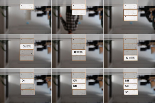
It’s easy to be responsive, too; you don’t need a complex logic of column restructuring. The sequence of containers is the same for desktop and mobile; we just change the number of elements presented and switch horizontal sliders to classic lists. It’s even simpler to optimize for tablets.
However, there are issues:
- Pages become really long, so there’s a risk that users won’t scroll to the end.
- It requires a lot of white space, so users with small monitors have less information density.
- A magazine-like layout is very graphic and colorful, so the effectiveness of ads can decrease.
We noted all of these risks to research further; that is, after we have something functional to test.
Even though one of the strategic goals of Mail.Ru Group is to unify the design of all products, many products need their own identity in order to strengthen their brands, so they are less dependent from the traffic coming from the portal home page. So how does one marry these conflicting needs, so that users will always have a familiar experience, while services don’t become just an appendix to a portal? We found a solution, but it did take some time.
A Little History
The “burger-driven” design is our second take on the unification of content-based projects. We started with the News in the spring of 2012. It’s a key product in the whole line with 4.5 million unique visitors daily. The interface had an endless number of cross-links, ads and redundant menus. We concentrated our efforts in two key areas.
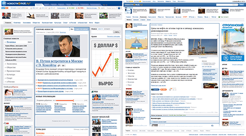
First, the article page, as it is a key landing page and the most visited. It was important to get rid of a left-hand column, so users could see the main content instead of secondary cross-links. We wanted to explicitly separate the main content, cross-links and partner links; it was a big problem for news sites back then and it remains so.
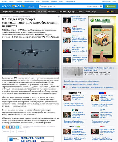
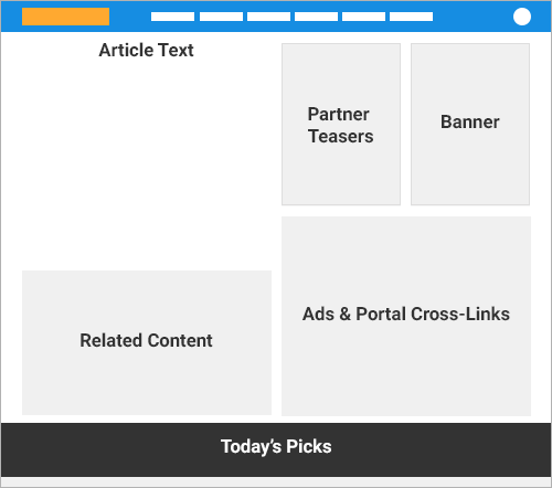
The solution was a 1+2 layout where the biggest and most prominent column is used for content; on the right we have a double column with ads and partner links. It focuses users on the main information with all relevant content accurately put nearby. Our sales department increased a price for ads, so we got rid of half of them. A sticky right column helped us to avoid holes in columns during scrolling, because article length can vary. At the end of a page we put a standard footer with hot topics and partner links.
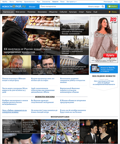
Second, we needed to work on the News home page and sections. We had more freedom here. The home page is visited much less, so we could leave out a lot of cross-links and ads to make the product’s face show. We waged a war on columns — they often become bloated with unnecessary cross-links, just because it’s easy to put something there. It introduces page layout flaws and brings limitations. So we made a row-like design that looks better and is more convenient to work with. Looking back, that was an unconscious inspiration for our newer “burger-driven” approach. However, it’s harder to take everything out of section pages — they have many more visits, so we had to keep 1+2 layout.
The launch of the News redesign had its problems — we had to find better solutions for many patterns, because key metrics decreased a bit; but when we launched the Sports website later, based on the same guidelines, we had problems with only one of our patterns. Unified design rules were working!
We thought about visual styling of content-based projects from the beginning. We wanted to have a unified user interface solution that could be adapted to specific niches and audiences, with additional colors, typography and decorations. We’ve already started to drive other products according to this vision, beginning with Sports and Kids websites.
However, we ended up with structurally similar and visually… successive designs that were too different at the level of details. It was also hard to support and evolve them separately. Moreover, as tablet usage grew, the 1+2 layout became unsuitable without a significant adaptation — there is a horizontal scroll in a portrait mode. We desperately needed a technical solution to limit any future design divergence.
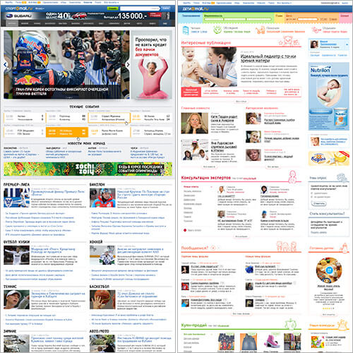
Understanding the pros and cons of our unified design efforts, we started working on the Events Guide website…
How We Did It, Part 2: Technology
We had already made the design-technology framework for “mobile” experiences; by the end of 2013 we’d launched a dozen of content-based projects on it — the approach was tried and tested.
However, launching a “mobile” website is very different from launching a “desktop” version. A horde of differences and nuances come into play; at the very least, mobile has only two patterns to present lists (a list and a slider with pre-defined image sizes), while desktop web has much more variety. But I want to praise our development team again — they assessed the challenge, estimated the benefits of using it, and got involved with this important and interesting project.
This is how our framework design process works:
- A pattern library in Photoshop and InDesign with all UI patterns, controls and common screens used across the product line. It comes with guidelines to define basic design principles. We work on live guidelines to leave out static deliverables — it uses production code instead of mock-ups. It shortens the production cycle, as well.
- A unified codebase that implements design patterns. The same pattern can be used on several pages — it’s independent of what’s happening around it. A designer doesn’t need to check every instance of a pattern to be sure it’s OK. We use BEM (block-element-modifier) naming conventions.
- A template engine to display a page in a user’s browser. It builds a final valid and well-formed HTML page on the fly using the code, image assets, styles and scripts of a single UI pattern. Every page template has a set of rules to build it: types of blocks and their order. We use our own technologies instead of BEM tools.
When we find a new design for a pattern or a component (e.g. a new way to display the photo gallery), then we change it in mock-ups, prototypes and codebase all at once. Then every project updates it from the unified repository (if a change is significant, then the back-end should also be updated). The best part is that designers have to review only a single implementation in the unified codebase instead of checking every product. And they can be sure that the final design quality is decent. We’ll describe the technical side in detail in the next part of this series.
We use the same page template for the server and the client in the mobile version; then the final HTML is generated with V8 in the user’s browser. This model works, despite, in the past, our products using different programming languages: Python, PHP and Perl. It got more complicated in our desktop web versions, because it’s important to send already rendered HTML to a browser. It meant that we had to generate it on the server. Our development team had to find a way to connect with a standalone V8 daemon for every programming language. My colleagues will reveal the technological side of the framework in the next article.
All in all, it’s not a simple project. But the idea to move design to the implementation level is critical for the company, as well as for designers:
- Unification is 90% guaranteed by the development process — all ready-made blocks and elements are taken only from the unified codebase. The other 10% is up to designers — they should think twice when choosing design patterns to create screens. We can build a monster even with a perfect toolkit.
- We moved from large redesigns every couple of years to iterative, constantly updated designs. Complex redesigns take a lot of time and effort, and typically lose a thousand little enhancements made to the design through its lifetime.
- There’s a cumulative effect from successful product decisions. For example, we can increase page views metrics on the Sports website and then quickly apply these enhancements to all other services.
- Designers spend less time on mockups and other static deliverables. A page can be built from ready-made components, and in the near future we won’t even need to launch Photoshop for that. It works perfectly for special projects, too. As soon as routine work decreases, we can shift our focus to product-definition tasks and solve more business problems: increasing key metrics, making delightful animations, considering more nuanced responsive contexts, creating user-friendly ad formats — it’s often hard to find time for them in an endless flow of redesigns and maintenance tasks. We want to use designers’ heads, not just their hands.
The company gets a systematic approach to product efficiency improvements, faster time to market for new features, plus a guaranteed design unification. The ability to talk the business language helped us to convince management to invest in this framework. I also wrote an article on UX strategy that might help you to learn this language and perhaps apply it to your context, too.
Launch: Numbers And Facts
By autumn 2014, we had four services launched and several more in development. The first wave included Auto, Events Guide, Health, and Weather, followed by Horoscopes and Realty. Had we succeeded in our job?
We ran several usability tests and dug into our web analytics data. There are always problems right after a launch and we have to solve the most critical of them as soon as possible. We were even more intrigued to see whether the “burger-driven” design worked as intended, and what about its risks — notably, scrolling on long pages? It mostly worked, although with some qualifications.
We analyzed scrolling funnels for home pages and key sections; they showed that users are OK with scrolling and they don’t exit more on long pages.
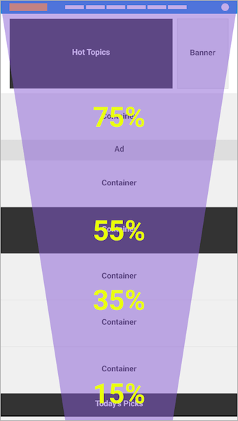
However, if a page is more or less homogenous (e.g. a list of movies), then “breaking-in” containers can be disastrous — users think that the page is finished and leave it. For the same reason, sharing buttons on some pages were perceived as the end of useful content, although there was a lot of really useful on-topic content right after them.
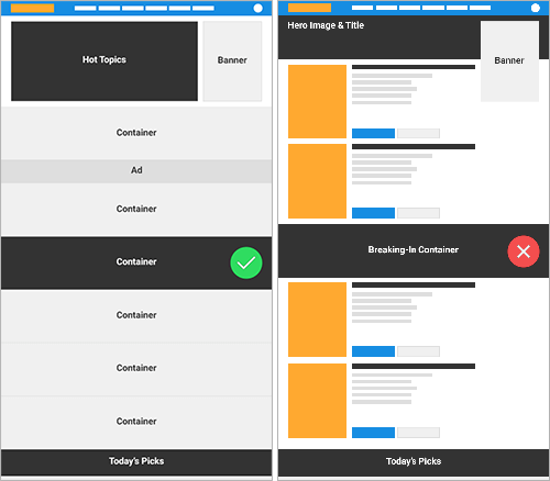
Having said that, aggregation pages are okay with breaking-in containers (e.g. a movie page that is fully built from pieces). It looks like users don’t have any expectations of what the key content is here. Anchor links help a lot, too — people use them actively to navigate through long pages.
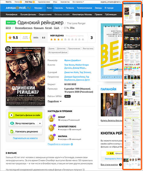
We made breaking-in containers smaller and with less contrast on problematic pages — they shouldn’t break a homogenous information flow. This increases the depth of scrolling that is critical for one of the key product goals — to navigate users further from a landing page with the help of on-topic cross-links.
Now we’re fine-tuning the framework and fixing remaining problems. In some places, like the Events Guide website, we had an opportunity to launch a beta version to a fraction of our user base to test ideas early and fix critical issues. Elsewhere, like the Auto site, we were tied to advertising contracts and had to launch by a particular deadline. However, the framework is a systematic solution, so insights we get and problems we fix are beneficial to the whole product line. They’re not just information to consider later — new products using the framework will avoid these problems altogether.
Here are some facts and numbers that show our work process improvements:
- The speed from design to development increased significantly. At the end of January we started design work on one of products and by mid-March we started its development. This wasan all-time record for us — previously, it had taken at least six months. We take less time to approve the visual style, we create fewer new patterns and components in the unified codebase, and we make fewer mock-ups and reuse whole page templates.
- It’s easier to sign off a design. We received an approval on the visual style and interaction principles from managers, editors and developers once we started with this framework. Now we mostly think about how our unified design solves specific product needs, instead of fighting for a best design concept. It limits designers a little, of course. However, there are still many ways to be creative — animation, ad formats, nuanced usage scenarios, analytics and design experiments.
- The first products to use a new design approach will see some metrics suffer. However, after any issues are solved, subsequent launches have much better results right from the start. It shows that the idea of scaling enhancements is working — we solve problems once and for all.
- Mobile and desktop web versions use the same engine, provide data the same way, and use many common libraries. In the first article, I mentioned that it was impossible for us to build fully responsive designs until we relaunch desktop versions of our products. Now it’s real, although there is no practical need at the moment. Users already have two identical representations of products — mobile and desktop versions have parity in content and services, URLs are the same without any “m.” prefixes.
- Working with the template engine in mobile and desktop web versions is the same. However, the smartphone version has fewer patterns and the layout is simpler, so there are no causes for design mismatches. At the same time, the desktop web version has many more variations and more layouts that have to support several screen sizes. It makes the coordination of different specialists especially important.
- Team rotation between projects is easier, because they’re similarly built from the inside. It became possible for two developers to work in parallel and implement a feature almost twice as fast — in reality, not in theory.
- Standardized solutions help a lot. It was chaos before the framework — every product used its own pattern implementations. It took the same time to port a photo gallery as writing it from scratch, even if there was already a solution. Managers complained, reasonably enough, “Why can’t we just take an existing pattern and reuse it?!” Now they can. However, the work process still needs some refinement.
- We don’t make alterations from standardized solutions anymore when managers ask for their project. This problem was solved by the design approach itself — it’s more expensive to deviate from unified components.
- The framework helped the back-end team bring order to what’s happening inside products and build a proper MVC model.
- Updating products component-by-component is working. We already updated photo galleries, sharing buttons, the article page, the publications list and other components. We also fine-tuned the general visual style: the typographic grid, the color palette, decorations. It’s critical to have semantic code and the right level of design abstraction. Modern CSS preprocessors (we use Stylus historically) let us define a lot of design parameters in variables; it makes updates through the whole product line less of a pain.
Big Little Details
Aside from reforming the work process for content-based projects, we solved a lot of other interesting and important problems.
Visual Styling With Accent Colors
Every service was given its own color — we use it to code interactive elements and the firm line under a page title.
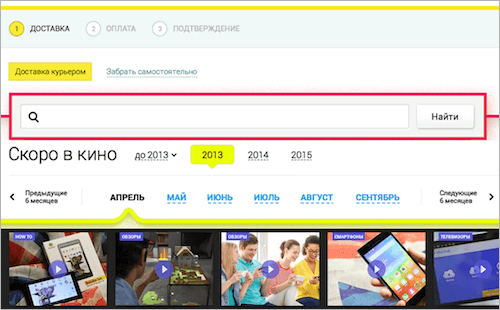
It’s not a unique approach, but thanks to pinpoint usage and the right shades we got a fresh and juicy look.
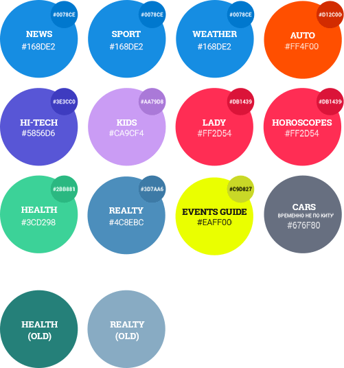
For these colors to harmonize with the blue brand color of Mail.Ru Group, we made a simple palette generator.
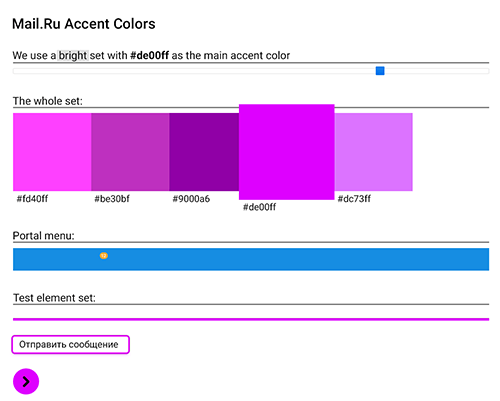
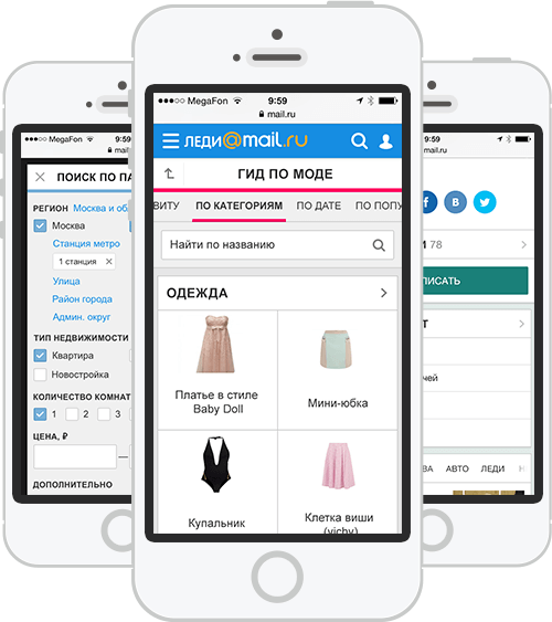
However, it turned out we didn’t need such a strict approach, so we keep simple color-picking rules. It’s new for the mobile framework and it’s being added to smartphone versions now.
Typographic Grid
It’s simple to use custom web fonts now, but many designers forget to check how they render on the most popular platforms (in Russia, they’re Windows 8, Windows 7 and Windows XP). We chose Roboto and made the grid adaptive, as well as taking into account rendering problems on different systems.
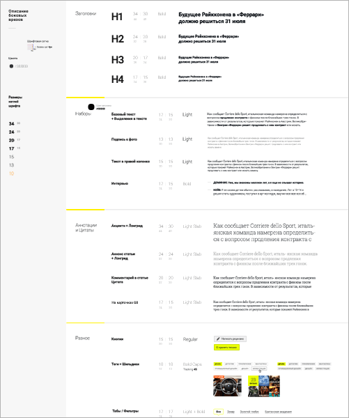
We use a regular weight on Windows and a light weight for Mac OS X, because of rendering differences. In addition, we use Arial on Windows XP — the rendering here is absolutely terrible.
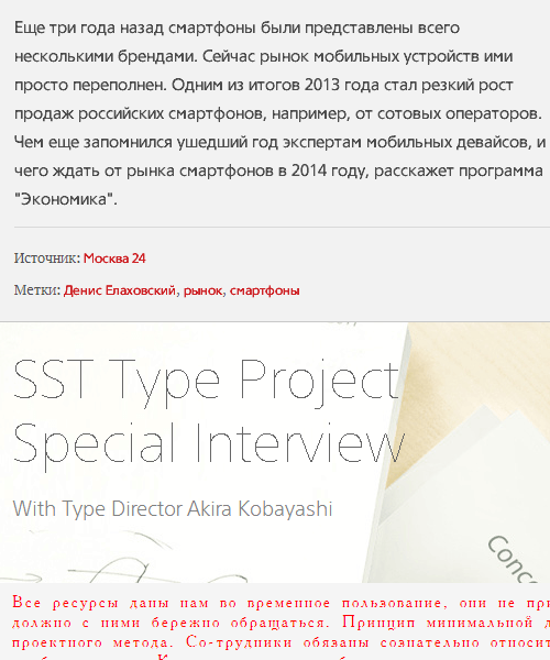
Unfortunately, there are not many free Cyrillic typefaces with a well-developed set of characters. Roboto wasn’t so universal at the beginning of 2013 as it is now. We wanted to use something less generic, but Russian websites with a huge number of visitors are limited in choice. Unfortunately, the politics of font licensing is not very friendly to large companies — in our case, with tens of millions of monthly page views, the cost would be prohibitive.
Pattern Library
We’ve assembled a vast library of typical user interface solutions as we’ve worked on more and more products. It helps to simplify the migration of other products to the framework and to create special projects faster. We’re working on live guidelines — an automatic specification based on production code rather than screenshots. Aside from being easier to support, we would be able to make prototypes out of real code, bypassing InDesign. That’s another step closer to the final implementation.
Design Principles
Design principles are closer to our mobile web versions now: cards are used for secondary content and aggregation pages, page-wide containers with sliding content are everywhere, and the “burger-like” page structure is the foundation. This will simplify product support and evolution for the team, as well as make them more familiar to users.
Ad Formats And Spots
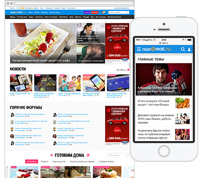
Ad formats and spots got special design treatment, as well as information architecture, interaction and visual design. In the real world they’re not annoying rectangles put on a page at the last moment — they make products a viable business. The advertising grid determines the product’s look, limiting the design grid. We’re working closely with our sales team to find ad formats that ruin neither the design nor the cash flow.
A parallax effect, plus alternative branding approaches, design-friendly context ads and other propositions help us to find a compromise.
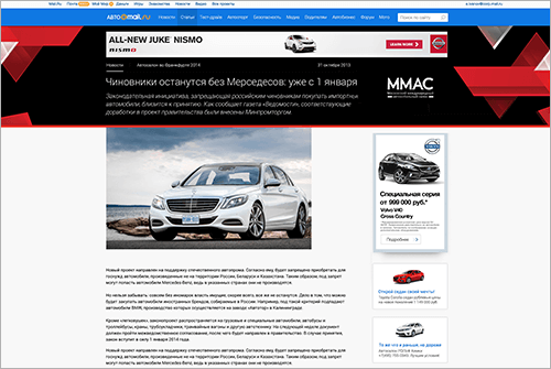
We began the redesign of the Auto magazine by rethinking the advertising grid. The old format with four little banners in each corner of the screen didn’t give us any chance to update the design.
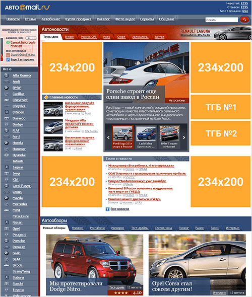
Moreover, any significant change to it could seriously affect the revenue. We made many iterations with the sales team and ad buyers to find a suitable replacement. Only after that were we able to work on the redesign.
40⁄20 Grid With Rhythm
It worked for newer “burger-driven” designs, as well as earlier 1+2 layout. It’s good for responsive layouts — the design has several strict breakpoints without flexibility between them. The rhythm is based on the 4-pixel base grid (it’s half the popular 8px). This is an incremental value to measure all UI elements — their sizes and margins. It also keeps the vertical rhythm consistent.
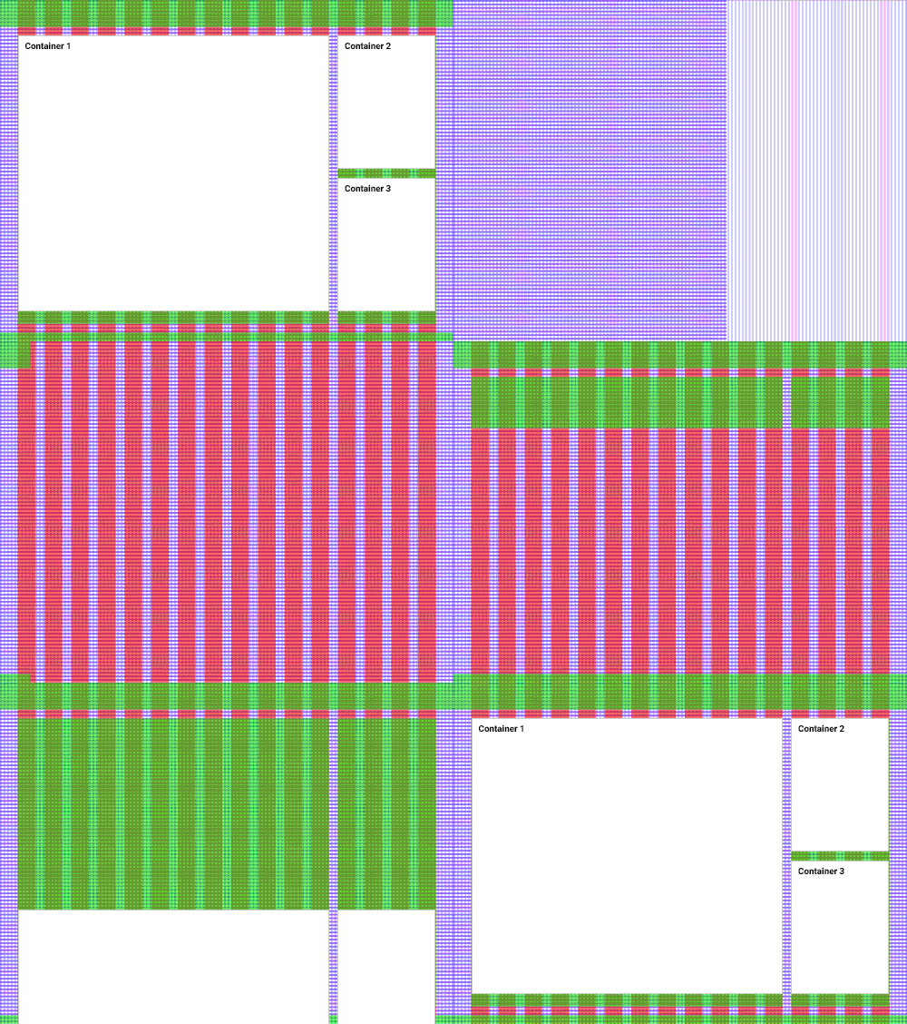
It took us some time to realize the benefits of 4-pixel increments, but now we’re actively implementing it in all designs and patterns — this is an invaluable tool for design systemization. Designers measure everything with well-defined mathematics, instead of relying on just their eyes, so there is even less room for errors.
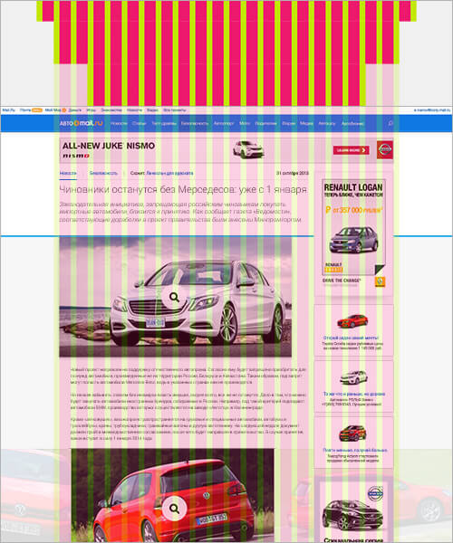
Image Formats
Image formats through all products are becoming unified, too. We have three proportions: 4:3, 16:9 and 1:1, with pre-defined sizes for the first two. It ties products together even more — visually (it’s easy to use cross-links to another product) and technically (we don’t have to prepare and store unusual image sizes).
Long Page Navigation
Navigation for long pages is thought-out partially for now, but we’ve already found that anchor links work great. They help users to orient themselves on pages and improve the scrolling funnel. We considered discrete scrolling (it’s used on one-page promo sites), but didn’t put it to production; it makes pages visually stunning with nuanced use of a screen’s space, but they are much harder to casually scan or digest content.
Product Team Owns Guidelines
The product team owns the guidelines, which helps us to keep them consistent. Managers stop us if we already have an existing pattern — it’s faster and cheaper to reuse. Developers show us inconsistencies — they don’t want to make several variations of the same pattern. This represents another level of quality control that improves a company’s design culture.
The Future Of Our Framework
The Template Engine And Components
We think we did a good job on the template engine that outputs information on webpages. It allows us to create new pages quickly and easily, and to update existing ones through the product line. So the hardest part is done. Products have a unified interface logic; similar pages use the same template, until there are limitations of content or ads on a particular product; the biggest problems are already fixed.
Yet we still have to polish a lot of visual styles and improve product metrics. The platform was built along with redesigns, and they were made by different designers, so there are a lot of small inconsistencies: an unnecessary shadow here, similar containers looking different there, a design pattern reused improperly somewhere else.
This caused another problem: front-end code was written by different people, so these small design inconsistencies led to changes in base styles within the code.
Why did this happen? We understood later on that you should think out components systematically, and build tight communication between design, front-end and back-end teams. As designers, we thought that it would be enough to create unified designs for patterns and pages, give them to developers, and consider it solved. In fact, every team had its own understanding of what “unified” meant; furthermore, development was carried out by different people so we ended up with many inconsistencies, mostly in the form of hardcoded additions to basic styles.
Moreover, the “front-end/back-end” team connection had the same type of misunderstanding as the one for “design/front-end”. Somebody set unclear requirements; someone didn’t envisage future use cases, so a component could be reworked. As a result, while designers and front-enders were happy with the platform and new work process, back-enders were skeptical. Now we’re trying to make this collaboration better.
Requirements for front-end developers are higher now. They work on shared components, so they have to coordinate to avoid breaking each other’s work. Our new photo gallery wasn’t architected properly, so developers had to go back and rework its first implementation. Now they think about reuse on every level.
We’re going through the list of inconsistencies and removing hard-coded styles. It’s critical to keep the code semantic to avoid fixing a bug becoming a full-fledged refactoring. CSS preprocessors and variables allow us to keep a high level of abstraction while we define a design. Changes to standard spacing, color palette or text heading styles won’t lead to rewriting dozens of templates by hand.
The Article Page
However, the tools for information input (or CMS in the case of content-based projects) are far from perfect. As a result, the main page and the most popular one — the article page — are far from what we imagined. Editors can’t do a lot with text, and somewhere specific image sizes are ruining it.
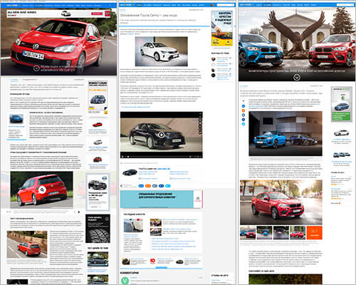
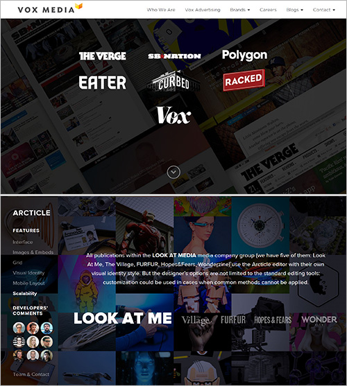
We love to see how some media companies like Vox Media or Look at Media in Russia have solved this problem. They built powerful editorial CMSes with a heap of possibilities and predefined styles. It produces gorgeous magazine-like content that is pleasing to read and look at. A system like this gives editors and journalists a simple tool to produce the required design quality for an article. We’re working now to make our articles beautiful.
A Deeper Unification
Mail.Ru Group has several product clusters that differ significantly in their goals, content and usage scenarios. These are web apps, content-based projects, e-commerce, games and social networks. For a long time they evolved in isolation and each had a different look. All products were distributed among several business units, making design unification into the single visual language even more complicated. But for the last several years, design teams across business units were able to unify a significant part of the product line into several clusters: productivity, content-based projects, e-commerce. These clusters still differ from one another, but the company now has less than 10 different design approaches instead of 40.
We don’t want to stop here and will try to unify products further. Moving more services onto the single framework gets us closer to this goal from the product and technical side. In parallel, we’re closing the gap between the visual styles of clusters from the design side. I hope to continue this series of articles with the next chapter of unification.
Conclusions
A framework like this has many benefits:
- Get new features to market faster.
- Unify design of several products for certain, guaranteed.
- Scale enhancements from a single product to a whole product portfolio.
- Designers work more with their heads than hands.
But the main result is a transition from large redesigns every couple of years to constantly updated designs. We can spend more time evolving a product rather than doing endless design maintenance. Moreover, product designers stop thinking in screens and become less like “Photoshop/Sketch people”.
P.S. Thanks to the whole team of designers and developers who made it happen!
Further Reading
- Which Responsive Design Framework Is Best?
- Frameworks: Just Because You Can, Should You?
- Creating A Complete Web App In Foundation For Apps
- Responsive Web Design: What It Is And How To Use It


 SurveyJS: White-Label Survey Solution for Your JS App
 Agent Ready is the new Headless
