Designing Web Interfaces For Kids
Kids spend a lot of time online, and their cognitive and physical limitations present many challenges to them when they do so. Pair that with poorly designed content and dark patterns, and you have a bad mix. As designers on the web, we have a responsibility to create things that empower kids and make them smarter, not the opposite.
This article will give you some insights about what kids are like from the psychological point of view, and how this affects the way they use the web. We’ll also cover practical design guidelines to create better web stuff for kids.
Paradigm Shift
On 12 March 1989, the first Internet browser, Mosaic, was born, essentially marking the birth of the Internet as we know it. The reason why this date is so important here is that the birth of the “common folk” Internet represents the end of one paradigm and the beginning of another. Those of us who have grown up without the Internet as the primary resource for information and entertainment simply live in a different paradigm than kids of today.
Pre-Internet Paradigm
Those of us who remember a time without the Internet live in an analogue paradigm. I vividly remember back in high school (1995 to 1998) scavenging the school and public library for good books to use in my studies.

Built into our mental framework is the notion that we have some control over the time an action takes, like walking from a desk to a bookshelf. We can choose to walk faster or slower. Ultimately, we are in control. This explains why many of us are so impatient when content loads slowly on a website. Our brain remembers what it is like to be in control, and it doesn’t like not having control over the website.
Internet Paradigm
People who have no memory of a world where the Internet was not the primary source of information have a different mental framework when it comes to time control. They know that a website loads as fast as it does. They can’t force it. They know they are not in control of the time an action takes.
I’ve done several studies on this in which I observed kids using a computer. If something loaded slowly, most of the kids simply did something else in the meanwhile — watching TV if one was nearby or talking to the kid next to them if they were in a social setting.
A little while back, I helped my 7-year-old install Google Earth on his computer. It took ages to download, and I remember leaving the room because I couldn’t stand that it was so slow. But he simply turned on the TV and watched a cartoon in the meantime and then called for me when the download was done.
The “Digital Native” Doesn’t Exist
I don’t believe there are “digital natives.” Sure, kids grow up with iPads and smartphones and computers, but that doesn’t mean they automatically become experts in using them. Quite the contrary, actually. An iPad (or any other tablet) is a closed, limited environment where they can’t do much harm (apart from buying too many Smurf berries or deleting photos), and it doesn’t teach them anything about how technology works, how computers work or how to manipulate technology to create new things.

Despite this disbelief in the “digital native”, I think the fact that kids live in a different paradigm has a great impact on the way they interact with and perceive the web. Playing in a touchscreen environment from a very early age will affect their mental model tremendously. (We’ll get back to this.)
In addition, they’re kids. They don’t have fully developed brains or physical skills like adults. So, we need to think differently when we design for them.
Design Guidelines For Kids Ages 7 To 12
The guidelines are geared to kids from the ages of 7 up to around 12. The reason is that a lot of research (including my own) points out that kids under the age of 7 mostly use touchscreens and apps (and mostly games), not browser-based applications and websites.
Kids above the age of 7 slowly start using the Internet in a more traditional way — using a browser to access websites and web applications — and that’s my primary focus. Kids above the age of 12 slowly accommodate to more “adult” interaction patterns.
Ultimately, my goal is to expose kids to less crap and more quality on the web. The amount of crap that kids are exposed to on the web is, quite frankly, astonishing. Just try downloading the Pixelmon Mod for Minecraft shown below. It took me several minutes, and I had to dodge not one but two “time-delay” ads that make you wait until you can bypass them.
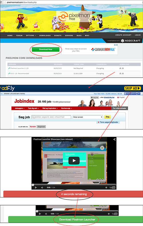
The image above illustrates the user’s path to downloading a file on Pixelmon Mod. On the website’s download page, you’re presented with a big green “Download” button, which is, in fact, an ad (it is connected to the ad on its right). If I were a kid looking to download the file, I would certainly click it!
Further down the page, I can choose one of several files to download depending on which Minecraft version I run. (Easy for a kid to figure this out, right? Not really!) And you can choose to click one of two identical download buttons. (I still haven’t figured out why there are two.)
When clicked, they both lead to different ad websites (see the second screenshot above). When I click “Skip ad” (which is not possible until after 5 seconds), I am directed to a page with a video and a countdown button. After 10 seconds, I can download the file. Do you think a kid would be able to do this without at least clicking one ad? Not a chance.
This is not fair treatment. This is evil. We as designers and developers should be better than this. In order to do that, we have to know what kids are like and how they interact with the world around them.
The Brain Of A Kid
Let’s look at how the human brain develops.
Around the age of 2, kids will have developed a sense of self, but very few mental models have formed in their brain. They have very rough motor skills, but they will know how to swipe and tap on a touchscreen. A recent study I conducted involving the parents of 80 kids showed that the primary device used by kids under the age of 4 is a tablet. My research is supported by other studies as well.
Around the age of 6, the frontal lobes slowly start to mature and develop. Around this age, you can start to teach kids to concentrate for longer periods of time (boys later than girls), and they start developing empathy. At this age, most children can cut precisely with a pair of scissors. But not until the age of 10 do fine motor skills fully develop, which is one of the things that affect the way kids physically interact with an interface.
So, a 10-year-old has all of the physical skills they need to operate a keyboard and a mouse. But one particular thing makes your average 10-year-old very different from an adult. They still haven’t developed the ability to think abstractly. This ability doesn’t start developing until the age of 12 — and the brain does not fully develop until the age of 26!
The ability to think abstractly is crucial because it allows a person to predict the consequences of their actions and to reflect on those consequences. Of course, an 8-year-old can predict that knocking over a glass of water into a computer will break the computer. But I guarantee you that two weeks after the computer is back from repair, the child will ask to sit by the computer with a glass of water again. (I know from personal experience.)
Likewise, if a 10-year-old clicks on an ad that takes them to a new website, they will get annoyed because the goal (in our case, downloading a mod for Minecraft) has been delayed. What the child cannot predict is how much damage it could do to the computer.
So, the next time they want to download something, they will probably make the same mistake. And again. And again. Until the computer needs to go in for repair because of all the malware. And when it returns, they will make the same mistake because their brain does not fully realize the consequences. Sure, the child knows that their path to the goal might be delayed by their mistakes, but they don’t fully realize how much time, effort and money will be spent repairing the computer, or how much data will be sent to some nefarious hacker, who can now track their every move and use this data to cause harm.
What Affects How Kids Use The Web?
So, we know that, cognitively, kids are very different from adults. And we know that their cognition develops tremendously as they grow older. But a lot of other factors affect the way we should design web stuff for kids. Let’s look at some of them.
Mental Models
My studies are quite conclusive: as mentioned above, the first experiences kids have with digital interfaces are through touchscreen environments. And the first things they use tablets for are games and YouTube (via the app, not the browser).
This is what they use digital interfaces for from a very early age (2 and younger). And this shapes their mental model in ways that we need to consider when designing web interfaces for them.
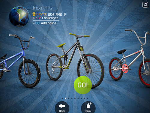

These interfaces are generally defined by having very little text and a lot of buttons and icons to support the navigation.
The question, then, is do kids transfer conventions from these interfaces? They do, to a certain extent, in the way they form mental models that are different from the mental models of adults. They become used to interfaces that have a lot of graphics and large navigation buttons and little written content. And they are familiar with core video-control elements, like play, pause and full-screen buttons, as well as key interactions such as tapping to pause and play.
Language And Reading
A language is essentially a set of symbols — a system — that a person needs to decode in order to use and manipulate it.
Kids learn how to use a language as soon as they are born (actually before they are born!). But they are not able to control and manipulate it before they start to gain control over their tongue and mouth. This doesn’t mean they don’t understand language or are not able to communicate — just that they don’t have the tool for it yet.
Let me use my own kids as an example. When my youngest son was 13 months old, he knew how to say very few things. But he knew around 20 words in sign language because we communicated through simple signs with him at home. So, he could ask for “olives,” and we could tell that he wanted to read a “book.” My point is that the physical constraint was something we could work around, and we presented him with alternative tools to decode and use the language.
Let’s put this into context. Reading skills are essential to using an interface. Kids learn to read in their native language from around the age of 6 (in Denmark at least), and by around 8 they master it to the point of being able to decode simple written language. They learn to read much faster than they learn to write and spell, which is also important to consider when designing things like search, navigation and content.
So, once kids reach the age when they can read properly, you should be fine, right? Not really. Not unless you design stuff for a very specific geographic area. If you’re designing stuff for a global user group, you have to think differently. Then, you are designing stuff for kids with the physical abilities of their actual age, but with the language skills of someone a lot younger, until they’re old enough to read English.
So, if the people you’re designing for can’t read or decode a language, what do they resort to? They use the tools at hand and make meaning through icons and images. This is why a 3-year-old can navigate YouTube to some extent and why non-English-speaking kids can play Minecraft and games on Y8 from before they can read. They look for things like buttons and images to make sense of the interface. And once they know how to operate the system, that information is stored in their muscle memory, so they know where stuff is and what it does both by their looks and by their placement.
Your experience would be similar to theirs when you enter a website like the one shown below, Alibaba, a popular Chinese e-commerce website. Unless you read Mandarin, you’d have no idea what’s going on. So, you’d resort to conventions like global navigation, images and icons. Kids do the same if they can’t “read” an interface.

So, now that we covered the basics of how the brain develops and what things affect the way kids use and make meaning of digital interfaces.
Based on this knowledge and the knowledge I’ve gathered about kids in recent years through my own studies and projects involving kids, I have come up with 10 guidelines that designers should follow when creating web interfaces for kids.
The Guidelines
Simple Data Entry
Interacting with an interface is a physical skill. And because we know that fine motor skills don’t fully develop until the age of 10, to an 8-year-old, typing is difficult. I once observed a boy log on to the Internet at school. It took him 15 seconds to type his username and password, and he used only one finger. His physical interaction was in clear contrast to that of a 10-year-old, who could type with two hands and was much faster. So, if you are designing for kids under the age of 10, make the keyboard-based data-entry requirements very, very simple. Typing is difficult for them.
Buttons Rather Than Text Links
A 2-year-old can’t control a mouse or a trackpad, but they can navigate on a tablet. Most 6-year-olds can use a computer mouse, but for the past three years of their lives, they’ve mostly been playing with tablets. So, they are used to buttons being the main navigation triggers. Again, the mental models they developed early on affect the way they perceive interfaces. In addition, remember that their fine motor skills aren’t fully developed until the age of 10. So, kids under 10 need larger trigger points than older kids.
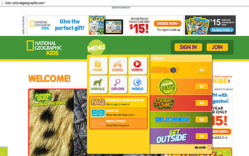
National Geographic’s kids website is a good example of an interface that uses buttons and close-to-nature icons. It accepts that kids have been influenced by touchscreen environments and, hence, are familiar with buttons as main entry points to the navigation.
Use Icons And Images
Icons should have a clear connection to the real world because children haven’t developed a lot of mental models for abstract icons yet. The younger the user group, the more direct this connection needs to be. As they grow older, they will learn more conventions.
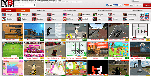
Y8, a gaming website very popular among both boys and girls, uses large images for navigation. From my research, I’ve found that kids who can’t read will navigate by looking at the images. (And they actually do that despite the poor quality!)
Don’t Reposition Key Navigation When Redesigning
Visual indicators such as images, icons and buttons (see guidelines 3 and 4) are key to making sense of an illegible interface. So is muscle memory. Remember the Alibaba website? That’s what an English website looks like if you are a 6-year-old child from a country whose native language is not English. You have to accept that kids remember through muscle memory as much as through vision.
Use Voiceover Sound For Young Kids
A few years ago, I worked on a project to build a website to help young kids (ages 6 to 8) develop empathy and, thereby, prevent bullying. I did a lot of usability testing, and I learned that kids who couldn’t read obviously benefited a lot from the built-in voiceover support. But the kids who had a beginner’s skill in reading preferred to read the text instead of waiting for the voiceover instructions.
So, use voiceover support for young kids, and let the older kids turn off sound if they can read. Otherwise, they will most likely experience mental overload, because reading and listening at the same time is really hard.
Search: Use Auto-Complete And Visual Search For Young Kids (Older Kids Can Use More Complex Search)
Remember that kids learn to read faster than they learn to spell. That is, while they will know how to read a lot of words, spelling those words is a very different matter.
Allison Druin, a researcher in the field of human-computer interaction and new technology for children, has found that kids experience many problems when searching. For instance, if a search field doesn’t have auto-completion, young kids (and non-native speakers) have a very difficult time searching properly. If they are searching by themselves (with no one nearby to help), then success is even harder to come by. In her article “Children’s Roles Using Keyword Search Interfaces at Home” (PDF), Druin states:
"Young people struggle with complex motor and visual interactions between mouse, keyboard, and screen. Children must also decide what to search for, type it (while spelling it reasonably accurately), and then read and make decisions about the utility of the results delivered."
This scenario illustrates very clearly the struggle kids face when searching. Therefore, make search functions simple, offer auto-completion and make the search results simple in structure (perhaps even supported by visual results). Generally, the study showed that young kids (7) are often unmotivated when searching and have a hard time searching via keywords, whereas older kids (11) use more complex search patterns.
Design For Social
More than 30% of the kids in the study primarily used a computer or tablet together with other kids. But social behavior doesn’t necessarily have to occur when people are physically in the same room. I did a study on a group of 8-year-olds in a school setting. They showed, without a doubt, that they all use computers in a social way; they play together and watch each other play.
But a social setting could also mean uploading videos to YouTube or playing Minecraft on a server. For older kids, rating and commenting are important, which is clear on the website DIY, where kids can share their DIY projects and have others comment on and rate their projects. So, think about interactive and social elements when you’re making web stuff for kids.

Provide Information And Instructions “Just In Time” And “On Demand”
Young kids (up to 8) won’t wait for instructions. (Honestly, no one wants to read instructions!) They have a “learning by exploration” behavior, but they will leave if they are not immediately successful. So, they will benefit from “on-demand” instructions (just remember the voiceover support). Older kids, on the other hand, benefit from post-failure messages, and they won’t be discouraged in the same way if they make mistakes.
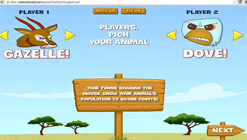

Design For Playfulness: Gamify!
More than anything, kids like playing games. They turn pretty much everything into games and competitions. Use quizzes and reward systems and other game features to move kids forward through the information you’re communicating to them.
The Fossil Master game (see previous guideline) is a good example of the implementation of game-like features such as a quiz. Levels and points would be a good addition as well. So, if you want to excite kids, gamify!
Test! Test! Test!
This final guideline is not really a guideline but important nonetheless. As with any project, testing is essential. But with kids, testing is a very different thing. You can’t expect them to follow your instructions.
Responsibility
I’d like to end with a note about responsibility. Kids are easily tricked into doing things that are not necessarily good for them. They are easy to take advantage of. And they cannot predict the consequences of their actions. We as designers and developers have a big responsibility. We are basically creating things for them that they didn’t ask for. We have to make stuff that will improve their lives, help them become smarter, not make their lives more difficult.
We also have an obligation to reject clients who want us to make crap, to make money off of innocent kids. We should be the ones who make sure that the kinds of things that go on in apps like Talking Tom and The Smurfs’ Village don’t become the norm. Designing with respect should be our norm.
Other Resources
- “A Dad’s Plea To Developers Of iPad Apps For Children,” Rian van der Merwe
- “Designing Websites for Kids: Trends and Best Practices,” Louis Lazaris
- “Best Practices for Web Design for Kids,” David Morrison
- “Designing Global Applications for Children,” Catalina Naranjo-Bock
Further Reading
- Designing Websites For Kids: Trends And Best Practices
- Designing For Kids Is Not Child’s Play
- Best Practices For Web Design For Kids
- Connecting Children With Nature Through Smart Toy Design


 Agent Ready is the new Headless
 SurveyJS: White-Label Survey Solution for Your JS App

