myMail App Case Study: Developing For Apple Watch Without The Device
How do you write a useful app for the Apple Watch? In what ways does it differ from coding for iOS? And what if you don’t have a Watch on hand to test with?
Before the launch of the Apple Watch, our iOS team at myMail (one of the popular alternative email apps for iOS and Android) worked tirelessly with a simulator to create a new Apple Watch app. We wanted the first buyers of the Apple Watch to have the opportunity to use myMail from day one.
What we learned through using the simulator and creating the app — including the Apple Watch’s UI quirks, passing data between devices, and the rigors of simulator-only development — is described below and (we hope) will help iOS developers get to results, faster, and avoid a few headaches down the road.
UI Development For Apple Watch
Writing code for the Apple Watch isn’t very different from writing code for iOS, since all the logic is processed on the iPhone. But when it comes to user interface development, it gets more complicated: new classes have been created for the Watch, classes which aren’t used elsewhere. At the moment, there are only 11 such classes, but the first version of iOS didn’t have many features either. We know the number of these features increased exponentially in following versions, so we hope that a similar future awaits the Apple Watch SDK. At present, though, here’s what the reality of UI development for Apple Watch looks like.
Only Apple Watch Components Can Be Used
Here’s the very first disappointment you encounter during UI development for the Watch: you have to forget all the fancy buttons, animations and screens you previously created for the iPhone. There’s no way to use them here because only visual components specifically for the Apple Watch can be used in the UI.
New Layout Model
Before iOS 6, it was possible to define specific coordinates of various elements and set rules for resizing elements as the screen stretched out. Not long ago, Apple presented a new layout model for its phones called “Auto Layout”, which allowed all these rules to be set in a more flexible way. You’d expect that it would be possible to use Auto Layout for the Apple Watch, but its SDK has an entirely new layout model that resembles the one used in the Android SDK. The entire interface consists of containers, which are filled with elements vertically or horizontally. By iOS 9, with the introduction of UIStackview, this layout model was made available on other devices.
Realignment After Hiding Elements
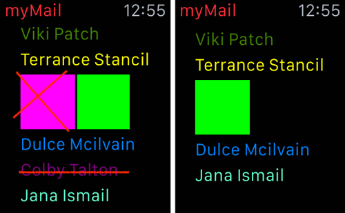
The Apple Watch has an interesting feature that wasn’t available in the iOS SDK: when you hide an element, it doesn’t simply disappear from the screen — all the other elements take its place, leaving no empty space. Thanks to this feature, you can place several screens on one screen with the possibility of dynamically switching between them.
The Apple Watch SDK offers several possibilities for switching between screens, including animated pop-ups from below and from the side (multi-page UI). There’s also an interesting alternative, though unofficial and undocumented, that lets you swap screens without any animation by emulating switching screens when elements are hidden.
Context Instead Of Interface Controller
While in the iOS SDK, we could initialize UIViewController and assign any properties to it. In the Apple Watch SDK, the interface controller (WKInterfaceController) is created by the system, and it’s impossible to access it from code. Instead, developers are given a new parameter called context, which can be conveyed to the controller when displayed. Inside the controller, it’s available in the awakeWithContext method. Through context, it’s possible to convey the same parameters we used to pass during creation, such as blocks that the child controller will have to invoke in order to pass data to the parent controller, the ID of the email to be opened, and so on.
Animation
In the Apple Watch, possibilities for creating animations are very limited. There are no CoreAnimation and UIKit frameworks, which let us create animations programmatically. The only way to animate anything in Apple Watch is to create a sequence of pictures, something like an animated GIF.
On the one hand, this approach lacks flexibility because animation parameters can’t be set dynamically in the code. On the other hand, it may be more convenient for developers, since designers bear full responsibility for creating an animation and providing it as a sequence of ready-to-use pictures. The only thing remaining for the developer is to display them either in loop mode, no-loop mode, or even partially — using only some of the images.
Glance
A glance is a small screen that any app can create to display pertinent information, like the number of unread emails and the sender’s name of the latest unread email. It’s up to the user to choose which glances will and will not be shown on the screen. To see the glances, the user must swipe from bottom to top on the watch’s screen, then swipe left or right to switch between glances on various apps. When a glance appears on screen it shows old info at first, allowing it to be displayed as quickly as possible. Apps usually update their glances with new data in about one second. Glances can’t be scrolled, so they can only contain as much info as will fit on a single screen.
Recommended Font Styles
The Xcode Interface Builder now offers a set of recommended font styles. Previously, you had the ability to choose the system font, its size, and style (italic, bold, etc.). Now there are font templates like Body and Title. The templates are optional, but we hope developers will use them, and that user interfaces will soon start to look more uniform.
Overlapping Of Elements
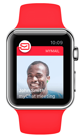
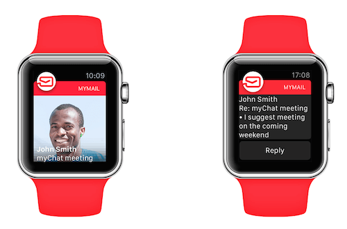
Unlike iOS, the Apple Watch doesn’t allow elements to overlap. The only way to get around this restriction is to set the group background as a picture and insert the element into the group contents. We used this workaround in the myMail app to display the screen for a new email notification: the sender’s avatar, captioned with the subject and sender’s name (for the text to be discernible, an underlying gradient is added).
Support For Attributed Strings
Among the nice features we were surprised to find in the Apple Watch UI was support for attributed strings in labels. Thanks to this feature, we can display text with differently formatted segments. Let’s take Glance, for example: we can highlight part of the text with some other color and format another part with a bigger font size.
Digital Crown And Force Touch
The Apple Watch has inherited the wheel (crown) from conventional watches, calling it the digital crown, and features a new gesture called force touch. It’s unclear how either of these elements will be used, and it seems that even their creators at Apple aren’t sure how to use them.
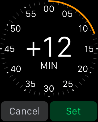
For example, the digital crown is sometimes used for scrolling a list, sometimes for zooming, and sometimes for moving between storyboard elements. It also controls sliders, which allows the user to change various values like text size. Since the digital crown’s behavior is outside the developers’ control, we have to put up with the functions that Apple assigns to it. Sliders can be controlled through either tapping images or via the wheel. Sometimes the slider may be inside the scrollable screen. In this case you should first tap the slider to control it via the wheel.
Force touch is a new feature for iOS that responds to the amount of pressure a user places on the touchscreen. When the watch is pressed firmly, it makes the current screen’s menu appear. As far as force touch is concerned, we’ve decided to wait a bit — the first version of the myMail app doesn’t include force touch support.
Image Caching
The image caching mechanism in Apple Watch is somewhat peculiar, but quite logical if we recall what a Watch app is. In brief, it consists of several parts: the main app (“host app”) and the WatchKit extension being run on the iPhone; and the Watch app, which is run right on the smartwatch.
What happens when an image is displayed on the Watch’s screen? The main app launches on the iPhone and forms the image; it downloads it from the internet, for example. The image is then transmitted via Bluetooth or Wi-Fi to the Watch.
This is where the Watch’s peculiarities begin. In conventional image caching, we’d simply download the image, show it to the user, and save it in a file until next time. But on the Apple Watch, we can’t simply put the image into a file on the iPhone, because we’d have to transmit it back to the Watch every time. For such occasions, there’s a 20MB image cache available on the Watch.
Interestingly, it’s possible to put an image into the Watch’s cache, but only a standard control can get it from there, and as far as we know there’s no direct way to tell whether an image has been cached or not. One way is to use API methods: we request the dimensions of the file named as the supposedly cached image. If we receive the dimensions, we know it’s there. If not, we know we need to download it.
Absence Of Application Lifecycle Notifications
An iOS app has its own life cycle: it launches, goes to the background, gets pushed out of memory, and more. As these events occur, an app gets corresponding notifications. There are no such notifications on the Apple Watch, so object creation at app launch is a bit complicated. Additionally, problems with third-party libraries may occur if they require these notifications to operate correctly; for example, the Flurry Analytics library fails to send statistical data to the server, but only because it doesn’t receive the necessary notifications.
Here’s the problem: unlike an iOS app with one access point where everything can be initialized all at once, an Apple Watch app has three access options: glance, notification, and main app. But in all three cases, launching a Watch app is connected with displaying the first controller. It lets us use the awakeWithContext method.
@implementationMRWKContactsInterfaceController
  ‐ (void)awakeWithContext:(id)context {
   [superawakeWithContext:context];
    // Call app initialization code from your main interface controller's awakeWithContext method
    [MRWKInitializationextensionDidFinishLaunching];
    //...
  }

// Separate class where we store all initialization code for our watch extension
@implementation MRWKInitialization
  +(void)extensionDidFinishLaunching {
// Wrap initialization in dispatch_once to prevent calling it multiple times accidentaly
     staticdispatch_once_tonceToken;
     dispatch_once(&onceToken,^{
       // This is where we create our global object instances and initialize external SDKs
       [selfinternalExtensionDidFinishLaunching];
  });
}
Moreover, it’s possible to use the initialize method in one of the extension classes, which will be executed on the first reference to this class.
You can also use lazy initialization, in which objects are created only when they’re referred to. But this doesn’t help with statistics. For example, Flurry needs to know exactly when an app was launched.
Interaction With The Main App
The capabilities of an Apple Watch app are limited, so we can invoke the main app to perform actions not supported by the Watch app. Here are several ways to do that.
Open Parent Application
There’s a new API, +[WKInterfaceController openParentApplication:reply:], which lets you invoke the main app from the Watch app. It launches the main app in the background, performs the requested actions, and returns the result.
@implementation WKInterfaceController (MRWKParentApplicationActions)
+ (void)mrwk_markMessageIdAsRead:(NSString *)messageId
  accountName:(NSString *)accountName
  completionBlock:(MRWKParentApplicationActionsCompletionBlock)completionBlock {
  MRWKParentApplicationAction *action = [MRWKParentApplicationAction markAsReadActionWithMessageId:messageId
    accountName:accountName];
  [self openParentApplication:action.dictionary reply:^(NSDictionary *replyInfo, NSError *error) {
    if (completionBlock) {
      MRWKParentApplicationReplyInfo *info = [[MRWKParentApplicationReplyInfo alloc] initWithDictionary:replyInfo];
      completionBlock(info.success, error ?: info.error);
    }
  }];
}
@end
Application Groups
The second way to get a Watch app and its counterpart to interact is with application groups. Under iOS, all applications and extensions are run in separate sandboxes, restricted parts of the file system that can only be accessed by those applications or extensions. For the apps to use shared resources or exchange files, there are application groups. If a host app and a watch extension are assigned a common application group, a folder is created in the file system, and both of them get access to it. We used this feature in particular to give the myMail Watch app access to the main app’s database (all emails, contacts, etc.) and to the NSUserDefaults object (various user settings).
Darwin Notifications
Darwin notifications is a system for exchanging messages between iOS processes. This feature has existed for a long time, but only when extensions appeared did it become important (in particular, the WatchKit extension). They make it possible to send a notification to the Watch if something changes in the main app, like a new contact being added in the main app while the contact list is open on the Watch. Darwin notifications let you send an event from the main app, allowing the Watch to update the contact list and databases.
Handoff
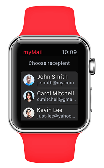
In the latest iOS version, Apple introduced the new Handoff function, which has been actively promoted. Handoff is a useful tool for the user. It can be viewed as a means of interaction with the main app. In this case, interaction doesn’t imply direct data exchange, but consists of creating activity from the Watch that makes a specific screen on the main app display once it’s launched. For example, if a user begins composing an email on the Watch and then later launches the app on their iPhone, Handoff lets them immediately and automatically open the screen for composing a new message.
Development Without A Device
While we were developing the myMail app, we could only use the simulator, which wasn’t entirely accurate. This is the primary pitfall of developing an app for Apple Watch: the inability to understand how things would work on a real device. Even the official documentation differs between content and reality.
Receipt Of Multiple Notifications
The simulator doesn’t reflect some things at all. For example, the documentation describes the following scenario: when several notifications are received, a round app icon appears on the screen with the text “N new notifications.” However, the simulator doesn’t show how that will look. It may seem unimportant, but in practice it might mean some unpleasant surprises. For instance, the app name might not show up as expected or the icon might be displayed incorrectly. These things are impossible to predict, and the only way to minimize risk is to follow the documentation in every detail.
Emoji
Apple’s presentation said the Watch would feature beautiful animated emoticons that could be customized. Our myMail app also supports them — the emoticons can be added via the standard screen for composing a new message. However, during development, we didn’t know exactly how they’d look in the message, what format they’d be in when sent to the app, or how they had to be transformed when inserted into the message. The documentation didn’t specify the format, either. In the first version of myMail, we decided to proceed from the assumption that the emoticons would come as text, which turned out to be correct.
Voice Recognition
There was another issue related to composing an email: how voice recognition would work. In general, everything seemed clear: we push the microphone, speak, and get the recognized text. But the details might differ. For example, the user might get several variants rather than a single line of text.
Unauthorized User
Here’s another ambiguous scenario: assume somebody has installed the myMail app on their iPhone, but has never launched it, and as a result has never been authorized. Would the Watch app be available in this case? Would the user be able to launch it from the Apple Watch display? To stay on the safe side, we made sure that if the Watch app was launched, an unauthorized user would receive the following notification, “Open the app on your phone to sign in.”
Static And Dynamic Notification
When push notifications are received by the Watch, it first tries to display a dynamic notification, which is a more complex interface. If screen loading takes too long, a simpler interface appears: a static notification. Unfortunately, the simulator doesn’t demonstrate this. (For details see the “Long looks” section in the App Components page)
iOS allows developers to put notifications in two formats: short looks and long looks. A short look is neither static nor dynamic but a separate view, as seen in the following picture:
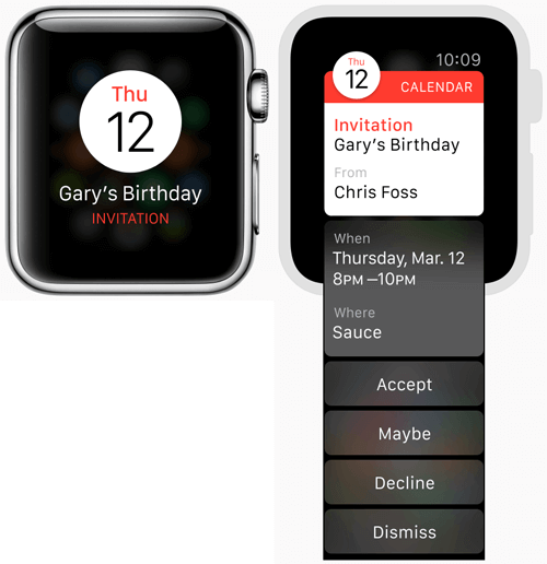
The division into static and dynamic is for purely technical reasons. A dynamic long look is a full notification screen with any kind of interface, while a static long look is a simplified view that only shows the text part of the notification’s contents. The static view is shown if the app fails to start and create a dynamic notification screen within an acceptable period of time.
Notifications: Division Of Labor Between The iPhone And The Watch
Certain actions are associated with notifications, including replying to an email message, deleting it, marking it as read, an so on. Some of these actions are processed by the WatchKit extension, others by the main app. On the simulator, we couldn’t test the actions processed by the main app. These actions can be invoked directly from the phone, but if we tried to invoke them from the Watch, the simulator tried to process them in the WatchKit extension. In real life, they’re processed by the main app. This behavior is due to the fact that the simulator doesn’t support push notifications at all — neither for the iPhone nor the Watch.
A new possibility has appeared in the Apple Watch SDK: when the Watch app is launched from a development environment, you can put the contents of a push notification there to see how it’ll be processed. The problem is that testing all possible cases isn’t feasible. For example, it’s impossible to set whether notifications will be processed by the main app or the WatchKit extension. So we had to content ourselves with testing the actions processed by the app by invoking them from notifications on the phone (a real device) and hoping it would work the same way on the Watch.
Development On Xcode
Everyone who works with Xcode knows that it has bugs, and each new version brings new ones. The release of the WatchKit SDK was no exception.
Certificates For Distribution
Xcode has recently set a course toward automatic code signing and provisioning. In theory, Xcode creates all the profiles, necessary certificates, and the Bundle ID for you. In practice, Xcode only does it in certain cases. Specifically, we’ve found that distribution profiles for the Watch aren’t created automatically. It must be done manually on the Apple Developer Portal.
Assignment Of Separate Group Radii For 38 And 42 mm
In the Interface Builder, it’s now possible to define certain properties of elements for Watches sized 38 and 42 mm, but this doesn’t work in all cases. If you set a radius for a group for different Watch versions, there won’t be any rounding at all. We avoided this bug by setting group radii in the code and not in the Interface Builder.
Obscure Settings And Error Messages
New properties have appeared in the Watch app property list, like RemoteInterfacePrincipalClass, whose purpose is unknown. On the one hand, it seems that it must be defined; on the other, judging from experience, its value doesn’t appear to affect anything. However, we ended up entering the correct name of the class, just in case it does do something on the real Watch.
The SPErrorGizmoInstallNeverFinishedErrorMessage error means that the simulator has some additional problems. Sometimes if you launch one Watch app, work with it, stop it, and then try to launch another, the simulator refuses to install it and displays an error with a strange name for the subheading. To fix it you must delete the simulator, reset all of the contents and fully clean out the project.
Code Reuse Between The App And The Extension
We’d like to say a few things about development process optimization. MyMail’s app and the WatchKit extension perform similar functions: both let you view the contact list, send emails, and so forth. For this reason, it makes sense to use parts of the main app’s code again in the Watch. Here is how you could increase the amount of shared code on your own projects.
- From the outset, write modular code so that all required classes can be used in extensions without adding lots of dependencies that may not even be needed for work but will be necessary to compile.
- Use CocoaPods, the dependency management system for Objective C. CocoaPods provides the ability to add certain libraries to various targets. It lets us add a large list of dependencies to the myMail main app’s target. Then add only those libraries from that large list necessary to the WatchKit app’s target.
- Use Dynamic Frameworks if you’ve already stopped supporting iOS 7.
- Use scripts for project file checking. If code files are added manually rather than through CocoaPods, make sure the targets include only the files used there. In our case, all the differences between the main target and the WatchKit target are specified in the configuration file and scripts checks them.
- Invoke the main app using an interprocess communication API when it’s more efficient than using classes from the main app on the Watch.
Conclusion
In general, we’ve worked out the following (quite obvious) rules for development without a real device:
- Study the documentation thoroughly because it’ll be almost impossible to detect a problem in testing.
- Provide backup options in addition to the main ones, in case the device doesn’t work the way you assume it will.
- Use all available sources of information about the device (see “Resources section” below) — everything from official sources to geekу podcasts.
With that in mind, happy designing for the Watch!
Useful Resources
- “Redesigning the Apple Watch UI”, Luke Wroblewski.
- Human Interface Guidelines
- App Components
- UI Elements
- Watchkit
- Apple Devforum
- Stack Overflow
Further Reading
- How We Designed And Built Our First Apple Watch App
- How To Think Like An App Designer
- Designing For Smartwatches And Wearables
- Getting Started With Wearables


 SurveyJS: White-Label Survey Solution for Your JS App
 Agent Ready is the new Headless

