What You Need To Know About Anticipatory Design
The word anticipatory comes from the Latin anticipare, which means “taking care of ahead of time.” We normally associate it with something that happens, is performed or felt in anticipation of something.
In a way, most products contain at least one element of anticipation. Aaron Shapiro from HUGE defined anticipatory design as a method where it’s up to the designer to simplify processes as much as possible for users, minimizing difficulty by making decisions on their behalf.
It’s Always Been Around
Think about it: since the dawn of the web we’ve seen alert boxes, pop-ups, in-app notifications and many other components that are triggered to prevent something from happening in the future, or to invite you to make something else happen based on past behavior. Most of these events are based on simple conditions: if users do X, then show them Y.
With anticipatory design, these basic interventions become more and more sophisticated with the only goal being to make our users’ tasks remarkably simpler. You read that right: it absolutely means more work for you and less work for them.
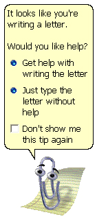
One example for this is Clippy. Long before Siri, Cortana or Google Now, Microsoft Office’s Clippy (first seen around 1997) detected basic intentions and responded offering help. In this case, typing a standard letter greeting like “Dear Sir” would trigger Clippy’s timely appearance.
Why Anticipatory Design? Why Now?
I strongly believe that anticipatory design is set to be the next great concern of user experience design in this decade. Engaging increasingly busy, burned-out users will require some careful consideration on how our products can facilitate their daily tasks. People no longer have time for the painful extra processing we’ve been forcing them to do. Arguably, we must structure our back-end around helping users complete their tasks without depleting valuable resources they’ll need several times during their day.
Now don’t get me wrong: this is not about designing for lazy automatons, nor about making all of us passive good-for-nothings. This is about putting cutting-edge technology at the service of users so they can dedicate more time to the high-level processing tasks that modern living requires of them.
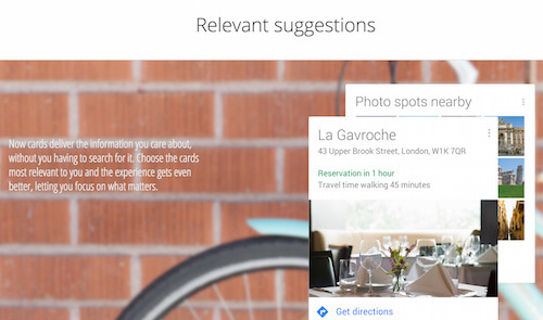
Google Now, for example, allows you to “focus on what matters” by solving issues before you even have to think about them. If there’s a restaurant reservation in your calendar, Google Now suggests travel time and great photo spots to enrich your experience.
Anticipatory Design And Cognitive Load
Developers have been championing the Don’t Repeat Yourself (DRY) and Keep It Simple, Stupid (KISS) principles for years, and it’s time to bring that painless logic to the way our users interact with what we’re building. Give it some thought: if we ask users to complete a task more than once within any given process, isn’t that an inefficient use of their time? Similarly, isn’t it redundant to ask someone what they prefer when you have collected that information in the past?
In psychology, we use the term cognitive load to describe the amount of mental effort being used in the working memory at any given moment in time. For everyone involved in user experience design, cognitive load is a crucial consideration. Are we doing everything in our power to relieve the strain caused by learning something new to use our product? How can we reduce the number of elements that our users need to worry about at any given time? Reducing cognitive load is one of the cornerstones of anticipatory design, as it helps create a more pleasurable experience by foreseeing our users’ needs.
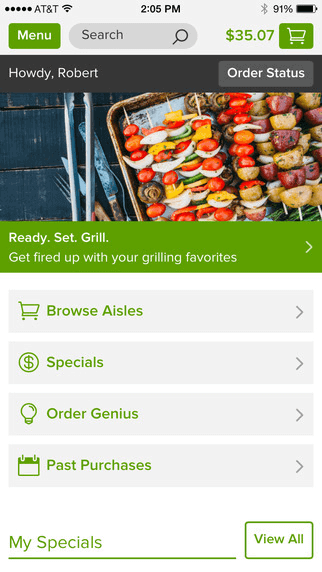
Online grocer Peapod just released a new mobile app that includes anticipatory design. Order Genius, as they’ve called the proprietary recommendation engine, allows you to fill your cart with just a few clicks based on what you’ve ordered in the past. What’s even more interesting is how Order Genius differentiates by seasonality and product cycle, and learns more about your purchase behavior as you use it over time.
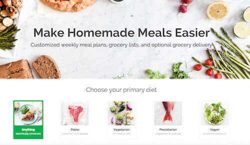
In another move to release grocery shoppers from the burden of having to coordinate recipes, lists and actual shopping, the app also integrates with the Gatheredtable API. With this integration, you can simply decide what kind of menu you’d like to provide your family with and Gatheredtable turns it into product lists that Peapod gladly adds to your shopping cart in a couple of clicks.
Anticipatory Design And Empathy
Being able to anticipate what our users will want and need is closely related to empathy. How connected are we with our customer base? Do we consistently go back and observe their natural behaviors to discover emerging needs? Recognizing effective opportunities for anticipatory design often depends on our ability to connect the dots in the environment where our product is being used.
As designer Pete Smart rightfully points out in his article, “Real Empathy For Innovation”: “Empathic investigation helps us to observe the ways in which people are already overcoming obstacles, and it often uncovers solutions that are more elegant than we’d expect.” He would know, as he recently travelled 2,517 miles to try to solve 50 problems in 50 days using design.
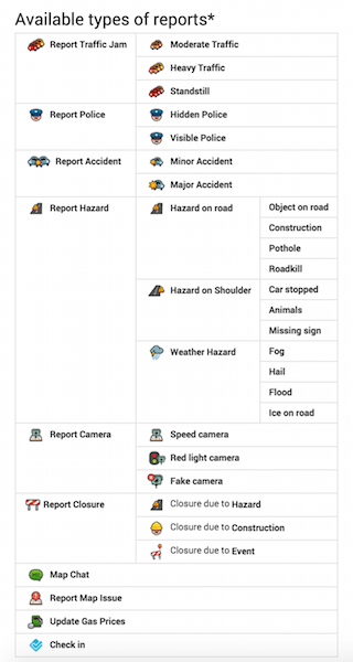
The founders of Waze, a popular navigation app, noticed that people could use one another’s feedback to drive smarter. They went on to create an interface where drivers can not only warn one another about impending issues (traffic jams, accidents, police ahead, among others), but also communicate openly via messages.
There are several elements of anticipatory design in Waze, but some of the most outstanding include: a warning when the car is moving and someone is typing (should always be a copilot); alerts when other drivers have experienced issues; and live notifications when a better route is found. The fact that the app is constantly looking for better routes based on user feedback is, in and of itself, a highly successful anticipatory feature. Once you set your destination in the app, you can basically just lean back to focus on your driving.
Like Waze, there are many other products and services harnessing the power of anticipatory design. Because developers and designers are making an extraordinary effort to incorporate these principles, we should expect them to become the norm rather than the exception. In this article, I will introduce ten examples of great anticipatory design patterns that we can bring into our own projects.
Examples Of Great Anticipatory Design
For the purposes of this article, user experience involves every single touchpoint that makes part of your user’s interaction with your product or service. This includes pre-purchase, purchase and post-purchase events of all sorts. We’ll also go beyond user interface concerns, and consider design elements related to marketing strategies. Since anticipatory design involves a thorough revision of the steps in our user experience flow, I will also share a checklist with questions that you can use to get started.
"User experience involves every single touchpoint that makes part of your user’s interaction with your product or service."
Facebook: Using Geolocation To Facilitate Real-Life Encounters
Facebook has become a pervasive social network and has managed to collect multiple data points throughout our online lifetime. Many believe that the platform is designed to empower virtual encounters, but some recent anticipatory features have begun to shift that. What if the information that Facebook collects about our desires, preferences and location could fuel physical, face-to-face encounters?
These were my thoughts when I first saw these in-app notifications:

The idea that users don’t need to figure out how to meet their friends in real life is convenient, friendly and well executed. As long as users are willingly providing Facebook with their location information, as I was, creating opportunities for physical encounters is a feature that anticipates my desire to socialize beyond the web. In anticipating that your users might need to meet up with friends attending nearby events and providing them with that option, Facebook effectively creates that mind-reading experience.
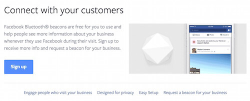
In addition to socially driven notifications, Facebook has recently begun exploring Bluetooth-powered devices that allow business managers to engage their visitors directly. This engagement can take the form of a welcome note, photos, and their friend’s recommendations about this place. In assisting decision-making by showing your friends’ opinions, Facebook Beacon is another example of anticipatory design.
Saleswise: How To Turn Collected Data Into Meaningful Time-Savers
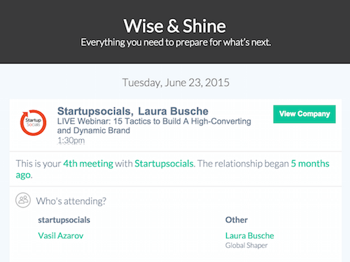
Saleswise is an app that connects your email, CRM, notes and other data into a dashboard that helps you close more sales. I must confess that the first time I opened my account it was out of mere curiosity, and I dropped the site a few minutes after logging in for the first time. And that’s exactly when their anticipatory design became interesting.
Before bouncing off, I had connected my Google Calendar to the site. Saleswise interprets and uses your calendar events as potential sales meetings. The day after I had signed up and, honestly, forgotten about the app, I received a handy email titled “Prepare for Startupsocials”. I did need to prepare for that. I had scheduled a webinar for that date and there was plenty of preparation required.
Besides reminding me about the event, Saleswise provided a detailed summary of my history with Startupsocials, as well as information about the attendees and company involved. The company had also been magically converted into a sales prospect in their CRM. This was convenience, anticipation and sheer predictive power.
Pandora: Recommendations Based On Relevance
A user’s past behavior reveals the kinds of solutions they’re looking for to meet specific needs and desires. Suggesting new activities based on past interactions is, therefore, an essential feature of any successful user experience design. While some recommendation engines focus on the basics (i.e. pushing items from the same category), developers are becoming increasingly savvy at creating smart algorithms that delve deep into our motivations.
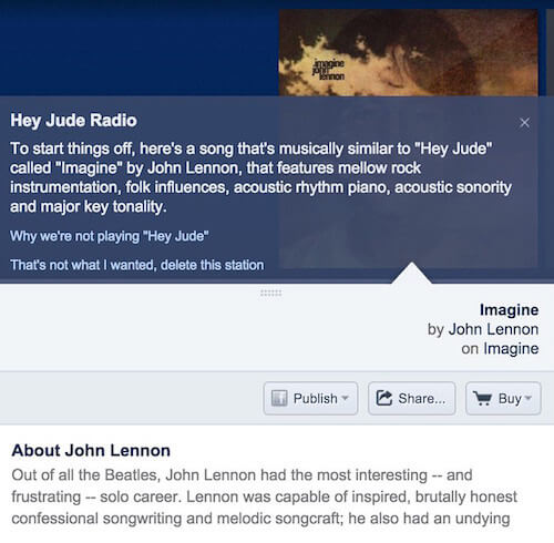
One such algorithm is Pandora’s Music Genome Project, which recommends an entire playlist based on a single song of your preference. Each song in the Music Genome Project is analyzed using up to 450 distinct musical characteristics by a trained music analyst. In capturing the musical identity behind each song, the Music Genome Project is able to suggest a song that might just become your new favorite.
Online marketplaces like Ebay and Amazon also excel at providing these tailored recommendations, and some go as far as to schedule specific emails that target their users’ needs based on past behavior.

Brita: How To Make Repeat Purchases Much Simpler
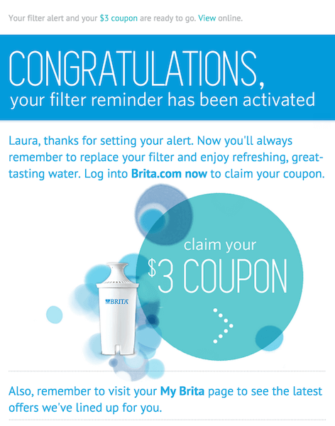
Brita, a water filter manufacturer, faces a unique challenge: all filters, no matter how their quality, will eventually expire and need to be replaced. Buyers are well aware of the impending need to watch out for these expiration dates. After all, it is their health that’s at stake whenever these filters no longer do their job. In light of this issue, Brita made it easy for buyers to scan their filter’s ID and sign up for regular updates regarding the status of their product.
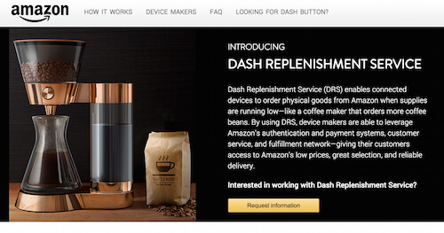
Many other types of retailers also experience this challenge, and Amazon will soon launch an anticipatory design feature to help them connect physical devices to online ordering. Dash Replenishment Service integrates with devices to detect when supplies (of anything) are running low. This is a potential game changer for brands manufacturing printers, coffee machines and other appliances with lucrative refills.
Meetup: Recommendations Based On User Interests
Meetup helps people find groups to join based on their professional and personal interests. You would expect an app like this to notify you whenever your groups have arranged a new meeting, or to remind you of an event that’s happening soon.
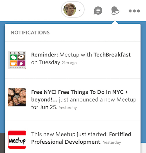
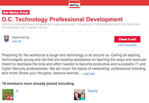
But Meetup goes a step further and tries to predict new groups that you’d like to join based on existing interests. Say you have joined a few professional development groups in your area and most of these are tech-related. This combination of data helps Meetup launch anticipatory email campaigns and notifications to inform you about the existence of a potentially exciting new Meetup.
Expedia: Offer Ideas Beyond Purchase
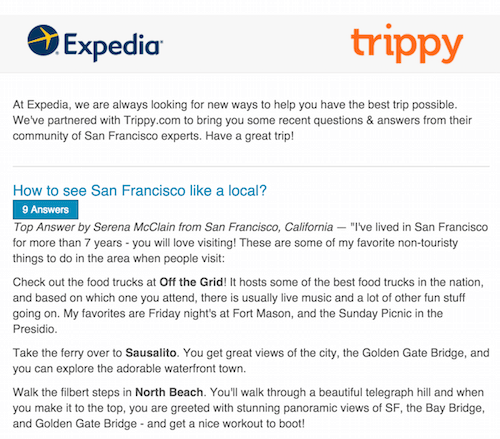
Sometimes anticipating your users’ needs and catering to them will require capabilities that go beyond what your team can do. In this case a strategic partnership can save the day, and allow you to add a feature that effectively reduces the amount of work that your user must complete. In one such strategy, online travel retailer Expedia joined forces with Trippy, a social travel knowledge base.
What this means for travelers is that the usual purchase follow-up question of What should I do in X city is finally answered. Because Expedia knows where you are going (data point A) and Trippy knows what other travelers love to do when they’re there (data point B), their union results in amazing predictive convenience for users.
Here’s what that looks like:
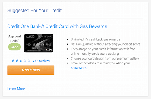
Credit Karma: How To Anticipate Cross-Selling Opportunities
When you are a credit management platform that has promised to remain free, you need to get creative with monetization. Credit Karma helps thousands of users learn about their credit status and how it can be improved. The truly anticipatory nature of their design, however, lies in their credit recommendation feature. Based on sensitive data that you have agreed to enter in their platform, Credit Karma provides a preliminary suggestion about the types of credit cards and loans you are eligible for. This is exactly how they make revenue: through partner sponsorships with financial institutions that pay when a user actually acquires those products due to Credit Karma’s referral.
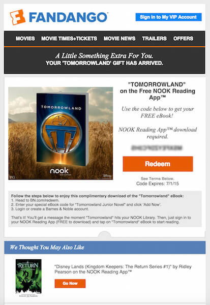
Fandango: Finding Relevant Opportunities To Add A “Little Extra” Value
Fandango is an online store for movie tickets that serves over 26,000 screens in the United States. They figured that if you proved your interest in a certain movie, you would also be interested in complementary items related to that movie. In this example, a friend bought a ticket for Tomorrowland and received the free Nook ebook that the movie is based on. It makes sense: if I sat through a couple of hours to watch the movie, wouldn’t I also be interested in at least browsing a few pages of the original book? This match also represented an opportunity for a brand partnership, where Nook and Fandango joined forces to add value for their audiences.
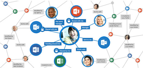
Microsoft Delve: Automatically Tailoring The Experience To Your User’s Preferences
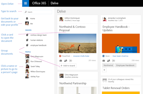
Microsoft Delve is like a virtual assistant for teams working in Office 365. It pulls from online content and your team’s information to offer suggestions, documents, context and contacts before you even consider asking. Each user’s Home View is unique, and is automatically generated based on what is likely to be more interesting to that person at a given time. For example, Delve identifies that you and someone else are working together if both of you modify or view a document simultaneously. Microsoft explains more about Delve’s card-based layout and the logic behind this anticipatory design in its support pages.
Turbotax: Transparently Combine Additional Forms Based On User Inputs
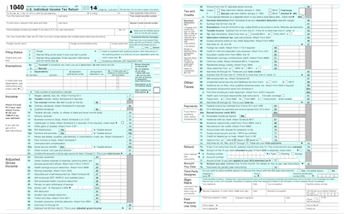
Perhaps no task is as grueling as filing your taxes. The design team behind Turbotax, however, has faced the challenge head-on. They’ve created a user-friendly form that guides you through the entire set of questions that you would otherwise have to fill out directly on the most confusing form you’ve ever seen. To get some perspective, here is an image of the Individual Income Tax Return form in the United States.
Turbotax has not only simplified the way the questions are presented, but has made sure that taxpayers are not exposed to unnecessary items. Depending on your answers to specific questions like whether you own a home or not, you will see further questions related to it. If any of your answers require attaching a specific form, they’ll automatically ask any information that needs to be filled out in that extra form.
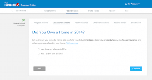
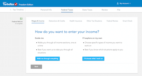
Put simply, the system predicts that you’ll need the form and proceeds to help you fill it out. At the end, you will be able to see any and all tax forms related to your yearly income. And you get all of that from a clean, simple set of questions. In addition, they’ll let you select whether you want to be guided or if you are able to explore on your own.
A Checklist To Get Started With Anticipatory Design
Having learned what so many others are doing to bring in anticipatory design principles, you’re probably wondering how your own product can benefit from these ideas. Once again, the best approach here is to simplify. Rather than looking at the entire user experience flow and trying to target everything at once, focus on how each individual step can be improved. The checklist below will help you get started.
For each step in your user experience flow, consider the following:
- Is there a way to make this task simpler for users?
- Are we giving users too much information that might be confusing?
- Is there a way to avoid asking this question and pre-fill it with existing data? Consider sign-up forms that could pre-populate with OpenID credentials, for example.
- Can we suggest a course of action based on previous preferences?
- Can we save the user some time by using templates that have been created before?
- Is there any extra value that we could add given the user’s action in this step?
- How can we prevent the user from making a mistake here, or provide alternative options before the mistake is made?
- Which medium would be most effective to share the instructions related to this task? Should we create text-based instructions, audio guides or a video?
Anticipatory Design: The New Standard
Modern users expect seamless, uncomplicated solutions to their needs and wants. Stuffing a product or service with vanity features is no longer viable. As the market moves towards simplicity and no-brainer user experiences, anticipatory design is no longer something you can afford to ignore. Look at the examples and consider the checklist above to spot opportunities for improvement in your current user experience. If you are starting out from scratch, you have a unique opportunity to embed these principles from the outset. Regardless, keep this idea close to heart:
“Everything should be made as simple as possible, but not simpler” — Albert Einstein
More Resources
- “The Next Big Thing In Design? Less Choice” by Aaron Shapiro via Fast Company
- “The next design trend is one that eliminates all choices” by Anne Quito via Quartz
- “The paradox of choice”, a TED talk by Barry Schwartz
- “A pattern for user experience design in predictive analytics” by Michael Kuniavsky via The Connective by Wired
Further Reading
- How To Build Honest UIs And Help Users Make Better Decisions
- Algorithm-Driven Design
- The Personification of Design
- Authentic Design


 SurveyJS: White-Label Survey Solution for Your JS App
 Celebrating 10 million developers
 Register Free Now


