Beyond Usability: Designing With Persuasive Patterns
You probably have a great product. You’ve done your usability deeds and you have a few core customers who regularly use your product. However, it just doesn’t stick out from the competition. It has a high bounce rate, only few users return, users abandon your product faster than you would like and, in general, users never get far enough to experience all that your product has to offer.
Building persuasive user experiences is like a relationship and you need to treat it like one. So, what do you want? A one-night stand or a lasting partnership?
There are three common challenges when engaging users with a product:
- Sign-up challenge: seducing your users People seem interested in your software, but aren’t motivated enough to give it a try. Communicate effectively and use persuasive design principles like scarcity, completion, tunneling, the endowment effect and social proof to move intention to action.
- First-time use challenge: falling in love with your product People are giving your software a try, but don’t know what to do or how to get started. Better onboarding and motivational mechanisms from game mechanics can help get people started and discover all your product has to offer.
- Ongoing engagement challenge: staying in love People understand the idea of your product and use it, but they’re leaving you before you’d like. Mastery, habits, communities, sandboxes and flow will lead to true intrinsic motivation and ongoing engagement.
Your approach to engaging users should be appropriately adjusted to the relationship you have with them. We will examine the three stages of a user relationship and what tools are appropriate to use for each challenge.
Sign-Up Challenge: Seducing Your Users
When we design our own products, we are often too familiar with their inner workings to be good at selling them. Designers and developers tend to focus on all the features, attributes and technical problems solved, all of which they have been preoccupied with for as long as they can remember.
When convincing users to try out your product, focusing on its features is a bad place to start.
Features Versus Benefits
To sell your product, you should focus on the perceived benefits from your customers’ perspective. Instead of falling into the common trap of describing what your product can do, explain what customers can do with your product. Don’t sell the product, but what your users can do with it. People don’t buy products, they buy better versions of themselves, accomplished through using the product. This should be your value proposition.
Communicating Effectively: What’s In It For The User?
The more value and relevance your message conveys, the better. Focus on what the user is going to gain by using your product, rather than what they have to part with. Focus on how your product will help users achieve what they want rather than how much it costs or how long it will take to sign up.
A good way to start thinking from the perspective of your users – to step into their shoes – is to ask: what’s in it for them? Explain why it is important for potential customers to spend their precious time on your product. Explain how will it help users succeed. A good way is to actually talk to people.
Communicating Efficiently: Aristotle’s Three Persuasive Appeals
Aristotle’s thoughts on effective communication are over 2,000 years old, but they’re still regarded as the basis of rhetoric today. His theories on public speaking are easily applied to digital user experiences.
Some of his basic heuristics (rules of thumb) are his three persuasive appeals: how we must consider at least three different aspects of an argument to persuade our audience.
Aristotle’s three appeals were:
- Logos: appealing to logic Appealing to logos is typically done by using facts and statistics, quotations from experts, and informed opinions.
- Pathos: appealing to emotion Appealing to pathos is typically done by using emotional outbursts, stories about emotional events, or using picturesque and vivid language.
- Ethos: appealing to ethics, morals and character Appealing to ethos is typically done by showing practical knowledge, showing moral character (areté), or showing good intentions and goodwill.
When introducing your product, consider covering all three persuasive appeals. Are you using convincing facts, telling exciting stories about how you have helped others, and are you showing off your track record? Let’s examine how the three persuasive appeals can help you improve your user experience.
Logos: Appealing To Logic
You appeal to logos when you have a sound argument that in itself will demonstrate that something is the case. For example, if your blog has a lot of readers, establish social proof by displaying how many. If you have helped customers earn money, show with facts and figures how much.
Pathos: Appealing To Emotions
Given you have established trust and your argument is backed up with facts and statistics, the use of emotions can be the tipping point of a user’s decision. Appealing to emotions can help reinforce positive arguments and dampen negative arguments. Examples of using pathos to persuade include overstatements, narratives about emotional events, figurative language, or conveying connotative meanings. You may use pathos to appeal to humor, fear, an unjust cause, imaginations, and hopes (when you present your solution).
Ethos: Appealing To Ethics, Morals And Character
Your audience will judge your propositions as being truer and more acceptable if you establish your credibility. Establish social proof with the power of authority through testimonials from credible customers; highlight how you are similar to your potential customers to induce liking and, in turn, their goodwill. Small adjustments like showing badges of affiliated industry organizations or well-known customers will help boost your credibility.
Persuasion Must Be honest
You may think of these practices as being psychological triggers that exploit human behavior in some sort of questionable way, somehow similar to mind control. You might also wonder if these tactics are ethical and if they are at all something you are ready to use.
If you do have these concerns, you have the right attitude, but let’s clear up one important truth: what I explain in this article is how to tap into existing triggers based on desire, which is already part of who we are as humans. You aren’t going to convince people they want something that they would otherwise not be interested in.
Persuasion must be honest and ethically sound to continue its effect beyond just a brief encounter. If you approach persuasion in a dishonest way when trying to get your users to sign up, it will eventually backfire when users find out once they start using your product.
Closing The Deal
Now your users are interested in what you have to offer, your next job is to close the deal. There are a number of techniques that will encourage users to make a decision, but we will focus on these four:
- Using the principle of commitment and consistency.
- Utilizing the power of scarcity.
- Close off detours by tunneling your users.
- Provide samples: give a piece of the action up front.
Commitment And Consistency
People want to act in a manner consistent with their stated beliefs and prior actions. We like to be seen to honor our commitments consistently; as somebody who can be counted on, instead of somebody who flip-flops, and is without self-control.
By getting users to state their position, declare their intentions, or show a small gesture of support, they will generally act in a manner consistent with these small requests, even if later on they’re asked to make a much larger, but consistent, commitment. Getting just a small commitment from your potential customers, like signing up for your newsletter or liking your page on Facebook, will make them more likely to purchase from you in the future. Also, getting a small commitment is its own test, whether people are interested in the product in the first place.
Scarcity
If something is promoted as being scarce, it can be perceived as more desirable and of more value to us. Simply put, people want more of those things they can have less of. The scarcity principle focuses on persuading people to make a decision, within a small window of time, by emphasizing the future unavailability of something. If you give people all the time in the world to make a decision, they will either take up every minute of that time, or never make a decision at all.
The successful application of the scarcity principle in design and marketing campaigns curtails the amount of time users take to think about their decision, and instead tries to push people into making a decision immediately. However, there’s a careful balance to be struck; stressing users too much will make them run away.
Tunneling
Close off detours from the desired behavior without taking away the user’s sense of control. Tunnel users through a decision process by removing all unnecessary functionality that could possibly distract their attention from completing the process.
Lead users through a predetermined sequence of actions or events, step by step. When users enter a tunnel, they give up a certain level of self-determination – once they have entered the tunnel, they have committed to experiencing every twist and turn along the way.
Guiding users through a process or experience provides opportunities to persuade along the way. The tunnel provides opportunity to expose users to information and activities and ultimately to persuasion.
Give Users A Piece Of The Action Up Front
Allow users to access a limited set of features, functionality or content without an account. As a consequence of interacting with your product, it is natural for users to give up information about themselves or their context, which is why the distance to actually creating an account becomes shorter and shorter. The traditional approach requires account registration, but lazy registration can help build up users’ investment and endowment.
It is easier than you think to deliver value to your users without them signing in. Some options include limited content, limited time trials, limited capacity, drafts and guest checkouts.
Some of the most common design metrics are registered users or paying users. If you share these goals, you will want to prompt users for conversion at some point, but make sure that point is after you have delivered value.
Trying to convert users before delivering on value only increases the chances of them leaving you before you get the chance. Don’t let someone into your product and have them realize that all of the features are locked until they sign in; that won’t feel very free. Engage users early into your product and get them past the need to supply their information to register or sign up.
First-Time Use Challenge: Falling In Love With Your Product
After users have signed up for your product, it’s time to give them a good first-hand experience. Your goal is to let users grasp all your product has to offer. Let’s take a look at what you can do to let users experience the true value of your product.
How Do We Make Specific Behavior Occur?
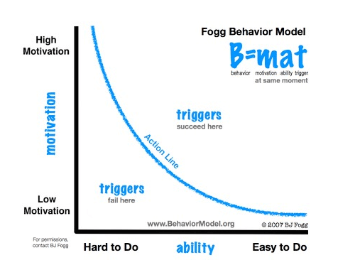
Your aim is to get your users to perform the behavior that shows them just how much value they can potentially receive from using your product. The Fogg behavior model explains how three elements must converge at the same moment for a behavior to occur: motivation, ability and trigger. When examining why users aren’t doing what we intended them to do, at least one of those three elements is missing.

Without a clear trigger and sufficient motivation, there will be no behavior. However, for companies building digital products, the greatest return on investment generally comes from increasing a product’s ease of use.
Increasing motivation is expensive and time-consuming. Influencing behavior by reducing the effort required to perform an action is usually more effective than increasing someone’s desire to do it. Make your product so simple that users already know how to use it.
Design The Experience Over Time
Consider the context of your users and design appropriate challenges and experiences which suit it. That is, design for changes over time. This is a radical break from the the standard usability approach, where everything is concentrated around making things as easy as possible. By designing for changes over time, you also concentrate on making things harder to do as users progress, to suit their growing skill level.
Appropriate Challenges
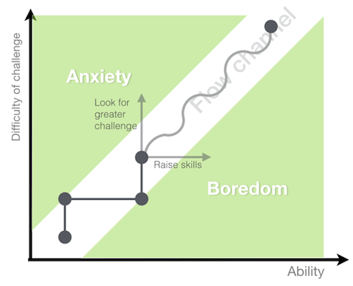
We’re in flow when we experience a task so positively that we do not allow ourselves to be diverted by distractions that don’t support the challenges and goals we are pursuing.
To keep users in flow we need to give them appropriate challenges. If a challenge is too hard, the user is going to feel stress and anxiety. If the challenge is too easy, the user is going to feel bored. Both boredom and anxiety tend to lead to disengagement from the activity that was previously rewarding.

To design for appropriate challenges is to keep a careful balance between producing neither anxiety nor boredom, to keep users in the flow channel.
When you think about appropriate challenges in your design, you are most often designing for a sequence of events that progressively require an increased skill level. In video games, the events are often represented by levels; in e-learning, by lessons within courses. To complete a challenge, it is necessary that the requisite learning takes place.
Reinforce Behavior With Rewards
To strike a perfect balance between anxiety and boredom, add proper incentives and rewards. Use rewards to encourage users to continue behavior you want them doing. With proper and thoughtful design, incentive and reward programs can be very effective in facilitating engagement.
When planning rewards, you should consider what the reward should be and when to give it.
What Kind Of Reward To Give
The nature of the reward is very important. Ultimately, the goal of the reward is to maximize motivation prior to receiving the reward, as well as happiness after receiving the reward. Depending on the context, the most popular reward arsenal includes:
- Completion. Provide a feeling of closure by rewarding a user’s completion of a goal.
- Points. Use scores, points or ratings to give users feedback on their actions and allow comparison with other users.
- Levels. Use levels to communicate progress and gauge personal development of the user.
- Status. We constantly assess how interactions either enhance or diminish our standing relative to others and our personal best.
- Powers. Give users a way to reach their goal more quickly than they could before.
- Unlock features. Exploit users’ desire to explore by unlocking new features as a reward for specific behavior.
- Prolonged play. Reward users by prolonging their game-time to allow for higher scores and measures of success.
- Self-expression. People seek opportunities to express their personality, feelings and ideas.
- Achievements. We are more likely to engage in activities in which meaningful achievements are recognized.
When To Give Rewards
The other element of a reward that needs careful planning is when a reward is granted. When and how often we reinforce a behavior can have a dramatic impact on the strength and rate of the response. When users do not know exactly when to expect a reward, they tend to expect it anytime soon. This leads to a higher level of activity than when linking rewards to specific actions or specific times.
Appropriate Mechanics Depend On The Community
In communities, users can be rewarded for working together as a group or excelling as individuals.

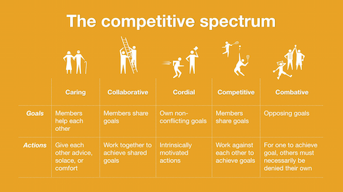
In a competitive community, users share the same goals, but must compete against each other to achieve them, whereas in a collaborative community, users work together to achieve the same goals. Users in the competitive community are motivated by extrinsic rewards such as accomplishments, points, levels, rank, or anything that can be used to establish their bragging rights.
In the collaborative community it is the more intrinsic rewards that should be focused on, such as meaningfulness, reputation, or personal satisfaction of a job well done.
Studies show that rewarding competitive actions accentuates users’ perceived difference between themselves and other users in the community, whereas rewarding collaborative actions minimizes perceived differences between the user and other users of a community.
Social structures aren’t always as simple as either being collaborative or competitive. Communities are also built around users caring for one another, helping, or even being combative toward one another. Learn more about the competitive spectrum at the Yahoo Design Pattern Library.
Good Guidance And Practice
Guided interaction, or guided practice, is a key component of educational systems, where you’re trying to gradually add support for someone through practice, as they go from a beginner level to mastery. That’s what we want to do to gradually engage our new users.
Good guidance will facilitate exploration, set achievable goals and provide prompt feedback, but also will not overdo it. This is quite important to think about. Let me explain why.
- Avoid the obvious. Wasting your guidance on what seems obvious to the user becomes an annoyance more than a help and will lead to users abandoning your service sooner than you would like.
- Don’t get in the way of users’ flow Don’t force the user to think more than necessary. Modals, alert boxes and similar interruptive elements force the user to spend precious brain energy on interpretation. Every time you break the flow, you give users an opportunity to drop out. You would rather have users spend that energy on understanding the value you deliver.
- Avoid repetition. If somebody has already learned something, then don’t waste their time on explaining it again.
- Allow escape. Let users skip or dismiss your coaching; some people just like to learn through trial and error.
Design Patterns To Aid Good Guidance
A number of design patterns help facilitate good guidance.
- Play-through. An authentic space where beginners can safely explore and learn core skills.
- User-guided tutorials. Let users into the full product experience, but trigger coaching and guidance as that user explores.
- Inline hints. Hints are blended with content for a seamless experience.
- Recognition over recall. It’s easier to recognize things we have previously experienced than it is to recall them from memory. Recognition tasks provide memory cues that facilitate searching through memory. This is why a familiar option is often selected over an unfamiliar option – even when the unfamiliar option may be the best choice. Favoring recognition over recall builds a smooth and easy process that helps users expend less energy.
Ongoing Engagement Challenge: Staying In Love
Users are signing up, they are starting to use your software, but you can’t seem to hold on to them for a longer period of time. You are dealing with an ongoing engagement challenge.
Let’s look at how you can keep people using your products through mastery, building habits, and sandboxing to facilitate true intrinsic motivation and, in turn, ongoing engagement.
The Player Journey
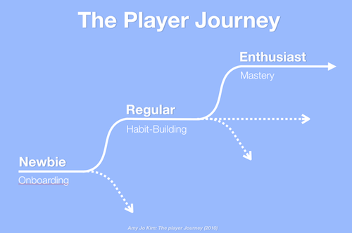
Game designer Amy Jo Kim described how we should focus on designing for the changes of time in users, as the user is on a player journey (Amy Jo Kim, The Player Journey, 2010).
Great games are compelling because the player’s experience and expertise change over time in meaningful ways. Games dole out just the right amount of challenge and learning to keep players engaged and on the edge of their ability. In short, games are compelling because they’re pleasurable learning engines – they offer up skills to master, and reward you with greater challenges and opportunities.

This perspective is directly compared to web design, and we have already discussed how we can avoid newbies dropping out before even trying out the service by constraining and simplifying an experience, and how we can enable and motivate behavior through use of extrinsic motivation. This will help newbies become regulars.
Intrinsic Motivation
But how do we make regulars become enthusiasts? How do we facilitate mastery?
The key is tapping into the existing intrinsic motivation of your users. In other words: if your product or service does not provide real value to your users in itself, there is no way you can make them love your product.
You can successfully apply persuasive principles to your design to let your users experience more quickly how great your product is. But if your product isn’t great and doesn’t provide real value for your users, there is no way you will be able to retain them in the longer term without using force.
If your product doesn’t provide real value, applying persuasive principles will only help it fail faster. Seduction and persuasion need to be honest to work in the longer run. Sooner or later, your users will find out if you are an impostor. Business and user goals need to match. Otherwise, all you will get is a one-night stand. Your job is to find the sweet spot in the middle.
Find out what motivate your users; what they really want. The best you can do to play on intrinsic motivation is to facilitate it. Once you start aiming toward solving the needs of your users, do your best to facilitate their intentions into behaviors and habits.
At the outset, using external rewards and punishments seem like a more effective way to motivate individuals into acceptable behaviors. However, the danger of relying on extrinsic motivators to encourage certain behavior, is the ease in which they can be administered.
Conclusion
Building persuasive user experiences is like a relationship and you need to treat it like one. If your intentions aren’t honest and in good faith from the start, then, sooner or later, your users are going to find out. And if you aren’t honest in your efforts, then eventually your users will abandon you.
The key to a successful relationship with your users is to align the intentions of your users with your own. User goals and business goals need to match. Usability naturally places the user at the center; persuasion doesn’t. Therein lies the danger of traversing the path of persuasion to begin with: forgetting about the user.
It’s vital to tap into the existing motivation of your users, the motivation that comes from inside and out: intrinsic motivation. Explore activities users find motivating in themselves – activities and goals which are their own end. Focus more on building learning engines that support an experience over time than on single experiences which lead to dead ends.
Intrinsic motivation lies within the user. Its amplification can be facilitated by persuasive design patterns. Persuasive design patterns can be used to convince users to sign up for your product and start using it, but you can only facilitate intrinsic motivation for true, engaged, ongoing use.
This article is a summary of Anders’ talk on designing with persuasive patterns at the Push Conference 2015.
Further Reading
- Persuasion Triggers In Web Design
- How To Persuade Your Users, Boss or Clients
- Lean UX: Getting Out Of The Deliverables Business
- Facilitating Inclusive Online Workshops (Part 1)


 Register Free Now
 SurveyJS: White-Label Survey Solution for Your JS App


 Celebrating 10 million developers

