Design Mock-Ups Need Dynamic Content: Tools And Plugins
Nothing is perfect on the web. We can’t make sure that our websites always work as intended, but we can try our best to design resilient and flexible websites that aren’t that easy to break — both in terms of interface design and security. Yet still neither resilience nor flexibility are usually reflected in deliverables and mock-ups.

In practice, mock-ups usually represent a perfect experience in a perfect context with perfect data which doesn’t really exist. A good example for it are “optimal” usernames which are perfectly short, fit on a single line on mobile and wrap nicely, or perfect photography that allows for perfectly legible text overlays. It’s not realistic. We need to work with dynamic content in our prototypes, with both average and extremes being represented.
Now, of course usually we don’t have the content when we’re designing, but it’s enough to have the content structure (video) to design an experience around it. It’s extremely helpful to know whether you should be expecting regular text paragraphs or many tabbed widgets or quite a few complex tables or a complex magazine layout with pullquotes and indented ads. This knowledge alone helps guide design decisions.
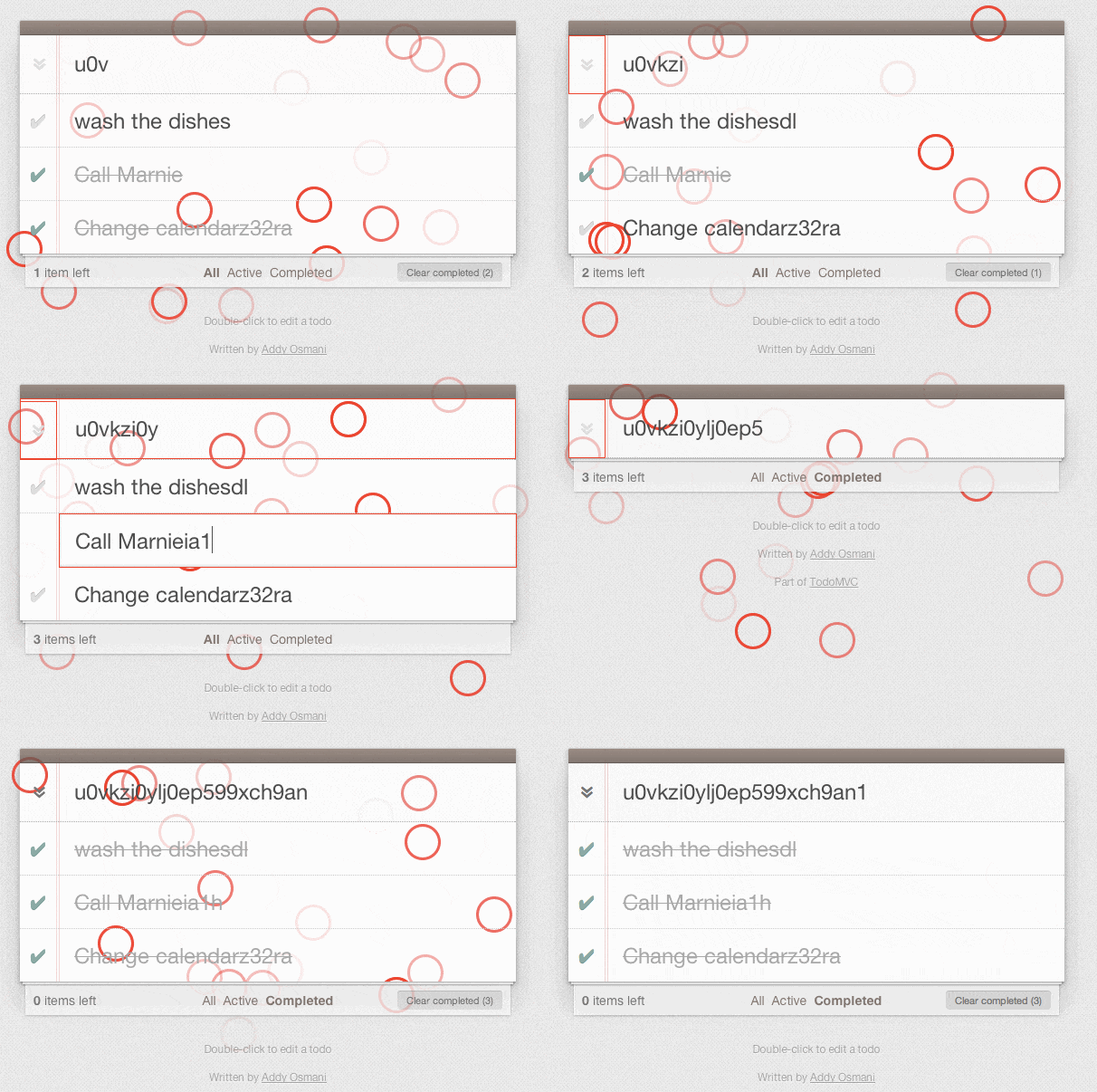
In all of those cases, a good strategy would be to use Forcefeed.js to populate our content areas with random content — sometimes too lengthy, sometimes too short, often with accent characters and perhaps even emojis.

Another tool is Gremlins.js, a monkey testing library that helps you check the robustness of web applications by “unleashing a horde of undisciplined gremlins”, i.e. it generates random data strings and types them in all over the place to test how a website responds. If you want to have a more controlled testing, you can also use the Prefill Forms Bookmarklet which allows you to predefine a set of templates to be submitted into forms to test its resilience.

We need to craft future-proof experiences, too. What if your interface design would need to be translated into other languages? While Chinese might be perfectly short and concise, German might turn out to create awkwardly long interface components, ranging from buttons to navigation. In this case, something as simple as jQuery Globalize plugin, or Sketch i18n plugin could be helpful.
You can define dynamic variables for your content and “plug them in” quickly, to verify that the layout doesn’t break when the language changes. For Sketch, you can also use Content Generation Plugins, ranging from importing financial data to random user profile images. And if you use Photoshop, there are ways to insert content into Photoshop from a text file, too. Also, Craft is a free plugin suite for Sketch and Photoshop that lets you design with real data, too.
We use these little helpers all the time, and they prove to be great tools to build websites that are prepared for everything that comes their way. They also reflect reality much better than perfect mock-ups with perfect heights and perfect names and email addresses ever would. Stay resilient — that’s the true power of the web.
Further Reading
- Optimizing Your Design For Rapid Prototype Testing
- Content-First Prototyping
- Content Prototyping In Responsive Web Design
- Resurrecting User Interface Prototypes


 Register Free Now
 Celebrating 10 million developers

 SurveyJS: White-Label Survey Solution for Your JS App

