Designing A Dementia-Friendly Website
Some well-established web design basics: minimize the number of choices that someone has to make; create self-explanatory navigation tools; help people get to what they’re looking for as quickly as possible.
Sounds simple enough? Now consider this… An ever-growing number of web users around the world are living with dementia. They have very varied levels of computer literacy and may be experiencing some of the following issues: memory loss, confusion, issues with vision and perception, difficulties sequencing and processing information, reduced problem-solving abilities, or problems with language.
Just when we thought we had inclusive design pegged, a completely new dimension emerges.
Designing websites for people living with dementia has thus far been relatively unexplored in the web design world. However, we at On Our Radar had to face up to the challenge of dementia-friendly design last year when creating “Dementia Diaries”: a project to encourage people living with dementia to record audio diaries of their experiences, achievements and challenges through a customized 3D-printed mobile phone. The collection of audio stories is hosted on the site where they are curated for media campaigns or used to provide insights for services and organisations who work with people with dementia.
We wanted to make the website as accessible as possible for people with dementia so that they could listen to the stories submitted by their peers and share advice or support. With the help of full-stack web developer Rory Gilchrist, we set about building a site that would be as inclusive as possible, while still being an engaging platform.
We included people with dementia in the design process. We listened to their feedback to make the website work for them. The Dementia Education and Empowerment Project also helped us during this time.
In this piece, we’ll share some lessons we learned along the way about making a dementia-friendly front end on a tight budget.
What Is Dementia?
The word dementia describes a set of symptoms that may include memory loss and difficulties with processing information, problem-solving or language. Dementia is caused when the brain is damaged by diseases, such as Alzheimer’s disease, or a series of strokes. Dementia is progressive. With the passing of time, the symptoms will gradually get worse. Some of the lesser known symptoms include hallucinations, sensory impairment, insomnia and mood swings.

At the end of 2017, there were an estimated 50 million people worldwide living with dementia. The number of people living with dementia will almost double every 20 years, reaching 74.7 million in 2030, and 131.5 million in 2050. There are 4.2 billion internet users worldwide, and as the number of people with dementia continues to rise, so too will the proportion of internet users living with the condition.
The New Frontier Of Designing For Dementia
Why Is This Relevant?
Organizations and businesses, especially those with a large user base of people over 60, risk alienating a large portion of their website users if they fail to adapt.
Many people with dementia find using computers and the internet more difficult as their dementia progresses (PDF). Although many people living with dementia use the internet to access information or communicate with peers, friends or family, actually navigating these digital spaces can become increasingly problematic.
Many websites provide services, products or information for people living with dementia, but are effectively useless if they aren’t designed with this user group in mind. Though other people can – and often do – help those with dementia access this information, this reduces the independence of people with dementia, which is central to maintaining emotional wellbeing.
Social Media
Older people and people with dementia are especially vulnerable to loneliness and social isolation. Loneliness is also associated with an acceleration of cognitive decline. Improving online practice to enable elderly people and people living with dementia to interact and share information online can have incredible benefits.

Key Features Of A Dementia-Friendly Website
Content
Make it clear what your website is doing, and why you’re doing it.
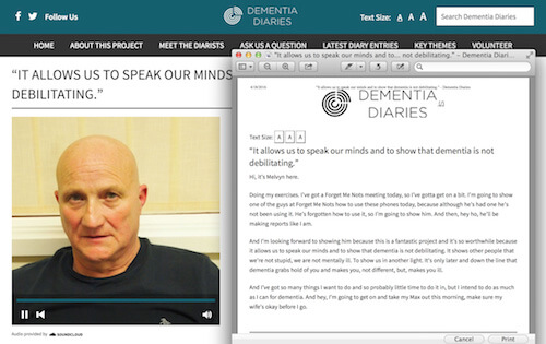
Though print is in decline and digital is ever present, a combination of the two can really support people living with dementia. Make your content printable so that people living with dementia can print out and read your content in their own time and space.
If you can include people with dementia, and their voices, in what you present then you’re on to a winner, particularly if it’s directly related to their condition. It is common for other people to speak on behalf of people with dementia, but this perpetuates the stereotype that they are not capable of completing ordinary, or even exceptional, tasks.
Key Lessons
- Be explicit: what does your website do and why are you doing it? Avoid complex wordplay and generic calls to action (e.g. ‘Get involved’).
- Content must be clear and arresting.
- Printable content is useful for people who have issues with vision and perception.
- The language used on websites is even more important than the language used in printed materials: avoid generalizations and make the text as easy to understand as possible.
- Avoid jargon or language that is too technical or scientific.
- When relevant, stories and tips from people with dementia themselves are very helpful.
In Their Words
“When you have dementia, it’s pretty hard to concentrate on things a long period of time, especially if you’re just sitting there.”
— Paul Hitchmough
“Reading is difficult, no question about that. Retaining what you’ve read is difficult. Remembering the book you’re reading is difficult, even the title of the book... Sometimes I’ll pick a book up and I can’t remember if I’ve read it or not.”
— Keith Oliver
Layout, Navigation And GUI
Make your navigation explicit and signpost a route back to the homepage.
There has been a surge in tablet computer use among older people, so designing digital technology for these groups must take this into account. This means websites targeted at older people need to be responsive to these devices.
Five years ago the Pew Internet and American Life Project indicated that older users with chronic illnesses are also more likely than their peers to participate in online discussions and seek out new communities. Bearing in mind that Facebook is the most popular social network for over-50s, you may want to make it as easy as possible for people to share your content there. Keep your buttons big and explicit.
Key Lessons
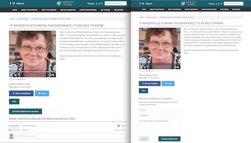
- Avoid splitting tasks across multiple screens if they require memory of previous actions (as pictured below).
- Make the breadcrumbs clear so that it’s easy to navigate back and forth.
- Don’t use hamburger menus, like “See menu” and “Close menu”.
- Use a “Home” button. Do not rely on having to click or tap a logo to get back home.
- Make sure hyperlinks are clear.
- Use clear buttons for sharing content that are large enough for use on tablets.
- Use clear line breaks. Clearly define sections with strong lines and headers so that the split is obvious.
- Make changes gradually. If something is working, don’t tinker unnecessarily.
In Their Words
“I am losing my ability to sequence... Because I live alone, this is becoming quite a challenge.”
— Agnes Houston
“You’ve got to keep forms simple. Your head gets confused. Do it wee bits at a time. Read it slowly.”
— Archie Latta
“Our brains need more time to process information in our 100 strings of Alzheimer’s, different for all, but we probably all recognise anxiety, confusion, planning, double checking – everything.”
— Anne MacDonald
Colors And Contrast
Living with dementia can manifest itself in the form of visuoperceptual difficulties (problems that affect both vision and perception) or sensory challenges. The specific difficulties a person experiences will depend on the type of dementia they have. This is because each type of dementia can damage the visual system in a number of different ways.
These include:
- Decreased sensitivity to differences in contrast (including color contrast such as black and white, and contrast between objects and background).
- Reduced ability to detect movement.
- Changes to the visual field (how much you can see around the edge of your vision, while looking straight ahead).
- Reduced ability to detect different colors (for example, a person may have problems telling the difference between blue and purple).
- Changes to the reaction of the pupil to light.
- Problems directing or changing gaze.
With this in mind, it is very important to get your color and contrast ratios right by following the Web Content Accessibility Guidelines (WCAG).
Key Lessons
- Use a color scheme with high contrast levels to make the pages more readable.
- The suggested WCAG ratios for contrast are 7:1 and 4.5:1. Due to the fact that our website is specifically designed for people with dementia, we tried to go even further than the recommended specifications.
- Use clear text, without overlaying against images.
- Use plain backgrounds to avoid distraction.
In Their Words
“I am now home with some perspex coloured overlays, prisms in my glasses to reduce the experience of double vision, to try and help with the jumping up of type and print.”
— Agnes Houston
It is important to note that high contrast can also be a problem for some people living with dementia who live with certain eye conditions. The symptoms of dementia are varied and, unfortunately, it is not always possible to account for everyone’s needs. However, high contrast is a good starting point for many people with dementia, and with customizable website contrast ratios, you can attempt to provide accessibility for as many people as possible. The Alzheimer’s Society offer the most comprehensive set of customisable accessibility options (text, font and letter spacing are all customisable).
Text And Fonts
Keep it clear and keep it simple!
Sans serifs are typefaces that do not have the small projecting features called serifs at the end of strokes. Modern and minimal, sans serifs are widely established as the go-to fonts for the web, particularly when the message is short and punchy. Though they are less visually distinctive, the simplicity of the sans letter shapes makes them more readable on all computer devices.
If you combine sans serifs with a clear dementia-friendly message, then you are going to make it easier for people to follow. Being able to alter the size of the text is a really nice touch, if your budget allows it.
Finally, forgetting names, events, dates and other day-to-day necessities is common for people with dementia. It is important, therefore, not to assume that people with dementia will recognize commonly used abbreviations or acronyms. Even if you signpost these earlier in the text, the person reading may not remember this a paragraph, or even a few lines later.
Key Lessons
- Don’t use abbreviations or acronyms.
- Use a large font size, or give people the option to alter text sizes, if possible.
- Use a clear sans serif font. We used Source Sans Pro (an open source typeface intended to work well in user interfaces).
- Use bold text, alongside clear, concise statements, to highlight important information.
- Avoid using multiple fonts or elaborate designs as this may be confusing.
In Their Words
“If you enjoy reading books and that becomes difficult, use a Kindle and you can choose your own font. That makes a lot easier reading.”
— Jo Bennett
“It is important to know that people with younger-onset dementia are much less likely to have memory problems than older people with dementia. Instead, they may experience problems with language, vision and behaviour or personality.”
— Tommy Dunne
Images
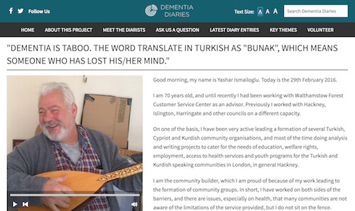
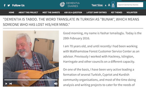
This one is a contradiction of sorts. Pictures increase shareability. Pictures add color to your site. Pictures tell a story. But pictures can also be disorienting and distracting for people living with dementia. This can present in the form of problems locating people or objects, even though they may be in front of the person: this may be because of other distracting visual information (such as patterned wallpaper) or because of a lack of color contrast. People can also misinterpret reflections: this may manifest as seeing an intruder or refusal to go into a bathroom because reflections make it appear occupied. In some cases, people living with dementia mistake images on the TV for real people. Many of these issues are due to an inability to consistently recognize objects, faces and colors.
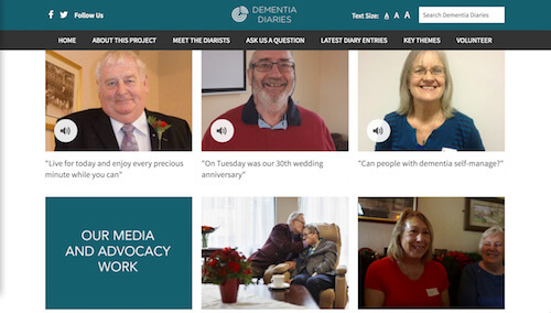
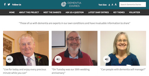
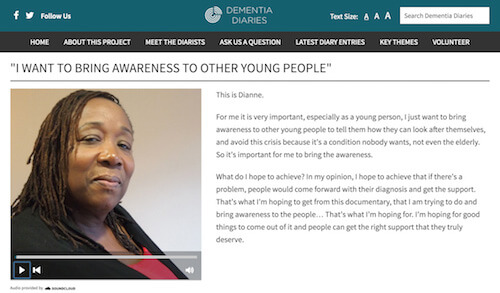
Though these issues represent an obvious challenge to decisions around the use of pictures, pictorial clues can strengthen the relationship between the user and the content, so it is certainly important to include them where relevant. The key is simplicity and relevance. A good example of this is that if you have audio playing, consider providing pictures of the person who is speaking.
Key Lessons
- Keep images relevant and closely related to the copy.
- Try to avoid overly abstract illustrations.
- Make sure the pictures add to the story rather than distract from it.
In Their Words
“We especially liked the little photos and illustrations that explained the process so clearly and was much easier to understand than just paragraphs of text.”
— Carol Forse, wife and carer of Chris Forse
Using Multimedia
As with photos, it’s about finding a balance between style and simplicity. Video and audio can be engaging, if used in the right way, but unexpected autoplays, pop-ups or elaborate graphics can be confusing.
Although you may wish to hold a person’s attention and create mood, it is worth bearing in mind that if you have sensory challenges then multiple media can be disorientating. Music can stimulate the senses in a positive way, but keep the volume of background music low and make sure it can be switched off easily.
Key Lessons
- Use autoplay on a page where audio or video is the only focus, but not immediately on the landing page of the site as this may shock or surprise the reader.
- Provide subtitles or transcripts alongside video or audio content when possible (see video examples).
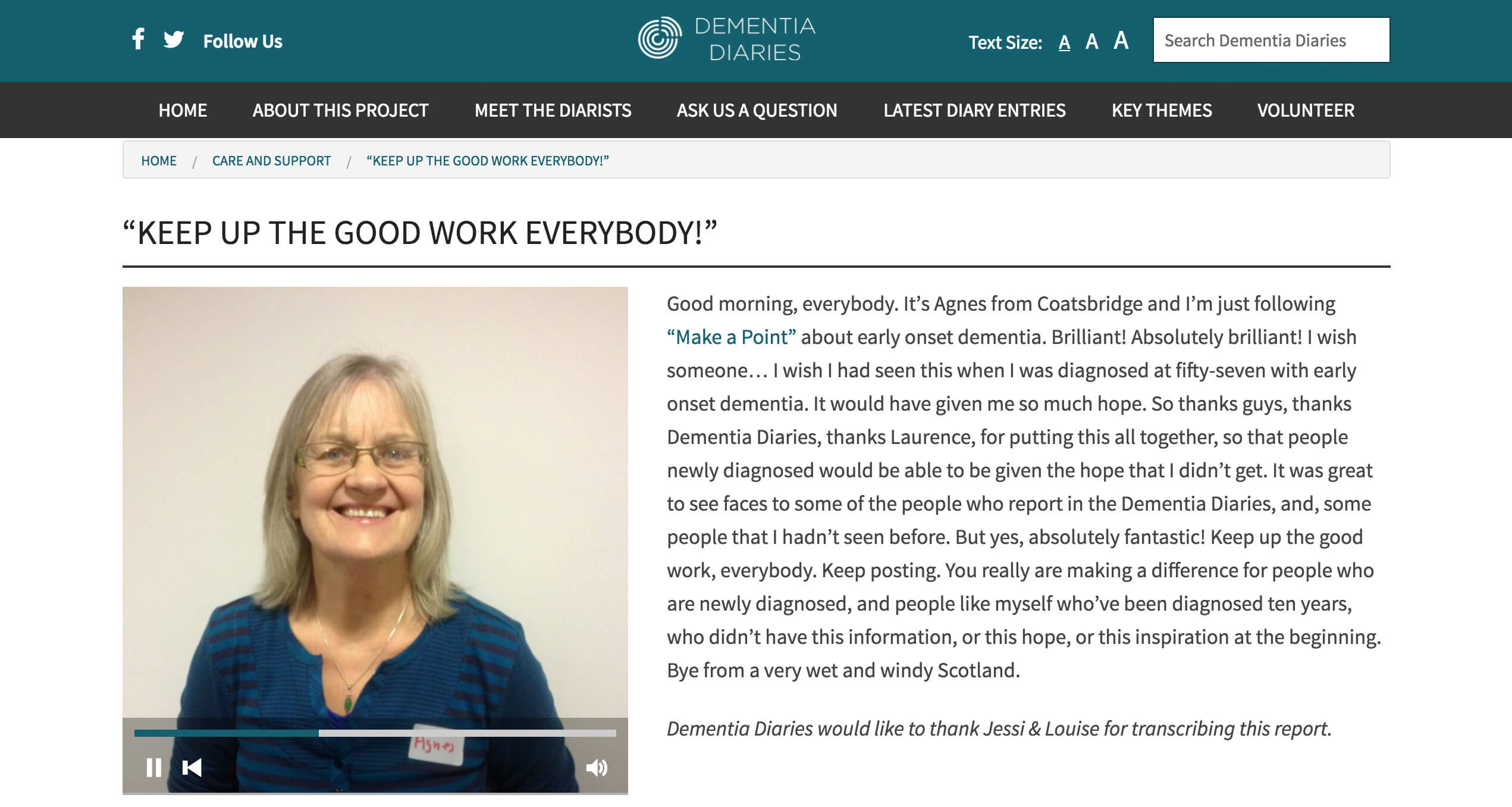
- Include very simple and familiar playback controls for audio or video so that it’s easy for the user to understand how to play and pause or adjust the volume.

In Their Words
“Background noises… can make it very difficult for the person with dementia to follow. My hearing has been heightened almost to the point of painfulness. In this society do we need to be bombarded with loud intrusive stuff? It’s just a thought. It’s not that I don’t like it, it’s that it’s so loud I cannot think, I cannot coordinate. I’m even staggering to the side. It just seems to take over my brain and I don’t know what I’m supposed to be doing.”
— Agnes Houston
“Music seems to reach parts of the damaged brain in ways that other forms of communication cannot.”
— Tommy Dunne
The Personal Touch
People living with dementia can feel alienated from society. There is still an element of stigma attached to the condition, so it’s important to make it clear you’re on their side and, when relevant, that your staff are trained appropriately. If possible, build in features such as a dedicated support line for those who are having difficulties and make it clear you’re willing to offer flexible personal support to support people with dementia.
Because our project is audio-based, we have developed a remote transcription tool which allows volunteers to transcribe the audio stories submitted by people living with dementia. This is a very focused task, with a simple user interface, so people living with dementia can do it. Importantly, we provide feedback to each individual who chooses to complete this process. We do this personally via email (as this is required when submitting a transcript). We also celebrate the involvement of remote volunteers by publicly thanking them for supporting the project in this way.
Key Lessons
- During longer tasks, give clear feedback on progress and on completion.
- Be aware of stigma and announce proudly that you’ve made every attempt to make your website dementia-friendly.
In Their Words
“I don’t say right away that I’ve got dementia; I say I’ll just get someone else to phone. If I do get really frustrated I’ll say to them, ‘I’m sorry, but I have dementia, so if you could just bear with me and speak a bit more slowly back to me then I’ll try and explain to you. It’s not rocket science, what I’m speaking to you about. I’m not stupid.’ And they’ll go ‘Oh, I’m sorry to hear that.'”
— Carol Ovenstone
“Being able to talk face-to-face might help – for example, by Skype. People could pick up on body language. They could see that I was still there, and getting my thoughts together – and they wouldn’t need to keep prompting as they could see I was trying to give an answer. On the phone I feel compelled to give a speedy answer, so I’m more likely to just agree – or say anything, right or not – just to give an answer and bring the call closer to a finish.”
— Chris Forse
If In Doubt, Ask
This is perhaps the most important.
Spend time talking to people to understand their needs and perspectives. When we designed our website prototype, we had no idea how complex it would be to cater to everyone’s individual needs. Over time, we consulted roughly 20 people with dementia and made a few necessary alterations to our site. If you can, budget in some time for co-design and feedback.
Key Lessons
- Include people living with dementia in the design stages.
- Get feedback from people with dementia when the website is in beta.
- Don’t make assumptions about user behaviour or capacity. Try to find a solution that is likely to be as accessible as possible.
In Their Words
"Those of us with dementia are experts in our own conditions and have invaluable information to share. It is important to involve us at the early stage of design for what is right for each of us… There are many gadgets around. With patience and help, I’m willing to try new things. We do not bite!”
— Anne MacDonald
Conclusion
People living with dementia do not expect web designers to cure the symptoms, and many people recognize that it isn’t always possible to apply each dementia-friendly web design lesson when building a site. But the combined use of some of these lessons can help many people live well with their conditions. It is important to remember that dementia presents in many different forms, its symptoms are varied, and many of these symptoms are also common to other degenerative illnesses, in particular, conditions which hinder the social inclusion of the elderly.
By making websites more accessible to a growing group of users who are so often excluded from the benefits that the internet has to offer, designers are not only supporting people living with dementia, but also those with similar accessibility challenges.
Further Reading
- How To Build Honest UIs And Help Users Make Better Decisions
- Ways Older People Use Digital Technology Differently
- Everything About Color Contrast And Why You Should Rethink It
- An Actionable And Reliable Usability Questionnaire With Only 7 Items: Inuit


 SurveyJS: White-Label Survey Solution for Your JS App
 Agent Ready is the new Headless

