Web Image Effects Performance Showdown
As browsers constantly improve their graphical rendering abilities, the ability to truly design within them is becoming more of a reality. A few lines of code can now have quick and dramatic visual impact, and allow for consistency without a lot of effort. And as with most things in web development, there are often many ways to achieve the same effect.
In this post, we’ll take a look at one of the most popular image effects, grayscale, and assess both the ease of implementation and performance implications of HTML canvas, SVG, CSS filters, and CSS blend modes. Which one will win?
Filters on the web work like a lens laid over an image. They are applied to the image after the browser renders layout and initial paint. In supporting browsers, filters can be applied individually or layered on top of one another. Because they can be applied as image modifications after the initial render, and are likely an enhancement, filters gracefully degrade by merely not being visible in browsers which do not support them.
CSS Filters
Let’s get started with the most straightforward method for producing a grayscale effect: the humble, yet powerful CSS filter.

To achieve this effect, we add a single line of CSS: filter: grayscale(1). This filter desaturates the image and can be used with any numeric or percentage-based value between 0 and 1 (or 0% to 100%). Note: currently, filters for WebKit-based browsers must be prefixed with -webkit-. However, a solution such as Autoprefixer would eliminate the need to add them by hand.
Live Demo – CSS Filter
.cssfilter-gray {
  -webkit-filter: grayscale(1);
  background: url('img/bird.jpg');
  filter: grayscale(1);
}
Background Blend Mode
CSS blend modes provide an endless variety of options for image effect combinations. There are two ways to use blend modes: the mix-blend-mode property and the background-blend-mode property.
mix-blend-modeis the property which describes how the element will blend with the content behind it.background-blend-modeis used for elements with multiple backgrounds, and describes the relationship between these backgrounds.
We’ll use the background-blend-mode: luminosity to pull luminosity channels over a gray background in our example, resulting in a grayscale image. One thing to note is that background order is constant: background images must always be ordered before solid colors or gradient backgrounds for effects to render properly. Color must be the last background layer. This is also a safeguard against older browsers which do not support background-blend-mode – the image will still render without the effect.
The only difference with blend modes and the CSS filter is that we now have multiple backgrounds, and are using background-blend-mode: luminosity, which grabs the luminosity values from the top image (the bird tester) and layers those brightness values over a gray second background.
Live Demo – Background Blend Mode
.cssfilter-gray {
  background: url('img/bird.jpg'), gray;
  background-blend-mode: luminosity;
}
At the moment, this is the newest and thus least supported option, though it still works well in Chrome and Firefox, and has partial Safari support. Note: Safari supports all blend modes except for the HSL-based blend modes: hue, saturation, color, and luminosity.
HTML5 Canvas
HTML5 <canvas> allows for a ton of flexibility when it comes to image manipulation, because we have access to each individual pixel’s data (specifically through canvasContext.getImageData) and can manipulate each one through JavaScript. This method, however, is the most complex and comes with the most overhead. It also has a few nuances in cross-origin issues due to security concerns.
To fix the cross-origin error in Chrome, your image will need to be hosted on a cross-origin resource sharing (CORS) friendly site like GitHub Pages or Dropbox, and specify crossOrigin="Anonymous".
The way to achieve a grayscale effect with <canvas> is to strip the red, green and blue components from any outlying value in the pixel value while maintaining its luminosity level (brightness). One way to do this is to average the RGB values like so: grayscale = (red + green + blue) / 3;.
In the example below, we are using the RGBa values in the format (R,G,B,a) in the image data; the red channel is data[0], the green channel is data[1], and so on. We then get the luminosity level of each of these channels (the brightness) and average them to turn the image grayscale.
Live Demo – HTML5 Canvas
SVG Filter
SVG filters have the widest support (even in Internet Explorer and Edge!) and are also (almost) just as easy to use as CSS filters directly. You can use them with the same filter property. In fact, CSS filters stemmed out of SVG filters. As with canvas, SVG filters allow you to transcend the flat plane of two-dimensional effects, as you can leverage WebGL shading to create even more complex results.
There are a few ways to apply an SVG filter, but in this case we will still use the filter property on the background image, just like the CSS filter example for consistency. The biggest difference with SVG filters is that we need to be careful to include and link to this filter with the proper path. This means we need to import the SVG on the page above the element in which we are using it (which can be made easier by using templating engine and include statements).
Live Demo – SVG Filter
<svg>
  <filter id="grayscale-filter">
    <feColorMatrix type="saturate" values="0"/>
  </filter>
</svg>
.svgfilter-gray {
  background: url('img/bird.jpg');
  -webkit-filter: url(#grayscale-filter);
  filter: url(#grayscale-filter);
}
Filter Performance
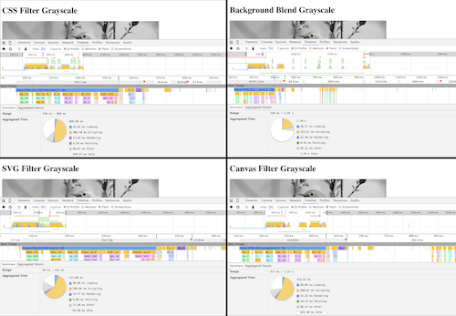
So how do these stack up when it comes to initial render performance? I made a test page for each and used the WebPagetest comparison feature in Chrome 47. Keeping in mind that each test gave slightly different results, the overall trend can be summed up as follows:
The CSS filter, SVG filter and CSS blend mode methods all loaded in relatively similar time frames. Sometimes the SVG filter was faster than the CSS blend mode (but always barely) and vice versa. The CSS filter was generally among the fastest to load, and `
For fairness sake, I wanted to also compare load time for multiple images. I created ten renditions of each (instead of just one) and ran the tests again:
The results were similar (keep in mind there were slight variations in each test). The CSS filter was 0.1ms slower in this case, showing that between CSS filters, blend modes and SVG filters, the results are inconclusive for the speediest method. However, HTML5 `
Taking a look deeper into page load time via JavaScript render and paint render time, you can see this trend continuing.

| Filter Type | Time to Render | Time to Paint |
|---|---|---|
| CSS Filter | 12.94ms | 4.28ms |
| CSS Blend Mode | 12.10ms | 4.45ms |
| SVG Filter | 14.77ms | 5.80ms |
| Canvas Filter | 15.23ms | 10.73ms |
Again, `
These results make sense, because `
#nofilter
What about using no filter? I compared our overall speediest method (adding a CSS filter) to editing your image in photo editing software before uploading it (I used Preview on Mac OS X to remove saturation). When preediting the image, I found a consistent 0.1ms performance improvement in my tests:
Conclusion
Image filters are a fun and effective way to provide visual unity and aesthetic appeal on the web. Keep in mind that they do come with a slight performance hit, but also with the benefits of speedy design in the browser and the opportunity to design interactions with.
For simple image effects use CSS filters, as they have the widest support and simplest usage. For more complex image effects, check out SVG filters or CSS blend modes. SVG filter effects are particularly nice because of their channel manipulation capabilities and feColorMatrix. CSS blend modes also offer some really nice visual effects with overlapping elements on the page. You can use similar blend modes within SVG (such as feBlend), though they are akin to CSS background-blend-mode in the sense that the interaction pertains to the SVG itself and not with surrounding elements, like mix-blend-mode allows. Just don't use `
Further Reading
- Web Image Effects Performance Showdown
- HTML5: The Facts And The Myths
- Efficient Image Resizing With ImageMagick
- Clever JPEG Optimization Techniques


 Register Free Now
 SurveyJS: White-Label Survey Solution for Your JS App


 Celebrating 10 million developers

