Axure 8: A Comprehensive Review
Behind every great invention lie dozens of sacrificed prototypes. It took Michele Ferrero almost five years to perfect the spherical wafer within the famous chocolates that bear his name. No great product or invention emerges fully formed, and this applies to great websites and software as well. Whether you’re working on digital products or chocolates, prototyping plays an important role in any successful project.
If you work in user experience or software development, chances are you will have encountered Axure RP at some point. Launched in 2003, Axure has gained a loyal following within the UX community. It allows for the creation of rich, functional prototypes without writing a single line of code.
Nowadays, there’s a lot more competition in the field. Adobe has recently released an early version of its new Experience Design software. Meanwhile, products like UXPin and InVision have slick interfaces, flexible pricing plans and a shallower learning curve. This leads to a much more crowded field when trying to determine the UX design tool of choice.
After a few months in beta, Axure 8 has been released, so it’s the perfect time to look at what’s inside. In this article, we’ll start by examining the new interface. We’ll then take a detailed look at the new tools, features and enhancements, and discuss how will they affect your day-to-day workflow. Has Axure done enough to stay ahead of the pack? Let’s find out.
Editor’s note: The author isn’t affiliated with Axure in any way and the article is solely based on the authors experience and thoughts.
Axure 8: A New Interface
The first thing you’ll notice when firing up version 8 is the new look. Axure 7 went for a brightly coloured style, resulting in an unecessarily complex UI. Happily, version 8 brings a refresh, with new icons, neutral colours, and a flatter, cleaner look overall.
Main Toolbar
The main toolbar has changed a lot. It used to look pretty empty, but now it includes many more tools and functions, leading to a more effective use of space. Common clipboard operations are represented by their own icons. There are also a couple of new additions – the slice and pen tools, which we’ll cover in a moment.
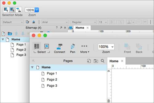
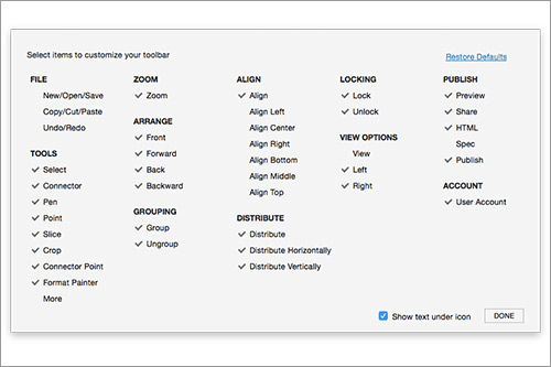
Overall, the interface is similar to the ribbon UI found in Microsoft software. If you want, you can also customize it by right-clicking on the toolbar, then choosing which tools and functions you want to display.
Another nice new addition is the ability to maintain the aspect ratio of widgets when resizing. If, like me, you often enter widget dimensions manually, this is a handy feature to have.
I Say Panel, You Say Panes
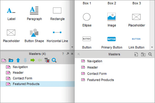
Much of Axure’s functionality lies within its series of dockable panes. These control everything from pages, masters and widgets, through to styles and interactions. Like the rest of the UI, these have been given a new lick of paint. The complex icons and garish colours are gone, bringing much needed restraint.
Functionality has been simplified too. The icons controlling each pane’s functions have been redesigned or consolidated. In each pane, undock now appears in the top-left, and search in the top-right. This consistency is welcome.
Meet The Inspector
Brand new to version 8 is the Inspector, which sits on the right-hand side of the interface. It features three tabs that allow you to modify the properties, notes, and style of the selected widget or active page. The Inspector consolidates three panes from past versions of Axure, which were previously all separate:
- widget interactions and notes
- widget properties and style
- page notes, interactions, and styles
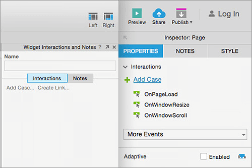
The functionality is pretty similar, but there have been some subtle tweaks here and there. Notes can now have formatting applied to them (such as bold and italic), which is a nice touch.
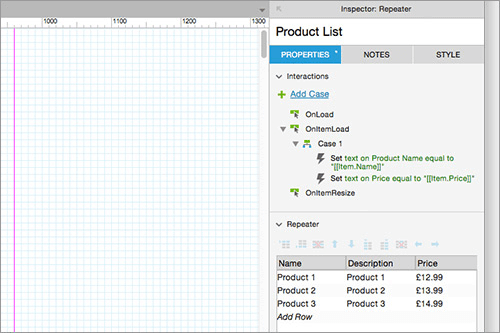
The biggest change to the Axure 8 interface is the bottom pane. In previous versions, this is where you could work with page notes, page actions and repeaters. In Axure 8, it’s been removed completely. While this makes the canvas area much larger, it could lead to a bad case of baby duck syndrome among Axure users.
Everything from the bottom pane has moved to the Inspector’s properties tab. It feels nice at first owing to all the extra space, until you start working with repeaters. Like everything else, the Excel-like table for entering data has been moved to the Inspector. Working with larger datasets now requires mucking around with the fiddly scrolling, or undocking the Inspector completely. Unfortunately, it makes using repeaters a lot more annoying.
Outline Pane
The outline pane is Axure 8’s new name for the widget manager. It works like the layers palette in Adobe software, listing of all the objects on a page.
In previous versions, finding a specific widget from a list of hundreds could be tricky if you hadn’t given them a name. Doing so is a good practice that helps you to easily find them later, but it’s easy to forget. Thankfully, in Axure 8 each widget now comes with a small thumbnail that helps you to recognize it.
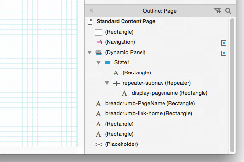
One of Axure’s more bizarre quirks was the way widgets were sorted in this list. For whatever reason, bringing a widget to the front of the canvas actually moved it to the bottom of the outline. The logic that led to this decision was questionable at best, but Axure 8 finally fixes it. The widget at the top of the list is in front of everything else, so using drag and drop to reorder widgets is much more intuitive. A truly welcome addition!
New Features And Tools
Cosmetic changes are all very well, but you’re probably wondering what you can do that you couldn’t do before. Not to worry – Axure version 8 comes with a couple of new tools to help you pump out those prototypes like never before.
The Pen Tool
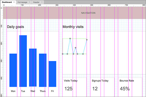
The pen tool is one of the major new headline additions to Axure 8, allowing you to draw custom vector shapes. While it’s not as fully featured as other vector-based programs, it’s a great addition that will be extremely useful in many scenarios. Best of all, anything you create with the pen works just like other Axure widgets, so you can apply interactions to them.
Say you’re working on some sort of dashboard interface, showing charts, graphs, and so on. Previously, you would have had to rely on Axure’s limited internal library of preset shapes to construct a crude approximation, or just import a static JPEG file. Using the pen tool, you can create these elements directly on the canvas, and apply granular interactivity to them if required.
Not Always Mightier Than The Sword
There are some important caveats to the pen tool, however. While the shapes you create will be vector-based within Axure itself, the generated prototype will convert them to PNGs. This can lead to blurring or other rendering issues if they are animated or enlarged within the prototype. With SVG supported in many browsers in 2016, it seems like a missed opportunity to not take advantage of it.

Another issue arises with compatibility. Importing vectors from other programs is still not possible, and neither is copy-and-paste – Axure will just convert your pasted vector to a bitmap. If you want to go the other way and export your Axure vectors for use elsewhere, the only method currently available is to print to a PDF, then open that in your vector editing program. Unfortunately this adds a lot of junk to the file, like extra anchor points, clipping paths and other nonsense which takes a fair bit of cleaning up.
The Point Tool
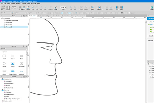
The point tool works in tandem with the pen tool. With a shape selected, it allows you to select, add or change any point along a path. You can also change line points into curves by dragging out Bézier handles.
It’s good that this functionality is there, but it does have some annoying drawbacks. First, the Bézier handles are not connected to their origin point – they simply float in empty space. Also, snapping functionality or smart guides are applied inconsistently. If you’re fussy about straightness, you’ll need to eyeball it. It’s not a deal-breaker, but it is a frustrating omission.
Despite this inconvenience, the pen tool is a really useful addition to the Axure toolbox. As long as you don’t intend to use it for designing logos or illustrations, you should be fine.
Groups
Groups have existed in Axure for some time. However, they didn’t really offer much apart from making it a bit easier to move things around the canvas. Now, when you group objects together, the group appears within the outline panel, showing its content in a nested list.
You can name groups, and easily drag and drop other widgets in and out of them. Even better, you can now apply interactions directly to the group, or any widgets within it. Need to make changes? You can do it directly on the canvas, without needing to open another tab.
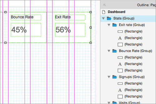
Why is this important? Previously, applying interactions to multiple widgets at once usually meant using a dynamic panel. The problem was, editing a dynamic panel opened it in a new tab, and you lost visibility of other objects on the canvas. This could be especially cumbersome if you had to nest dynamic panels within another – your Axure window would quickly fill up with tabs, making it easy to become lost.
In extreme cases, overuse of dynamic panels could spiral out of control, trapping Axure users in an Inception-esque nightmare. You could recognize the symptoms: glazed eyes, a cold cup of untouched coffee on your desk, cursing regularly under your breath.
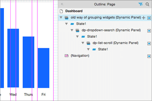
It’s a subtle addition, but groups will hopefully allow Axure users to put those dark days behind them. By reducing the need for dynamic panels, organizing widgets and creating interactions is much more streamlined.
The Snapshot Widget
Rounding up the trifecta of new tools is the snapshot widget. This allows you draw a rectangle, then load another one of your pages within it. The page is then rendered as a flat image. Handily, if you update the source pages, any associated snapshots will update automatically. You also get options for triggering onload events if you have any conditional logic applied.
The snapshot tool is very useful when you’re working on user flow diagrams to demonstrate to clients or colleagues. By stringing a sequence of snapshot widgets together, it’s quick and easy to document the flow of steps involved in accomplishing a given task, like using a sign-up form.
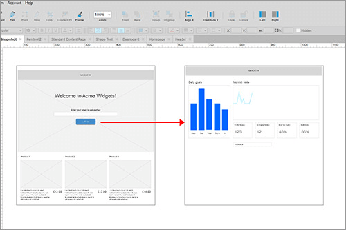
At Amaze, we create these types of deliverables quite a lot, which helps to describe functionality during presentations. Using the snapshot widget will be a useful way of maintaining a living document that can be updated dynamically as your project progresses.
Enhancements
That’s the new tools out of the way. Now. we’ll look at some of the ways Axure has built on what it already has. Thankfully, they have listened to the community and added some really useful stuff.
New Actions And Animations
Rejoice! Version 8 comes with some brilliant new animation tools. Two brand-new animations have been added, as well as new parameters for defining how they work. What’s also great is that due to the changes Axure has made under the hood, they’re driven by CSS.
Animation Anchors
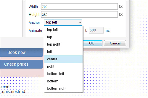
A new feature of animations in Axure 8 is the concept of anchors. These allow you to specify an origin point for animations, which can be any of the four sides, four corners, or the center of a widget. For example, if you want to display a lightbox in your prototype, you can show it using an animation that resizes it from the center. This overcomes a limitation from previous versions of Axure, where objects would only resize from the top-left.
These new animations, along with all existing actions, can also be applied to groups, which affects all the widgets inside. This is a wonderful addition, and will allow for some much more visually interesting (not to mention fun) projects to be created. It’s already saved my skin a couple of times so far!
Timing
Animation timing has also changed. Previously, any animations would fire sequentially. For example, let’s use our lightbox from before. Say you set up the following events to occur on the lightbox once a button was clicked:
- Show Lightbox (fade-in 500ms duration)
- Resize Lightbox to 500×500px (500ms duration)
In Axure 7, the total sequence would take one second to complete (500ms + 500ms = 1,000ms). Furthermore, the lightbox wouldn’t start resizing until it had finished the fade-in animation, which would look a bit jerky and weird.
In version 8, actions occur simultaneously by default, so the lightbox can start the resize and fade-in animation at the same time, taking only 500ms in total. If you need a pause between actions, you need to insert a wait action between them.
It’s a subtle change, but should open up all sorts of creative possibilities. You’ll be able to create much richer, high-fidelity mock-ups that come close to matching your final product.
Rotate
This does what it says on the tin. You can specify a relative or absolute rotation, add animation, define a rotation anchor (center, top-right, etc.), and even apply an offset. It’s also possible to define the rotation amount as the output of a function or variable value.
Finally, along with the action, there’s also a new OnRotate event, which you can also use to set up looping rotations if you want. Axure challenge: build a working clock!
Set Opacity
Again, this works pretty intuitively. You select an event and target, then apply the set opacity action. The opacity value is specified as a percentage, and you can also animate it.
Flip
Flipping is a new effect that’s only available as an option when setting up existing actions. Now, when showing or hiding widgets, or changing the state of a dynamic panel, you can animate it as a fancy 3D flip from one of four different directions.
When it comes to animation, the new tools in Axure 8 provide a lot more freedom. They will be very useful when working with design or development teams, as you’ll be able to depict how things should animate and behave within the prototype itself, instead of just describing them in documentation.
Fire Event
Fire event is a new action that allows you to trigger any event on another widget. For instance, you could use an OnClick event on one widget (say, a button) to fire the OnClick event on another button. Sounds a bit boring, I’ll admit. So what’s the big deal?
Fire event becomes very useful if you need to trigger the same set of actions from multiple places. Say you’re working on a store locator, where the user can view a store’s details from a results screen. They can do this either by clicking on a store’s name within the list of results, or by clicking pins on a map. If you’re being fancy, you might have the details slide in from the left, apply the store’s correct name using a variable, or a million other things.
Previously, to set this up properly, you would need to apply your original set of actions to all the widgets involved (in this case, all the map pins). If you needed to make changes, it would require a lot of effort. Things got worse the more complex your prototype. If you had missed a widget out, it was a hair-pulling exercise trying to debug everything.
All this is much simpler in Axure 8. Using our earlier example, let’s say we applied all our actions to the store’s name in the list of results. Now, when the map pins are clicked, you can make them fire the OnClick event of our original widget: the store’s name. If you need to make changes, you only need to make them once to the original widget’s actions, and let fire event take care of the rest. It’s a bit tricky to explain, but it makes these types of scenarios much, much easier to set up and maintain.
New Events
While it’s easy for the new actions and animations to steal the show, we must give some credit to the new events in Axure 8. For instance, applying rotation to a widget can also fire off the new OnRotate event. This is useful if you want something to rotate in a loop (seriously, I want someone to make an Axure clock).
There are a couple of new ones that will make working with forms much easier too. Elements like radio buttons and checkboxes now have new OnUnselected or OnSelected events. Previously, these form controls only had one event: OnSelectedChange. If you wanted different actions to occur on checking and unchecking these controls (such as adding or removing a filter), you needed to build conditional logic into the event. With these new events, it’s much easier to control over what happens when these elements are clicked. A small change, but it is nice to see.
Styling Changes
Creating And Updating Styles
From Microsoft Word to Adobe InDesign, using styles helps to maintain visual consistency. Axure is no different, but up until now, the implementation has left a lot to be desired. Creating a new style from an existing widget was often a confusing process, with multiple steps involving lots (and lots) of checkboxes.
Now, working with styles is much easier than it used to be. Each default widget in Axure 8 comes loaded with its own preset style, which will add itself to your document’s styles list automatically when you drag it on to the canvas. New styles can be created from any widget using the new Inspector pane. You can also easily modify and update existing styles from here too.
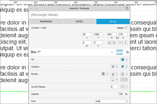
New Style Options
Axure 8 adds more granularity to how you apply styles. First, borders can be toggled for each of the four sides of a widget, another example of a more CSS-friendly feature. Previously, creating this sort of effect would involve adding multiple lines around your object, which was fiddly and cumbersome. This new method is much simpler.
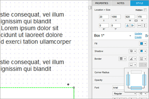
Unfortunately, the thickness of borders themselves can still only be set using a small range of preset values. Being able to enter a custom value for the thickness is still not possible, which seems like a missed opportunity.
Second, rounded corners have been given a useful tweak. In Axure 8 you can toggle roundness to each corner individually. This will be very useful when designing certain elements of your UI, like tab elements, buttons or tooltips.
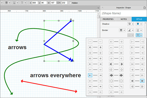
Finally, the interface for applying arrows to lines has been made more flexible. Instead of choosing from a simple preset list, you can now apply different arrows to the start and end points of your lines. Better yet, these also work seamlessly with the pen tool, so your nice curvy lines can have all manner of arrows and other shapes added.
Changes To Repeaters
The repeater was a wonderful and powerful addition to Axure 7. It made short work of certain tasks that were previously complex or downright impossible, by using a quasi-database to allow for dynamic, data-driven prototypes. It was great for prototyping e-commerce sites, but also for creating elements like news feeds, image galleries, or anything that displayed a list of similar content elements. However, it wasn’t perfect, and had a number of frustrating limitations.
Hide-And-Seek
The main limitation of repeaters concerned hidden elements. If your repeater had any hidden elements inside it, it would render itself as if they were visible, creating unsightly gaps. Creating things like accordions or fly-out menus using repeaters was almost impossible without mind-bending hacks and workarounds. Most of the time, it wasn’t worth it.
This time around, hidden elements no longer affect the repeater item’s size: the hidden element won’t render, and you won’t get any gaps in between your repeater items. This is huge – it’s now much easier to add functionality like drop-down menus that only appear when a button is clicked, for example. If you’re using push/pull to show the hidden element, the other repeater items will move as it is made visible, which is also very nice.
Browser Prototype Changes
Under The Hood
Axure generates prototypes using good ol’ HTML, CSS and JavaScript. It’s a piece of prototyping software, so the quality of the code it outputs doesn’t matter too much – it’s not like you would use it on a live site. However, it has a reputation for being very inefficient. Prototypes could easily span thousands of files, and dozens of megabytes of data. On projects with complex functionality, performance in the browser could slow to a crawl. This could lead to some awkward situations, nervously reassuring your client that the final product wouldn’t be so slow, while you waited for something to load.
The Land Before CSS
For an explanation, we must look back through the web design looking glass. Axure version 1 appeared nearly 13 years ago. Back then, the web was very different. The browser wars had seen Netscape lose ground to the upstart Internet Explorer, and the <table> element ruled layouts with a non-semantic fist.
At the time, using CSS for layouts was almost revolutionary, but browser support was poor. Getting Internet Explorer to play nice required a lot of frustrating hacks. For this reason, Axure wisely made concessions in its code, and flattened most of the page’s objects into images (besides text and form elements). This made everything render consistently from browser to browser, but at a cost to performance.
Old Dog, New Tricks
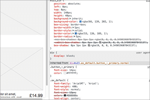
This has changed in version 8. Widget backgrounds, borders, rounded corners and shadows are now created using CSS instead of images. As fewer files are being pulled from the server, this should lead to a big performance boost, especially when prototypes are running on mobile devices or over a slower connection.
Prototype Sidebar Changes
All Axure prototypes feature a navigation sidebar when viewed in the browser. When presenting work to your clients or colleagues, this is something that sees a lot of use. Thankfully, it’s also been tidied up.
Console
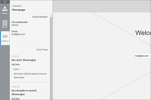
The console tab is new to version 8. From here, you get an overview of all your variables, and can watch them update in real time or reset them if you wish. A really useful new feature is the console trace, which lists all interactions as they are triggered, and what widgets are affected. This will be invaluable when debugging, in the same way the JavaScript console is used when debugging a live site.
Other Tweaks And Enhancements
Slice Tool
The slice tool allows you to slice an image up into smaller pieces. Along with the existing crop tool, it will help you save time by avoiding the need to do basic image editing in an external application.
Connect Point
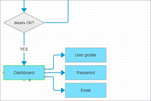
Flowcharts help you to document complex logic within your product, and Axure has had them for a while now. It’s always been possible to create similar diagrams in other software, but the advantage of using Axure is that your lines will stay connected as you move elements around. It saves a lot of time compared to using something like Adobe Illustrator.
Previously, Axure’s flowchart widgets were restricted to four anchor points. Using the new connect point tool, you can add anchor points to any widget, wherever you like. It brings Axure closer to dedicated flowchart software like OmniGraffle, and while not quite as powerful as that tool, it’s a welcome addition. If you don’t have any other software for creating flowcharts, the new tools in Axure 8 should get you up to speed.
Improved Printing
When working with large teams, it’s often useful to print your wireframes out, pin them to a wall, and bust out the trusty Post-it note (or scribble all over it). Axure 8 makes this much easier thanks to improved printing options.
You are now able to define a printed page size, and display guides that show you the page boundaries on the canvas itself. You get more options for controlling scaling and fitting items to a page, choose which pages or masters you want to print, and the ability to create multiple print configurations. If you like working with your team in meatspace, then these new options should be very useful.
Version Control And AxShare
AxShare is the name give to Axure’s own hosting platform, which provides a quick method of publishing and hosting prototypes so that they can be shared with your stakeholders.
Previous versions of Axure have allowed for team collaborations on projects. It was possible to publish these to an SVN server, allowing for checking projects in and out. This functionality has now been enabled on AxShare itself, so you don’t have to set up your own SVN server. This should be beneficial if you work on big, complex projects where separate teams work on different sections. You can also share other things like any custom widget libraries you may have created.
Licensing Models
When Adobe moved to a subscription-only plan for Creative Suite, it wasn’t a terribly popular move. Axure now offers a subcription plan for version 8, but thankfully, the old standalone license is available too. It’s great that customers have a choice, instead of being forced to use a model that doesn’t suit them.
What We Want For The Next Release
When you use a piece of software long enough, the little imperfections turn into annoying frustrations. Axure 8 has improved its interface and added a ton of new features, which should make many common tasks easier. However, that doesn’t mean that there isn’t room for improvement. Below is a short list of enhancements that would improve Axure even further.
Interface Improvements
Version 8’s new interface has helped to make Axure feel more modern, but it’s hard not to think that the changes are largely cosmetic. Deep down, there’s still an overreliance on pop-up dialogs and windows. Many actions are repetitive or require too many steps, like mapping database fields to widgets in a repeater. Some further streamlining of common tasks would be ideal.
Dynamic Styling
Setting widget styles is all very well, but they could be made so much more powerful if you could use actions to apply any custom styles you’ve created. This is already possible in a limited sense, as widgets do come with built in interaction styles: default, mouseOver, mouseDown, selected and disabled.
However, if your widget needs more styles than this, you’re out of luck. You have to rely on dynamic panels, creating states in which each widget is styled individually, then set up actions to switch between them. It’s a clumsy workaround. A simple ‘set style on widget’ action in the case editor would solve the problem, and it’s unfortunate that it’s still not available.
Easier Repeaters
Repeaters remain a wonderful addition to the Axure toolbox, but they can easily become hideously complicated, especially for Axure newbies. Performing advanced actions, like filtering or updating, are especially cumbersome, often relying on Axure’s functions editor and a working knowledge of JavaScript. Filtering items in a repeater by multiple properties, as you would do in a faceted search, is almost impossible. A simpler setup process and streamlined functionality would help a lot.
Better Case Editor
The case editor sees a lot of action, so it’s unfortunate that nothing has been done to improve it for many years. Including all the new actions has made it even more bloated. Adding search or filtering functions would help a lot.
Finally, while the new animations are lovely, they still have to be defined programmatically using discrete values, which leads to a lot of trial and error. Being able to define animation start and end points directly on the canvas (à la InVision or Flash) would be marvelous.
Adaptive Views
Another recent addition with room for improvement. Many widgets like tables and tree menus don’t support adaptive views at all, making them next to useless if you are working on a responsive site. While some support for fluid elements was added in version 7, it is still limited in that it can only apply to dynamic panels.
Furthermore, setting other properties (like pinning an item to the viewport) will persist across all breakpoints too. Better support of fluid elements (like text containers) and more granular control over their behaviour would be amazing. Let’s hope it comes in a future release.
Better Rulers And Guides
Axure’s canvas rulers have always been frustrating. They show random increments which change depending on how far you are zoomed in. Axure 8 has done nothing to change this. Also, the ability to save your own custom grids into Axure would save a lot of time when setting up new projects.
SVG Support
It’s 2016. ’Nuff said!
Conclusion
I hope you’ve gained a good understanding of the new features available with Axure 8, and how they could improve elements of your daily workflow. There are definitely some really useful new additions. As always, Axure have generously decided that the update to version 8 will be free for existing owners. I look forward to seeing the amazing wireframes, prototypes and mock-ups that the talented UX community will create once it launches!
Other Resources
- Axure website: Download a 30-day free trial of Axure 8
- The Ten Commandments Of Efficient Design In Axure: A list of very useful Axure tips that will save you a lot of time.
- Creating Responsive Prototypes With Adaptive Views In Axure RP 7: While written for Axure 7, this article still applies equally well to Axure 8.
Further Reading
- The 10 Commandments Of Efficient Design In Axure
- Creating Responsive Prototypes With Adaptive Views In Axure RP 7
- How Creating A Design Language Can Streamline Your UX Design
- Mobile Prototyping With Axure RP


 SurveyJS: White-Label Survey Solution for Your JS App
 Agent Ready is the new Headless


