Breaking Out Of The Box: Design Inspiration For July
With the summer holidays coming up, I’d like to share a couple of inspirational illustrations and photos which I hope will help you daydream and relax. There’s no doubt that there are a lot of great techniques out there — they just need to be discovered.
While going through this month’s collection, you’ll notice some pretty interesting and refreshing color combinations. I’ve made sure to include a good bunch we can all admire and learn from — I hope you’ll agree! Get ready to enter the summer with a big spark of inspiration.
The Art Of Storytelling
Very nice metaphor to use books as flat buildings to make you think about the stories behind each of those windows. Perfect for a subject such as “the art of storytelling”. Beautiful geometry at work.
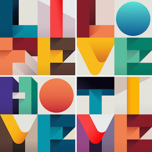
Life — Love — Home — Time
A very colorful 4x4 typographical illustration about the 4 elements on which human existence is based: Life, Love, Home, Time. There’s a great system at work here. The color combination and 3D effect is very well and cleverly done.
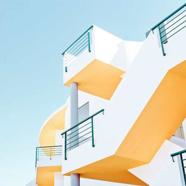
Material I-II
Matthias Heiderich inspires me to look up and try to spot patterns in buildings when walking around in the city. So many interesting things to discover when you actually take the time to look. Learn to look and you see so many inspiring things.
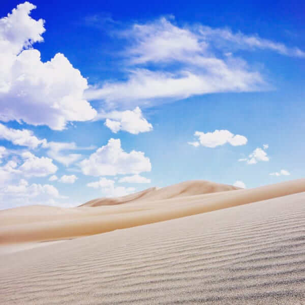
Great Sand Dunes National Park
This looks like it could have been shot at the Sahara but it was in fact taken at the Great Sand Dunes National Park in Colorado. I admire how you can see structure in the sand in the first part but in the back it’s like perfectly flat.
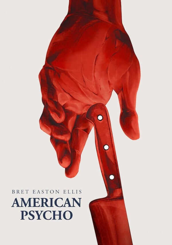
American Psycho
Re-interpretation of the movie poster for the classic American Psycho. A personal project by Tomasz Majewski. Makes me think of my art class during my school time period where I had to sketch my hand. It’s all about putting the shadows and highlights on the right spot.
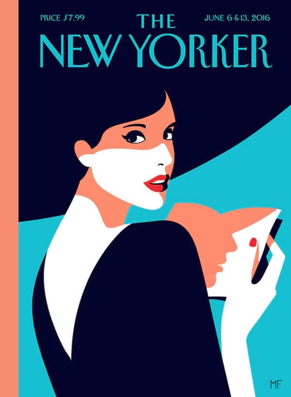
The New Yorker - Malika
New work by Malika Favre for The New Yorker. Her typically elegant female characters in combination with bright colors are always inspiring and very recognizable as her style.
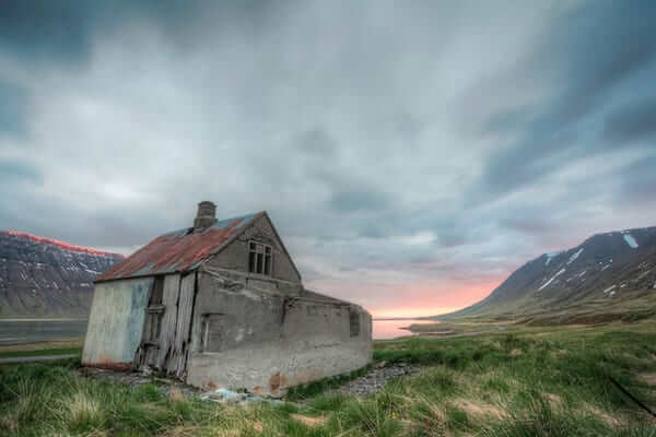
Önundarfjörður
Abandoned house in Önundarfjörður in the West Fjords of Iceland. Iceland is a pretty photogenic place. This was taken around 3 in the morning. The light on the mountainside is fantastic!
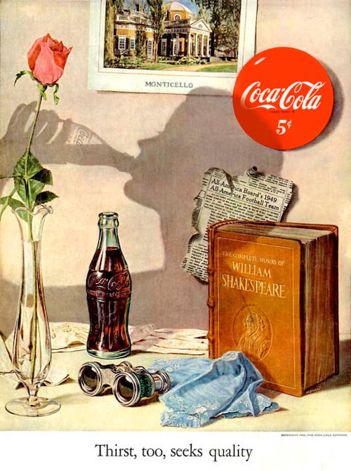
Thirst Too, Seeks Quality
I love these vintage ads to study the textures, the transparency in the vase, the reflection etc. It’s all done with such photographical detail, and realistic perfection. The shadow silhouet is really cleverly done, especially the bottle is truly amazing. This one is an old Coca Cola ad from the USA (1950).
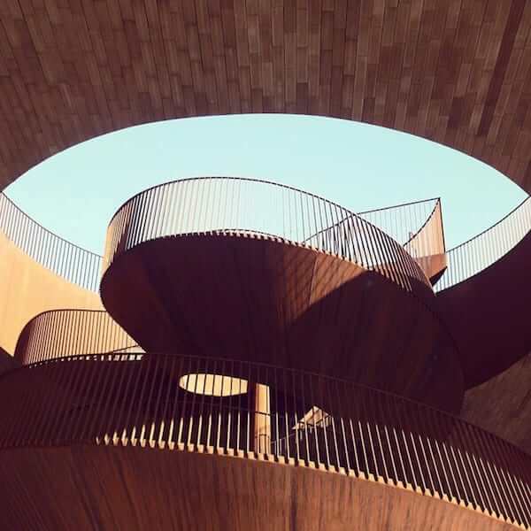
Sprout
Sebastian Weiss’s photography is fueled by his interest in unique architectural urban shapes. He’s also one of the most popular architectural photographers on Instagram where he is posting under the alias “Le_Blanc”. Antinori nel Chianti Classico, Bargino, Italy. Besides the beautiful lines, I truly love the contrasting color palette.
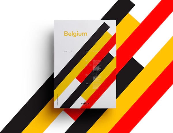
UEFA EURO 2016 Poster Series
Sean Ford created a real fun and inspiring personal project for the UEFA EURO 2016 campaign. He created a series of posters for each country using elements from their respective flags. Putting the elements bigger in the background works wonderfully well in this case. Be sure to check out all others.
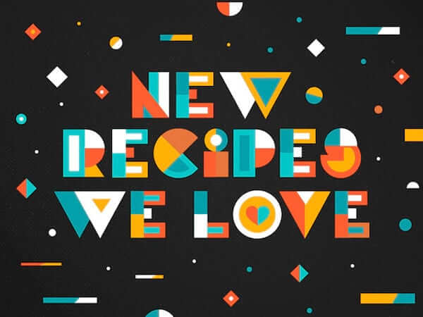
New Recipes
Colorful things always attract my attention. These custom letters are very well executed and it’s pretty sweet as a whole.
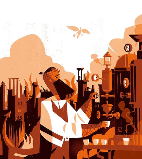
Coffee Wars
Fun illustration for an article on escaping the clutches of the hipster barista invasion. There are a few good details in it that are nicely hidden until you look closer.
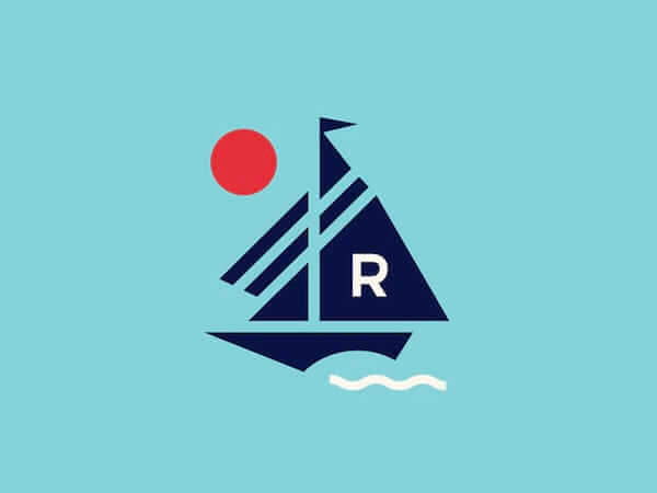
Sailing Mark
Very nice mark. Broken down to just some basic elements and it works wonderfully well. Looking at some of these pieces you’ll probably be thinking, “I wish I had thought of this”.
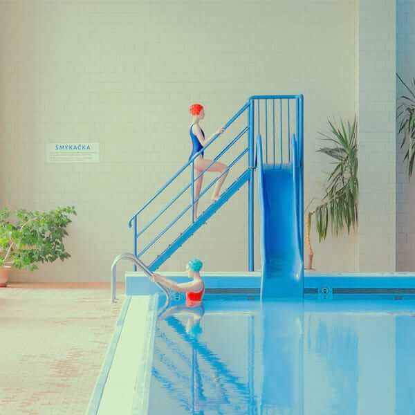
No Diving
New photographs in the swimming pool series by Maria Svarbova. No surprise it’s as good as the first one. The colors are totally doing the heavy lifting, and the post processing creates a fitting mood. Very nice!
Textured Vet
Creating textures that lift an illustration to the next level is a talent I admit I’m jealous of. This illustration uses an inspiring color palette and textured background.

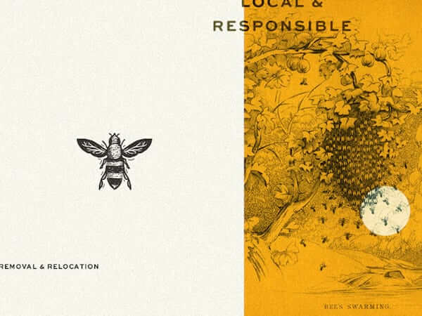
Metro Bee
Part of an identity for a bee relocation specialist. What I like here is that the bee was hand drawn with micron pens, something I still love using too, though I used it constantly in my early days. It’s first been drawn out on paper and then scanned into Illustrator; then redrawn over it, and the lines were refined with the pen tool. I love the rough feel to it.
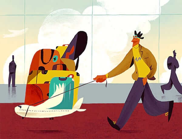
Airline Passengers Rights
I picked this one for the way the figure is drawn. The large hand, arm and trouser gives all this a uniqueness to it. Looking closer is a great way to learn.
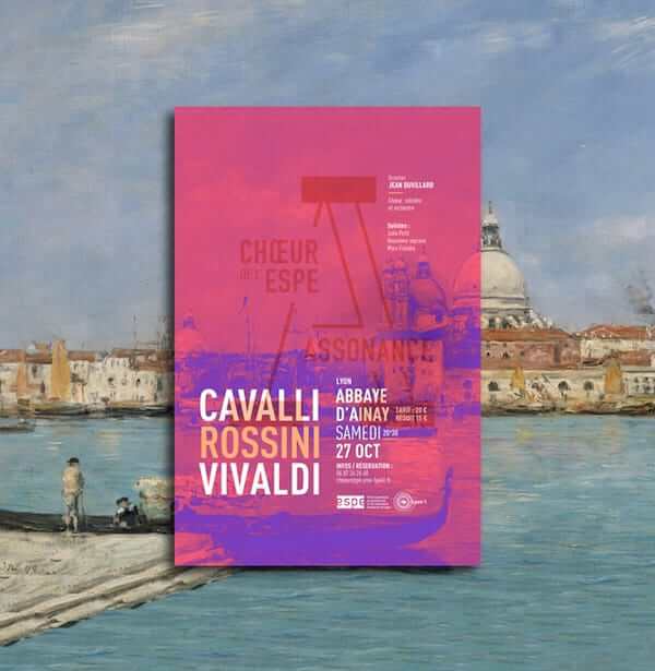
Assonance - Poster Design
Visual identity of the “ESPE - Assonance Choir”, mixed choir of over a hundred people. This identity is mostly developed on the posters of the concerts. On every poster, the logo appears in a big size at the center and is used as a grid. In the background, classic paintings illustrate the theme of the concert. Wonderful usage of overlay effects!
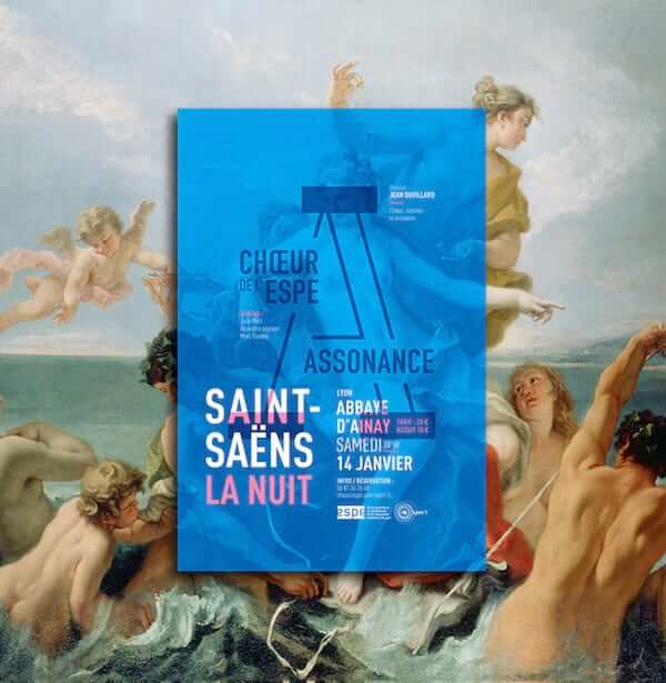
Assonance - Poster Design II
Another poster that shows the visual identity of the “ESPE - Assonance Choir” on a grid. Beautiful overlay effect, and great typography too.
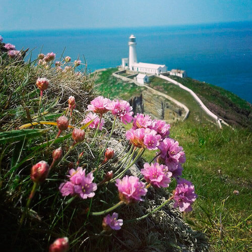
Lighthouse Anglesey
A lovely sea breeze and a moment of peace to take it all in. Lovely shot from the South Stack lighthouse.
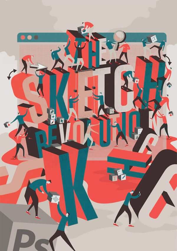
Net Magazine Cover
Editorial illustration for the cover of Net Magazine. The idea was originally to have a “revolution” of people scattered around the word “Sketch” since that now is considered cooler than Photoshop. I love the chaotic busy look here while it still feels like it’s all going smooth as an oiled machine.
The Painted Photograph
One part of a set of rigorously composed, scenic character portrayals that merge the pictorial traditions of cinema and documentary photography. Great colors!
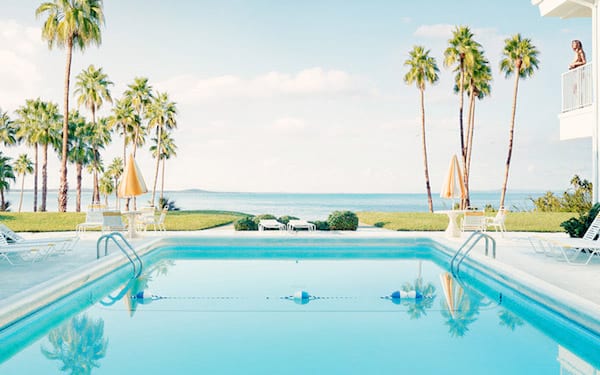
Image credit: Dean West
Conceptual Digital Illustration
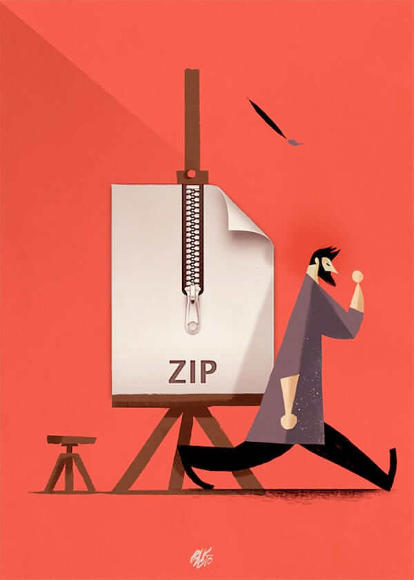
It has been some time since I last featured something from Riccardo Guasco. Riccardo’s style never stops to amaze me. The ZIP document has a very different realistic design style, and somehow it still all works well together.
Popular Mechanics
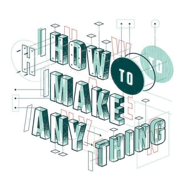
Type opener for Popular Mechanics “How to Make Anything” issue. Lovely clean 3D look, and composition with lost of details and nice subtle textures in places which makes it interesting to keep looking at.
DNA Doctors
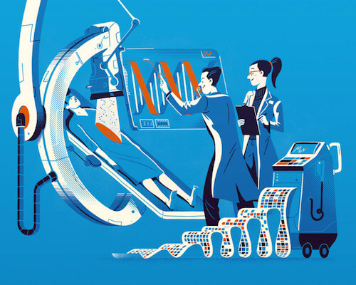
It’s always fascinating to dissect the fantasy that went into creating the illustration. Love the vintage look here, and how the line patterns are applied to add shadow and highlights. It adds this subtle depth effect, while on the people, especially the clothing, it’s done more flat and clean as if the 2 tand into the spotlight.
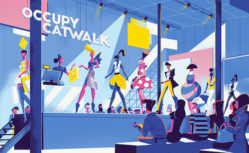
Occupy Catwalk
Editorial illustration for an article about the changing face of fashion. The thought that went into dresses on the models are really inspiring. What’s also very well done it how the yellow is applied. You would think a combination of yellow, lavender blue, and pink will never go well, but this proofs that it’s all about how the colors are applied. The highlight and shadow on the audience, and people on the catwalk is also very well done.
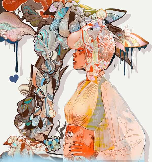
Daphne / Illustrator Startup Screen 2015.3
The new Adobe Illustrator start-up screen for version 2015.3 is the work of Giulio Iurissevich. His illustrations are difficult to miss with graffiti-like aesthetic featuring striking silhouettes coloured by vivid printed designs.
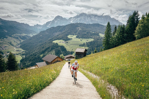
A Ride In The Dolomites I
My friend Ashley Gruber had a little mountain adventure with a scenery that just screams wanderlust. The Dolomites never stop to amaze me with their beauty. One day…
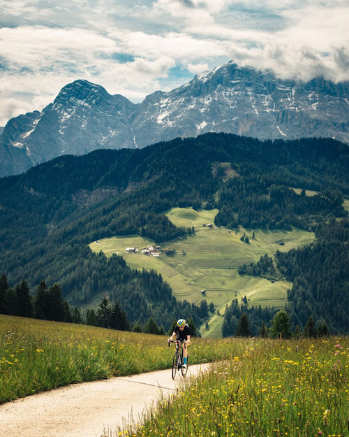
A Ride In The Dolomites II
Here’s another one. If this gets your appetite going and you’re up for a serious adventure listen up. It’s too much for me, but if you want to ride a 120k-ish and 5000m of climbing you are in for a treat in the weekend of September 10⁄11. My friends are organizing this “wonderous adventure” in the Dolomites.
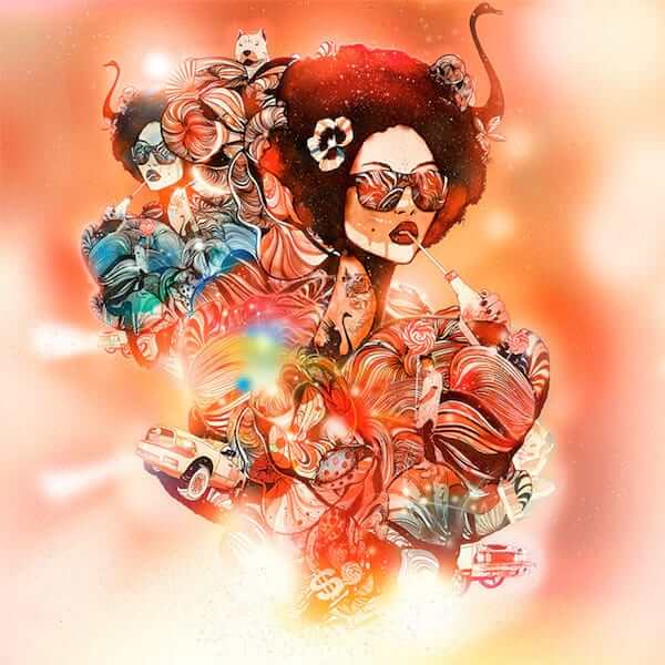
Lollipop - Giulio
Another piece of urban-inspired art of illustrator Giulio Iurissevich. Giulio focuses on the human figure and especially on the slight nuances of expression in the portraiture of girls’ faces.
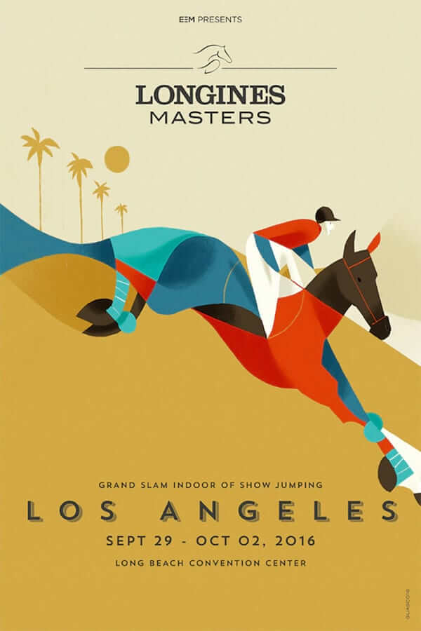
Longines Masters
Posters made for the Longines Masters, the Grand Slam Indoor of Show Jumping. Love how the horse is constructed from colorful shapes. It comes together very nicely and draws all attention to the horse. Beautiful colors and lines.
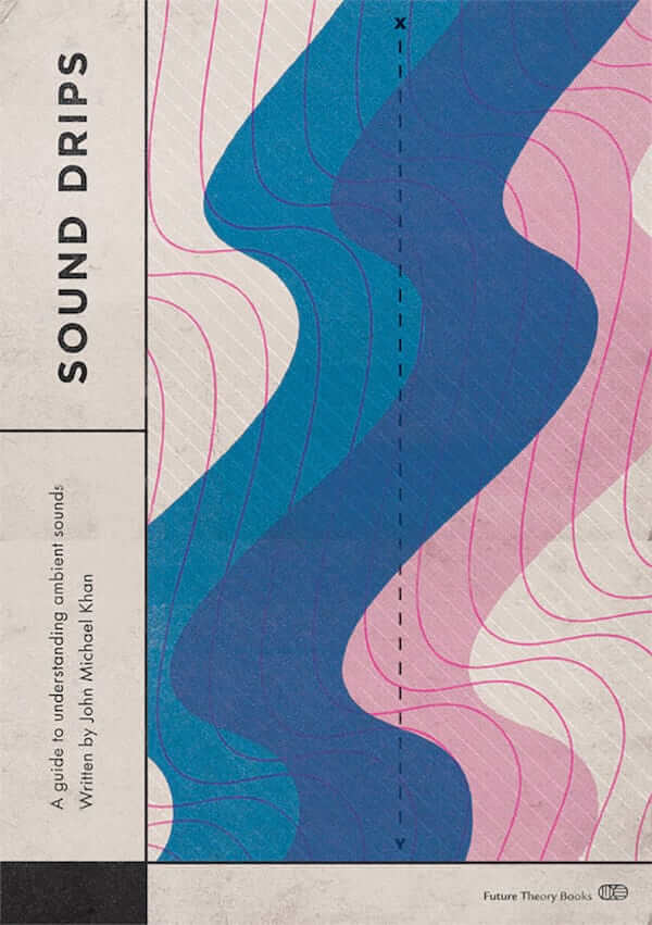
Sound Drips
Cover for a guide to understand ambient sounds. Simple usage of shapes in combination with smartly chosen colors can lead to beautiful results.
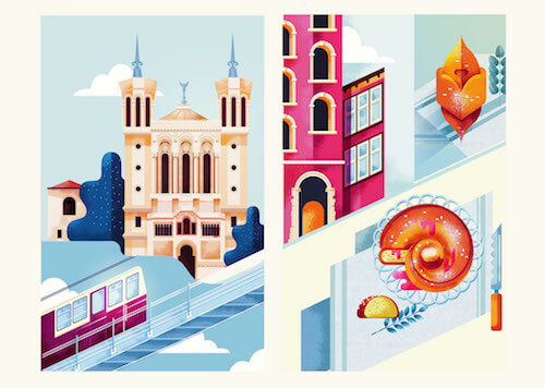
Eurostar x Lyon
Illustration for the Eurostar Lyon campaign. Lyon, the city of 2 rivers, the belly of France, of food & wine. The food looks super delicious I must say. Admiring the textures & color choices.
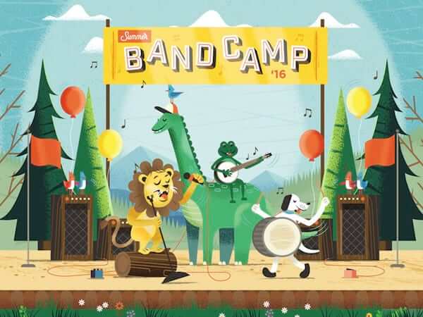
Summer Band Camp ‘16
Adorable creatures, especially the birds. Inspiring composition as well. This illustration would fit wonderfully in a children’s book.
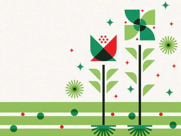
Soil
Oh my! This is delightful! The shapes and colors are so sweet. Looks super easy, but trying to accomplish, it never is. At least not in my case.
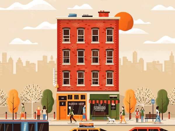
Street Life
Great detail and a lovely warm color palette. Some amazing details too. The reflection on the windows is so fresh. The bricks motif is also truly inspiring, same for the volume on the trees.
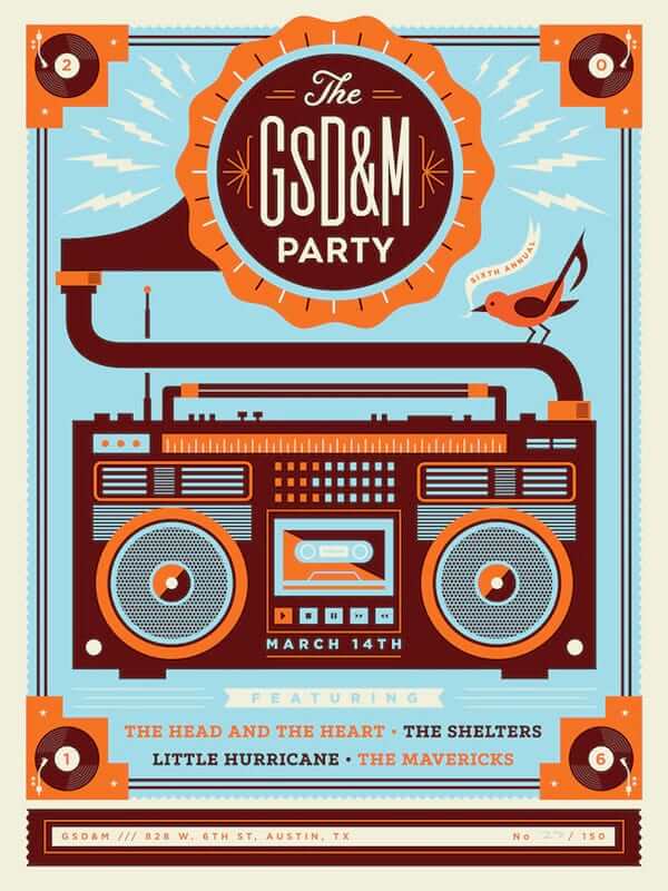
Party Poster GSD&M
Killer concept of merging that phonograph with the boombox, makes it a modern vintage mashup. Like!
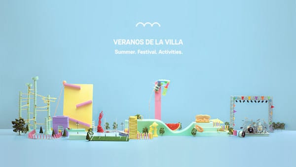
Veranos De La Villa
Great idea to use real life objects to create a set that represents the summer program events in Madrid. Be sure to watch the video as you’ll see it all comes to life. The color palette is also perfectly chosen. It totally sets a distinguished style.
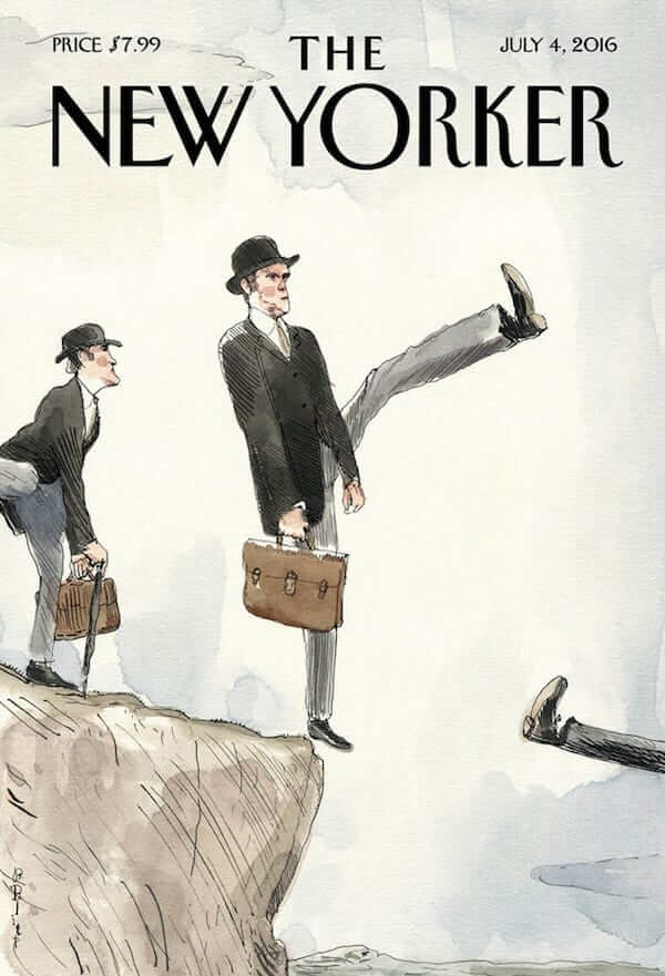
Ministry Of Silly Walks
Brilliant cover for The New Yorker based on the famous sketch of the Monty Python comedy television show ‘Monty Python’s Flying Circus’. Created for the Brexit cover story: Barry Blitt’s “silly walk off a cliff”.
In Pieces II
Another one in the ‘In Pieces’ series from Brooklyn-based photographer Dean West where he collaborated together with renowned LEGO® artist Nathan Sawaya. The project features a series of typical North American ‘picture postcards’, each containing items created from thousands of blocks of LEGO®, glued together in reflection of the pixel assemblages of the digital age.

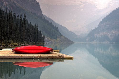
Lake Louise, Canada
I would almost say that you hear the silence but that wouldn’t make sense. Lake Louise, Canada, such a great scenery to take in. Love the bright red accent of the canoes.
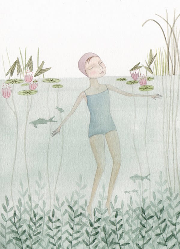
Swimming
I’ve always been a fan of watercolor pencil style drawings, plus I like to swim. This illustration scores on both. The pastel colors, the subtle blush on the girls cheek, it’s all just right. Here’s to a Summer with many swimming opportunities.
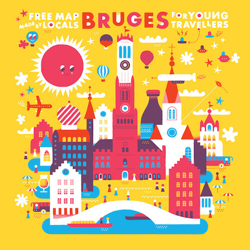
Free Map Bruges
This year’s Use-It map of Bruges done by KHUAN+KTRON. Brightly colored illustration of one of my favourite Belgian cities. I love how everything is simplified into this cute flat 2D style.
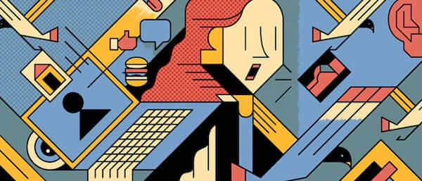
de Correspondent
Editorial illustration for de Correspondent about the pharmaceutical industry and database marketing. Special how the face is almost 3D like.
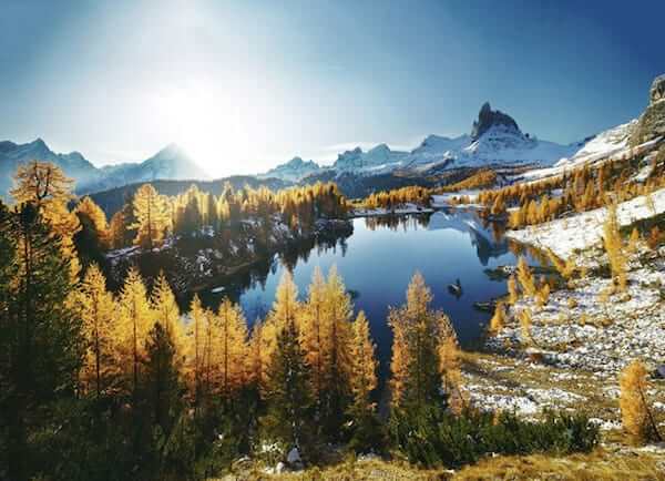
Dolomites - Heart Of The Alps
The Dolomites, probably Europe’s most beautiful mountains chain. Such an impressive and striking impression that these world-famous limestone giants leave behind.
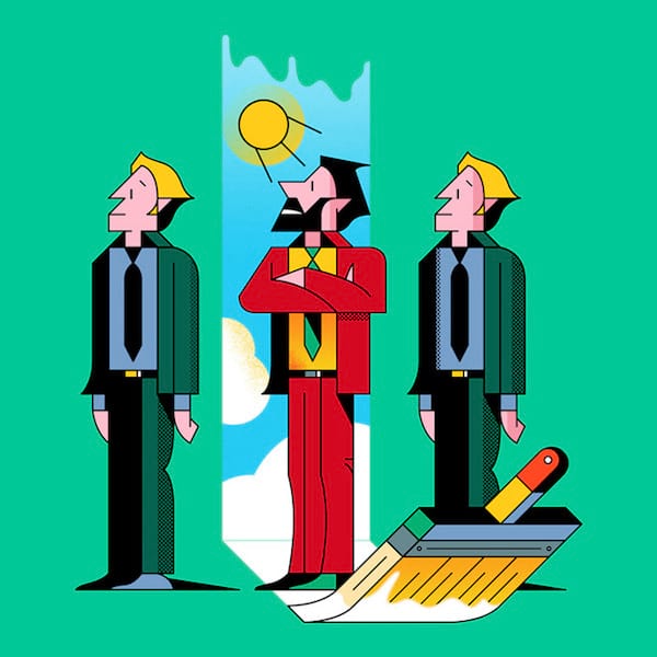
Wemokki
The shapes of the faces are refreshing. Not easy to achieve this perfection to draw people in this geometrical style. The color palette is also very well done and eye-catching.
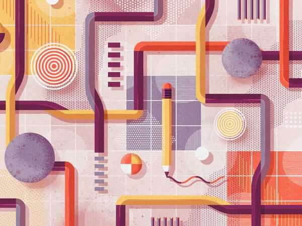
Shape Study
Wonderful study of shapes. Shapetastical! Great for studying the wonderful textures and patterns usage in there. Beautiful color palette too.
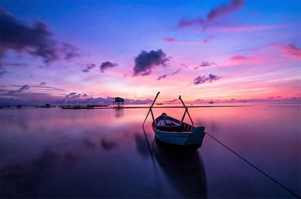
Sunrise Phu Quoc Island Ocean
Such a wonderful moment with brilliant colors captured at sunrise at Phú Quốc, a Vietnamese island off the coast of Cambodia in the Gulf of Thailand. Available as a wallpaper.
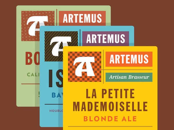
Artemus
A very nice identity design for Artemus, a new craft brewery in Paris. These are the front labels. Great colors and typography.
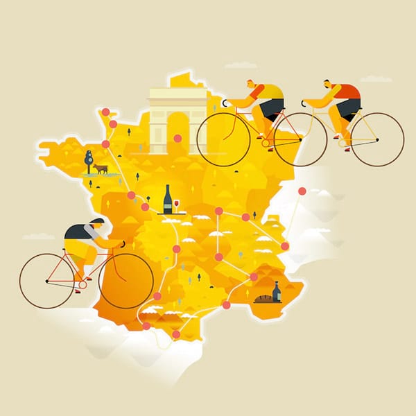
Tour de France 2016
Nice little tribute to what many will call ‘the greatest cycling race of all’. Clever to work with bigger proportions for the bicycle. Beautiful color palette too.
Further Reading
- A Simple Web Developer’s Guide To Color
- Accessibility: Improving The UX For Color-Blind Users
- Color Theory For Designers: Creating Your Own Color Palettes
- Colors In Corporate Branding And Design
- Hex Colors: The Code Side Of Color


 Register Free Now
 Celebrating 10 million developers

 SurveyJS: White-Label Survey Solution for Your JS App

