Building “Topple Trump”, An Interactive Web-Based Quiz Game (Case Study)
Creating an online quiz that is simple to use, looks great and is really fun to play is one thing. Basing it on Donald Trump’s polarizing presidential campaign is another.
The brainchild of Parallax director and developer Andy Fitch, Topple Trump! has gone on to win numerous awards. But it was a real team effort that brought the game to life. Here’s a glimpse into precisely how that happened, touching on the development process, design considerations and some valuable lessons learned along the way.
How It Works
In the game, players are invited to read actual statements spouted by Donald Trump during his presidential campaign — but with crucial words missing. They must fill in the blank by choosing from six possible answers, only one of which is true. To show whether they’ve guessed correctly, players are treated to the relevant soundbite.
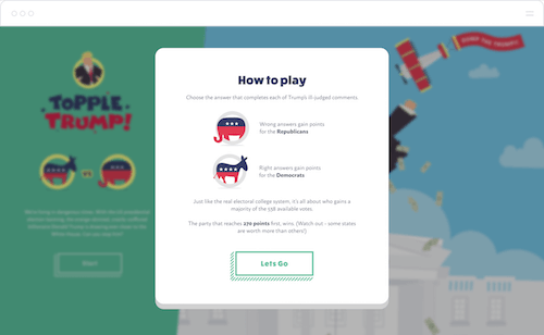
The point of the game is to stop Trump from getting votes. Every time the player gets an answer right — or, in other words, identifies the genuine ridiculous statement — points are awarded to the Democrats. If the player fails to identify the correct inflammatory phrase, votes go to the Republican party. In line with the real presidential election, the party that reaches 270 votes (a majority of a possible 538 across all US states) wins. In other words, if the player manages to take the Democrats over the line first, they’ll topple Trump.
Developing The Idea
During one of our Hack Day brainstorms, we hit upon the idea of taking all of the unpleasant things Donald Trump has been saying in the news and channeling them into a force for good. As fans of web games such as Fibbage, Quiplash and Bomb Corp, we wondered whether it would be possible in some way to turn Trump’s risible rhetoric into an actual quiz.
After researching and pulling together all of Trump’s most recent statements, we had a foundation on which to build our idea. A lot of the quiz logic was written in the first few weeks, but it needed input from the wider team if it was going to be developed into something special. This wasn’t a client project, so we had to find the time and resources wherever we could.
In the early days, Topple Trump! was shaping up into a sort of distant cousin of Cards Against Humanity, in which players piece together statements from different cards. But to keep things simple, we reduced the project to a more straightforward fill-in-the-blanks-style quiz. If it was going to be fun to play, we reasoned, it had to be as simple and straightforward as possible. And for that to happen, the interface had to be intuitive.
User Interface: Designing A Playable Game
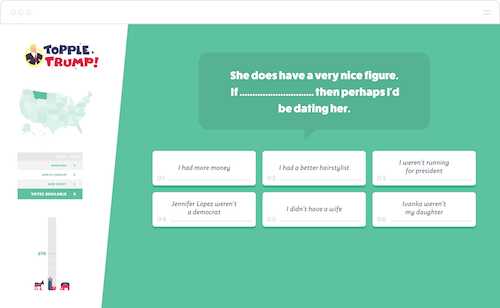
To get things up and running, we started out by building a very simple interface, with the score and a map of the US on the left, and some unstyled questions on the right. Wireframing was done in pencil, and it quickly became apparent that we were all on the same wavelength. We mocked up some initial designs, which ended up being of such high quality that we all started to get a bit excited about the result.
We discussed the user journey at length. We went through surprisingly few iterations before finding the sweet spot — the more we figured out how players would interact with the website, the more the quiz started to feel like a real thing. Questions and answers were dictated by how many decent audio quotes we could find. Luckily, we weren’t short on material. It was perhaps some of the most enjoyable (if disturbing) research we’ve ever conducted.
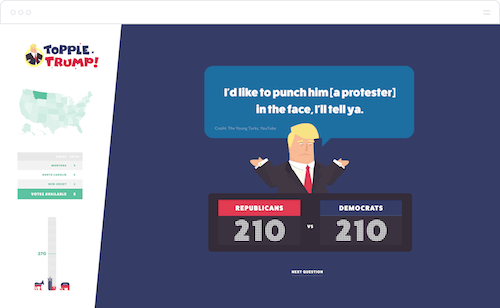
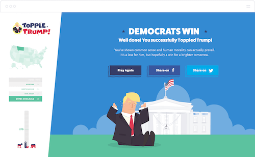
A few weeks of development went by, but the user journey lacked a satisfying ending. Early versions of the game had a couple of basic messages at the end, one informing the player they’d won and another telling them they’d lost. Working these into proper end-of-game screens, with intricate SVG animations, really brought some life to the social-sharing aspect of the game — an area that people often neglect but that is vital to increasing awareness. The sharing graphics were themed to clearly indicate a win or a loss, showing the appropriate background color and image of Trump, as well as the player’s score.
User Experience: Designing A Beautiful Game
Every single element of the website was carefully considered, with the copy, music, sound effects and game-show-host narration all chosen or created to complement and enhance the tongue-in-cheek tone of the game. From the neutral colors of the backgrounds and US states (green and yellow, respectively, to differentiate from the politically associated red and blue) to the careful wording of the instructions, no detail was overlooked.
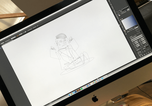
Because Trump is the focal point of the game, we decided pretty early on to illustrate him larger than life. We started out by examining key elements such as his hair, facial features and unique mannerisms — all the things that make him instantly recognizable. We’d heard he is known for having small hands, so this was taken into account during the initial sketches.

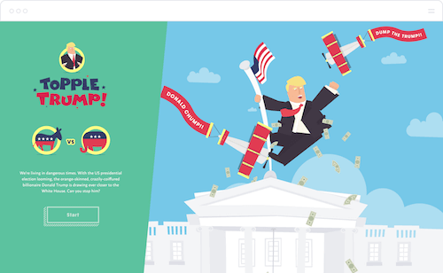
Wanting to keep the overall style lighthearted, we kept everything basic. We aimed for a broad caricature, not an exact replica — by exaggerating his persona to the extreme, we considered how he’d position himself and where he might stand. For the landing page, we hit upon the idea of having Trump atop the White House batting off planes. It tied in perfectly with the idea of Topple Trump! — after all, the game gives players the chance to knock him off his perch.

Once the character illustrations were finalized, we discussed types of animation. We split up the vector files into their constituent parts, taking great care to give each one a unique name so that it could be selected in JavaScript later. Once animated, the files were exported as SVGs. We used the GreenSock animation library for its high performance, cross-browser compatibility and easy-to-use API. Each animation on the website is a function made up of multiple nested timelines that can be paused and played together.
// MONEY ANIMATION

var timeline = new TimelineMax();
var dollars = $('[data-name="hp-dollar"]');

for(var i = 0; i < dollars.length; ++i)
{
    var rotation = Math.random() * 720;
    var size = 1.0 + Math.random();
    var offset = i * 0.2;

    TweenMax.set(dollars[i], { scale:0 });

    timeline.fromTo(dollars[i], 3.0,
    {
        scale: 1.0,
        repeat: -1
    },
    {
        x: offset,
        y: 700,
        scale: size,
        rotation: rotation,
        repeat: -1
    },
    i * 0.2);
}

The visuals came together pretty quickly, and soon after we had some whimsical background music in place. But we still felt as though something was missing. Taking a cue from some of our favorite games, we hit upon the idea of a game show host or narrator character — one who is as bemused by Trump’s quotes as we are. We drafted a script and uploaded it to VoiceBunny.
For those who don’t know, VoiceBunny is a fantastic service for finding voiceover artists. Simply search for the dulcet tones that best suit your needs, send them your script, with notes on delivery, and they’ll get back to you with MP3 and WAV files within a matter of hours. This made it super-easy to edit the files and drop them into the game.
About The Build
The website is set up on Expose — our own content management system (CMS) — offering a reliable and versatile foundation. Built on top of CakePHP, it provides a solid framework for managing the quiz data. The vast majority of the website is JavaScript, with separate modules (quiz, questions, cookies, loading, map, sounds, timer, animation and voiceover) all interacting with each other.
We implemented some really cool bits of technology along the way, including a forked version of HTML5 Audio Read-Along for highlighting the answers in time with the sound bites — we painstakingly married this to every word in every single quote across the entire game. With a little help from the Service Worker API and Google’s excellent Service Worker Precache module, we also made sure that the website runs offline, meaning that people can play even when they’re out of reach of Wi-Fi.
We built a custom database to look after all of the answers for the quiz. There is one correct answer and eight incorrect answers for each question, and six answers are shown at a time, so that every time a question is selected, five incorrect answers are randomly chosen along with the correct one.
The game takes full advantage of Amazon CloudFront’s recent HTTP/2 support, which allows for the delivery of resources on a single TCP connection. This is a big win for performance on mobile networks especially, where latency is always high. And, of course, it’s fully responsive, working well on all types of devices — but that came with its own set of challenges.
Due to the complex nature of what’s on screen at any given moment during the gameplay, we had to work really hard to get the level of responsiveness we needed. For instance, the slanted partition between the scoring (or progress) panel on the left and the main gameplay area on the right presented some real challenges. We wanted a UI that keeps as much information on screen as possible without cramping the content or reducing fonts to illegible sizes.
The first step we took was the obvious one — to make things smaller. There are limits to this, however, so we also had to remove some elements that weren’t strictly essential to the game — the bells and whistles. For example, the scoring panel contains four parts — the logo, the state map, a table of votes for the current question, and the score bar. On large screens, these are stacked in a single column, and for slightly smaller screens we had to shrink the score bar and bring it up inline with the votes table. We also had to remove the party mascots, which were deemed non-essential — we decided that the colors of the bars would indicate which score belongs to whom.
For non-desktop users, the info pane is hidden from view, and a “View progress” button appears in the footer. We can’t expect users to keep clicking on this button, so we needed a way to provide them with the current score at all times. To do this, we show mobile users a specially designed scoreboard at the top of the screen.
Again, on small screens, we decided to do away with superfluous decoration; as the screen size increases, these elements become more visible. On mobile, the main question screen, scores and votes are fixed to the top of the screen and essential game buttons are fixed to the bottom. Whichever devices people use, we wanted to do everything we could to make the experience of playing the game as fulfilling as possible.
User Testing And Feedback
Before launching, we put the website on UserTesting to get some feedback from real users. A lot of the initial comments were positive, particularly about the look and feel of the game, and even those who aren’t particularly politically engaged found it enjoyable to play. But a number of issues were also flagged.
First and foremost, people were struggling to complete the questions in time. We’d added a timer fairly late, to give a sense of urgency; it originally kicked in as the narrator started speaking and lasted only 20 seconds. It was soon pretty obvious that people were struggling to read the question as the narrator spoke, digest nine possible answers and make their selection. To remedy this, we increased the timer to 30 seconds, reduced the number of possible answers to six and made sure the timer didn’t start until the narrator had finished their line.
There was another issue with the sound mix on the ending screens; the loud music drowned out the narrator. A quick re-edit sorted this. We also had a big problem with the display on certain screen sizes. Even though the game was built to be fully responsive, on low-resolution screens, players had to scroll down to find the “Next question” button, which was far from ideal. Our answer to this was to place the button in a fixed position at the bottom of the screen, immediately above the footer bar, which contains the game controls and sharing buttons, thus adding to the feel of a native mobile experience and ensuring that a UI element that is essential to the game is not only visible above the fold, but is placed exactly where you would expect it to be.
The Finishing Touches
For any game to really shine — no matter how tongue-in-cheek — it needs polish. In the final days before launching, we spent a lot of time making sure that everything is as refined as possible. This included rigorous testing by everyone on the team, spotting bugs and fixing errors, such as problems with the scoring mathematics and how the website appears on devices with a small market share. We also refined and simplified the “How to play” instructions and updated the animation for the “good ending” to include Trump crying and kicking his legs.
We added extra sound effects and new colors for when players click on an answer tile and advance to the next question. Earlier versions of the game included embedded YouTube videos showing the real Trump make his statements; with the illustrative style of the game, these stood out like a sore thumb. By bringing the cartoon Trump into the answer screens, we were able to maintain his presence throughout and really tie the game together.
What We Discovered
Making a game based on something so topical is extremely fun and rewarding. With the type of websites we generally build, it’s rare that we get to try our hand at games (although we have been known to), so it was a refreshing experience that required us to look at things from a whole new angle.
Even though this wasn’t a client project, we gave ourselves a pretty strict deadline. Ultimately, the game had to be finished ahead of November’s presidential election, but we wanted it to be completed before the end of the summer, ahead of the major debates. We were also concerned that Trump might say or do something that would get him disqualified from the race, which would have turned the whole endeavour into a massive waste of time.
Due to this short timeframe, we allowed quite a lot of staff to jump on the build — probably the most ever for a Hack Day project. We really had to up our game with branching workflows and to be more careful than ever not to step on each other’s toes — in other words, we had to keep checking that everyone was working towards the same goal.
A project like this really is a great way to test the limits of the team and to identify areas for improvement. Throughout the process, we learned a lot about service workers and HTTP/2, which we hadn’t had much experience with.
Launch, Recognition And Awards
We put a lot of effort into planning the launch. We set up an ad hoc Twitter account to promote the game and handle any incoming queries — this kept our main account free for our regular messaging. We designed a selection of custom social media assets and scheduled posts for during live debates or when fresh controversies unfolded.
Consistency was important throughout the marketing phase. For example, the sharing function at the end of the game generated the hashtag #ToppleTrump, and we used that wherever possible. We also made sure to keep using the phrase, “It’s the game you’ll love to hate!” — a line uttered by the narrator as soon as the landing page loads.

#ToppleTrump to help raise awareness. (Large preview)We wrote about the game on our own blog and published the story to Medium. We pulled together a huge list of media contacts, researched the most appropriate awards, and targeted relevant businesses and individuals across the fields of design, development and politics. Beyond that, we just had to hope people found the game fun to play!
Since launching, the game has received some incredible feedback. It’s been played by people in over 150 countries, and the website has racked up — so far — over a quarter of a million hits. We’ve had some lovely responses on Twitter, as well as some fantastic write-ups from The Creators Project, Prolific North and the A.V. Club. We’ve also managed to bag Website of the Day from the CSS Design Awards, not to mention the Site of the Day (plus an honorable mention) from the peerless Awwwards. Most recently, the game was nominated for Site of the Month and pitted against the likes of Spotify and Google.
Further Reading
- Gamification And UX: Where Users Win Or Lose
- How To Build A SpriteKit Game In Swift 3
- Combining UX Design And Psychology To Change User Behavior
- WordPress Playground: From 5-Minute Install To Instant Spin-Up


 Agent Ready is the new Headless

 SurveyJS: White-Label Survey Solution for Your JS App

