Brush Lettering: It Only Gets Better After Practice (Part 2)
In the first part of this article, we discussed the resurgence of lettering, we defined the differences between lettering, calligraphy, and typeface design, and we also discussed pens, papers, and other supplies. In this second part, I will share with you how I got started, my journey, and will also share specific tips on how to start. Let’s get started.
The Journey Is Particular To You
When I decided to practice lettering daily, I was a tad overwhelmed with the options: Crayola (there is even a term for it, crayligraphy), pointed pen, brushes, illustrative lettering, lettering, calligraphy (Copperplate and Spencerian), modern calligraphy, and so on. I did not know what to do or where to start.
I had taken a short course offered by Caroline Kelso from Made Vibrant, where she teaches a simple way to do lettering. I started to realize that one thing that all lettering styles had in common, among the sea of differences and uniqueness, was that everybody would embrace their own style. That was the moment when I decided to try different tools and see what I was most comfortable with and what I liked the most. Eventually, I started to settle on brush lettering.
My Journey As A Learner
Influences
After practicing for a few months, I started to realize that the foundation of brush lettering was similar to the Spencerian and Palmer methods of penmanship. Spencerian penmanship is the type of cursive writing that was taught in the United States from approximately 1850-1925. Platt Roger Spencer developed it for the purpose of aiding business communication. However, it started to become obsolete with the introduction of the typewriter. (Another instance where one technological tool displaces another). Spencerian penmanship has, however, seen resurgence in some charter schools and home school education.
The other handwriting method is called The Palmer method, developed by Austin Palmer. The Palmer method, a simplified style of Spencerian, emphasizes muscle and arm movement as opposed to finger movement. The Spencerian method, however, focuses on four types of movement: finger, forearm, combined, and whole arm. The Palmer method became very popular as it was intended to simplify writing and compete with the typewriter. The Palmer method drills were taught in schools as well.
Both Spencerian and the Palmer method encourage the practice of a collection of exercises or drills, which have now become very popular.
The Principles
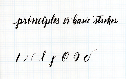
Spencerian penmanship focuses on eight principles or strokes: a diagonal straight line, the right curve, the left curve, the extended loops (upwards and downwards), the direct oval, the reverse oval, and the capital stem. For some letterers, the capital stem and the diagonal straight line are the same. As I continued to observe letterers and calligraphers on Instagram, I started to see that these principles were the foundation of their unique styles.
See a short demo here:
Now that we have a good foundation and context, let’s talk about how to start.
Where To Start: Understanding Your Space And Your Letters
Let’s discuss some basic terms to give us a foundation, and so you know where to start on the page.
Terms To Know
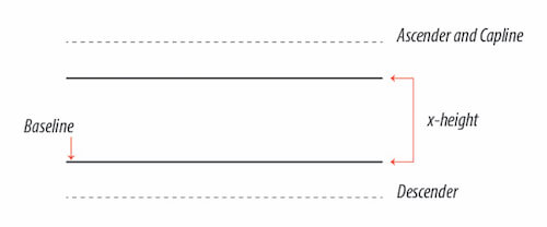
- Baseline: The baseline is an imaginary line where the letters “sit”. Think of your name, for example. Each letter aligns perfectly at the bottom on an imaginary line.
- X-height: This refers to how tall each letter is. Think of the lowercase x. From the bottom (baseline) to its top, that space is called the x-height. Your lettering can have uniform x-height, or you can play with making some letters with a small x-height and others with a large x-height.
- Capline: Each capital letter also touches an imaginary line at the top where all the caps meet. If you were to draw a line across touching each cap, you would see how they all align perfectly. But, as I explained in the x-height above, you can create your caps to all be uniformly the same height or you can play with creating a playful rhythm.
- Ascenders: The vertical line or stroke of letters like the lower case b, d, f, h, k, and l extend beyond the x-height line. Thus, we call that stroke ascender as they ascend or they rise.
- Descenders: Just like some letters ascend, or go up beyond the x-height, other letters descend, or go below the baseline. Letters like g, j, p, and q descend below the baseline; thus, we call that part of the letter, descenders.
Here is a diagram that will help clarify it for you:
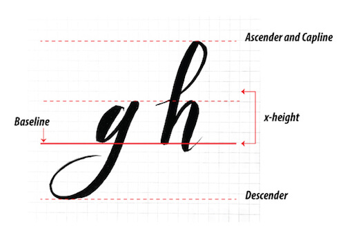
Here is the diagram with some letters. Note: I gave these letters taller ascenders and longer descenders.
Basic Strokes
Like in many other disciplines, there are several ways to create letters in brush lettering. Also, each brush pen and brush will give you a slightly different mark or marks depending on its texture and size of the tip. The uniqueness of lettering is not only dependent on the brush type and size, but it is also determined by how each letterer imparts his or her flair, personality, style, and uniqueness to the letters.
As we discussed earlier, there are eight basic strokes, also called principles, in the Spencerian Penmanship Theory Book. However, remember the two most important principles to keep in mind are the pressure you apply on the brush pen and the angle in which you hold it. Pressure is used to create the thick lines going down, while the release of the pressure creates the thin lines when you go up. These are two critical factors. The rest is an expansion of what we do naturally with a pen or pencil.
Instead of walking you through a sheet full of the letters of the alphabet and having you try and copy them to my style or my interpretation, allow me to show you the basic strokes or principles that are the foundation for the letters. I want you to think about the letters’ basic strokes and how they come together. Unlike traditional calligraphy, in brush lettering we don’t have to replicate a calligraphic hand style impeccably.
Note: These principles have been adapted in my practice from The Theory of the Spencerian Penmanship Practice. These workbooks have been very helpful in developing and practicing my own voice.
Angle
The angle in which you hold the brush will be crucial. It will affect the angle of each letter, their posture, and in general, the look of the entire word, phrase, quote, etc. Remember your baseline. If you trace a straight vertical line from the baseline, that would be a 90-degree angle, right? If you start writing with a pencil or pen, usually the slant of your letters will be about 30 to 40 degrees to the right of the vertical line we just drew. Now, in calligraphy, every calligraphic hand will be created at a specific angle, which will create a specific slant. These exact requirements are necessary to replicate that calligraphic hand with exactitude. But, in brush lettering, especially in modern brush lettering, the angle may vary. That is, you may decide to write your letters with the brush at 90 degrees, 60, 55, or 30 degrees. You are welcome to play with it and test what you like most. For instance, my natural handwriting is usually at 60 degrees from the baseline. That is where I am most comfortable because it is how my handwriting works. But, I realized after practicing this past year, when I wanted to slow down and write each letter at a time, instead of sweeping through, my letters still sat at a 60-degree slant. See diagram below.
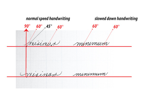
The most important thing is to remain consistent with the slant (sometimes referred to as the slope) of your letters.
Here is a short demo:
Pressure: The Thicks And The Thins
To create thick strokes, you need hand pressure applied to the chosen tool when making the letter on the surface. On the way up, you don’t apply pressure, rather guide the hand gently in an upward motion. This theory is easy to understand but hard to do immediately. Practice is necessary to create muscle memory.
See a short demo here:
Every down or diagonal stroke that goes towards the baseline will be thick. You will create that thickness by slightly changing the pen’s angle and adding pressure. When you move the pen towards the x-height line or the ascender line, either straight up or a diagonal, the pressure should be very light.
Applying pressure on your down strokes and releasing it on the up strokes sounds very easy. However, it takes a lot of practice to control the brush’s pressure. Even 15 minutes of dedicated practice every day will help you improve. Notice in the example below how I hold my brush pen. (And by the way, it does not matter which brush pen you are holding, the principle is the same: thick on the way down or downwards diagonal, light on the way up or upwards diagonal.)
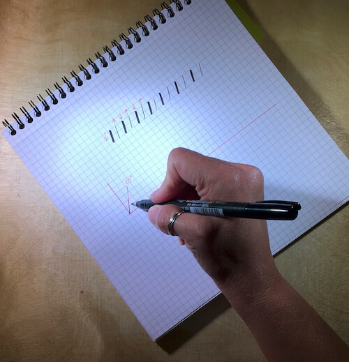
A closer view can be found here:
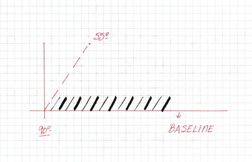
The Line (Stem Or Stroke)
This line will often be at a slant or angle. If you think about it for a moment, how many letters have a vertical line in their construction? Let’s spell them out. On the capital letters we have the B, D, E, F, H, J, K, L, N, P, R, T, and I. On the lower case letters we have the b, d, f, h, i, j, k, l, p, q, and t.
See diagram below:
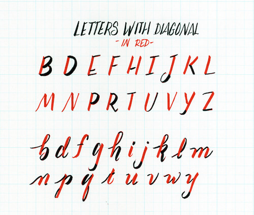
The Curved Line
Letters with curved lines are: capital B, C, D, G, J, O, P, Q, R, S, and U. Lowercases: a, b, c, d, e, f, g, h, j, m, n, o, p, q, r, s, u, and a cursive z. Furthermore, we can think of right curved lines and left curved lines. If you divide the O or Q in the middle, you will have a right curve and a left curve that optically come together in the center.
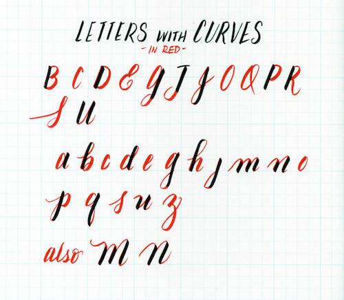
Extended Loop
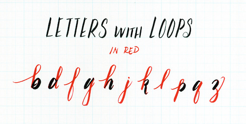
Remember when we talked about ascenders and descenders on the b, d, f, g, h, k, l, p, q, and the cursive z? Well, creating an extended loop that will either go beyond the x-height or below the baseline will form those ascenders and those descenders. On the ascenders, your brush will go up first. Therefore, it will be a lightweight stroke. Conversely, on the descenders, your brush pen will make a downward stroke that will be thick. As you are turning the brush to go up again, the stroke will be lighter.
Ovals
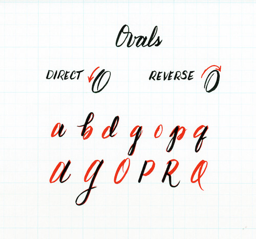
There are two types of ovals. The direct oval, which is created clockwise, and reverse oval, which is created counterclockwise. Here are the examples.
The Turns
In addition to the principles or basic strokes, there are two turns that are very important: the under turns and over turns. These turns give you the line and place which allow you to connect the letters. Generally, these turns will need the most practice as your brush pen will either press on or be lighter on the page.
See a demo here:
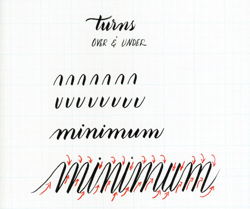
These are the fundamental principles to create the letters. It is a good idea to practice them on a quad sheet of paper, or you can make your own guidelines and practice them. Even 15 minutes a day will help you. If you are reading this, you can download a blank practice sheet here.
Making The Letters
Now that we have the basics covered, let’s talk about how to make the letters. You will find a diverse range of opinions on whether or not practicing each letter is beneficial. I would prefer to point your attention to the fact that the letters are made out of groups of shapes. In other words, letters are like a large family and some letters have more commonalities than others. If you study them as groups of similar shapes, your foundation will be more solid because your letters will be more consistent.
How To Make The Letters
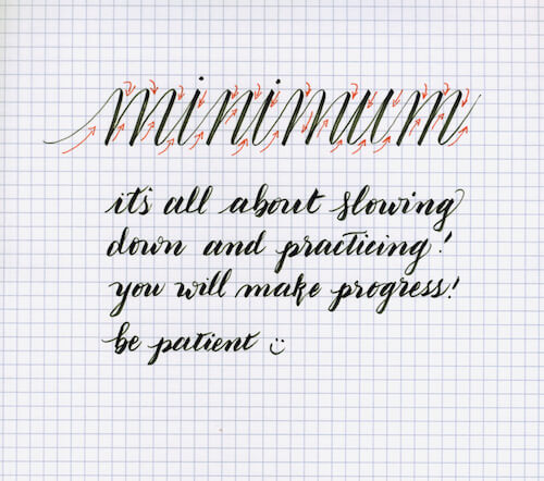
The first step in making the letters is to practice the strokes individually. Then, mix them to make letters and words. My preference is to practice with short and long words. This practice teaches me to think about flow and connectivity between each letter.
A right side curve, plus half an oval, plus a slanted stroke, plus a left side curve, makes an a. Just like this:
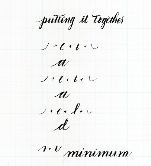
The second step in making the letters is to imagine the letter, or letters, in your mind. I know it sounds simple and silly, but it’s true. Visualize the letters in your mind as it helps to think of them as you try to write them.
To help you with that, I put together a short video:
Practice Makes Progress
Now that you have the basic strokes and principles of constructing each letter, my best advice for you is to practice. One thing that helped me greatly was to practice only the strokes over and over. I would take a grid notebook with me, and I would fill a sheet with each stroke. Here are two examples of my practice during swim meets. While I wait for my kids’ turns, I practice.
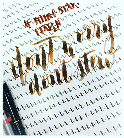
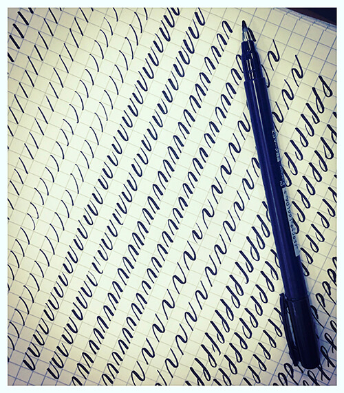
Practicing drills or exercises may not be a “sexy” practice, but it will give you “sexy” letters. People will ask you what you are doing, and you can tell them all about the letters! Plus, practicing lettering has a great side effect: it is very calming and soothing. Remember the beginning of the article on part one?
Lettering is not just about making pretty letters. It offers significant benefits for your mind, learning, and retention. When you have to make your to-do list, letter it. Since that list just became something where you drew each letter, you will remember it more. Practice writing words will allow you to practice thick and thins, underturns, overturns, and flow.
“Practicing drills or exercises may not be a ‘sexy’ practice, but it will give you ‘sexy’ letters.”
Closing Thoughts
I consider my practice of brush lettering a journey to help me progress in expressing my voice. And, that is what it should be: a journey for you to express your voice, your visual style, or your meditation. I sometimes work out creative problems by writing them out or lettering them. Recently Tobias Frere-Jones gave a talk in which he stated the following:
“But as I think of it, typeface design stands at this curious intersection of culture, and language, and technology.”
Without disrespecting him, I would like to rephrase or add to this beautiful quote by saying that all lettering (brush and otherwise) also stands at the curious intersection of culture, language, and technology. This is why lettering is so appealing, and it has boomed so much.
Letterers add a spice that is unique to each of them, to their culture, to their context, and to their language. As a bilingual speaker, I see the truth in Jones’ quote. For instance, when I letter in my native language, it is different. The colors may be different or the same, but the flavor, the slant, and even the words’ emphasis will be different. This fact should be encouraging to you if you are beginning this journey, or you are half way there or even if you have made it as a professional and successful letterer. No two letterers are the same. Start your journey. It will be rewarding.
Resources
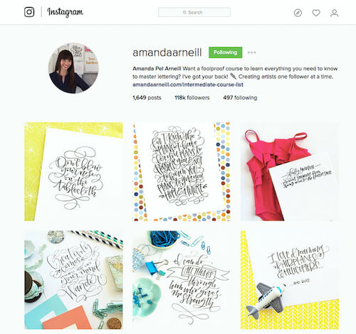
There are many letterers and calligraphers whose work is amazing on Instagram. But, if I give you all the possible names you will be overwhelmed. Instead, I am going to list my seven favorites to follow.
Amanda Pel Arneill
Stefan Kunz

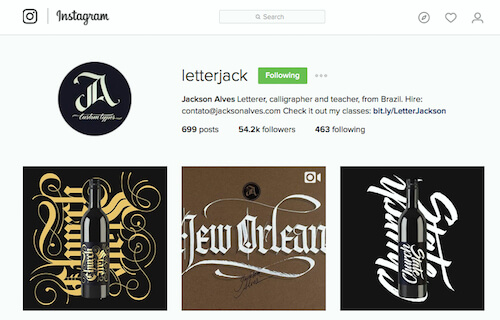
Jackson Alves
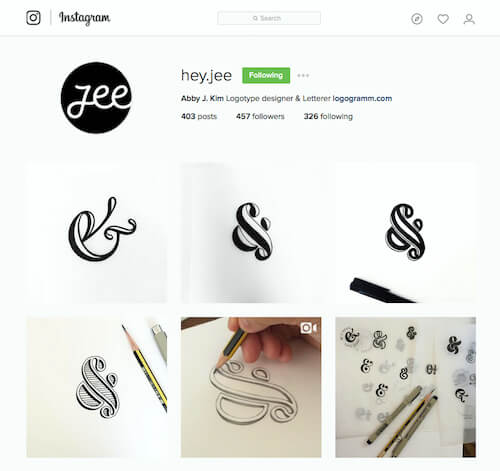
Abby Kim
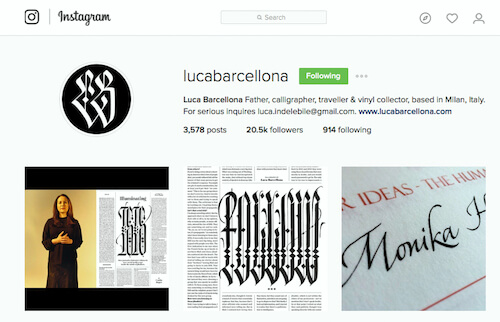
Luca Barcellona
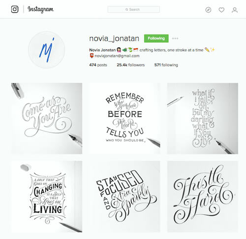
Novia Jonatan
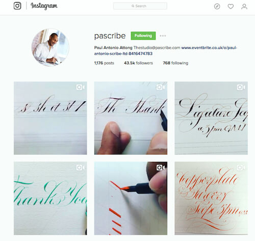
Paul Scribe
Blogs Or Sites To Find More Information
IAMPETH
The International Association of Master Penmen, Engrossers, and Teachers of Handwriting is an organization dedicated to foster, teach, and promote all calligraphic arts. You don’t have to be a member, but the membership is so affordable that you might as well. They hold an annual conference and, though I have yet to go to one, I hear that the teaching is excellent. Plus, they have lots of resources online and a directory for those who are members.
The Flourish Forum
Founded by Erica McPhee, the Flourish Forum is an online community with over 5,000 members for those who love calligraphy and the lettering arts. You have to be approved to participate, but once you are, the range of topics and help is outstanding.
The Postman’s Knock
Lindsey Bugbee is the owner of this site and blog. Lindsey has created a diverse collection of resources, printables, and tutorials that she likes to price the same as a latte.
Your Turn!
In this article we discussed the basic strokes that make the letters. Think of the letters as groupings based on the strokes. My recommendation is that you start with practicing each stroke. We call this practice making drills. Practice makes progress. As you get better, you will look back on your work and see how much you have learned and how far you have come. If you like to practice something more than just the principles we discussed here, I have put a short video together for you to show you some drills as well. See here:
And for those of you faithful readers, who made it to the end, here are a couple of freebies for you: practice sheets for you which include the basic strokes and drills!
Please remember these are for your personal use. If you would like more copies, feel free to contact me or to visit my Etsy store. Thank you for reading and please share in your comments, your thoughts, what has worked for you and what hasn’t. Also, feel free to contact me via Twitter, Email, or Instagram.
Further Reading
- The Art Of Hand Lettering
- Beautiful Hand Drawn Typography
- Beautiful Handwriting, Lettering and Calligraphy
- An Interview With Type Designer Akira Kobayashi


 SurveyJS: White-Label Survey Solution for Your JS App


 Agent Ready is the new Headless


