An Introduction To Building And Sending HTML Email For Web Developers
I’ve spent the past several years building development tools — two of those years as product design lead at Mailgun, an email service for developers, where I learned a lot about how email works and the problems that developers face when building HTML email. In this post, I’ll share some of my knowledge about the topic.
HTML email: Two words that, when combined, brings tears to a developer’s eyes. If you’re a web developer, it’s inevitable that coding an email will be a task that gets dropped in your lap at some time in your career, whether you like it or not. Coding HTML email is old school. Think back to 1999, when we called ourselves “webmasters” and used Frontpage, WYSIWYG editors and tables to mark up our websites.
Not much has changed in email design. In fact, it has gotten worse. With the introduction of mobile devices and more and more email clients, we have even more caveats to deal with when building HTML email.
I’ve spent the past several years building development tools — two of those years as product design lead at Mailgun, an email service for developers, where I learned a lot about how email works and the problems that developers face when building HTML email. In this post, I’ll share some of my knowledge about the topic.
Introduction To Sending Email
As a developer responsible for an email campaign or all of the emails your company sends, you will need to know how email works, the legal requirements and how to actually get email delivered. Companies send a few different types of email. Let’s take a look.
Marketing Email
A lot of email service providers (ESPs) specialize in marketing and promotional emails: SendPulse Email, Campaign Monitor, MailChimp, Emma, Constant Contact, OneSignal to name just a few. They provide full solutions for managing subscribers, working with email templates, running bulk email campaigns and reporting.
Transactional Email
Transactional email includes receipts, alerts, welcome emails, password resets and so on, and it is typically implemented with development tools and APIs such as SendPulse Transactional, Mailgun, SendGrid and Postmark. These tools are more API-focused, less CMS- and WYSIWYG-based; however, combined with a service such as Sendwithus, they can be made even more powerful.
An alternative to using a service is to roll your own email server with something like Postfix. The downside of this is that it’s up to you to set up and configure it and to understand the technical details of sending email, implementing tracking and unsubscribing, and getting email delivered to inboxes.
Life-Cycle Email
Life-cycle and behavior-based email services help with onboarding, engagement and more. A lot of ESPs focused on marketing also offer this service, but I tend to group services such as SendPulse Automation, Intercom, Customer.io, Drip, Vero and ConvertKit into this category.
Email List Best Practices
Don’t buy email lists. Maybe a handful of legit services are out there, but you’re best off staying away from buying lists altogether.
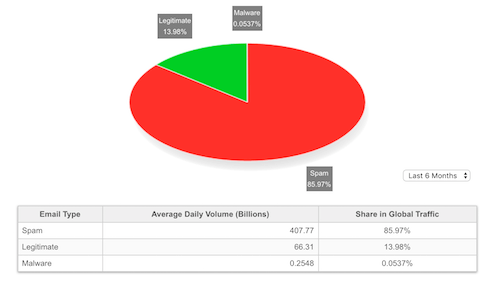
My experience is that anyone who buys an email list will suffer from a lot of bounces, give their Internet Protocol (IP) address a bad reputation, and get their emails blocked by Internet service providers (ISPs) or sent to spam. 85% of the world’s email is considered spam, according to SenderBase; don’t fall into this bucket.
Double Opt-In
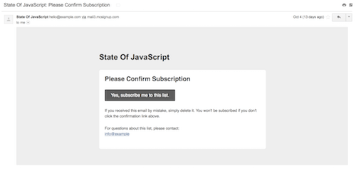
A subscriber having to verify their email address adds an extra step to the process, but it makes sense and stops other people from abusing their email address by signing them up for lists without their permission. It also helps to keep your subscription list clean and is the “100% correct way to validate an email address”.
CAN SPAM
These are your legal requirements for sending email, enforced by the CAN-SPAM Act of 2003:
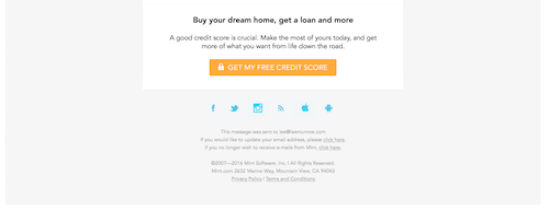
- Don’t use false or misleading header information.
- Don’t use deceptive subject lines.
- Identify the message as an ad.
- Tell recipients where you’re located.
- Tell recipients how to opt out of future email from you.
- Honor opt-out requests promptly.
- Monitor what others are doing on your behalf.
MailChimp has a good list of email legal requirements by country.
Analytics And Measuring Performance
Measure everything. You need to measure to know whether your emails are improving. The numbers will differ vastly depending on what you do, your industry, the type of emails you send and the context. However, in general:
- 20% is a good open rate,
- 3 to 7% is a good clickthrough rate,
- 5% is a poor bounce rate,
- 0.01% is a poor spam rate,
- 1% is a poor unsubscribe rate.
Also, remember that open rates and clickthrough rates can be vanity metrics (read “they don’t really matter”). At the end of the day, what you really want to track is that end goal or conversion. At Airbnb they track an email quality score, which is a good indicator on engagement quality.
Google’s URL builder can help with tracking if you’re using Google Analytics.
Sending Score And Reputation
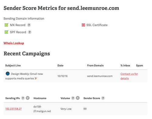
Your emails have a reputation and score associated with them. This affects how ISPs and mailbox providers deal with your email, whether they accept or reject it and whether they send it to the recipient’s inbox or straight to spam.
Some contributing factors are:
- your IP reputation (check yours with SenderScore),
- your domain name signature (see DKIM and SPF),
- bounce rates and complaint rates.
Sending Bulk Email
When you send a lot of emails (imagine a campaign with millions of emails), they are not all sent instantaneously. They can only be sent as fast as the servers and IP addresses can handle them. Keep in mind that your recipients might not receive the emails at exactly the same time.
So, if you’re sending millions of emails at once, you’ll probably want quite a few IPs to handle the load.
Email Clients
Litmus keeps track of the market share of email clients, based on its own internal statistics. Keep in mind that this is probably not the same for your customer base, but it is a good indicator to go by.
Here are the statistics as of December 2016:
- iPhone: 33%
- Gmail: 19%
- iPad: 12%
- Android: 8%
- Apple Mail: 7%
Bear in mind that not all emails can be tracked. Email tracking is done via pixel-tracking, so only those clients with images enabled will report back.
HTML Templates
Building HTML email templates can be a slog. As a result, a lot of poorly designed email is out there — clunky, themed, verbose, pointless, distracting. If you enjoy a challenge or want a unique look and feel, then building your own can actually be fun and rewarding. Alternatively, some good email templates are available:
Building HTML Email Templates
Now you know how to properly set up and send emails. The next decision you’ll make is whether to code your own HTML template. This is a bit more complex than coding the average web page. Let’s dive in.
Client-Rendering Engines
Email design is still in the dark ages. Due to the numerous email clients and devices, your email will get rendered for users in a variety of ways.
Email clients use different engines to render HTML emails:
- Apple Mail, Outlook for Mac, Android Mail and iOS Mail use WebKit.
- Outlook 2000, 2002 and 2003 use Internet Explorer.
- Outlook 2007, 2010 and 2013 use Microsoft Word (yes, Word!).
- Web clients use their browser’s respective engine (for example, Safari uses WebKit and Chrome uses Blink).
Clients will also add their own flavor of styles on top of yours. For example, Gmail sets all <td> fonts to font-family: Arial,sans-serif;.
Look at your own statistics so that you know what to design for.
Gmail Support For Inline CSS And Media Queries
Only recently did Google announce support for embedded CSS and media queries in Gmail. This is huge for the email development industry.
Now, as of September 2016, Gmail will support a slew of CSS properties, which makes template development for Gmail a lot easier.
Using HTML Tables For Layout
Divs have positioning and box-model issues in different clients — in particular, those that use Microsoft Word to render (i.e. Outlook). You can use divs if you want, but it’s safer to code like it’s 1999 and stick to tables. This means:
<table>instead of<div>,#FFFFFFinstead of#FFF,paddinginstead ofmargin,- CSS2 instead of CSS3,
- HTML4 instead of HTML5,
background-colorinstead ofbackground,- HTML attributes instead of CSS,
- inline CSS instead of style sheets or
<style>blocks.
These are best practices. You could certainly ignore the safe route and go above and beyond.
When using tables, don’t forget border="0" cellpadding="0" cellspacing="0". If you’re using Premailer, it has special CSS declarations for applying these HTML attributes.
Inline CSS
Some clients (most notably Gmail until recently) will strip any CSS that isn’t inlined. You have a couple of options here:
- write CSS inline as you go,
- use a web-based CSS inliner,
- use a programmatic CSS inliner,
- let your ESP handle the inlining for you (if it supports it).
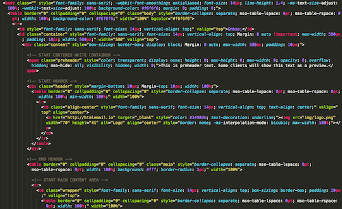
Writing inline as you go isn’t exactly a scalable or maintainable solution, so I tend not to recommend this, but I know that a lot of email developers prefer this in order to maintain 100% control. If you do write your CSS inline manually, then I recommend making use of snippets and/or a templating language with partials and helpers. This will save you from having to repeat yourself.
Web-based inliners include HTML Email’s Responsive CSS Inliner and Foundation for Email’s Responsive Email Inliner.
For a programmatic inliner, I recommend the Node.js module Juice. The Premailer gem and Roadie are good Ruby alternatives.
Buttons
Trying to achieve the perfect cross-client button is painful. As mentioned, you should be using tables and table cells for pretty much everything, including buttons.
My preference is to use the following solution. Here is how you might normally style a button for the web:
<a href="#" class="btn btn-primary">Click Here</a>
Instead, write it like this:
<table border="0" cellpadding="0" cellspacing="0" class="btn btn-primary">
  <tr>
    <td align="center">
      <table border="0" cellpadding="0" cellspacing="0">
        <tr>
          <td> <a href="" target="_blank">Take action now</a> </td>
        </tr>
      </table>
    </td>
  </tr>
</table>
Then, once your CSS is inlined, it will look like this:
<table border="0" cellpadding="0" cellspacing="0" class="btn btn-primary" style="border-collapse: separate; mso-table-lspace: 0pt; mso-table-rspace: 0pt; width: 100%; box-sizing: border-box; min-width: 100% !important;" width="100%">
  <tr>
    <td align="center" style="font-family: sans-serif; font-size: 14px; vertical-align: top; padding-bottom: 15px;" valign="top">
      <table border="0" cellpadding="0" cellspacing="0" style="border-collapse: separate; mso-table-lspace: 0pt; mso-table-rspace: 0pt; width: auto;">
        <tr>
          <td style="font-family: sans-serif; font-size: 14px; vertical-align: top; background-color: #3498db; border-radius: 5px; text-align: center;" valign="top" bgcolor="#3498db" align="center"> <a href="" style="display: inline-block; color: #ffffff; background-color: #3498db; border: solid 1px #3498db; border-radius: 5px; box-sizing: border-box; cursor: pointer; text-decoration: none; font-size: 14px; font-weight: bold; margin: 0; padding: 12px 25px; text-transform: capitalize; border-color: #3498db;">Take action now</a> </td>
        </tr>
      </table>
    </td>
  </tr>
</table>

What’s going on here? The first <td> is a wrapper to help us center the button. The second <td> is the size of the button. Some clients (such as Outlook) don’t recognize the padding on the <a> tag, so we fill in the background color of the table cell. The <a> tag then takes up space available in the second <td>, and the whole area becomes clickable. Check out the code and client tests on Litmus.
This is just one way to implement buttons in email. Admittedly, it doesn’t always look identical in every client, but the web is not always pixel-perfect either. I prefer this because it’s simpler and doesn’t involve using image assets or VML.
What’s VML? If you’ve spent any time developing emails, you’ve likely come across some reference to it. Vector Markup Language (VML) is supported by old versions of Outlook. According to Microsoft, as of Internet Explorer (IE) 10, VML is obsolete, which means that it is no longer supported in new versions of IE. However, as long as Outlook 2007, 2010 and 2013 are around, you will see it being used, typically for background images.
Typography
In general, sticking with standard system fonts is easiest. This includes Helvetica, Arial and so on. However, we can use web fonts, such as Google Fonts. Put them behind a WebKit conditional media query, so that Outlook doesn’t mess them up:
<style>
@import url(https://fonts.googleapis.com/css?family=Pacifico);

/* Type styles for all clients */
h1 {
 font-family: Helvetica, Arial, serif;
}

/* Type styles for WebKit clients */
@media screen and (-webkit-min-device-pixel-ratio:0) {
  h1 {
    font-family: Pacifico, Helvetica, Arial, serif !important;
  }
}
</style>
Remember to include a font family, font size and color for every <td>, or else you risk the client overwriting your carefully chosen type styles.
Conditionals
We can apply specific CSS styles and show or hide elements and content for different versions of Outlook.
The following targets all Microsoft Word-based versions of Outlook:
<!--[if mso]>
Only Microsoft Word-based versions of Outlook will see this.
<![endif]-->
This next snippet targets all IE-based versions of Outlook:
<!--[if (IE)]>
Only IE-based versions of Outlook will see this.
<![endif]-->
We can also target specific version numbers of Outlook:
<!--[if mso 12]>
Only Outlook 2007 will see this.
<![endif]-->
We can target WebKit-based clients with a media query:
.special-webkit-element {
  display: none;
}

@media screen and (-webkit-min-device-pixel-ratio:0) {
  .special-webkit-element {
    display: block !important;
  }
}
Images And Media
Images In Email
Some clients will show images by default. Some won’t. Keep this in mind when including images in your email content. This also affects tracking metrics, because images will typically be used to track opens.
- Outlook blocks image-rendering by default.
- Apple Mail doesn’t.
- Gmail doesn’t (anymore).
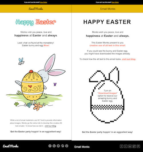
Remember to include good alt text for all of your images. The text could either tell the user what the image says or just describe what it is (for example, “company logo”). You can get creative with alt text for clients that turn off images, as Email Monks does:
Remember to include a basic reset for all images:
<img src="https://www.smashingmagazine.com/wp-content/uploads/2016/11/" alt="" width="" height="" border="0" style="border:0; outline:none; text-decoration:none; display:block;">
Animated GIFs are supported in most clients. Outlook versions 2007 to 2013 do not support animated GIFs, instead falling back to the first frame.
Remember to compress your media assets and upload them to a content delivery network (CDN), such as Amazon Web Services, Cloudinary or imgix. Most marketing ESPs will handle this for you.
Scalable vector graphics (SVGs) have a lot of advantages on the web. As you would expect, email support varies, and SVG requires a couple of fallback hacks or conditionals. I typically recommend staying away from SVG in email, but if you want to get serious about it, then CSS-Tricks has a guide on SVG support in email.
For Retina-ready images, supply a larger image (1.5× to 3×) and resize it. I’ll typically save a low-quality image that has 2× dimensions, which works well. (I’ve written more on this technique.)
Keep in mind that, for Outlook, you need to declare how wide an image should be with the width attribute. Otherwise, Outlook might render the actual width of the image and break your email.
Video In Email
Video is supported in iOS, Apple Mail and Outlook.com. You can use media queries to show or hide a video based on the client. Email on Acid has more on email video support.
For inspiration, check out Kevin Mandeville’s tutorial on coding HTML5 video as a background in an email — impressive stuff and worth a look.
Forms In Email
Support for form elements varies. Try to steer clear, and link to an external form if you need one. Campaign Monitor offers some advice on forms.
Obviously, it depends on your objectives. Staying away from forms is safer, but Rebelmail and Mixmax have done interesting things with forms for surveys and e-commerce, with good fallback support.
Gmail Actions
Google makes handy actions available for Gmail. You’ve probably seen them on GitHub for issues or on Amazon for orders.

Adding the code is straightforward. You have two options:
- JSON-LD
- microdata
Getting whitelisted involves a few more steps. You can test Gmail actions with an @gmail.com address.
Preheader Text
Something important but often forgotten is preheader text. Some clients show preview text next to or under the subject line. These clients include iOS, Apple Mail, Outlook 2013, Gmail and AOL.
Clients will grab the first bit of text they find in your email’s body and display it here. Make the most of this and add a hidden element to your body’s content that appears first. This text should provide an extra incentive for the user to open your email. Hide the text like so:
<span style="color: transparent; display: none !important; height: 0; max-height: 0; max-width: 0; opacity: 0; overflow: hidden; mso-hide: all; visibility: hidden; width: 0;">Preheader text goes here</span>
Use Austin Woodall’s subject and preheader tool to preview your email subjects and preheaders.
Testing Email
I don’t think I’ve ever sent an email successfully the first time. There is always something to fix, always a typo, always a rendering issue in Outlook, always something I’ve forgotten to add.
You can test your email in a few ways:
- Send an email to yourself and check it on a desktop client (Outlook), a web client (Gmail) and a mobile client (iOS Mail).
- Automate tests using Litmus or Email on Acid.
- Proofread the content, and check the layout renders.
- A/B test various types of content, lengths of content and subject lines.
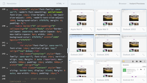
How do you send HTML emails to yourself? Good question. It’s harder than you think. Postdrop lets you do this quite easily, and Thunderbird lets you compose with its HTML editor.
MIME Multi-Part
A plain-text email is just that, plain text. An HTML email is just HTML. Most emails you send or receive are MIME (Multipurpose Internet Mail Extensions) multi-part emails (not to be confused with MIME type). This standard combines both plain text and HTML, leaving it up to the recipient to decide which to render.
When you send an email, whether transactional or bulk, include both the HTML and plain-text versions. Even if, in your mind, every one uses a client that renders HTML, still send plain text.
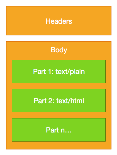
Also, note that some clients render plain-text email as HTML; for example, Gmail will add some default styles and turn URLs into links. Most ESPs will construct the MIME for you, so you don’t really need to worry about it. Some will also create a plain-text version, based on your HTML.
Pro tip: In Gmail, select “Show original” from the dropdown menu to see the full MIME.
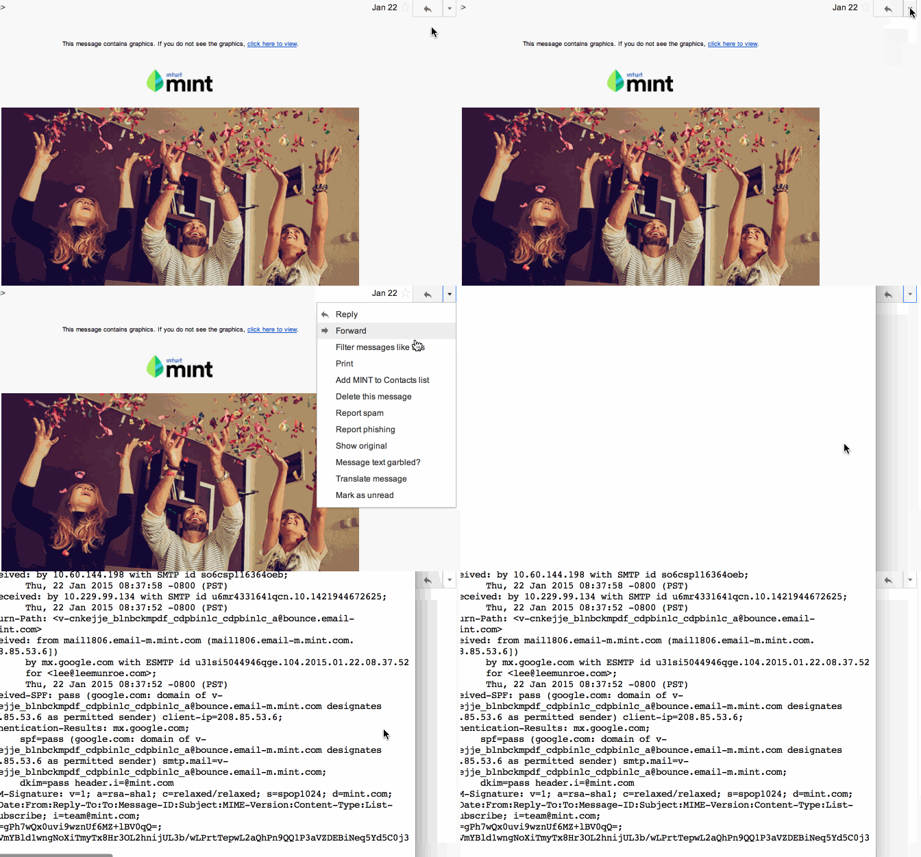
A new MIME part has surfaced: text/watch-html. This content will only be displayed in Apple Watch (and any other clients that support this MIME type going forward).
Accessibility
On the web, if you follow standards and best practices and use semantic markup and valid HTML syntax, you tend to get basic accessibility out of the box. Unfortunately, with email, due to our excessive hacks and the poor support for HTML, accessibility is often ignored.
I’ve seen little discussion on email accessibility, but one that stands out is Mark Robbins’ post on accessibility. He recommends the following:
- Add
role="presentation"to each table so that it’s clear the table is being used for layout. - Provide
alttext with meaningful descriptions. - If you don’t need or want
alttext, then usealt=""so that screen readers know it is meant to be blank. - Use semantic HTML tags, such as
<p>and<h1>, where applicable. - Use the
roleattribute for elements such as headers and footers (for example,role="header").
Responsive Email Design
- Email opens on mobile are at 50% and rising. The exact metric depends on which report you check and which audience you cater to, but I think we can all agree that this is important.
- Email Client Market Share, as of August 2016, puts iPhone at 33%, iPad at 11% and Android at 10% (that’s over 50%!).
- MailChimp found that unique clicks among mobile users for responsive campaigns rose from 2.7 to 3.1% — a nearly 15% increase.
“Responsive web design” is a phrase coined by Ethan Marcotte back in 2010:
"By marrying fluid, grid-based layouts and CSS3 media queries, we can create one design, that, well, responds to the shape of the display rendering it."
In the email world, we can still make use of fluid design, grid-based layouts and media queries. The problem is that not all clients support these. Therefore, we need some hacks along the way.
Until recently, Gmail did not support media queries. Thankfully, as of September 2016, most of its clients do. However, several mobile clients still do not, including Yahoo, Windows Phone 8 and Gmail for Android.
Several techniques are used in the email world to get around a lack of support for media queries. Some of the terms you’ll hear are “fluid,” “adaptive,” “responsive,” “hybrid” and “spongy.”
Fluid
The easiest solution is to stick to a single column and make your emails fluid. This means that as the viewport shrinks, your content area shrinks.
.container {
  max-width: 600px;
  width: 100%;
}
Responsive And Adaptive
Using media queries and breakpoints, we can provide alternate styles for different-sized viewports. We can also hide or show elements.
This starts to get complicated once you introduce a grid and columns. You could have a two-column layout and then switch to a stacked one-column layout below a certain viewport width.
But, as we’ve seen, media queries aren’t supported everywhere, so this isn’t always reliable.
Hybrid And Spongy
This technique uses a bit of fluid, a bit of responsive and a couple of hacks for Outlook support. We also get to ensure that the columns stack without media queries.
This technique is outlined by ActionRocket, and Nicole Merlin has written a great step-by-step tutorial on it.
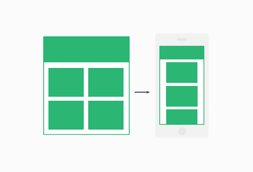
Here is a snippet of the code I use to build most of my emails.
<!--[if (gte mso 9)|(IE)]>

<table align="left" border="0" cellspacing="0" cellpadding="0" width="100%">
  <tr>
    <td align="left" valign="top" width="50%">
    <![endif]-->
      <div class="span-3" style="display: inline-block; Margin-bottom: 40px; vertical-align: top; width: 100%; max-width: 278px;">...</div>
    <!--[if (gte mso 9)|(IE)]>
    </td>
    <td align="left" valign="top" width="50%">
    <![endif]-->
      <div class="span-3" style="display: inline-block; Margin-bottom: 40px; vertical-align: top; width: 100%; max-width: 278px;">...</div>
    <!--[if (gte mso 9)|(IE)]>
    </td>
  </tr>
</table>

<![endif]-->
@media only screen and (max-width: 620px) {
  .span-3 {
    max-width: none !important;
    width: 100% !important;
  }
  .span-3 > table {
    max-width: 100% !important;
    width: 100% !important;
  }
}
Take a look at Fabio Carneiro’s spongy open-source repository on GitHub and read Stig’s take on coding mobile-first emails. Rémi Parmentier also has another responsive technique that doesn’t need media queries and makes use of calc() function.
Responsive Images
As mentioned, use Retina images at 1.5× to 3×, and set image dimensions inline.
<img src="https://www.smashingmagazine.com/wp-content/uploads/2016/11/logo.png" height="100" width="600" alt="Company Logo" style="max-width: 100%;">
We can’t rely on max-width: 100%; because some clients ignore it. You will also want to embed the following CSS:
@media only screen and (max-width: 620px) {
  img {
    height: auto !important;
    max-width: 100% !important;
    width: auto !important;
  }
}
Automating Your Workflow
The process of putting together a bulletproof email is complex. There are a lot of steps, and there is room for a lot of things to go wrong.
Like any monotonous task with steps, I recommend automating what you can, so that you build the system once and make it easier for future work.
Brian Graves has a good post on making your email modular. Just as you have a design system and pattern library for a website or application, you should do so for email, making components reusable and emails consistent across your product and company.
Kevin Mandeville recommends using snippets of reusable code to optimize your workflow, so that you’re not constantly rewriting code. In his post, he outlines how to use snippets in modern editors (such as Atom and Sublime), and he points to the community-contributed library of snippets hosted by Litmus.
For my own part, I’ve put together and open-sourced a Grunt workflow for automating email builds. It runs various tasks, such as inlining CSS, compressing images, uploading images to a CDN, sending a preview, and testing with Litmus, all with one command. If you’re new to Grunt, I’ve written a detailed tutorial on how it works. Foundation for Email also has some great automation tools for developers, as does Mailjet with its responsive email framework MJML.
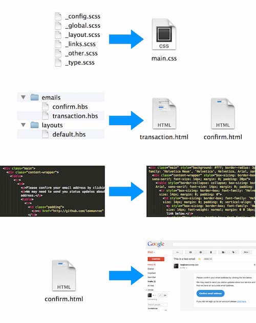
Looking To The Future
Google just recently rolled out support for media queries; Microsoft has just partnered with Litmus to “make email better”; and AOL’s Alto now supports responsive email. So, the future is looking much brighter.
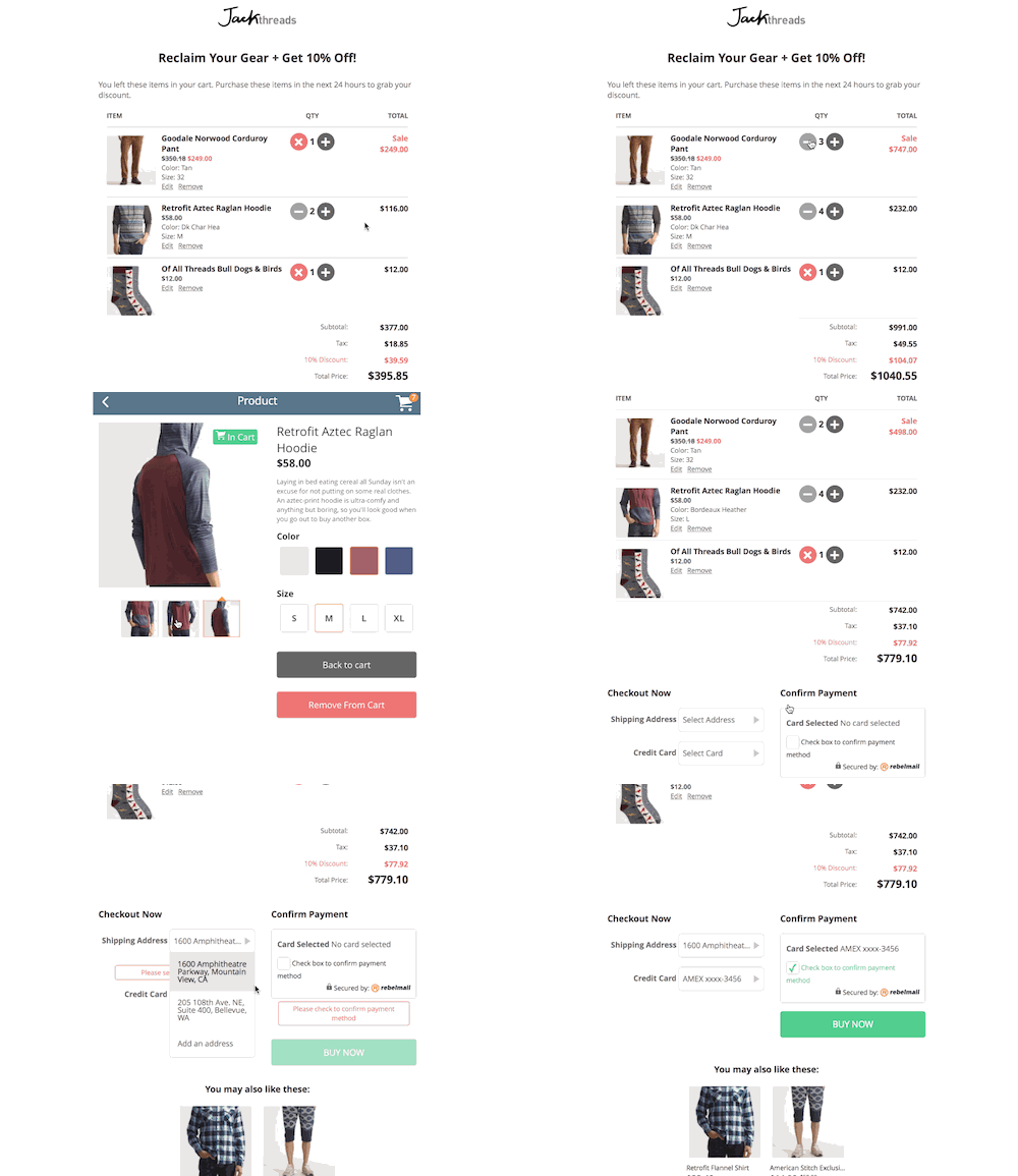
More and more companies and developers are experimenting with what’s possible with email technology: CSS animation, audio, shopping carts in email. Expect more instances of interactive and kinetic email emerge in 2017.
Conclusion
Email design and development is a beast. It is a lot like building a web page… 10 years ago. Email client vendors haven’t been as progressive as web browser vendors in adopting new standards, and we users and companies don’t adopt new email clients like we do with web browsers. Add to that the rise of mobile, and we’re left in this state of having to support a convoluted mix of clients and versions.
My introduction here is a high-level overview; you could dive deep into every one of these points. Hopefully, it’s given you good insight into the world of building and sending email, and the code snippets and resources have added some hours back to your life.
Recommended Resources
- Really Simple Responsive HTML Email Template, Lee Munroe (my free open-source email template)
- Professional Email Design, Jason Rodriguez
- “Unmasking HTML Emails” (course), Dan Denney, Code School
- “The Best Email Designs in the Universe (That Came Into My Inbox),” Really Good Emails
- “Dynamic and Interactive (Kinetic) Email Examples and Techniques,” Justin Khoo
Blogs To Follow
Further Reading
- Design And Build Email Newsletters Without Losing Your Mind
- 18 Email Templates For Web Designers And Developers
- Making Responsive HTML Email Coding Easy With MJML
- How To Improve Your Email Workflow With Modular Design


 Try if for free!
 JavaScript Form Builder — Create JSON-driven forms without coding.
 Register for free today!
 Get a Free Trial

