Building For Mobile: RWD, PWA, AMP Or Instant Articles?
As we look deep into 2017, one of the questions on every web developer’s mind ought to be, “What trend will define the web in 2017?” Just three years ago, we were talking about the “Year of Responsive Web Design”, and we’ve all seen how the stakes were raised when Google announced Mobilegeddon (21 April 2015) and started to boost the rankings of mobile-friendly websites in mobile search results.
Today, as our findings indicate, responsive web design is the norm, with 7 out of 10 mobile-optimized websites being responsive, up from 5 last year, which begs the questions: What’s next? Where is it all heading? We solved the screen-size issue and had a great run for a few years — now what?
Not long ago, having an application in an app store was considered the holy grail. To this day, a lot of companies still religiously follow the path to app store publishing. “Publish it and they will come,” “The web is dead,” they used to say!
According to recent studies, just 26.4% of users who visit a page in an app store today will install an app. The other 73.6% are lost to the developer and don’t even try the app. Among the ones who install it, an average of 99% are lost in the following 90 days. As a consequence, the same people who declared the web dead years ago are now shouting, “Apps are dying” and “Wait! The web isn’t dead after all!”
This made us ask, Where is the mobile web heading? To answer this question, my colleagues and I at Appticles have conducted a colossal study on 10,000 publishing and e-commerce websites from Alexa, scouting for signs of resurrection, and instead finding serious traces of diversification. Our findings are detailed below.
Responsive Websites Are Getting Taller And Fatter
According to Google’s guidelines, we have taken into consideration three types of configurations for building mobile websites:
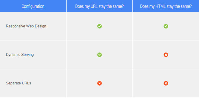
- Responsive web design. Serve the same HTML code on the same URL, regardless of the user’s device. The display would render differently based on the screen’s size.
- Dynamic serving (also known as adaptive) Use the same URL regardless of device, but generate HTML code dynamically by detecting the browser’s user agent.
- Separate URLs (also known as mobile-friendly) Serve different code to each device class, with a separate web address for the mobile version.
To detect the mobile strategy used by different websites, we crawled them using an iPhone user agent and using the headless browser PhantomJS to detect JavaScript redirects.
On top of that, we also identified website owners who have implemented a smart app banner meta tag in the head of their home page, to market their iOS app:
<meta name="apple-itunes-app" content="app-id=myAppStoreID">To analyze performance, we used Google’s PageSpeed Insights API, which takes into consideration not only the size of a web page, but also compression, server response time, browser caching and landing page redirects, among other factors.
All of the code used for this study is available for comments and contributions on GitHub.
Here’s what we identified:
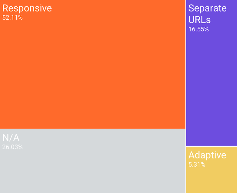
- Responsive is the preferred technique for mobile optimization, used by 52% of all websites in the study.
- The mobile-friendly approach (i.e. using a separate domain) has declined to 16% usage, from 26% in 2016.
- Adaptive methods have stagnated at around 5%.
- Still, 3 out of 10 websites are not mobile-optimized.
Comparing publishers (blogs, newspapers, magazines) with e-commerce websites resulted in some interesting variations in mobile web optimization:
- 60% of websites in the blogging vertical use responsive design, whereas only 47% of websites in the newspaper vertical have adopted responsive techniques.
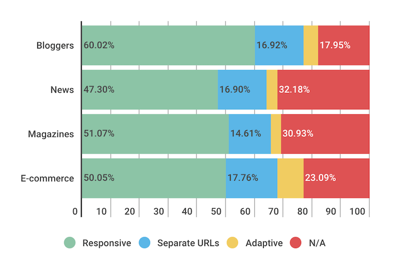
(View large version) - The adaptive strategy has found the most followers in the e-commerce industry, with 9% of shopping websites being adaptive (compared to less than 5% among blogs, news websites and magazines).
- The average mobile page height has increased to almost 10 screens (up from 7 last year). Blogs have more than 90% of their home page content (dispersed over 13 screens) below the fold, while e-commerce websites do a better job of greeting the user with their most relevant content, with just 3 screens to encapsulate it.
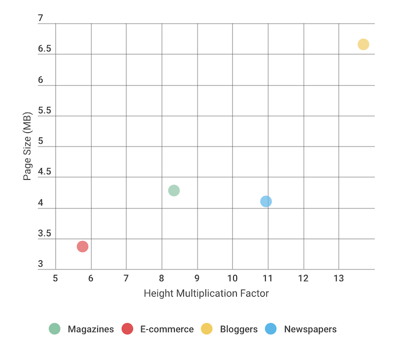
(View large version) - As a consequence of tall mobile websites, blogs also have a weight issue, with the average mobile page weighing in at almost 7 MB. On the other hand, e-commerce websites have it under control at 3 MB.
- If you think that just by designing responsively you'll score better in Google's PageSpeed Insights, think again! Take blogs: Although they're designing responsively, they score an average of 40% in PageSpeed Insights, whereas e-commerce websites have an average of over 50%.
What these numbers show us is that mobile screen-size optimization is at its peak: New websites are responsive by default, and the majority of those that haven't had a mobile presence have already made the switch. In other words, I think that the mobile web is nearing its potential in addressing the screen-size issue: 7 out of 10 websites have already implemented some form of mobile-friendly optimization, and this hasn't grown significantly since last year.
In addition, the trends seem to indicate that mobile websites are getting taller and fatter by the year. Is this what we envisioned for the mobile web when we started designing responsively? Because approximately 30% of the web is powered by WordPress, I can’t help but suspect that the way WordPress themes are built is shaping the mobile web.
Smart App Banners Drive App Downloads But Not Retention
The banner that floats on your page when your website is viewed on a mobile device is an incredibly valuable tool for converting web traffic into app users. According to a study by Branch.io, click-to-install rates are slightly higher on Android than on iOS (13.5% versus 11.9%), but the average is about 13%.

We discovered that 6.5% of news websites use smart app banners to notify mobile users of their apps, whereas all of the other verticals we analyzed (blogging, magazines and e-commerce) scored below 2% usage.
What’s interesting is that the majority of news websites that have been identified as using smart app banners are responsive. In other words, the strategy at play for news publishers (mostly newspapers) is to be where their readers are: both in app stores and on the mobile web.
The thinking behind maintaining both mobile channels and splitting the mobile audience is that (1) a responsive website would be the first contact that occasional mobile users have with the publisher, and (2) a dedicated application would make a lot of sense for loyal mobile users.
To put it differently, consider investing in an application for an app store when the mobile retention rate for your website is already high. Let’s look at some additional numbers that support this rule.
According to SimilarWeb’s “State of Mobile Web US 2015” report, roughly 56% of consumer traffic to the leading US websites is now from mobile devices. Given an average click-to-install rate of 13%, an online publisher using a smart app banner and inviting mobile users to install their application would succeed at converting a little over 7% of mobile traffic into app installations.
Data shows that losing 80% of mobile app users is the norm. Mobile intelligence startup Quettra put together some exclusive data and graphs on retention rates, based on anonymized data points from over 125 million mobile phones, and showed that the average app loses 77% of its daily active users within the first 3 days of installation. Within 30 days, it has lost 90% of daily active users. Within 90 days, over 95%.
Based on our findings, it would appear that online publishers and stores have devised a strategy whereby their responsive websites act mostly as acquisition channels for their mobile apps. However, it’s easy to see how publishers end up investing tens of thousands of dollars, spending months developing and promoting their applications, converting a staggering 1.5% of their existing web traffic into mobile app users after 90 days.
The question then becomes, How do we engage mobile users and get them to use the app on a daily basis?
Accelerated Mobile Pages Outperform Facebook Instant Articles
Last year saw both Google and Facebook launch competing initiatives: Accelerated Mobile Pages (AMPs) and Instant Articles, respectively.
According to Google’s own reviews, some 700,000 domains have published AMP pages, with real benefits to publishers, ranging from a higher return rate among users of mobile search to increased monthly unique visitors and impressions. This is indeed impressive, but we wanted to go beyond the vanity metrics and see the real percentage of websites that have implemented AMP.
After careful examination, we identified that approximately 10% of websites support AMP (close to the 11.6% identified in research conducted by Searchmetrics), whereas only a little over 2% have integrated Facebook’s Instant Articles. And though WordPress comes with plugins for both AMP and Instant Articles, it seems that in terms of active installations, AMP is leading 100,000 to 10,000.
We wanted to see how industry experts weigh the pros and cons of AMP and Instant Articles. The general consensus is summarized below:
| Pros | Cons | |
|---|---|---|
| Google's AMP | Mobile content loads incredibly fast. | Loading time is not a direct ranking factor for organic search results. There is some conjecture that faster-loading websites mean better click-through rates and longer time spent on website. |
| Mobile content for news websites appears in a special carousel at the top of organic search results. | Using AMP involves some work. If your organization is strapped for resources, know that this is more than just flipping a switch. | |
| One of the big ranking factors for mobile organic search results is mobile-friendliness, and you can't get friendlier than AMP. | Not all content works with AMP. For instance, if you have piles of video content, AMP will make the text load faster, but the video will still take a bit to load. | |
| The click-through rate when a page is featured in Google's "Top Stories" carousel is higher. | Back in February 2016, Google pundit Jeff Jarvis stated, "The carousel layout may not always be there, so if that's your big selling point, don't get comfortable." | |
| It's only for news and blog articles (at least for the moment). | ||
| Facebook's Instant Articles | The format enables publishers and content providers to instantly reach a built-in audience of millions when they include their content. | The fact that it does not link over to a publisher's website is a downside, but the benefits of adding content in a format like this are greater if you plan that content appropriately. |
| It creates an additional revenue stream. | Overall revenue per user from Instant Articles might be lower than what publishers would make from ads that appear directly on their website. | |
| Small publishers and content creators get a piece of the substantial time spent in apps, which would otherwise not be available. | Integrating Instant Articles involves some work, especially to customize the look and feel of articles. |
Because implementing AMP can bring more traffic from organic search results, it’s no wonder that it has become more popular than Instant Articles. Granted, the latter offers access to an additional revenue stream, but that comes at a price — giving up control over users, and giving up on converting them into subscribers.
Early Adopters Of Progressive Web Apps Report Exciting Metrics
A lot of attention has been paid to progressive web apps lately, and we wouldn’t miss the chance to analyze how many of the URLs we scrutinized support any of the main characteristics of progressive web apps:
- HTTPS,
- Offline mode,
- Web push notifications,
- “Add to home screen” prompts.
Progressive web apps are fully supported by Chrome and Opera. Firefox supports nearly all of their features. Microsoft Edge is working on them. The Samsung Internet browser has been making great strides this past year and has shown a strong commitment to progressive web apps, as demonstrated by Samsung’s leadership in some of the key standardization work. Apple has not yet fully jumped on the mobile web train: Service workers, a key component for supporting offline mode, are “under consideration”; push notifications and installation to the home screen through a browser-provided prompt are available in some form in Safari, but they are not implemented in standard ways.
This didn’t stop the Washington Post — an early adopter of progressive web app technology — from making it the default mobile experience for its web users after seeing “about 5x engagement — page views per visit, number of stories read” on its public-facing beta.
Before getting to the actual results, a few words on the methodology of obtaining the data. We used the Lighthouse extension for Chrome. It is an open-source, automated tool for improving the quality of web apps, and it can run as a Chrome extension or from the command line. We used the command line to conduct our study, and we interpreted the JSON that was returned.
First, we found that, of the 10,000 URLs we analyzed (blogs, newspapers, magazines and e-commerce websites), only about 12% support SSL. Not surprisingly, the e-commerce segment scored the highest (25%) in SSL usage. While this number is still low, it will drastically increase throughout 2017, because Google now favors HTTPS page indexing, and Chrome will soon mark unsecure pages containing password and credit-card input fields as being “Not secure” in the URL bar.

Next, we looked at usage of the manifest.json file, which is considered a good indication that users will be prompted to add the website to their home screen via an app install banner (even though they can manually add it to their home screen from the browser’s menu).
As it turns out, 3% of e-commerce websites make use of the manifest file for web applications, with blogs and digital newspapers barely reaching 0.5%. HTTP/2 is also being used mostly on e-commerce websites, although the overall percentage is as low as 4%.
In identifying usage of service workers and push notifications, fewer than 1% show up in the statistics.
"Service workers enable a Progressive Web App to load instantly, regardless of the network state. A service worker is like a client-side proxy, written in JavaScript and puts developers in control of the cache and how to respond to resource requests. By pre-caching key resources, one can eliminate the dependence on the network, ensuring an instant and reliable experience for your users."
The fact that service workers are so poorly implemented on websites nowadays directly affects mobile user engagement, which is a shame because web push notifications reportedly increase engagement by four times, and those users spend twice as long on the websites. As an example, after rolling out its progressive web app, AliExpress improved its conversions for new users across all browsers by 104% and increased its iOS conversions by 82%, despite iOS not supporting the full feature set of progressive web apps.
Progressive web apps are barely seeing the light of day. However, with all of the benefits they promise, one can only hope that we’ll see more of them built in 2017.
Final Notes
The main conclusion is that we’re starting to see a more diversified mobile strategy from the publishing industry. No longer are they settling for an application in an app store or a responsive website as the only means of addressing their mobile users. Instead, they’re going for both apps and responsive websites and, in addition, are beginning to throw Facebook’s Instant Articles and Google’s Accelerated Mobile Pages into the mix.
Publishers are not leaving anything to chance. With four mobile channels in which to view for user attention, the quest will be not to find the best-performing channel, but rather to find a sustainable model, with all of the channels complementing each other, together increasing reach, engagement and, ultimately, revenue.
As for a “progressive” future of the mobile web, the early signs are encouraging. Progressive web apps boost mobile engagement for publishers and conversions for e-commerce websites. That’s why we, web developers and designers, should consider implementing them. The app store model is beginning to fail publishers, and businesses are realizing that it’s no longer the holy grail they’ve been hoping for. We’re beginning to understand that we need to give the mobile web a chance to evolve, to progress beyond questions of format (i.e. fitting the screen) into the full-blown applications that until recently were only available natively via app stores.
Further Reading
- Google’s Mobilegeddon Aftermath
- Progressive Web AMPs
- A Beginner’s Guide To Progressive Web Apps
- Why Perceived Performance Matters


 Register Free Now

 Celebrating 10 million developers
 Try ProtoPie AI free →


