Inspiring Illustrations With Plenty Of Bright Colors And Cool Patterns
It’s almost time to leave winter behind us here in the Northern Hemisphere. Most of the time, the weather can’t quite make up its mind, and so the days pass by with half of the sky sunny while the other half gray. Nature usually tends to have a strong impact on my mood, and so these days I feel like I’m literally in a gray zone — between winter and spring.
I’m not sure about you, but with springtime lurking around the corner, my need for extra inspiration is even bigger. So, I hope that this month’s set will give you just that spark you need to cheer you up and boost your creativity.
SZ Magazin
The style and the little details such as the bottom band on his pants, his shirts and his handbag are the cherries on the cake.

The Classics Are Coming!
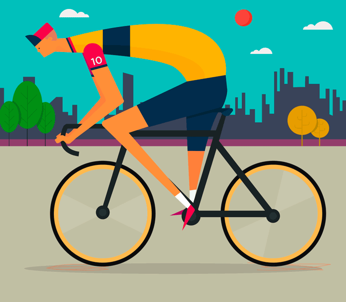
Exciting times ahead for cycling fans. This nice design however was to celebrate Chris Froome winning Le Tour for the third time. Love how the body is arched over.
The Best Things In Life Are Free
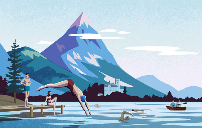
Illustration for Lonely Planet’s book. A illustration style reminiscent of mid-century hand-painted billboards.
Mountains - Steve Wolf
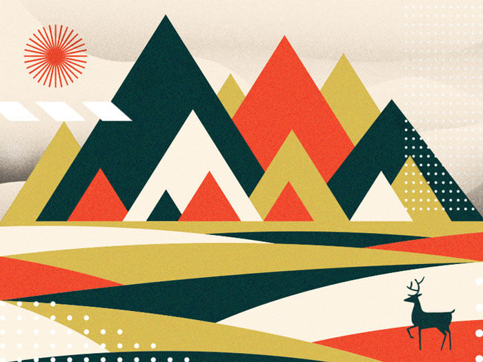
Probably not your average color combo but it sure works.
Control 4
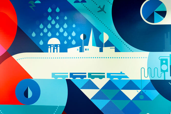
Part of a murals series for a company that is leading the way in smart home technology. They turned out wonderful. See them all.
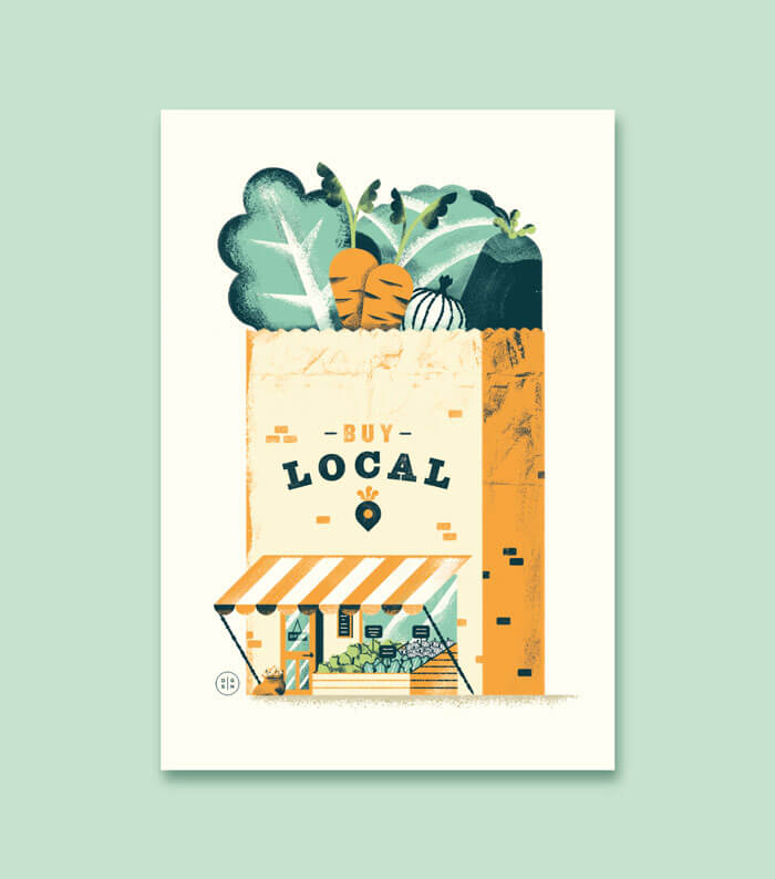
Buy Local
Cool idea to visualize a campaign to ‘buy local’ this way. Creative! Also digging those grunge effects.
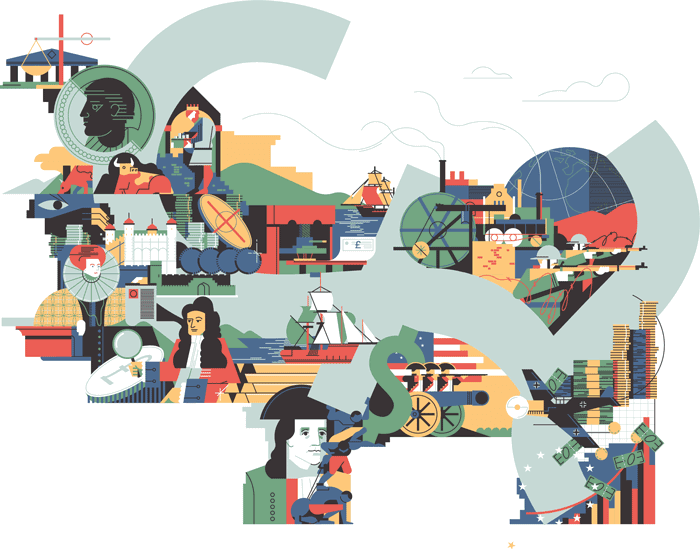
Elementi – The Rise And Fall Of British Pound
An editorial illustration that accompanies an article about the history of the British Pound.
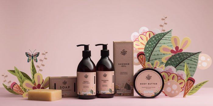
The Handmade Soap Company
I have seen this technique of combining real products with simple shape paper-cut elements a couple of times already and the result is really beautiful.
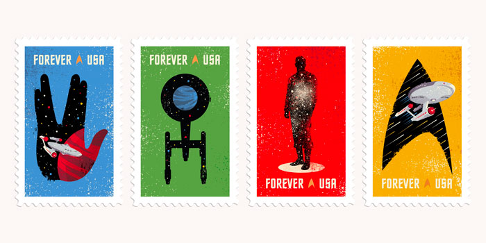
Star Trek Postage Stamps
In order to celebrate the 50th Anniversary of the original Star Trek television series on CBS, the Philadelphian design studio ‘The Heads Of State’ created these stamps. Large view here.
Umami
An illustration for Umami, a chain of restaurants based in Zagreb, Croatia. It was made as a part of a poster series which takes on curiosity and exploration of different tastes and flavors.
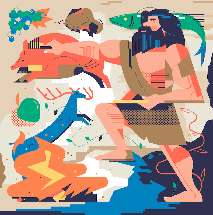
Tsawwassen Mills
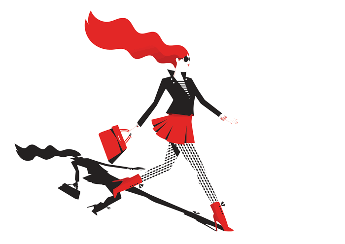
The hair, the skirt but especially her stockings are what makes this illustration what it is. Such class! Look at that shadow. <3
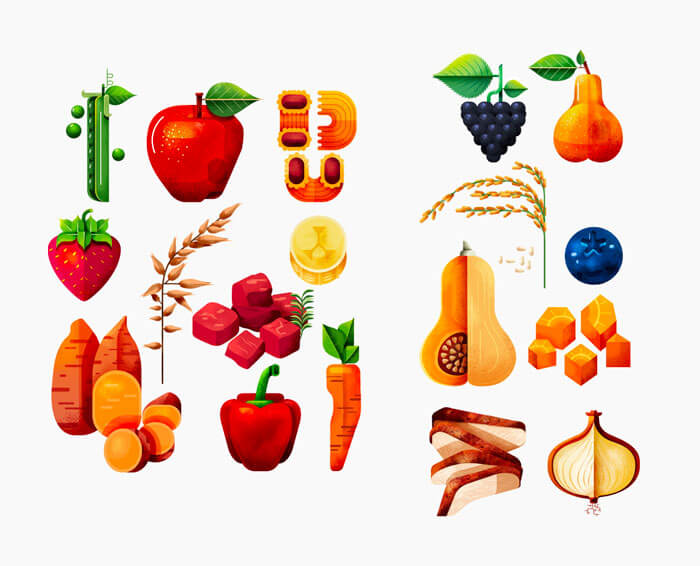
Nestlé
These vegetables are beautiful. They have a certain edge. They are items for new packaging.
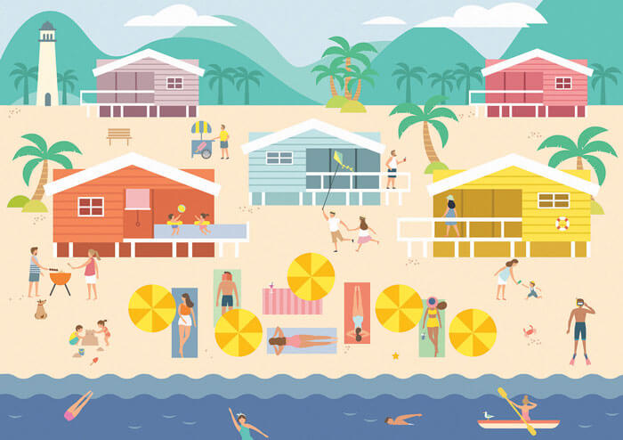
Create Your Own Summer Adventure
Wonderful color choices. Love this special 2D approach where things are viewed from 2 different angles, top and front. Makes you hardly wait for summer to arrive!
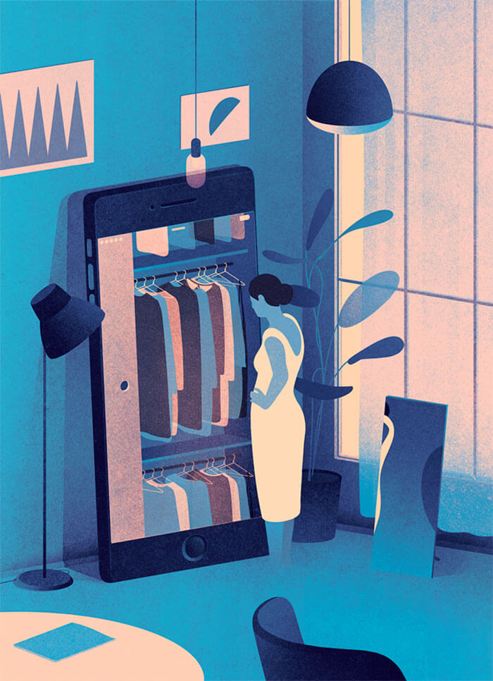
Smart Wardrobe
Artwork that shows us a beautiful way of how the illustrator's imagination thinks and works.
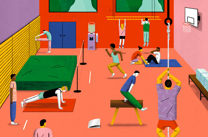
Raúl Soria - Sport
I need my weekly dose to keep me sane. Interesting bright colors and cool pattern details.
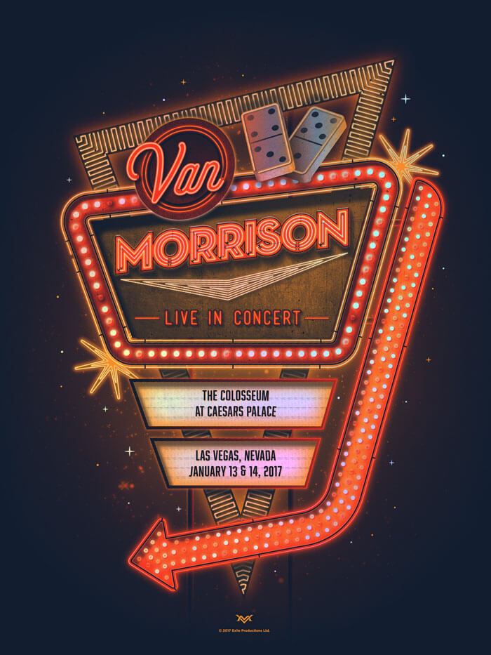
Van Morrison Las Vegas Poster
Talk about making the most of a limited set of colors. The neon lightbulbs are so well done. Incredible piece of work. Be sure to watch the process video!
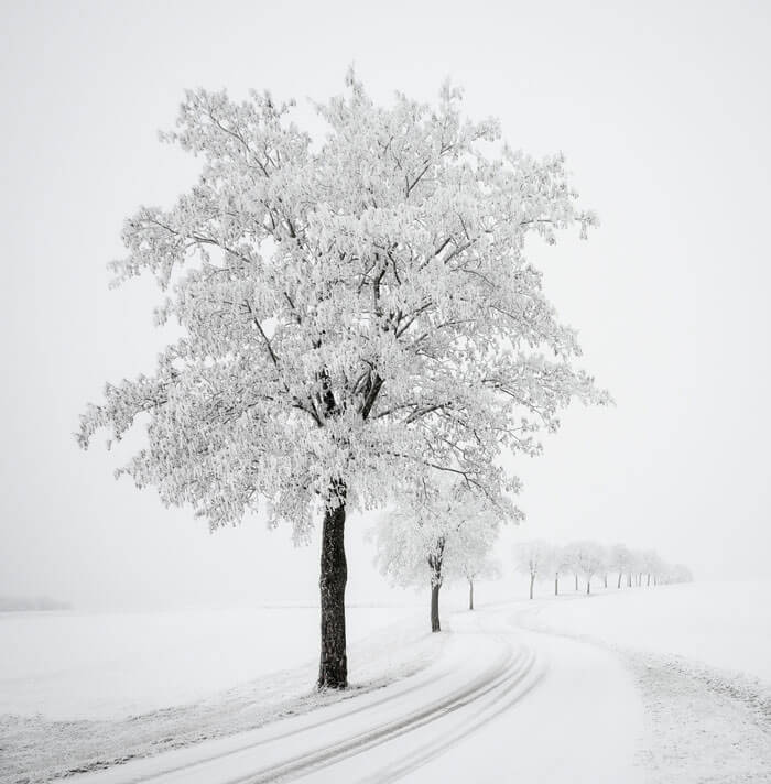
The Minimalism Of Winter
Great textures and atmosphere. Just by looking at it you can almost feel the cold.
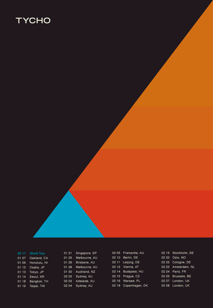
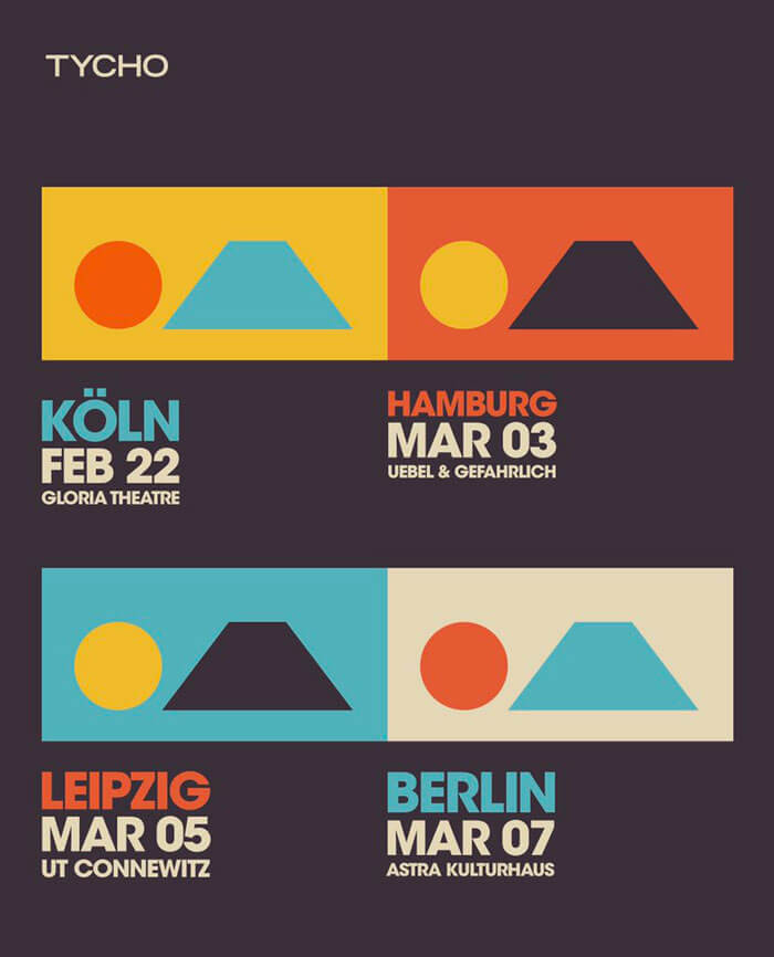
Tycho World Tour
I have been enjoying Tycho's latest album and wanted to go see Scott live in Brussels but it's sold out already. This is the world tour poster.
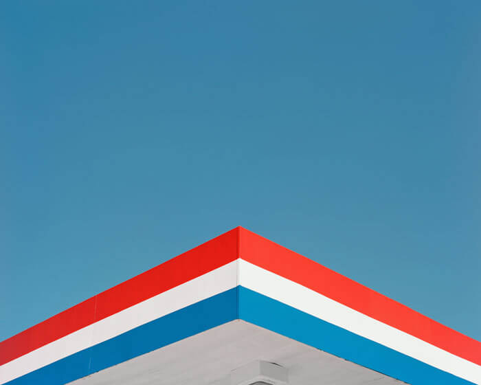
Q & A
Sometimes you don't need much to get an interesting result. Look up! In his series, Alexander Missen captured many fundamental symbols of America.
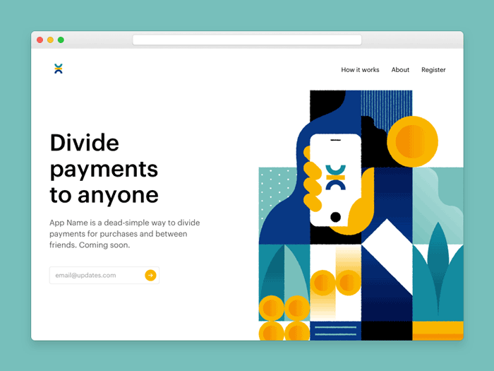
Marketing Page
Love the illustration style. Inspiring color choices, too.
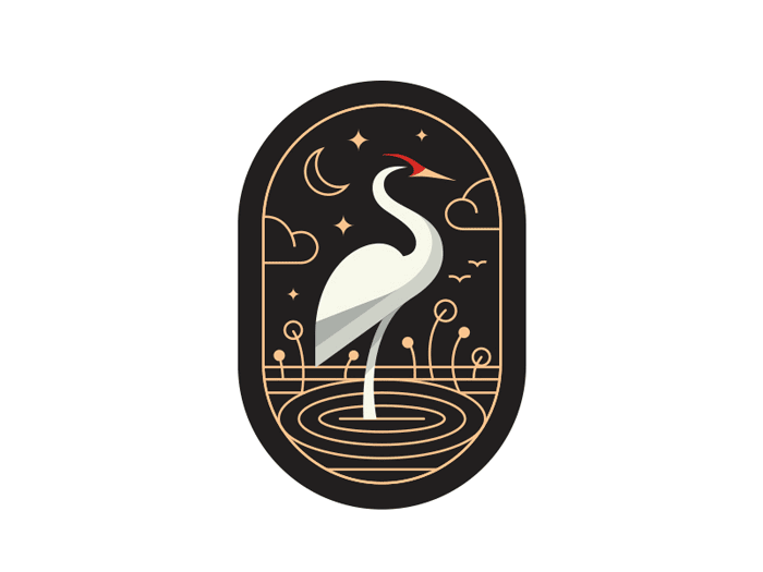
Crane Capsul
So simple, yet so amazing! Love deconstructing this. So much to learn.
Forms | Shapes
Great personal project by Peter Tarka. Such great details and attention to colors and backdrops in this series. There are a few more to check out.
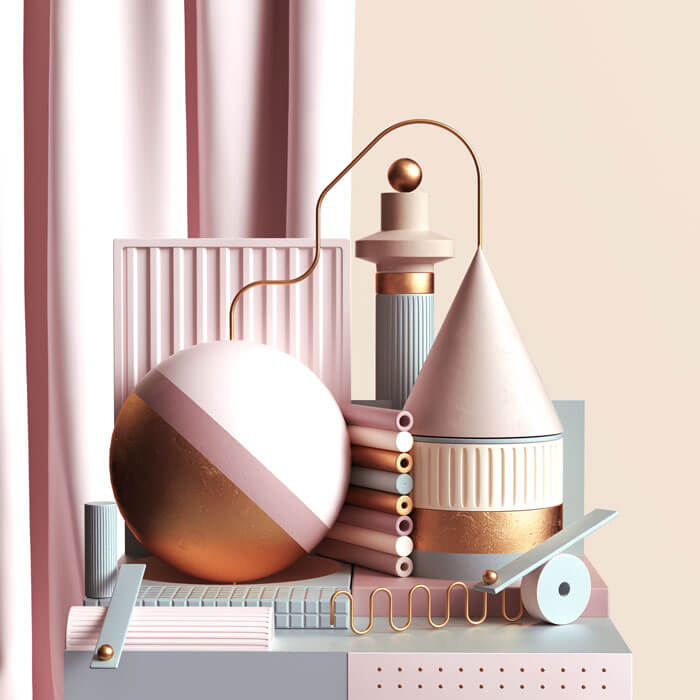
Making House
Very nice how the objects are placed so you are really looking inside.
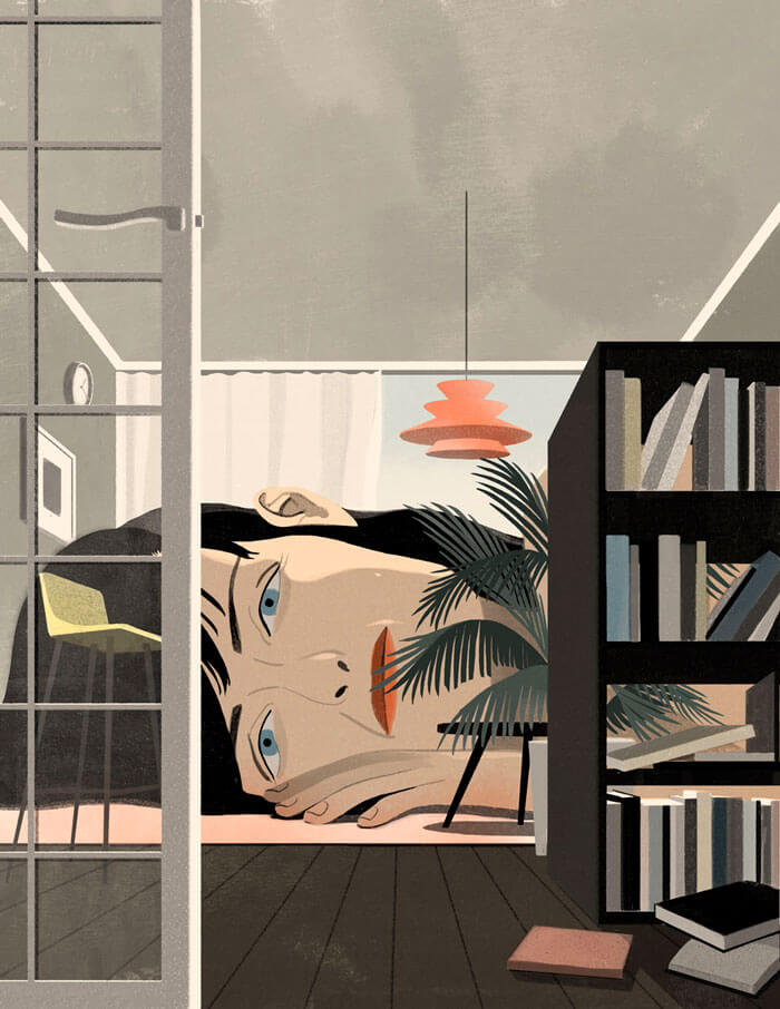
Connecting The Dots
Pictures like this make you forget the cold. Some nice light and colors shot in Ringerike, Norway.
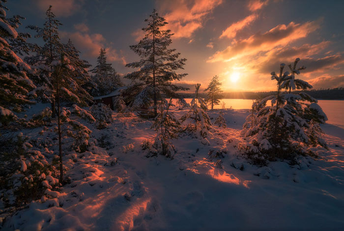
Bicycle Retro Cruise
A poster for a bicycle Retro Cruise in Kyiv. Original style! Patterns on the socks and jacket are simply fabulous.
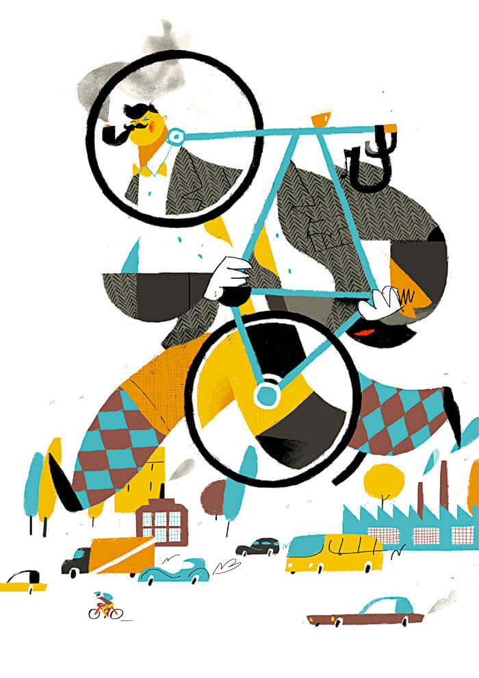
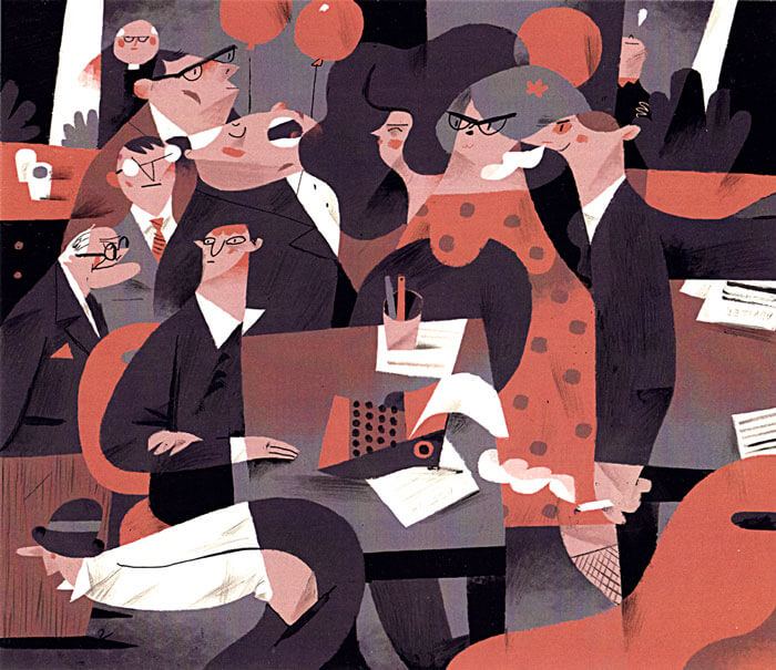
An Autumn Office Depression
Quite busy, I admit, but I admire how everything flows into each other. Well done, especially since it's not that easy using only a limited amount of colors.
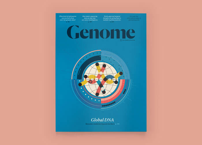
Genome Magazine
This cover for Genome is just absolutely brilliant! So fitting, and just look at those colors. So yummy!
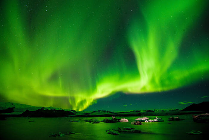
Green
I've heard so many good things about Iceland and by looking at this picture they all must be true.
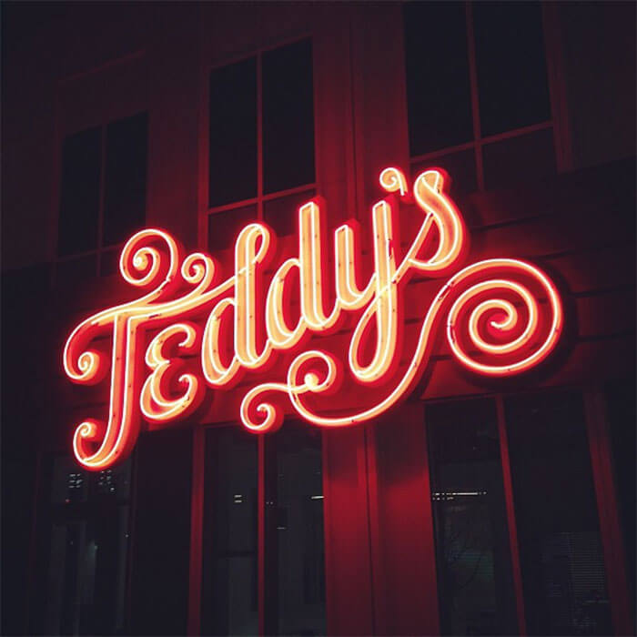
Teddy’s
Big neon sign for Teddy's Nacho Royale, a burrito joint on the campus of a large social media company. Had no clue that they could create such attractive neon signs.
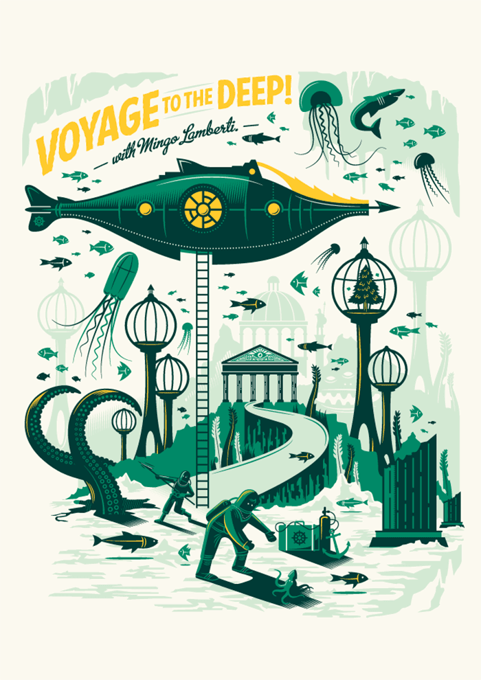
Voyage To The Deep
The vintage atmosphere is lovely. Makes me think of a Jules Verne novel.
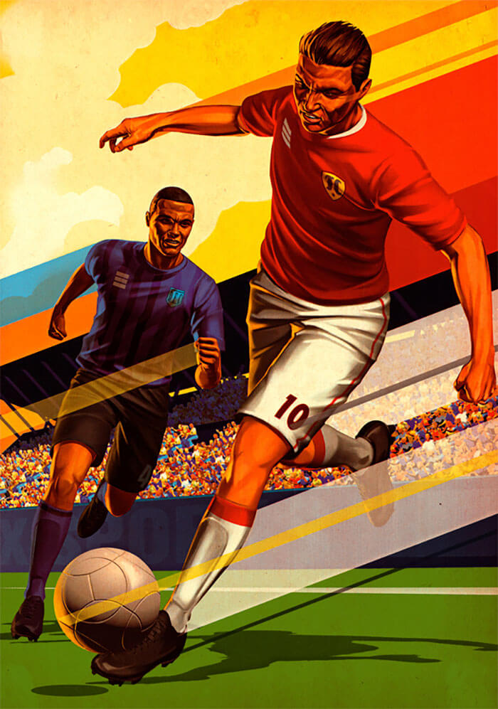
Crowd Goes Wild
The artist's style is obviously inspired by 1940s comic book art in this piece, as well as the Russian avant-garde movement and printed materials from the 1950s/60s.
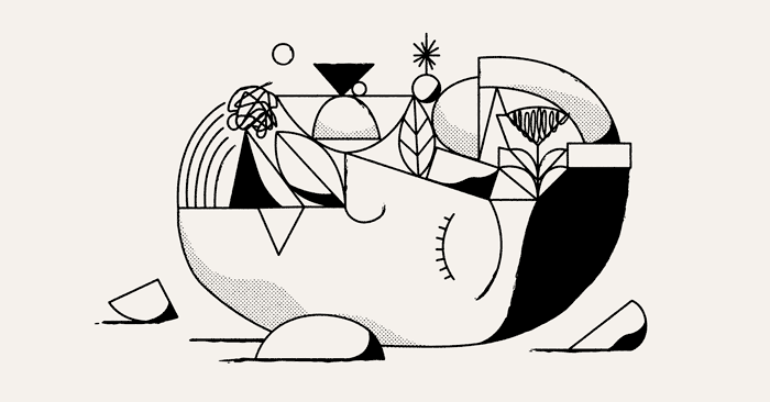
It’s Nice That
The work of Christopher DeLorenzo is mostly black and white, and consists of lines with only a few filled areas.
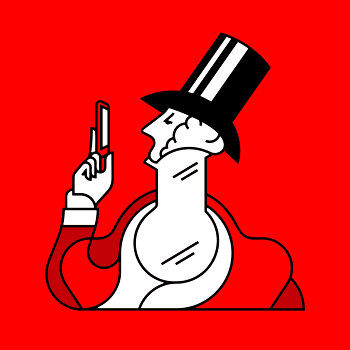
Eustace Tilley
An illustration of Eustace Tilley, the iconic dandy of New York.
Retail News
Lovely colors and admiring the simplicity of the characters.
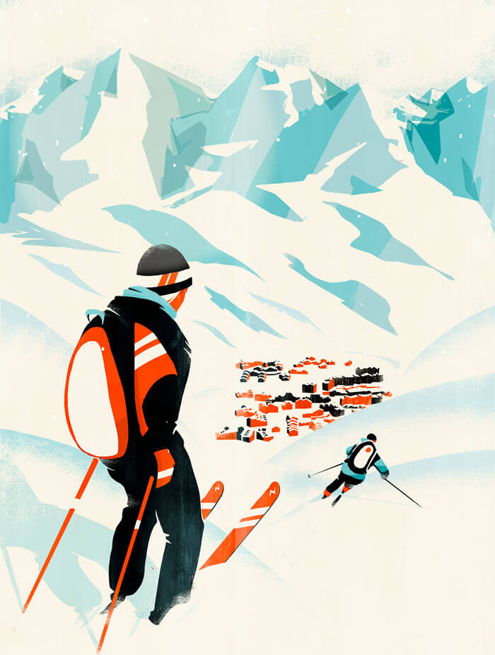
Val Thorens - EasyJet
Cover illustration of ski resort Val Thorens for the EasyJet magazine Traveller.
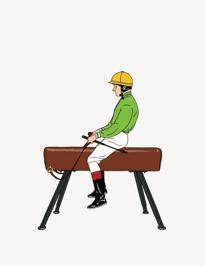
Jockey
The witty style of Jean-Michel Tixier is one of my top favorites. It was inspired by traditional French cartoons.
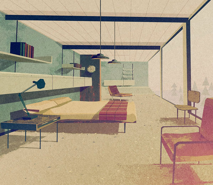
Room With A View
The geometric style of Matthew Lyons. I first discovered his work way back in 2010 thanks to Scott Hansen.
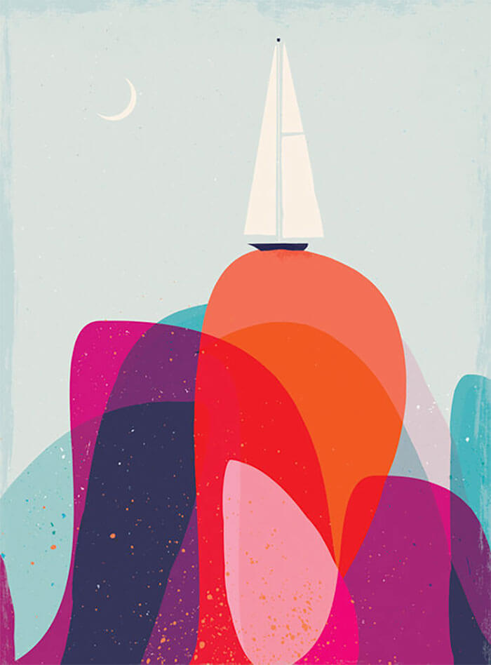
Boat - Waves
A nice combination of colors, don't you think?
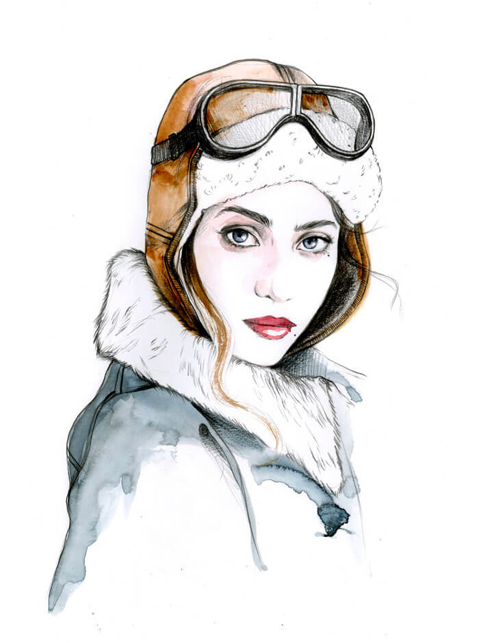
Great Escape
I always admired illustrators that are working for the fashion industry. The faces are so good! Those are difficult to get right.
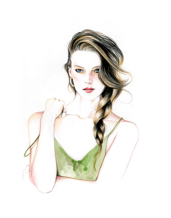
Great Escape II
A second one from Caroline. Just look at that hair! Those are some mad skills! The blush, the eyes, the lips...
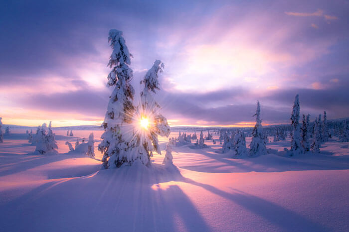
Sun Starburst
Stunning capture! It's like a dream.
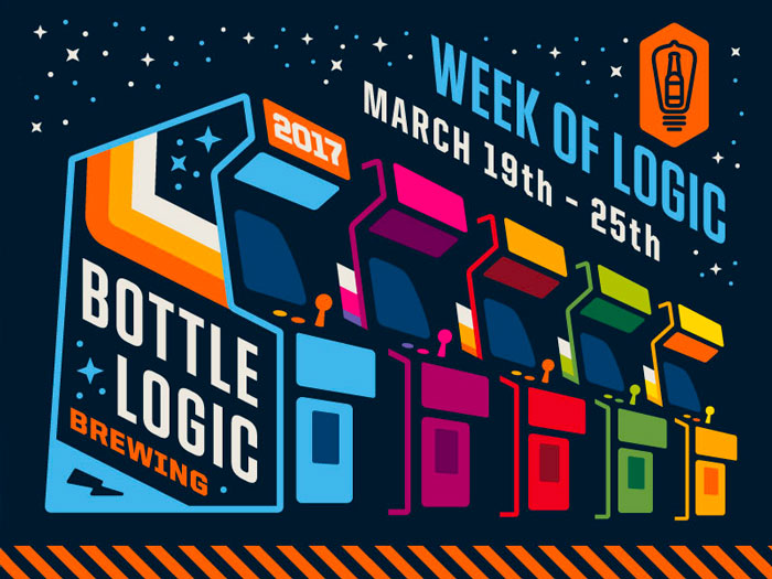
Bottle Logic
Memories from my childhood. The arcade park! Tasteful colors.
Germany Shows
Wonderful to see the design system evolve with each location ISO50 visits while he's on tour.
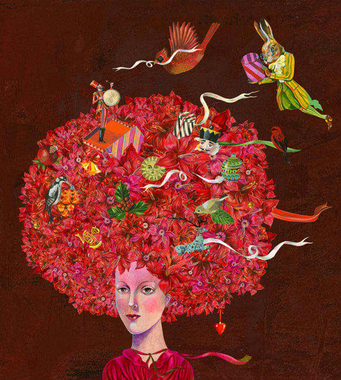
“BREUNINGER” Christmas
Such a special style. Love how the 'hair' is done with all the hidden elements.
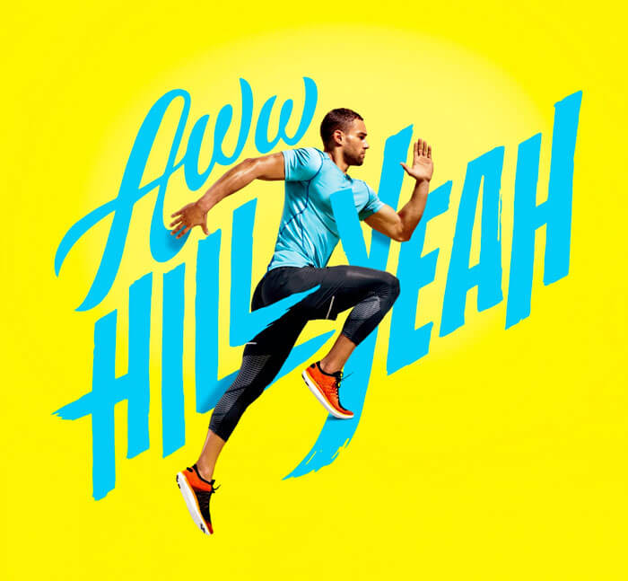
Don’t Sweat It
Lovely example that shows what can be done when photographs are combined with custom lettering.
TGV Magazine
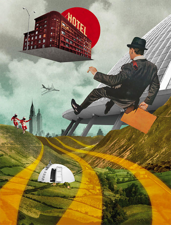
Julien Pacaud is a French illustrator with a very particular style that you could describe as retro-futuristic.
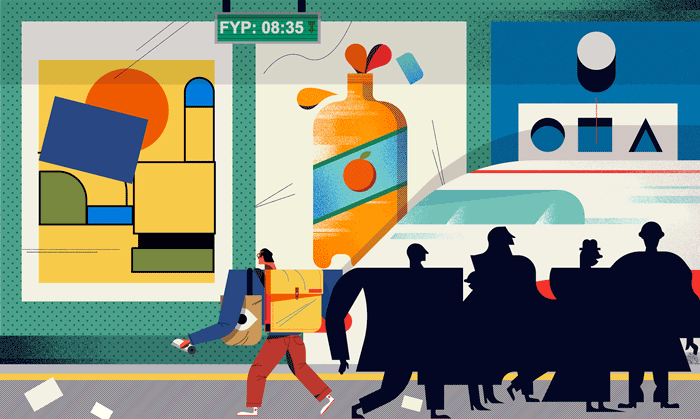
The Guardian University Guide
The shape of the figures are super cute.
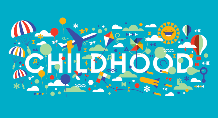
Childhood
Happy from just looking at this. A lot items but still all very balanced. Illustration for Swissmiss's Creative Morning's website.
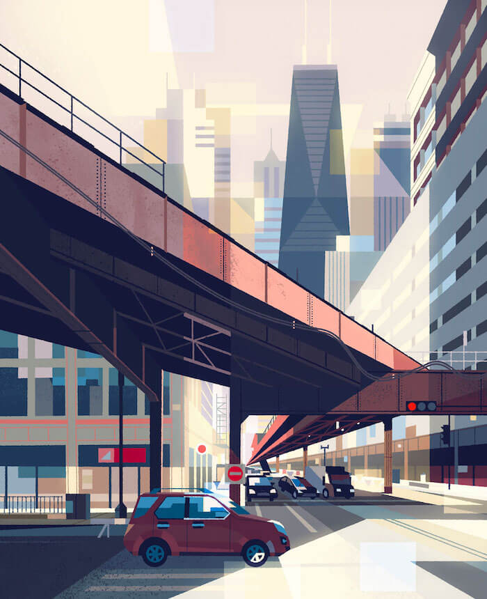
City Bridge
It's quite impressive when you realize that most of this is made out of rectangles.
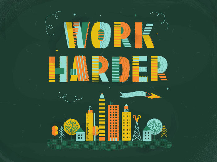
Work Harder
A bit of motivation can't hurt. Love the type used here and how the buildings were made.
Further Reading
- Spotify Playlists To Fuel Your Coding And Design Sessions
- Delightful Bits Of Vintage Graphic Design Inspiration
- Things You Didn’t Know Your Doodles Could Accomplish
- How To Enhance Your Creativity: Taming The Wild Mind
- How To Get Started With Sketchnotes


 Register Free Now

 SurveyJS: White-Label Survey Solution for Your JS App
 Celebrating 10 million developers


