Vibrant Illustrations To Let Your Mind Wander
On days when things don’t seem to go as you’d like them to and inspiration is at its lowest, it’s good to take a short break and go outside to try and empty your mind. That always seems to be the best remedy for me, especially whenever I jump on my bike and go for a short ride.
Now the time has come to enjoy these moments even more as the spring season finally starts to show up in nature. We’re starting to see green leaves on the trees again, and every morning I wake up to the sounds of the birds chirping. I really enjoy these small joys of spring — who doesn’t? Hopefully this new batch of illustrations will feed your creativity tank with extra vitamins to make sure those inspiration levels are up and running at its best.
Reflect Magazine
Great color combination. Impressive how all elements have been refined to their best simplicity.

Quentin Monge
The fantasy of French illustrator Quentin Monge. Such a lovely style!

“Lire” Cover
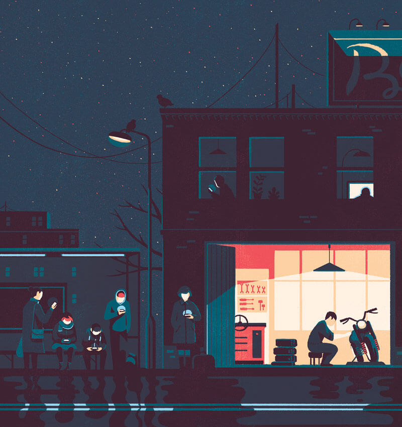
Admiring how the illustrator played with light sources and shadows. The faces immediately catch your attention, don’t they?
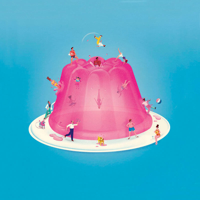
If I Was Small
This one made me laugh. What if I was small? Those characters are just sublime! So very well done.
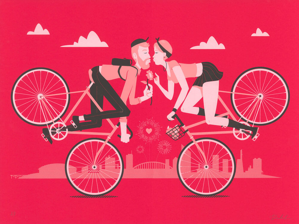
Endo-Kiss
Riding your bike together is exactly like you see here.
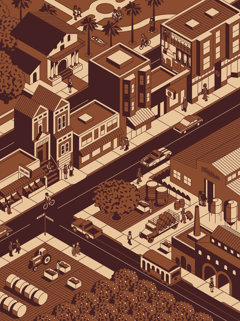
Almanac Beer Co’s Mural
Part of a bigger illustration of a mural. You can view a process video of how this was applied on the wall here.
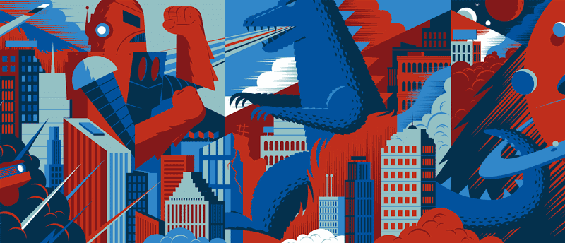
Cinerama
Part of a bumper animation that plays before each film at Cinerama. Here you see it animated. It’s really cool — I’m sure you’ll agree.
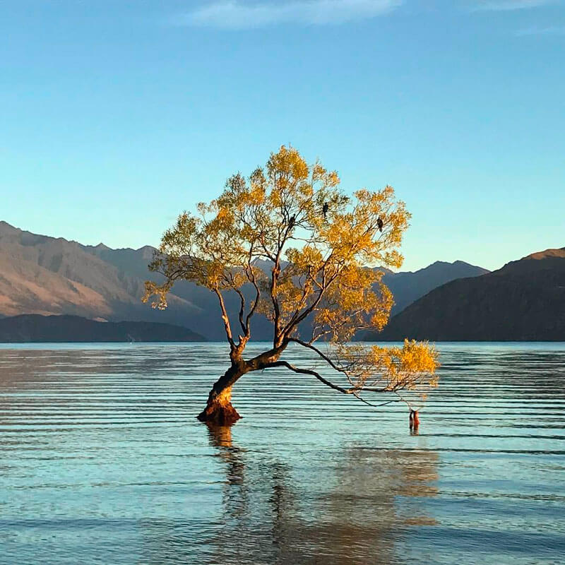
Lone Tree Of Lake Wanaka
Sometimes you don’t need much to get a great picture.
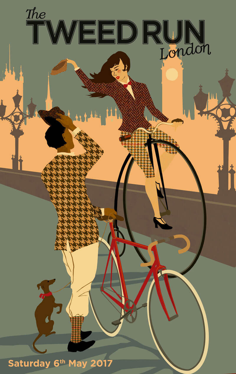
Tweed Run London 2017
This vintage bicycle event has always a nice poster.
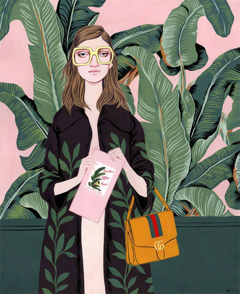
Beverly Hills Hotel: Gucci
Nice style! The eyes with glasses are such stunners.
Mystery Project 82.1
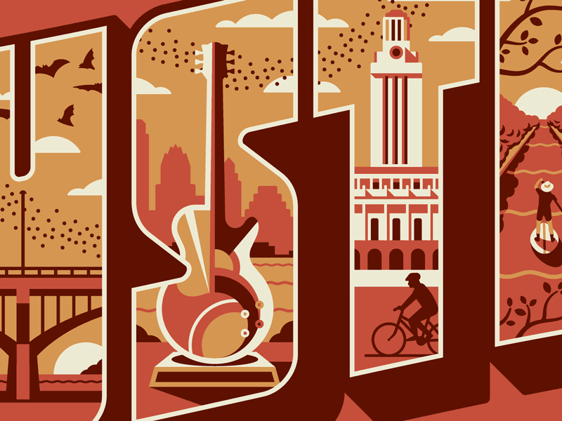
A sneak peek of a new print the crew at DKNG is working on. Looks like Austin to me. Love the effect of the letters used as masks. How the few colors are applied is just sublime!
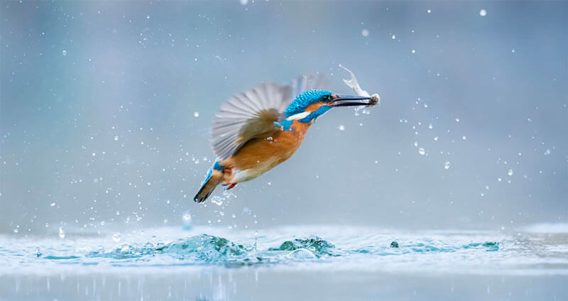
Kingfisher
One entry of ten finalists that capture the theme of “through young eyes” in this young photographers’ competition that aims to engage youth around the world in wildlife conservation. Check out the other nine submissions, too.
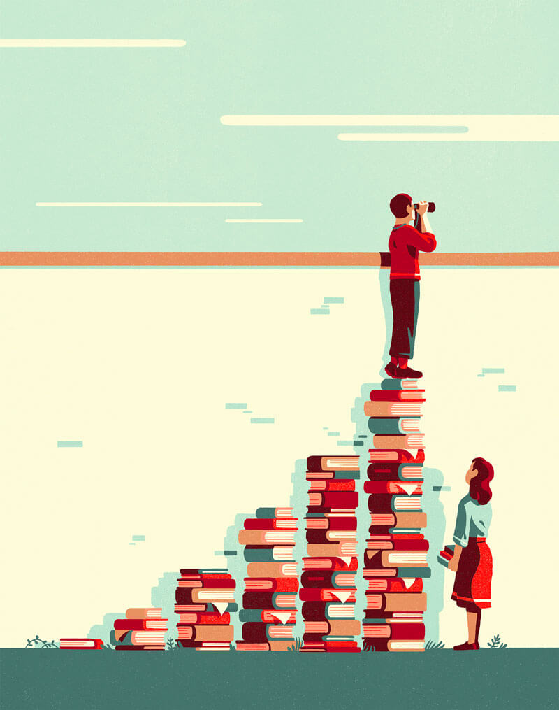
For “Le Monde”
Divine color palette! Superb highlights and shadows.
Café Insoluble
My kind of color palette and great textures.

Lápiz Grafito
The colors are so harmonious and pleasing, and the drawing is just magnificent.

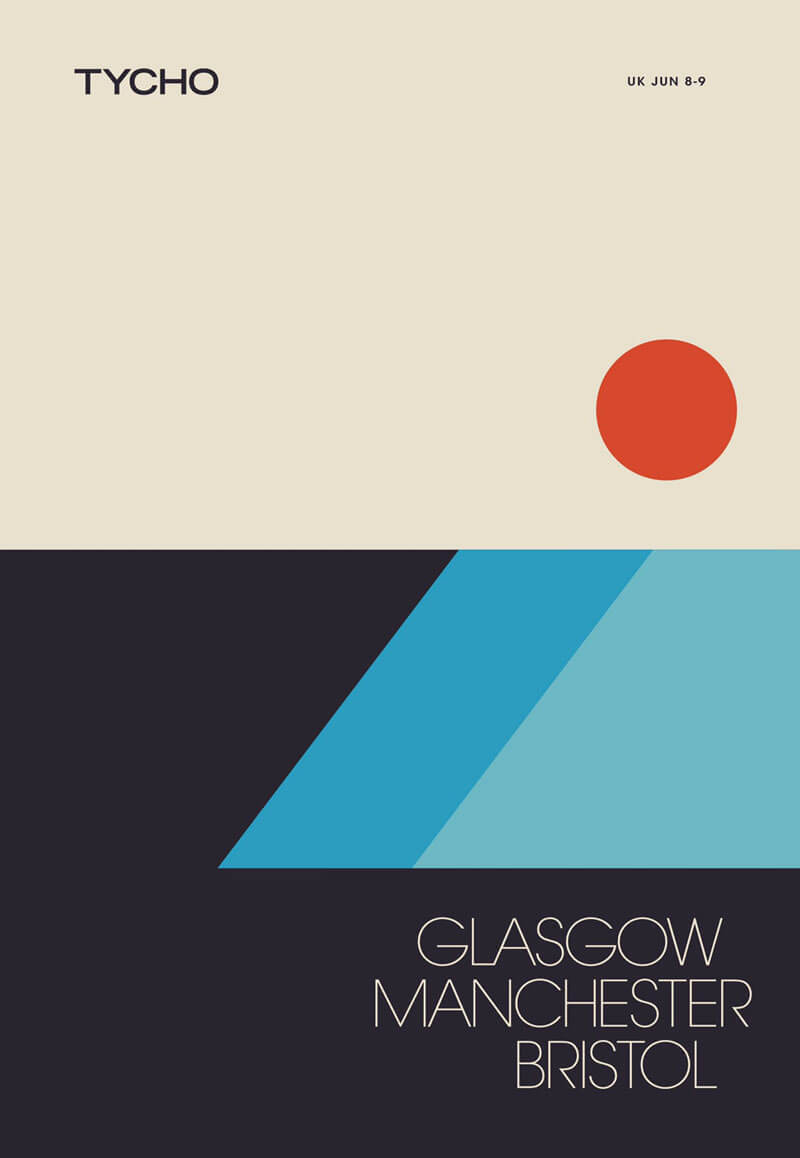
Tycho: UK Tour
Another addition to the European Tour Tycho is currently working on. This is quite lovely and makes me think back to the cassette era.
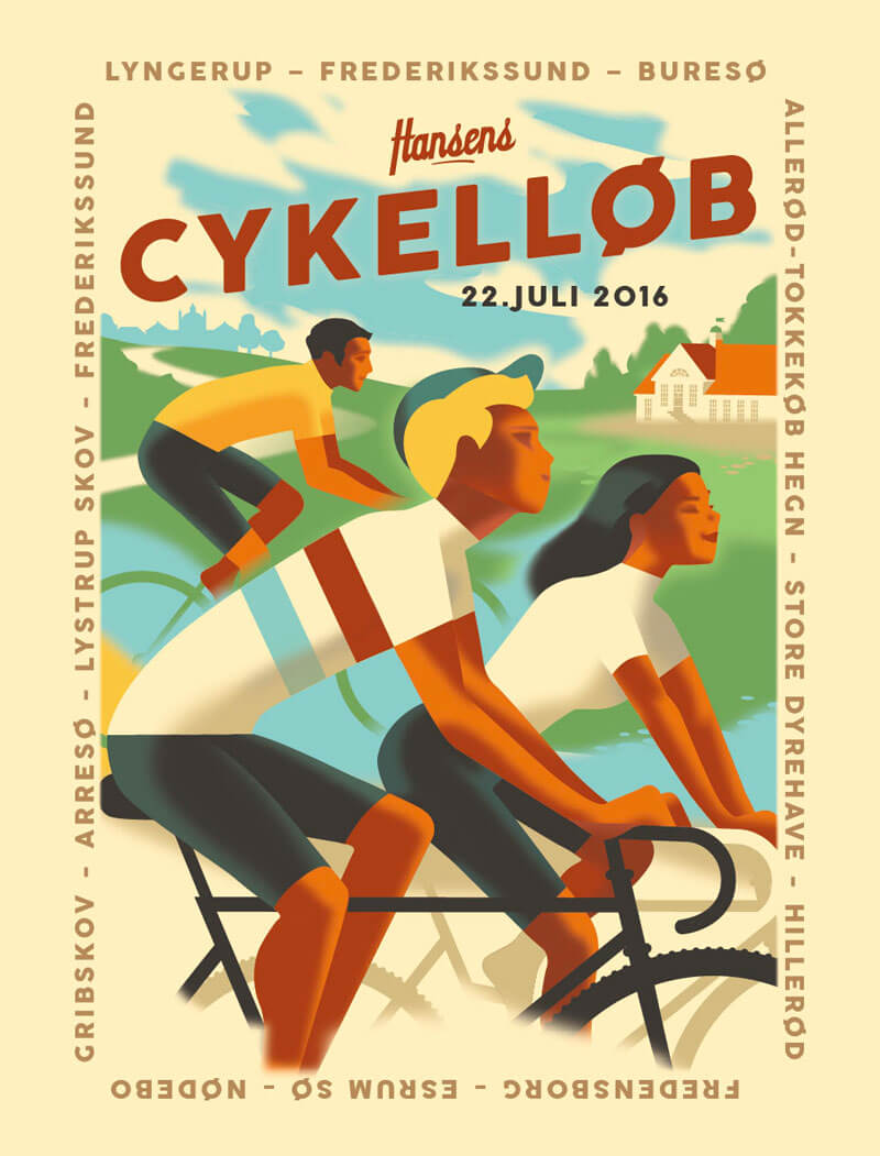
Hansen’s Bicycle Race
Always a fan of something with a bike in it. When it’s created by the talented Madsberg it gets even better. I love the elegance in his work.
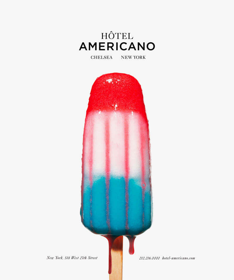
Hôtel Americano
Part of a series that was created as an irreverent ad campaign inspired by the hotel’s close relationship with the contemporary art world.
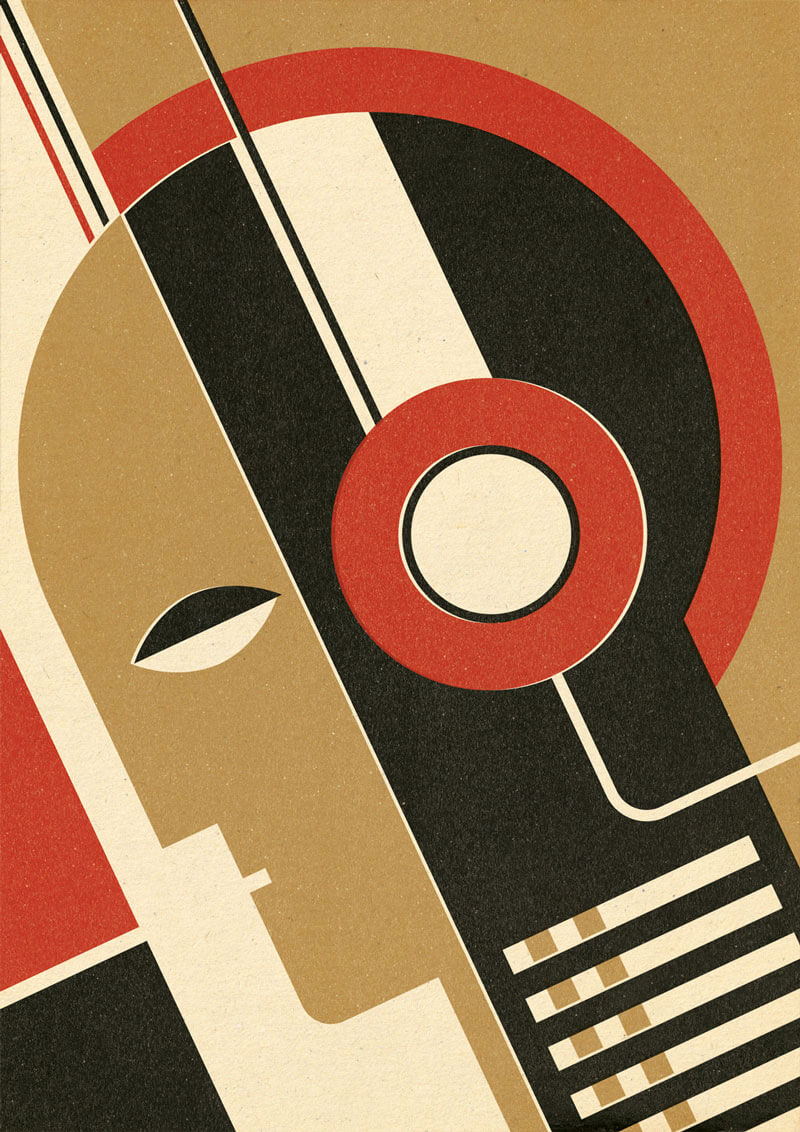
Bauhaus Music
Project on the theme of music, while playing with a Bauhaus-inspired style.
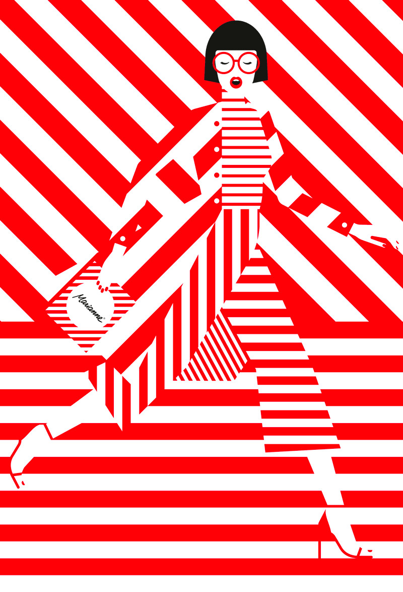
Fazer Marianne
Interesting play with lines. Not an easy one to pull off.
Feel The Night
With the atmosphere in this illustration you just feel the night. Come in and enjoy the ride.
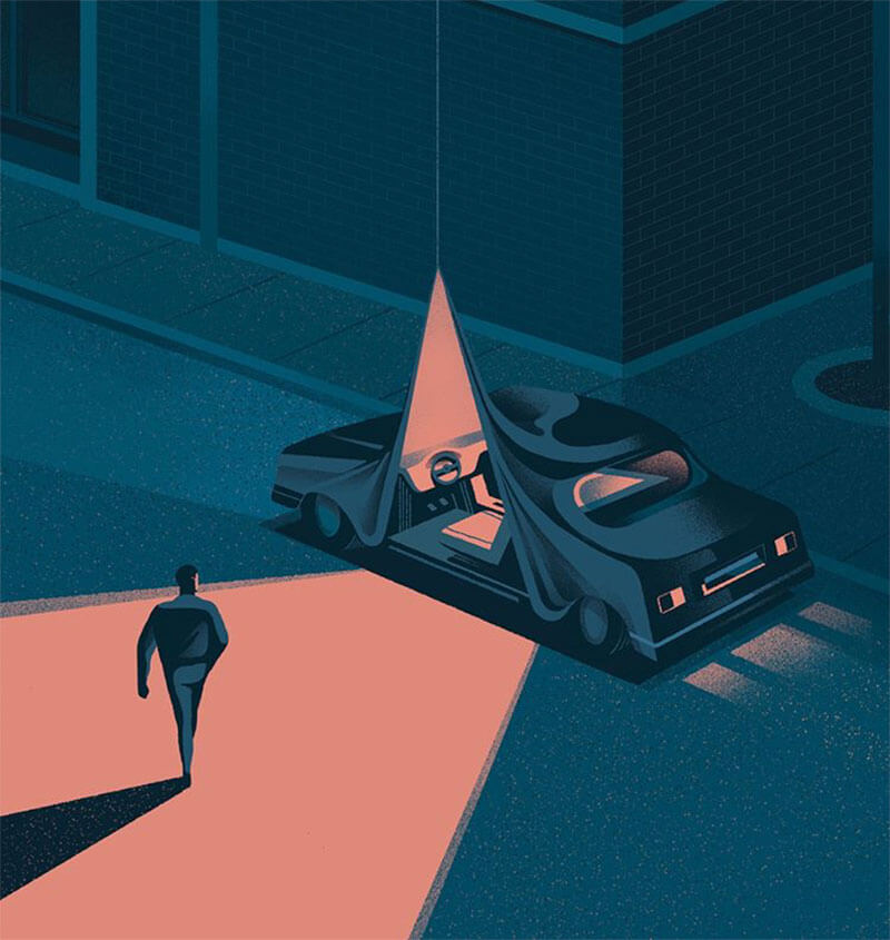
The Path
Brilliant light. Excellently executed. A perfect example of what you can get when you are in the right spot at the right time.
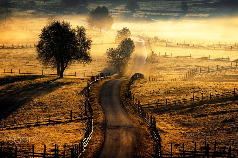
Afternoon And Downhill
Marvellous winter picture! Ain’t that light spectacular?
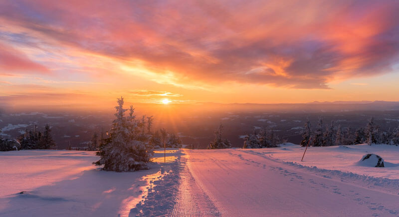
Educating Your Dreams
Special style. Inspiring patterns.
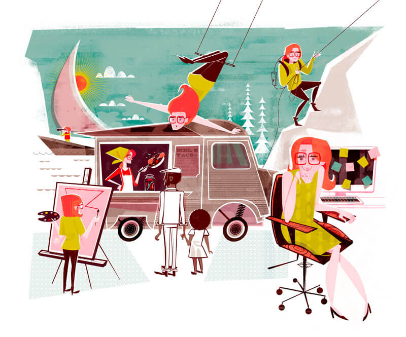
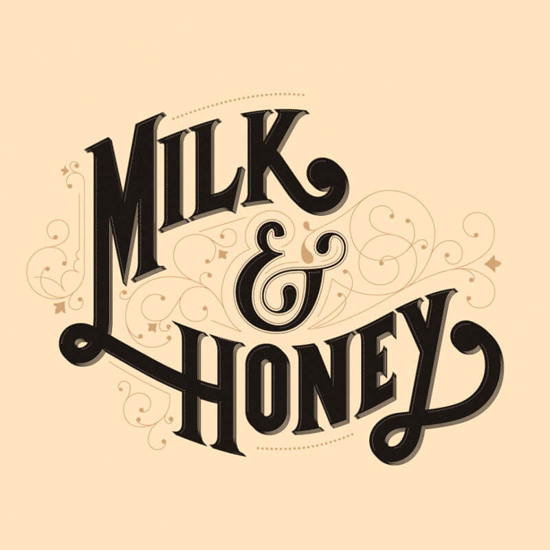
Milk & Honey
Lovely custom type and ornaments.
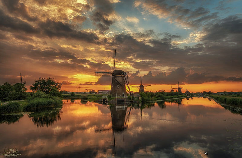
Reflections Of Kinderdijk II
Beautiful perspective, great reflection and amazing warm colors!
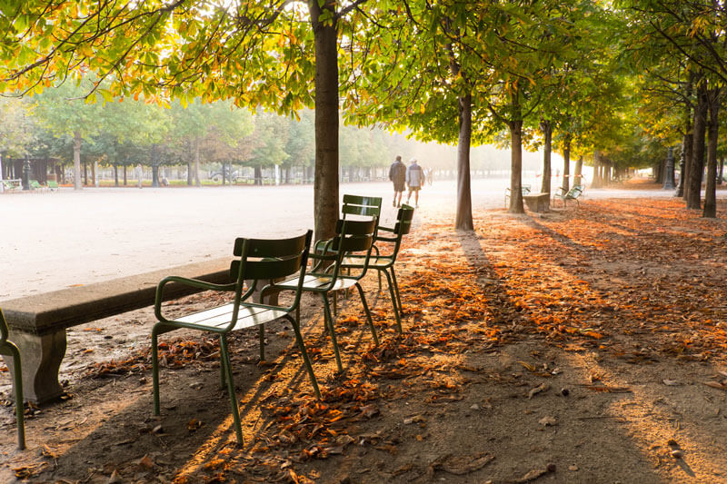
Paris: Nathalie
Gorgeous photos of Paris from Nathalie Geffroy. Be sure to go see the rest.
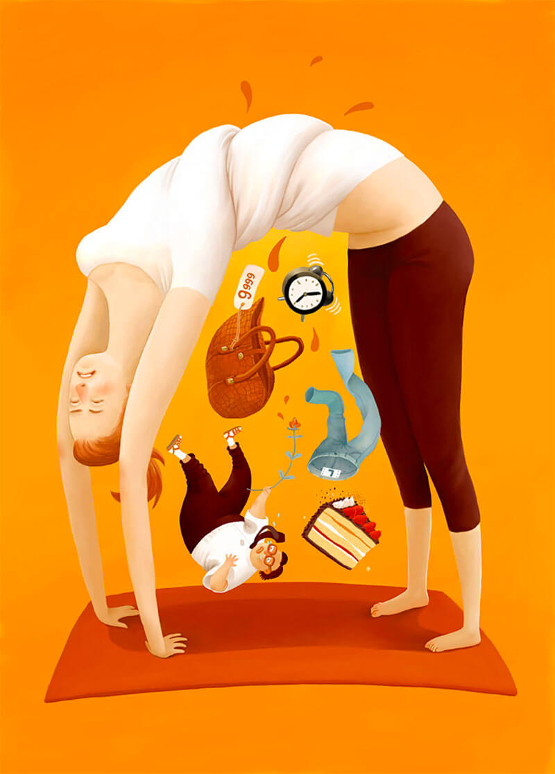
Bending Over Backwards
I’ve been following Oksana Grivina for many years and her style is just as lovely as I remember.
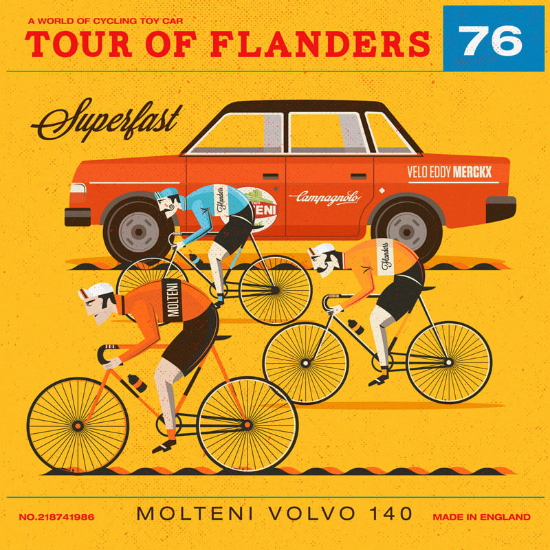
Matchbox Cycling Packaging
The legendary car that still is to be seen in Oudenaarde, Belgium. Neil Stevens created this one for Matchbox.
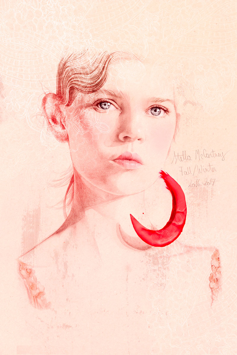
Stella McCartney
The portraits of Elodie are always a pleasure to look at. So many details to take in and think (wish I could do that).
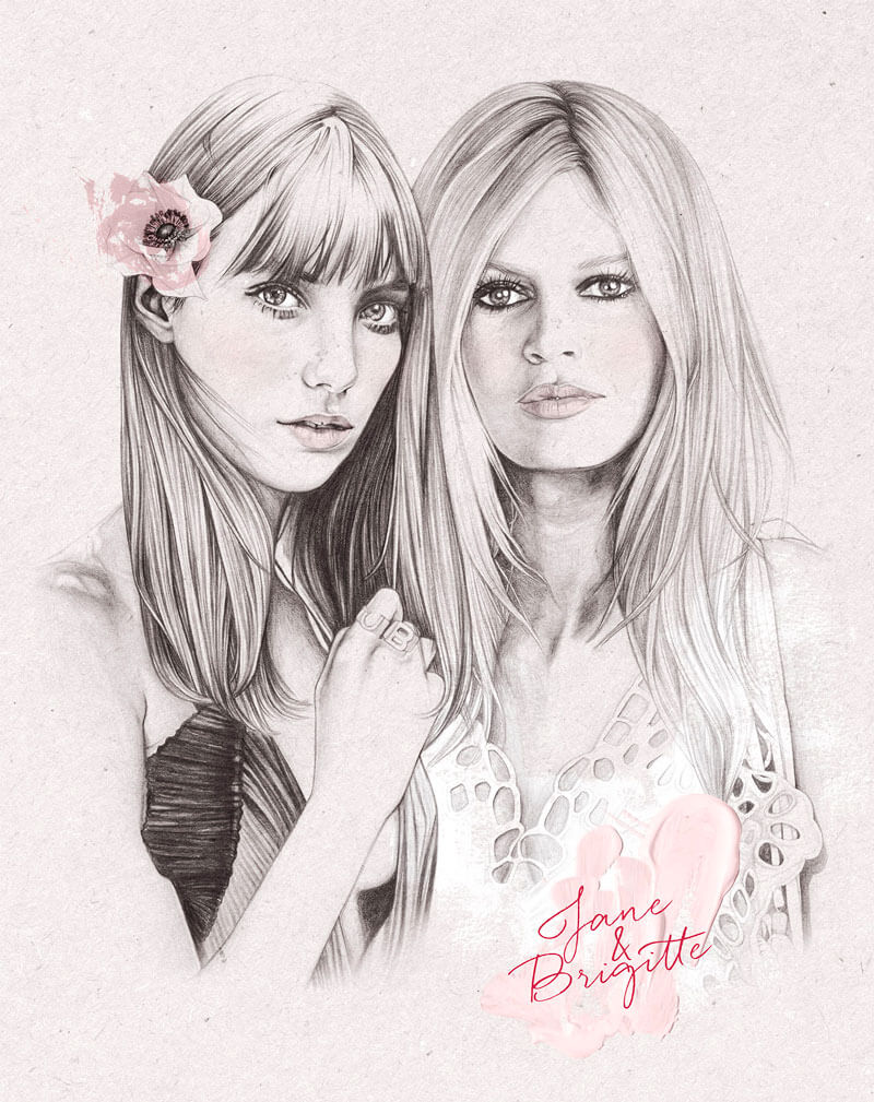
Jane & Brigitte
A second one from Elodie that I couldn’t resist. Look at those eyes and lips.
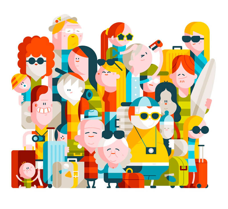
Up Characters
Admiring the faces of these holiday characters for Westjet’s inflight magazine “UP”. The expressions created with just a few lines.
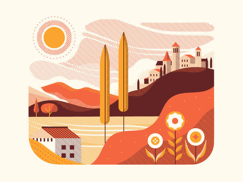
Tuscany
Love the use of color and patterns. Beautiful curvy lines of the landscape too!
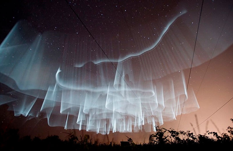
White Aurora
What an amazing display of white Northern Lights or white aurora curtain. Seen somewhere over Finland.
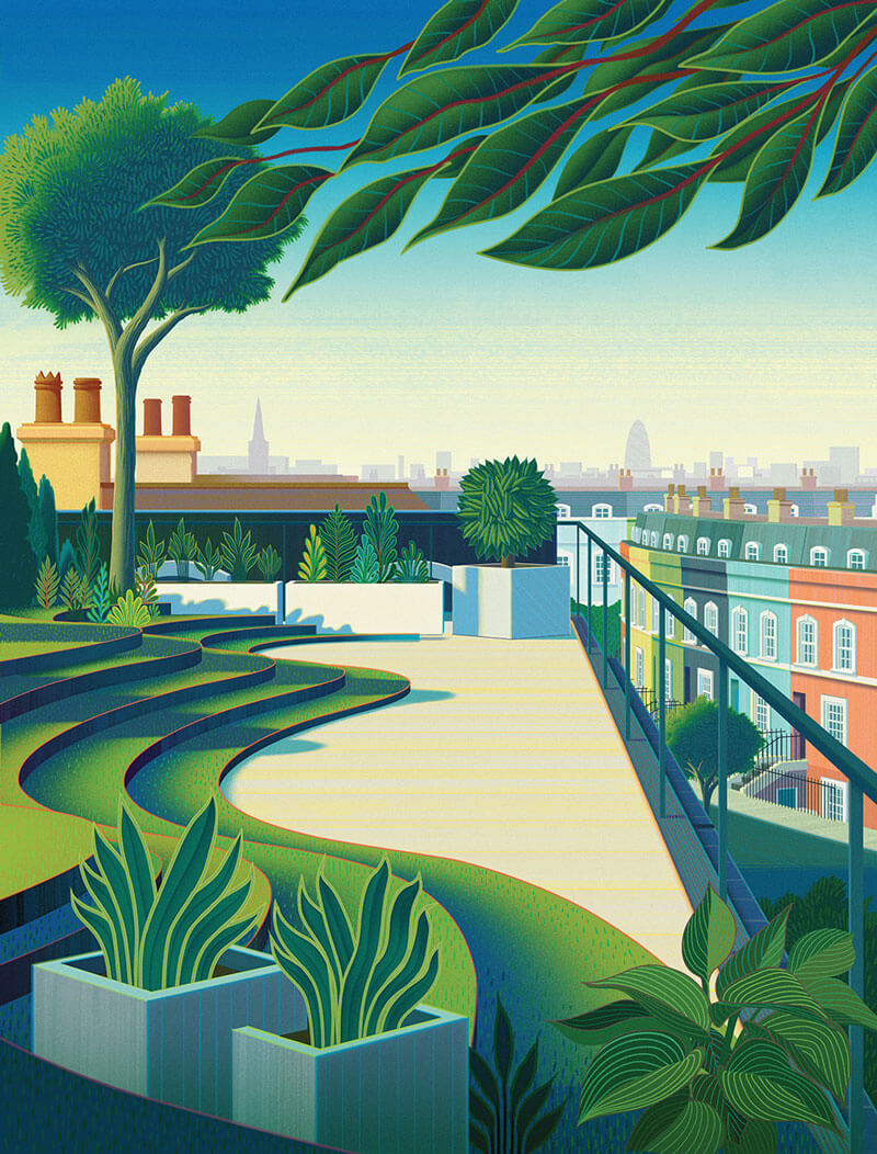
Fabric Magazine: London’s Green Spaces
Beautiful cover for Fabric’s spring issue. Sam’s work usually has a futuristic element to it, but this one is great too, especially the plants and colors. Those lines and details in each leaf are just fantastically well executed. Perfect light and shadow effects too.
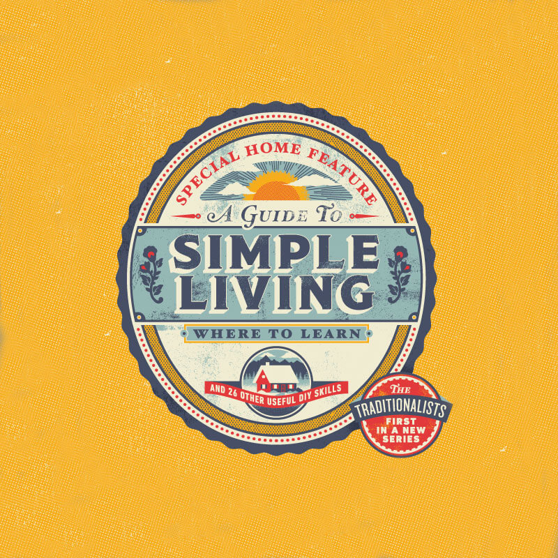
Yankee
The typefaces, textures and colors. They are all spot on in this illustration. Inspired by country vintage.
Robinhood Gold
Beautiful harmony and consistency without leaning over towards kitsch. Not easy when there is gold involved.
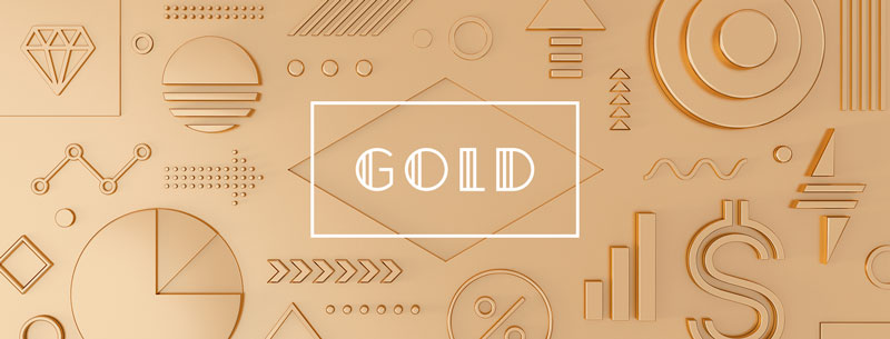
Digital Arts Expo
Nice identity for The Digital Arts Expo, an annual showcase of student and faculty projects integrating engineering, computer science, and the visual and performing arts.

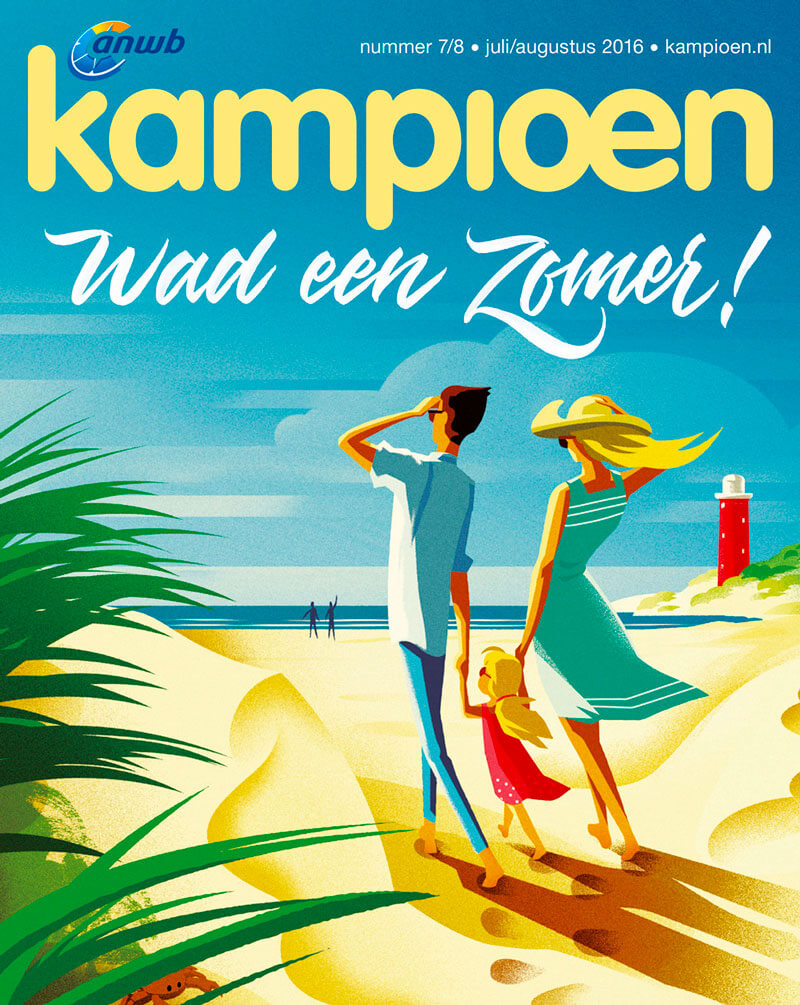
ANWB: Kampioen
Great nostalgic vibe in this one. Reminds of the early adverts from the 60’s. Love the bright colors, as well as the shadow and highlights effects.
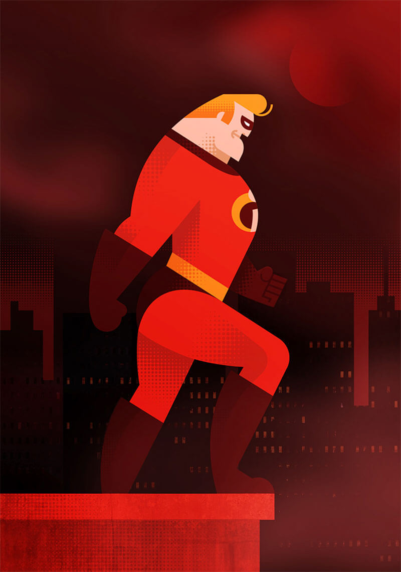
Pixar Times
Illustration created for The Pixar Times. Everybody loves a hero. Love how the shadows are done, and the pattern effects.
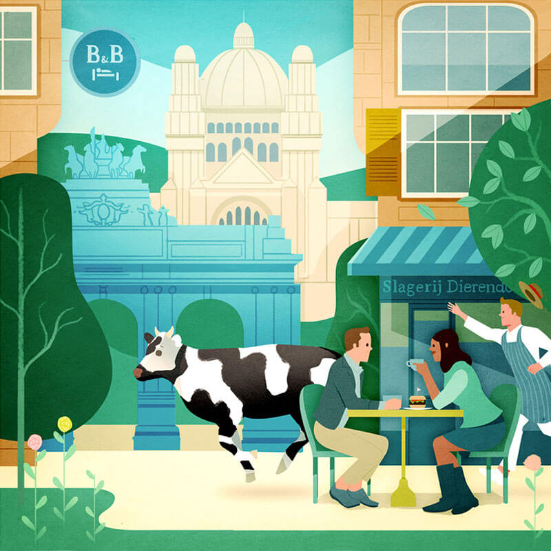
What To See And Do In Brussels
Illustrations for Eurostar’s Metropolitan magazine to accompany an article about what to see and do in Brussels. The butcher chasing the cow is such a nice detail.
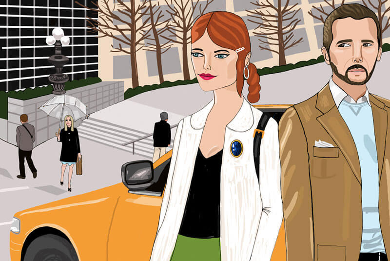
Moment In New York
The faces are very original and recognizable as the style of Dutch illustrator Jackie Besteman.
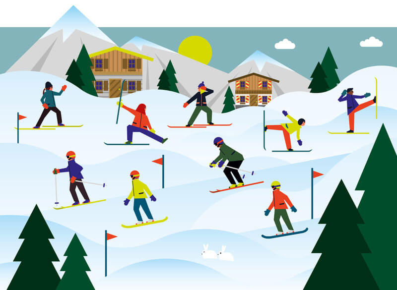
Exercise On Skis
Love the figures and how they are portrayed.
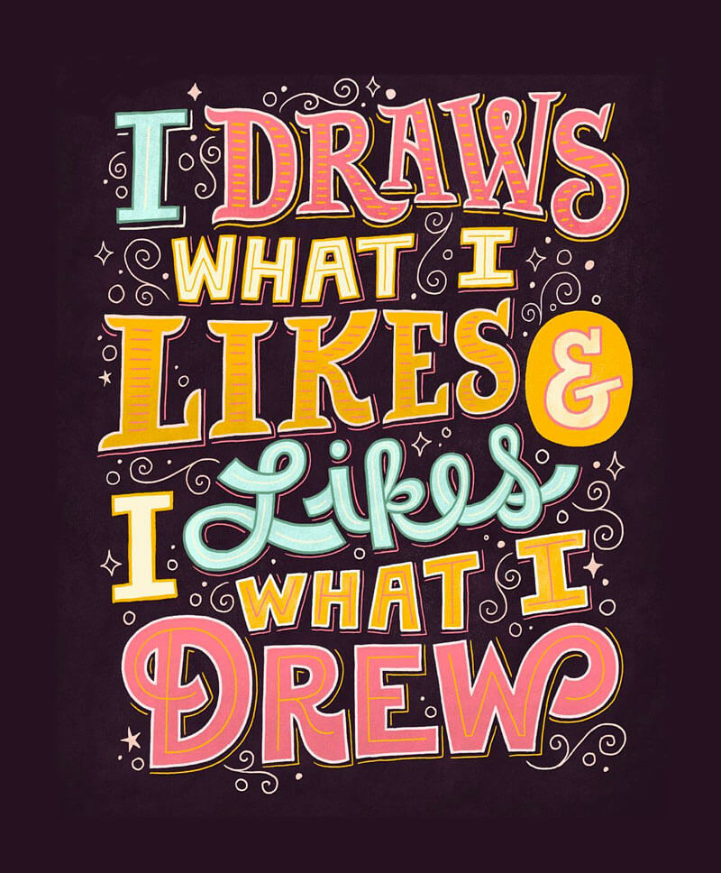
I Draws What I Likes…
“When I’m stressed about work, I just think about this. Drawring!” Beautiful custom typography and great colors.
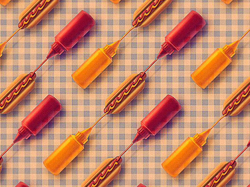
Hotdogs!
A nice pattern of hotdogs to get you hungry. It’s available at the pattern library.
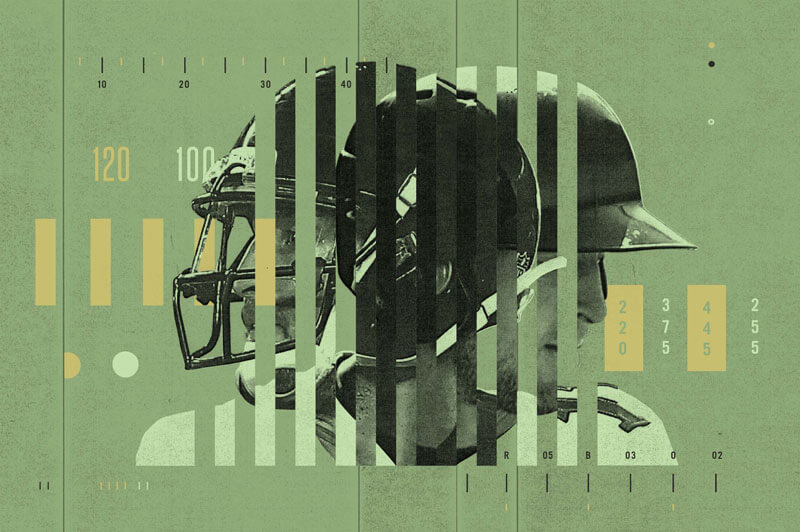
Bleacher Report
This image goes along an article on how Tim Tebow is making a drastic switch from being a football player to a baseball player. Love this vertical stripe collage blend effect. So well done!
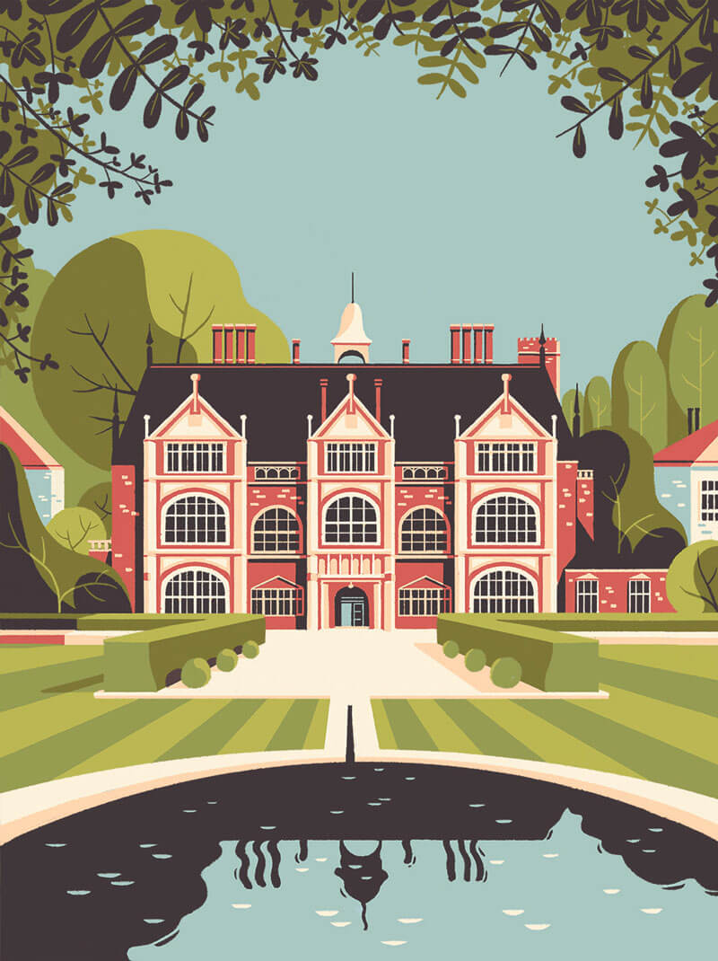
Modus Magazine
The lanes in the grass are like guides to draw you into the building. It also creates a beautiful symmetrical vibe.
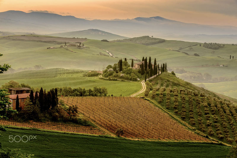
Life Is Beautiful
With a view like this I would totally think so. Taken in Belvedere, Tuscany.
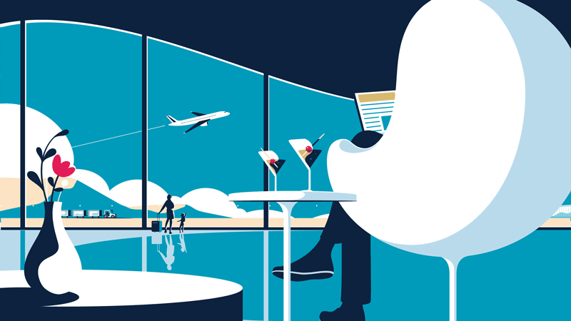
Amex Gold
Great usage of minimal colors and shapes.
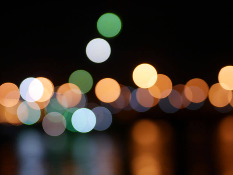
Bokeh Tribute
Lovely tribute to the bokeh effect.
Further Reading
- Finding Inspiration In Uncommon Sources: 12 Places To Look
- Add Music To Your Workflow To Improve Results
- Inspiring Everyday Graphic Design
- Art Inspiration From Individual Artist Portfolios


 Register Free Now
 Celebrating 10 million developers
 SurveyJS: White-Label Survey Solution for Your JS App


