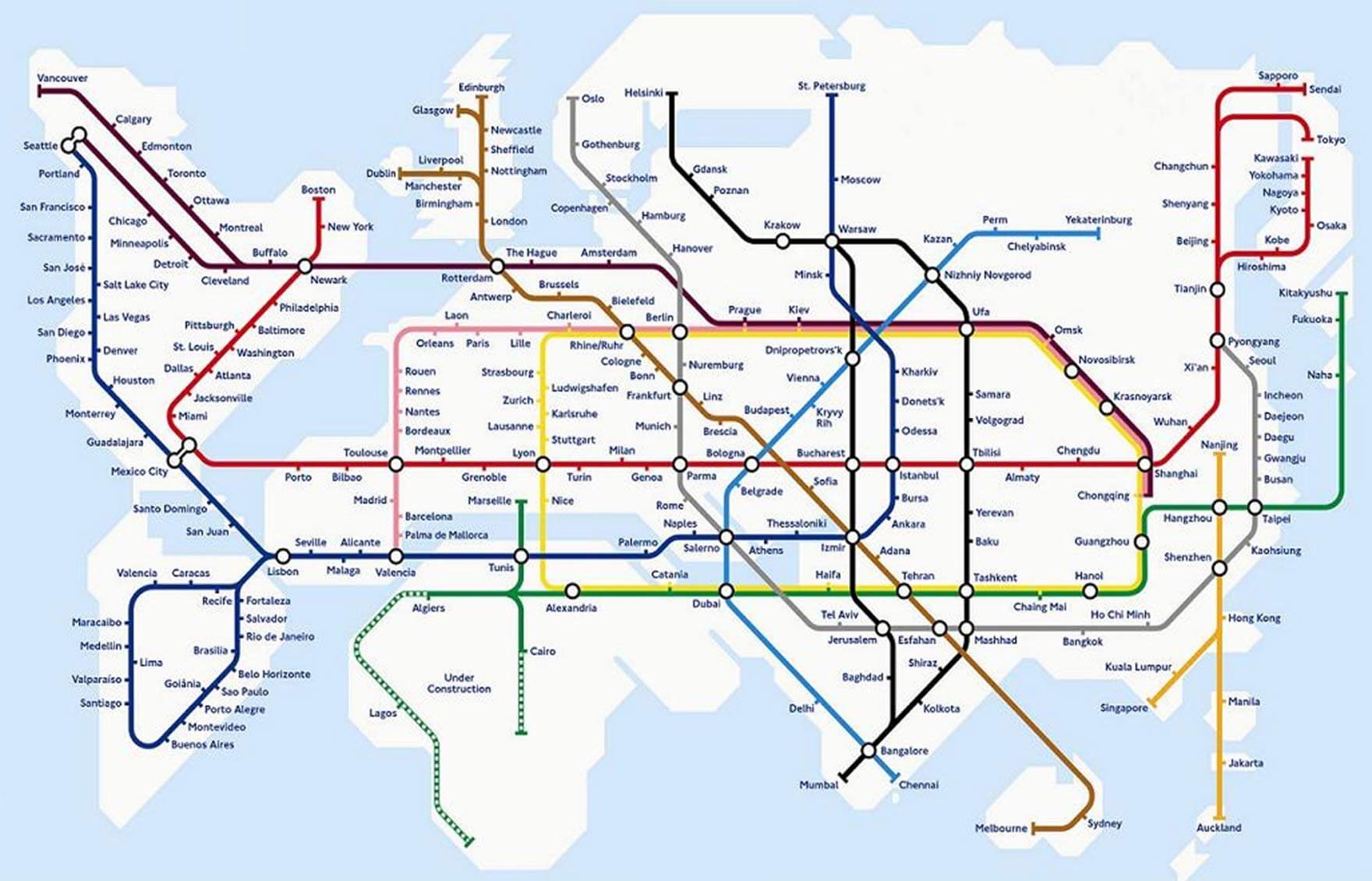
Things To Keep In Mind When Designing A Transportation Map

Email Newsletter
Weekly tips on front-end & UX.
Trusted by 182,000+ folks.
 Register Free Now

 Try ProtoPie AI free →
 SurveyJS: White-Label Survey Solution for Your JS App
 Celebrating 10 million developers
For many people, a map of a transportation network is a given, an expected part of the system, something that just is — like a fire-escape plan in a building. So, when I say that I design transportation maps, they don’t understand. What is there to design even?
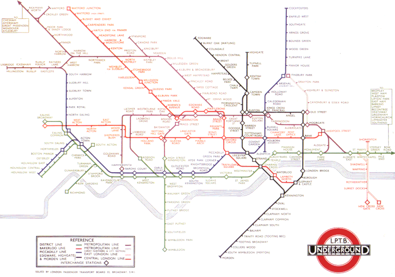
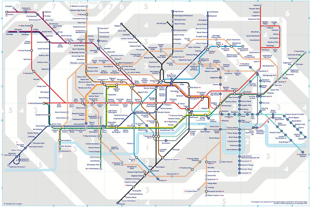
Well, let’s take the London underground map as an example. Designed by Harry Beck, it was the world’s first transportation map to use the principles of electrical circuit drawings. All line segments were put to the angles of 45 or 90 degrees. The distances between stations were equalized. I wrote about it in part three of my “Maps and Reality” series, “Diagrams.”
This schematic approach was later adopted for many transportation maps of the world. But not every time was this a good idea. This is one useless map (from Samara, Russia):
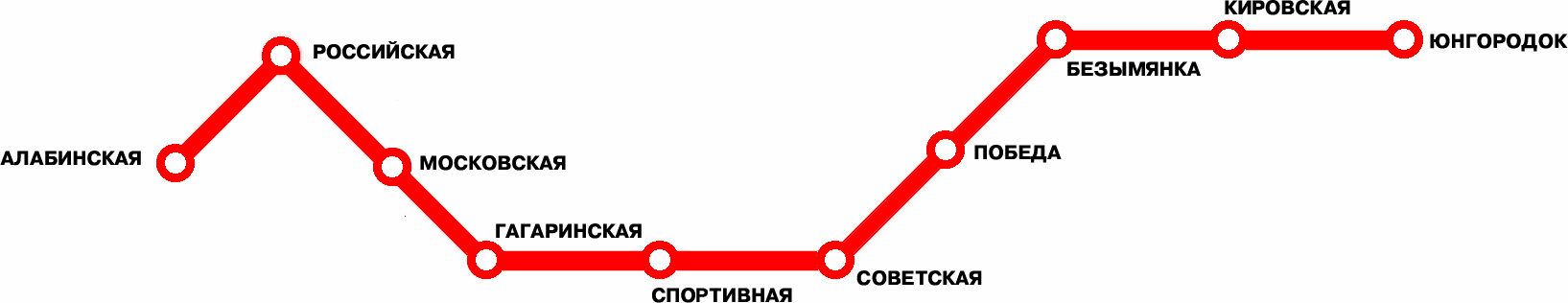
It adds almost nothing beyond just listing the stations: Алабинская · Российская · Московская · Гагаринская · Спортивная · Советская…
Beck’s design dealt with growing complexity and the spread of London’s underground rail network. When there is just one line, it’s better to put this line in context. See the Ekaterinburg metro map, for example:
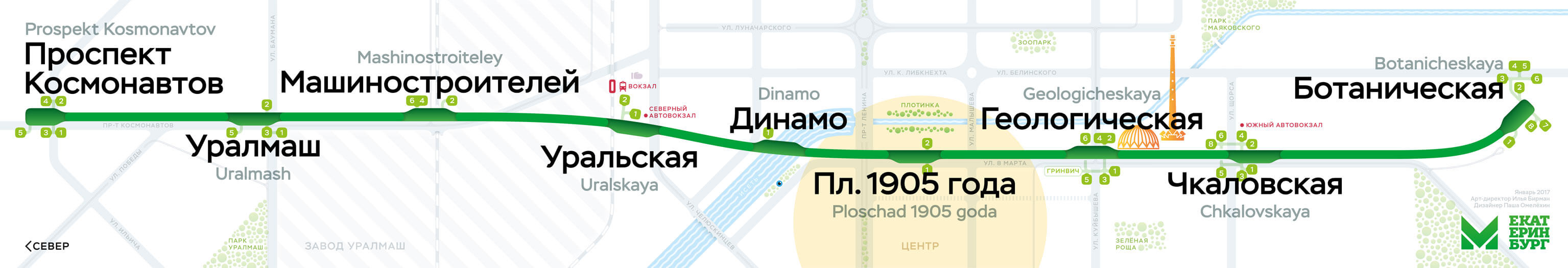
Every transportation network requires a specialized solution.
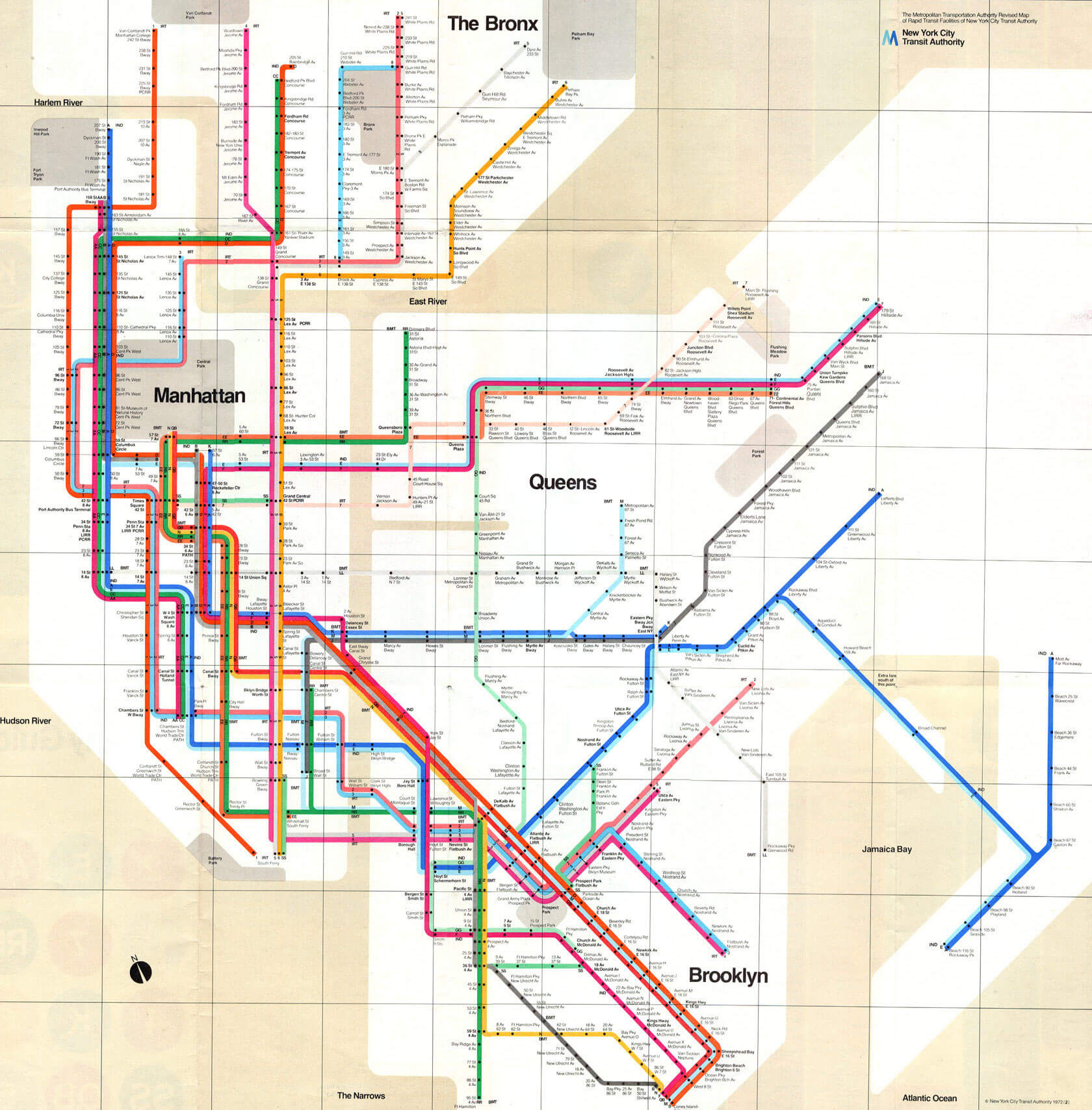
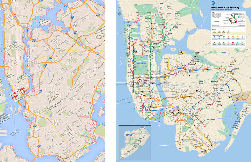
Let’s look at New York. The subway is large and complicated but quite different from London’s: Trains can have different routes, which are denoted by both numbers and letters. In 1972, Massimo Vignelli designed this map:
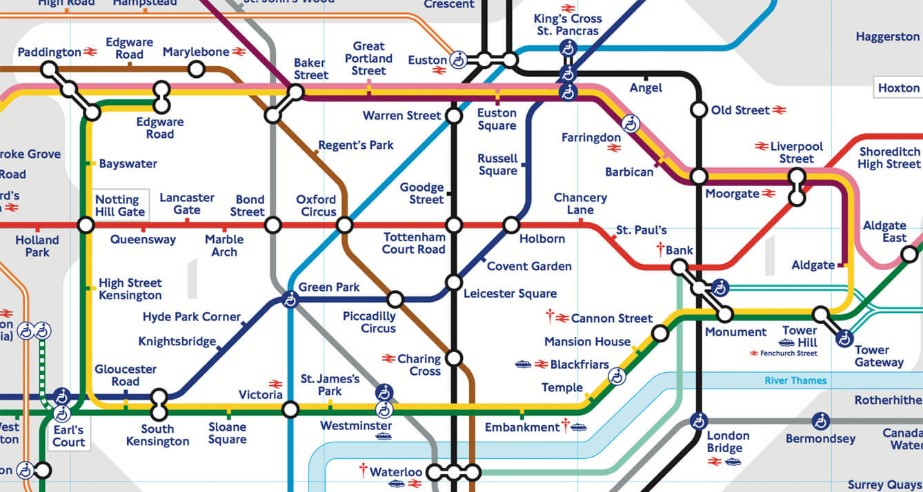
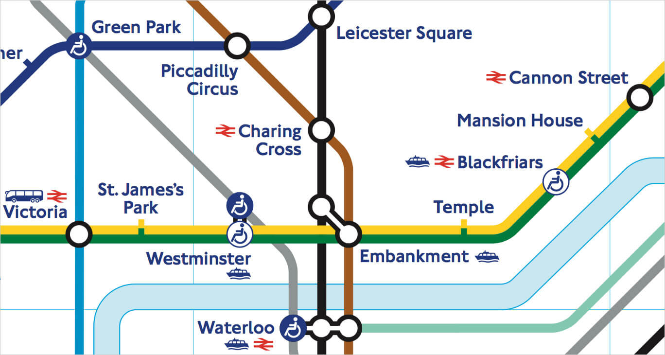
In London, ticks are used to depict stations:
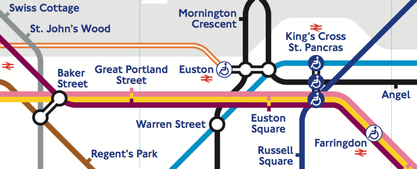
Vignelli couldn’t have used them in New York. In London, lines rarely run together through the same stations. And when they do, all trains in a “wisp” stop at all of them — see Great Portland Street and Euston Square above.
In New York, such wisps are everywhere, and some trains don’t stop at some stations. So, when there is a stop on a particular route, Vignelli puts a black bullet on the route’s line:
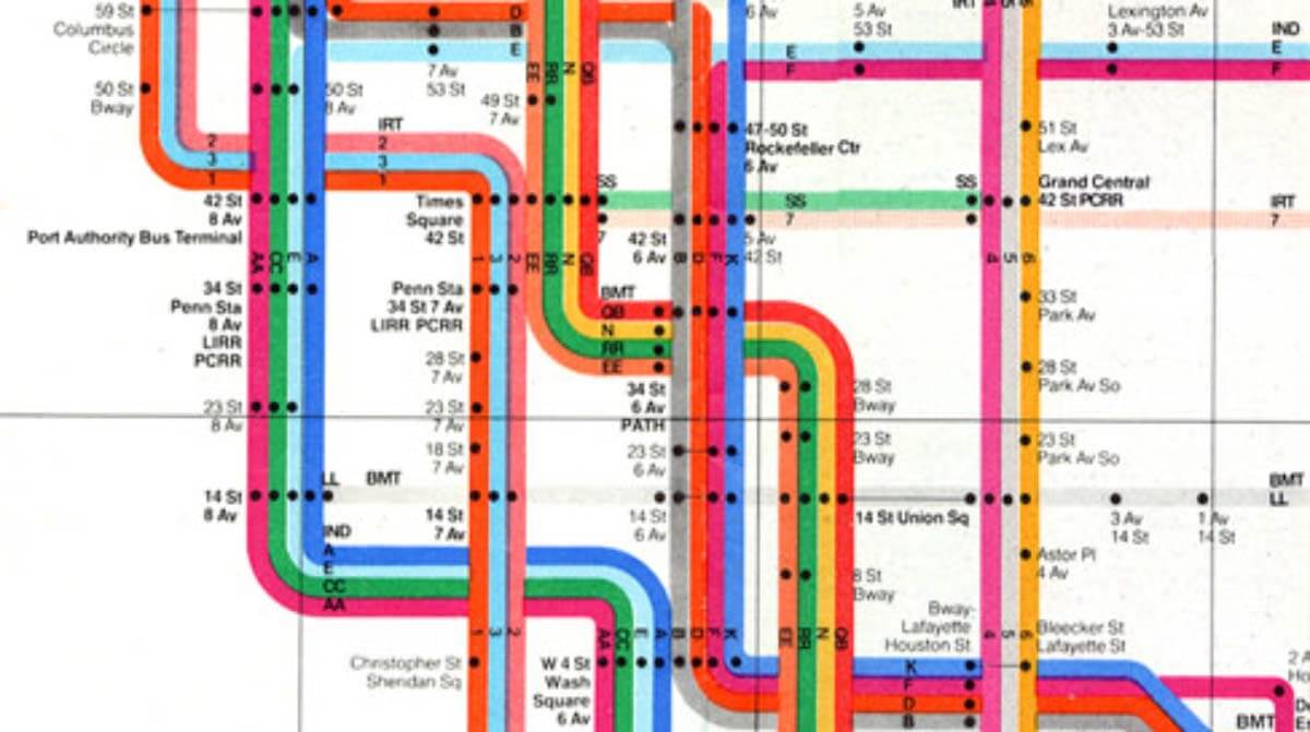
You can see that, at some stations, not every line has a bullet.
Vignelli’s map was beautiful but, unfortunately, unsuccessful. People considered it too abstract. Having no geographical reference, the eye had nothing to catch on. Also, the stations named with street numbers looked identical — the font was just too small for that.
This design was the closest to London’s that New York has ever seen.
The successful design was the one by Michel Hertz (1979) — still in use. It includes parks, ponds, main streets and area names:
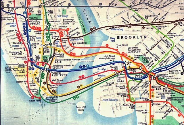
The related routes are denoted with just one line, not a wisp:
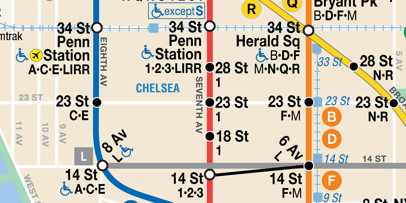
But there’s a list of stopping routes at each station. Look at the red line, for example. Only route 1 stops at 18th, 23rd and 28th Streets, but all routes stop at 14th and 34th Streets.
Hertz wanted his map to look geographical. But he knew that a “true” map would use the format very inefficiently. So, his map is actually distorted significantly for everything to fit. Compare Google Maps on the left to Hertz’s map on the right:
Hertz’s map doesn’t look stylish. But it has proven to work well. This is a very specific, bulletproof design tailored to New York.
But even maps that appear to be much more alike in principle have many little details to serve their cities’ needs.
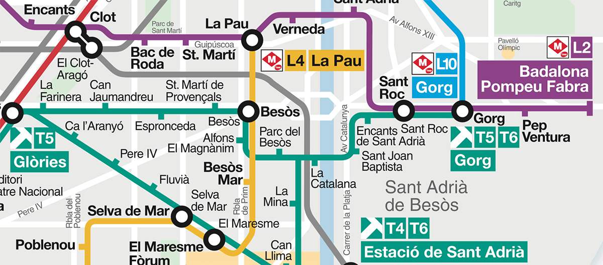
On stations, there are tracks for opposing directions. In some cities, these tracks are marked with the names of the lines’ terminals.
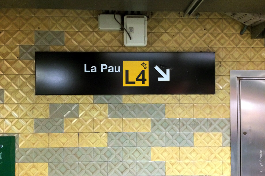
The terminals are, thus, important for wayfinding, so they have to be emphasized on a map. In Barcelona, they put the terminal’s name on a background, whose color matches the line’s:
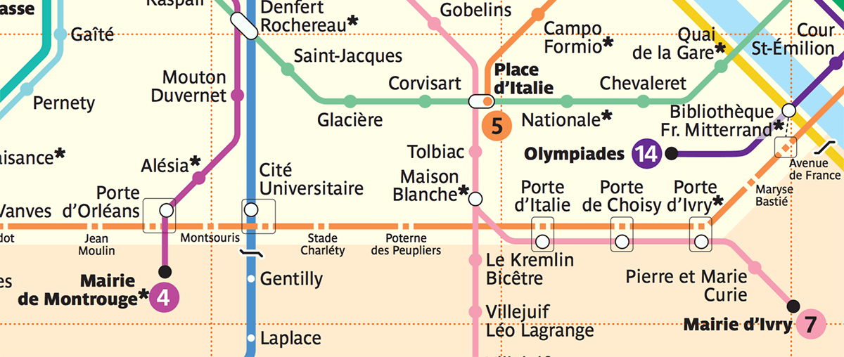
In Paris, they use bold font and symbols for the line numbers:
This is unnecessary in London, where, instead of toponymics, they use geographic directions (for example, “Northbound”).
In Oslo, a thick wisp of lines passes through the city center. One of the lines forms a loop and passes several stations twice: first as line 4, then as line 6. The transformation from 4 to 6 is shown with a gradient — not a typical element indeed:
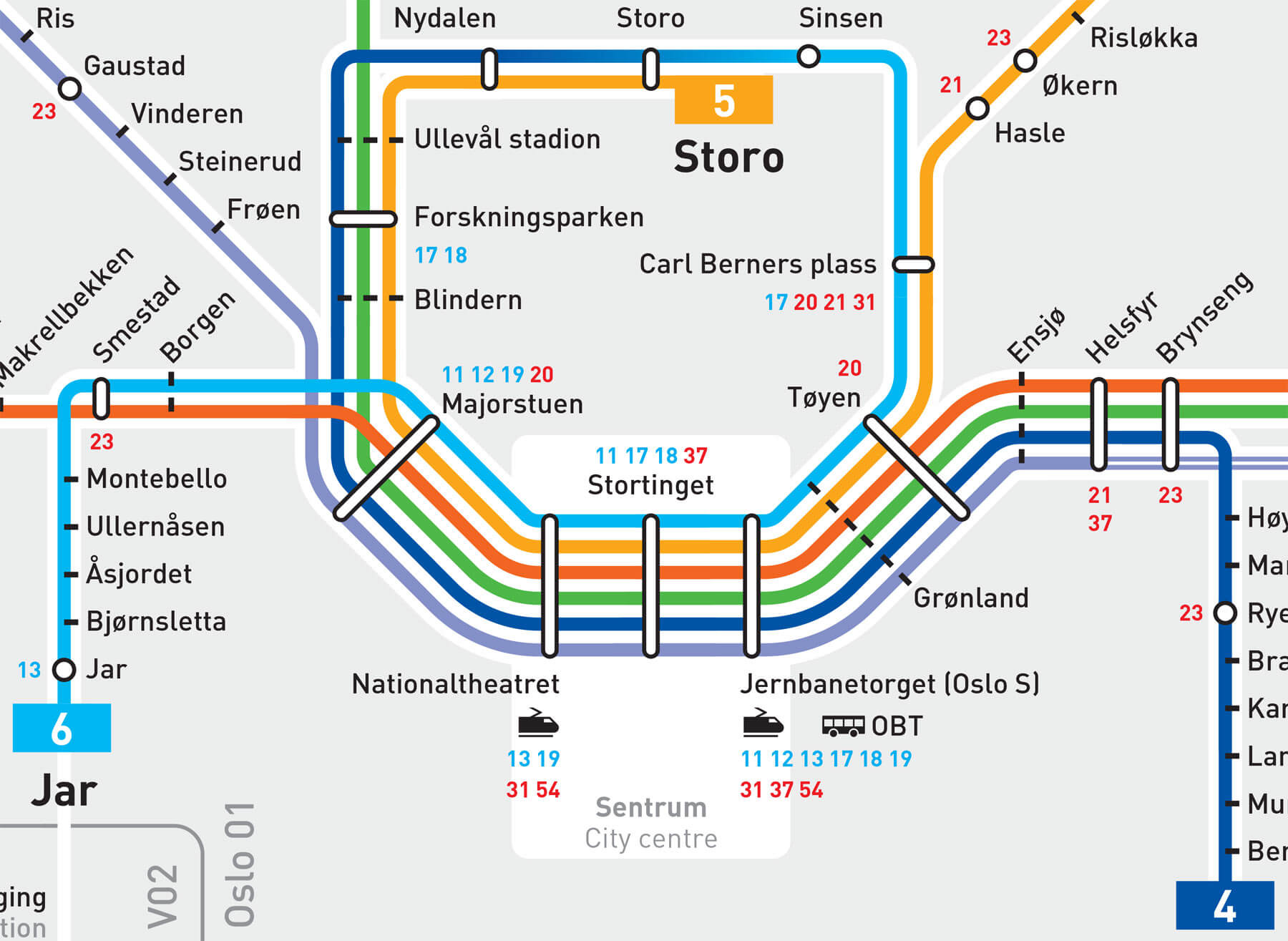
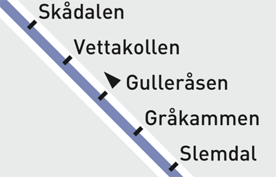
There is another detail in Oslo: Trains pass Gulleråsen station in only one direction. This requires a designation, an element that is not used in any of the maps we’ve discussed above:
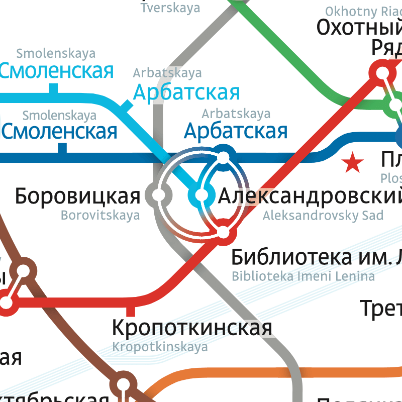
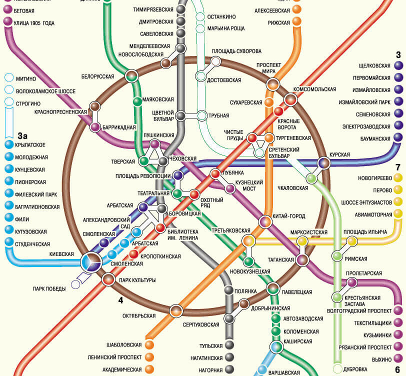
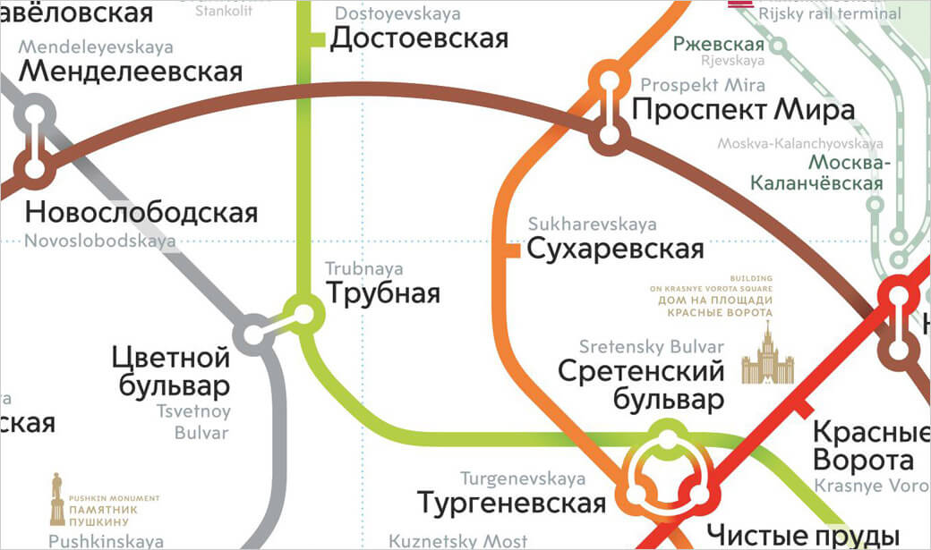
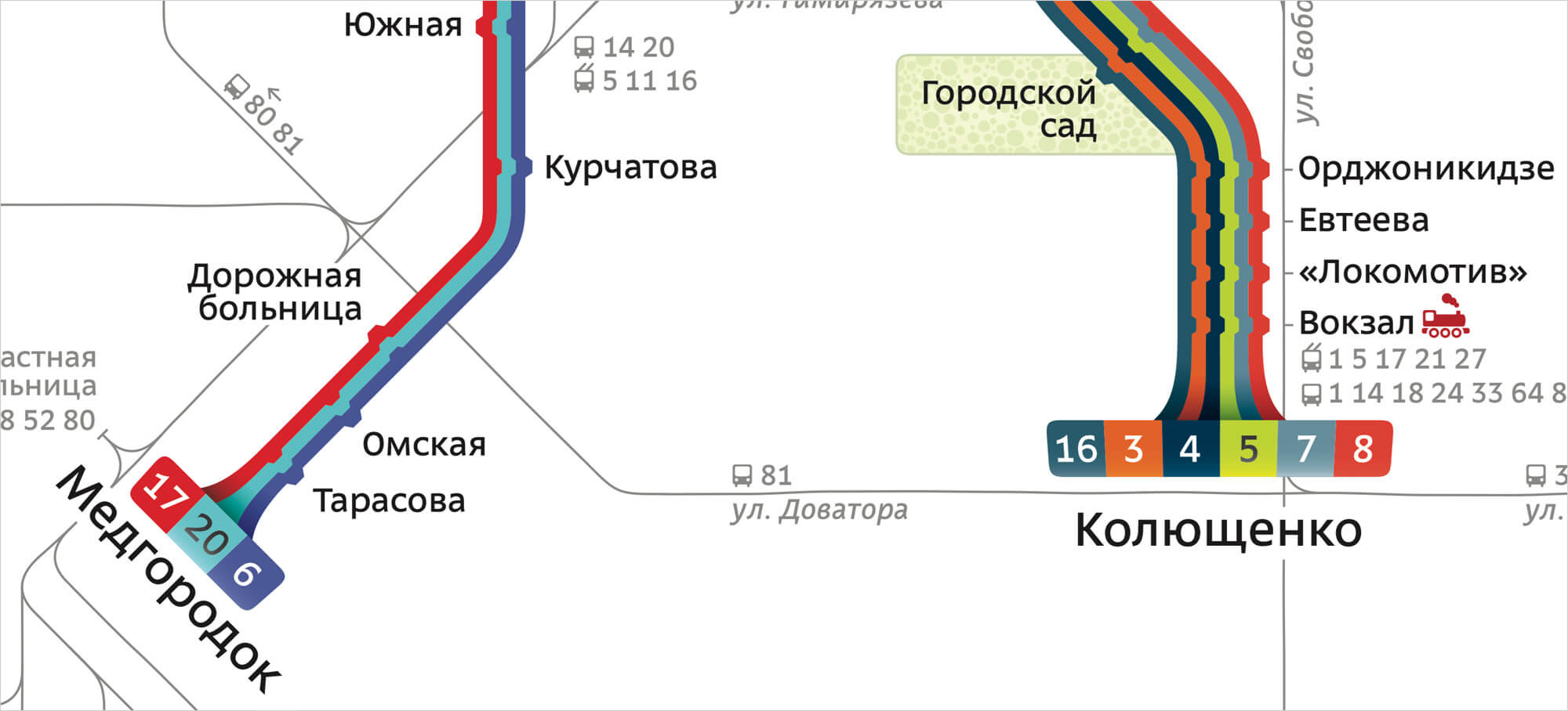
Moscow has its own peculiarity: For historical reasons, the stations have different names on different lines (sick, but what can you do). In addition, the Moscow metro map has to use both Cyrillic and Latin scripts for its station names. Depiction of transfers turns into a problem. Here, eight names must be positioned around the “Biblioteka Imeni Lenina — Aleksandrovsky Sad — Arbatskaya — Borovitskaya” junction, where four lines intersect:
A whopping six lines intersect at London’s “King’s Cross St. Pancras” station; just one name suffices:
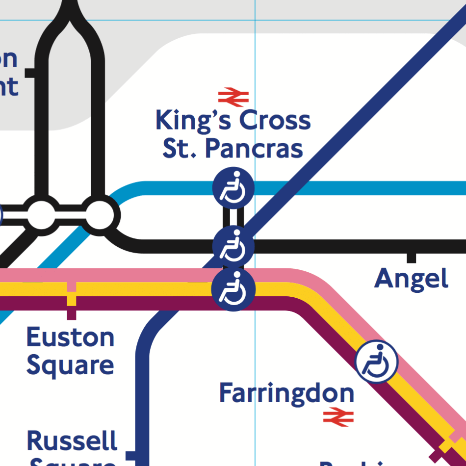
There is not a single place on London’s giant map where a station name intersects a line — there is always space around the lines. To achieve this in Moscow, one would need to dramatically reduce the font size and complicate the line geometry. That’s why Moscow’s metro map includes a device that the London one does not: a semi-transparent background for the station names that cross lines (see above).
But London has its own complication, one absent in Moscow. The gray “clouds” delineate the payment zones — something Moscow does not need because the price of a ride is fixed:
Every city and transportation network has a lot of details, which makes it impossible to use exactly the same graphical principles everywhere. But there is another reason for maps to be so different: aesthetics.
A transportation map is not only a tool, but also a notable object of graphic design in a big city. So, if you opt for Beck’s design language, you would get a London-like map, no matter what you depict. The transportation system must have a face, and aesthetics are as important as logic.
The main feature of the Moscow metro map is the circle line. It doesn’t fit Beck’s language, but it’s very important to Moscow. This is not of Moscow:
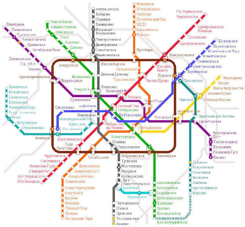
This, on the other hand, is:
London also has a line named Circle, but it has never been depicted as a circle. Today, it’s not even a closed loop:
These circle lines are major elements and form the overall impression of the map.
But little details also influence the perception of a map.
In London, the black rings of the transfer stations are noticeably thinner than the lines. The “corridors” are of the same width. The stations’ ticks are square, sticking out at two thirds of a line’s width. The names are typeset with blue New Johnston:
In Moscow, the fat rings of the transfers are colored with their lines’ colors. The corridors are much thinner and have a gradient. Some transfers are circular. The station ticks stick out at a full line’s width. The names are typeset with black Moscow Sans:
Look at this tram map:
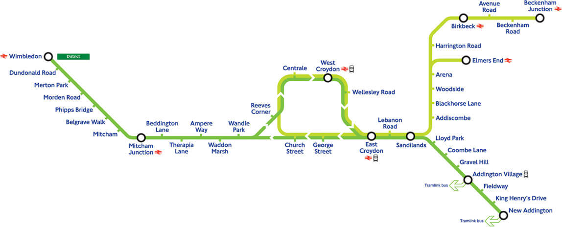
It’s obvious that it’s a tram map for London, not for some other city. It follows London’s transportation graphic design standards — the rings, the ticks, the captions.
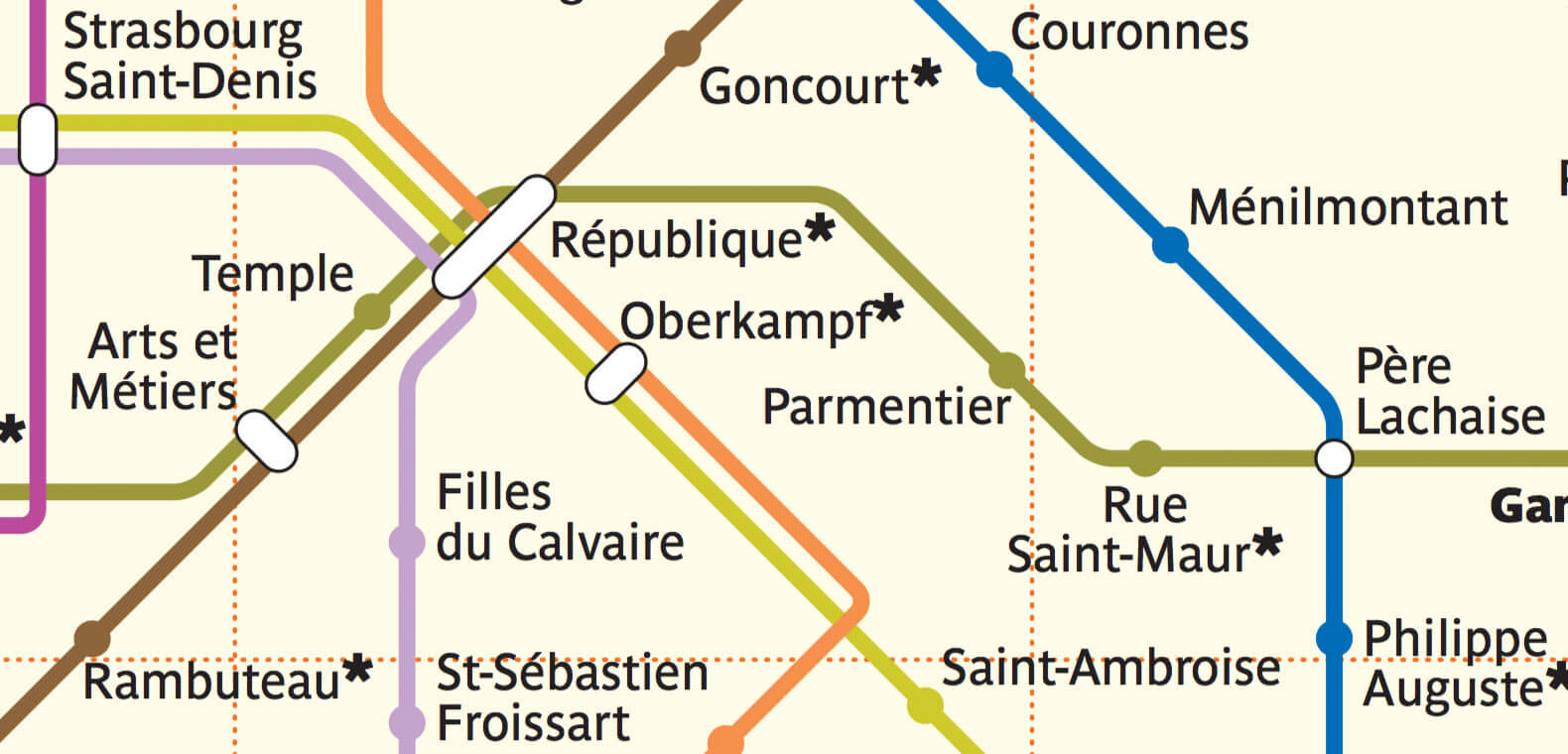
When we see the beige background, the particular palette of the lines, the filled station disks and the distinct designation of the transfers, we immediately recognize the Paris map:
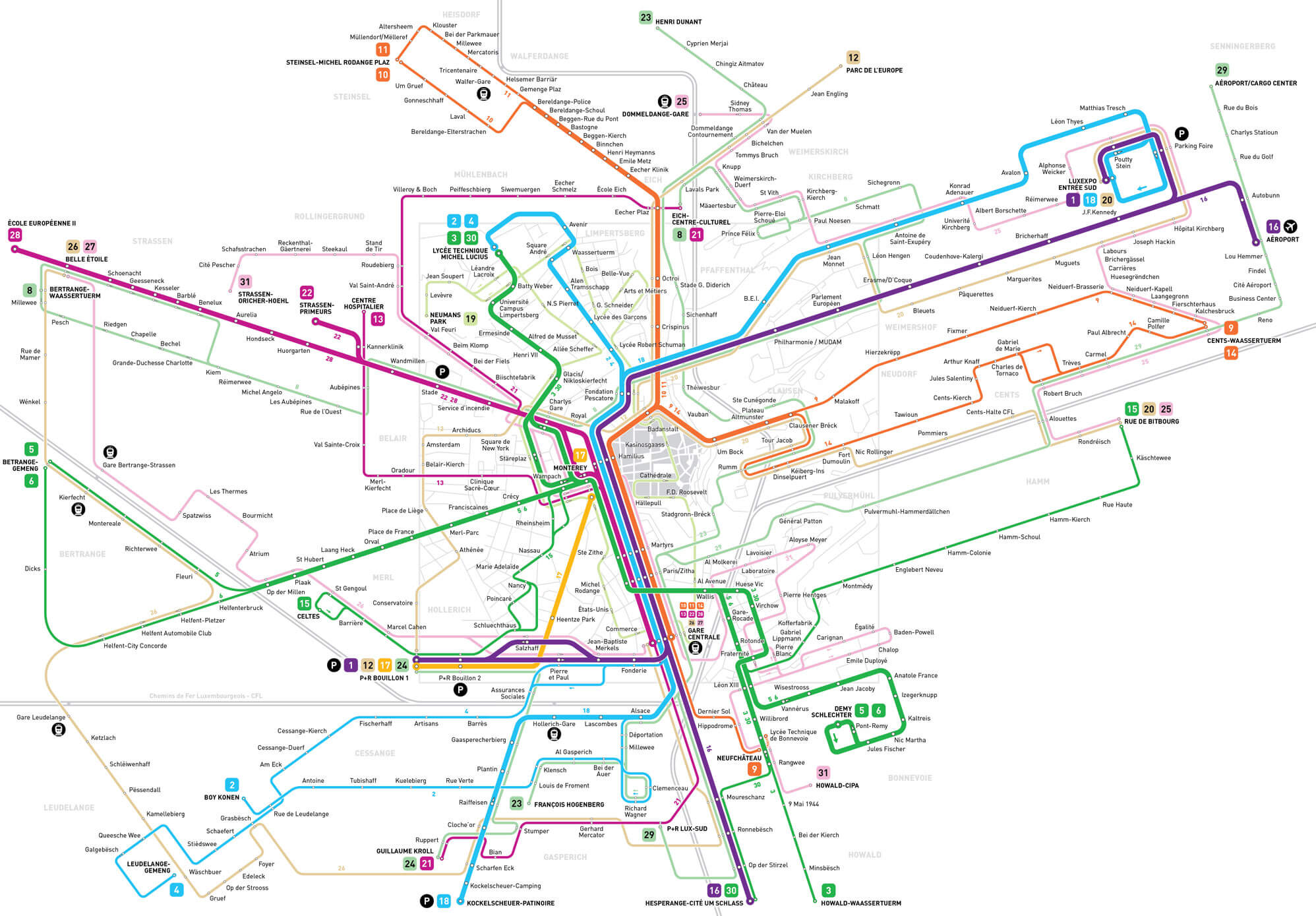
Jug Cerović follows an unusual 18-degree-angle grid in his Luxembourg map. Once you see it, you’ll recognize it every time:
For Chelyabinsk’s trams map, we’ve come up with these 3D terminals:
Why are they like this? The only reason is that we wanted this map to look special.
It is not enough for a good transportation map to just answer the question, “How do I get there?” Because it is used everywhere, it is a part of the city’s image. And if its design is powerful, it will influence the city in other ways.
Moscow’s circle line has inspired designers to create this beautiful wayfinding signage:

The round designations of New York’s subway train routes are used in all of the signage and have even made it to the dots of the i’s in the pedestrian city maps (in the classic Helvetica these dots are rectangles):
And in London, the tube map has given birth to the graphical language of all transportation-related signage:
This graphical language is so iconic that you can even buy all sorts of souvenirs with its elements: t-shirts, umbrellas, shower curtains. This design has spread not only beyond the Tube, but beyond London. All sorts of maps are now done in this style:
Strong graphic design makes transportation systems more attractive. This helps cities get rid of privately owned cars. People spend more time outside, interacting with each other. This gives small businesses a boost and makes cities more pleasant to live in.
Further Reading
- Maps In Modern Web Design: Showcase and Examples
- The Joy Of Illustrated Maps In The Era Of Google Earth
- A Common Misconception About Designing With Data
- Color Contrast And Why You Should Rethink It


