Removing Friction In UX: Last-Minute Travel Planning And Activity Booking (A Case Study)
Most travellers make last-minute decisions, even though they spend significant time researching things to do before embarking on their trip. Finding a hotel and flight is relatively easy, but when it comes to tours and activities, the problem is that late or last-minute bookings are not always available. And if they are available, the process of making a purchase online is often hard. The mobile experience can also be limited because many websites are slow or their booking process is long and complex.
In this article, we’ll present a case study and share observations on the project we designed and built, GetLocal, an online travel-agency and booking platform in Iceland. We will share how we created a booking platform that tackles multiple challenges faced by mobile users, by building a responsive website with super-fast search and a mobile-optimized booking experience. Although this article focuses on travel, designers and developers can apply what we’ve learned to any type of e-commerce and mobile search.
Building A Mobile eCommerce Site Right
If you happen to be planing your next mobile e-commerce website, keep in mind that there are many things to consider before getting started, and questions that you need to ask yourself. Read a related article →
Finding The Hardest Problem To Solve
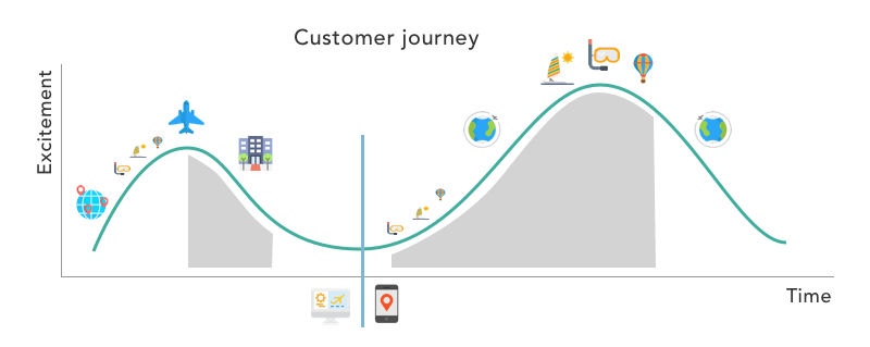
We started by writing a business plan outlining the problems we wanted to solve. A study by Google shows that 85% of travellers make a purchasing decision after arriving at their destination, and 50% use their mobile phone to book. With this in mind, we built multiple use cases catering to different personas. The hardest problem we needed to solve was for the people on the road who were using a mobile device with a slow connection and who needed to find a specific activity with last-minute availability and who needed to be able to finalize their booking online.
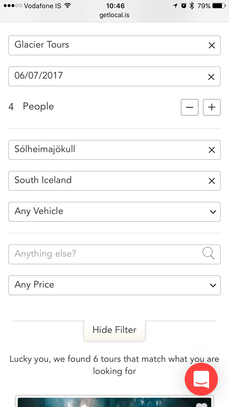
Imagine a group of friends travelling down the south coast of Iceland, famous for its waterfalls and black-sand beaches. It’s 10:00 am, and the group wants to use the opportunity to book a glacial hike on a nearby glacier named Sólheimajökull; they need to find a tour with a certified glacial guide who is able to fit them in an afternoon tour on the same day. They have a mobile phone connected to a wireless router that came with the rental car, but in the countryside they’ll be lucky if they find a solid 3G connection. They want to book online and secure their spot.
Going Beyond Mobile Design
To us, designing for mobile goes beyond visual design. We look at everything from rendering speed to every single piece of content. From the beginning, GetLocal was designed mobile-first. From the first wireframe drawing to the high-definition designs in Sketch, we kept the mobile experience at the forefront.
Having this in mind helped us to simplify the navigation, as well as the information architecture; it also meant that all elements were designed for touch and that we use mobile design patterns such as horizontal sliding. We also had to overwrite many native form elements and replace them with simpler menus that are easier to use.
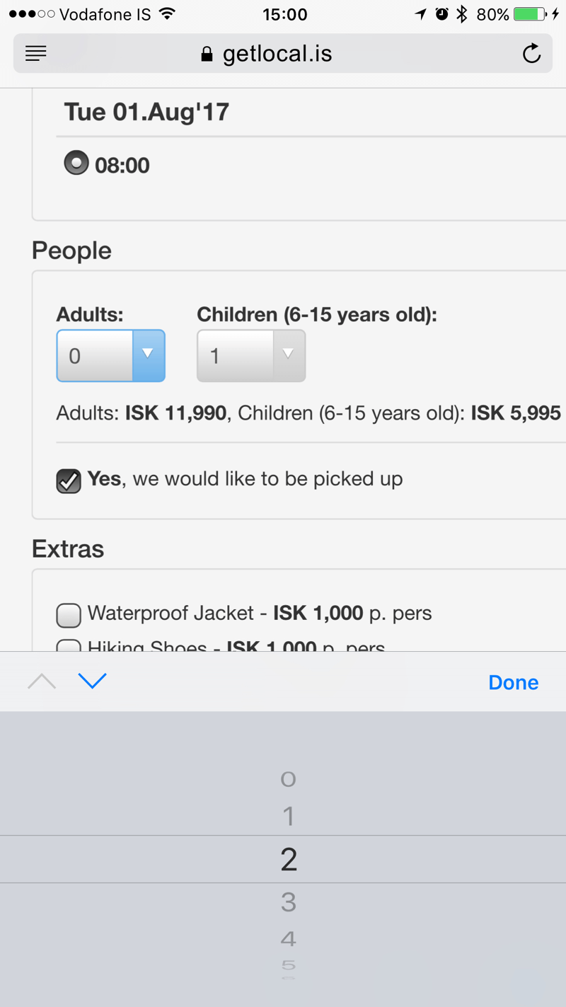
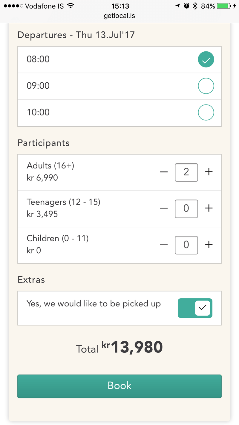
If you compare our desktop version to the mobile version, you can see that we simply copied the mobile booking form to the desktop version. That wasn’t the plan, but once the mobile version was made, we didn’t see a need to create a different experience for the desktop.
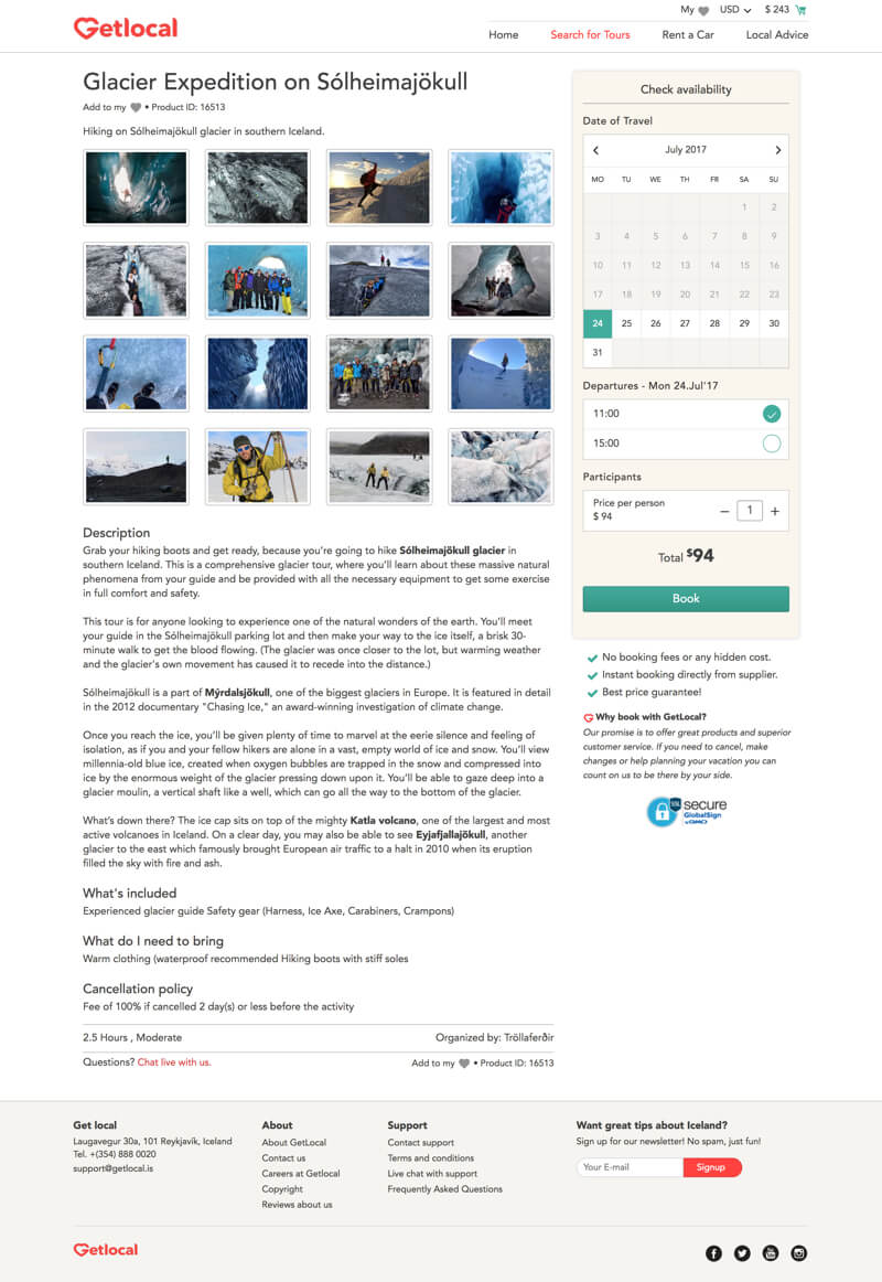
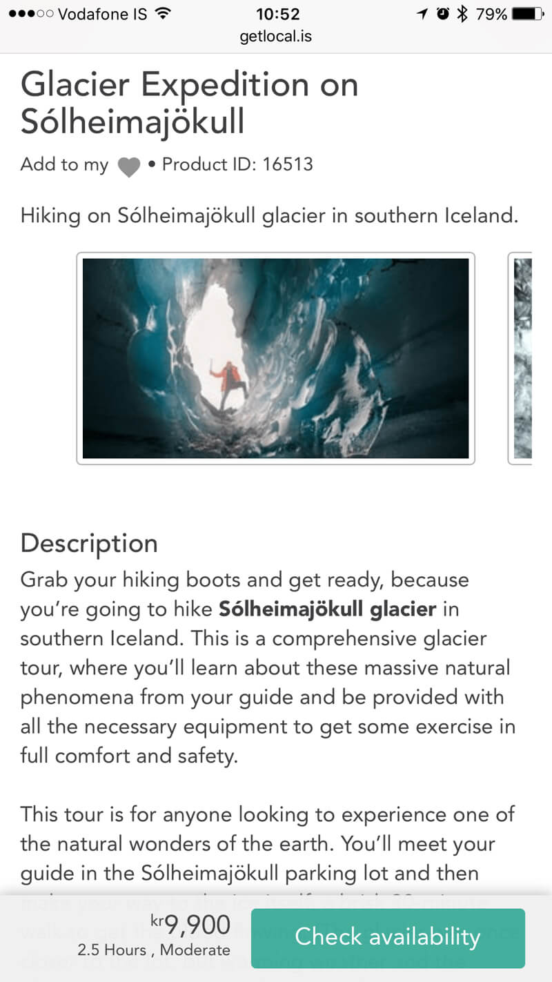
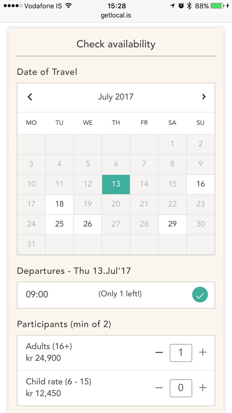
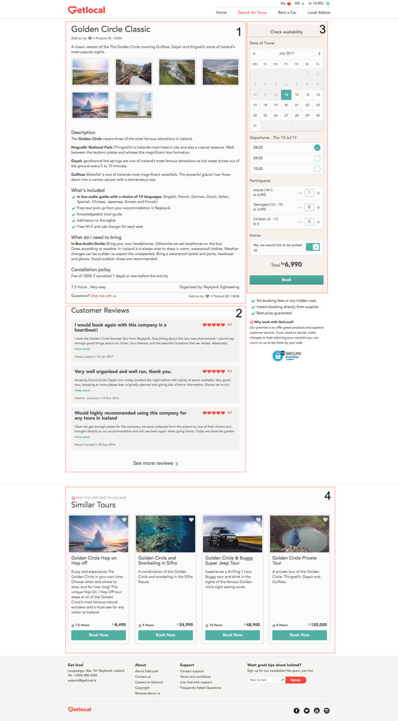
The booking form queries real-time availability APIs and immediately informs you of the availability on each day. If a departure has fewer than 10 seats left, we tell you exactly how many can be booked. We do this by connecting to various inventory solutions. Once a product is loaded, we call the API and get the available days, along with the number of seats that are left. This allows us to disable days that have no inventory and show the customer how many seats are left.
Having this direct access in real time saves the user the frustration of not having to start a booking process only to find out that what they want is sold out or not available on their preferred date.
Need For Speed
We wanted our customers to get the feeling that our website is super-fast, and we wanted to crack the 1-second start rendering time. It’s not an easy task, especially when you have a very visual website loaded with beautiful images.
We challenged our lead front-end developer, Alpesh Prajapati from Gateway Technolabs, to cut requests by 40% and increase the rendering speed by 60%. We wanted to be four times faster than our main competitors. To begin with, he thought it was crazy to set such an ambitious goal, but once we started scrutinizing everything we had made so far, we kept finding ways to improve and move closer to our goals.
After pushing ourselves as far as we could, we hired Harry Roberts to audit performance for us. Harry provided a very deep analysis and pointed out a few places where we could do better. As a result, we modified our caching strategy and refactored some of our CSS, leading to even further improvements.
Make Fewer Requests
We switched over to HTTP/2 in order to load requests in parallel. However, because each request from the server to the client still takes time, we reduced the number of requests by merging and compressing CSS and JavaScript files, using sprites for icons, etc. The merging and compression bring some overhead to development during updates and releases, but they’re still worth it.
We also broke up the JavaScript and CSS files to load only what is necessary on pages; for example, the CSS and JavaScript required for a calendar isn’t needed on our blog. We also removed some libraries that we were using in the beginning because we found a way around them; for example, we dropped Font Awesome, as awesome as it is.
Compress Images And Serve The Optimum Sizes
We use a lot of images and we found that Photoshop and Sketch didn’t compress them highly enough. We started passing all images through ImageOptim (Mac only), and then we integrated our CMS with the ImageOptim web service, so all images that are uploaded go through proper compression before being stored and published on our CDN.
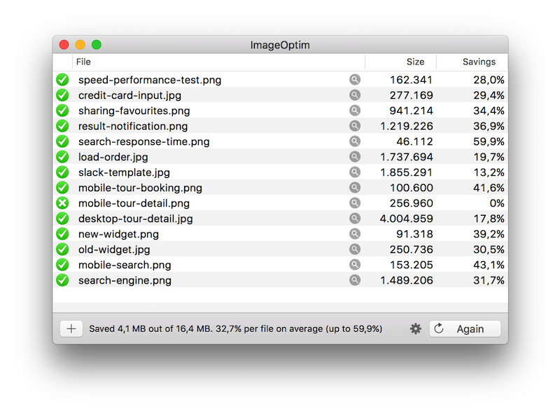
Although compression of the images reduced the sizes a lot, we knew that serving images in different sizes based on the screen size of the device would help further. This also enables us to adjust the cropping point and even to serve different images to different devices to make the best use of the space.
We use the picture element to serve the right-sized image at different breakpoints.
<picture> <source media="(max-width: 480px)" srcset="https://d1xcc5iosvch6m.cloudfront.net/pages/gullfoss-480.jpg" /> <source media="(max-width: 780px)" srcset="https://d1xcc5iosvch6m.cloudfront.net/pages/gullfoss-780.jpg" /> <source media="(max-width: 1200px)" srcset="https://d1xcc5iosvch6m.cloudfront.net/pages/gullfoss-1200.jpg" /> <source srcset="https://d1xcc5iosvch6m.cloudfront.net/pages/gullfoss-2400.jpg" /> <img alt="The magnificent Gullfoss waterfall seen from above" src="https://d1xcc5iosvch6m.cloudfront.net/pages/gullfoss-1200.jpg" /> </picture>
For each image, we create versions 480, 780, 1200 and 2560 pixels wide. We use a Slack template to position and crop hero banners in the best way for common screen sizes, sometimes using different images if they fit better.

We preload the hero banner and serve the best-fitting size inline in the header, for optimum size and design (although preload is not supported by all browsers).
<link rel="preload" href="https://d1xcc5iosvch6m.cloudfront.net/images/gullfoss-2560-20170718155205jpg" as="image" media="(min-width:1200px)" />
<link rel="preload" href="https://d1xcc5iosvch6m.cloudfront.net/images/gullfoss-1200-20170718155209jpg" as="image" media="(max-width:1199px)" />
<link rel="preload" href="https://d1xcc5iosvch6m.cloudfront.net/images/gullfoss-780-20170718155212jpg" as="image" media="(max-width:767px)" />
<link rel="preload" href="https://d1xcc5iosvch6m.cloudfront.net/images/gullfoss-480-20170718155215jpg" as="image" media="(max-width:480px)" />
<style>@media  screen and (min-width:1200px) {.trip-banner {background-image: url("https://d1xcc5iosvch6m.cloudfront.net/images/gullfoss-2560-20170718155205jpg");}}</style>
<style>@media  screen and (max-width:1199px) {.trip-banner {background-image: url("https://d1xcc5iosvch6m.cloudfront.net/images/gullfoss-1200-20170718155209jpg");}}</style>
<style>@media  screen and (max-width:767px) {.trip-banner {background-image: url("https://d1xcc5iosvch6m.cloudfront.net/images/gullfoss-780-20170718155212jpg");}}</style>
<style>@media  screen and (max-width:480px) {.trip-banner {background-image: url("https://d1xcc5iosvch6m.cloudfront.net/images/gullfoss-480-20170718155215jpg");}}</style>
Use A CDN, And Cache Properly
We have customers from all over the world, and we want customers from Brazil, Australia and China to experience the same speed as customers from Europe. All common files except critical CSS and JavaScript files are stored on Amazon’s S3, served through the CloudFront content delivery network (CDN). For most files, we set the browser cache to be immutable, which basically means that the browser will never try to fetch that file again. In order to break that cache, we change the version numbers of the files. As a backup for browsers that don’t support immutable caching, we set an expiry date very far into the future.
<link href="//d1xcc5iosvch6m.cloudfront.net/assets/css/v1.17/boostrap.css" rel="stylesheet" type="text/css">
<link href="//d1xcc5iosvch6m.cloudfront.net/assets/css/v1.17/style.css" rel="stylesheet" type="text/css">
<link href="//d1xcc5iosvch6m.cloudfront.net/assets/css/v1.17/merge.css" rel="stylesheet" type="text/css">
We use Redis for server-side caching for the majority of our pages, but we don’t cache everything because the inventory checks need to be live and are populated via AJAX.
When a page loads, we:
- get the product details,
- load the reviews,
- call the real-time availability APIs and populate the calendar,
- and, finally, load similar tours.
Move Above-The-Fold Styles Inline
Speed has a lot to do with perception. Being able to start rendering a page within a second is important because it gives the impression that it is fast, even if the full rendering time is slower.
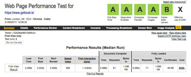
We do this by taking parts of our main CSS file, just what is needed to render the first part of the page, and include it in the head of our template, which allows the browser to start rendering the page, even though it hasn’t downloaded all of the CSS. Loading CSS files causes render-blocking, so we load the full style sheets asynchronously using loadCSS.
Keep Optimizing — It’s Never Over!
Optimizing is a bit like going on a diet: Once you reach your goal, you tend to start slacking off and forgetting to optimize. Speed is one of our main features, so we often check to make sure we are still in good health. We use Pingdom’s speed tester to automatically test various pages and send us weekly results; this alerts us if something goes wrong or we become forgetful.
Use The Tools And Get Outside Help
We’ve used Lighthouse, WebPagetest and Google’s PageSpeed Insights to better understand what we can do to improve our website. We recommend finding a benchmark, setting a goal and optimizing until you reach that point.
Check out some of the performance articles on Smashing Magazine. There are also a lot of great videos and books out there on the subject. Don’t be shy to hire experts to perform an audit or give you advice. This subject is really tricky and requires a lot of specialization.
Can Too Fast Be A Problem?
Shortly after going live, we realized that one of our biggest challenges was to find tours with availability. In a relatively small market like Iceland’s, where tourism has been growing more than 20% per year, it’s become increasingly difficult to find available seats close to departure, especially on the more popular tours. We are not a meta search engine, and we integrate directly on top of inventory solutions. We handle the full lifecycle, from search to booking. So, rather than handing off the customer to another sales platform with an affiliation key, we are able to follow the customer through the purchasing funnel, making sure that every step is optimized.
We needed to find a way to map the activities available in our market, so we built a search engine using relative data points, such as location, activity type, price, duration, departure time, vehicle type and sights. Once you start looking into the challenge and throwing booking cutoff times and availability into the mix, the size of the data set starts to grow quite fast.
A tour with three departures a day, 365 days a year, and that contains multiple facets will require over a thousand rows of complex data. Multiply that by a thousand tours and you have over a million rows of data.
With such a large inventory of products on offer but with so many search facets in place (we use over a hundred data points for categorization purposes), we needed to find a solution that not only fulfills our need for speed but also is flexible and scalable enough to handle the load of processing up to a million records in just a few milliseconds.
We thought about building our own search engine and made a few prototypes, but then we came across Algolia and magic started to happen. However, integration with Algolia was quite tricky because we needed to design a data set that holds all of the information and facets but with a limitation of 10 KB per record (a limit set by Algolia). We also needed to build custom widgets on top of Algolia’s API because we wanted to use our own designs.
In our database, we store all of the product information that we aggregate from the inventory solutions we integrate with. This includes meta data and descriptions, photos, categorization for the search facets, as well as pricing and availability. This required us to build cron jobs that at certain intervals throughout the day send a request to the APIs of the inventory solutions; these requests check the updated availability for the next few weeks and take in the latest prices. Once an update has been made, we push the changes into Algolia via its API so that the search data set is in sync and shows real-time availability and prices.
The integration of multiple inventory solutions and Algolia was no easy task, but the end result makes us really proud. The search engine delivers a response within 25 milliseconds — it’s almost too fast!
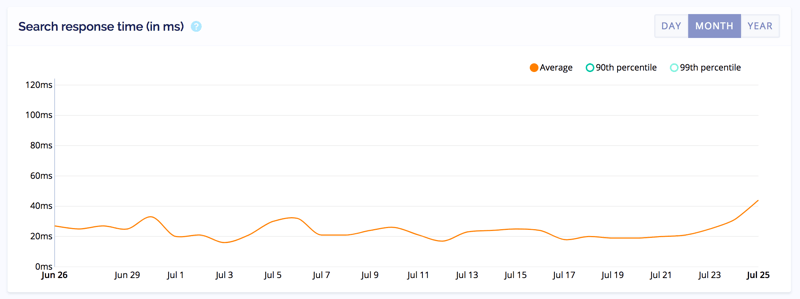
The 25-Millisecond Problem
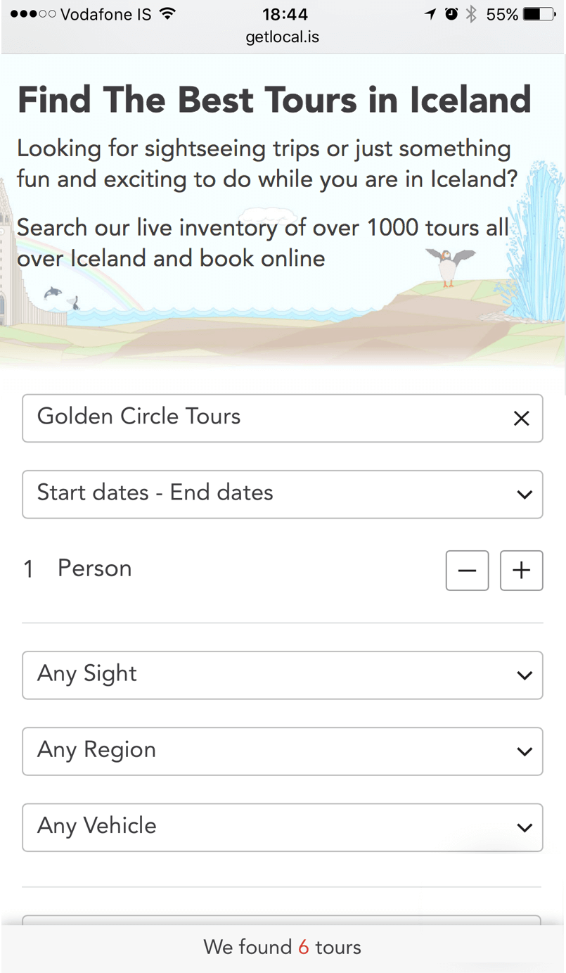
With the result set updating instantly in 25 milliseconds we realized that we need to somehow let the user know that changes have taken place, because the results might appear below the fold.
To work around this problem, we tested using a “Submit” button to mimic a form’s submission, but the button doesn’t really do anything because once any filter is changed, the result set is updated. All the button does is act like an anchor that navigates you down to the result set, thus giving you a feeling that a change has been made in the result set below.
We also tested the yellow fade technique to highlight the change in the result set number, just to let people know that changes have taken place and that the number of results has changed.
Recently, we’ve been experimenting with a sliding panel that appears for two seconds if there is a change in the result set. On mobile, we fix the position of this preview so that people can immediately see the impact their changes have made on the results.
Content Is Still King
For us, content is a critical part of design — not only the labels and headings, but also the descriptions of the products we sell. We operate a marketplace, so our suppliers provide us with their own marketing material, including text and images. Because we work with 200 suppliers and have over 1000 tours to sell, you can imagine the vast difference from item to item.
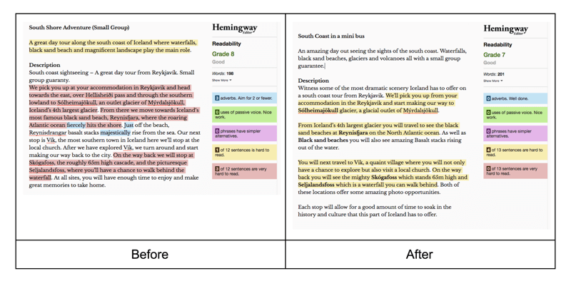
This resulted in our need to rewrite the descriptions for the majority of products we offer. We used the opportunity to enhance the descriptions, making them shorter and more direct. We put ourselves in the shoes of a traveller, reading and trying to understand every product that we sell. What information is necessary, and what is just wasteful fluff? Are key elements missing that we can try to answer, and can we highlight key details that we find important.
This process is slow yet important; it is still in progress, but it enables us to add our personal tone and brand to all of the products we sell. We wanted our tone to be that of a friend or of a friendly local who gives you honest and direct answers, rather than glorifying tourist traps (as magnificent as they might be). This enabled us also to use slightly simpler language, because many of our customers are non-native English speakers. The Hemingway app has been a great tool to help us rephrase and form our sentences to make them easier to read and understand.
Removing Friction
E-commerce is full of hurdles, feelings of insecurity, and complex forms and labels. Users often have to to sign up or give away personal information that is not necessarily needed in order to complete their purchase. One small mistake and you’ve lost a customer forever. Our situation is even more difficult because most of our customers only shop once during their stay, so we don’t get much of an opportunity to build a relationship with them.
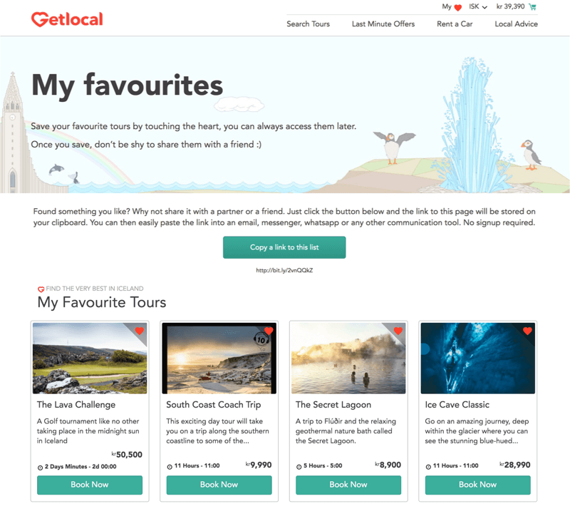
For this reason, we don’t require anyone to sign up in order to check out or to add a product to their list of favorites. We store their choices in a cookie but allow them to share a link that reveals the contents of their saved list.
We apply the same philosophy to the checkout, having no hidden fees and not asking for any information we don’t need. We explain why we need the information we collect; we auto-suggest country calling codes; and we make sure that the input fields offer the right keyboard format.
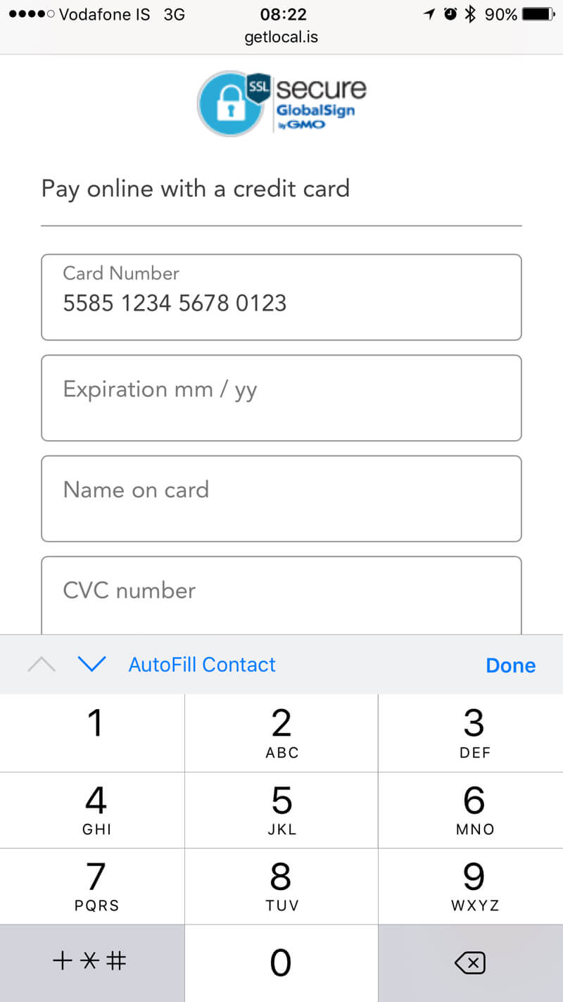
For us, there are two major hurdles in e-commerce. The first is getting visitors to give up their email address, and the second is getting their credit card information. We experimented with asking for their credit card first, before asking for their name, phone number and email address. The idea behind that was that if they are willing to cross the biggest hurdle of providing their credit card, then providing the rest wouldn’t be a problem. The experiment was successful, although we didn’t see a significant change in conversions. So, we reverted to the classic approach because it felt more natural.
Conclusion
Building a great mobile experience is really hard and time-consuming, but with enough attention to detail, you can succeed. For us, it’s been only eight months since going live, so we are nowhere near our goal, although we have made good progress.
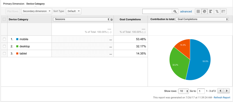
We’ve managed to prove our case, and currently the majority of our sales (over 70%) take place on mobile and tablet.
Our goal was to go live with a minimum viable product (MVP) in six weeks, including design and development of the first version. In the first version, we had to take a few shortcuts, but we wanted to prove that we were able to convert. We made our first sale, a $2500 snowmobile trip, within two days of going live. Since then, thousands of travellers have used us our service to book their dream vacation. Now we have started to focus on the next phase of our product, so stay tuned.
Summary
- Ship fast and keep testing for usability and market fit.
- Get everybody on the team on board with recognizing the importance of speed and user experience.
- Continually question what has been created, and find ways to improve.
- Set a performance budget, stick to it, and keep measuring.
- Use the great selection of tools and resources available.
- Don’t be shy to hire outside help.
Further Reading
- Accessible Target Sizes Cheatsheet
- Five-Second Testing: Taking A Closer Look At First Impressions (Case Study)
- An Actionable And Reliable Usability Questionnaire With Only 7 Items: Inuit
- FabUnit: A Smart Way To Control And Synchronize Typo And Space


 SurveyJS: White-Label Survey Solution for Your JS App
 Agent Ready is the new Headless


