An Overview Of The Most Common UX Design Deliverables
The list below contains the most common deliverables produced by UX designers as they craft great experiences for users. For better readability, I’ve combined the deliverables according to UX activities:
If you’d like to create and design your own prototypes a bit more differently, you can download and test Adobe XD, and get started right away.
Obtaining The Best Mobile User Experience Possible
Always remember that design isn’t just for designers — it’s for users. It's important to treat your work as a continually evolving project, and use data from analytics and user feedback to constantly improve the experience. Read a related article →
Project Assessment
Project assessment is an evaluation process which helps UX designers understand a current state of the product.
Analytics Audit
An analytics audit is a way to reveal which parts of a website or app are causing headaches for users and are reducing conversions. During an analytics audit, an auditor will use a variety of methods, tools and metrics — traffic sources, traffic flows, conversions (and abandonments) hot spots, etc. — to analyze where a product is going wrong (or right). Ultimately, an analytics audit should enable UX designers to know how to boost conversions by making it easier for users to achieve their goals on the website or app.
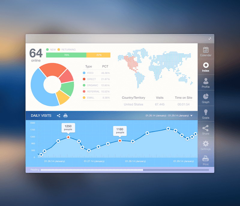
Tip: Get into the habit of A/B testing your design changes. Knowing that all of your changes will be A/B tested will give you a tremendous amount of freedom to try new (and potentially risky) things. If they work, you’ll find out almost immediately. Also, you won’t need to worry that some change you’ve made will ruin everything.
Content Audit
Content audit is the process of evaluating information assets on some part or all of an app or website. It could be said that a content audit is a content inventory and evaluation of each page’s content (either qualitative by a person or quantitative using analytics) and/or an assignment of content owners. It involves gathering all of the content on your website or in your app and assessing its relative strengths and weaknesses in order to prioritize your future marketing activities. By auditing, you’ll understand the content much better. You might find things you didn’t know existed, spot duplicated or outdated content, or identify all kinds of relationships in the content. The results of a content audit can be used for a global task (creating a content strategy) or a local task (optimizing a certain page).

Usability Test Report
Usability testing is a way to see how easy a product is to use by testing it with real users. A usability test report summarizes usability findings in a clear, concise and descriptive way, helping the project team to identify issues and work towards a solution.
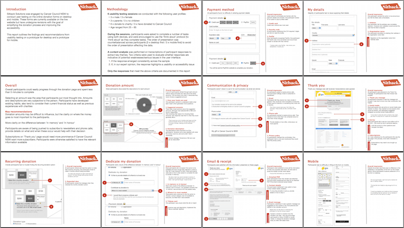
Tip: Rank your findings. Every issue that’s discovered through usability testing is not equally important. A usability report could have 5 or 100 findings, depending on the scale of the study, and sometimes it might be overwhelming for a team to go through all of them. That’s why findings should be ranked in terms of severity (low, medium or high). This will help the team identify critical issues exposed by the usability study.
Competitor Assessment
Competitor assessment is an assessment of the strengths and weaknesses of current and potential competitors. Assessing the strengths and weaknesses of your rivals is a critical part of your own UX strategy.
Competitive Analysis Report
An analysis of competitor’s products will map out their existing features in a comparable way. This competitive analysis report helps UX designers to understand industry standards and identify opportunities to innovate in a given area.
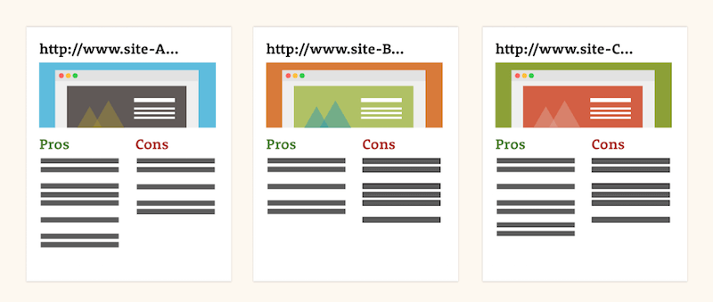
Tip: A useful starting point for identifying strengths and areas for improvement might be user experience heuristics. While competitive analysis isn’t intended to replicate heuristics evaluation, heuristics can be a good starting point because they offer a good structure for presenting information. Heuristics include efficient navigation, clarity of text and labels, consistency, readability, scannability, etc.
Value Proposition
A value proposition is a statement that maps out the key aspects of a product: what it is, who it is for and how it will be used. A value proposition helps the team form consensus around what the product will be.
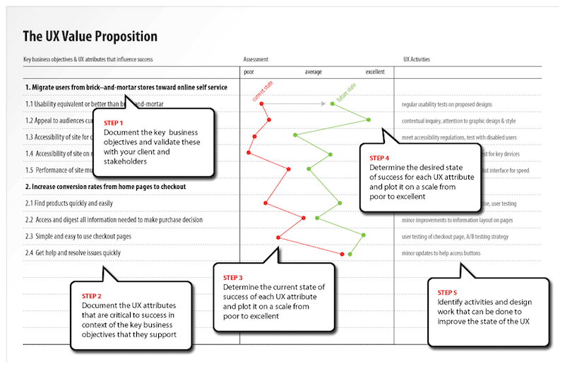
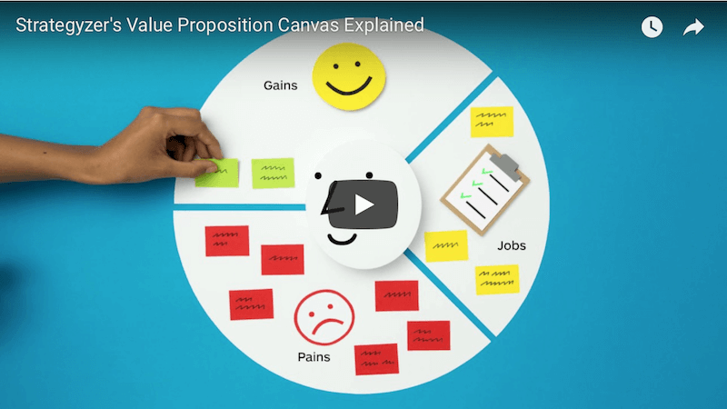
Tip: Make sure your value proposition is directly associated with key business objectives. By doing this, it will be much easier to have discussions about time and budget for UX activities.
User Research
User research focuses on understanding user behaviors, needs and motivations through observation techniques, task analysis and other feedback methodologies.
Personas
A persona is a fictional character who uses the product in a similar way to a potential user type. Personas make it easier for designers to empathize with users throughout the design process. Personas are a controversial tool in the UX armory: Some UX designers love them, others hate them. Thus, it’s important to understand not just benefits but also downsides of personas before using them in your UX design process.
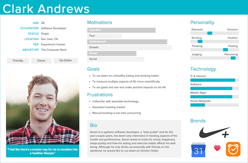
Tip: The most effective personas are created from in-depth user interviews and observation data of real users. Collect as much information and knowledge about users as possible by interviewing and/or observing a sufficient number of people who represent your target audience.
User Story
A user story is a simple description of a feature told from the perspective of a user of the product. Basically, it’s a very high-level definition of a requirement (at a conceptual level), containing just enough information that the developers can produce a reasonable estimate of the effort required to implement it.
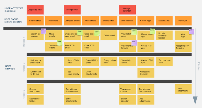
Tip: Use user stories to prevent feature creep. Feature creep is a term that comes up regularly during product design. It refers to the tendency to want to keep adding more features and expanding the scope of a project. Try to refuse to add any feature without a user story that explains why that particular feature matters.
Use Cases
A use case is a written description of how users will perform tasks in the app or website. It outlines, from a user’s point of view, an app or website’s behavior as it responds to a request. Each use case is represented as a sequence of simple steps, beginning with a user’s goal and ending when that goal is fulfilled.
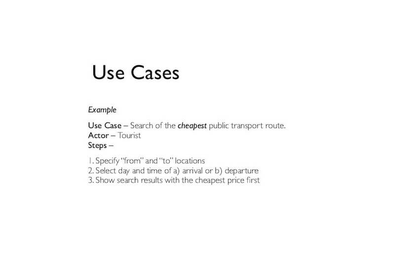
Tip: Use cases aren’t reserved for the UX phase; they can used for the QA phase as well. Thus, when reviewing the usability of a given product, it’s critical that the QA specialist have the use cases on hand. This will give the QA specialists a set of criteria that will have to have been addressed by the design.
Experience Map
An experience map is a diagram that explores the multiple steps taken by users as they engage with a product. It enables designers to frame the user’s motivations and needs at each step of the journey, designing solutions that are appropriate for each.
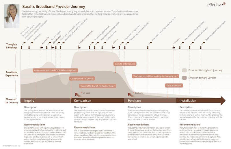
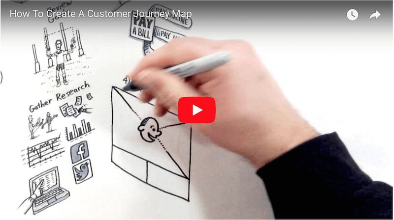
Tip: The process of creating a customer journey map has to begin with getting to know users. While you can turn to many sources for data about your users, one of the most obvious is website or mobile app analytics. Analytics provide valuable insight into what users are doing on your website or in your app, and this data will help you build compelling cases.
Storyboards (Current)
Storyboards are illustrations that represent shots and that ultimately represent a story. In UX, this story is the series of actions that users would take while using the product. Storyboards help designers to honor the real experiences of the people for whom they are designing.
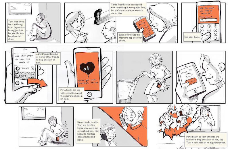
Tip: When thinking about storyboarding, most people focus on their ability (or inability) to draw. The good news is that you don’t need to be good at drawing before you start drawing storyboards. What is far more important is the actual story you want to tell. Clearly conveying information is key.

Survey
A survey is a quick and inexpensive way to measuring the level of user satisfaction and to collect feedback about the product. While a survey is a great way to collect information from a large number of users, it’s obvious limitation is a lack of qualitative insights — for example, why customers use the product in a certain way.
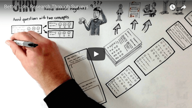
Tip: Keep the survey short. The temptation when creating a survey is to add more questions. The problem is that it can become painfully long, and people will simply skip questions. If you want to collect more valuable information, you should use a better approach. Keep the survey succinct and run another in a month or two.
Information Architecture
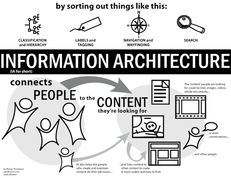
Information architecting is the practice of deciding how to arrange the parts of something to be understandable. For digital products, information architecture results in the creation of navigation, site maps, taxonomies and wireframes.
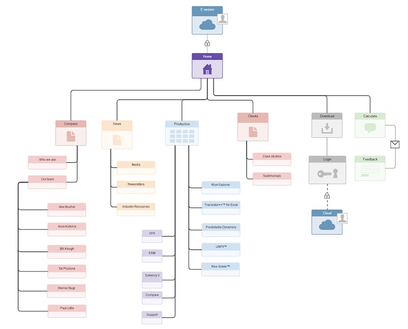
Site Map
A site map is a diagram of a website’s pages, organized hierarchically. It makes it easy to visualize the basic structure and navigation of the website.
Tip: If you want to create site map quickly and easily, use the card-sorting method.
Taxonomy
A taxonomy results from an exploration of multiple ways to categorize content and data: articles in a news website, product categories in an e-commerce app, etc. A taxonomy helps designers to define the content structure that supports the user’s and the business’ goals.
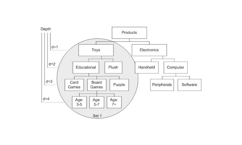
Tip: A taxonomy is a living document, and it needs to be retested and updated regularly.
Wireframe
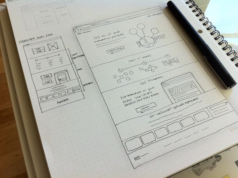
A wireframe is a visual guide that represents a page’s structure, as well as its hierarchy and key elements. Wireframes are useful when UX designers need to discuss ideas with team members and stakeholders, and to assist the work of visual designers and developers.
Wireframes can be presented in the form of sketches:
Wireframes can also be presented as digital illustrations:
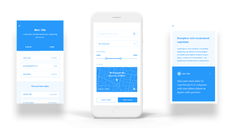
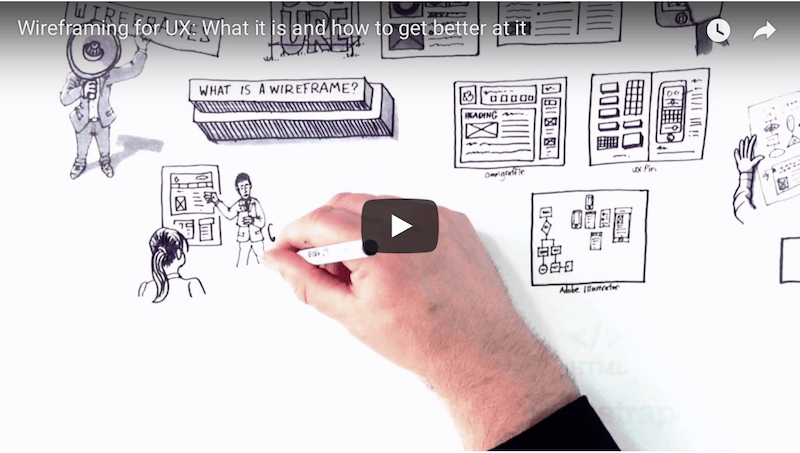
Tip: Keep wireframes simple, and annotate. The aim of a wireframe is to show the structure of a page’s design — details come later. If you plan to present a wireframe to the team, try to include annotations. Annotations help to create context and quickly deliver key ideas.
Interaction Design
Interaction design (often abbreviated as IxD) is the practice of designing interactive digital products. It’s a process by which designers create engaging user interfaces with logical and thought-out behaviors and actions.
Storyboards (Planned)
Basically, this is the same storyboard that we saw in the section on user research, with just one difference: These storyboards are used to sell design solutions. Designers use them to show the benefits of a proposed solution and to convince stakeholders with it.
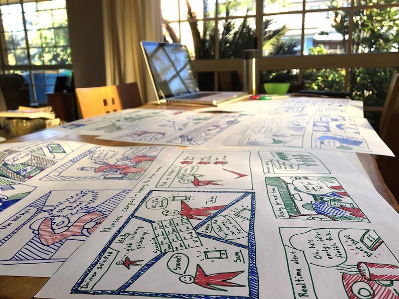
Tip: Design a clear outcome. Make sure your storyboard leaves the audience with no doubt about the outcome of the story. If you’re describing an unfavorable situation, end with the full weight of the problem; if you’re presenting a solution, end with the benefits of that solution for your character.
User Flow Diagram
A user flow diagram is a visual representation of the user’s actions to complete tasks within the product. A visualized user flow makes it easier to identify which steps should be improved or redesigned.
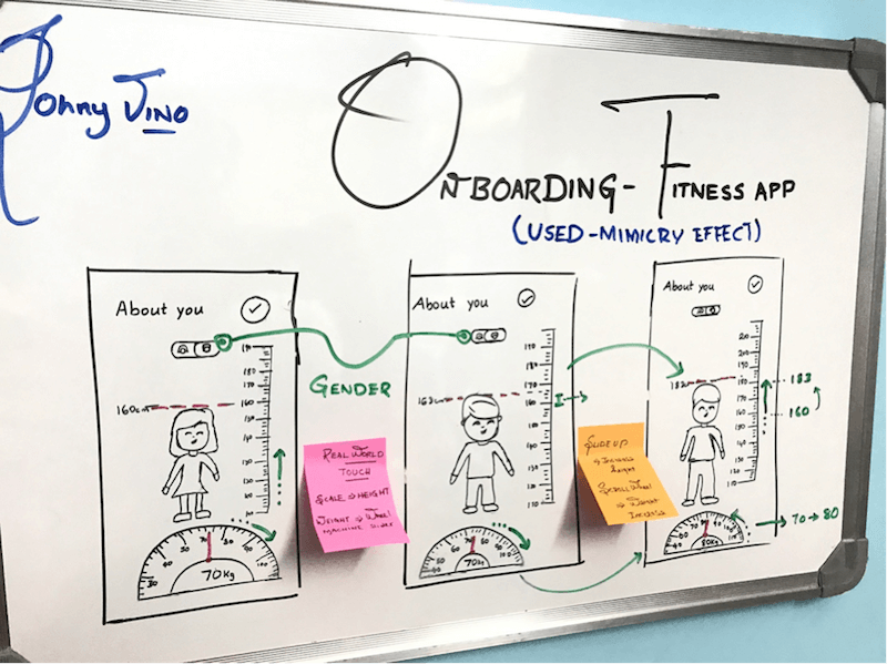
Tip: For many projects in the active design phase, creating user flows might be time-consuming, because drawings will become instantly outdated as screens change. Ryan from Basecamp proposes a simplified version of user flows. This format is really fast to sketch, and it communicates the essentials of what needs to happen.
Prototype
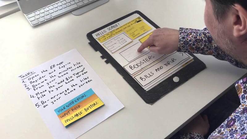
A lot of people use the terms “wireframe” and “prototype” interchangeably, but there’s a significant difference between the two design deliverables: They look different, they communicate different things, and they serve different purposes. While wireframes are similar to architectural blueprints (for example, a building plan), a prototype is a mid- to high-fidelity representation of the final product. The goal of a prototype is to test products (or product ideas) before investing a lot of time and money in the final product.
A prototype gives a taste on how the user will interact with the product. It can be analog:
Or it can be digital:
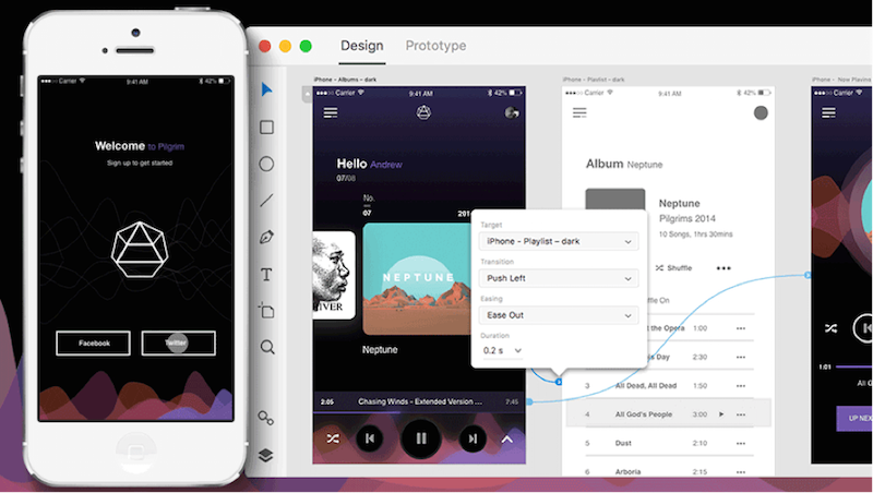
The most important thing is that the prototype should allow the user to experience content and test the main interactions with the interface in a way similar to how they would with the final product.
Tip: Test prototypes on real devices as much as possible. While an emulator on your desktop might work in some cases, nothing replaces experiencing designs on a real device.
Conclusion
Most likely you are surprised by the number of deliverables mentioned in this article. Rest assured, each project is different and a UX designer wouldn’t need to produce all of them for each project. Also, remember that there is no one-size-fits-all deliverable that will be equally effective for all projects. Each deliverable becomes an effective communication tool in the right context and with the right audience.
"This article is part of the UX design series sponsored by Adobe. Adobe XD tool is made for a fast and fluid UX design process, as it lets you go from idea to prototype faster. Design, prototype and share — all in one app. You can check out more inspiring projects created with Adobe XD on Behance, and also visit the Adobe XD blog to stay updated and informed."
Further Reading
- Better Context Menus With Safe Triangles
- The UX Of Flight Searches: How We Challenged Industry Standards
- How To Become A Better Speaker At Conferences
- Gatsby Headaches And How To Cure Them: i18n (Part 1)


 JavaScript Form Builder — Create JSON-driven forms without coding.
 Get a Free Trial
 Try if for free!

 Register for free today!

