Right-To-Left Development In Mobile Design
The Middle Eastern market is growing at a rapid pace, and, as a result, demand for various IT products is also booming in the region. What is peculiar, though, is that Middle Eastern countries require design that is not only compatible with their needs and comfortable for their users, but that is also suitable to their language standards, making a serious adaptation process very important. Given that most languages spoken in the Middle East are written and read from right to left (such as Arabic, Hebrew and Urdu), developers often face a range of problems when creating products in those languages.
Although this might seem like not that big of a deal, IT development for right-to-left (RTL) languages entails paying attention to a number of peculiarities. This is only further complicated by the fact that the RTL market is relatively new, and not many resources are available to help developers.
Our experience with RTL development has enabled us to compile a thorough list of tips that are useful for anyone developing an RTL product (such as a website or mobile app). By following the tips closely, you should be able to navigate the challenging waters of RTL development and deliver a functional, user-friendly result.
Flipping The Interface
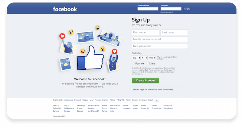
First and foremost, the interface must be flipped from right to left. You might think this is rather “D’uh” advice, but we simply could not disregard it, because it is in fact the very first thing to do.
Here’s an example of Facebook’s left-to-right (LTR) design:
And here is the RTL version of Facebook:
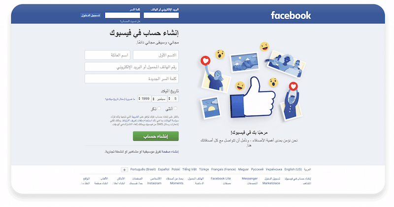
There are several ways to achieve this.
1. Using The Dir Attribute Or CSS
If the basic markup is built with floating blocks, it will look something like the example below.
For LTR design, pay attention to the styles. In this case, the link with logo will be fixed to the left, with the login-container to the right.
    <!doctype html>
    <html lang="en">
        <head>
            <meta charset="utf-8">
            <title>Example</title>
            <style>
                .float-left{
                float: left;
                }
                .float-right{
                float: right;
                }
                body[dir="rtl"] .float-left{
                float: right;
                }
                body[dir="rtl"] .float-right{
                float: left;
                }
            </style>
        </head>
        <body>
            <header class="clearfix">
                <a href="#" class="float-left logo"><img src="static/logo.png"></a>
            <nav class="float-right login-container"></nav>
        </header>
    <main></main>
    <footer></footer>
    </body>
    </html>

For RTL design, once you’ve assigned the body tag to the dir="rtl attribute, the whole markup will be mirrored, placing the logo to the right and login-container to the left. The opposite properties will be then applied to blocks with the float-left or float-right class.
<body dir="ltr">The dir attribute specifies the text’s direction and display (either left to right or right to left). Normally, browsers recognize the direction because it’s assigned in the Unicode character set, but with the dir attribute, you can set whatever direction you want.
The possible variants are dir="ltr", dir="rtl" and dir="auto". This attribute can also be rewritten with the CSS direction property.
Because text direction is semantically tied to content and not to presentation, we recommend that, whenever possible, web developers use the dir attribute and not the CSS properties related to it. That way, the text will be displayed properly even in browsers that don’t support CSS (or in those where CSS support is turned off).

With this attribute, you can horizontally mirror images, reassign fonts, align text to either side of the page, etc. However, the manual way is fairly labor-intensive. There are tools to automate the assembly of RTL styles, which we’ll get to a bit later in this post. In the meantime, we’ll describe another way of dealing with markup directional changes.
2. Using Flexbox
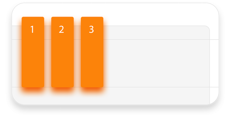
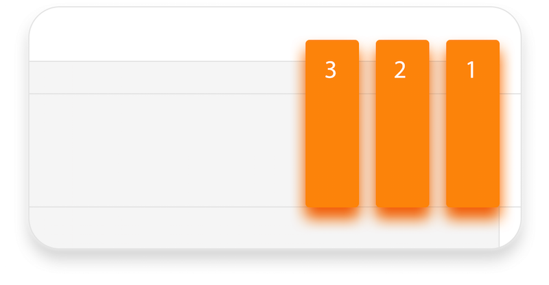
Flexbox is popular among developers for a couple of good reasons. Not only does it provide flexibility when adjusting the alignment of page elements and other bits, but it also eliminates the need to reassign styles for RTL development. See the code snippets below for more details.
For LTR:
    <div class="flex-container">
        <div class="flex-item">1</div>
        <div class="flex-item">2</div>
        <div class="flex-item">3</div>
    <div>
For RTL:
    <div class="flex-container" style="direction: ltr;">
        <div class="flex-item">1</div>
        <div class="flex-item">2</div>
        <div class="flex-item">3</div>
    <div>
The grid layout is also useful here. We set grid-template-areas in the containing block with {display: grid;} property (imagine it as a table with two columns and three rows). From the top: The header occupies the entire width of the screen, the sidebar is on the left, while the main content and the footer are on the right, one under another.
For LTR:
    <div class="grid"
    style="grid-template-areas: "header  header";
    "sidebar main"
    "sidebar footer";">
        <div class="item-1" style="grid-area: header;">header</div>
        <div class="item-2" style="grid-area: sidebar;">sidebar</div>
        <div class="item-3" style="grid-area: main;">main</div>
        <div class="item-4" style="grid-area: footer;">footer</div>
    </div>
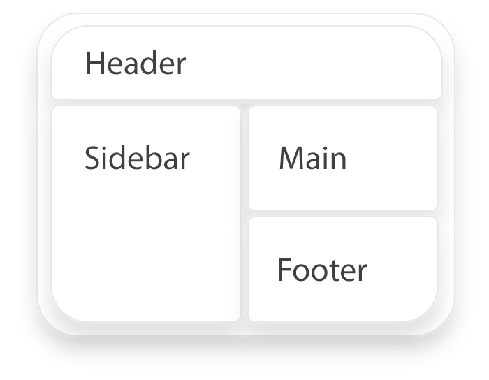
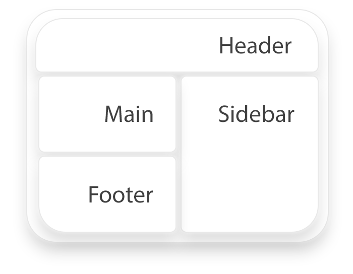
For RTL, by changing the dir attribute, the horizontal axis with the grid class and the {display: grid;} property will adjust to the specified direction. The layout matrix is then inverted:
    <div class="grid"
    style="grid-template-areas: "header header"
    "sidebar main"
    "sidebar footer";
    dir="rtl">
        <div class="item-1" style="grid-area: header;">header</div>
        <div class="item-2" style="grid-area: sidebar;">sidebar</div>
        <div class="item-3" style="grid-area: main;">main</div>
        <div class="item-4" style="grid-area: footer;">footer</div>
    </div>
Even though using tables to build layouts hasn’t been popular for a while now, they would still build flow direction as a component, just like in the previous examples, meaning that when you add the dir="rtl" tag, columns will start from the right and move from right to left. All table elements will follow this, unless the direction is clearly predefined beforehand.
Character Encoding
Save your file using a character encoding that includes the characters you need (UTF-8 is a good bet). Declare that you are going to use such characters in the head tag of your HTML page with:
<meta charset="utf-8"/>
UTF-8 is a character encoding capable of encoding all possible Unicode code points, and it covers almost all languages, characters and punctuation symbols. Using UTF-8 also removes the need for server-side logic when individually determining each page’s character encoding or each incoming form submission. Coding helps to convert everything into binary numbers. For instance, “hello” in UTF-8 would be stored like this (in binary): 01101000 01100101 01101100 01101100 01101111.
Formatted Text
Try as hard as you can to avoid using bold and italics. Bold text would make readability extremely difficult in most RTL languages (especially Arabic), and italics is simply never used. As well, capital letters are almost always disregarded in RTL languages.

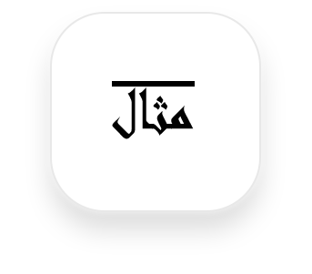
If you need to highlight a certain part of text in Arabic, overline it instead of underlining, interspacing or italicizing. Here is how we do it:
<h1>مثال</h1>
    h1 {
        text-decoration: overline;
    }
Make sure that all text is aligned to the right, and that font and font size are adjusted properly (better yet, customize them), because Latin fonts tend to affect Arabic readability rather poorly.
Actually, the best way to deal with fonts is to speak to your client (assuming, of course, they speak the language). The thing is that languages such as Arabic tend to have a great number of spoken and written variations, and if you’re making a product catered specifically to some region, it should really display the language version used there. If you find this matter interesting, information about the history of Arabic writing systems is available here.
In case your client isn’t a native speaker of the product’s language or isn’t able to help you, there is always the simple option of using one of the Google Noto fonts (there is one for every language, and all of them are free). Alternatively, Arabnet recommends 10 Arabic fonts (the list is from 2014, but things haven’t changed much in this area over the last three years). However, do keep in mind that your client always knows best which language variant is used most in their particular region, and if you have a chance to consult with them about it, do so right away.
Also, remember that words in RTL languages are often much shorter than words in English. So, adjust to keep a balance in how text is displayed on the page.
Icons
Using icons in RTL development can be tricky. Keep in mind that some of them might have to be mirrored, and some could be considered offensive to people of some nationalities, so double-check that the icons you’re using make sense.
Icons that are symmetrical and that don’t point in a particular direction should not be flipped.
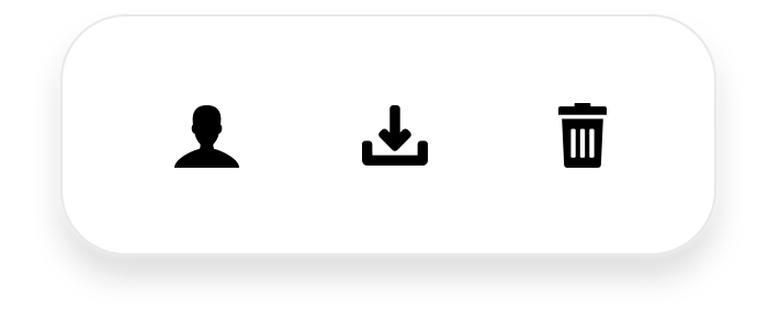
On the other hand, icons that clearly point in a particular direction should be mirrored.
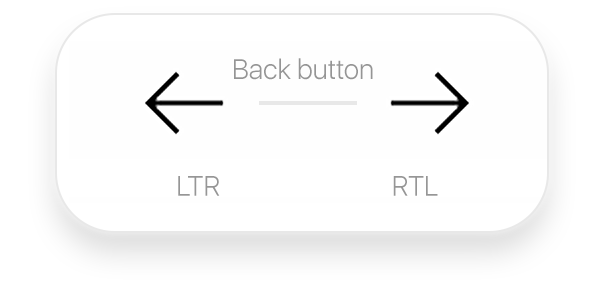
<span class="back-icon"></span>
    body[dir="rtl"] {
        transform: scale(-1, 1);
    }
The scale (x, y) CSS function used in the example above modifies the size of an element. If set to 1, it does nothing, but when negative, it performs as a “point reflection” and can modify size.
Icons that have characters or words from non-RTL languages don’t need to be mirrored. You should, however, localize them if necessary.
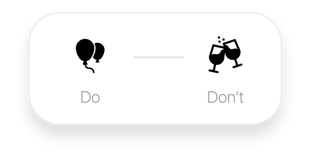
Ensure that the icons you’re using are appropriate. For example, using a wine glass as a symbol for a restaurant or bar could be misunderstood because alcohol consumption is prohibited in Islam. Cultural peculiarities need to be taken into account, and developers should double-check that the symbols and icons they’re using are appropriate for the target market.
Navigation Menus
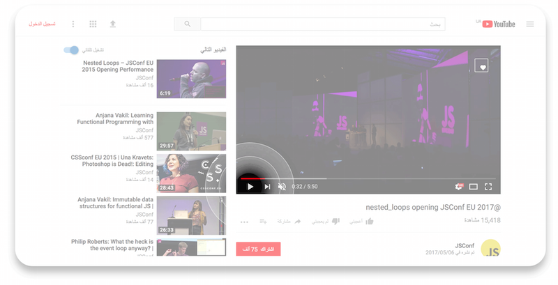
Logos, navigation buttons and menus should be located in the upper-right corner for RTL design. The two latter elements also need to be displayed in reverse order. You don’t, however, need to mirror all of the stuff related to controlling media content (such as play and pause buttons).
Digit Ordering
The order of digits in numbers should not be changed for RTL. Note the phone number below. The digits are displayed in the same order in both LTR and RTL, but the telephone icon changes position. The same rule applies to other digits (such as addresses and other numeric strings).

Position Of Control Buttons
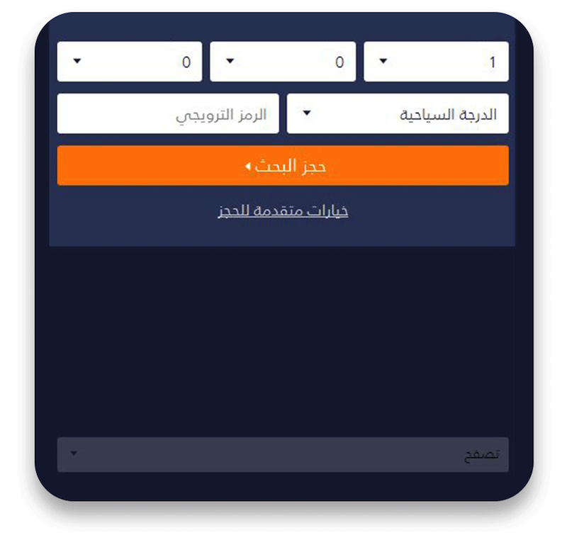
Even though people speaking RTL languages perceive and process information from right to left, many of them are right-handed. Thus, it would be a good idea not to mirror control buttons, so that users can interact with them comfortably. Instead, center them to resolve any issues. For instance, if the orange button shown below was located to the left, it’d be extremely difficult for people to reach it with their right thumb while holding their device in one hand:
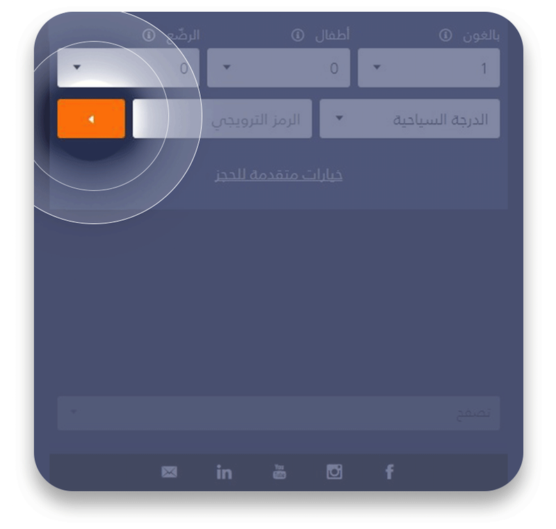
In this case, it would be much more convenient for users if such important elements of interaction were large and located in the middle of the screen.
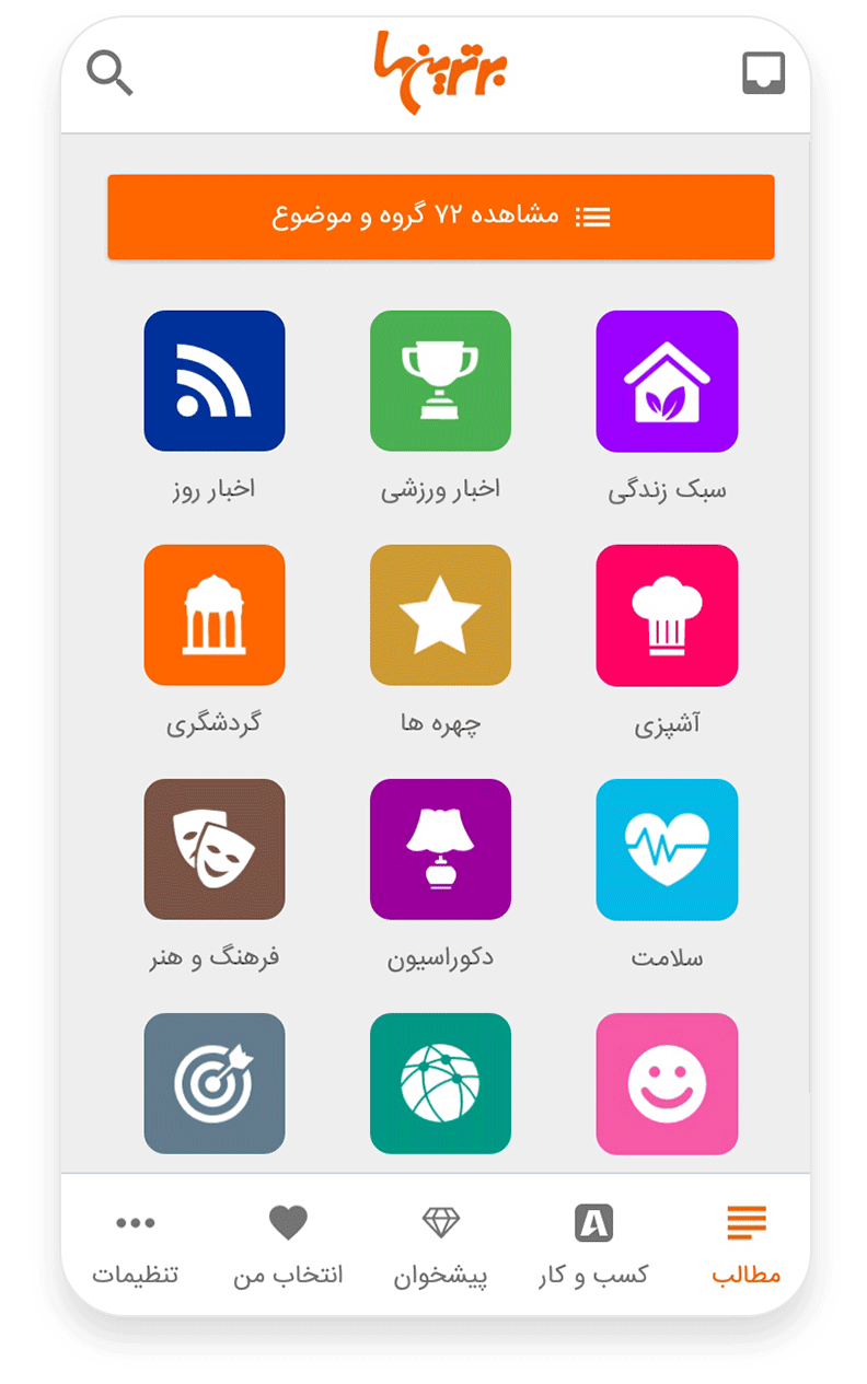
The elements in the bottom tab bar below should be positioned from right to left. RTL also exists in the Persian language — see example below:
Navigation drawers should appear from the right side.

Position Of Other Symbols
The position of symbols that can be used for both RTL and LTR (such as punctuation marks) will depend on the direction of the text as a whole. This is because browsers process RTL words in the RTL direction, even though the data format starts from the beginning. Punctuation is converted only towards the specified direction.
The following example should illustrate the issue better:

To fix this problem, you can convert RTL and LTR strings (or text fragments) into separate elements. Then, specify their direction with either the dir attribute or the CSS direction property. In the first case, you would do this:
    <p dir="rtl" class="rtl-text">?سوف أعطي مثالا على ذلك. لا تمانع</p>
    <p dir="ltr" class="ltr-text">I will give an example. Don’t you mind?</p>
And in the second, this:
.rtl-text {
    direction: rtl;
}

.ltr-text {
    direction: ltr;
}
Alternatively, you could also use the bdi tag to avoid this type of issue. However, it is only supported in Chrome (16) and Firefox (10).
Separate RTL CSS File
For basic CSS styles, you should create a separate RTL file and set the horizontal properties there (floating left and right, padding left and right, margins and so on), while also redefining them appropriately:
div.class {
    width: 150px;
    height: 100px;
    float: left;
    padding: 0 15px 0 10px;
}
And in the rtl.css file:
html[dir="rtl"] div.class {
    float: right;
    padding: 0 10px 0 15px;
}
If you need to eliminate some other LTR-directed features, you can always create and attach another separate rtl.css file.
In case this approach doesn’t meet your needs well enough, you can create two separate style files for LTR and RTL. Various utilities can be applied to automate their assembly. One such program is css-flip (created by Twitter). With its help, you can easily compile a file with properties redefined for RTL from an existing source file.
In input.css:
p {
    padding-left: 1em;
}
And in output.rtl.css:
p {
    padding-right: 1em;
}
You can also use replacements and exceptions, based on directives in the source file. For example, in input.css:
p {
    /@replace: -32px -32px/ background-position: -32px 0;
    /@replace: ">"/ content: "<";
    /@noflip/ float: left;
}
And in output.rtl.css:
p {
    background-position: -32px -32px;
    content: ">";
    float: left;
}
RTLCSS is another tool that supports replacements (exceptions) and makes it possible for developers to rename selectors, add local configurations of exception, and delete or add properties.
You could also use plugins for assembly instruments, including for Gulp, Grunt and Webpack.
For example, in input.css:
.example {
    transform: translateY(10px) /*rtl:append:scaleX(-1)*/;
    font-family: "Helvetica Neue", Arial/*rtl:prepend:"Arabic fonts", */;
    font-size:1.3em/*rtl:1.2em*/;
    /*rtl:remove*/
    text-decoration:underline;
    /*rtl:begin:ignore*/
    margin-left:15px;
    padding-left:20px;
    /*rtl:end:ignore*/
}
And in output.rtl.css:
.example {
    transform: translateY(10px) scaleX(-1);
    font-family: "Arabic fonts","Helvetica Neue", Arial;
    font-size:1.2em;
    margin-left:15px;
    padding-left:20px;
}
You can also make configurations for renaming selectors. Again, in input.css:
/*rtl:begin:options: {
    "autoRename": true,
    "stringMap":[ {
       "name" : "prev-next",
       "search" : ["prev"],
       "replace" : ["next"],
       "options" : {"ignoreCase":false}
   } ]
} */
slide-prev {
    content: '<';
}
slide-next {
    content: '>';
}
/*rtl:end:options*/
And in output.rtl.css:
slide-next {
    content: '<';
}
slide-prev {
    content: '>';
}
Calendars
Calendars are probably one of the most important and complicated aspects of RTL design, because calendar years are different between LTR and RTL geographic regions.
Hijri
Hijri, the Islamic calendar, is lunar-based, which means that a year in the Gregorian calendar is longer than in the Islamic calendar. As a result, Hijri always has to shift according to the Gregorian calendar.
Hebrew Calendar
The Hebrew calendar, which has 12 lunar months, with an extra month added every few years, also differs from the Gregorian calendar. These differences make it hard to find an adequate tool for working with both Gregorian calendars in LTR scripts and non-Gregorian calendars in RTL scripts.
Tools For Displaying Calendars
One popular tool is FullCalendar, because it calculates time based on Moment.js. However, it cannot convert between different types of calendars and is only useful for localizing dates and displaying RTL content.
dijit/Calendar is able to display non-Gregorian calendars but has a rather limited range of tasks.
The DateTimeFormat constructor is an invaluable property for international objects. It makes it possible to pass additional options to the argument string when specifying the exact formatting for time and date.
Below, you can see how a date should be converted from the Gregorian calendar to the Islamic one:
var sampleDate = new Intl.DateTimeFormat("ru-RU-u-ca-islamicc").format(new Date()); // => "26.03.2017" console.log(sampleDate); // => "27.06.1438 AH"Abbreviations (Days Of Week)
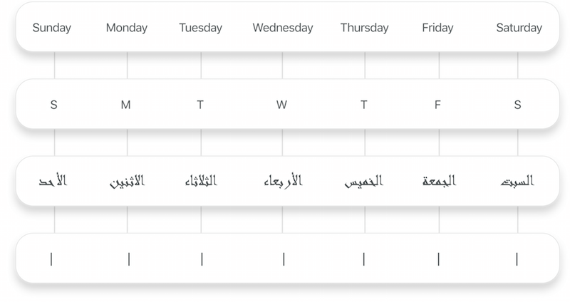
Although abbreviating the names of the days of the week is standard in many languages, this isn’t possible in Arabic because all of them start with the same letter. Instead, simply display their whole names and reduce the font size.
Internationalization
If your product requires internationalization, consider the ECMAScript Internationalization API. It comes with a language-sensitive string comparison and relevant formatting for numbers, dates and time.
Another important point is that ECMAScript supports not only Arabic, but also a wide range of other combinations, such as Arabic-Arabic and Arabic-Tunisian.
Also, keep in mind that the use of Eastern and Western Arabic numerals might depend on the language variant. Some regions might use Eastern Arabic numerals (123), while others use Western ones (١٢٣).
Formatting Arabic-Egyptian Numerals
var sampleNumber = new Intl.NumberFormat(‘ar-EG’).format(12345);
        console.log(sampleNumber); // => ١٢٬٣٤٥
In Tunisia, for instance, Eastern Arabic numerals are usually used:
var sampleNumber = new Intl.NumberFormat(‘ar-TN’).format(12345);
        console.log(sampleNumber); // => 12345
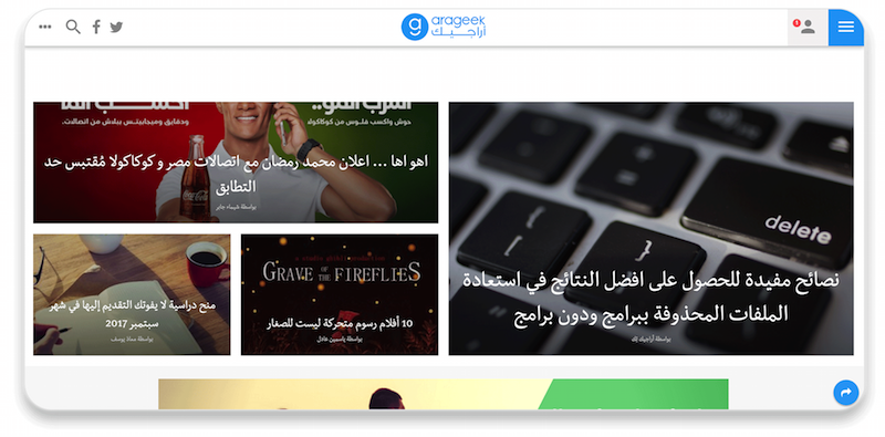
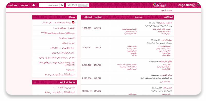
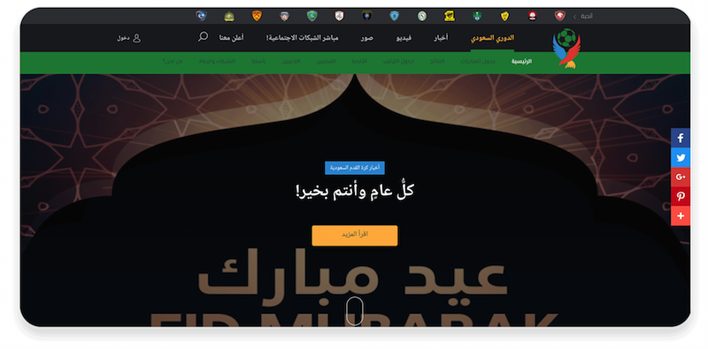
Examples Of Native Arabic Websites
Share Your Experience!
Cultural and linguistic peculiarities can be a hassle when you’re developing for different regions and markets. When it comes to the RTL market, developers must use their knowledge to adhere to a completely different set of rules, making the whole process more challenging and potentially frustrating. Using the 12 tips above, we hope you’re able to overcome some of the most common problems with RTL development.
If you have encountered any obstacles related to RTL development, please describe them (along with the solutions you’ve found) in the comments section below. The more that developers share their knowledge and experience, the easier it will be for all of us to deal with the peculiarities of RTL development.
Further Reading
- Accessible Target Sizes Cheatsheet
- Modern Technology And The Future Of Language Translation
- Designing Web Design Documentation
- Everything I Know About UX Research I First Learned From Lt. Columbo


 SurveyJS: White-Label Survey Solution for Your JS App
 Agent Ready is the new Headless

