Art Directing For The Web With CSS Grid Template Areas
(This article is kindly sponsored by CoffeeCup Software.) Alright, I’m going to get straight to the point. CSS Grid is important, really important, too important to be one of those "I’ll use it when all browsers support it" properties. That’s because, with CSS Grid, we can now be as creative with layout on the web as we can in print, without compromising accessibility, responsiveness, or usability.
If you’re at all serious about web design or development, you need to be serious about learning and using CSS Grid too. In this article I’m going to explain how to use one aspect, grid-template areas, a way of arranging elements that even a big, dumb mug like me can understand, and one that doesn’t get enough attention.
Now, you want to see some action and some code, I know that, but hold on one Goddam minute. Before you learn "how," I want to teach you "why" it’s important to make the kind of layouts we’ve seen in other media for decades, but have mostly been absent from the web.
Feeling Frustrated
I guess you’ve seen those "which one of these two layouts are you designing today?" tweets, lamenting the current state of design on the web. Even I’ve spoken about how web design’s lost its "soul." I bet you’ve also seen people use CSS Grid to recreate posters or pages from magazines. These technical demonstrations are cool, and they show how easy implementing complex layouts with CSS Grid can be when compared to other methods, but they don’t get to the bottom of why doing this stuff matters.
So what’s the reason? Why’s layout such an important part of design? Well, it all boils down to one thing, and that’s communication.
For what seems like forever, web designers have created templates, then filled them, with little consideration of the relationship between content and layout. I suppose that’s inevitable, given considerations for content management systems, our need to make designs responsive, and the limitations of the CSS properties we’ve used until now. Sure, we’ve made designs that are flexible, usable, but we’ve been missing a key piece of the puzzle, the role that layout plays in delivering a message.
If you’ve been around the block a few times, you’ll know the role color plays in setting the right tone for a design. I don’t need to tell you that type plays its part too. Pick the wrong typeface, and you run the risk of communicating ineffectively and leaving people feeling differently to how you intended.
Layout — closely linked to aspects of typography like the ’measure’ — plays an equally important role. Symmetry and asymmetry, harmony and tension. These principles draw people to your content, guide them, and help them understand it more easily. That’s why crafting the right layout is as important as choosing the most appropriate typeface. Print designers have known this for years.
Telling Stories Through Art Direction
Art direction matters as much on the web as it does in other media, including print, and what I’m going to cover applies as much to promoting digital products as it does to telling stories.
What do you think of when you hear the term ’art direction?’ Do you think about responsive images, presenting alternative crops, sizes or orientations to several screen sizes using the <picture> element or ’sizes’ in HTML? They’ve become useful responsive design and art direction tools, but there’s more to web design than tools.
Do you think of those designers like Jason Santa Maria and Trent Walton who sometimes art direct their writing by giving an entry its own, distinctive image, layout and typography. This gets us closer to understanding art direction, but images, layout, and typography are only the result of art direction, not the meaning of it.
So if art direction isn’t exactly those things, what exactly is it? In a sentence, it’s the art of distilling an essential, precise meaning or purpose from a piece of content — be that magazine article or a list of reasons why to use the coolest app from the hottest start-up — and conveying that meaning or purpose better by using design. We don’t hear much about art direction on the web, but it’s well established in another medium, perhaps the most memorable being magazines and to some extent newspapers.
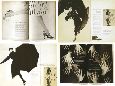
I’m not old enough to remember first hand Alexey Brodovitch’s work on Harpers Bazaar magazine from 1934 to 1958.
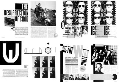
I do remember Neville Brody’s artistic art direction for the Face magazine and I’m still inspired by it every day.
Art direction is so rarely discussed in relation to the web that you could be forgiven for thinking that it’s not relevant. Perhaps you see art direction as an activity that’s more suited to the print world than it is to the web? Some people might think of art direction as elitist in some way.
I don’t think that any of that’s true. Stories are stories, no matter where they’re told or through what medium. They may be thought-provoking like the ones published on ProPublica, or they might be the story of your company and why people should do business with you. There’s the story of how your charity supports a good cause and why people should donate to it. Then there’s the story of your start-up’s new app and why someone should download it. With all of these stories, there’s a deeper message beyond just telling the facts about what you do or sell.
Art direction is about understanding those messages and deciding how best to communicate them through the organization and presentation of words and visuals. Is art direction relevant for the web? Of course. Art directors use design to help people better understand the significance of a piece of content, and that’s as important on the web as it is in print. In fact, the basic principles of art direction haven’t changed between print and digital.
I’d go further, by saying that art direction is essential to creating cohesive experiences across multiple channels, so that the meaning of a story isn’t lost in the gaps between devices and screen sizes.
David Hillman, formerly of The Guardian and New Statesman and designer of many other publications said:
"In its best form, (art direction) involves the art director having a full and in-depth understanding of what the magazine says, and through design, influencing how it is said."
My friend Mark Porter, coincidentally the former Creative Director at The Guardian also said:
"Design is being in charge of the distribution of elements in space."
CSS Grid makes being in charge of the distribution of elements more possible than ever before.
Art Directing A Hardboiled Story
I guess now is the time to get down to it, so I’m going to tell you how to put some of this to work in a series of Hardboiled examples. I’ll shine a flashlight on layout and how it helps storytelling and then give you the low down on how to develop one of these designs using CSS Grid.

First, the backstory. On the cover of my 2010 edition of Hardboiled Web Design (1), a mystery woman in a red dress (there’s always a woman in a red dress) is pointing a gun at our private dick. (Sheesh, I know that feeling.) By the Fifth Anniversary Edition in 2015 (2), the story’s moved on and a shadow moves ominously across the door of our detective’s office. The door flies open, two villains burst in (3), and a fist fight ensues (4). Our mystery woman sure knows how to throw a punch and before you can say "kiss me, deadly" one villain’s tied to a chair and ready to spill the beans (5).
Chapter Three
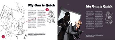
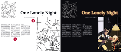
I’ll start telling that story at the explosive moment when those two villains bust open the door. Now, if you’ve read Scott McCloud’s book ‘Understanding Comics’ you’ll know that panel size affects how long people spend looking at an area, so I want to make the image of our bad guys as large as possible to maximise its impact (1). What the hoods don’t know is that our woman is waiting for them. I use layout to add tension by connecting their eye lines, (2) at the same time drawing a reader’s eyes to where the content starts.
Chapter Four
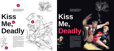
As the first villain bursts onto the scene, I use the left edge of the page, without margins, to represent the open door (1). As most of the action takes place on the right, I create a large spacial zone using the majority of the height and width of the page (2).
Now, when fists fly in all directions, our layout needs to do the same, so my content comes from the top — where whitespace draws the eye down to the bold paragraph (3) — and from the left with the enormous headline (4). You might be wondering why I haven’t mentioned that smaller image in the top-right, but I’ll get to that in a minute.
Chapter Five
The fight’s over, and our detective is back in control, so on this final page I use a more structured layout to reflect the order that’s returned. Solid columns of justified text (1) with plenty of whitespace around them add to the feeling of calm. At the same time, the right aligned caption (2) feels edgy and uncomfortable, like the gunpoint interrogation that’s taking place.
Getting My Dands Dirty
It’s time for a confession. I’m not going to teach you everything you need to know about developing layouts using CSS Grid as there are plenty of smarter people who’ve done that before:
- Grid by Example by Rachel Andrew
- Learn CSS Grid with Wes Bos
- A Complete Guide to Grid by Chris House on CSS Tricks
Instead, I’ll show you the inspiration for one grid, how I translated it into a (large screen) layout using columns and rows in CSS Grid, and then placed elements into the spacial zones created using the grid-template areas property. Finally, I’ll deconstruct and alter the design for smaller screen sizes.
The Perfect Beat
My inspiration for the layout I use came from this 1983 design by Neville Brody for The Face Magazine. I was drawn to how Brody cleverly created both horizontal and vertical axis and the large space occupied by the main image.

I did the same by applying the following CSS Grid properties to the margin-less <body> element of my page, where columns one fraction unit wide repeat five times with a 2vw gap between them:
body {
margin: 0;
padding : 0;
display: grid;
grid-column-gap : 2vw;
grid-template-columns: repeat(5, 1fr); }

In CSS Grid we define a grid module by giving it a name, then we place an element into either a single module or multiple adjacent modules — known as spacial zones — with the grid-template-areas property. Sounds complicated huh? No, not really. It’s one of the easiest and most obvious ways of using CSS Grid, so let’s get to work.
First things, first. I have five elements to position, and they are my "Kiss Me, Deadly" title, the largest ’banner’ image, main content, aside paragraph and two images, fig-1 and fig-2. My HTML looks like this:
<body>
<picture role="banner">…</picture>
<h1 class="title">…</h1>
<main>…</main>
<aside>…</aside>
<img class="fig-1">
<img class="fig-2">
</body>
I wrote that markup in the order that makes most sense, just as I would when constructing a narrative. It reads like a dream on small screens and even without styles. I give each element a grid-area value that in a moment I’ll use to place it on my grid:
[role="banner"] { grid-area: banner; }
.title { grid-area: title; }
main { grid-area: main; }
aside { grid-area: aside; }
.fig-1 { grid-area: fig-1; }
.fig-2 { grid-area: fig-2; }
Your grid area values don’t necessarily need to reflect your element types. In fact, you can use any values, even single letters like a, b, c, or d.
Back with the grid, I add three rows to the columns I created earlier. The height of each row is automatically defined by the height of the content inside it:
body {
grid-template-rows: repeat(3, auto); }
Here’s where the magic happens. I literally draw the grid in CSS using the grid-template-areas property, where each period (.) represents one empty module:
body {
grid-template-areas:
".  .  .  .  ."
".  .  .  .  ."
".  .  .  .  ."; }
Now it’s time to position elements on that grid using the grid-area values I created earlier. I place each elements’ value into a module on the grid and if I repeat that value across multiple adjacent modules — either across columns or row, that element will expand across them to create a spacial zone. Leaving a period (.) will create an empty space:
body {
grid-template-areas:
".  aside  .  fig-2  fig-2"
"title  title  banner  banner  banner"
"fig-2  main  banner  banner  banner"; }
One more small detail before I finish the layout CSS. I want the content of the aside element to sit at the bottom — close to the title and leaving ample white space above it to draw someone’s eye down — so I use an align-self property that might be familiar from learning Flexbox, but with a new value of ’end.‘
aside {
align-self: end; }
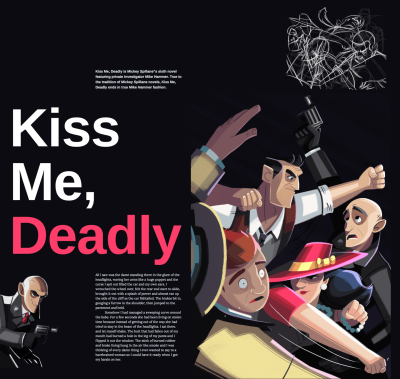
All that remains is to add a few other styles to bring the design to life, including a striking inverse color scheme and a bright, red accent that ties the word "Deadly" in the title to the color of our woman’s dress:
<h1 class="title">Kiss Me, <em>Deadly</em></h1>

.title em {
font-style: normal;
color : #fe3d6b; }
Going Up In Smoke
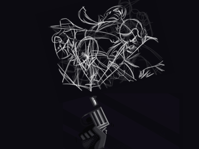
Now, I know you’ve been wondering about that smaller fight image, and I need to admit something. Natalie Smith made only one finished fists flying illustration for my Hardboiled Shot covers, but her sketches were too good to waste. I used CSS Grid to position an inverted version of one pencil sketch above the gun and rotated it with a CSS transform to form a cloud of smoke.
Breaking It Down
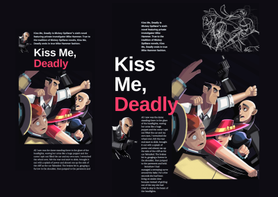
In this article, I’ve shown how to create a layout for large screens, but in reality, I start with a small one and then work up, using breakpoints to add or change styles. With CSS Grid, adapting a layout to various screen sizes is as easy as positioning elements into different grid-template areas. There are two ways that I can do this, first by changing the grid itself:
body {
grid-template-columns: 50px repeat(2, 1fr); }

@media screen and (min-width : 48em) {
body {
grid-template-columns: repeat(5, 1fr); }
}
The second, by positioning elements into different grid-template areas on the same grid:
body {
grid-template-areas:
"fig-1  aside  aside  aside  aside"
"fig-1  title  title  title  title"
"banner  banner  banner  banner  banner"
"....  main  main  main  main"; }

@media screen and (min-width : 64em) {
body {
grid-template-areas:
"....  aside  ....  fig-2  fig-2"
"title  title  banner  banner  banner"
"fig-1  main  banner  banner  banner"; }
}
Using CSS Grid Builder
Grid template areas make developing art directed layouts so easy that even a flat-foot like me can do it, but if you’re the type that likes tools to do the dirty work, CSS Grid Builder from CoffeeCup Software might be just the thing for you. You may have used WYSIWYG editors before, so you might be remembering how lousy the code they spat out was. Let me stop you there. CSS Grid Builder outputs clean CSS and accessible markup. Maybe not as clean as you write yourself, but pretty damn close, and the small team who developed it plan to make it even better. My handwritten HTML looks like this:
<picture role="banner">
    <source srcset="banner.png" media="(min-width: 64em)">
    <img src="banner-small.png" alt="Kiss Me, Deadly">
</picture>
The CSS Grid Builder <picture> element comes wrapped in an extra division, with a few other elements thrown in for good measure:
<div class="responsive-picture banner" role="banner">
    <picture>
    <!--[if IE 9]><video style="display: none;"><![endif]-->
    <source srcset="banner.png" media="(min-width: 64em)">
    <!--[if IE 9]></video><![endif]-->
    <img alt="Kiss Me, Deadly" src="banner-small.png">
    </picture>
</div>
Like I said, close enough, and if you don’t believe me, download a set of exported files from my Hardboiled example. Maybe that’ll convince you.
Browsers’ developer tools are getting better at inspecting grids, but CSS Grid Builder helps you build them. Obviously. At its core, CSS Grid Builder is a Chromium-based browser wrapped in a user-interface, and it runs on macOS and Windows. That means that if the browser can render it, the UI tools can write it, with one or two notable exceptions including CSS Shapes.
In fact, CSS Grid Builder builds more than grids, and you can use it to create styles for backgrounds — including gradients, which is very handy — borders, and typography. It even handles Flexbox and multi-column layouts, but you’re here because you want to learn about CSS Grid.
Looking Around The Interface
The interface in CSS Grid Builder, is pretty much as you’d expect it, with a wide area for the design you’re making on the left and controls over on the right. Those controls include common elements; text, images, interactive buttons and form controls, and layout containers. If you need one of those elements, drag and drop it into your work area.
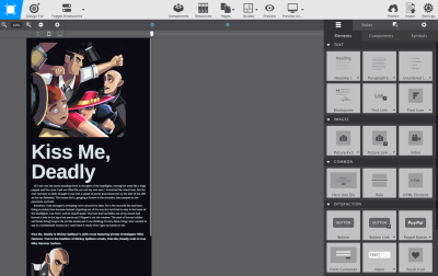
Press to reveal the Styles tab, and you’ll find controls for naming class and ID attributes, applying styles at specific breakpoints and in particular states. All very useful, but it’s the layout section — somewhat inconveniently tucked away at the bottom of the pane — that’s the most interesting.
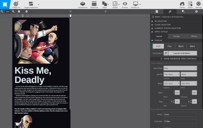
In this section you can design a grid. Setting up columns and rows to form a layout without visual representation can be one of the hardest parts of learning how ‘grid’ works. The app’s ability to visually define the grid structure is a handy feature, especially when you’re new to CSS Grid. This is the section I’m going to explain.

Using CSS Grid Builder I added a container division. When selecting that in the work area, I get access to the Grid Editor. Activate that, and all the tools needed to visually build a grid are there:
- Add columns and rows
- Align and justify content and items within each module
- Size columns and rows using every type of unit including fr and minmax
- Specify gaps
- Name grid-template-areas
- Specify breakpoints
When I’m happy with those settings, "OK" the changes and they’re applied to the design in the work area. Back there, use sliders to preview the results at various breakpoints, and if you’re one of those people who’s worried about the shrinking percentage of people using incapable browsers, CSS Grid Builder also offers settings where you can figure fallbacks. Then just copy and paste CSS styles to somewhere else in your project or export the whole kit and caboodle.

CSS Grid Builder is currently free while CoffeeCup develops it and if you like what they’re doing, you can throw a few dollars their way to help fund its development.
Cleaning Up
I’m finding it hard to contain my excitement about CSS Grid. Yes, I know I should get out more, but I really do think that it offers us the best chance yet of learning lessons from other media to make the websites we create better at communicating what we aim to convey to our audiences. Whether we make websites for businesses who want to sell more, charities who need to raise more money through donations to good causes, or news outlets who want to tell stories more effectively, CSS Grid plus thoughtful, art directed content makes that all possible.
Now that’s Hardboiled.
I hope you enjoyed this article, now view the project files on CodePen or download the example files.
 ‘Art Direction for the Web’ by Andy Clarke, the first Hardboiled Web Design ‘shot.’ Shots are a series of short books on ‘Art Directing for the web, ’ ‘Designing with a Browser,’ and ‘Selling Creative Ideas’ to be published throughout 2018.
Further Reading
- CSS Blurry Shimmer Effect
- How To Draw Radar Charts In Web
- Overflow Issues In CSS
- Everything You Need To Know About Alignment In Flexbox

