Scroll Bouncing On Your Websites
overscroll-behavior, which was implemented in Chrome on December 2017 and in Firefox on March 2018, is also described here. A good understanding of this effect is very helpful for building or designing any website that has fixed elements.Scroll bouncing (also sometimes referred to as scroll ‘rubber-banding’, or ‘elastic scrolling’) is often used to refer to the effect you see when you scroll to the very top of a page or HTML element, or to the bottom of a page or element, on a device using a touchscreen or a trackpad, and empty space can be seen for a moment before the element or page springs back and aligns itself back to its top/bottom (when you release your touch/fingers). You can see a similar effect happen in CSS scroll-snapping between elements.
However, this article focuses on scroll bouncing when you scroll to the very top or very bottom of a web page. In other words, when the scrollport has reached its scroll boundary.
Collecting Data, The Powerful Way
Did you know that CSS can be used for collecting statistics? Indeed, there's even a CSS-only approach for tracking UI interactions using Google Analytics. Read a related article →
A good understanding of scroll bouncing is very useful as it will help you to decide how you build your websites and how you want the page to scroll.
Scroll bouncing is undesirable if you don’t want to see fixed elements on a page move. Some examples include: when you want a header or footer to be fixed in a certain position, or if you want any other element such as a menu to be fixed, or if you want the page to scroll-snap at certain positions on scroll and you do not want any additional scrolling to occur at the very top or bottom of the page which will confuse visitors to your website. This article will propose some solutions to the problems faced when dealing with scroll bouncing at the very top or bottom of a web page.
My First Encounter With The Effect
I first noticed this effect when I was updating a website that I built a long time ago. You can view the website here. The footer at the bottom of the page was supposed to be fixed in its position at the bottom of the page and not move at all. At the same time, you were supposed to be able to scroll up and down through the main contents of the page. Ideally, it would work like this:
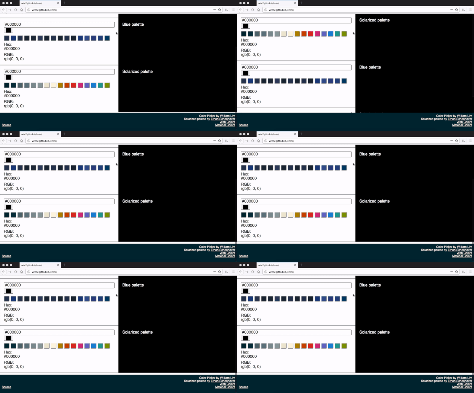
It currently works this way in Firefox or on any browser on a device without a touchscreen or trackpad. However, at that time, I was using Chrome on a MacBook. I was scrolling to the bottom of the page using a trackpad when I discovered that my website was not working correctly. You can see what happened here:
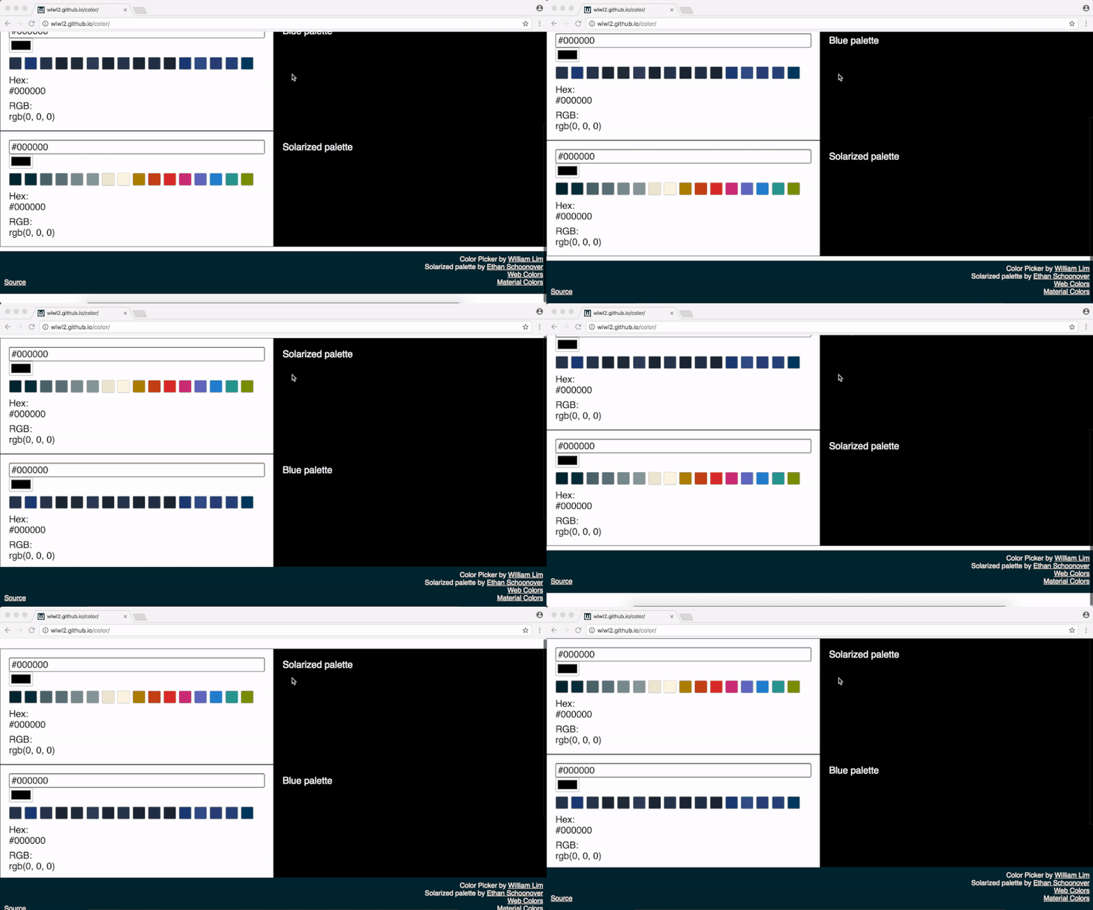
Oh no! This was not what was supposed to happen! I had set the footer's position to be at the bottom of the page by setting its CSS position property to have a value of fixed. This is also a good time to revisit what position: fixed; is. According to the CSS 2.1 Specification, when a “box” (in this case, the dark blue footer) is fixed, it is “fixed with respect to the viewport and does not move when scrolled.” What this means is that the footer was not supposed to move when you scroll up and down the page. This was what worried me when I saw what was happening on Chrome.
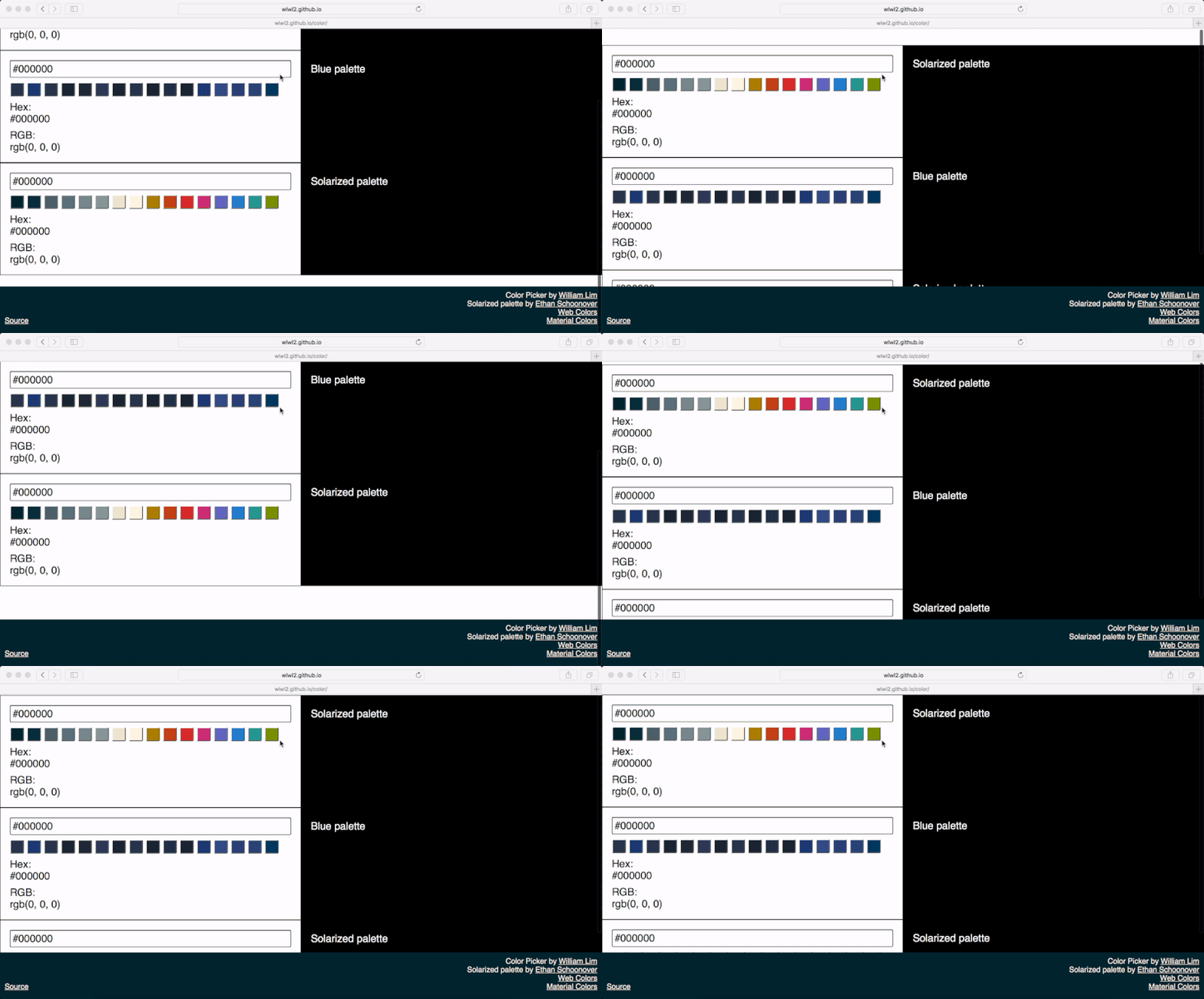
To make this article more complete, I’ll show you how the page scrolls on both Mobile Edge, Mobile Safari and Desktop Safari below. This is different to what happens in scrolling on Firefox and Chrome. I hope this gives you a better understanding of how the exact same code currently works in different ways. It is currently a challenge to develop scrolling that works in the same way across different web browsers.
Searching For A Solution
One of my first thoughts was that there would be an easy and a quick way to fix this issue on all browsers. What this means is that I thought that I could find a solution that would take a few lines of CSS code and that no JavaScript would be involved. Therefore, one of the first things I did, was to try to achieve this. The browsers I used for testing included Chrome, Firefox and Safari on macOS and Windows 10, and Edge and Safari on iOS. The versions of these browsers were the latest at the time of writing this article (2018).
HTML And CSS Only Solutions
Absolute And Relative Positioning
One of the first things I tried, was to use absolute and relative positioning to position the footer because I was used to building footers like this. The idea would be to set my web page to 100% height so that the footer is always at the bottom of the page with a fixed height, whilst the content takes up 100% minus the height of the footer and you can scroll through that. Alternatively, you can set a padding-bottom instead of using calc and set the body-container height to 100% so that the contents of the application do not overlap with the footer. The CSS code looked something like this:
html {
  width: 100%;
  height: 100%;
  overflow: hidden;
  position: relative;
}

body {
  width: 100%;
  margin: 0;
  font-family: sans-serif;
  height: 100%;
  overflow: hidden;
}

.body-container {
  height: calc(100% - 100px);
  overflow: auto;
}

.color-picker-main-container {
  width: 100%;
  font-size: 22px;
  padding-bottom: 10px;
}

footer {
  position: absolute;
  bottom: 0;
  height: 100px;
  width: 100%;
}
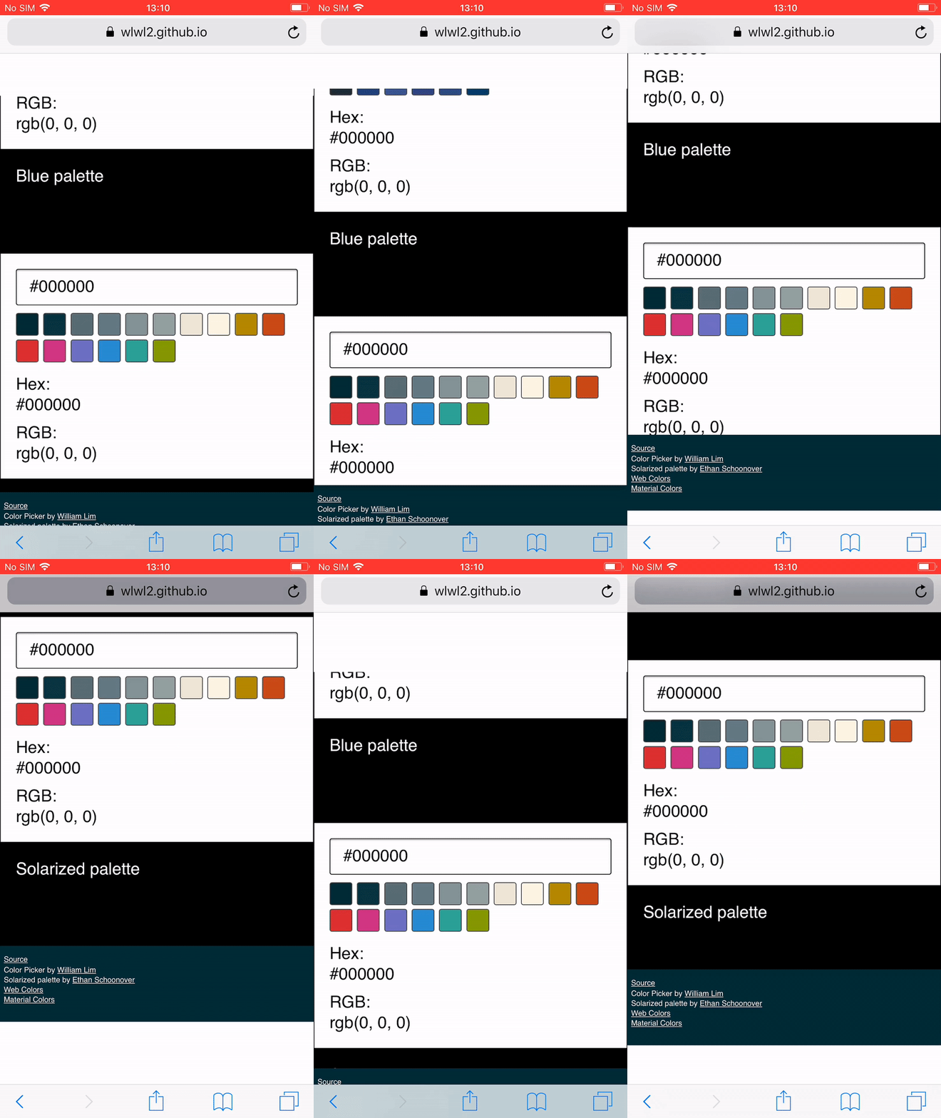
This solution works in almost the same way as the original solution (which was just position: fixed;). One advantage of this solution compared to that is that the scroll is not for the entire page, but for just the contents of the page without the footer. The biggest problem with this method is that on Mobile Safari, both the footer and the contents of the application move at the same time. This makes this approach very problematic when scrolling quickly:
Another effect that I did not want was difficult to notice at first, and I only realized that it was happening after trying out more solutions. This was that it was slightly slower to scroll through the contents of my application. Because we are setting our scroll container’s height to 100% of itself, this hinders flick/momentum-based scrolling on iOS. If that 100% height is shorter (for example, when a 100% height of 2000px becomes a 100% height of 900px), the momentum-based scrolling gets worse. Flick/momentum-based scrolling happens when you flick on the surface of a touchscreen with your fingers and the page scrolls by itself. In my case, I wanted momentum-based scrolling to occur so that users could scroll quickly, so I stayed away from solutions that set a height of 100%.
Other Attempts
One of the solutions suggested on the web, and that I tried to use on my code, is shown below as an example.
html {
  width: 100%;
  position: fixed;
  overflow: hidden;
}

body {
  width: 100%;
  margin: 0;
  font-family: sans-serif;
  position: fixed;
  overflow: hidden;
}

.body-container {
  width: 100vw;
  height: calc(100vh - 100px);
  overflow-y: auto;
  -webkit-overflow-scrolling: touch;
}

.color-picker-main-container {
  width: 100%;
  font-size: 22px;
  padding-bottom: 10px;
}

footer {
  position: fixed;
  bottom: 0;
  height: 100px;
  width: 100%;
}
This code works on Chrome and Firefox on macOS the same way as the previous solution. An advantage of this method is that scroll is not restricted to 100% height, so momentum-based scrolling works properly. On Safari, however, the footer disappears:
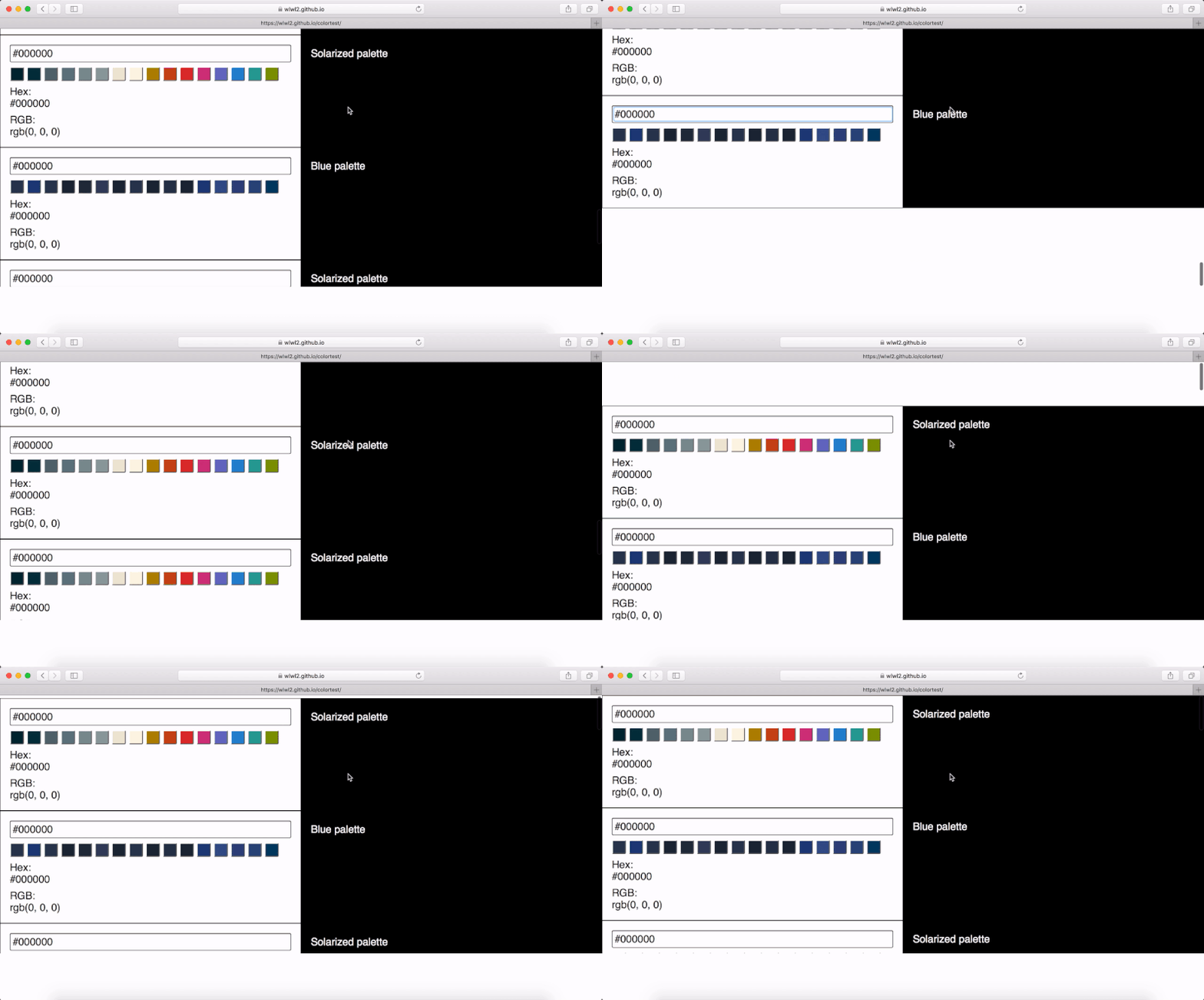
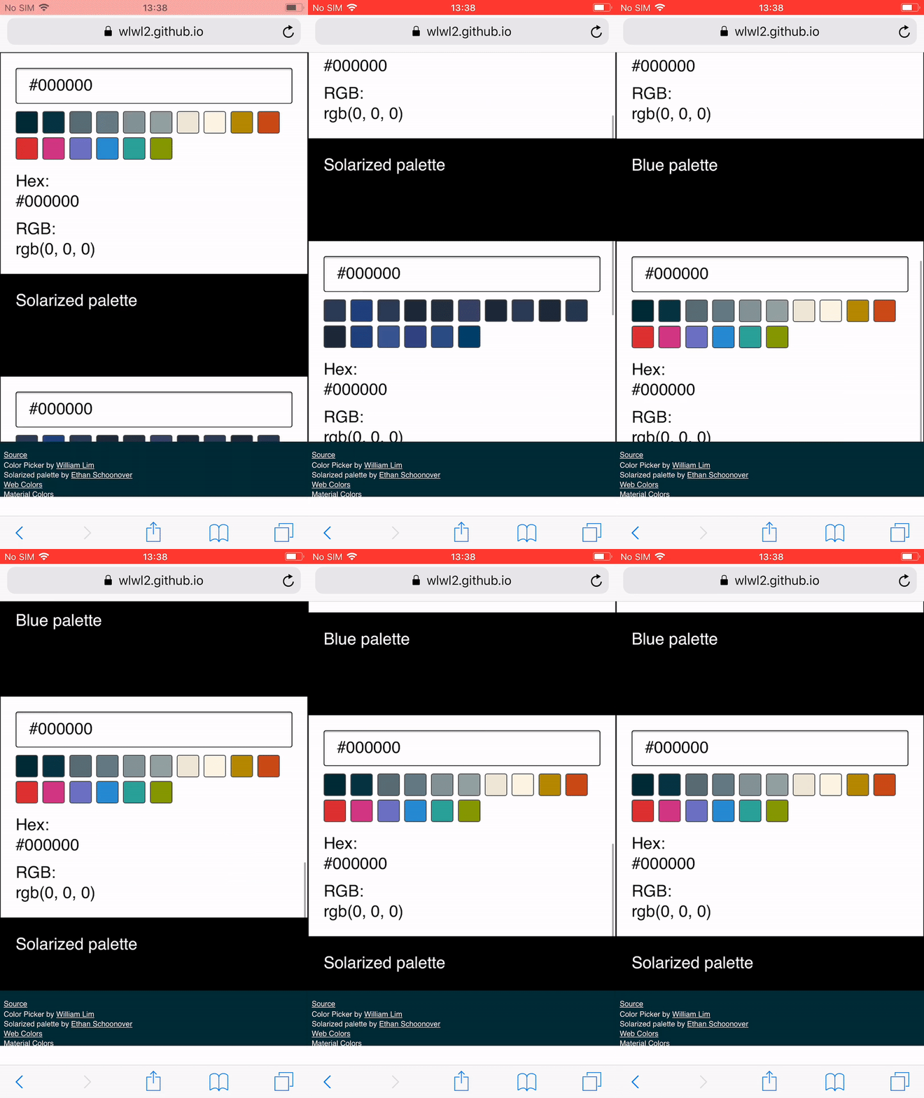
On iOS Safari, the footer becomes shorter, and there is an extra transparent (or white) gap at the bottom. Also, the ability to scroll through the page is lost after you scroll to the very bottom. You can see the white gap below the footer here:
One interesting line of code you might see a lot is: -webkit-overflow-scrolling: touch;. The idea behind this is that it allows momentum-based scrolling for a given element. This property is described as “non-standard” and as “not on a standard track” in MDN documentation. It shows up as an “Invalid property value” under inspection in Firefox and Chrome, and it doesn’t appear as a property on Desktop Safari. I didn’t use this CSS property in the end.
To show another example of a solution you may encounter and a different outcome I found, I also tried the code below:
html {
  position: fixed;
  height: 100%;
  overflow: hidden;
}

body {
  font-family: sans-serif;
  margin: 0;
  width: 100vw;
  height: 100vh;
  overflow-y: auto;
  overflow-x: hidden;
  -webkit-overflow-scrolling: touch;
}

.color-picker-main-container {
  width: 100%;
  font-size: 22px;
  padding-bottom: 110px;
}

footer {
  position: fixed;
}
This actually works well across the different desktop browsers, momentum-based scrolling still works, and the footer is fixed at the bottom and does not move on desktop web browsers. Perhaps the most problematic part of this solution (and what makes it unique) is that, on iOS Safari the footer always shakes and distorts very slightly and you can see the content below it whenever you scroll.
Solutions With JavaScript
After trying out some initial solutions using just HTML and CSS, I gave some JavaScript solutions a try. I would like to add that this is something that I do not recommend you to do and would be better to avoid doing. From my experience, there are usually more elegant and concise solutions using just HTML and CSS. However, I had already spent a lot of time trying out the other solutions, I thought that it wouldn’t hurt to quickly see if there were some alternative solutions that used JavaScript.
Touch Events
One approach of solving the issue of scroll bouncing is by preventing the touchmove or touchstart events on the window or document. The idea behind this is that the touch events on the overall window are prevented, whilst the touch events on the content you want to scroll through are allowed. An example of code like this is shown below:
// Prevents window from moving on touch on older browsers.
window.addEventListener('touchmove', function (event) {
  event.preventDefault()
}, false)

// Allows content to move on touch.
document.querySelector('.body-container').addEventListener('touchmove', function (event) {
  event.stopPropagation()
}, false)
I tried many variations of this code to try to get the scroll to work properly. Preventing touchmove on the window made no difference. Using document made no difference. I also tried to use both touchstart and touchmove to control the scrolling, but these two methods also made no difference. I learned that you can no longer call event.preventDefault() this way for performance reasons. You have to set the passive option to false in the event listener:
// Prevents window from moving on touch on newer browsers.
window.addEventListener('touchmove', function (event) {
  event.preventDefault()
}, {passive: false})
Libraries
You may come across a library called “iNoBounce” that was built to “stop your iOS webapp from bouncing around when scrolling.” One thing to note when using this library right now to solve the problem I’ve described in this article is that it needs you to use -webkit-overflow-scrolling. Another thing to note is that the more concise solution I ended up with (which is described later) does a similar thing as it on iOS. You can test this yourself by looking at the examples in its GitHub Repository, and comparing that to the solution I ended up with.
Overscroll Behavior
After trying out all of these solutions, I found out about the CSS property overscroll-behavior. The overscroll-behavior CSS property was implemented in Chrome 63 on December 2017, and in Firefox 59 on March 2018. This property, as described in MDN documentation, “allows you to control the browser's scroll overflow behavior — what happens when the boundary of a scrolling area is reached.” This was the solution that I ended up using.
All I had to do was set overscroll-behavior to none in the body of my website and I could leave the footer’s position as fixed. Even though momentum-based scrolling applied to the whole page, rather than the contents without the footer, this solution was good enough for me and fulfilled all of my requirements at that point in time, and my footer no longer bounced unexpectedly on Chrome. It is perhaps useful to note that Edge has this property flagged as under development now. overscroll-behavior can be seen as an enhancement if browsers do not support it yet.
Conclusion
If you don’t want your fixed headers or footers to bounce around on your web pages, you can now use the overscroll-behavior CSS property.
Despite the fact that this solution works differently in different browsers (bouncing of the page content still happens on Safari and Edge, whereas on Firefox and Chrome it doesn’t), it will keep the header or footer fixed when you scroll to the very top or bottom of a website. It is a concise solution and on all the browsers tested, momentum-based scrolling still works, so you can scroll through a lot of page content very quickly. If you are building a fixed header or footer on your web page, you can begin to use this solution.
Further Reading
- CSS Blurry Shimmer Effect
- New CSS Viewport Units Do Not Solve The Classic Scrollbar Problem
- Top Front-End Tools Of 2023
- How To Draw Radar Charts In Web


 Agent Ready is the new Headless


 SurveyJS: White-Label Survey Solution for Your JS App


