How To Build A Website With The WP Page Builder Plugin
(This is a sponsored post.) WordPress page builders are the first choice for creating a perfect website without any help from a developer. And a new one is on the market that we are going to test in this article. It’s WP Page Builder. We’ll learn how to use this page builder plugin to create a website.
WP Page Builder is a free plugin that integrates with any WordPress theme. You can easily drag and drop elements onto the pages you are building, and you don’t need any coding skills to do so.
At least, that is the developer Themeum’s point of view, which I’ll put to the test in this article. Does the plugin really help us build a website so easily? Are we able to achieve our goals for a website with it? We’re about to find out.
Let’s go through the process of building a real website using the WP Page Builder plugin. We’ll build a website of a few simple pages related to the fictional Rockhedge Park. We’ll learn about the plugin from installation to website launch.
Our goals are to:
- quickly create the website,
- create a home page with the park’s features and highlights,
- create a page to help visitors find the park,
- create a contact page.
Let’s start with a blank WordPress website, with the Twenty Seventeen theme installed.

Installing The Plugin
WP Page Builder is free, and you can download it from Themeum’s website. It’s also easy to install via WordPress’ admin panel, but because the plugin is new, you’ll have to scroll down the list to find it.
Look for the one with the cool blue “P” icon with a square inside.
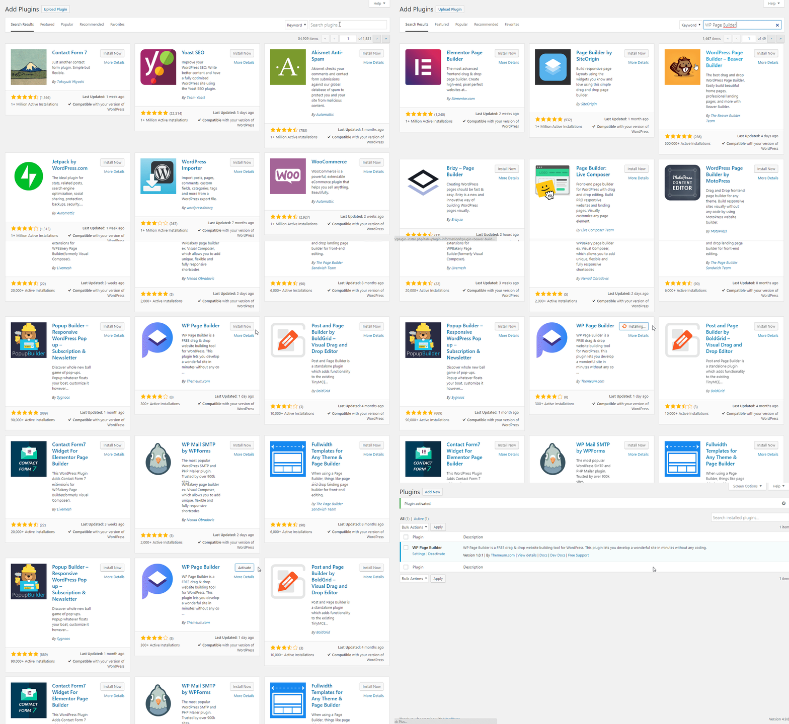
After installation, you will not be bugged with any splash screen, and the only new thing in the admin area you might notice is a new item in the menu. This is the plugin’s general settings page, where you can control a few things such as which post types the plugin should support and who should be able to edit a page with the page builder.

I like that the plugin does not take over the whole admin panel. It’s discreet, and you are not even forced to use it to create pages or posts:

After clicking the button, you are taken to a new screen where the page builder really makes an appearance.
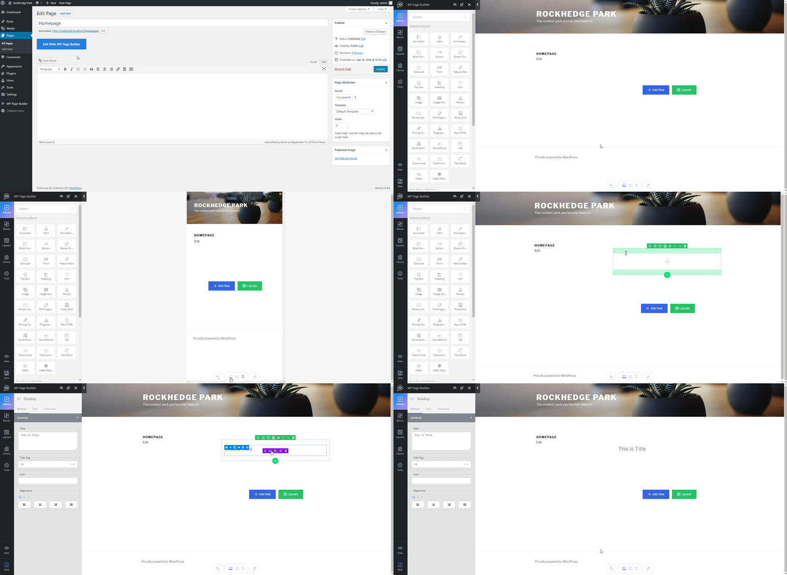
The overall look and feel are very good. I particularly like the way the responsive options work; the whole website shrinks with a nice animation when you click the tablet or mobile icon.
All of the content and options you can tweak are on the left side, which is pretty convenient because the editing panels are not mixed up with the actual page content.
What I find not so great are the row and addon toolbar icons. They are just too small, and you cannot really distinguish them from each other without getting closer to the monitor. Also, I had to think a while about the menu items on the left, because the name “Addons” was a bit confusing to me. In this plugin, addons are the pieces of content you place on your website, not premium addons that you can install to make your website even cooler.
Another thing needed is support. There is none. It would be very nice to have some help text, even though the page builder seems to be very easy to use. For example, the “Library” tab doesn’t have any content, and I don’t really know what it is or what I can do with it.
Aside from these small things, I like this editor. Let’s proceed to set up our first page!
Creating The Home Page
By default, you can put the content created with WP Page Builder in one spot, where standard content would appear. While this would be the expected behavior with most themes, it’s not in my case. I don’t want my content to be squished together in the default template:

This is probably why the plugin comes bundled with a page template called WP Page Builder Template. It spreads the content you build across the whole page, and only the header and footer of the theme are used.
The content looks way better now. I think this page builder could fit into any theme using this page template.
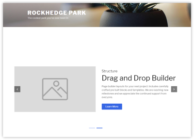
OK, the theme is installed, the page builder is installed, and the page is prepared. What do we do next? I’m sure you’ve been in this position when using page builders before; you just don’t know what to do with the page. You don’t even know what you can do with the page. It’s the standard “blank canvas” problem.
However, I discovered something called “Layouts” in the plugin’s sidebar. And the way it works impressed me.
Page Layouts
Page layouts are complete pages, ready to be imported in your WordPress website. Sounds cool, doesn’t it? Watch this:
As you can see, there are many templates, and most of them are paid. A few are free, though, and you can use them to get some inspiration.
The best part with this importing is that it doesn’t bloat WordPress. You can wipe out the page content with two clicks, and nothing is left. Even the images are not loaded to WordPress’ library.
You can test many concepts and options, and adjust everything to your needs without ending up with a ton of unused things imported into your WordPress installation. I really like that.
Composing The Home Page
My initial idea for the home page was a few images of the park and some features highlighted.
After getting inspired by the layouts prepared by Themeum, I started with a header image, and I created my other pages, as well as the main navigation.
I decided not to use any layouts because the blocks and addons are very simple to use, and they come with default content.
I started with a big image section just beneath the header, with a fixed background and a generic title.

Configuring this section was very easy, but I had some trouble with the custom font for the headings. I figured out that I have to remove my previous selection, and then I’m able to pick a new font family.
One thing I like is the way you can adjust the addon’s padding live on the screen:
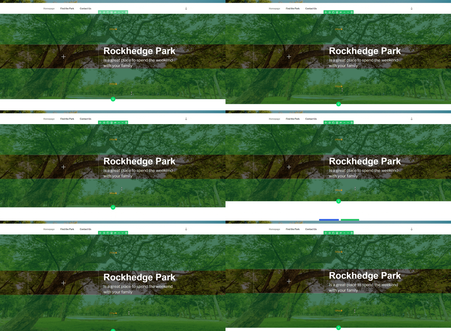
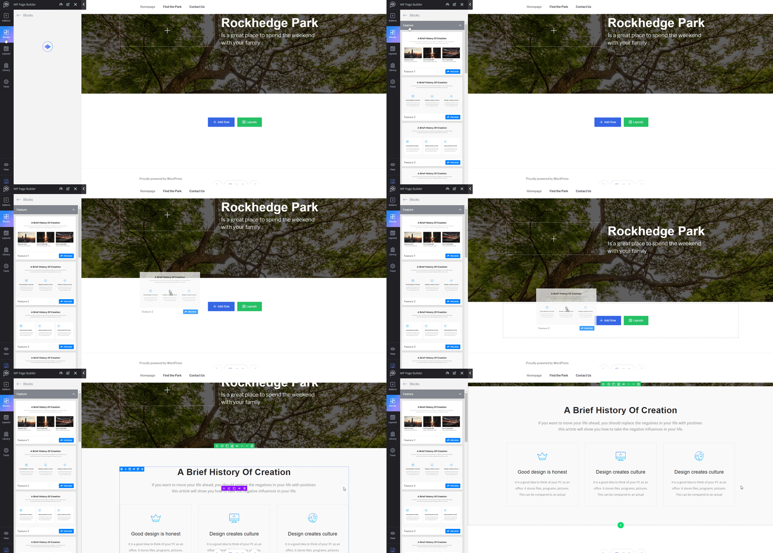
For the next section, I decided to use a predefined content block, which looks perfect for me. Adding it to the page is also very simple: Just drop it in the desired spot, and adjust the sample content.

Filling in the content was a breeze, and I quickly reached the last section, the call to action. There, I used the call-to-action block with very simple content.

Et voilà! The process of creating the page was very simple, and I enjoyed it.
Creating The “Find Us” Page
The next page is the one where people can easily find our park. This involved the use of more advanced sections, like a map.
Unfortunately, the map addon isn’t available in the free version of the plugin, so I decided to write that one myself and see how the plugin’s code base looks.
The code is not bad at all. It’s clear and easy to read, despite the fact that there are almost no inline comments. I haven’t found any documentation whatsoever, so I had to dig in to see how I could extend the plugin. And it didn’t look like I needed much — just an addon class and filter.
Custom Google Map Addon
When you don’t have any documentation, the best approach is to copy and adjust existing code.
A lot of configuration options seem to be available, some of which really need strong documentation. But for our case, we’ll make a simple Google Map iframe using a Google API key, with a place to query and the iframe’s height.
This is what our class looks like:
class JakubMikita_Addon_GoogleMap{

    public function get_name(){
        return 'jakubmikita_googlemap_block';
    }
    public function get_title(){
        return 'Google Map';
    }
    public function get_icon() {
        return 'wppb-font-location-map';
    }

    // Google Map block Settings Fields
    public function get_settings() {

        $settings = array(
            'apikey' => array(
                'type' => 'text',
                'title' => __('Google Maps API key','wp-pagebuilder'),
            ),
            'place' => array(
                'type' => 'text',
                'title' => __('Map place','wp-pagebuilder'),
            ),
            'height' => array(
                'type' => 'number',
                'title' => 'Height',
                'unit' => array( 'px','em','%' ),
                'responsive' => true,
                'std' => array(
                    'md' => '500px',
                    'sm' => '500px',
                    'xs' => '500px',
                ),
                'tab' => 'style',
                'selector' => '{{SELECTOR}} iframe { height: {{data.height}}; }',
            ),
        );
        return $settings;
    }

    // Google Map Render HTML
    public function render($data = null){
        $settings       = $data['settings'];
        $apikey         = isset($settings['apikey']) ? $settings['apikey'] : false;
        $place          = isset($settings['place']) ? $settings['place'] : false;

        $output = '';
        return $output;
    }

    // Google Map Template
    public function getTemplate(){
        $output = '';
        return $output;
    }

}
Looks simple, right? At the top, we have three methods that identify the addon: name, title and icon.
The next method, get_settings(), is where we define all of the user inputs. We define them as an array; I just looked at other addons to figure out the fields I can add. Pretty simple and easy to implement.
I figured out that the next method, render(), is used on the front end. It gets all of the user settings and returns the map iframe.
The last method, getTemplate(), is used on the page builder screen. Having two methods render the same code is not great, but I suppose the reason for it is that the second one has to be parsed with JavaScript.
Another thing that would work better is the method of registering an addon. If this were a more advanced addon, I’d want to include the CSS and JavaScript in separate files. Not very convenient, but also not the end of the world.
The last thing we have to do to register the addon is include it in the array, which we can do with a simple filter:
add_filter('wppb_available_addons', function( $addons) {
    $addons[] = 'JakubMikita_Addon_GoogleMap';
    return $addons;
} );
That’s all. The process is quick and simple. Here is our custom addon:
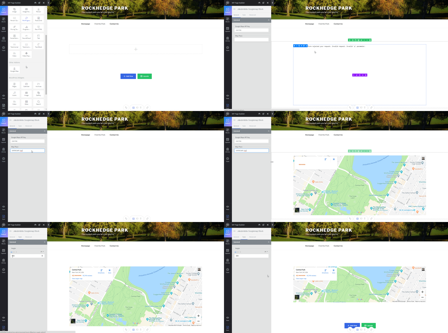
We’ve now got an awesome full-page map on this page.
Creating The “Contact Us” Page
For the last page, let’s put a contact form. I was about to install one of the popular contact form plugins when I noticed the “Form” addon. I gave it a try.
Surprisingly, when I dropped the addon onto the page, I saw all of the fields I wanted already configured and aligned nicely.
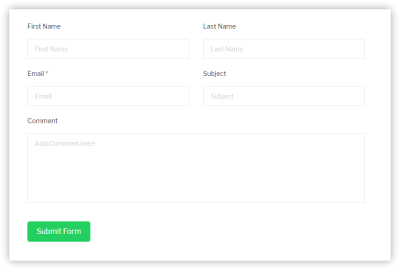
The most interesting part is that WP Page Builder integrates with the Contact Form 7 and weForms plugins. You can even add a simple CAPTCHA or use Google’s reCAPTCHA after providing the website’s keys.
Very cool addon. Submissions to the form come to my inbox without any problem, including all of the fields, and the user sees a nice confirmation message upon submitting the form.
Summary
I must say that WP Page Builder is a solid plugin. Obviously, it have some flaws, but it’s still a young product, and I’m sure Themeum will fix all of the bugs and implement the improvements mentioned in this article.
The overall feel of the plugin is great. The plugin does most of the heavy lifting, and you don’t have to think about how to do what you want because it’s mostly already done. The default content does a really good job and speeds up the work.
Themeum is right: Building a page with its plugin is simple, but not because the plugin is basic. The plugin is intuitive, yet packed with cool addons.
I used only a few of the addons, but the plugin comes with a lot more. Blocks you’d normally spend hours trying to figure how to implement are a drag-and-drop away when using the WP Page Builder plugin.
For example, progress bars, social icons, testimonials and flipping content boxes are ready and waiting to be used. It’s hard to convey the experience in writing. You just have to install the plugin and see for yourself.
Further Reading
- WordPress Playground: From 5-Minute Install To Instant Spin-Up
- The Problem With WordPress Is Positioning, Not Plugins
- How To Host A WordPress Site On Amazon Lightsail
- Useful Figma Plugins And Tools

