Using Visual Composer Website Builder To Create WordPress Websites
(This is a sponsored article.) WordPress has changed the way we make websites and millions of people use it to create websites today. But this tool has a few significant limitations — it requires time and coding skills to create a website.
Even when you have aquired coding skills, jumping into code each time when you need to solve a problem (add a new UI element or change styling options for existing one) can be tedious. All too often we hear: “We need to work harder to achieve our goals.” While working hard is definitely important we also need to work smarter.
Today, I’d like to review a tool that will allow us to work smarter. Imagine WordPress without design and technical limits; the tool that reduces the need to hand-code the parts of your website and frees you up to work on more interesting and valuable parts of the design.
In this article, I’ll review the Visual Composer Website Builder and create a real-world example — a landing page for a digital product — just by using this tool.
What Is Visual Composer Website Builder?
Visual Composer Website Builder is a simple and powerful drag-and-drop website builder that promises to change the way we work with WordPress. It introduced a more intuitive way of building a page — all actions involving changing visual hierarchy and content management are done visually. The tool reduces the need to hand-code the theme parts of a website and frees you up to work on valuable parts of the design such as content.
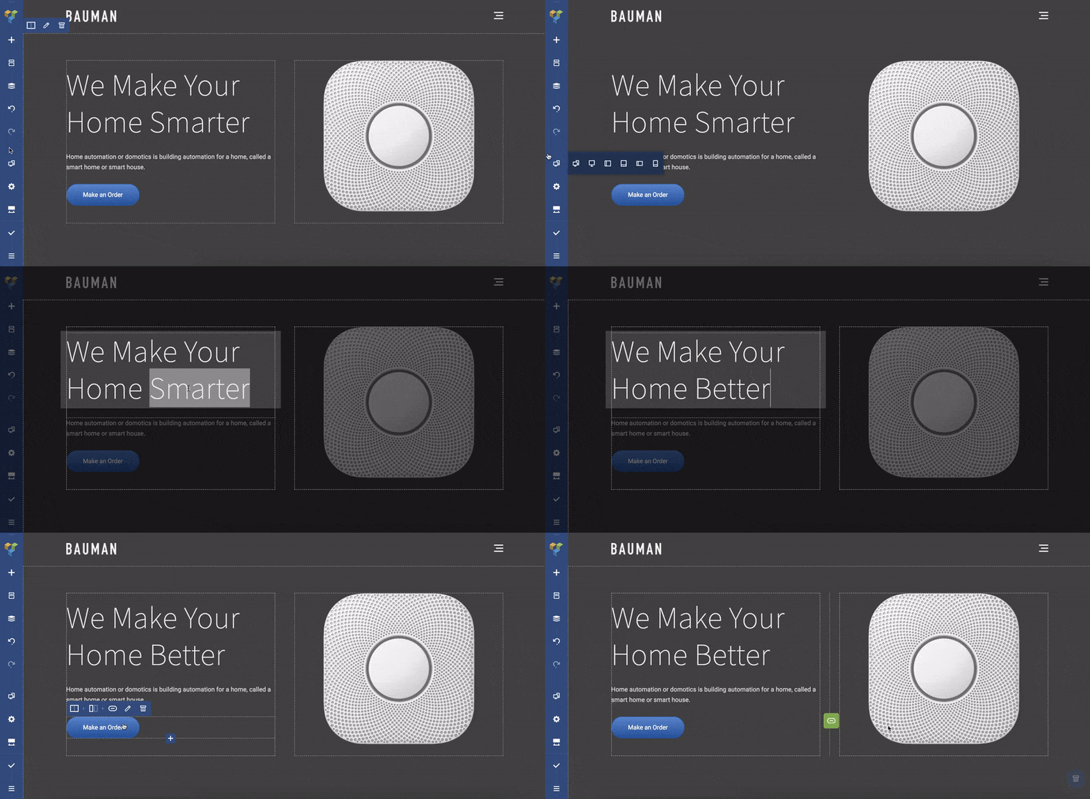
Content is the most important property of your website. It’s the primary reason why people visit your site — for content. It’s worth putting a lot of efforts in creating good content and use tools that help you to deliver the content in the best way to visitors with the least amount of effort.
Visual Composer And WPBakery
Visual Composer Website Builder is a builder from the creators of WPBakery Page Builder. If you had a chance to use the WPBakery Page builder before you might wonder what the difference between the two plugins is. Let’s be clear about these two products:
There are a few significant differences between the two:.
- The key difference between WPBakery Page builder and Visual Composer is that WPBakery is only for the content part, while with Visual Composer Website Builder you can create a complete website (including Headers and Footers).
- Visual Composer is not shortcode based, which helps generate clean code. Also, disabling the plugin won’t leave you with “shortcode hell” (a situation when shortcodes can’t be rendered without an activated plugin).
You can check the full list of differences between two plugins here.
Now, Visual Composer Website Builder is not an ‘advanced’ version of WPBakery. It is an entirely new product that was created to satisfy the growing needs of web professionals. Visual Composer is not just a plugin; it’s a powerful platform that can be extended as user needs continue evolving.
A Quick List Of Visual Composer’s Features
While I’ll show you how Visual Composer works in action below, it’s worth to point out a few key benefits of this tool:
- It’s a live-preview editor with drag-and-drop features, and hundreds of ready-to-use content elements that bring a lot of design freedom. You can make changes instantly and see end-results before publishing.
- Two ways of page editing — using frontend editor and tree view. Tree view allows navigating through the elements available on a page and makes a design process much easier.
- Ready-to-use WordPress templates for all types of pages — from landing pages and portfolios to business websites with dedicated product pages, because editing an existing template is a lot easier than starting from scratch with a blank page.
- Visual Composer works with any theme (i.e. it’s possible to integrate Visual Composer Website builder into your existing themes)
- Responsive design out-of-the-box. All the elements and templates are responsive and mobile-ready. You can adjust responsiveness for each independent column.
- Header, footer, and sidebar editor. Usually the header, footer and sidebar are defined by the theme you’re using. When web professionals need to change them, they usually move to code. But with Visual Composer, you can change the layout quickly and easily using only the visual editor. This feature is available in the Premium version of the product.
- An impressive collection of add-ons (it’s possible to get add-ons from the Hub or get them from third-party developers)
There are also three features that make Visual Composer stand out from the crowd. Here they are:
1. Visual Composer Hub
Visual Composer Hub is a cloud which stores all the elements available to the users. It’s basically like a design system that keeps itself updated and where you can get new elements, templates, elements, blocks (soon).
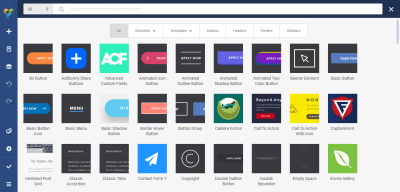
The great thing about Visual Composer Hub is that you don’t need to update the plugin to get new elements — you can download the elements whenever you need them. As a result, your WP setup isn’t bloated with a myriad of unused elements.
2. New Technical Stack
Visual Composer Website builder is built on a new technology stack — it’s powered by ReactJS and doesn’t use any of the WordPress shortcodes. This helps to achieve better performance — the team behind Visual Composer conducted a series of internal tests and showed that pages created with Visual Composer load 1-1.5s faster than the same layouts re-created with WPBakery.
3. API
Visual Composer Website builder has a well-documented open API. If you have coding skills, you can extend Visual Composer with your own custom elements which may be helpful for some custom projects.
How To Create A Landing Page With Visual Composer
In this section, I’ll show how to create a landing page for a digital product called CalmPod (a fictional home speaker device) with the new Visual Composer Website Builder.
Our journey starts in a WP interface where we need to create a new page — give it a title and click the ‘Edit with Visual Composer button.’

Creating A Layout For A Landing Page
The process of creating the page starts with building an appropriate layout. Usually building a layout for a landing page takes a lot of time and effort. Designers have to try a lot of different approaches before finding the one that works the best for the content. But Visual Composer simplifies the task for designers — it provides a list of ready-to-use layouts (available under the Add Template option). So, all you need to do to create a new page is to find the appropriate layout from the list of available options and see how it works for your content.
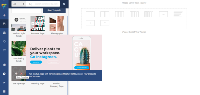
But for our example, we’ll select the Startup Page template. This template applies automatically as soon as we click the + symbol, so all we need to do is to modify it according to our needs.
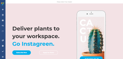
Each layout in Visual Composer consists of rows and columns. The row is a base that defines the logical structure of the page. Each row consists of columns. Visual Composer gives you the ability to control the number of columns in a row.

Tip: Notice that Visual Composer uses different colored borders for UI units. When we select a row, we see a blue-colored border, when we select a column, we see an orange-colored border. This feature can be extremely valuable when you work on creating complex layouts.
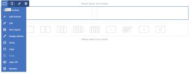

The great thing about Visual Composer is that we can customize all properties of the layout — add/remove elements or change their styling options (such as margins, padding between elements). For example, we don’t need to dive into the code to alter the sizes of columns; we can simply drag and drop the borders of individual elements.

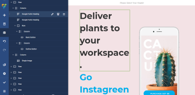
It’s important to mention that we can use either the visual editor or the tree view of elements to modify individual properties of UI elements.
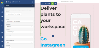
By clicking on the ‘Pen’ icon, we activate a screen with individual styling properties for the element.
Stretch Content
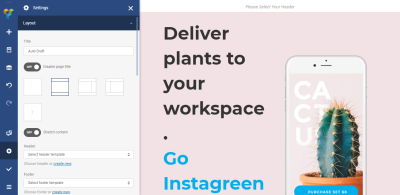
Visual Composer allows making the layout either boxed or stretched. If you switch the ‘Stretch content’ toggle to ‘On’, your layout will be in full width.
Changing The Page Title
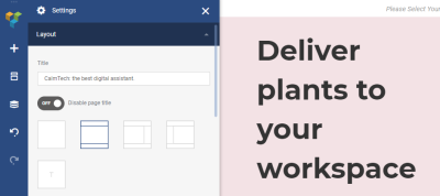
Visual Composer allows users to change the page title. You can do it in the Layout settings. Let’s give our page the following title: ‘CalmTech: the best digital assistant.’
Adding The Top Menu
Now it’s time to add a top menu to our landing page. Suppose we have the following menu in WP:
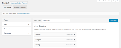
And we want to place it at the top of our newly created landing page. To do that, we need to go to Visual Composer -> Headers (because the top of the page is a default place for navigation) and create a new header.
As soon as we click on the ‘Add Header’ button, we’ll see a screen that asks us to provide a title for the page — let’s give it a name “Top header.” It’s a technical name that will help us identify this object.

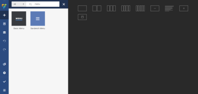
Next, Visual Composer will direct us to the Hub where we can add all required UI elements to our header. Since we want to have a menu, we type ‘menu’ in the search box. The Hub provides us with two options: Basic menu and Sandwich menu. For our case, we’ll use the* Basic Menu* because we have a limited number of top level navigation options and want all of them to be visible all the time (hidden navigation such as Sandwich Menu can be bad for discoverability) .
Finally, we need to choose the menu source (in our case it’ll be Main menu, the one that we have in WP) and change the appearance of the navigation options.
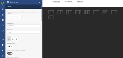
Let’s change the alignment of the menu (we will move it to the right).

And that’s all. Now we can use our header page settings. Let’s modify our home page to include a Header. Hover over the *Please select Your Header*element, and you’ll see a button Add Header.

When you click on the button, you’ll see a dialog at the left part of the screen that invites you to select a header. Let’s choose the Top Header option from the list.
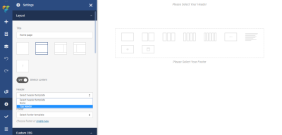
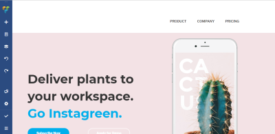
After we select a header, you’ll see a menu at the top of the page.
Making The Top Menu Sticky
The foundational principle of good navigation says that a navigation menu should be available for the users all of the time. But unfortunately, on many websites, the top navigation menu hides when you scroll. Such behavior forces users to scroll way back to the top in order to navigate to another page. It introduces unnecessary interaction costs. Fortunately, there’s a simple solution for this problem — we can make the top menu sticky. A sticky menu stays visible all the time no matter where the user is on a page.
To enable stickiness, we need to turn the Sticky toggle for our header On (for the whole Menu container) and add a margin 50-pixels margin to the Margin top.
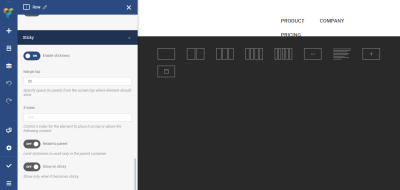
When you scroll the landing page, you’ll notice that the header stays visible all the time.
Pairing Image With Text
Next comes a really exciting part — we need to describe our product to our visitors. To create a great first-time impression, we need to provide excellent images paired with a clear description. Text description and product picture (or pictures) should work together and engage visitors in learning more about a product.
We need to replace a default image with our image. Click on the image and upload a new one. We’ll use an image with a dart background, so we also need to change the background for the container. We need to select the row and modify the background color option.
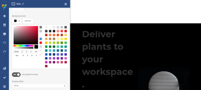
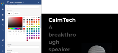
Next, we need to add a text section to the left of the image. In the western world, users scan the page from left to right, so visitors will read text description and match it with the image. Visual Composer uses Text Block object to store the text information. Let’s replace a text that came with theme with our custom text “CalmTech A breakthrough speaker that adapts to its location.” Let’s also modify the text color to make the text more relevant to the theme (white for the title and a shade of gray for the subtitle).
Creating A Group Of Elements
We have a picture of a product and a text description, but still, one element is missing. As you probably guessed, it’s a call to action (CTA). Good designers don’t just create individual pages but a holistic user journey. Thus, to create an enjoyable user journey, it’s important to guide users along the way. At the time when visitors read the necessary information, it’s vital to provide the next logical step for them, and a CTA is a precisely right element for this role.
In our case, we’ll need two CTAs — ‘Buy now’ and ‘Learn More.’ The primary call to action button “Buy now” should come first and it should be more eye-catching (we expect that users will click on it). Thus, we need to make it more contrasting while the “Learn more” button should be a hollow button.
Visual Composer makes it easier to customize the general parameters for the UI element (such as a gap) as well as individual styling options. Since we’re interested in changing individual properties, we need to click on ‘Edit’ for a particular button.

Playing With Animation To Convey Dynamics And Telling Stories
People visit dozens of different websites on a daily basis. In such a highly competitive market web professionals need to create genuinely memorable products. One way to achieve this goal is to focus on building better user engagement.
It’s possible to engage visitors to interact with a product by conveying some dynamics. If you make a site less static, there’s a better chance that visitors remember it.
Visual Composer allows you to choose from a few predefined CSS animations of a particular element. When we open design options for any UI element we can find the option Animate. When we choose the animated option, it’ll be triggered once the element will be visible in the browser window.

Final Polishing
Let’s see how our page looks like for our site’s visitors. It’s obvious that it has two problems:
- It looks a bit unfinished (we don’t have a logo of a website),
- The elements have the wrong proportions (the text overpowers the image so the layout looks unbalanced).
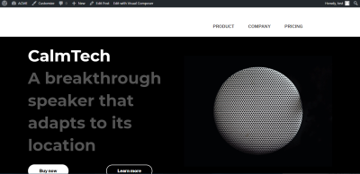
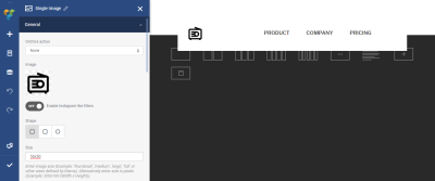
Let’s solve the first problem. Go to the Headers section and select our Top Header. Click on ‘+’ element and select an object Single Image. Upload new image (the icon). Notice that we can modify the size of the image right in the Visual Composer. Let’s make the size of our icon 50px x 50px (in the Size section).
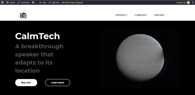
Now it’s time to solve the second problem. Select the first column and adjust the size of an text (set the size to 40 for the subheader). Here is how our page will look like after the changes.
Conclusion
Visual Composer Website Builder simplifies the process of page building in WordPress. The process of web design becomes not only fast and easy, but it also becomes more fun because designers have a lot more creative freedom to express their ideas. And when web professionals have more creative freedom, they can come up with better design solutions.
Further Reading
- Building Gatsby Themes For WordPress-Powered Websites
- WordPress Notifications Made Easy
- Getting Started With Gutenberg By Creating Your Own Block
- Exploring Enhanced Patterns In WordPress 6.3

