Designing Emotional Interfaces Of The Future
Emotions play a vital role in our decision-making process. One second of emotion can change the whole reality for people engaging with a product.
Humans are an emotionally driven species; we choose certain products not because of what makes sense, but because of how we think they will make us feel. The interfaces of the future will use the concept of emotions within the foundation of product design. The experiences that people use will be based both on intellectual quotient (IQ) and emotional quotient (EQ).
This article is my attempt to look into the future and see what interfaces we will design in the next ten years. We’ll be taking a closer look at the three mediums for interaction:
- Voice
- Augmented Reality (AR)
- Virtual Reality (VR)
Developing For Virtual Reality
It’s not that difficult to create content for VR nowadays. Still, if you’re looking for a way to get a better understanding of VR development, working a demo project can help. Read a related article →
Practical Examples Of Future Emotional Interfaces
How will interfaces look like in the future? Even though we do not have an answer to this question just yet, we can discuss what characteristics interfaces might have. In my opinion, I’m sure that we will eventually move away from interfaces full of menus, panels, buttons, and move towards more ‘natural interfaces’, i.e. interfaces that extend our bodies. The interfaces of the future will not be locked in a physical screen, but instead they will use the power of all five senses. Because of that, they will require a less learning curve — ideally, no learning curve at all.
The Importance Of EQ Emotional Intelligence In Business
Apart from making the experience more natural and reducing the learning curve, designing for emotion has another benefit for product creators: it improves user adoption of the product. It’s possible to use humans’ ability to act on emotions to create better user engagement.
Voice Interfaces That Feel Real
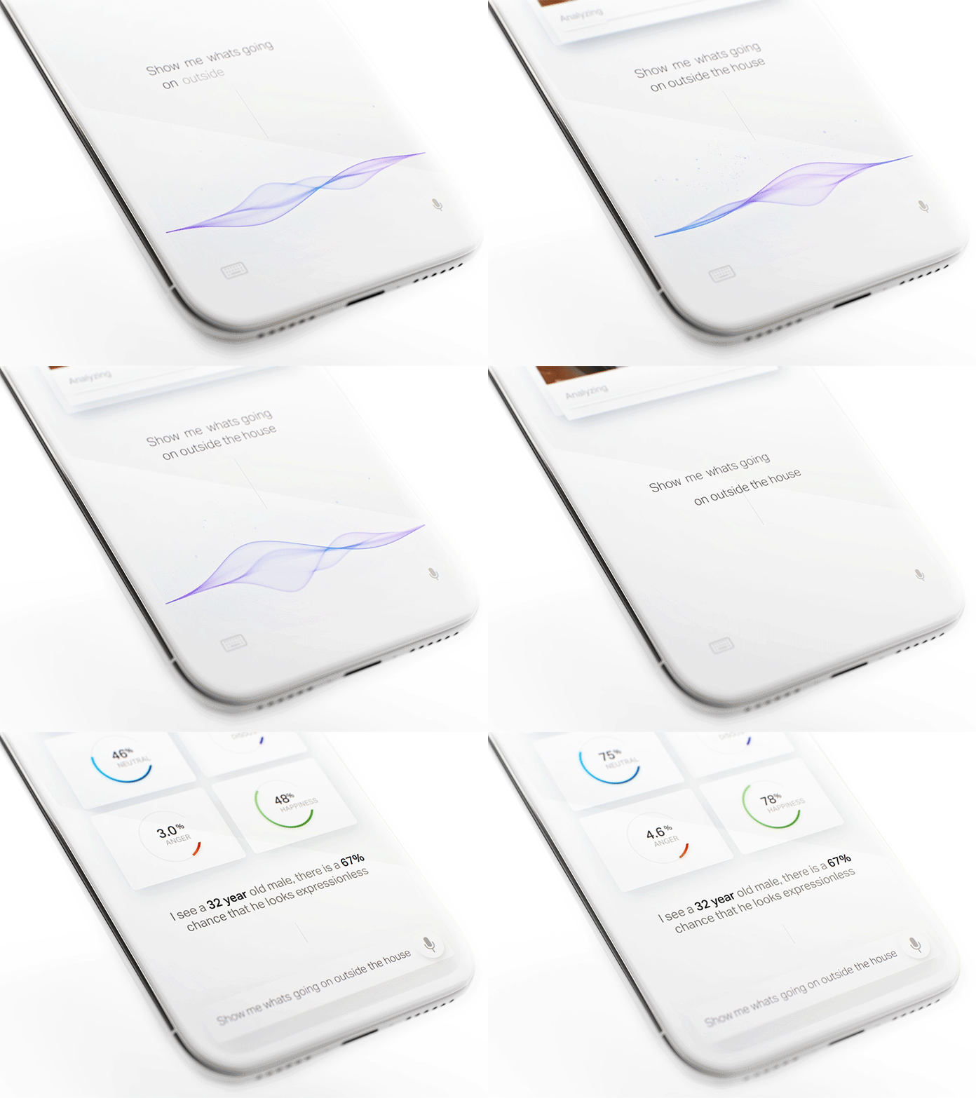
Products that use voice as the primary interface are becoming more and more popular. Many of us use Amazon Echo and Apple Siri for daily routine activities such as setting an alarm clock or making an appointment. But a majority of voice interaction systems available on the market today still have a natural limitation: they do not take user emotions into account. As a result, when users interact with products like Google Now, they have a strong sense of communicating with a machine — not a real human being. The system responds predictably, and their responses are scripted. It’s impossible to have a meaningful dialogue with such a system.
But there are some completely different systems available on the market today. One of them is Xiaoice, a social chatbot application. This app has an emotional computing framework at its core; the app is built on the idea that it’s essential to establish an emotional connection with the user first. Xiaoice can dynamically recognize emotion and engage the user throughout long conversations with relevant responses. As a result, when users interact with Xiaoice they feel like they’re having a conversation with a real human being.
The limitation of Xiaoice is that it’s a text-based chat app. It’s evident that you can achieve a more powerful effect by making voice-based interactions (the human voice has different characteristics such as a tone that can convey a powerful spectrum of emotions).
Many of us have seen the power of voice-based interactions in the film “Her” (2013). Theodore (the main character played by Joaquin Phoenix) fell in love with Samantha (a sophisticated OS). This also makes us believe that one of the primary purposes of voice-based systems of the future will be a virtual companion to users. The most interesting thing about this film is that Theodore did not have a visual image of the Samantha — he only had her voice. To build that kind of intimacy, it’s essential to generate responses that reflect a consistent personality. This will make the system both predictable and trustworthy.
Technology is still a long away from a system like Samantha, but I believe that voice-first multimodal interfaces will be the next chapter in the evolution of voice-enabled interfaces. Such interfaces will use voice as a primary way of interaction and provide additional information in a context that creates and builds a sense of connection.
The Evolution Of AR Experience
Augmented Reality (AR) is defined as a digital overlay on top of the real world and transforms the objects around us into interactive digital experiences. Our environment becomes more ‘intelligent’ and users have an illusion of ‘tangible’ objects on the tips of their fingers, which establishes a deeper connection between a user and a product (or content).
Reimagine Existing Concepts Using AR
The unique aspect of AR is that it gives us an extraordinary ability to physically interact with digital content. It allows us to see things that we could not see before and this helps us learn more about the environment around us. This AR property helps designers to create new level experiences using familiar concepts.
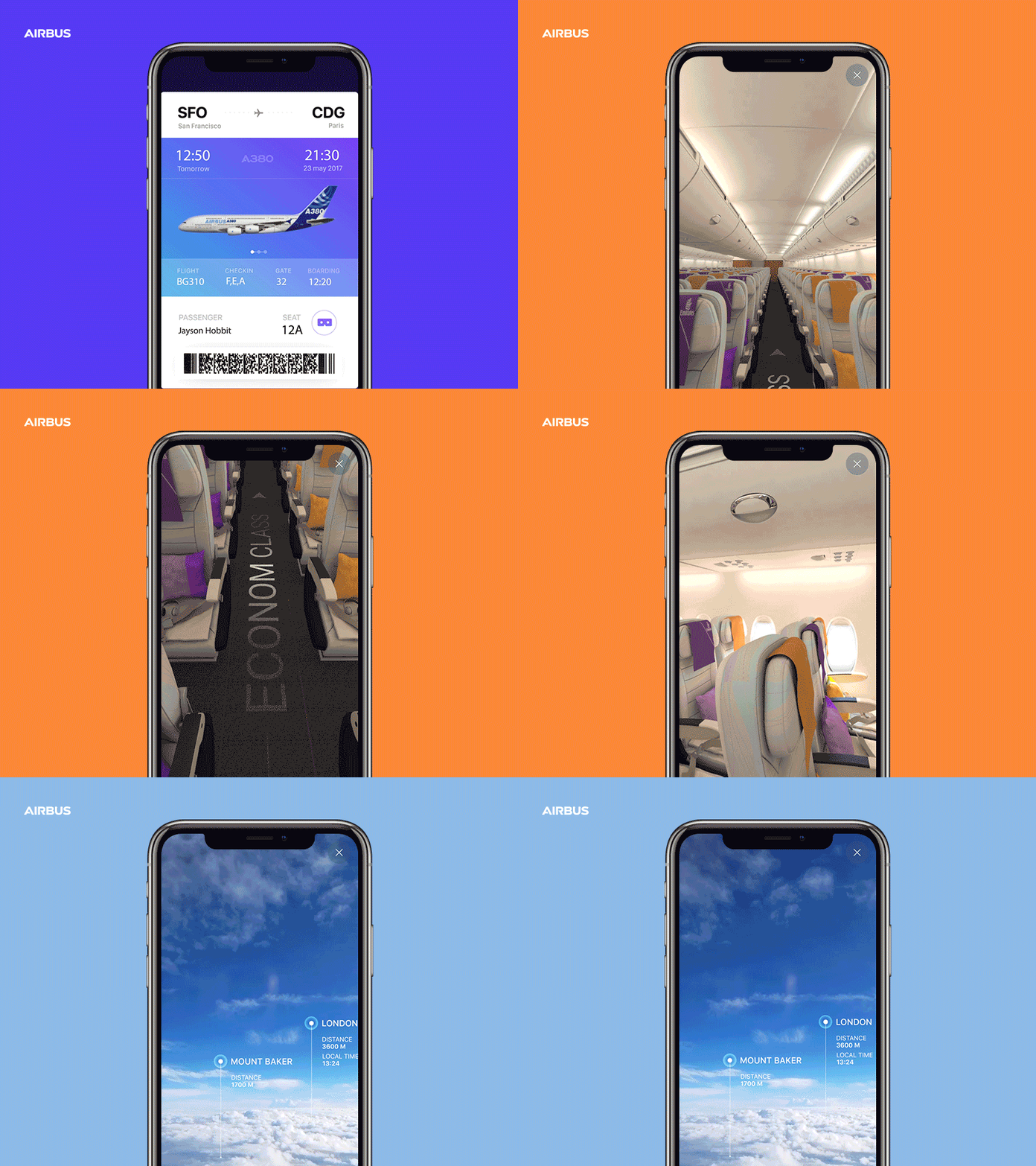
For example, by using mobile AR, it’s possible to create a new level of in-flight experience that allows a passenger to see detailed information about her class or current flight progress:
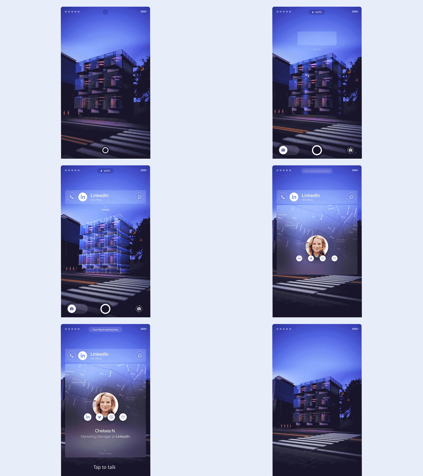
AR helps us find our way through spaces and get the required information at a glance. For example, AR can be used to create rich contextual hints for your current location. The technology known as SLAM (Simultaneous Localization And Mapping) is perfect for this. SLAM allows real-time mapping of an environment and also makes it possible to place multimedia content into the environment.
There are massive opportunities for providing value to users. For example, users can point their devices at a building and learn more about it right there on their screens. It significantly reduces the effort and allows for an emotional experience of ease by allowing navigation and access.
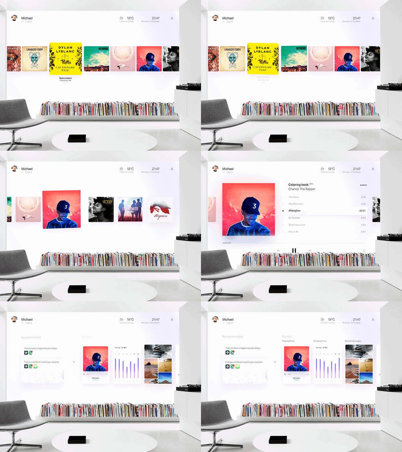
The environment around us (such as walls or floors) can become a scene for interactivity in ways that used to be limited to our smartphones and computers.
The concept that you see below does just that; it uses a physical object (white wall) as a canvas for the content usually delivered using a digital device:
Avoiding Information Overload
Many of us saw the video called “HYPER-REALITY”. In this video, the physical and digital worlds have merged, and the user is overwhelmed with a vast amount of information.
Technology allows us to display several different objects at the same time. When it’s misused, it can easily cause overload.
Information overload is a serious issue that has a negative impact on user experience and avoiding it will be one of the goals of designing for AR. Well-designed apps will filter out elements that are irrelevant to users using the power of AI.
Advanced Personalization
Personalization in digital experience happens when the system curates the content or functionality to users’ needs and expectations in real time. Many modern mobile apps and websites use the concept of personalization to provide relevant content. For example, when you visit Netflix, the list of movies you see is personalized based on your interests.
AR glasses allow creating a new level of personalization, i.e. an ‘advanced’ level of personalization. Since the system ‘sees’ what the user sees, it’s possible to utilize this information to make a relevant recommendation or provide additional information in context. Just imagine that you’ll soon be wearing AR glasses, and the information that is transferred to your retina will be tailored to your needs.
Here’s a foretaste of what’s in store for us:
Moving From Augmented Reality Towards Virtual Reality To Create An Immersive Experience
AR experience has a natural limitation. As users, we have a clear line between us and content; this line separates one world (AR) with another (real world). This line causes a sense that the AR world is clearly not real.
You probably know how to solve this limitation, i.e. with virtual reality (VR), of course. VR is not exactly a new medium, but it’s only been in the last few years that technology has reached a point where it allowed designers to create immersive experiences.
Immersive VR experiences remove the barrier between the real world and digital. When you put on a VR headset, it’s difficult for your brain to process whether the information that you are receiving is real. The idea of how VR experiences can look in the nearest future is well explained in the movie “Ready Player One”:
Here is what designers need to remember when creating immersive virtual environments:
- Write a story
Meaningful VR has a strong story at its core. That’s why before you even start designing for a VR environment, you need to write a narrative for the user journey. A powerful tool known as a ‘storyboard’ can help you with that. Using a storyboard, it’s possible to create a story and examine all the possible outcomes. When you examine your story, you will see when and how to use both visual and audio cues to create an immersive experience. - Create a deeper connection with a character
In order to make users believe that all things around them in VR are real, we need to create a connection with the characters played by the users. One of the most obvious solutions is to include a representation of users’ hands in the virtual scene. This representation should be of actual hands — not just a rigged replica. It’s vital to consider different factors (such as gender or skin color) because it’ll make interactions more realistic.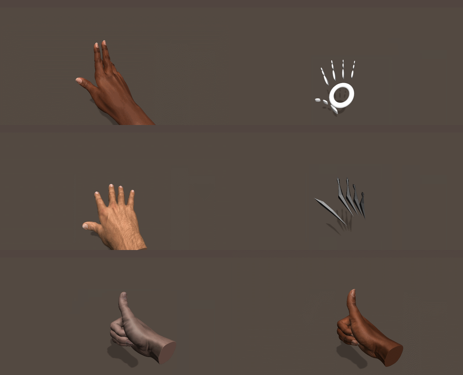
A user can look at his or her hands and see themselves appear as a character. (Source: leapmotion)
It’s also possible to bring some objects from real life to a VR environment in order to create this connection. For instance, a mirror. When the user looks at a mirror and sees their character in the reflection, it enables more realistic interactions between the user and virtual characters.
A virtual reality user looks into a virtual mirror and sees himself as a character in a VR environment. Credits: businesswire. (Large preview) - Use gestures instead of menus
When designing immersive VR experiences, we can’t rely on traditional menus and buttons. Why? Because it is relatively easy to break a sense of immersion by showing a menu. Users will know that everything around them is not real. Instead of using traditional menus, designers need to rely on gestures. The design community is still in the process of defining a universal language for using gestures, and taking part in this activity is fun and exciting exercise. The tricky part is to make gestures familiar and predictable for users.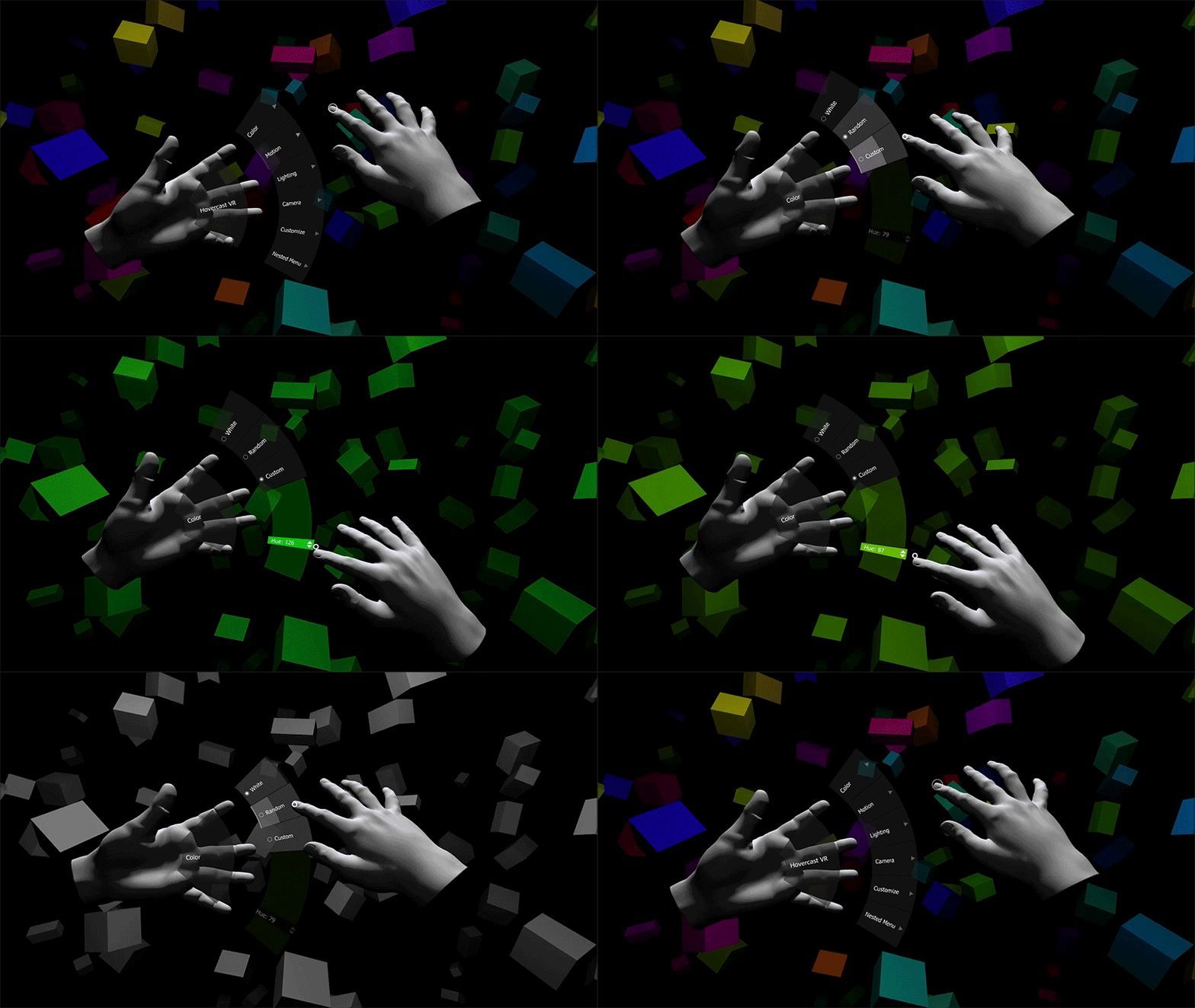
Hovercast VR menu is an attempt to reuse existing concepts of interaction for VR experience. Unfortunately, this concept can break the sense of immersion. New medium requires a new model of interaction. - Interact with elements in the VR environment
To create an environment that feels real, we need to give the user the ability to interact with objects in that reality. Ideally, all objects in the environment can be designed in a way that allows users to touch and inspect them. Such objects will act as stimuli and will help you create a more immersive experience. Touch is extremely important for exploring the environment; the most important information that babies get in the first days is received through touch. - Share emotion in VR
VR has a real opportunity to become a new level of social experience. But to make it happen, we need to solve one significant problem, i.e. bring the non-verbal cues into the interaction.
When we interact with other people, a significant part on information that we get comes from body language. Surprise, disgust, anger — all these emotions are in our facial expressions, and during face-to-face interactions, we infer information from the eye region. It’s important to provide this information when people interact in a VR environment to create more realistic interactions.
The good news is that the head-mounted devices (HMDs) will soon cover emotion recognition. Almost any area of human-to-human interaction will benefit from facial expressions in VR.
Sharing emotions in VR space (Source: Rachel Metz of MITReview) - Design sound and music suitabke for a VR environment
Audio is a huge component of the immersive experience. It’s impossible to create a genuinely immersive experience without designing sound for the environment. The sound can both be used as a background element (i.e., ambient sound of wind) or directional. In the latter case, the sound can be used as a cue — by playing with directionality (where the sound comes from) and distance (it’s possible to focus user attention on particular elements).
When it comes to designing audio for VR, it’s essential to make the sound 3D. 2D sound doesn’t work for VR very well because it makes everything too flat. The 3D sound is the sound that you can hear in every direction around you — front, behind, above and beyond — all over the place. You don’t need specialized headphones to experience 3D sound; it’s possible to create it using standard stereo speakers of HMD.
Head tracking is another critical aspect of a good sound design. It’s vital to make sounds behave in a realistic manner. That’s why when a user moves his head, the sound should change according to the head movement. - Prevent motion sickness
Motion sickness is one of the primary pain-points in VR. It’s a condition in which a disagreement exists between visually perceived movement and the vestibular system’s sense of movement. It’s vital to keep users comfortable while they experience VR.
There are two popular theories what causes motion sickness in VR:- ‘Sensory Conflict’ Theory
According to this theory, motion sickness occurs as a result of a sensory disagreement between expected motion and motion that is actually experienced. - ‘Eye Movement’ Theory
In the book “The VR Book: Human-Centered Design For Virtual Reality”, Jason Jerald mentions that motion sickness occurs because of the unnatural eye motion that is required to keep the scene’s image stable on the retina.
- Physical body movement should match with visual movement. Sometimes even a small visual jitter can have an enormously negative impact on the experience.
- Let users rest between moving scenes (this is especially important when the VR experience is really dynamic).
- Reduce virtual rotations.
- ‘Sensory Conflict’ Theory
Conclusion
When we think about the modern state of product design, it becomes evident that we are only at the tip of the iceberg because we’re pretty limited to flat screens.
We’re witnessing a fundamental shift in Human-Computer Interaction (HCI) — rethinking the whole concept of digital experience. In the next decade, designers will break the glass (the era of mobile devices as we know them today) and move to the interfaces of the future — sophisticated voice interfaces, advanced ARs, and truly immersive VRs. And when it comes to creating a new experience, it’s essential to understand that the only boundary we have are our brains telling us it’s got to be how it’s always been.
Further Reading
- How To Build A Virtual Reality Model With A Real-Time Cross-Device Preview
- Reducing The Web’s Carbon Footprint: Optimizing Social Media Embeds
- Penpot’s CSS Grid Layout: Designing With Superpowers
- How Accessibility Standards Can Empower Better Chart Visual Design


 Agent Ready is the new Headless


 SurveyJS: White-Label Survey Solution for Your JS App

