Comparing Styling Methods In Next.js
As you might be aware, there are many differing perspectives on CSS-in-JS, and we all have an opinion of the topic in one way or the other that might be quite different from the opinions of framework authors.
Next.js is one of the recommended tool-chains when creating a new React app. Tools like Next have a simple goal of abstracting away commonly redundant tasks when writing a React app. This helps developers focus more on writing code than reinventing the wheel. While this is usually a good thing, it can also be a little tedious to get started with. For one, there’s a hurdle to cross by learning about the abstractions, and while there are a bevy of that in Next (Routing, Data Fetching…), one often overlooked is Styling.
To serve a wider audience, Next.js supports a myriad of ways to style your components. Whether you belong to the Utility first or CSS-in-JS party isn’t much of Next’s concern, its concern is how you inject your choice into its API.
The goal of this article is to help you understand how to set up styling in your Next app. We’ll be using different methods to handle the comparison. We’ll implement the different types of styling in a book application I have set up. The styling methods we’ll be looking at include:
- Global CSS,
- SASS/SCSS,
- Component-Level SASS/SCSS,
- Component-Level CSS (CSS Modules),
- Styled-Components,
- Styled JSX,
- Emotion.
Prerequisite
Before we begin our styling tour, there are some Next nuances you need to acquaint yourself with.
_app.js
This is a custom component that resides in the pages folder. Next.js uses this component to initialize pages._document.js
Like_app.js,_document.jsis a custom component that Next.js uses to augment your applications<html>and<body>tags. This is necessary because Next.js pages skip the definition of the surrounding document’s markup._.babelrc
When present, Next.js uses this file as the single source of truth for some internal configuration and gives you permission to extend it.
Keep in mind that if you have your server running before adding the _app.js file, then you need to restart it.
Creating A Next App With create-next-app
Creating a Next app with create-next-app is as simple as following the steps below:
- Install
create-next-appglobally.
yarn global add create-next-app // Installs create-next-app globally- Create a new Next app named styling-in-next.
create-next-app styling-in-next // Creates a new Next app named styling-in-next- Change directory into the new site.
cd styling-in-next // Switch directory into the new Next app- Run the site.
yarn dev -p 3000 // Instruct Next to run on port 3000“Refer to the documentation for more information on creating and running a Next app.”
The app should now be running on https://localhost:3000.

Demo Repository
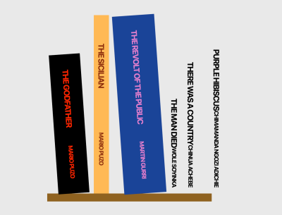
As we go along we’ll be building a contrived Bookshelf by applying different styling methods to each books. The end result will look like:

The image above shows 6 books; each book will have its own components, then we’ll apply a specific style type to each specific book, i.e. Book 1 will make use of a global style while Book 2 will make use of another. This way we’ll see how each of these styles work and how they can be used. This will help you in making a better decision on what option to choose.
To make things simple, I’ve scaffolded a GitHub repository for you to follow along. You can grab it here.
Some changes have also been made to the default starter generated by create-next-app. Folders like emotion, global, modules, styled-components etc. have been added to the styles folder — with their corresponding style files — as well as a components directory with multiple components.

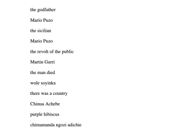
The index.js file has been modified to import and render the needed components, and each of the components has a similar structure as shown in the image below.

If you cloned and ran the demo repository, here’s what your page should look like:

With all that out of the way, let’s get styling.
Global Style
One of the common things you’d normally do when you start a new web project is to reset or normalize your CSS so there’s a uniform starting position among browsers. This is a perfect example of using Global CSS without worrying about scoping.
- Update
styles/global/globals.csswith this extended Minimal CSS Reset.
/* styles/global/globals.css */
html {
  box-sizing: border-box;
  font-size: 16px;
  font-family: -apple-system, BlinkMacSystemFont, Segoe UI, Roboto, Oxygen,
    Ubuntu, Cantarell, Fira Sans, Droid Sans, Helvetica Neue, sans-serif;
}
*,
*:before,
*:after {
  box-sizing: inherit;
}
body,
h1,
h2,
h3,
h4,
h5,
h6,
p,
ol,
ul {
  margin: 0;
  padding: 0;
  font-weight: normal;
}
h1,
h2,
h3,
h4,
h5,
h6 {
  font-weight: bold;
}

ol,
ul {
  list-style: none;
}

img {
  max-width: 100%;
  height: auto;
}

a {
  color: inherit;
  text-decoration: none;
}- Import the CSS reset
styles/global/globals.cssinpages/_app.js.
// pages/_app.js
import "../styles/global/globals.css";

function MyApp({Component, pageProps}) {
  return <Component {...pageProps} />;
}

export default MyApp;
Global styles can only be imported in the pages/_app.js. This is directly logical because these styles will apply to all pages and components in your application — regardless of where you import them — so it is better to have a single source of [import] truth to keep things straightforward, and/or if something goes wrong.
At this point, we do not have a lot of visual changes to our Bookshelf since we have only made normalization changes. One thing you might notice is the font and spacing changes.

SASS/SCSS
Next.js also allows styling with SASS with the .sass or .scss extension. Installing Sass is a requirement. Just like global styles, they can only be imported in pages/_app.js.
- Install the Sass package.
yarn add sass- Update
styles/scss/bookshelf.scss.
// styles/scss/bookshelf.scss
.the-bookshelf {
  width: 100vw;
  height: 100vh;
  background-color: #e3e3e3;
  display: flex;
  justify-content: center;
  align-items: center;

  .bookshelf-wrap {
    > .bookshelf {
      box-shadow: inset 0 -20px #7b5019;
      padding-bottom: 20px;
      display: flex;
      align-items: flex-end;
    }

    [class*="book"] {
      font-size: 32px;
      letter-spacing: -0.045em;
      display: flex;
      transition: 0.2s;

      &:hover {
        transform: none;
      }
    }

    .book-info {
      text-transform: uppercase;
      writing-mode: sideways-rl;
      display: flex;
      justify-content: space-around;
      flex: 1;
      align-items: center;
      font-weight: bold;
      padding: 16px 0;

      .title {
        font-weight: inherit;
        font-size: 20px;
      }

      .author {
        font-weight: inherit;
        font-size: 15px;
      }
    }
  }
}- Also update
styles/sass/bookone.sassandstyles/sass/booktwo.sasslike so:
// styles/sass/bookone.sass
  .book-one
    color: #f00
    width: 78px
    height: 350px
    transform: rotate(-4deg)
    margin-left: 16px
    margin-right: 23px
    background-color: black
// styles/sass/booktwo.sass
.book-two
color: #781e0b
width: 38px
height: 448px
margin-right: 23px
background-color: #ffab44SASS (.sass) is based on indentation. To make formatting easier, you can install this VSCode Extension for SASS files support (formatting, syntax highlighting…)
- Import the three style files —
styles/scss/bookshelf.scss,styles/sass/bookone.sass, andstyles/sass/booktwo.sass— inpages/_app.js.
// pages/_app.js
import "../styles/globals.css";
import "../styles/scss/bookshelf.scss";
import "../styles/sass/bookone.sass";
import "../styles/sass/booktwo.sass";

function MyApp({Component, pageProps}) {
  return ;
}

export default MyApp;
Our Bookshelf is beginning to take shape. With the styles applied, the first and second book should be styled and displayed as intended.

CSS Modules
CSS Modules is a component-level CSS, that comes built-in with Next and can be activated by naming the style files with the .module.css extension. It is also possible to use CSS Modules with SASS/SCSS with the .module.sass or .module.scss extension.
Let’s style the components/BookThree.js component with it.
- Update
styles/modules/BookThree.module.css.
/* styles/modules/BookThree.module.css */
.book-three {
  color: #df66c3;
  width: 106px;
  height: 448px;
  margin-right: 23px;
  background-color: #153086;
  transform: rotate(-4deg);
}- Import
styles/modules/BookThree.module.cssincomponents/BookThree.js, and apply the.book-threeclass.
// components/BookThree.js
import BookThreeStyles from "../styles/modules/BookThree.module.css";

export default function BookThree() {
  return (
    <div className={BookThreeStyles["book-three"]}>
      <div className="book-info">
        <p className="title">the revolt of the public</p>
        <p className="author">Martin Gurri</p>
      </div>
    </div>
  );
}
Accessing class names in CSS Modules is similar to Property Accessors in JavaScript — with the dot or bracket notation. Here we import BookThreeStyles and then use the bracket notation to apply the style we have in styles/modules/BookThree.module.css file.
If the selector (in this case, class name) was properly accessed, the third book should be styled now.

Emotion
Emotion is a CSS-in-JS library and like any other CSS-in-JS, allows you to write CSS styles with JavaScript.
Let’s style the components/BookFour.js component with it.
- Install the packages:
@emotion/core,@emotion/styled,emotion,emotion-server.
yarn add @emotion/core @emotion/styled emotion emotion-server- Update
styles/emotion/StyledBookFour.js.
// styles/emotion/StyledBookFour.js
import styled from "@emotion/styled";

export const StyledBookFour = styled.div`
  color: white;
  width: 38px;
  height: 400px;
  margin-left: 20px;
  margin-right: 10px;
  background-color: #2faad2;
  transform: rotate(4deg);
`;
After importing styled from @emotion/styled, we export the StyledBookFour styled component — not to be confused with the other CSS-in-JS Styled Component — enhanced with the styled emotion method as in styled.div. Then we can use <StyledBookFour/> as in the next step below.
“Learn more about emotion’s styled function.”
- Using
<StyledBookFour/>is similar to how you’d use any other React component. Importstyles/emotion/StyledBookFour.jsincomponents/BookFour.js, and apply theStyledBookFourcomponent.
// components/BookFour.js
import {StyledBookFour} from "../styles/emotion/StyledBookFour";

export default function BookFour() {
  return (
    <StyledBookFour className="book-four">
      <div className="book-info">
        <p className="title">the man died</p>
        <p className="author">wole soyinka</p>
      </div>
    </StyledBookFour>
  );
}
With a sufficient dose of emotion, the fourth book should be thus styled.

Styled JSX
Like Global CSS and CSS-Modules, Styled-JSX works with Next.js without any extra setup required. If it helps, Styled-JSX is also Vercel’s offering of a component-based CSS, the same creators of Next.js.
Let’s style the components/BookFive.js component with it.
To keep things simple, we use the internal mode of styled-jsx here. By passing the jsx prop to the <style/> component, we are able to write as much CSS as we want like we did with .book-five, with the additional benefit of the style being localized to the <BookFive/> component.
// components/BookFive.js
export default function BookFive() {
  return (
    <div className="book-five">
      <div className="book-info">
        <p className="title">there was a country</p>
        <p className="author">Chinua Achebe</p>
      </div>
      <style jsx>{`
        .book-five {
          color: #fff;
          width: 106px;
          height: 448px;
          margin-right: 23px;
          background-color: #000;
          transform: rotate(4deg);
        }
      `}</style>
    </div>
  );
}
And just like that, the fifth book takes its styling.

Styled Components
Styled-Component, just like Emotion, is also a CSS-in-JS library that allows you to write CSS styles with JavaScript. Getting it setup is a little bit involved.
- First, install
babel-plugin-styled-componentsandstyled-components.
yarn add babel-plugin-styled-components styled-components- Create a
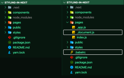
.babelrcfile at the root of your app, and apages/_document.jsfile, as shown in the before (left) and after(right) image below.

_document.js and .babelrc. (Large preview)- Update the
.babelrcfile to include thenext/babelpreset and include thestyled-componentsplugin, with server-side-rendering (ssr) enabled.
// .babelrc
{
  "presets": ["next/babel"],
  "plugins": [
    [
      "styled-components",
      {
        "ssr": true
      }
    ]
  ]
}- Update
pages/_document.jsby injecting the server-side rendered styles into the<head>.
Keep in mind, the snippet below (pages/_document.js) is a required logic for styled-components to work with Next.js. You almost have to do nothing but copy the logic as pointed out in the styled-components documentation.
// pages/_document.js
import Document from "next/document";
import {ServerStyleSheet} from "styled-components";

export default class MyDocument extends Document {
  static async getInitialProps(ctx) {
    const sheet = new ServerStyleSheet();
    const originalRenderPage = ctx.renderPage;

    try {
      ctx.renderPage = () =>
        originalRenderPage({
          enhanceApp: (App) => (props) =>
            sheet.collectStyles(<App {...props} />),
        });

      const initialProps = await Document.getInitialProps(ctx);
      return {
        ...initialProps,
        styles: (
          <>
            {initialProps.styles}
            {sheet.getStyleElement()}
          </>
        ),
      };
    } finally {
      sheet.seal();
    }
  }
}
After the updates to .babelrc, and pages/_document.js, we can now begin to use styled-components.
- Update
styles/styled-components/StyledBookSix.js.
styled is an internal utility method that transforms the styling from JavaScript into actual CSS. <StyledBookSix/> is, and, can be used as any other React component.
// styles/StyledBookSix.js
import styled from "styled-components";

const StyledBookSix = styled.div`
  color: #fff;
  width: 106px;
  height: 448px;
  margin-right: 23px;
  background-color: rebeccapurple;
`;

export default StyledBookSix;
Learn more about How To Use Styled-Components in React.
- Import
styles/styled-components/StyledBookSix.jsincomponents/BookSix.js, using the imported styled-components<StyledBookSix/>.
// components/BookSix.js
import StyledBookSix from "../styles/styled-components/StyledBookSix";

export default function BookSix() {
  return (
    <StyledBookSix className="book-six">
      <div className="book-info">
        <p className="title">purple hibiscus</p>
        <p className="author">chimamanda ngozi adichie</p>
      </div>
    </StyledBookSix>
  );
}
With the first to sixth step completed, the sixth should be styled, and the Bookshelf done:

That’s it.
If all went well, then you should have the complete Bookshelf with the books waiting to be read.
Conclusion
In my own usage with Next.js, Global styles and styled-components have often been sufficient. But there’s no doubt that all these methods have their pros and cons. And as you settle on what method to use, just keep in mind: in the end, it’s all CSS. At this point, I believe you can be able to figure out which pattern best serves you in your next project.
Resources
I find that for learning about setting up styling methods with Next.js, there’s no better place than its official documentation.
But there are also specific repositories for various styling methods. You can go through the various repository to learn more, or check for update, as things may change incognito.
Further Reading
- Meet Codux: The React Visual Editor That Improves Developer Experience
- A Thoughtful Way To Use React’s useRef() Hook
- Gatsby Headaches: Working With Media (Part 1)
- Internationalization In Next.js 13 With React Server Components


 Celebrating 10 million developers
 SurveyJS: White-Label Survey Solution for Your JS App

 Register Free Now


