A CSS Grid Framework For Shopify Collection Pages
This article has been kindly supported by our dear friends at Shopify, an all-in-one commerce platform to help you start, run, and grow your business. Thank you!

CSS Grid has become an increasingly popular technique for applying a layout to pages amongst other CSS frameworks. Developers can take advantage of this system to reduce complexity and define clear style rules. As explained in my Shopify blog post on getting started with a CSS grid layout, a CSS Grid framework can be easily implemented on Shopify themes to design responsive page layouts based on rows and columns.
All pages of a Shopify online store can adopt CSS Grid, but one obvious touchpoint of any e-commerce site that can benefit from a robust and clean grid layout is the collection page. On collection pages, it feels natural that products are organized in a grid format, with rows and columns. So, if an option for creating a robust grid arrangement with a simple set of rules is possible, it’s worth exploring for your custom theme projects.
Note: To get an idea of how this could look for your clients and so you can follow along with this CSS Grid tutorial, I’ve set up a test store which you can use to see the approach I’ve outlined in this tutorial.
Creating A Basic Collection Page Layout
Working with CSS Grid on a Shopify collection page will operate in very much the same way as how Grid works on a custom section—something we explored in the CSS grid blog article. Thankfully, Shopify has excellent CSS grid support. The biggest difference when implementing a grid system on a collection page is that you won’t need to assign a class to each individual item. Note that if you aren’t extremely advanced with CSS, we recommend you read over our intro to CSS guide before going further.
Now, since products are automatically outputted in a loop as repeatable content items, it’s possible to apply the same class to all products that are associated with a collection. But first, let’s look at an example of a collection page with no styling.
If you start off with a basic collection page setup, you’d likely have markup that looks like the following:
<h1>{{ collection.title }}</h1>
  {% for product in collection.products %}
    <a href="{{ product.url | within: collection }}">
      <img src="{{ product.featured_image.src | img_url: '300x' }}" alt="{{ product.featured_image.alt | escape }}">
    </a>
    <a href="{{ product.url | within: collection }}">{{ product.title }}</a>
      <p>{{ product.price | money }}</p>
  {% unless product.available %}<br><strong>sold out</strong>{% endunless %}
  {% endfor %}
This will output the collection name as a header, and display the collection’s associated products with their image, name, and price. Without any styling, these products will appear in a vertical row by default. The size of the product images will be 300 pixels, as defined by the img_url filter.
To apply a CSS Grid framework to this group of products, you’ll first want to wrap the collection for loop in one main grid container, which is considered the parent container. Next, you can wrap the code for each individual product (the children) within its own individual container.
Once these containers are added, the markup would appear as:
<h1>{{ collection.title }}</h1>
  <div class="grid-collection">
    {% for product in collection.products %}
      <div class="grid-product">
        <a href="{{ product.url }}">
          <img src="{{ product.featured_image.src | img_url: '300x' }}" alt="{{ product.featured_image.alt | escape }}">
        </a>
        <a href="{{ product.url }}">{{ product.title }}</a>
          <p>{{ product.price | money }}</p>
          {% unless product.available %}<br><strong>sold out</strong>{% endunless %}
      </div>
    {% endfor %}
  </div>
Applying The CSS Grid Framework Styling To The Collection Page
Now that we have a basic collection page with a hierarchy of containers, you can divide the products into a grid layout by applying styles to the classes you’ve created. In the themes stylesheet file, you can add the following:
.grid-collection {
  display: grid;
  grid-template-columns: repeat(auto-fit, minmax(300px, 1fr));
}

.grid-product {
  display: grid;
}
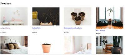
Now, when you navigate to the collection page, you should see the products appearing in a grid, fitting into the available space on the screen.

As well as adding display: grid, you’ll notice we’re also using the grid-template-columns property, which can be used to define how many columns appear within the grid. Instead of defining a fixed value, we can use the repeat notation to create a rule that our products should appear as many times as they can fit inside the Grid.
Within the functional notation, auto-fit is displaying as many items on the line as possible, so on a full screen, we will see as many products appearing as there is space on the buyers screen. Finally, with minmax, we set up a rule that each cell should be a minimum of 300 pixels, and a maximum of one fraction of the grid-container.
When using this property, we need to ensure that the size defined in the minmax function matches, or is larger than, the size defined by the img_url Liquid filter in our markup. If the minmax function contains a smaller pixel size, you’ll see that product images become cut off as they won’t have enough space within the defined cell.
Once our basic grid is appearing as expected, we can add additional CSS to tidy up the layout by adding margin space and positioning the products on the center of the page. If you’d like the gap between your columns and rows to be the same, you can define both with the gap property, rather than defining each separately.
Once this is all set up, your stylesheet will look like this:
.grid-collection {
  display: grid;
  grid-template-columns: repeat(auto-fit, minmax(300px, 1fr));
  gap: 1px;
  margin: 1em;
  background-color: white;
}

.grid-product {
  display: grid;
  justify-content: center;
  padding: 10px;
  color: white;
  line-height: 1;
  border-radius: 5px;
}
While this is a simple example of how a CSS Grid framework can be applied to a collection page, I’d recommend that you experiment with different parameters to suit your client’s images and existing brand imagery. You can also use this approach to create grids on other pages, like the cart and adjust based on its unique characteristics.
Adding Customizable Grid Options
The above approach works well for a grid that will display columns of products based on the size of the screen. But, what if you want to give the merchant some control over how the grid is represented?
In some cases your clients may want to customize the product page, and dictate how many products appear.
If your markup is contained in a section file, you can create section settings that will allow clients to customize the grid from the online store editor. A configuration of settings that allows your client to select a number of products on a row could look like this:
{% schema %}

{
    "name": "Collection",
    "settings": [
  {
    "type": "select",
    "id":  "product_number",
    "label": "Number of products per row",
    "options": [
        {
        "value": "two",
        "label": "two"
        },
        {
        "value": "three",
        "label": "three"
        },
        {
        "value": "four",
        "label": "four"
        }
      ]
    }
  ]
}

{% endschema %}
You can see here that the setting has a type of select which will output a drop down option on the online store editor. There is also a label property to describe the setting.
The id property will not be visible on the editor, but we can reference this to create a variable. A common use-case for variables created with section objects is to reference them within the markup to change class names based on what settings are selected.
To achieve this effect, we can use Liquid to output the value that is selected on the online store editor, as an attribute of the section object. This object will be expressed as {{ section.settings.product_number }}, and will output whichever value is the selected option.
One way of looking at it is that the id we assigned in the section setting becomes a "placeholder" for the value in the selected option.
Then, we can take this object and append it to the class name of the collection. This will allow the class name to change based on the selected option, and you can create different CSS rules for each class name.
When we append the variable to the existing collection class name it will look like:
<div class="grid-collection-{{ section.settings.product_number }}">
Here you can see that the section object references the id of the section setting. The value that is outputted by this section object is determined by the value selected on the online store editor. For example, if "three" is selected on our drop down box, this would cause the markup to output as:
<div class="grid-collection-three">
Now we can move back to our stylesheet and set up different CSS rules for grid-collection-two, grid-collection-three, and grid-collection-four. These would look like:
.grid-collection-two {
  display: grid;
  grid-template-columns: repeat(2, 1fr);
  gap: 1px;
  margin: 1em;
  background-color: white;
}

.grid-collection-three {
  display: grid;
  grid-template-columns: repeat(3, 1fr);
  gap: 1px;
  margin: 1em;
  background-color: white;
}

.grid-collection-four {
  display: grid;
  grid-template-columns: repeat(4, 1fr);
  gap: 1px;
  margin: 1em;
  background-color: white;
}
The grid-template-columns property determines how many columns will appear within the grid, and as a result, how many products will appear in a row on the collection page. So, each class will have a different value for the grid-template-columns property, that corresponds with its unique class name.
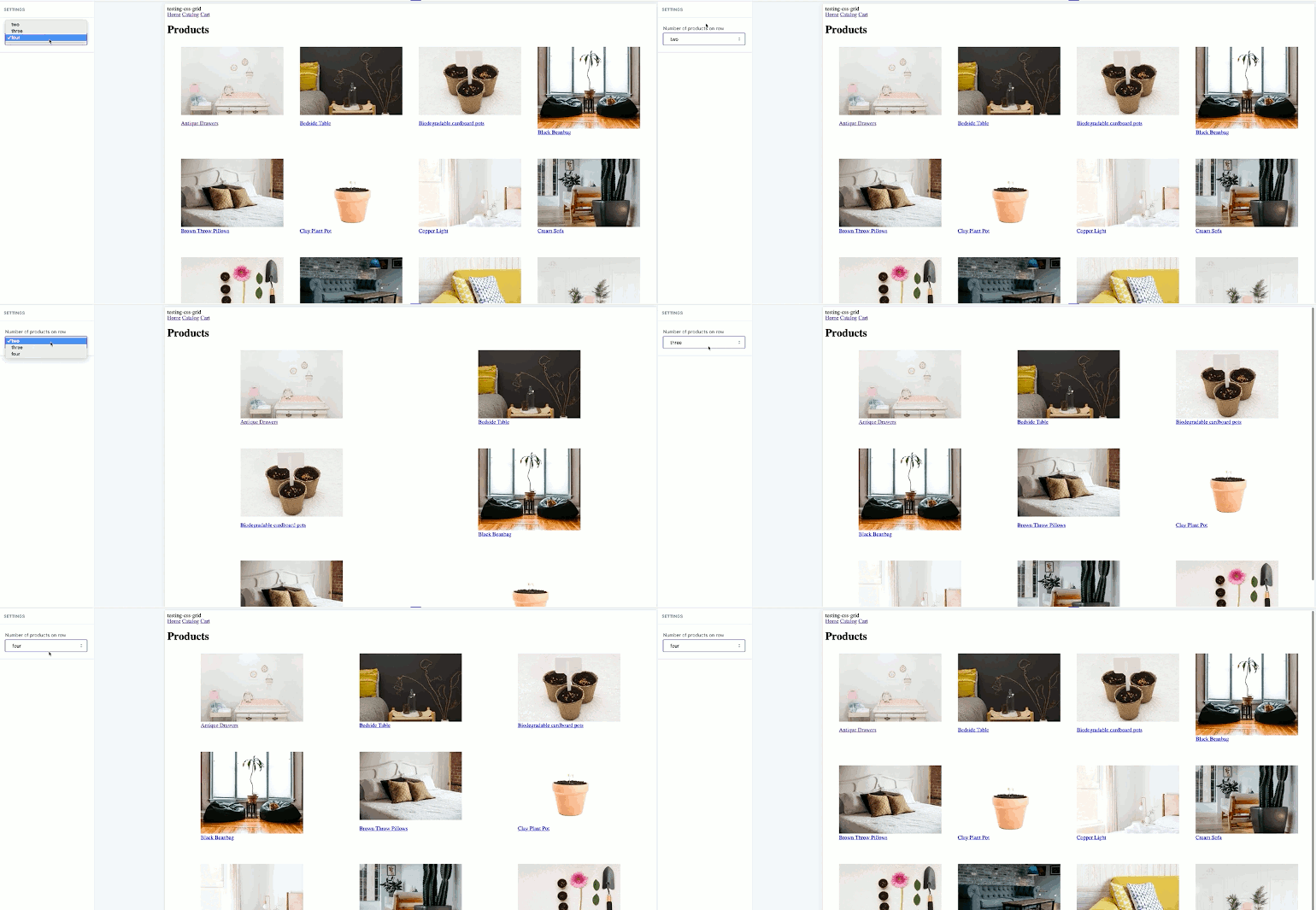
Now when a client navigates to the online store editor and selects an option for "Number of products per row", the grid will adjust to reflect this:

Finally, we can add media queries so that there are different CSS Grid rules for smaller screens. This will avoid the grid appearing with too many columns of products on smaller devices, which would result in products appearing off-screen.
Each variation of the collection-grid class can be assigned different rules where the grid will drop to two or one columns. When this is set up on your stylesheet, it could look like this:
@media screen and (max-width: 992px) {
  .grid-collection-two {
    grid-template-columns: repeat(2, 1fr);
  }
}

@media screen and (max-width: 600px) {
  .grid-collection-two {
    grid-template-columns: repeat(1, 1fr);
  }
}

@media screen and (max-width: 992px) {
  .grid-collection-three {
    grid-template-columns: repeat(2, 1fr);
  }
}

@media screen and (max-width: 600px) {
  .grid-collection-three {
    grid-template-columns: repeat(1, 1fr);
  }
}

@media screen and (max-width: 992px) {
  .grid-collection-four {
    grid-template-columns: repeat(2, 1fr);
  }
}

@media screen and (max-width: 600px) {
  .grid-collection-four {
    grid-template-columns: repeat(1, 1fr);
  }
}
It’s likely that you’ll need to adjust the pixel sizes and values for the img_url filter based on the specific requirements of your client and the images they’re using. However, this method will show you how to get started using a CSS Grid system for collection pages on your own custom theme builds.
Expanding The Grid
Once you’ve applied a CSS Grid to your collection pages, you can start to consider other areas on your Shopify themes where robust website layouts may apply. As an example, it’s possible to create image gallery sections in a grid, and add irregular shaped cells for variety.
There are a range of opportunities when using CSS Grid on Shopify, and each one potentially adds further value to your theme projects. With the help of this article, you can expand the CSS Grid framework to all of your theme projects.
Further Reading
- It’s Time To Talk About “CSS5”
- Sticky Headers And Full-Height Elements: A Tricky Combination
- How To Create An Information Architecture That Is Easy To Use
- When Friction Is A Good Thing: Designing Sustainable E-Commerce Experiences

