Different Ways To Design Digital Product Pages

Email Newsletter
Weekly tips on front-end & UX.
Trusted by 182,000+ folks.

 Celebrating 10 million developers
 Custom Web Forms for Angular, React, & Vue. Your backend.


I think it’s fair to say that when designing mobile product pages for physical products, you’ll use a similar layout and include the same details, regardless of the website.
For instance, this is what product pages for Peloton bikes, Macy’s clothing and Truth Bars look like:
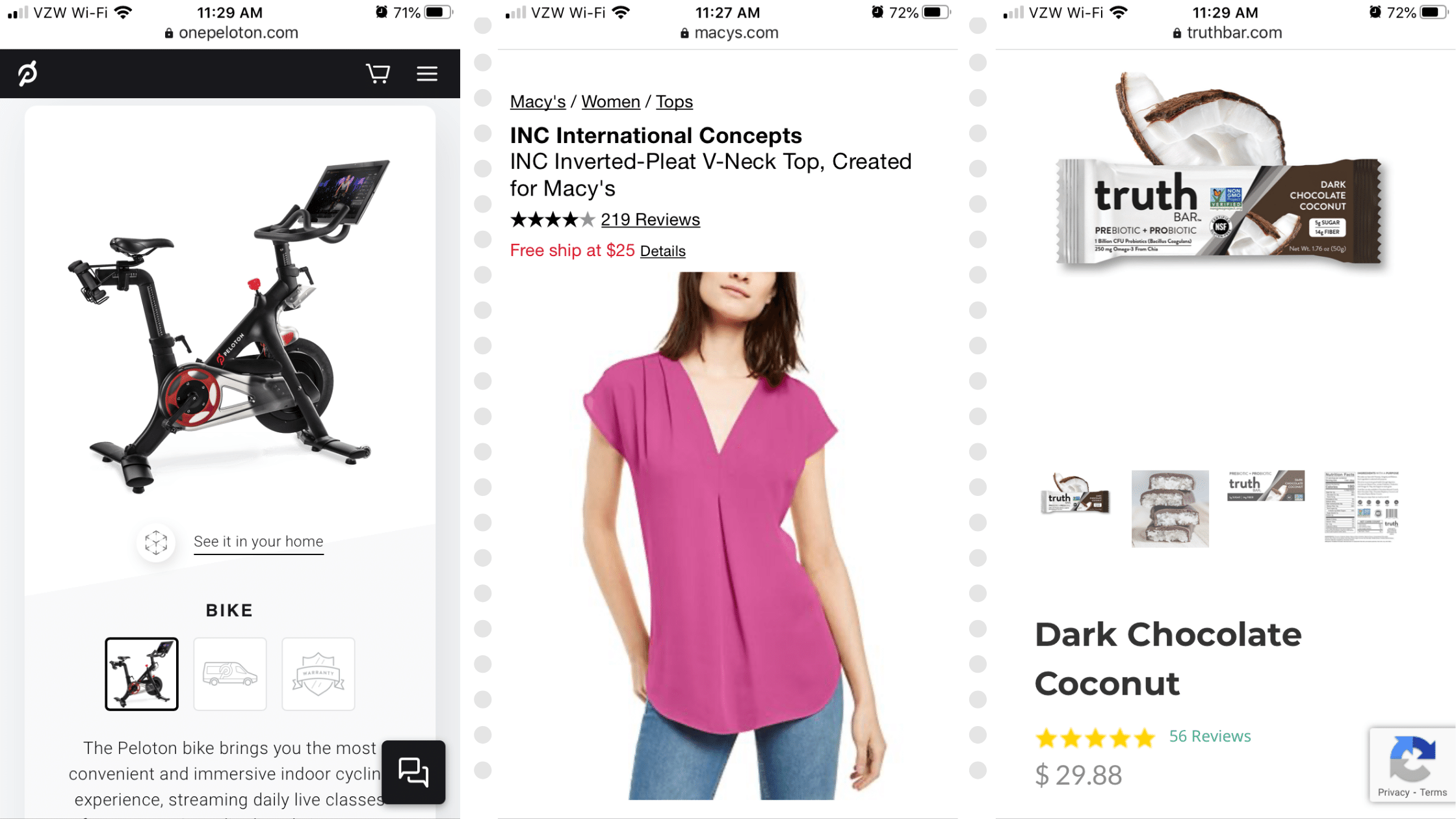
There are slight differences in how the information is positioned, with some product pages showing the product name, average rating and price first while others let the product image lead the way. Regardless, there isn’t a whole lot of wiggle room in terms of what you can include.
Designing digital product pages for mobile isn’t that straightforward.
While you might be able to design a clothing, equipment and food product page similarly, you can’t do the same for digital products like:
- eBooks and other documents,
- Media and other licensable files,
- Courses.
As consumers spend more time online and with their smartphones, there’s a growing need for high-quality digital products. If you’re interested in designing e-commerce websites for these kinds of products, you’ll need to understand the differences between the types and how to present them the right way to consumers with your product page design.
Different Ways To Design Digital Product Pages For Mobile
Selling digital products is a great way to generate a (mostly) passive income online. Digital product vendors don’t have to own or manage inventory, deal with shipping and returns or other challenges that come with selling physical items.
As for marketing those digital products, that’s when it may become challenging.
Here’s what you need to know when designing pages for the following types of digital products:
eBook Product Page Design
With each passing year, more and more money is spent on ebooks around the globe. These are the projected global earnings for ebooks, according to data collected by Statista:
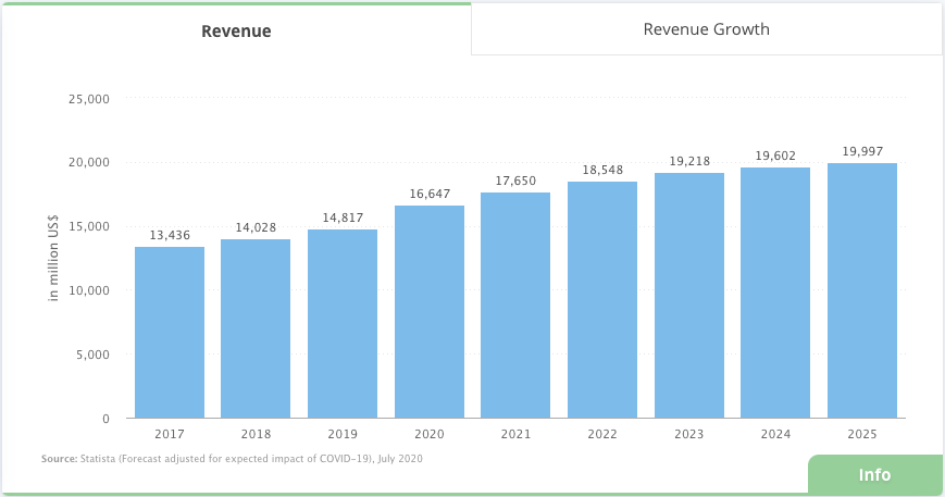
Because of this, ebooks are a great marketing venture for businesses these days. The same goes for other downloadable digital documentation, like templates, checklists, and so on.
But rather than leave it to marketplaces to take a chunk of those digital product profits, marketing and selling ebooks through one’s own site can help a business capture more revenue.
Let’s use the example of Smashing Magazine. While it can and does sell its ebooks through Amazon, it also has a dedicated “Books” section on the website. And I’m guessing that more sales come through the site than from Amazon… for a number of reasons.
For one, each ebook page is designed to align with the Smashing Magazine brand that readers know and trust:
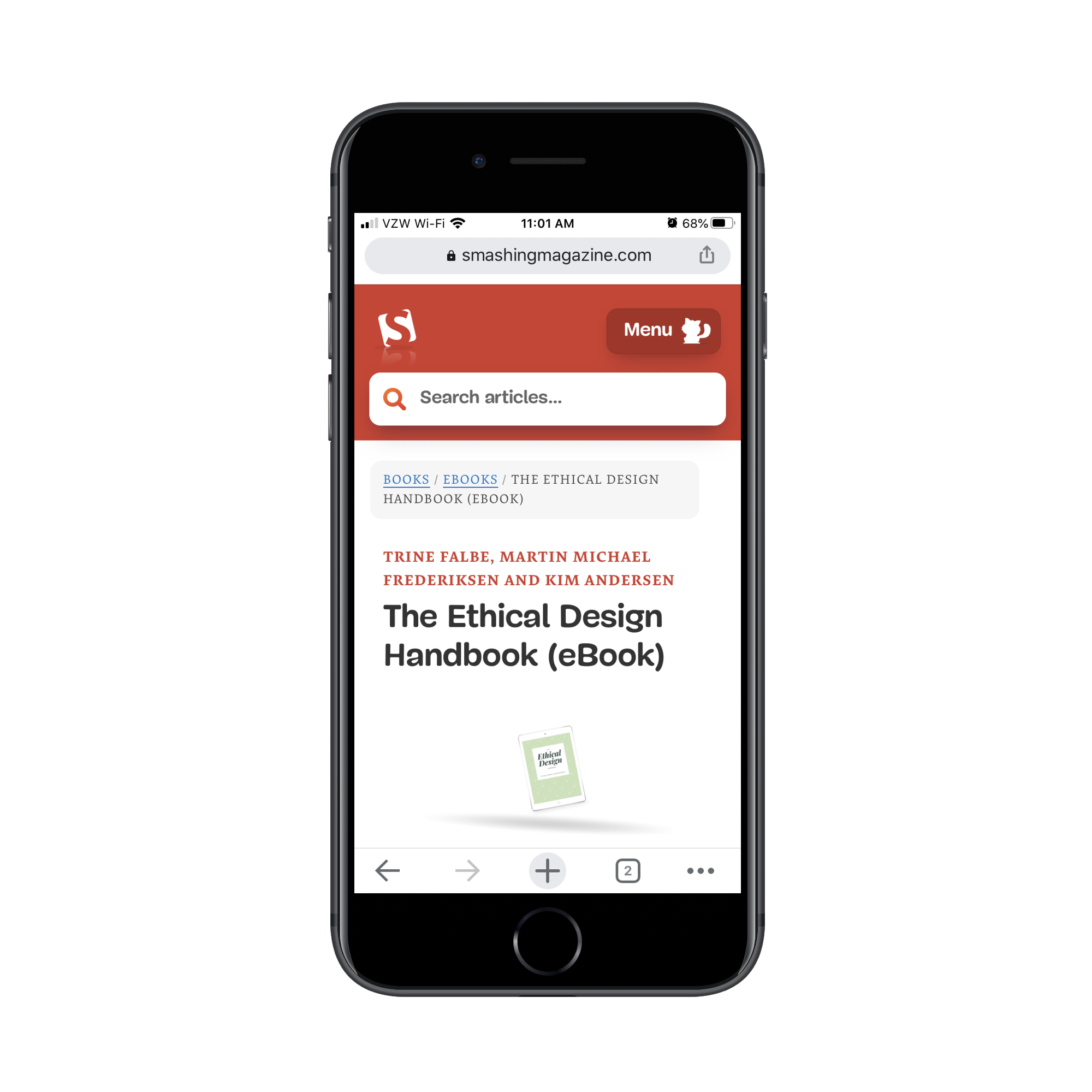
This sense of consistency and familiarity is going to earn much more trust from long-time readers, much more so than Amazon customers who happen to stumble across it.
The rest of the product page does what it needs to do to encourage visitors to buy the ebook, even if they’re not ready to do so when they see this first CTA:
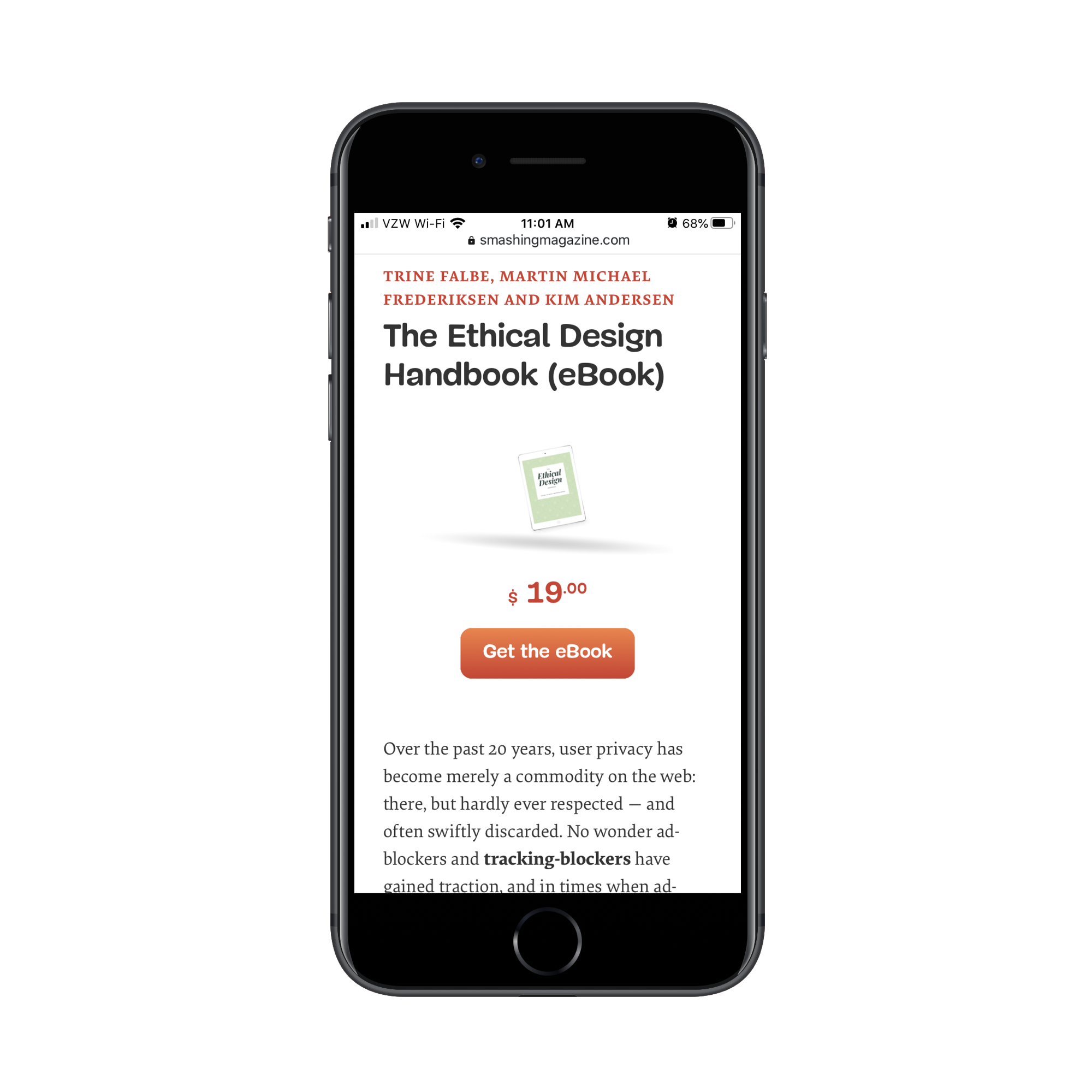
The ebook description is presented in a clear and straightforward manner. There are no distractions along the way promoting other books or ads.
And it’s not long before interested readers are presented with the chance to read a preview of the book:
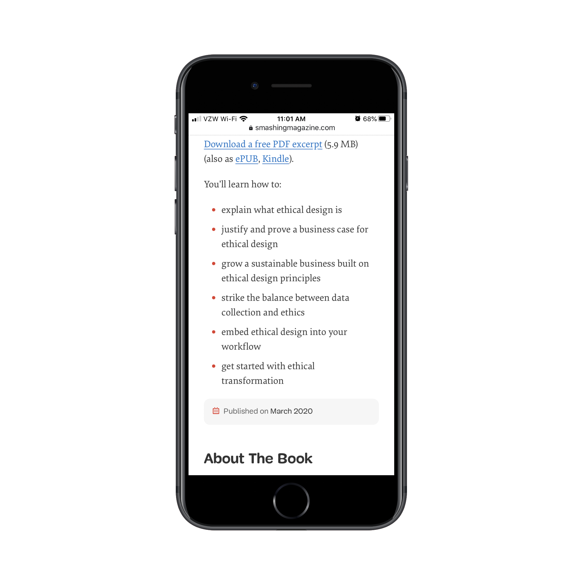
This is a must any time your website sells a digital document. Not only should the ebook page spell out what lessons they’re going to learn (as this one does), but an excerpt in their preferred file format is a must.
Without a preview of what they’re buying, it’s going to be mighty difficult to make that sale.
Another element you should include on an ebook landing page is a section about the author(s).
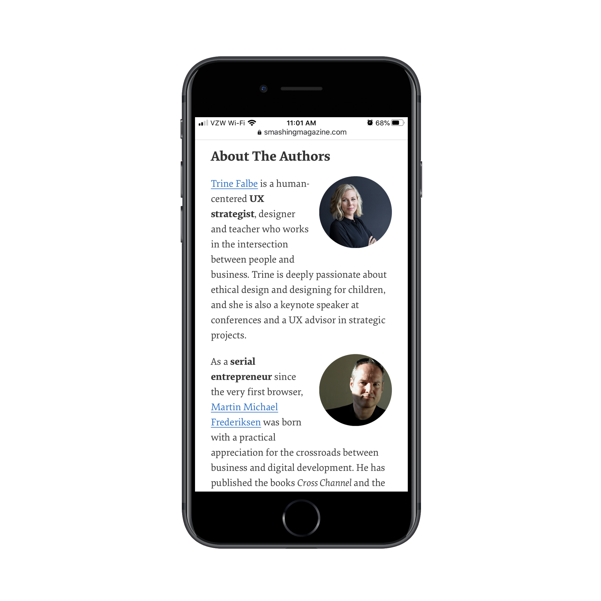
For new visitors to your website and ebook landing page, they might be wondering, “Why the heck should I even listen to this person?” The author’s section enables you to put a face and context to the book.
There’s another section on this page that you’ll want to mirror your own ebook page after. I’d even suggest placing it higher up if your authors aren’t well-known names (yet):
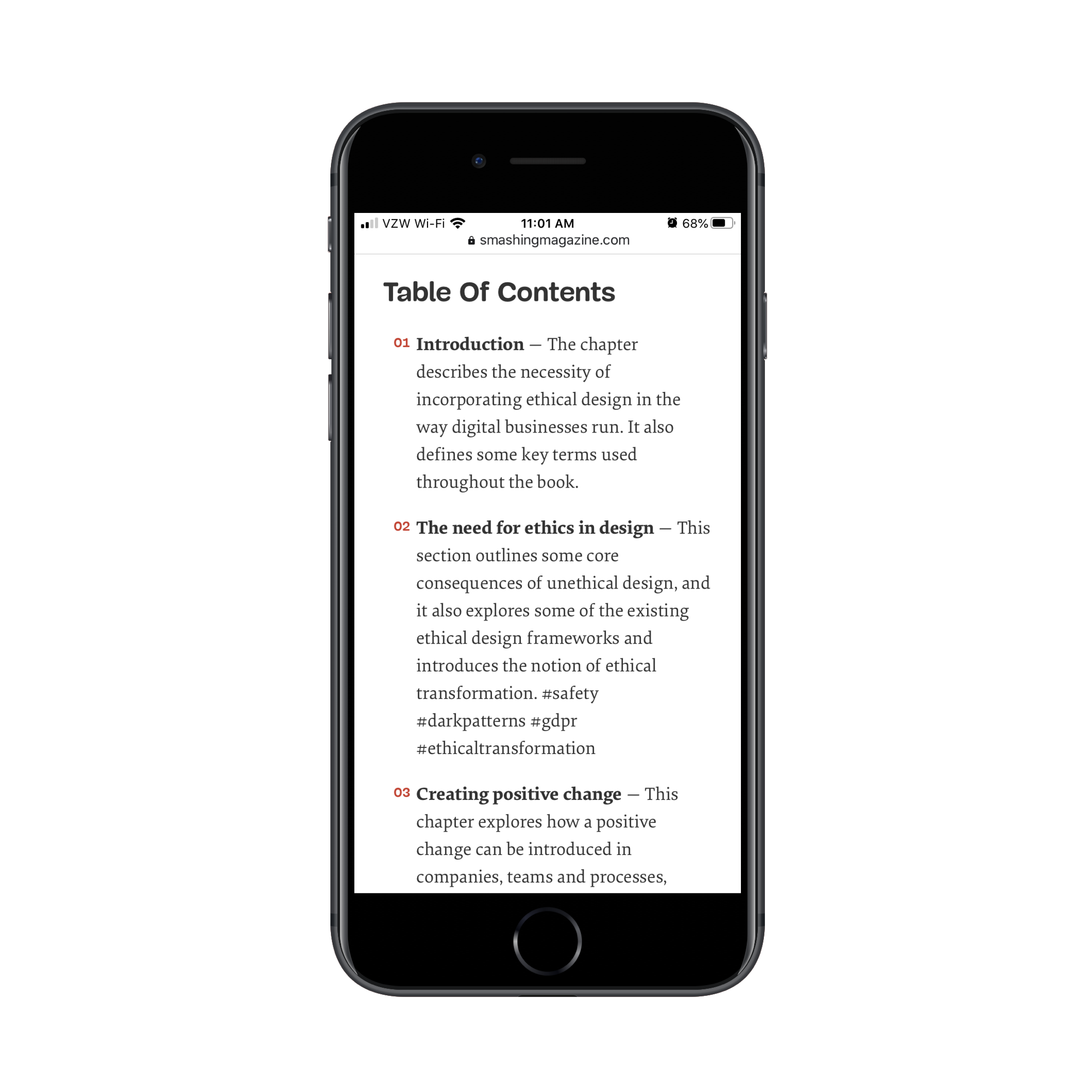
A table of contents section is helpful for a number of reasons:
- A summary of each chapter enables readers to determine if it’s going to be valuable.
- A search-optimized table of contents would be just as effective as strategically using header tags in a blog post.
- It can also be used to generate structured data and display a partial table of contents in relevant online searches.
There’s one thing not included in this example that I’d urge you to include on your ebook pages if you can: Ratings or testimonials.
Just because it’s a digital product, that doesn’t mean readers don’t need social proof to take them from “Sounds interesting” to “I need to read this”. In fact, it’s a big part of what helps ebooks sell on platforms like Amazon and Barnes & Noble.
If your site only has one or two ebooks for sale, reader testimonials are fine. If your site includes a repository of eBooks, then add a rating and review system so it’s easy for anyone to leave their comments.
Media Product Page Design
As a web designer, you’re already familiar with the vast amounts of licensable content out there:
- Images,
- Videos,
- Icons,
- Music,
- Sound effects,
- Video,
- Fonts,
- Design themes or templates,
- Plugins.
Let’s be honest, if you’re looking for stock content or pre-designed components, you’re most likely going to go to a popular marketplace to buy them. The sheer quantity and diversity in offerings alone is much more appealing than having to visit independent creators’ websites to try to find what you need.
So, why are we even talking about this one, then?
There are two points I want to make:
If you’re tasked with designing a marketplace for licensable content, don’t recreate the wheel.
Use the tried and true formula that works for others. Customers don’t want to figure out a new way to find digital content from a massive repository just because you felt like getting creative.
If you’re tasked with creating digital product pages on the website of a small agency or independent creator, now that’s a different story.
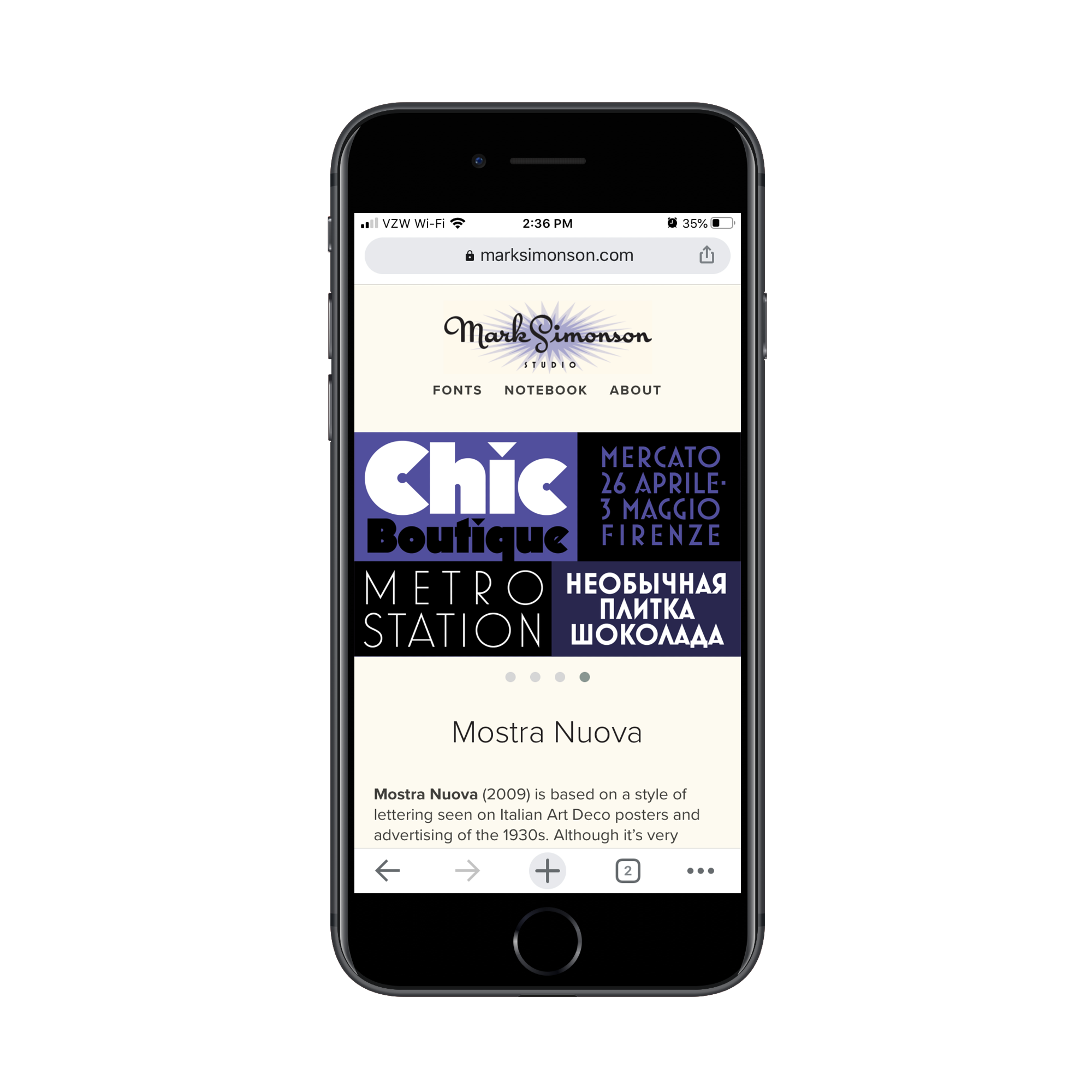
I’m going to use typographer Mark Simonson’s website to demonstrate how you should approach something like this.
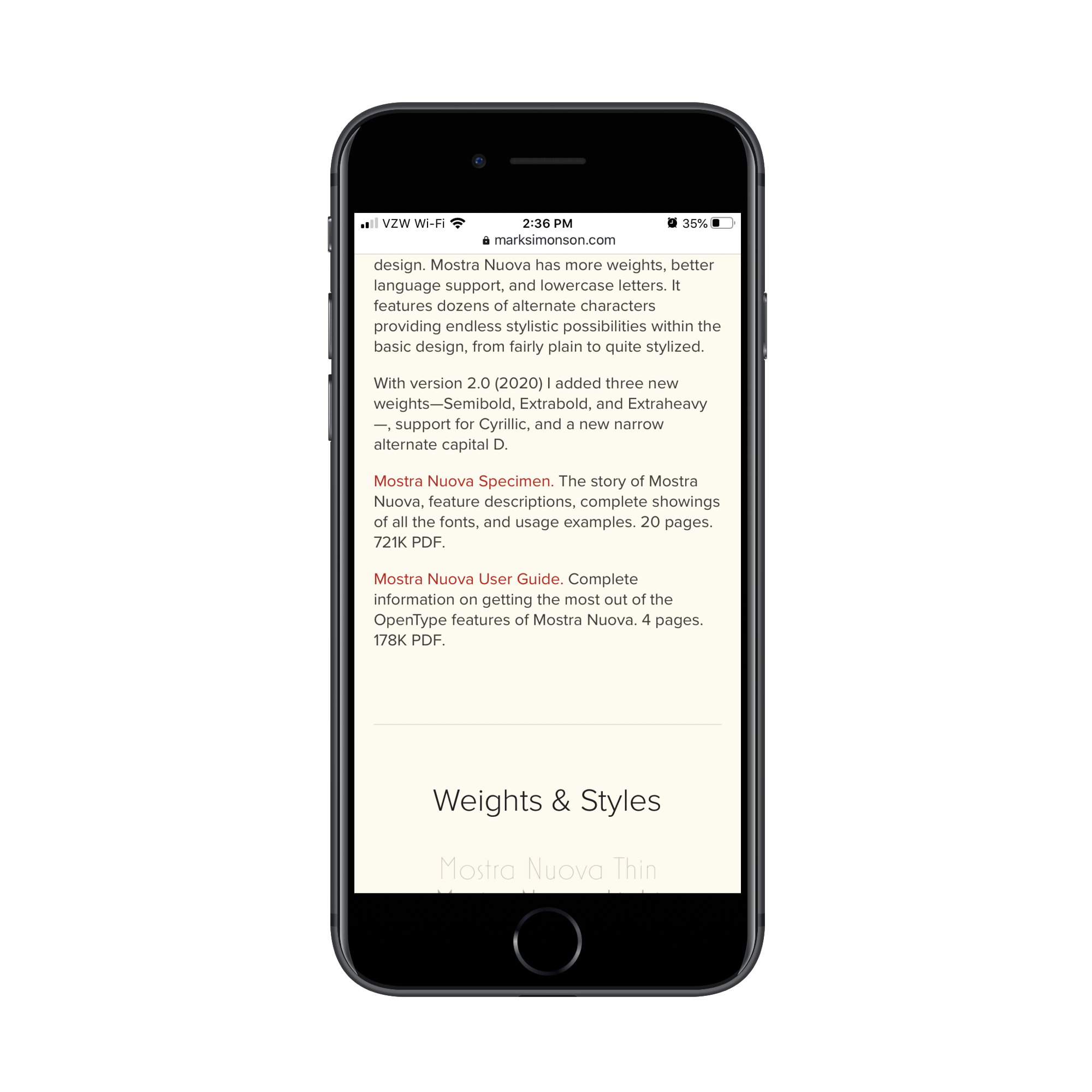
This is the landing page for the Mostra Nuova font:
When creators sell their digital media on marketplace websites, they have very little control over how they’re presented. Nor do they have control over what other distractions or recommendations are simultaneously presented to prospective customers.
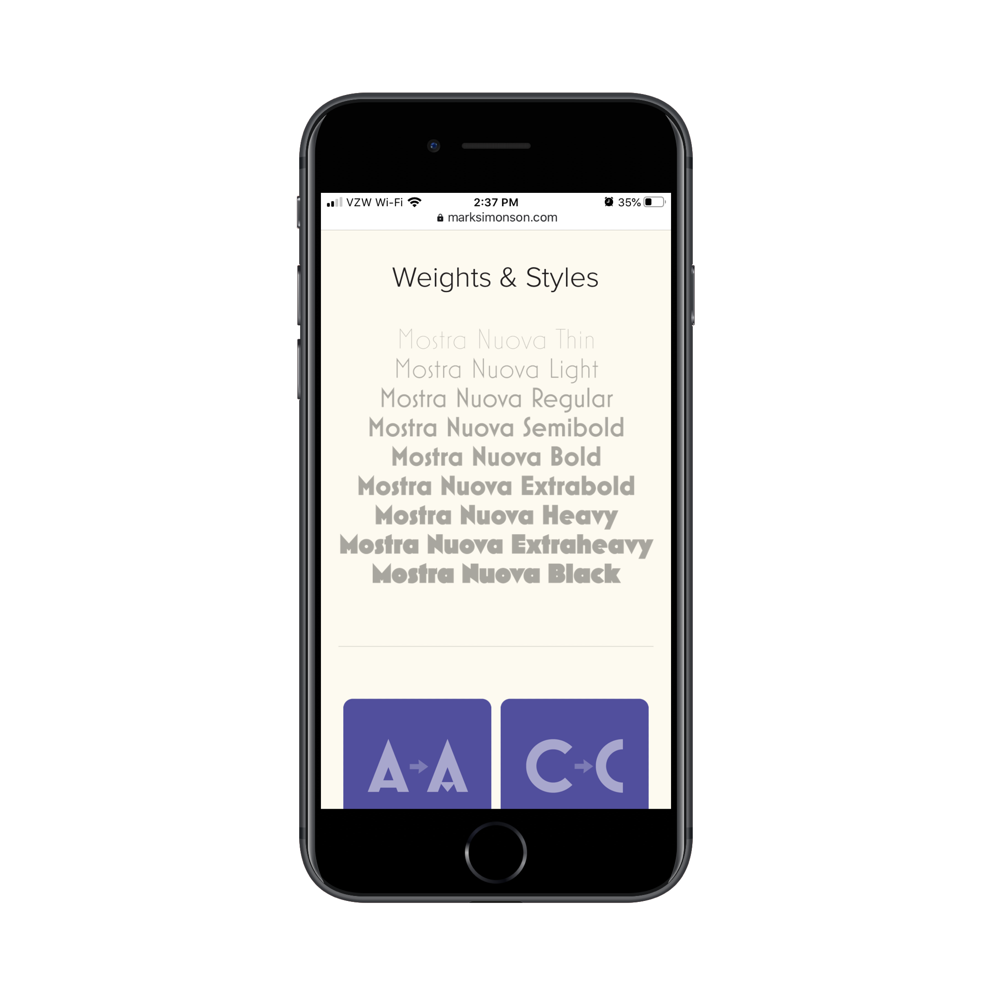
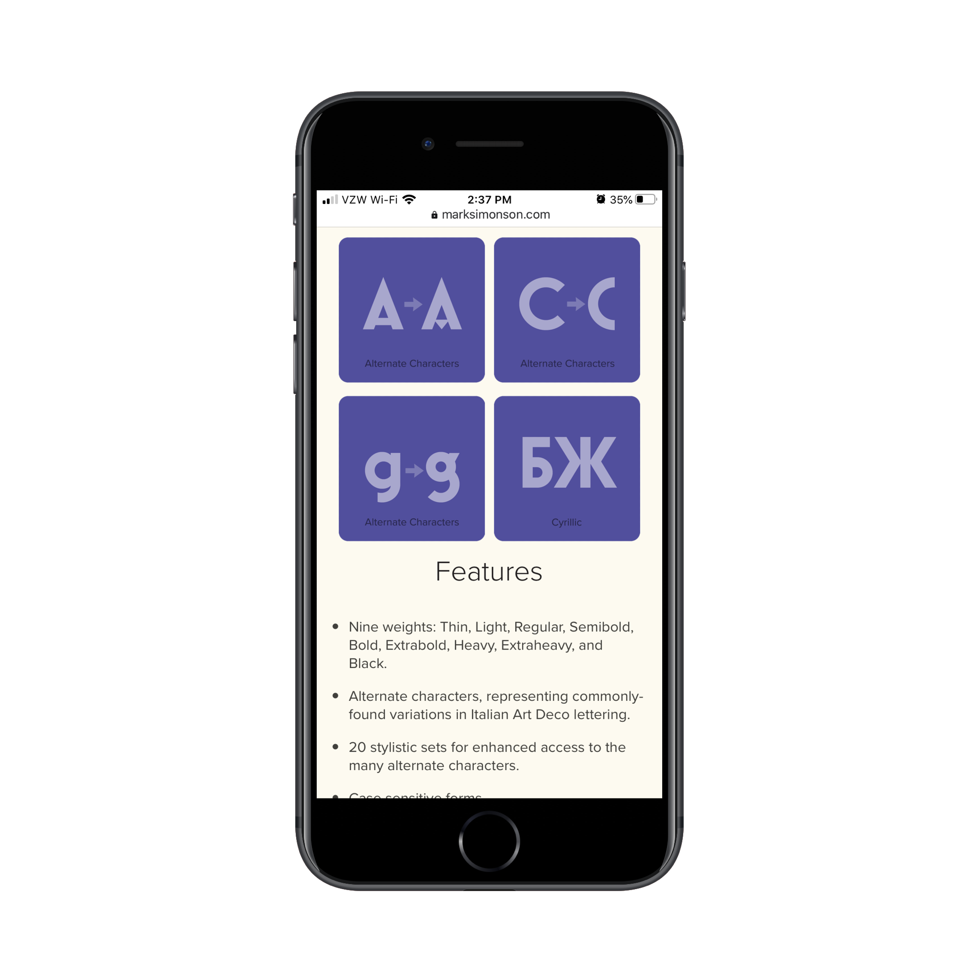
By creating dedicated pages for each product on your website, however, you can control the look and the narrative as this page does:
You also don’t have to conform to the marketplace’s guidelines. Your branding and its products come first:
Another nice thing about selling media products on one’s own website is that there’s no reviewer to get approval from whenever you want to upload or sell a new media file. You also don’t have to wait for updates to existing ones to get pushed through.
This means there’s very little lag time in the marketing or sales cycle, which leads to greater profitability for the creator.
Before we address how to actually sell digital products like these on a website, I want to show you something that Mark Simonson includes at the bottom of his font pages. It’s an “… in Use” section:
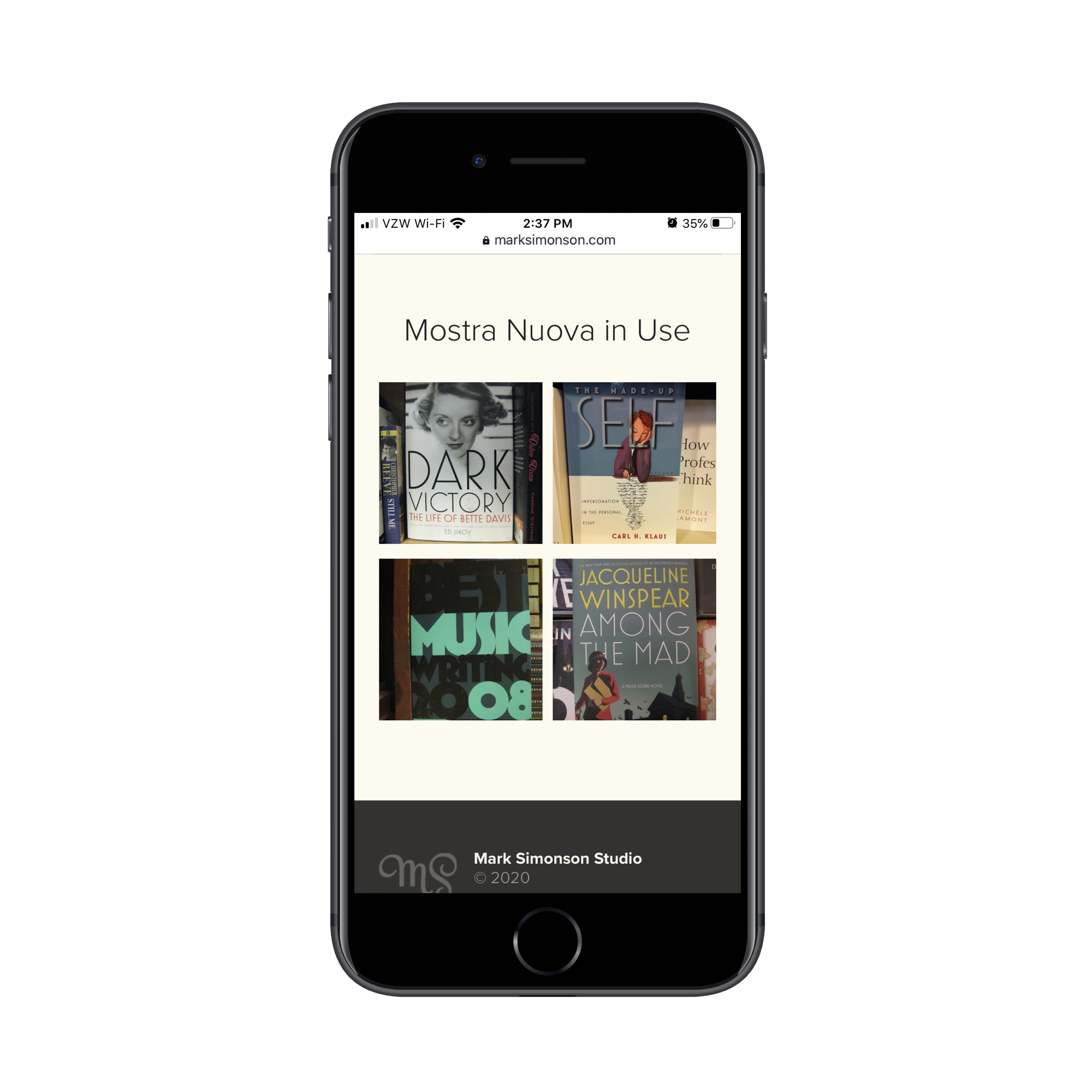
This isn’t something you often see on creators’ websites, at least not for the digital products they sell. However, I think a section like this can really seal the deal with visitors as it gives them real examples of the media element in action.
It might not be feasible to provide customer examples for every digital product site you build. But it’s something to consider if the products are popular enough.
As for selling media on your website, you have a couple of options. You can do as the Mark Simonson Studio does and provide a long list of links to places where the font is sold:
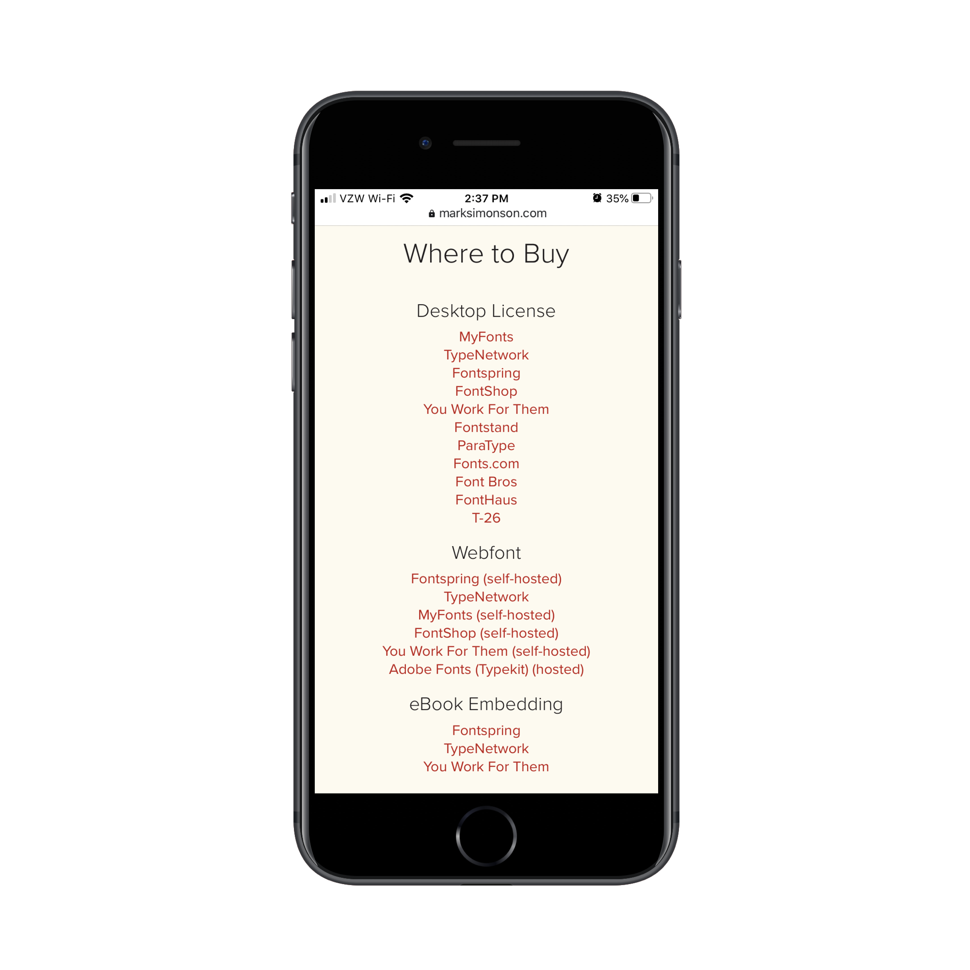
The way this is presented is great because it gives customers the flexibility to use their preferred font marketplace and to get the font in the format they need. And if your client doesn’t want to deal with the hassle of managing product sales, this is definitely the way to go.
If your client prefers to own the sales process, set it up the way you would any other e-commerce site. Provide a “Buy” link, information on pricing and licensing, and then push them over to a secure checkout site. Oh, and if the content can easily be taken from the site without a purchase, make sure to slap a watermark on it.
Course Product Page Design
Pre-recorded courses and classes from subject matter experts and influencers are very popular these days:
- Coursera has over 68 million learners.
- Udemy has 35 million learners.
- edX has more than 20 million learners.
Clearly, people are hungry for digital course content, especially when they don’t have to sit in a virtual lecture hall and can take the classes at their own pace.
There’s absolutely nothing wrong with selling courses through these marketplaces since they’ve got huge numbers of learners just waiting to discover new content.
However, when creators sell digital course content through their websites, they can do a lot more with it and make more money, too. That’s because they offer more than just the opportunity to log in and press “Play”. These courses usually come with:
- Supplementary material,
- Newsletters and email reminders,
- Private communities,
- And more.
The key to selling a course this way is to design the digital product page like a sales funnel.
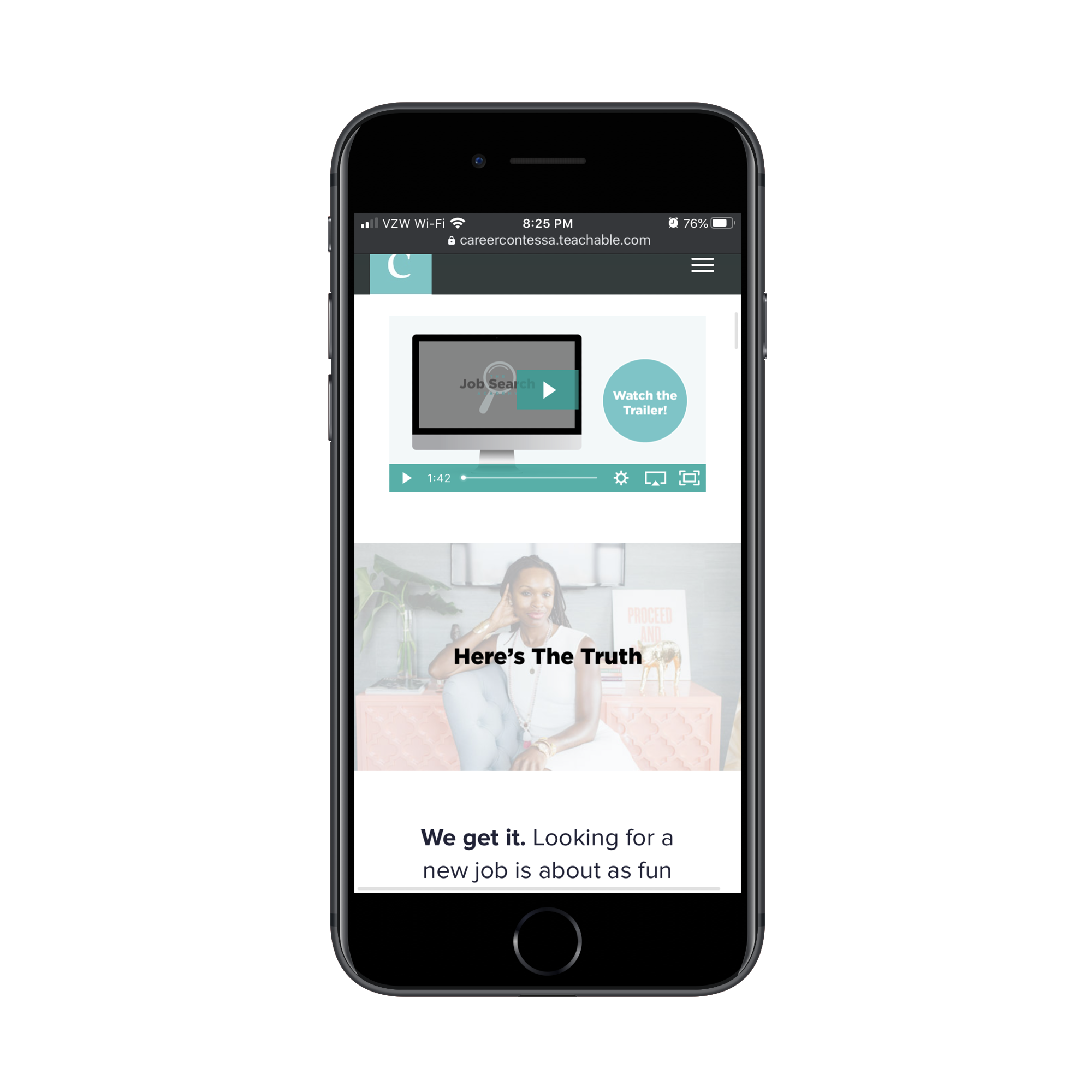
Let’s look at an example from the Career Contessa website. This is the page for The Job Search Academy program:
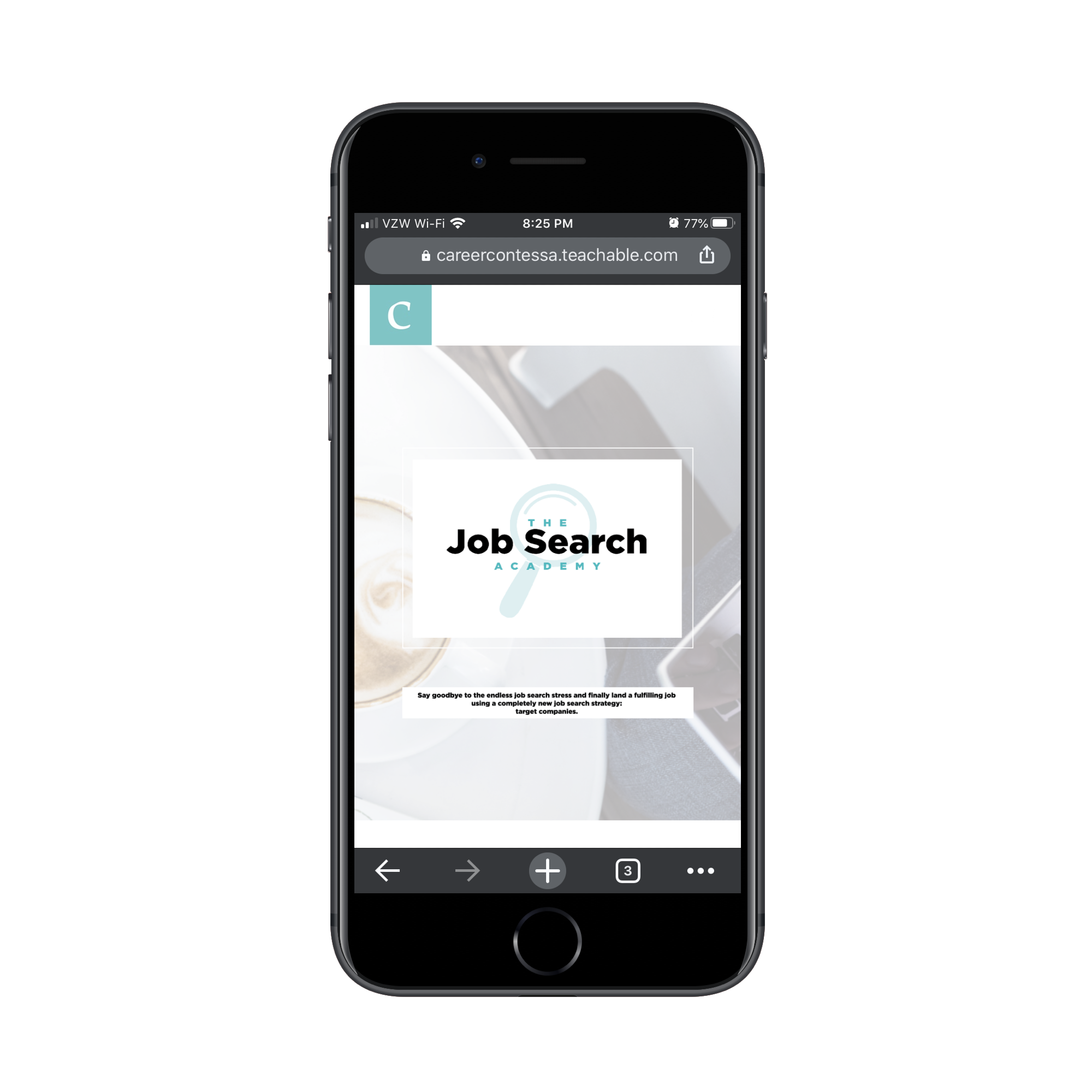
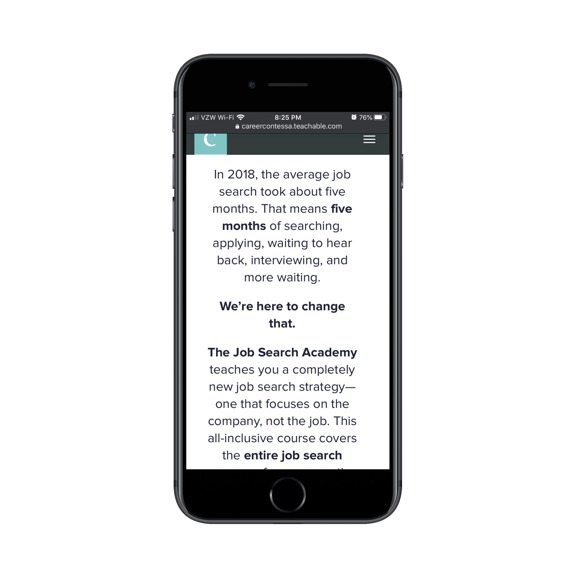
Similar to what we’ve seen before, designing your own digital product pages allows you to create a branded experience for learners. For those who know and trust this brand already, the next scroll down the page is a no-brainer:
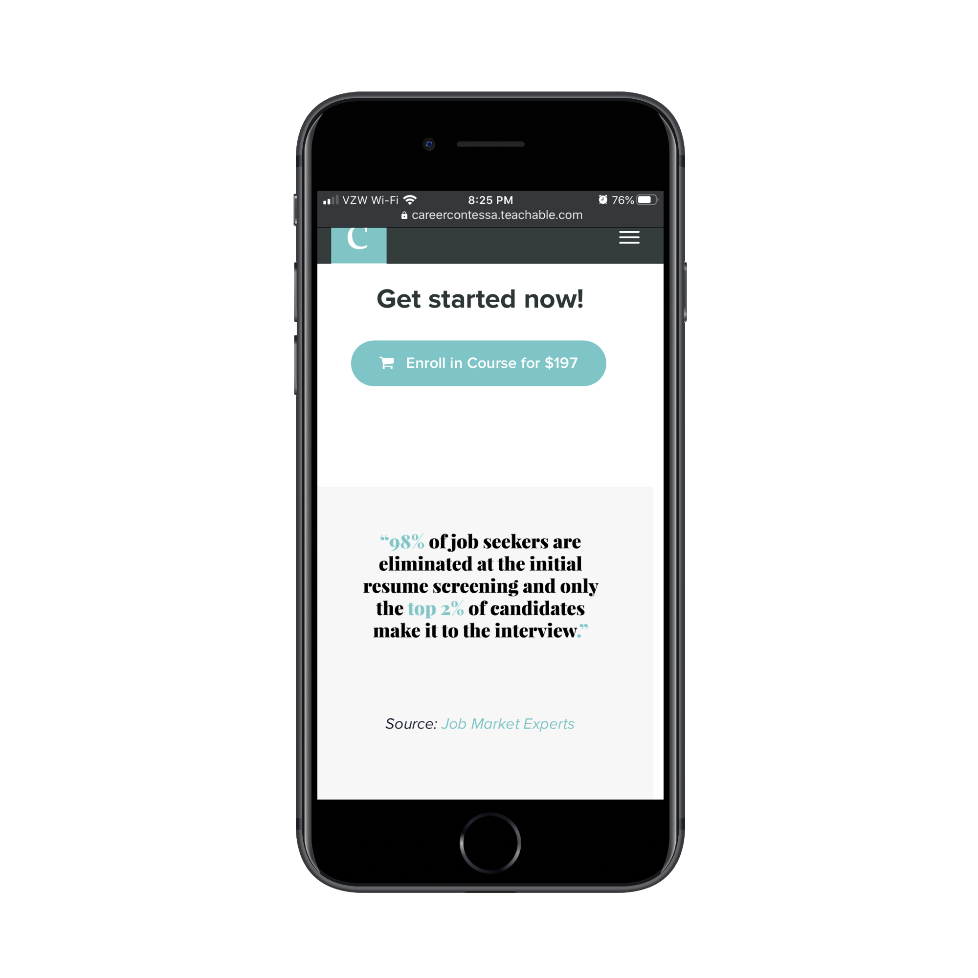
For learners who are still on the fence, the powerful statistic just below the CTA button could be enough to convince them. If not, there’s a ton of content on the page that’s carefully been planned out to help them make up their minds.
While there is a lot of written content on this landing page, it’s well-formatted. Paragraphs are kept to a decent length on mobile while bolding is used to highlight important bits of text.
It’s not all walls of text though. Learners also see video content:
Scannable bulletpoint lists:
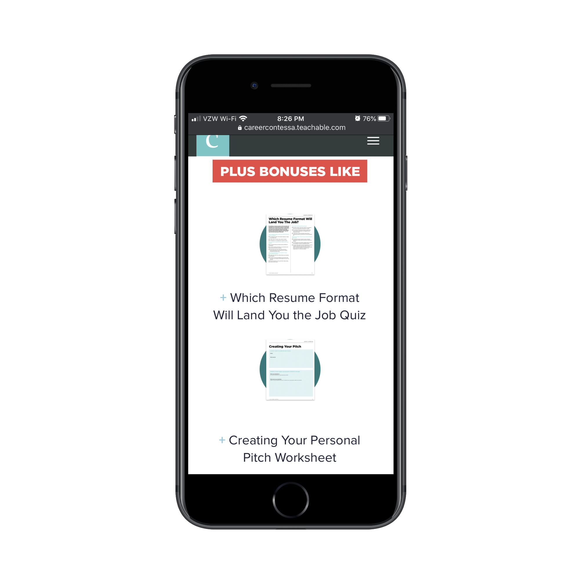
Nicely presented information about bonus content:
It’s obvious that a designer spent a lot of time giving each section a distinct look so it would be much easier to scan and read through.
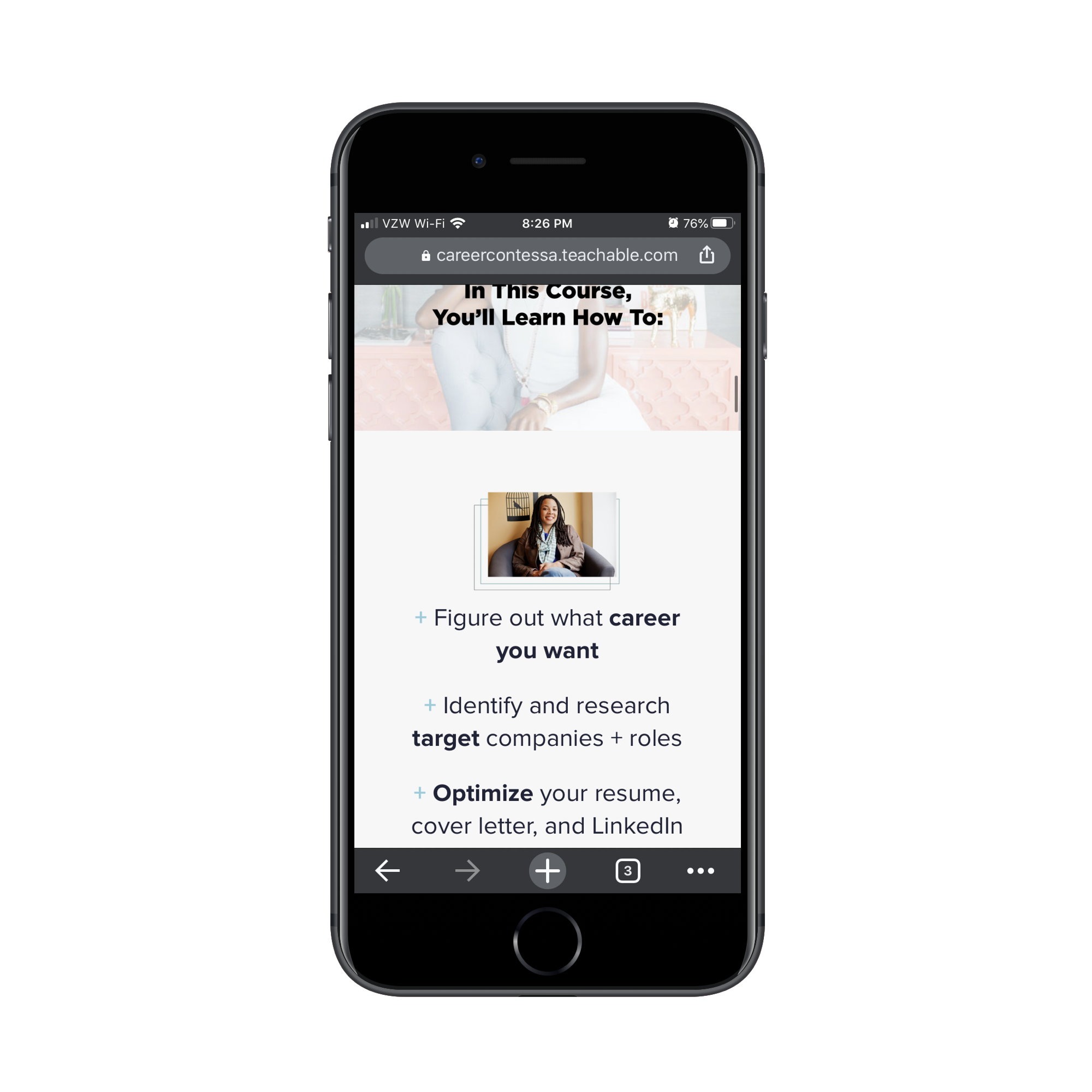
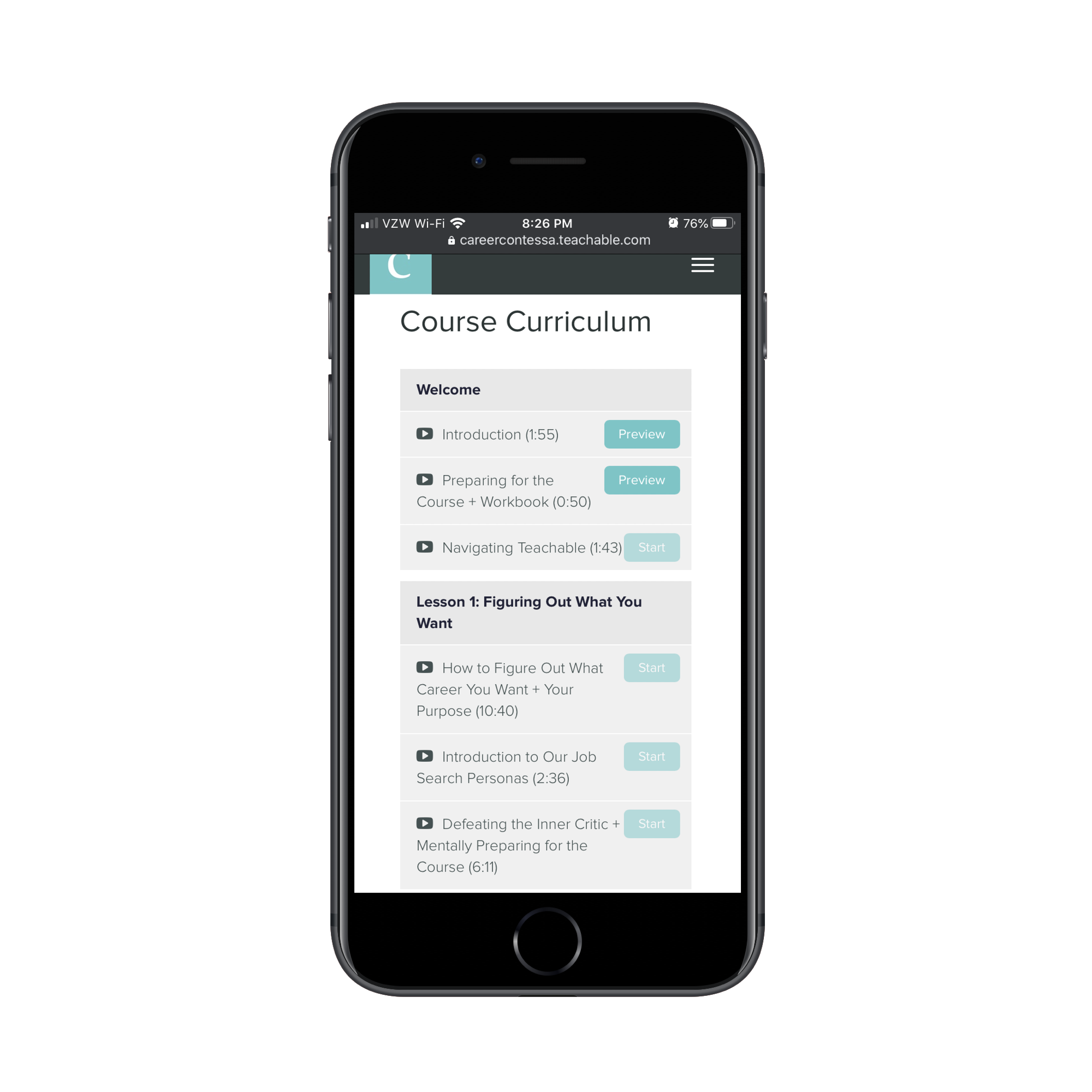
If learners have made it this far, they’re going to reach the most critical part of the sales page. This is where they find out exactly what they’ll learn with a well-designed curriculum and lesson previews:
Just like you’d expect a sales funnel page to do, prospective learners are presented with a testimonial section as well as an FAQs next. These are two elements that you cannot do without when designing a sales funnel, for courses or otherwise. And it needs to be at the bottom of the page, just before you ask once more if they’re ready to sign up for the pricey course.
This might seem like overkill, but the approach is sound. You can sell your courses to casual learners on sites like Coursera and edX, but there’s no relationship there. They sign up for your course just as easily as the next one offered on the site.
When you design course pages on your website, however, you capture the most dedicated of learners — the ones who’ll complete the course in its entirety and want to sign up for more courses and content in the future.
Wrapping Up
What’s interesting to note about the examples above is how creators are selling their digital content both through popular marketplaces as well as their websites. As you can imagine, this is the best way to capture as much revenue from digital products as possible.
Just make sure that when you design digital product pages for your clients’ mobile sites that you don’t try to emulate what the marketplaces do. Often, their designs are crowded, distracting, and not really optimized for the smartphone user. By designing the creator’s pages to be more user-friendly, you’ll encourage more people to buy directly from them and, consequently, put more money into the pockets of your clients.
Further Reading
- Why Anticipatory Design Isn’t Working For Businesses
- Pricing Projects As A Freelancer Or Agency Owner
- Crafting Experiences: Uniting Rikyu’s Wisdom With Brand Experience Principles
- Changing A Tire On A Moving Car (Or How To Improve Product Roadmaps)


