SmashingConfs, Inspiring Talks And Birthday Cake
Do you know when the very first article got published on Smashing Magazine? Well, it doesn’t take long to research and find out: it was back in September ’06. Since then, the web has obviously changed a lot, but there’s one thing that has always remained true for us: we care about quality content. We never wanted to be a big publishing house: Our team is small, but it’s a truly wonderful team of people who really care about what they do. Passionate and dedicated. Honest and respectful. Professional but informal. Quirky and personal.
This year wasn’t quite the year that we planned, but we’re super proud of handling it so well nevertheless. As soon as lockdowns were announced, we launched our online events, and it’s awesome to see how well they’re being received. The team has so much fun meeting people in different timezones while being scattered all over the globe.
So after 14 years of online publishing, we are ever so committed to nourishing productivity, improving design and development skills, and finessing the work-life balance. We hope that our articles, guides, podcast, digital books, job openings, conferences, newsletter and membership will help you explore and learn something new each and every day. Getting better — together — by learning from each other; that’s really the spirit that has been our mantra throughout all these years.

Last year, our editor-in-chief Rachel Andrew already shared quite a number of personal stories from the Smashing team, but in case you’ve only just recently started reading Smashing Magazine and haven’t been around for that long, perhaps you’d like to read our guidelines to find out more about how things run around here. We’re always glad to make new contacts and explore new possibilities, and would be very happy to welcome you on board of our Smashing team!
Interface Design Checklists PDF (100 Cards, Updated Regularly)
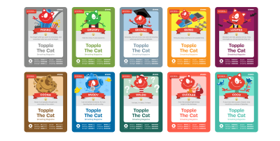
 A few weeks ago, we released a digital edition of Vitaly’s Smart Interface Design Checklists of which we’re quite fond of adding to our Smashing collection. The cards were created to help designers and developers iron out misunderstandings early on in their work, thus avoiding ambiguity and costly mistakes down the line. Jump to the table of contents →
Please note that the cards are currently only available in PDF format — we’re doing our best to print them as soon as it’s possible to ship worldwide!
Upcoming Online Workshops
So, when’s the next chance to join a workshop and meet all the amazing folks from the industry? Search no more: I’ve brought all the dates and names for you below:
| Sept. 22 – Oct. 6 | Smart Interface Design Patterns, 2020 Edition | Vitaly Friedman | Design & UX |
| Oct. 8 – Oct. 22 | The SVG Animation Masterclass | Cassie Evans | Front-end |
| Oct. 12 – Oct. 26 | Web Performance Masterclass | Harry Roberts | Front-end |
| Oct. 28 – Oct. 29 | Designing for Emotion Masterclass | Aarron Walter | Design & UX |
| Nov. 12 – Nov. 27 | Build, Ship and Extend GraphQL APIs from Scratch | Christian Nwamba | Front-end |
| Nov. 18 – Nov. 26 | Designing Websites That Convert | Paul Boag | Design & UX |
| Dec. 3 – Dec. 17 | Building A Design System With CSS | Andy Bell | Front-end |
Attending a Smashing online event means that you’ll be taking part in live sessions, Q&As, discussion zones, challenges, and so much more! Join in the fun — we provide live captioning in English, too!

Upcoming Online Conferences
As we’ve decided to take all of our 2020 events online, there are still two more you can join in for some SmashingConf fun. We hope to see you there!
SmashingConf Austin/NY Online (Oct 13–14)
We have combined the programming for New York and Austin as these two events were so close together and similar to each other. We’ll be running this event in Central time, just as if we were all in Austin. Check out the schedule, and buy tickets here. We’d love to see you in October!
SmashingConf SF Online (Nov 10–11)
In PST, join us for a SmashingConf San Francisco on November 10th–11th. The schedule and tickets are online for you to take a look at. We’ll be sure to have a great celebration for our final event of 2020!
Trending Topics On Smashing Magazine
At Smashing Magazine, we publish at least one new article every single day that is related to an important topic in the web industry. Of course, we have an RSS feed to which you can subscribe to anytime if you’d like to be among the first readers to be informed once there’s new content to dive in to!
- “Designing With Reduced Motion For Motion Sensitivities,”
written by Val Head - “How To Build Your Own Comment System Using Firebase,”
written by Aman Thakur - “Everything Developers Need To Know About Figma,”
written by Jurn van Wissen - “Forms And Validation In Ionic React,”
written by Jerry Navi - “Demystifying Django’s Magic,”
written by Precious Ndubueze
Newsletter Best Picks
As we’ve now started sending out weekly editions of the Smashing Newsletter, we’ve been aiming for shorter and topic-specific issues. So far, we’ve sent out editions that focus on CSS, front-End accessibility, and JavaScript. Of course, we like to add in a mix of other topics as well, just so that there’s something there for everyone! 😉
We love sharing all the cool things that we see folks doing across communities within the web industry, and we hope you’ll help spread the word! Here are just some of the projects that our subscribers found most interesting and vauable:
Free Vector Illustrations And Animations
A cow kidnapped by aliens, a dropped ice cream cone with a sad face, the Lochness monster emerging from the water. These are some of the fun error state animations that the folks at Pixel True Studios offer for free download in their set of vector illustrations and animations.

Apart from error state animations, the set includes illustrations, icons, and animations to depict everything a web project could call for: security, search, contact, e-commerce, SEO, and a lot more. The illustrations are available as SVGs, the animations are made with Lottie. Released under an MIT License, you can use them for free both in personal and commercial projects. A great way to add a fun and friendly touch to a design. (cm)
A Journey Through Japanese And Cyrillic Web Design
The web spans the entire globe, however, when we talk about web design, the examples and showcases usually revolve around the 26 characters of the Latin alphabet. Other writing systems are often not part of the discussion — with the effect that a lot of brilliant websites stay unnoticed for a lot of us. Time to change that.

If you’re up for a journey through Japanese web design, Responsive Web Design JP is for you. The examples in the collection shine with a unique lightness and concentration on the essential, and, even if you don’t master Japanese, you can browse the showcase by technique.
Another inspiring site that lets us take a look beyond the Latin writing system is Cyrillic Design, dedicated to sites that use Cyrillic typefaces. Lots of beautiful designs can be discovered in there and it’s particularly interesting to see how type is used to make bold statements. Two fantastic reminders to look for inspiration outside of our own comfort zones. (cm)
Cloud Diagrams Made Easy
Making complex relationships and contexts visible, a well-made diagram can often replace lengthy explanations. A fantastic little tool to help you next time you need to visualize a cloud architecture, comes from Mark Mankarious: Isoflow.

Isoflow works right in the browser and provides an easy-to-use interface that makes creating beautiful, isometric diagrams a matter of only a few minutes. Just drag and drop the elements you need onto the canvas, connect them, and add labels. Once you’re happy with the result, you can export the diagram for print or web — thanks to vector icons, it will look sharp at any size. A true timesaver. (cm)
Website Features That Annoy Screen Reader Users
A missing alt caption, an auto-playing video, unlabelled buttons, poor use of headings, inaccessible web forms — what might seem like a small issue for sighted users can make the difference between being able to use a website independently or not for blind and visually impaired people. Holly Tuke knows this from her own experience.

To raise awareness for common accessibility issues, Holly summarized five annoying website features she faces as a screen reader user every single day, and, of course, how to fix them. Little details that make a huge difference. (cm)
Accessibility For Teams
Accessibility goes far beyond the code, so when it comes to delivering accessible websites, each person in a team has their specific responsibilities. If you feel that your team hasn’t found the right strategy to tackle accessibility yet, Peter van Grieken’s guide “Accessibility for teams” has got your back.

The guide consists of six parts, with each one of them aimed at the different specialists in your team: product managers, content designers, UX designers, visual designers, and front-end developers, plus a guide on accessibility testing. The guide is still a work in progress, the parts for product managers and UX designers have already been released. A great resource that helps incorporate accessibility into your team’s workflow from the ground up. (cm)
Design Systems From All Over The Globe
An effective design system helps you reuse UI components to create coherent user experiences across all aspects of a product. If you need some inspiration for what your design system could look like, Josh Cusick started the project Design Systems For Figma, a collection of design systems from all over the globe.

Atlassian, Audi, Uber, the City of Chicago, Apple, Goldman Sachs, Slack — these are only some of the 45 companies featured in the collection. All of the design systems were created in Figma, so if you are a Figma user yourself, you can duplicate or download a file to inspect how the design system was made. A precious look into how other design teams work. (cm)
The Past, Present, And Future Of Interfaces
Why do we interface? Back in 2018, product designer Ehsan Noursalehi presented a talk on the topic at a meetup. This summer, after several months of strict quarantine gave him a new perspective on our relationship with technology, he decided to convert his observations and questions into an online micro book.

Why Do We Interface takes a historical look at interfaces to build an understanding of how they allow us to utilize information in such powerful ways that they can fundamentally change what it means to be human. A thought-provoking journey from the failed Apple Newton of 1993 to the voice-first interfaces of today and the challenges the future might bring, as well as a precious reminder about the true purpose of a designer’s job. (cm)
Generate Blobs With Ease
A blob is a blob is a blob? Not at all! Lokesh Rajendran built a cool, minimalist tool that lets you generate beautiful blob shapes for web and Flutter apps with ease.

Blobs, as the blob generator is called, creates random or fixed blobs for you, all you need to do is adjust the level of randomness and complexity. You can also customize the blobs’ color, of course, and, if you like, define a gradient for the filling or outline. To use the blob right away in a project or customize it further by animating or clipping it, the generator provides you with the SVG and Flutter code. Perfect for a nice little UI animation, as a background for an icon, a frame, or whatever else you can think of. Happy blobbing! (cm)
Accelerating JavaScript In The Browser
Once made fun of for its slowness, JavaScript became one of the most optimized and performant dynamic languages out there. But how can you get as much performance out of it as possible in an actual project? Jonathan Dinu shares a roadmap for determining how to speed up your JavaScript application.

At the core of the roadmap is a flowchart to help you assess what type of performance bottleneck you’re dealing with and how to solve it. Jonathan explores various options of leveraging browser native APIs and technologies to accelerate JavaScript execution and gives tips when a solution is beneficial and when it might even hurt performance. A deep dive into streaming data, web workers, GPU, and Web Assembly. (cm)
Design Your Own 2D Game
Arcades, shooters, adventures, puzzles — do you have a sweet spot for games? Then Ct.js is for you. The free and open-source game framework and editor lets you create 2D games of any genre while putting your JavaScript skills to the test.

Based on WebGL, the modular library is coupled with a visual editor that helps you bring your game to life. Ct.js is designed to be beginner-friendly, so there are tutorials, editable examples, and demos to tinker with; more advanced users can even add their own JavaScript library to it to expand the possibilities. The documentation features a concise introduction to the world of variables, properties, conditional statements, loops, and operations, making Ct.js a great resource for students who are just taking their first steps in coding. (cm)
A React-Powered Node Editor To Extract Business Logic
Does your app serve users with very different business logics? Do you frequently create “feature flags” to turn parts of your code on and off for different users? Is your business logic complicated and hard to maintain? If you answered one of these questions with “yes”, you might want to take a look at Flume.

The React-powered node editor and runtime engine helps you build apps that are resilient to changing requirements by modeling your business logic as a JSON graph. Flume’s sleek UI makes it easy to create and edit the graphs and its fast engine runs your logic anywhere — in a browser, on your server, in any JavaScript environment, and, if you’re not using a node server, in any environment that supports JSON. Flume is released under an MIT Open-Source license. (cm)
More Smashing Stuff
In the past few years, we were very lucky to have worked together with some talented, caring people from the web community to publish their wealth of experience as printed books that stand the test of time. Paul and Alla are some of these people. Have you checked out their books already?
Click!
A practical guide on how to encourage clicks without shady tricks.
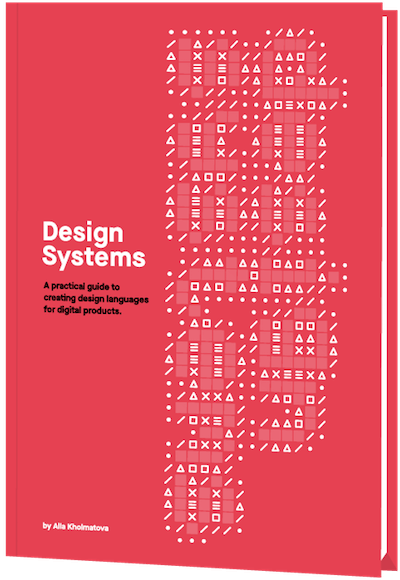
Design Systems
A practical guide to creating design languages for digital products.
Front-End & UX Workshops
Interactive, live online sessions, broken into 2.5h segments and a friendly Q&A.
Further Reading
- The Modern Guide For Making CSS Shapes
- How To Design Effective Conversational AI Experiences: A Comprehensive Guide
- What Are CSS Container Style Queries Good For?
- Sticky Headers And Full-Height Elements: A Tricky Combination


