Best Practices For E-Commerce UI Design

Email Newsletter
Weekly tips on front-end & UX.
Trusted by 182,000+ folks.
This article has been kindly supported by our dear friends at Shopify Partners, who can help you provide your web design clients with customized eCommerce experiences. Thank you!
When you envision shoppers moving through the e-commerce sites you build, you more or less expect them to follow this journey:
- Step 1: Enter on the homepage or a category page.
- Step 2: Use the navigational elements to orient themselves to the store and zero in on the specific things they’re looking for.
- Step 3: Review the descriptions and other pertinent purchase details for the products that pique their interest.
- Step 4: Customize the product specifications (if possible), and then add the items they want to their cart.
- Step 5: Check out.
There are deviations they might take along the way (like exploring related products, perusing different categories, and saving items to a wishlist for a rainy day). But, for the most part, this is the top pathway you build out and it’s the one that will be most heavily traveled.
That being the case, it’s especially important for designers to zero in on the interface elements that shoppers encounter along this journey. If there’s any friction within the UI, you won’t just see an increase in unexpected deviations from the path, but more bounces from the site, too.
So, that’s what the following post is going to focus on: How to ensure that the UI along the buyer’s journey is attractive, intuitive, engaging, and friction-free.
Let’s examine three parts of the UI that shoppers will encounter from the point of entry to checkout. I’ll be using e-commerce websites built with Shopify to do this:
1. Create A Multifaceted Navigation That Follows Shoppers Around
There once was a time when e-commerce websites had mega menus that shoppers had to sort through to find their desired product categories, sub-categories and sub-sub-categories. While you might still run into them nowadays, the better choice is a navigation that adapts to the shopper’s journey.
The Main Menu
The first thing to do is to simplify the primary menu so that it has only one level beneath the main category headers. For example, this is how United By Blue does it:
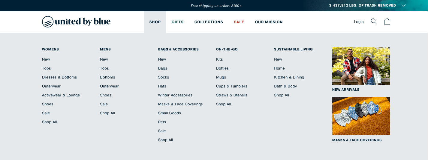
The product categories under “Shop” are all neatly organized beneath headers like “Womens” and “Mens”.
The only exceptions are the categories for “New Arrivals” and “Masks & Face Coverings” that are accompanied by images. It’s the same reason why “Gifts” is in a lighter blue font and “Sale” is in a red font in the main menu. These are super timely and relevant categories for United By Blue’s shoppers, so they deserve to be highlighted (without being too distracting).
Returning to the site, let’s look at how the designer was able to keep the mobile site organized:
Rather than shrink down the desktop menu to one that shoppers would need to pinch-and-zoom in on here, we see a menu that’s adapted to the mobile screen.
It requires a few more clicks than the desktop site, but shoppers shouldn’t have a problem with that since the menu doesn’t go too deep (again, this is why we can’t use mega menus anymore).
On The Product Results Page
If you’re building an e-commerce site for a client with a complex inventory (i.e. lots of products and layers of categories), the product results page is going to need its own navigation system.
To help shoppers narrow down how many products they see at a time, you can include these two elements in the design of this page:
- Filters to narrow down the results by product specification.
- Sorting to order the products based on shoppers’ priorities.
I’ve highlighted them on this product results page on the Horne website:
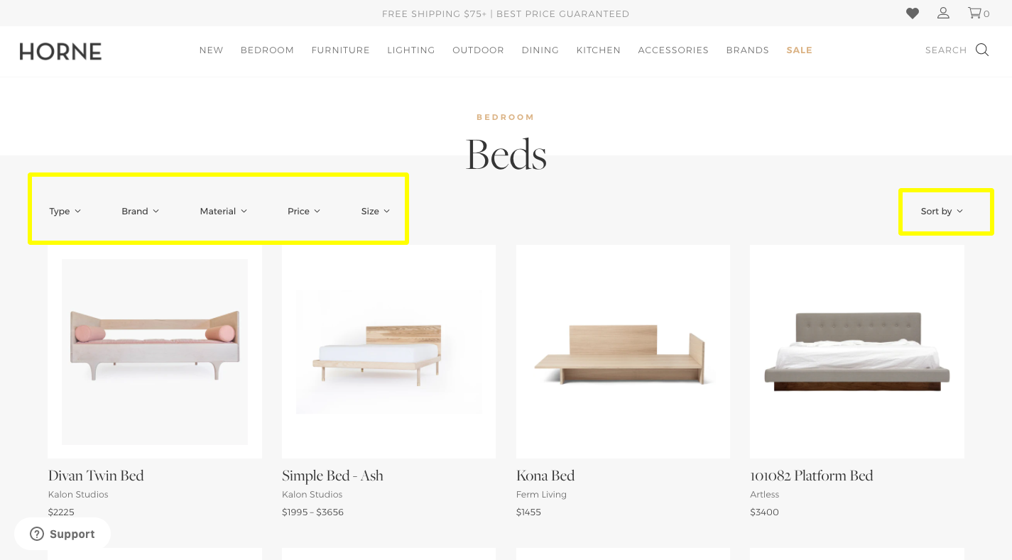
While you could store your filters in a left sidebar, the horizontally-aligned design above the results is a better choice.
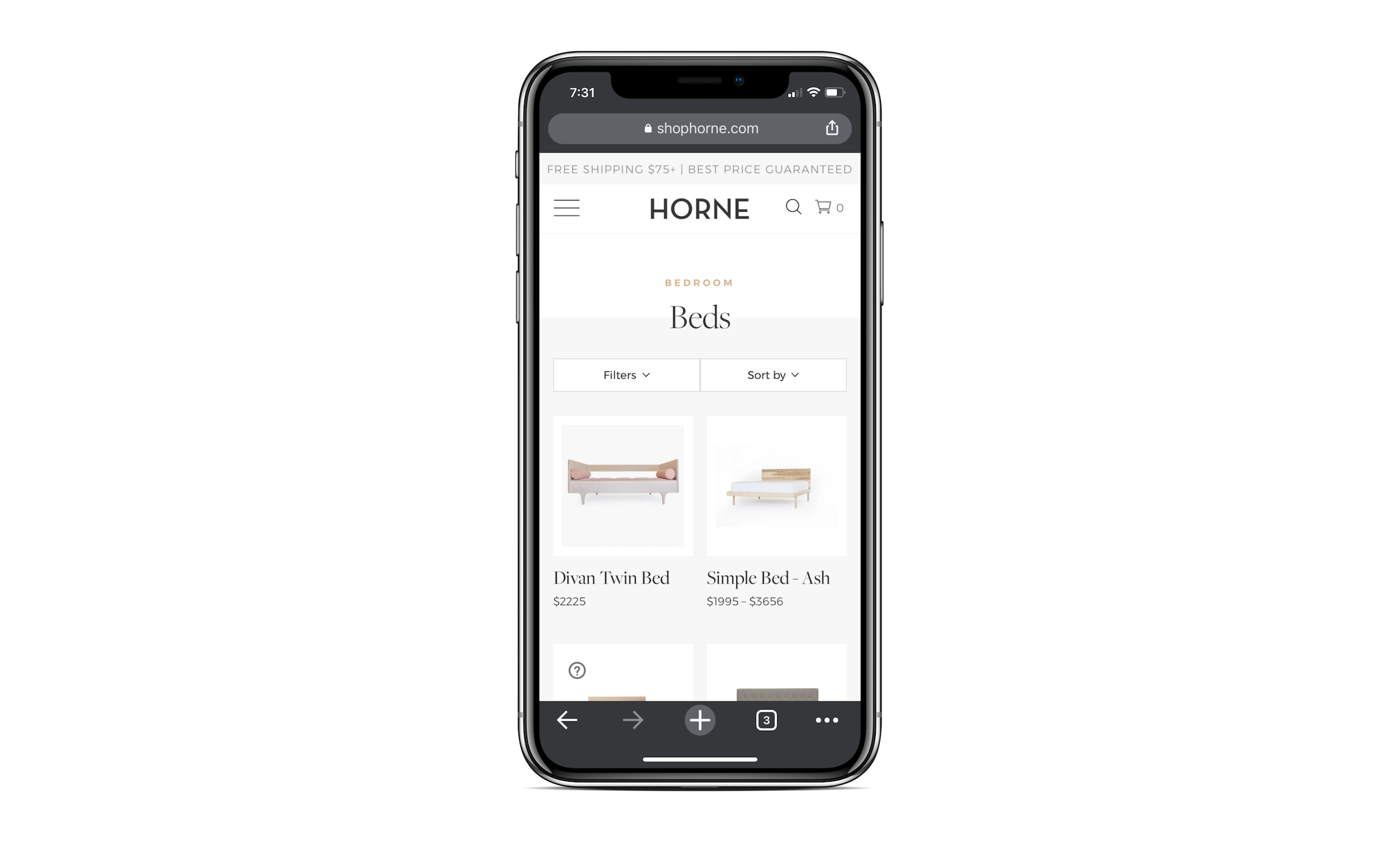
This space-saving design allows you to show more products at once and is also a more mobile-friendly choice:
Keep in mind that consistency in UI design is important to shoppers, especially as more of them take an omnichannel approach to shopping. By presenting the filters/sorting options consistently from device to device, you’ll create a more predictable and comfortable experience for them in the process.
Breadcrumbs & Search
As shoppers move deeper into an e-commerce site, they still might need navigational assistance. There are two UI navigation elements that will help them out.
The first is a breadcrumb trail in the top-left corner of the product pages, similar to how tentree does:
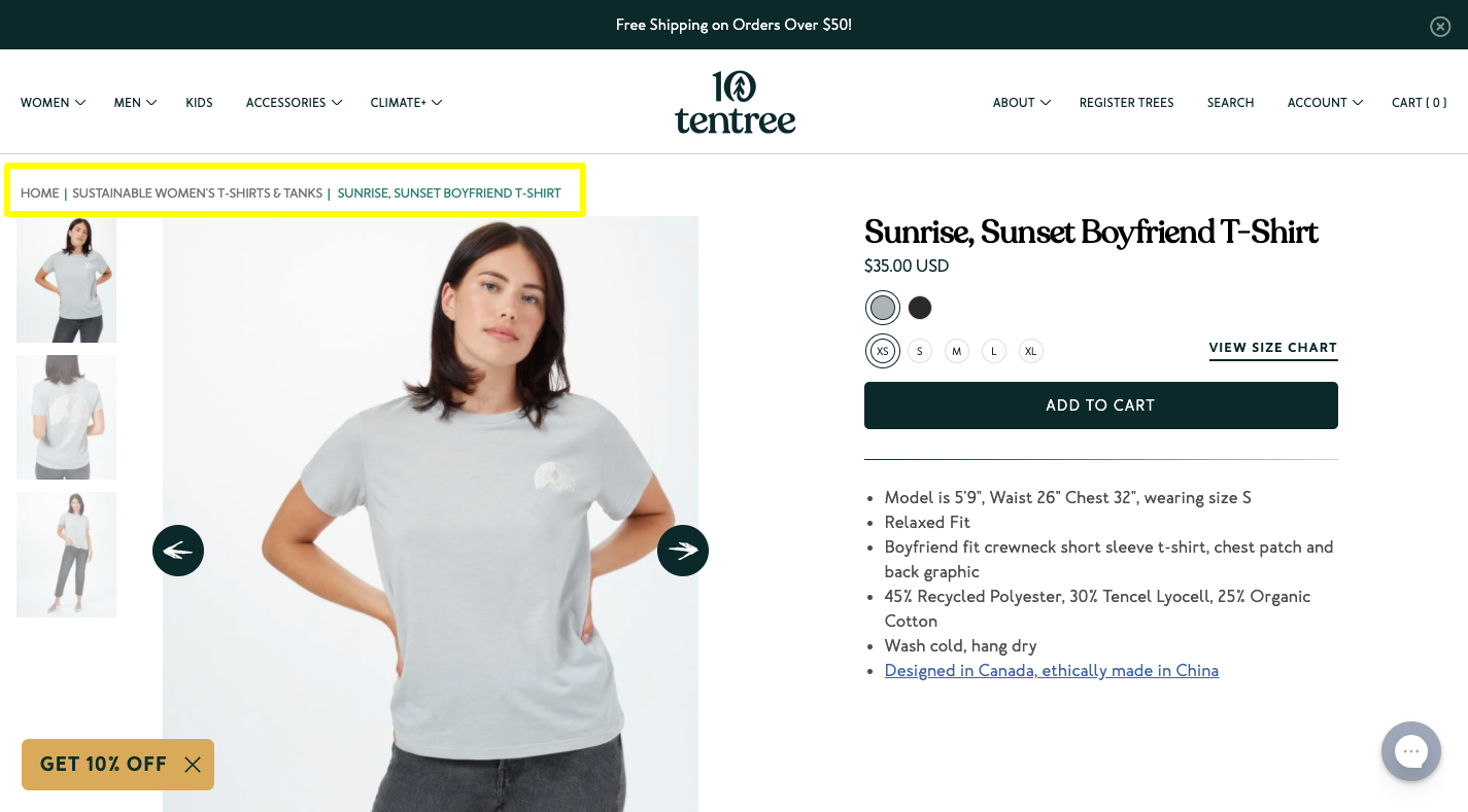
This is best used on websites with categories that have sub-categories upon sub-categories. The further and further shoppers move away from the product results page and the convenience of the filters and sorting, the more important breadcrumbs will be.
The search bar, on the other hand, is a navigation element that should always be available, regardless of which point in the journey shoppers are at. This goes for stores of all sizes, too.
Now, a search bar will certainly help shoppers who are short on time, can’t find what they need or simply want a shortcut to a product they already know exists. However, an AI-powered search bar that can actively predict what the shopper is looking for is a smarter choice.
Here’s how that works on the Horne site:
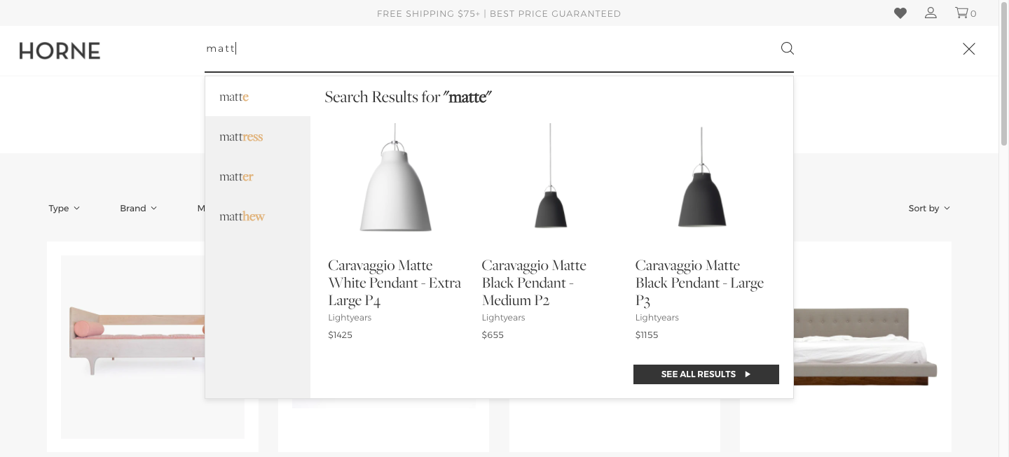
Even if the shopper hasn’t finished inputting their search phrase, this search bar starts serving up suggestions. On the left are matching keywords and on the right are top matching products. The ultimate goal is to speed up shoppers’ search and cut down on any stress, pressure or frustration they might otherwise be feeling.
2. Show The Most Pertinent Details At Once On Product Pages
Vitaly Friedman recently shared this tip on LinkedIn:
He’s right. The more time visitors have to spend digging around for pertinent details about a product, the greater the chance they’ll just give up and try another store.
Shipping alone is a huge sticking point for many shoppers and, unfortunately, too many e-commerce sites wait until checkout to let them know about shipping costs and delays.
Because of this, 63% of digital shoppers end up abandoning their online carts because of shipping costs and 36% do so because of how long it takes to receive their orders.
Those aren’t the only details digital shoppers want to know about ahead of time. They also want to know about:
- The returns and refund policy,
- The terms of use and privacy policy,
- The payment options available,
- Omnichannel purchase-and-pickup options available,
- And so on.
But how are you expected to fit this all in within the first screenful?
Present The 30-Second Pitch Above The Fold
This is what Vitaly was talking about. You don’t have to squeeze every single detail about a product above the fold. But the store should be able to sell the product with only what’s in that space.
Bluebella, for example, has a space-saving design that doesn’t compromise on readability:
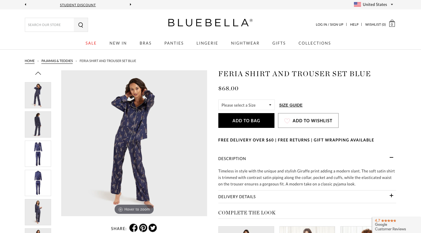
With the image gallery relegated to the left side of the page, the rest can be dedicated to the product summary. Because of the varying size of the header fonts as well as the hierarchical structure of the page, it’s easy to follow.
Based on how this is designed, you can tell that the most important details are:
- Product name;
- Product price;
- Product size selector;
- Add-to-bag and wishlist buttons;
- Delivery and returns information (which neatly appears on one line).
The rest of the product details are able to fit above the fold thanks to the accordions used to collapse and expand them.
If there are other important details shoppers might need to make up their minds — like product reviews or a sizing guide — build links into the above-the-fold that move them to the relevant sections lower on the page.
Quick Note: This layout won’t be possible on mobile for obvious reasons. So, the product images will get top billing while the 30-second pitch appears just below the fold.
Make Extra UI Elements Small
Even if you’re able to concisely deliver the product’s description, extra sales and marketing elements like pop-ups, chat widgets and more can become just as annoying as lengthy product pages.
So, make sure you have them stored out of the way as Partake does:
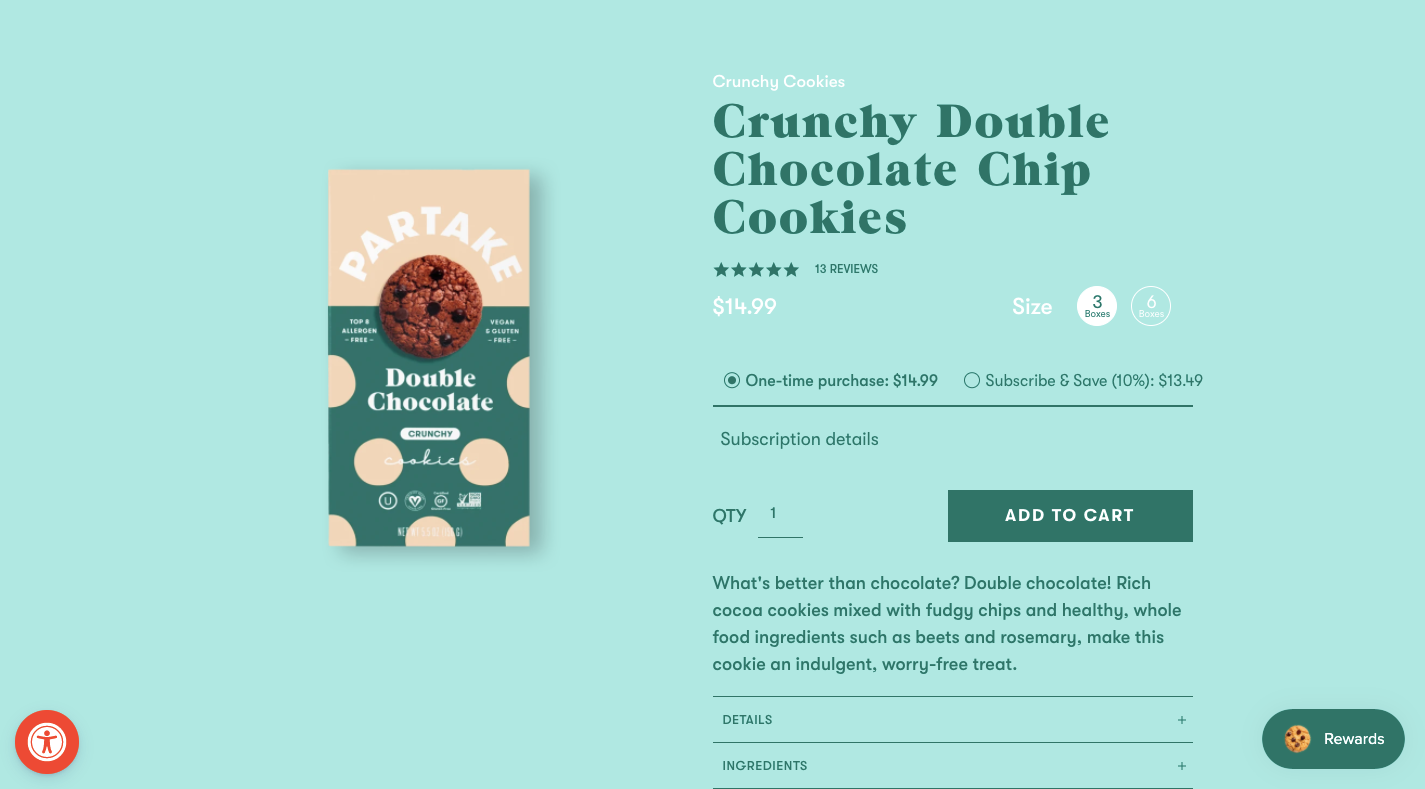
The red symbol you see in the bottom left enables shoppers to control the accessibility features of the site. The “Rewards” button in the bottom-right is actually a pop-up that’s styled like a chat widget. When opened, it invites shoppers to join the loyalty program.
Both of these widgets open only when clicked.
Allbirds is another one that includes additional elements, but keeps them out of the way:
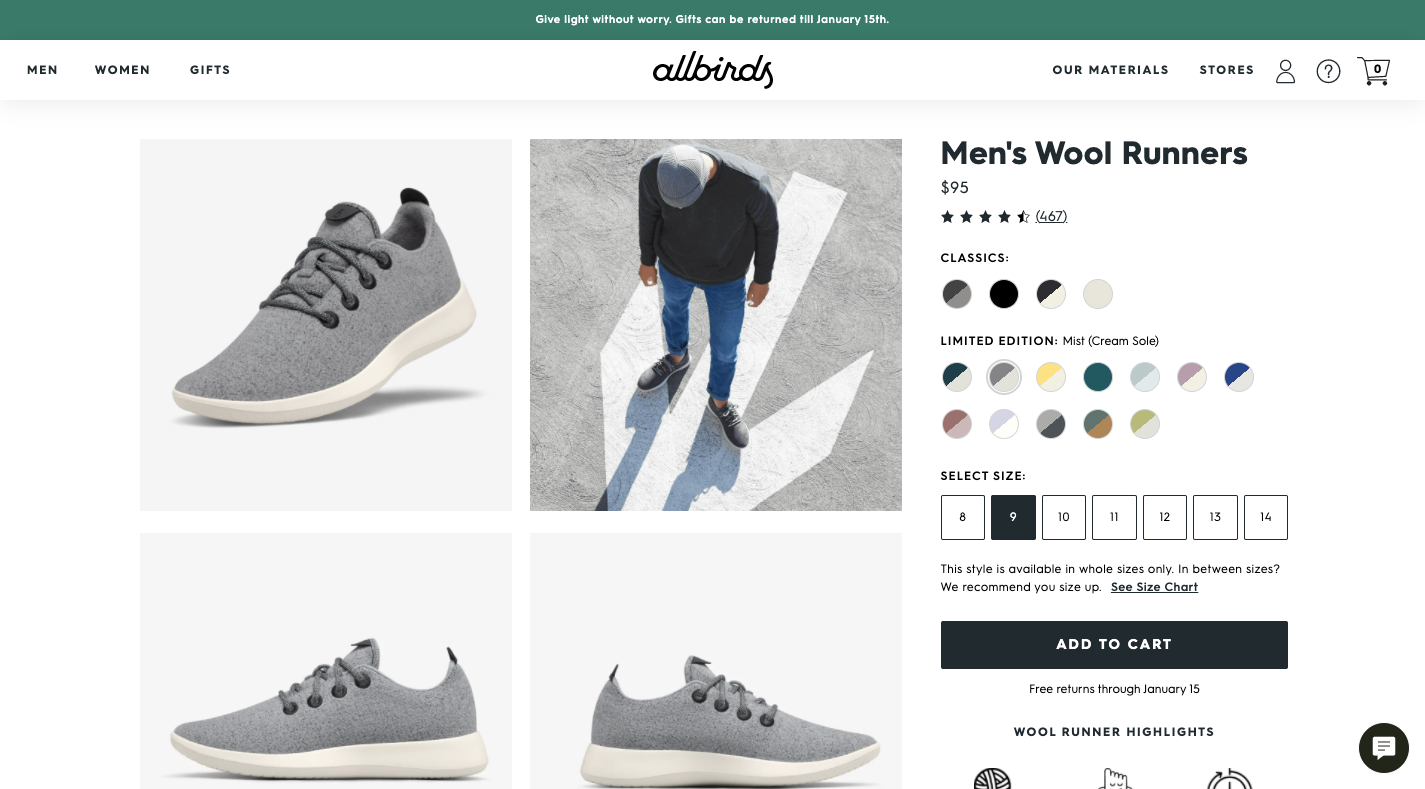
In this case, it includes a self-service chat widget in the bottom-right that has to be clicked in order to open. It also places information about its current returns policy in a sticky bar at the top, freeing up the product pages to strictly focus on product details.
3. Make Product Variants As Easy To Select As Possible
For some products, there is no decision that shoppers have to make other than: “Do I want to add this item to my cart or not?”
For other products, shoppers have to define product variants before they can add an item to their cart. When that’s the case, you want to make this process as pain-free as possible. There are a few things you can do to ensure this happens.
Let’s say the store you design sells women’s undergarments. In that case, you’d have to offer variations like color and size.
But you wouldn’t want to just create a drop-down selector for each. Imagine how tedious that would get if you asked shoppers to click on “Color” and they had to sort through a dozen or so options. Also, if it’s a standard drop-down selector, color swatches might not appear in the list. Instead, the shopper would have to choose a color name and wait for the product photo to update in order to see what it looks like.
This is why your variants should dictate how you design each.
Let’s use this product page from Thinx as an example:
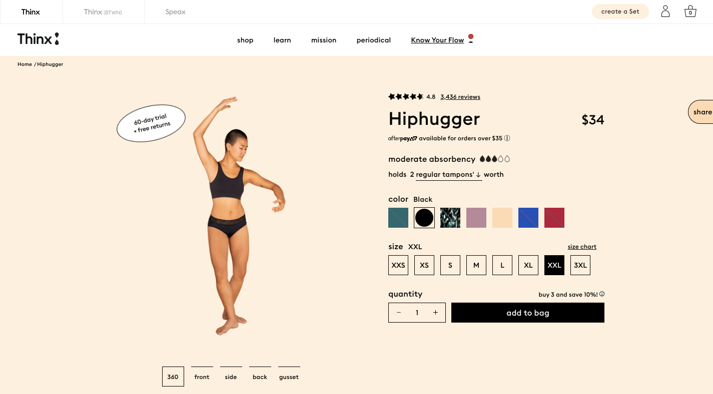
There are two variants available on this page:
- The color variant shows a row of color swatches. When clicked, the name of the color appears and the product photo adjusts accordingly.
- The size variant lists sizes from extra-extra-small to extra-extra-extra-large.
Notice how Size comes with a link to “size chart”. That’s because, unlike something like color which is pretty clear-cut, sizing can change from store to store as well as region to region. This chart provides clear guidance on how to choose a size.
Now, Thinx uses a square button for each of its variants. You can switch it up, though, if you’d like to create a distinction between the choices shoppers have to make (and it’s probably the better design choice, to be honest).
Kirrin Finch, for instance, places its sizes inside empty boxes and its color swatches inside filled circles:
It’s a small difference, but it should be enough to help shoppers transition smoothly from decision to decision and not miss any of the required fields.
Now, let’s say that the shop you’re building doesn’t sell clothing. Instead, it sells something like beds, which obviously won’t include choices like color or size. At least, not in the same way as with clothes.
Unless you have well-known abbreviations, symbols or numbers you can use to represent each variant, you should use another type of selector.
For instance, this is a product page on the Leesa website. I’ve opened the “Pick your size” selector so you can see how these options are displayed:
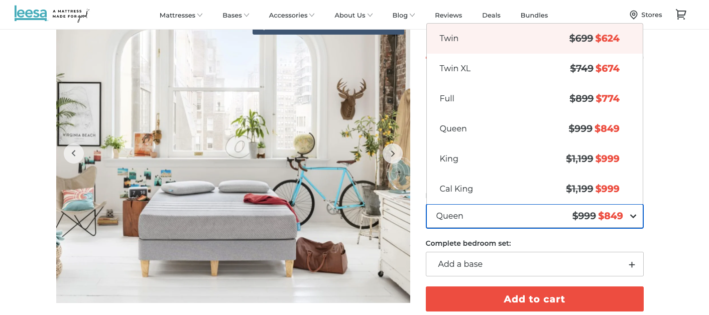
Why is this a drop-down list as opposed to boxes?
For starters, the size names aren’t the same length. So, box selectors would either be inconsistently sized or some of them would have a ton of white space in them. It really wouldn’t look good.
Also, Leesa wisely uses this small space to provide more information about each mattress size (i.e. the normal vs. sale price). So, not only is this the best design for this particular variant selector, but it’s also a great way to be efficient with how you present a lot of information on the product page.
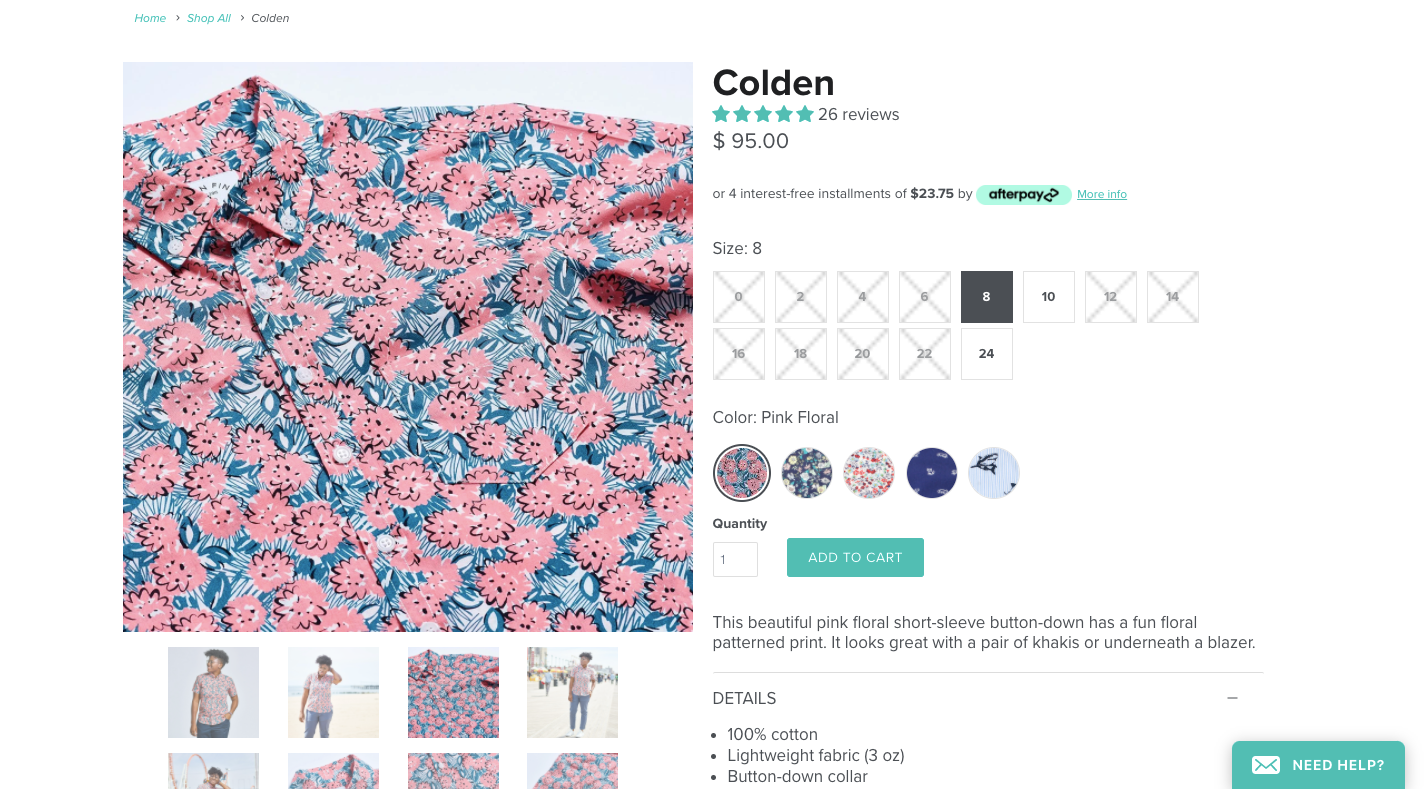
A Note About Out-Of-Stock Variants
If you want to remove all friction from this part of the online shopping process, make sure you come up with a distinct design for out-of-stock variants.
Here’s a closer look at the Kirrin Finch example again:
There’s no mistaking which options are available and which are not).
Although some shoppers might be frustrated when they realize the shirt color they like is only available in a few sizes, imagine how annoyed they’d be if they didn’t learn this until after they selected all their variants?
If the product selection is the last step they take before clicking “add to cart”, don’t hide this information from them. All you’ll do is get their hopes up for a product they took the time to read about, look at, and fall in love with… only to find it’s not available in a size “16” until it’s too late.
Wrapping Up
What is it they say? Good design is invisible?
That’s what we need to remember when designing these key user interfaces for e-commerce websites. Of course, your client’s store needs to be attractive and memorable… But the UI elements that move shoppers through the site should not give them pause. So, simplicity and ease of use need to be your top priority when designing the main journey for your client’s shoppers.
If you’re interested in putting these UI design philosophies to work for new customers, consider joining the Shopify Partner Program as a store developer. There you’ll be able to earn recurring revenue by building new Shopify stores for clients or migrating stores from other commerce platforms to Shopify.
Further Reading
- Creating Accessible UI Animations
- A Complete Guide To Live Validation UX
- When Friction Is A Good Thing: Designing Sustainable E-Commerce Experiences
- Frequently Heard In My Beginning Front-End Web Development Class
 (ra, il, mrn)