From Design To Developer-Friendly React Code In Minutes With Anima

Email Newsletter
Weekly tips on front-end & UX.
Trusted by 182,000+ folks.
This is a friendly sponsored article written with the kind support of our dear friends at Anima who help you design fully interactive high-fidelity prototypes with Sketch, Figma or Adobe XD. Thank you!
The promise of seamless design to code translation goes back to the early WYSIWYG page builders. Despite the admirable goal, their biggest flaw (among many) was the horrible code that they generated. Skepticism remains to this day and whenever this idea reappears, the biggest concerns are always related to the quality and maintainability of the code.
This is about to change as new products have made great leaps in the right direction. Their ultimate goal is to automate the design to code process, but not at the cost of code quality. One of these products, Anima, is trying to finally bridge the gap by providing a fully-fledged design to development platform.
What’s Anima?
Anima is a design-to-development tool. It aims to turn the design handoff process into a continuous collaboration. Designers can use Anima to create fully responsive prototypes that look and work exactly like the finished product (no coding required). Developers, in turn, can take these designs and export them into developer-friendly React/HTML code. Instead of coding UI from scratch, they are free to focus on logic and architecture.
It does that with the help of a plugin that connects directly to your design tool and allows you to configure designs and sync them to Anima’s web platform. That’s where the rest of the team can access the prototype, discuss it, and pick useful specs or assets. Aside from the collaboration functionality, it gives developers a headstart thanks to the generated code.
This could make a big difference in the traditional back and forth dance that goes between designers and developers. It keeps everything in one place, in sync, and allows both sides to make changes using either code or design tools.
Installing The Plugin And Setting Up A Project
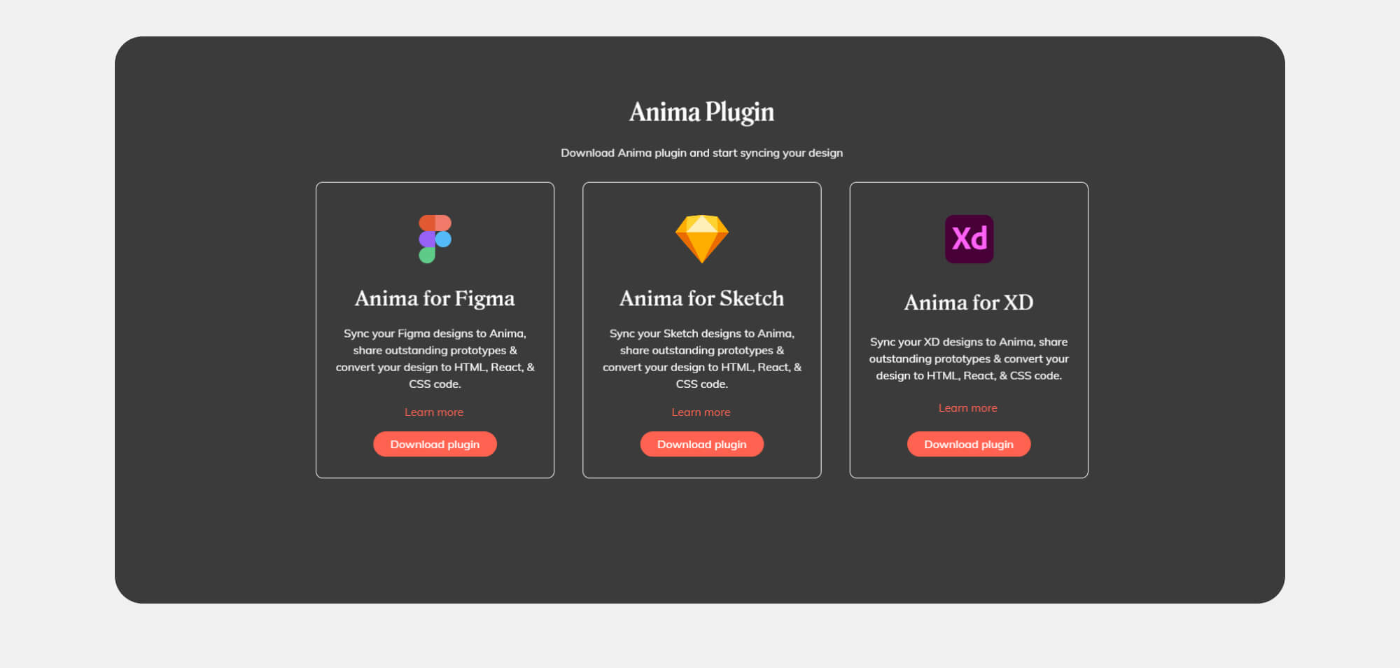
Getting started with Anima is simple. You first need to create an account and then install the plugin. While I’ll be using Figma for this walkthrough, Anima supports all of the major design tools: Sketch, Figma, and Adobe XD.
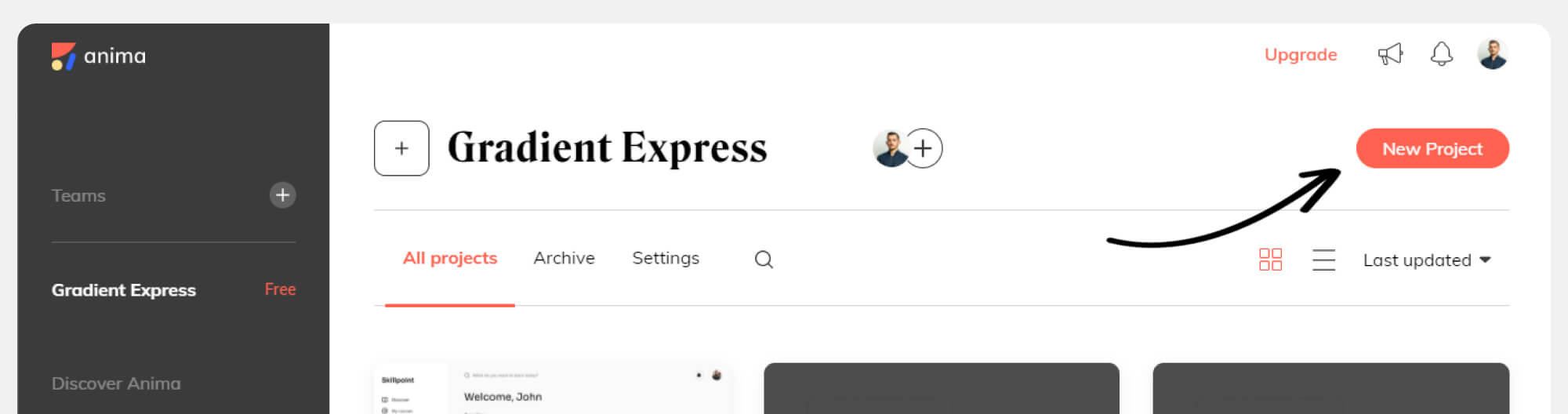
Once this is done, make sure you create a project on Anima’s platform — that’s where our designs will appear when we sync them.
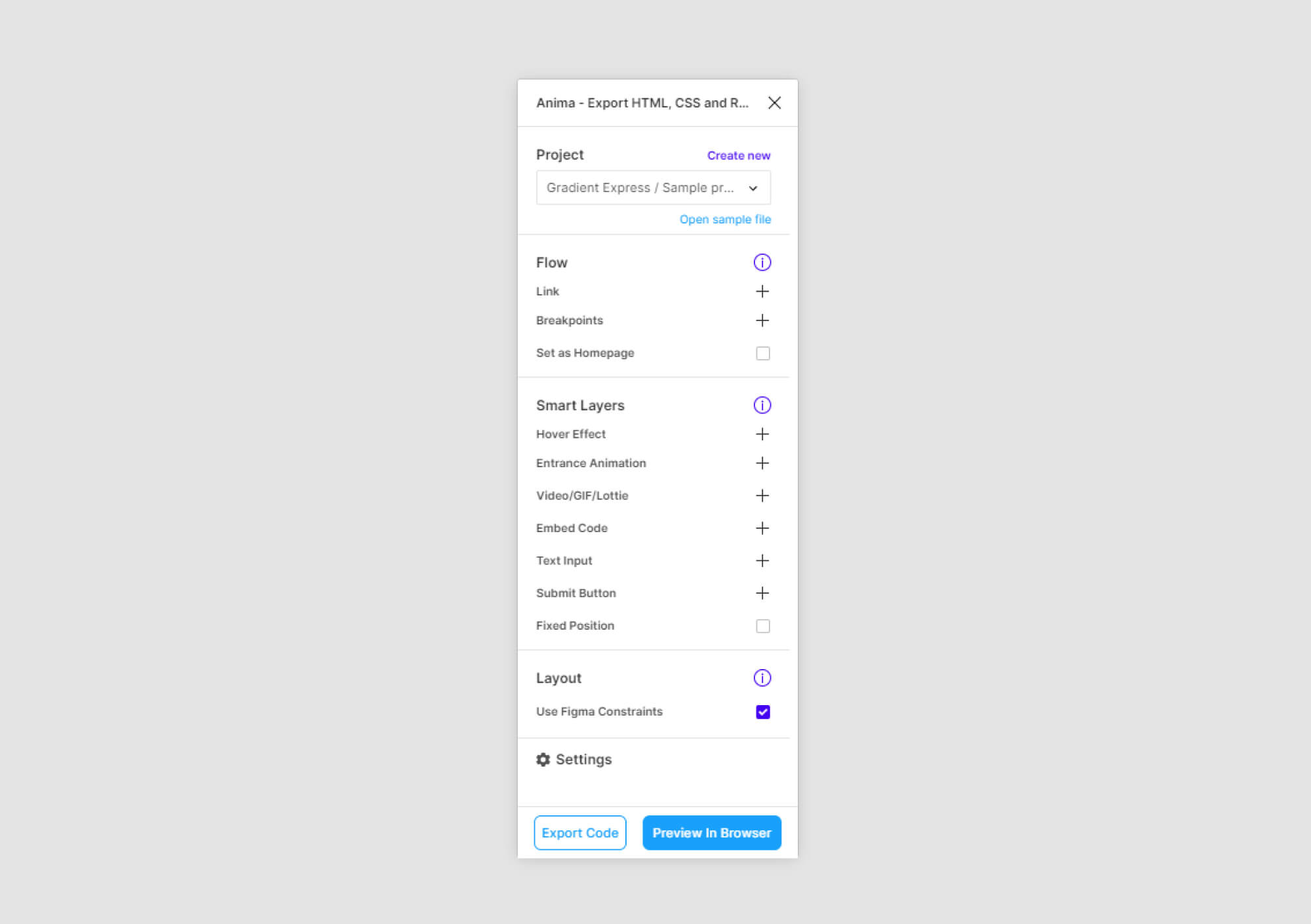
The plugin itself is separated into three main sections, each with a list of options. Most of what we’ll be doing is simply selecting one of those options and then applying a specific layer or frame in Figma.
Creating A Responsive Prototype
For the purpose of the article, we have designed an onboarding experience that will be transformed into an interactive prototype. So far we have prepared screens for the three most common breakpoints and we have linked them together using Figma’s prototyping features.
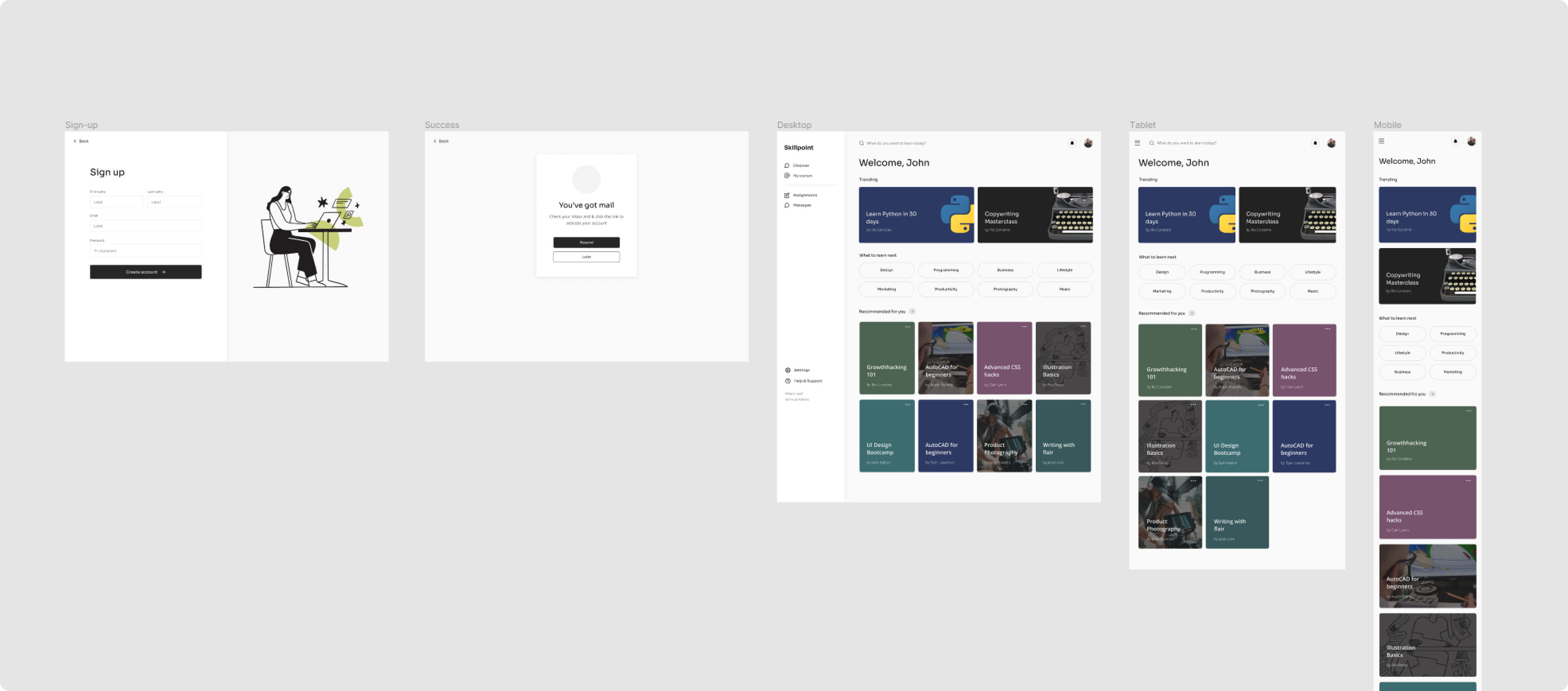
One of the interesting things we can achieve with Anima is making prototypes that fit all screen sizes. Traditional prototypes made of clickable images are static and often fail under different screen sizes.
To do that, click on “Breakpoints” option and Anima will ask you for the frames that you want to connect. Select all of the frames to add them as breakpoints. Then confirm your selection by clicking on “Done”.
Once you are ready, click on “Preview in browser” to see the result. That’s when Anima will convert your designs into code.
The first thing you’ll notice is that the prototype is now transformed into HTML and CSS. All the content is selectable and reflows as the screen is resized. This is most visible when you select the “Responsive” mode in the prototype previewer and play with different screen sizes.
To achieve smoother transitions, it’s important to use Figma’s constraint features when designing your components. Make sure to also check the box “Use Figma Constraints” in the “Layout” section of the plugin.
Bring Your Designs To Life With Smart Layers
We can take things a little bit further. Since Anima converts designs into code, the possibilities are endless for the things we can add to make our prototype more realistic.
Animations and hover effects would be a great way to make the prototype more alive and to impress stakeholders. Anima offers a variety of options that can be applied to any layer or component. In our case, we’ll select the headline layer, then choose the “Entrance animation” and “Fade In”. In the delay field, we’ll add 0.5.
For each field, we’ll add a glow effect on hover. Select the field layer, then “Hover effect” and choose “Glow”. Repeat the same for the button.
Now that we have applied all the changes, we can see that the prototype starts to feel like a real product.
One of the unique features that Anima offers is the ability to add live fields and forms to prototypes. Since we are designing an onboarding experience, this will actually be really useful for us. Data entry is one of the biggest churn points in any product experience and it’s really hard to test out ideas without taking it into account.
Similar to how we added the previous effects, we now select the field component and choose “Text field”. From there, we’ll have to choose the type of field that we need. If we choose a password field, for example, input will be hidden and Anima will add a show/hide functionality to the field.
As you can see, fields now work as intended. It’s also possible to gather all the data collected from those fields in a spreadsheet. Select the “Continue” button and then click on the “Submit Button” option in Anima. This will open an additional dialog, where we need to check the box “Add to Spreadsheet” and select redirect destinations in case of success or failure.
Next, we’ll add a Lottie animation for our success screen as it will be a great way to make the experience a bit more engaging. For that, we need to add a placeholder layer in the place of the animation, then select it and choose the “Video / GIF / Lottie” option in the plugin.
Then we’ll paste the URL of our Lottie animation and check the boxes of “Autoplay” and “No controls”. In our case, we don’t want to have any video player controls, since this is a success animation.
Apply the changes and open the preview mode to see the results. As you can see, when we fill out the fields and submit the form, we get redirected to our success page, with a looping animation.
Share Designs With The Rest Of The Team
Up until that point, we were working on a draft that was visible only to us. Now it’s time to share it with the rest of the team. The way to do this in the app is by clicking on “Preview in browser”, check how it looks, and if you’re satisfied, continue with “Sync”.
Everyone invited to the project will now have access to the designs and will be able to preview, leave comments, and inspect code.
Developers Can Get Reusable React Code
As mentioned earlier, as developers, we are usually skeptical of tools that generate code, mostly because writing something from scratch is always faster than refactoring something that was poorly written. To avoid this, Anima has adopted some best practices to keep the code clean, reusable, and concise.
When we switch to the “Code” mode, we can hover and inspect elements of our design. Whenever we select an element, we’ll see the generated code underneath. The default view is React, but we can also switch to HTML and CSS. We can also adjust preferences in the syntax and naming conventions.
The classes reuse the names of the layers within your design tool, but both designers and developers can rename the layers, too. Still, it’s important to agree on unified naming conventions that would be clear and straightforward to both designers and developers.
Even if we have left some layers unnamed, developers can actually override them and make changes when necessary. This experience reminds me of Chrome’s Inspect element feature, and all the changes are saved and synced with the project.
If you are using Vue or Angular, it’s expected that Anima will start supporting these frameworks in the near future as well.
Looking Forward
As we can see, the gap between design and code keeps bridging. For those who write code, using such a tool is very practical as it can reduce a lot of repetitive work in frontend. For those who design, it allows prototyping, collaboration and syncing that would be difficult to achieve with sending static images back-and-forth.
What’s already certain is that Anima eliminates a lot of wasteful activities in the hand-off process and allows both designers and developers to focus on what matters: building better products. I look forward to seeing what comes up next in Anima!
Further Reading
- The Timeless Power Of Spreadsheets
- From Design To Developer-Friendly React Code In Minutes With Anima
- The Forensics Of React Server Components (RSCs)
- The End Of My Gatsby Journey
 (vf, il, mrn)