Front-End Performance Checklist 2021 (PDF, Apple Pages, MS Word)

Email Newsletter
Weekly tips on front-end & UX.
Trusted by 182,000+ folks.
This guide has been kindly supported by our friends at LogRocket, a service that combines frontend performance monitoring, session replay, and product analytics to help you build better customer experiences. LogRocket tracks key metrics, incl. DOM complete, time to first byte, first input delay, client CPU and memory usage. Get a free trial of LogRocket today.
Web performance is a tricky beast, isn’t it? How do we actually know where we stand in terms of performance, and what exactly our performance bottlenecks are? Is it expensive JavaScript, slow web font delivery, heavy images, or sluggish rendering? Have we optimized enough with tree-shaking, scope hoisting, code-splitting, and all the fancy loading patterns with intersection observer, progressive hydration, clients hints, HTTP/3, service workers and — oh my — edge workers? And, most importantly, where do we even start improving performance and how do we establish a performance culture long-term?
Back in the day, performance was often a mere afterthought. Often deferred till the very end of the project, it would boil down to minification, concatenation, asset optimization and potentially a few fine adjustments on the server’s config file. Looking back now, things seem to have changed quite significantly.
Performance isn’t just a technical concern: it affects everything from accessibility to usability to search engine optimization, and when baking it into the workflow, design decisions have to be informed by their performance implications. Performance has to be measured, monitored and refined continually, and the growing complexity of the web poses new challenges that make it hard to keep track of metrics, because data will vary significantly depending on the device, browser, protocol, network type and latency (CDNs, ISPs, caches, proxies, firewalls, load balancers and servers all play a role in performance).
So, if we created an overview of all the things we have to keep in mind when improving performance — from the very start of the project until the final release of the website — what would that look like? Below you’ll find a (hopefully unbiased and objective) front-end performance checklist for 2021 — an updated overview of the issues you might need to consider to ensure that your response times are fast, user interaction is smooth and your sites don’t drain user’s bandwidth.
Table Of Contents
- All on separate pages
- Getting Ready: Planning And Metrics
Performance culture, Core Web Vitals, performance profiles, CrUX, Lighthouse, FID, TTI, CLS, devices. - Setting Realistic Goals
Performance budgets, performance goals, RAIL framework, 170KB/30KB budgets. - Defining The Environment
Choosing a framework, baseline performance cost, Webpack, dependencies, CDN, front-end architecture, CSR, SSR, CSR + SSR, static rendering, prerendering, PRPL pattern. - Assets Optimizations
Brotli, AVIF, WebP, responsive images, AV1, adaptive media loading, video compression, web fonts, Google fonts. - Build Optimizations
JavaScript modules, module/nomodule pattern, tree-shaking, code-splitting, scope-hoisting, Webpack, differential serving, web worker, WebAssembly, JavaScript bundles, React, SPA, partial hydration, import on interaction, 3rd-parties, cache. - Delivery Optimizations
Lazy loading, intersection observer, defer rendering and decoding, critical CSS, streaming, resource hints, layout shifts, service worker. - Networking, HTTP/2, HTTP/3
OCSP stapling, EV/DV certificates, packaging, IPv6, QUIC, HTTP/3. - Testing And Monitoring
Auditing workflow, proxy browsers, 404 page, GDPR cookie consent prompts, performance diagnostics CSS, accessibility. - Quick Wins
- Download The Checklist (PDF, Apple Pages, MS Word)
- Off We Go!
(You can also just download the checklist PDF (166 KB) or download editable Apple Pages file (275 KB) or the .docx file (151 KB). Happy optimizing, everyone!)
Getting Ready: Planning And Metrics
Micro-optimizations are great for keeping performance on track, but it’s critical to have clearly defined targets in mind — measurable goals that would influence any decisions made throughout the process. There are a couple of different models, and the ones discussed below are quite opinionated — just make sure to set your own priorities early on.
- Establish a performance culture.
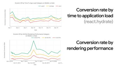
In many organizations, front-end developers know exactly what common underlying problems are and what strategies should be used to fix them. However, as long as there is no established endorsement of the performance culture, each decision will turn into a battlefield of departments, breaking up the organization into silos. You need a business stakeholder buy-in, and to get it, you need to establish a case study, or a proof of concept on how speed — especially Core Web Vitals which we'll cover in detail later — benefits metrics and Key Performance Indicators (KPIs) they care about.For example, to make performance more tangible, you could expose the revenue performance impact by showing the correlation between the conversion rate and time to application load, as well as rendering performance. Or the search bot crawling rate (PDF, pages 27–50).
Without a strong alignment between dev/design and business/marketing teams, performance isn’t going to sustain long-term. Study common complaints coming into customer service and sales team, study analytics for high bounce rates and conversion drops. Explore how improving performance can help relieve some of these common problems. Adjust the argument depending on the group of stakeholders you are speaking to.
Run performance experiments and measure outcomes — both on mobile and on desktop (for example, with Google Analytics). It will help you build up a company-tailored case study with real data. Furthermore, using data from case studies and experiments published on WPO Stats will help increase sensitivity for business about why performance matters, and what impact it has on user experience and business metrics. Stating that performance matters alone isn’t enough though — you also need to establish some measurable and trackable goals and observe them over time.
How to get there? In her talk on Building Performance for the Long Term, Allison McKnight shares a comprehensive case-study of how she helped establish a performance culture at Etsy (slides). More recently, Tammy Everts has spoken about habits of highly effective performance teams in both small and large organizations.
While having these conversations in organizations, it’s important to keep in mind that just like UX is a spectrum of experiences, web performance is a distribution. As Karolina Szczur noted, "expecting a single number to be able to provide a rating to aspire to is a flawed assumption." Hence performance goals need to be granular, trackable and tangible.
- Goal: Be at least 20% faster than your fastest competitor.
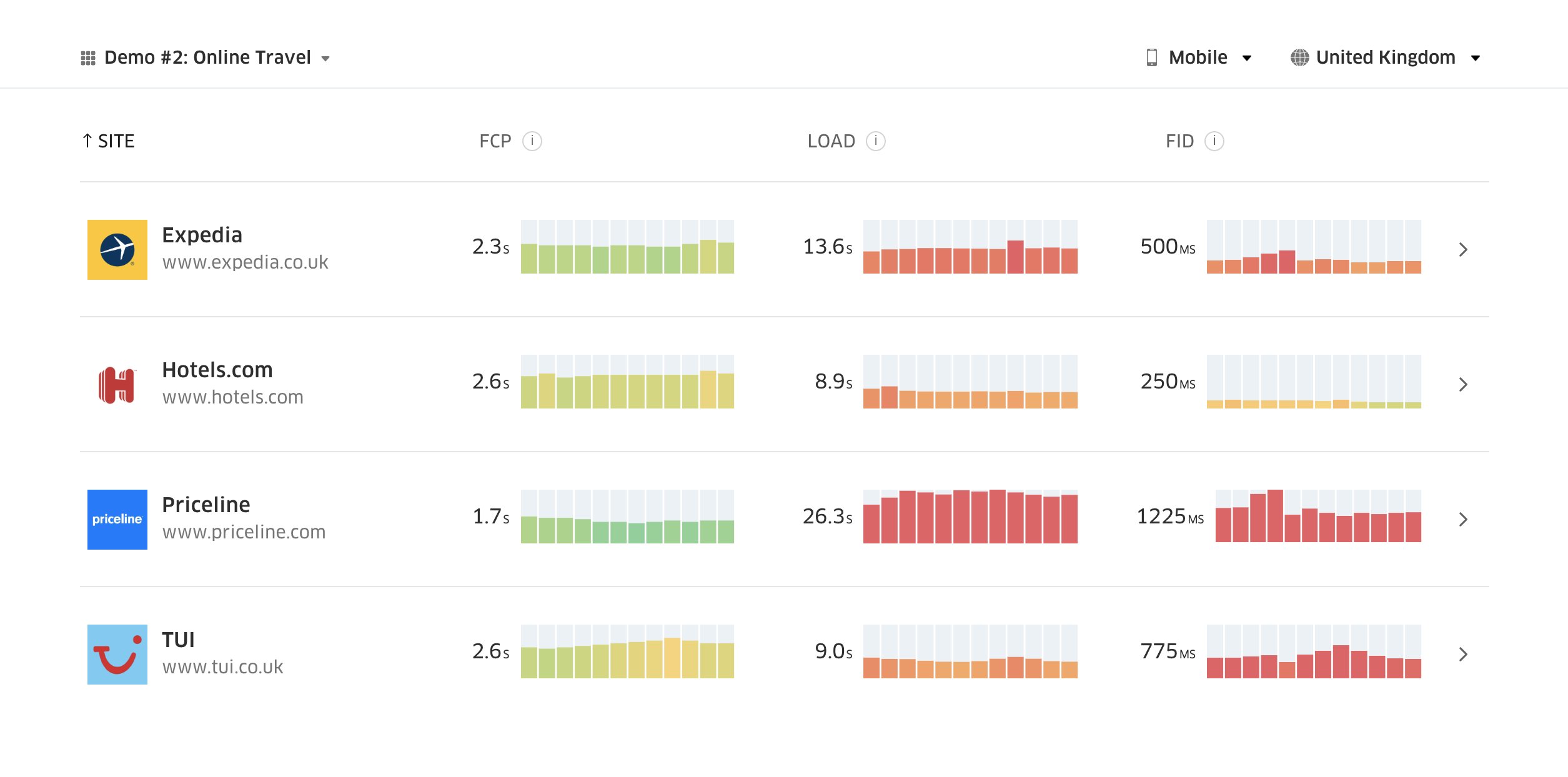
According to psychological research, if you want users to feel that your website is faster than your competitor’s website, you need to be at least 20% faster. Study your main competitors, collect metrics on how they perform on mobile and desktop and set thresholds that would help you outpace them. To get accurate results and goals though, make sure to first get a thorough picture of your users' experience by studying your analytics. You can then mimic the 90th percentile’s experience for testing.To get a good first impression of how your competitors perform, you can use Chrome UX Report (CrUX, a ready-made RUM data set, video introduction by Ilya Grigorik and detailed guide by Rick Viscomi), or Treo, a RUM monitoring tool that is powered by Chrome UX Report. The data is gathered from the Chrome browser users, so the reports will be Chrome-specific, but they will give you a fairly thorough distribution of performance, most importantly Core Web Vitals scores, across a wide range of your visitors. Note that new CrUX datasets are released on the second Tuesday of each month.
Alternatively, you can also use:
- Addy Osmani’s Chrome UX Report Compare Tool,
- Speed Scorecard (also provides a revenue impact estimator),
- Real User Experience Test Comparison or
- SiteSpeed CI (based on synthetic testing).
Note: If you use Page Speed Insights or Page Speed Insights API (no, it isn’t deprecated!), you can get CrUX performance data for specific pages instead of just the aggregates. This data can be much more useful for setting performance targets for assets like “landing page” or “product listing”. And if you are using CI to test the budgets, you need to make sure your tested environment matches CrUX if you used CrUX for setting the target (thanks Patrick Meenan!).
If you need some help to show the reasoning behind prioritization of speed, or you’d like to visualize conversion rate decay or increase in bounce rate with slower performance, or perhaps you’d need to advocate for a RUM solution in your organization, Sergey Chernyshev has built a UX Speed Calculator, an open-source tool that helps you simulate data and visualize it to drive your point across.
CrUX generates an overview of performance distributions over time, with traffic collected from Google Chrome users. You can create your own on Chrome UX Dashboard. (Large preview) 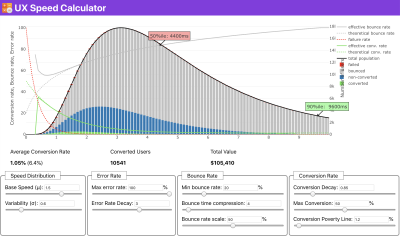
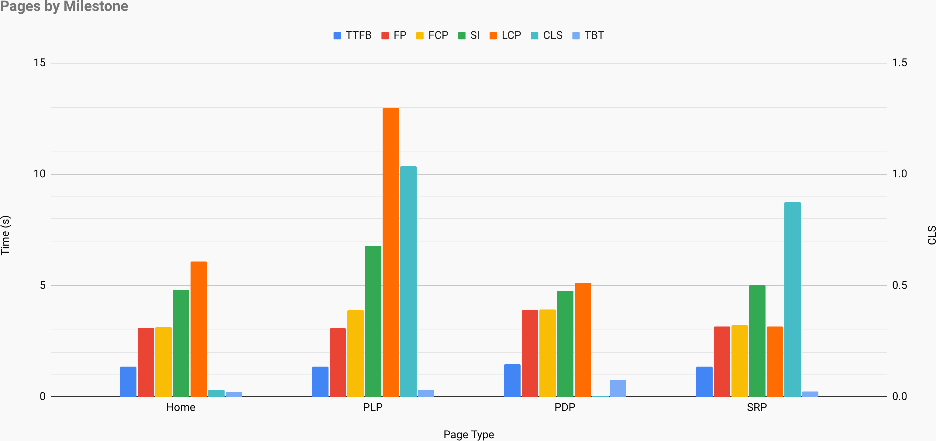
Just when you need to make a case for performance to drive your point across: UX Speed Calculator visualizes an impact of performance on bounce rates, conversion and total revenue — based on real data. (Large preview) Sometimes you might want to go a bit deeper, combining the data coming from CrUX with any other data you already have to work out quickly where the slowdowns, blindspots, and inefficiencies lie — for your competitors, or for your project. In his work, Harry Roberts has been using a Site-Speed Topography Spreadsheet which he uses to break down performance by key page types, and track how different key metrics are across them. You can download the spreadsheet as Google Sheets, Excel, OpenOffice document or CSV.

Site speed topography, with key metrics represented for key pages on the site. (Large preview) And if you want to go all the way, you can run a Lighthouse performance audit on every page of a site (via Lightouse Parade), with an output saved as CSV. That will help you identify which specific pages (or types of pages) of your competitors perform worse or better, and what you might want to focus your efforts on. (For your own site, it’s probably better to send data to an analytics endpoint though!).

With Lighthouse Parade, you can run a Lighthouse performance audit on every page of a site, with an output saved as CSV. (Large preview) Collect data, set up a spreadsheet, shave off 20%, and set up your goals (performance budgets) this way. Now you have something measurable to test against. If you’re keeping the budget in mind and trying to ship down just the minimal payload to get a quick time-to-interactive, then you’re on a reasonable path.
Need resources to get started?
- Addy Osmani has written a very detailed write-up on how to start performance budgeting, how to quantify the impact of new features and where to start when you are over budget.
- Lara Hogan’s guide on how to approach designs with a performance budget can provide helpful pointers to designers.
- Harry Roberts has published a guide on setting up a Google Sheet to display the impact of third-party scripts on performance, using Request Map,
- Jonathan Fielding’s Performance Budget Calculator, Katie Hempenius' perf-budget-calculator and Browser Calories can aid in creating budgets (thanks to Karolina Szczur for the heads up).
- In many companies, performance budgets shouldn’t be aspirational, but rather pragmatic, serving as a holding sign to avoid slipping past a certain point. In that case, you could pick your worst data point in the past two weeks as a threshold, and take it from there. Performance Budgets, Pragmatically shows you a strategy to achieve that.
- Also, make both performance budget and current performance visible by setting up dashboards with graphs reporting build sizes. There are many tools allowing you to achieve that: SiteSpeed.io dashboard (open source), SpeedCurve and Calibre are just a few of them, and you can find more tools on perf.rocks.

Browser Calories helps you set a performance budget and measure if a page is exceeding these numbers or not. (Large preview) Once you have a budget in place, incorporate them into your build process with Webpack Performance Hints and Bundlesize, Lighthouse CI, PWMetrics or Sitespeed CI to enforce budgets on pull requests and provide a score history in PR comments.
To expose performance budgets to the entire team, integrate performance budgets in Lighthouse via Lightwallet or use LHCI Action for quick Github Actions integration. And if you need something custom, you can use webpagetest-charts-api, an API of endpoints to build charts from WebPagetest results.
Performance awareness shouldn’t come from performance budgets alone though. Just like Pinterest, you could create a custom eslint rule that disallows importing from files and directories that are known to be dependency-heavy and would bloat the bundle. Set up a listing of “safe” packages that can be shared across the entire team.
Also, think about critical customer tasks that are most beneficial to your business. Study, discuss and define acceptable time thresholds for critical actions and establish "UX ready" user timing marks that the entire organization has approved. In many cases, user journeys will touch on the work of many different departments, so alignment in terms of acceptable timings will help support or prevent performance discussions down the road. Make sure that additional costs of added resources and features are visible and understood.
Align performance efforts with other tech initiatives, ranging from new features of the product being built to refactoring to reaching to new global audiences. So every time a conversation about further development happens, performance is a part of that conversation as well. It’s much easier to reach performance goals when the code base is fresh or is just being refactored.
Also, as Patrick Meenan suggested, it’s worth to plan out a loading sequence and trade-offs during the design process. If you prioritize early on which parts are more critical, and define the order in which they should appear, you will also know what can be delayed. Ideally, that order will also reflect the sequence of your CSS and JavaScript imports, so handling them during the build process will be easier. Also, consider what the visual experience should be in "in-between"-states, while the page is being loaded (e.g. when web fonts aren’t loaded yet).
Once you’ve established a strong performance culture in your organization, aim for being 20% faster than your former self to keep priorities in tact as time passes by (thanks, Guy Podjarny!). But account for the different types and usage behaviors of your customers (which Tobias Baldauf called cadence and cohorts), along with bot traffic and seasonality effects.
Planning, planning, planning. It might be tempting to get into some quick "low-hanging-fruits"-optimizations early on — and it might be a good strategy for quick wins — but it will be very hard to keep performance a priority without planning and setting realistic, company-tailored performance goals.


- Choose the right metrics.
Not all metrics are equally important. Study what metrics matter most to your application: usually, it will be defined by how fast you can start to render most important pixels of your interface and how quickly you can provide input responsiveness for these rendered pixels. This knowledge will give you the best optimization target for ongoing efforts. In the end, it’s not the load events or server response times that define the experience, but the perception of how snappy the interface feels.What does it mean? Rather than focusing on full page loading time (via onLoad and DOMContentLoaded timings, for example), prioritize page loading as perceived by your customers. That means focusing on a slightly different set of metrics. In fact, choosing the right metric is a process without obvious winners.
Based on Tim Kadlec’s research and Marcos Iglesias’ notes in his talk, traditional metrics could be grouped into a few sets. Usually, we’ll need all of them to get a complete picture of performance, and in your particular case some of them will be more important than others.
- Quantity-based metrics measure the number of requests, weight and a performance score. Good for raising alarms and monitoring changes over time, not so good for understanding user experience.
- Milestone metrics use states in the lifetime of the loading process, e.g. Time To First Byte and Time To Interactive. Good for describing the user experience and monitoring, not so good for knowing what happens between the milestones.
- Rendering metrics provide an estimate of how fast content renders (e.g. Start Render time, Speed Index). Good for measuring and tweaking rendering performance, but not so good for measuring when important content appears and can be interacted with.
- Custom metrics measure a particular, custom event for the user, e.g. Twitter’s Time To First Tweet and Pinterest’s PinnerWaitTime. Good for describing the user experience precisely, not so good for scaling the metrics and comparing with with competitors.
To complete the picture, we’d usually look out for useful metrics among all of these groups. Usually, the most specific and relevant ones are:
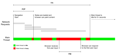
- Time to Interactive (TTI)
The point at which layout has stabilized, key webfonts are visible, and the main thread is available enough to handle user input — basically the time mark when a user can interact with the UI. The key metrics for understanding how much wait a user has to experience to use the site without a lag. Boris Schapira has written a detailed post on how to measure TTI reliably. - First Input Delay (FID), or Input responsiveness
The time from when a user first interacts with your site to the time when the browser is actually able to respond to that interaction. Complements TTI very well as it describes the missing part of the picture: what happens when a user actually interacts with the site. Intended as a RUM metric only. There is a JavaScript library for measuring FID in the browser. - Largest Contentful Paint (LCP)
Marks the point in the page load timeline when the page’s important content has likely loaded. The assumption is that the most important element of the page is the largest one visible in the user’s viewport. If elements are rendered both above and below the fold, only the visible part is considered relevant. - Total Blocking Time (TBT)
A metric that helps quantify the severity of how non-interactive a page is prior to it becoming reliably interactive (that is, the main thread has been free of any tasks running over 50ms (long tasks) for at least 5s). The metric measures the total amount of time between the first paint and Time to Interactive (TTI) where the main thread was blocked for long enough to prevent input responsiveness. No wonder, then, that a low TBT is a good indicator for good performance. (thanks, Artem, Phil) - Cumulative Layout Shift (CLS)
The metric highlights how often users experience unexpected layout shifts (reflows) when accessing the site. It examines unstable elements and their impact on the overall experience. The lower the score, the better. - Speed Index
Measures how quickly the page contents are visually populated; the lower the score, the better. The Speed Index score is computed based on the speed of visual progress, but it’s merely a computed value. It’s also sensitive to the viewport size, so you need to define a range of testing configurations that match your target audience. Note that it is becoming less important with LCP becoming a more relevant metric (thanks, Boris, Artem!). - CPU time spent
A metric that shows how often and how long the main thread is blocked, working on painting, rendering, scripting and loading. High CPU time is a clear indicator of a janky experience, i.e. when the user experiences a noticeable lag between their action and a response. With WebPageTest, you can select "Capture Dev Tools Timeline" on the "Chrome" tab to expose the breakdown of the main thread as it runs on any device using WebPageTest. - Component-Level CPU Costs
Just like with the CPU time spent, this metric, proposed by Stoyan Stefanov, explores the impact of JavaScript on CPU. The idea is to use CPU instruction count per component to understand its impact on the overall experience, in isolation. Could be implemented using Puppeteer and Chrome. - FrustrationIndex
While many metrics featured above explain when a particular event happens, Tim Vereecke’s FrustrationIndex looks at the gaps between metrics instead of looking at them individually. It looks at the key milestones perceived by the end-user, such as Title is visible, First content is visible, Visually ready and Page looks ready and calculates a score indicating the level of frustration while loading a page. The bigger the gap, the bigger the chance a user gets frustrated. Potentially a good KPI for user experience. Tim has published a detailed post about FrustrationIndex and how it works. - Ad Weight Impact
If your site depends on the revenue generated by advertising, it’s useful to track the weight of ad related code. Paddy Ganti’s script constructs two URLs (one normal and one blocking the ads), prompts the generation of a video comparison via WebPageTest and reports a delta. - Deviation metrics
As noted by Wikipedia engineers, data of how much variance exists in your results could inform you how reliable your instruments are, and how much attention you should pay to deviations and outlers. Large variance is an indicator of adjustments needed in the setup. It also helps understand if certain pages are more difficult to measure reliably, e.g. due to third-party scripts causing significant variation. It might also be a good idea to track browser version to understand bumps in performance when a new browser version is rolled out. - Custom metrics
Custom metrics are defined by your business needs and customer experience. It requires you to identify important pixels, critical scripts, necessary CSS and relevant assets and measure how quickly they get delivered to the user. For that one, you can monitor Hero Rendering Times, or use Performance API, marking particular timestamps for events that are important for your business. Also, you can collect custom metrics with WebPagetest by executing arbitrary JavaScript at the end of a test.
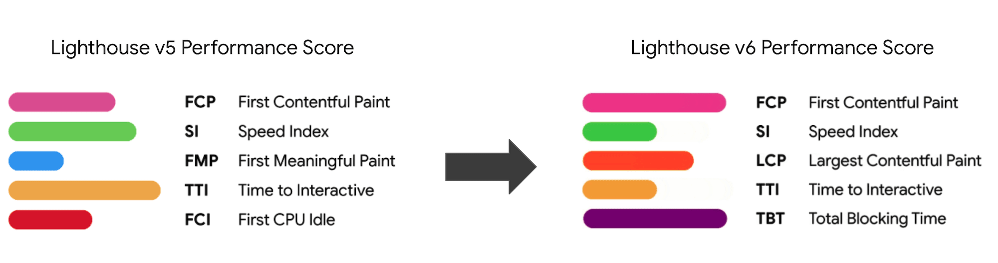
Note that the First Meaningful Paint (FMP) doesn’t appear in the overview above. It used to provide an insight into how quickly the server outputs any data. Long FMP usually indicated JavaScript blocking the main thread, but could be related to back-end/server issues as well. However, the metric has been deprecated recently as it appears not to be accurate in about 20% of the cases. It was effectively replaced with LCP which is both more reliable and easier to reason about. It is no longer supported in Lighthouse. Double check latest user-centric performance metrics and recommendations just to make sure you are on the safe page (thanks, Patrick Meenan).
Steve Souders has a detailed explanation of many of these metrics. It’s important to notice that while Time-To-Interactive is measured by running automated audits in the so-called lab environment, First Input Delay represents the actual user experience, with actual users experiencing a noticeable lag. In general, it’s probably a good idea to always measure and track both of them.
Depending on the context of your application, preferred metrics might differ: e.g. for Netflix TV UI, key input responsiveness, memory usage and TTI are more critical, and for Wikipedia, first/last visual changes and CPU time spent metrics are more important.
Note: both FID and TTI do not account for scrolling behavior; scrolling can happen independently since it’s off-main-thread, so for many content consumption sites these metrics might be much less important (thanks, Patrick!).
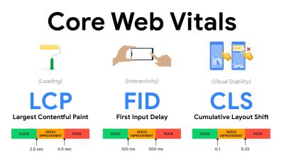
- Measure and optimize the Core Web Vitals.
For a long time, performance metrics were quite technical, focusing on the engineering view of how fast servers are at responding, and how quick browsers are at loading. The metrics have changed over the years — attempting to find a way to capture the actual user experience, rather than server timings. In May 2020, Google has announced Core Web Vitals, a set of new user-focused performance metrics, each representing a distinct facet of the user experience.For each of them, Google recommends a range of acceptable speed goals. At least 75% of all page views should exceed the Good range to pass this assessment. These metrics quickly gained traction, and with Core Web Vitals becoming ranking signals for Google Search in May 2021 (Page Experience ranking algorithm update), many companies have turned their attention to their performance scores.
Let’s break down each of the Core Web Vitals, one by one, along with useful techniques and tooling to optimize your experiences with these metrics in mind. (It’s worth noting that you will end up with better Core Web Vitals scores by following a general advice in this article.)
- Largest Contentful Paint (LCP) < 2.5 sec.
Measures the loading of a page, and reports the render time of the largest image or text block that’s visible within the viewport. Hence, LCP is affected by everything that’s deferring the rendering of important information — be it slow server response times, blocking CSS, in-flight JavaScript (first-party or third-party), web font loading, expensive rendering or painting operations, lazy-loaded images, skeleton screens or client-side rendering.
For a good experience, LCP should occur within 2.5s of when the page first starts loading. That means that we need to render the first visible portion of the page as early as possible. That will require tailored critical CSS for each template, orchestrating the<head>-order and prefetching critical assets (we’ll cover them later).The main reason for a low LCP score is usually images. To deliver an LCP in <2.5s on Fast 3G — hosted on a well-optimized server, all static without client-side rendering and with an image coming from a dedicated image CDN — means that the maximum theoretical image size is only around 144KB. That’s why responsive images matter, as well as preloading critical images early (with
preload).Quick tip: to discover what is considered LCP on a page, in DevTools you can hover over the LCP badge under "Timings" in the Performance Panel (thanks, Tim Kadlec!).
- First Input Delay (FID) < 100ms.
Measures the responsiveness of the UI, i.e. how long the browser was busy with other tasks before it could react to a discrete user input event like a tap, or a click. It’s designed to capture delays that result from the main thread being busy, especially during page load.
The goal is to stay within 50–100ms for every interaction. To get there, we need to identify long tasks (blocks the main thread for >50ms) and break them up, code-split a bundle into multiple chunks, reduce JavaScript execution time, optimize data-fetching, defer script execution of third-parties, move JavaScript to the background thread with Web workers and use progressive hydration to reduce rehydration costs in SPAs.Quick tip: in general, a reliable strategy to get a better FID score is to minimize the work on the main thread by breaking larger bundles into smaller ones and serving what the user needs when they need it, so user interactions won’t be delayed. We’ll cover more on that in detail below.
- Cumulative Layout Shift (CLS) < 0.1.
Measures visual stability of the UI to ensure smooth and natural interactions, i.e. the sum total of all individual layout shift scores for every unexpected layout shift that occurs during the lifespan of the page. An individual layout shift occurs any time an element which was already visible changes its position on the page. It’s scored based on the size of the content and distance it moved.
So every time a shift appears — e.g. when fallback fonts and web fonts have different font metrics, or adverts, embeds or iframes coming in late, or image/video dimensions aren’t reserved, or late CSS forces repaints, or changes are injected by late JavaScript — it has an impact on the CLS score. The recommended value for a good experience is a CLS < 0.1.
It’s worth noting that Core Web Vitals are supposed to evolve over time, with a predictable annual cycle. For the first year update, we might be expecting First Contentful Paint to be promoted to Core Web Vitals, a reduced FID threshold and better support for single-page applications. We might also see the responding to user inputs after load gaining more weight, along with security, privacy and accessibility (!) considerations.
Related to Core Web Vitals, there are plenty of useful resources and articles that are worth looking into:
- Web Vitals Leaderboard allows you to compare your scores against competition on mobile, tablet, desktop, and on 3G and 4G.
- Core SERP Vitals, a Chrome extension that shows the Core Web Vitals from CrUX in the Google Search Results.
- Layout Shift GIF Generator that visualizes CLS with a simple GIF (also available from the command line).
- web-vitals library can collect and send Core Web Vitals to Google Analytics, Google Tag Manager or any other analytics endpoint.
- Analyzing Web Vitals with WebPageTest, in which Patrick Meenan explores how WebPageTest exposes data about Core Web Vitals.
- Optimizing with Core Web Vitals, a 50-min video with Addy Osmani, in which he highlights how to improve Core Web Vitals in an eCommerce case-study.
- Cumulative Layout Shift in Practice and Cumulative Layout Shift in the Real World are comprehensive articles by Nic Jansma, which cover pretty much everything about CLS and how it correlates with key metrics such as Bounce Rate, Session Time or Rage Clicks.
- What Forces Reflow, with an overview of properties or methods, when requested/called in JavaScript, that will trigger the browser to synchronously calculate the style and layout.
- CSS Triggers shows which CSS properties trigger Layout, Paint and Composite.
- Fixing Layout Instability is a walkthrough of using WebPageTest to identify and fix layout instability issues.
- Cumulative Layout Shift, The Layout Instability Metric, another very detailed guide by Boris Schapira on CLS, how it’s calcualted, how to measure and how to optimize for it.
- How To Improve Core Web Vitals, a detailed guide by Simon Hearne on each of the metrics (including other Web Vitals, such as FCP, TTI, TBT), when they occur and how they are measured.
So, are Core Web Vitals the ultimate metrics to follow? Not quite. They are indeed exposed in most RUM solutions and platforms already, including Cloudflare, Treo, SpeedCurve, Calibre, WebPageTest (in the filmstrip view already), Newrelic, Shopify, Next.js, all Google tools (PageSpeed Insights, Lighthouse + CI, Search Console etc.) and many others.
However, as Katie Sylor-Miller explains, some of the main problems with Core Web Vitals are the lack of cross-browser support, we don’t really measure the full lifecycle of a user’s experience, plus it’s difficult to correlate changes in FID and CLS with business outcomes.
As we should be expecting Core Web Vitals to evolve, it seems only reasonable to always combine Web Vitals with your custom-tailored metrics to get a better understanding of where you stand in terms of performance.
- Largest Contentful Paint (LCP) < 2.5 sec.
- Gather data on a device representative of your audience.
To gather accurate data, we need to thoroughly choose devices to test on. In most companies, that means looking into analytics and creating user profiles based on most common device types. Yet often, analytics alone doesn’t provide a complete picture. A significant portion of the target audience might be abandoning the site (and not returning back) just because their experience is too slow, and their devices are unlikely to show up as the most popular devices in analytics for that reason. So, additionally conducting research on common devices in your target group might be a good idea.Globally in 2020, according to the IDC, 84.8% of all shipped mobile phones are Android devices. An average consumer upgrades their phone every 2 years, and in the US phone replacement cycle is 33 months. Average bestselling phones around the world will cost under $200.
A representative device, then, is an Android device that is at least 24 months old, costing $200 or less, running on slow 3G, 400ms RTT and 400kbps transfer, just to be slightly more pessimistic. This might be very different for your company, of course, but that’s a close enough approximation of a majority of customers out there. In fact, it might be a good idea to look into current Amazon Best Sellers for your target market. (Thanks to Tim Kadlec, Henri Helvetica and Alex Russell for the pointers!).

When building a new site or app, always check current Amazon Best Sellers for your target market first. (Large preview) What test devices to choose then? The ones that fit well with the profile outlined above. It’s a good option to choose a slightly older Moto G4/G5 Plus, a mid-range Samsung device (Galaxy A50, S8), a good middle-of-the-road device like a Nexus 5X, Xiaomi Mi A3 or Xiaomi Redmi Note 7 and a slow device like Alcatel 1X or Cubot X19, perhaps in an open device lab. For testing on slower thermal-throttled devices, you could also get a Nexus 4, which costs just around $100.
Also, check the chipsets used in each device and do not over-represent one chipset: a few generations of Snapdragon and Apple as well as low-end Rockchip, Mediatek would be enough (thanks, Patrick!).
If you don’t have a device at hand, emulate mobile experience on desktop by testing on a throttled 3G network (e.g. 300ms RTT, 1.6 Mbps down, 0.8 Mbps up) with a throttled CPU (5× slowdown). Eventually switch over to regular 3G, slow 4G (e.g. 170ms RTT, 9 Mbps down, 9Mbps up), and Wi-Fi. To make the performance impact more visible, you could even introduce 2G Tuesdays or set up a throttled 3G/4G network in your office for faster testing.
Keep in mind that on a mobile device, we should be expecting a 4×–5× slowdown compared to desktop machines. Mobile devices have different GPUs, CPU, memory and different battery characteristics. That’s why it’s important to have a good profile of an average device and always test on such a device.
- Synthetic testing tools collect lab data in a reproducible environment with predefined device and network settings (e.g. Lighthouse, Calibre, WebPageTest) and
- Real User Monitoring (RUM) tools evaluate user interactions continuously and collect field data (e.g. SpeedCurve, New Relic — the tools provide synthetic testing, too).
- use Lighthouse CI to track Lighthouse scores over time (it’s quite impressive),
- run Lighthouse in GitHub Actions to get a Lighthouse report alongside every PR,
- run a Lighthouse performance audit on every page of a site (via Lightouse Parade), with an output saved as CSV,
- use Lighthouse Scores Calculator and Lighthouse metric weights if you need to dive into more detail.
- Lighthouse is available for Firefox as well, but under the hood it uses the PageSpeed Insights API and generates a report based on a headless Chrome 79 User-Agent.


Luckily, there are many great options that help you automate the collection of data and measure how your website performs over time according to these metrics. Keep in mind that a good performance picture covers a set of performance metrics, lab data and field data:
The former is particularly useful during development as it will help you identify, isolate and fix performance issues while working on the product. The latter is useful for long-term maintenance as it will help you understand your performance bottlenecks as they are happening live — when users actually access the site.
By tapping into built-in RUM APIs such as Navigation Timing, Resource Timing, Paint Timing, Long Tasks, etc., synthetic testing tools and RUM together provide a complete picture of performance in your application. You could use Calibre, Treo, SpeedCurve, mPulse and Boomerang, Sitespeed.io, which all are great options for performance monitoring. Furthermore, with Server Timing header, you could even monitor back-end and front-end performance all in one place.
Note: It’s always a safer bet to choose network-level throttlers, external to the browser, as, for example, DevTools has issues interacting with HTTP/2 push, due to the way it’s implemented (thanks, Yoav, Patrick!). For Mac OS, we can use Network Link Conditioner, for Windows Windows Traffic Shaper, for Linux netem, and for FreeBSD dummynet.
As it’s likely that you’ll be testing in Lighthouse, keep in mind that you can:
- Set up "clean" and "customer" profiles for testing.
While running tests in passive monitoring tools, it’s a common strategy to turn off anti-virus and background CPU tasks, remove background bandwidth transfers and test with a clean user profile without browser extensions to avoid skewed results (in Firefox, and in Chrome).
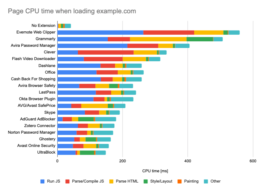
DebugBear’s report highlights 20 slowest extensions, including password managers, ad-blockers and popular applications like Evernote and Grammarly. (Large preview) However, it’s also a good idea to study which browser extensions your customers use frequently, and test with dedicated "customer" profiles as well. In fact, some extensions might have a profound performance impact (2020 Chrome Extension Performance Report) on your application, and if your users use them a lot, you might want to account for it up front. Hence, "clean" profile results alone are overly optimistic and can be crushed in real-life scenarios.
- Share the performance goals with your colleagues.
Make sure that performance goals are familiar to every member of your team to avoid misunderstandings down the line. Every decision — be it design, marketing or anything in-between — has performance implications, and distributing responsibility and ownership across the entire team would streamline performance-focused decisions later on. Map design decisions against performance budget and the priorities defined early on.
Setting Realistic Goals
- 100-millisecond response time, 60 fps.
For an interaction to feel smooth, the interface has 100ms to respond to user’s input. Any longer than that, and the user perceives the app as laggy. The RAIL, a user-centered performance model gives you healthy targets: To allow for <100 milliseconds response, the page must yield control back to main thread at latest after every <50 milliseconds. Estimated Input Latency tells us if we are hitting that threshold, and ideally, it should be below 50ms. For high-pressure points like animation, it’s best to do nothing else where you can and the absolute minimum where you can't.
RAIL, a user-centric performance model. Also, each frame of animation should be completed in less than 16 milliseconds, thereby achieving 60 frames per second (1 second ÷ 60 = 16.6 milliseconds) — preferably under 10 milliseconds. Because the browser needs time to paint the new frame to the screen, your code should finish executing before hitting the 16.6 milliseconds mark. We’re starting to have conversations about 120fps (e.g. iPad Pro’s screens run at 120Hz) and Surma has covered some rendering performance solutions for 120fps, but that’s probably not a target we’re looking at just yet.
Be pessimistic in performance expectations, but be optimistic in interface design and use idle time wisely (check idlize, idle-until-urgent and react-idle). Obviously, these targets apply to runtime performance, rather than loading performance.
- FID < 100ms, LCP < 2.5s, TTI < 5s on 3G, Critical file size budget < 170KB (gzipped).
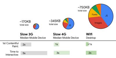
Although it might be very difficult to achieve, a good ultimate goal would be Time to Interactive under 5s, and for repeat visits, aim for under 2s (achievable only with a service worker). Aim for Largest Contentful Paint of under 2.5s and minimize Total Blocking Time and Cumulative Layout Shift. An acceptable First Input Delay is under 100ms–70ms. As mentioned above, we’re considering the baseline being a $200 Android phone (e.g. Moto G4) on a slow 3G network, emulated at 400ms RTT and 400kbps transfer speed.We have two major constraints that effectively shape a reasonable target for speedy delivery of the content on the web. On the one hand, we have network delivery constraints due to TCP Slow Start. The first 14KB of the HTML — 10 TCP packets, each 1460 bytes, making around 14.25 KB, albeit not to be taken literally — is the most critical payload chunk, and the only part of the budget that can be delivered in the first roundtrip (which is all you get in 1 sec at 400ms RTT due to mobile wake-up times).
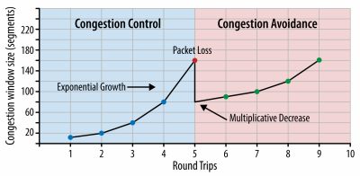
With TCP connections, we start with a small congestion window and double it for every roundtrip. In the very first roundtrip, we can fit 14 KB. From: High Performance Browser Networking by Ilya Grigorik. (Large preview) (Note: as TCP generally under-utilizes network connection by a significant amount, Google has developed TCP Bottleneck Bandwidth and RRT (BBR), a TCP delay-controlled TCP flow control algorithm. Designed for the modern web, it responds to actual congestion, rather than packet loss like TCP does, it is significantly faster, with higher throughput and lower latency — and the algorithm works differently. (thanks, Victor, Barry!)
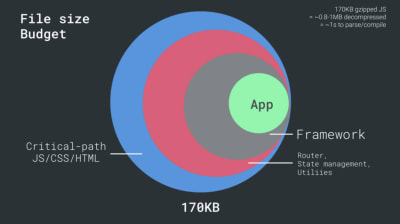
On the other hand, we have hardware constraints on memory and CPU due to JavaScript parsing and execution times (we’ll talk about them in detail later). To achieve the goals stated in the first paragraph, we have to consider the critical file size budget for JavaScript. Opinions vary on what that budget should be (and it heavily depends on the nature of your project), but a budget of 170KB JavaScript gzipped already would take up to 1s to parse and compile on a mid-range phone. Assuming that 170KB expands to 3× that size when decompressed (0.7MB), that already could be the death knell of a "decent" user experience on a Moto G4/G5 Plus.
In the case of Wikipedia's website, in 2020, globally, code execution has got 19% faster for Wikipedia users. So, if your year-over-year web performance metrics stay stable, that's usually a warning sign as you're actually regressing as the environment keeps improving (details in a blog post by Gilles Dubuc).
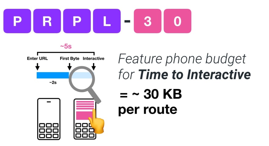
If you want to target growing markets such as South East Asia, Africa or India, you’ll have to look into a very different set of constraints. Addy Osmani covers major feature phone constraints, such as few low cost, high-quality devices, unavailability of high-quality networks and expensive mobile data — along with PRPL-30 budget and development guidelines for these environments.
According to Addy Osmani, a recommended size for lazy-loaded routes is also less than 35 KB. (Large preview) 
Addy Osmani suggests PRPL-30 performance budget (30KB gzipped + minified initial bundle) if targeting a feature phone. (Large preview) In fact, Google’s Alex Russell recommends to aim for 130–170KB gzipped as a reasonable upper boundary. In real-world scenarios, most products aren’t even close: a median bundle size today is around 452KB, which is up 53.6% compared to early 2015. On a middle-class mobile device, that accounts for 12–20 seconds for Time-To-Interactive.

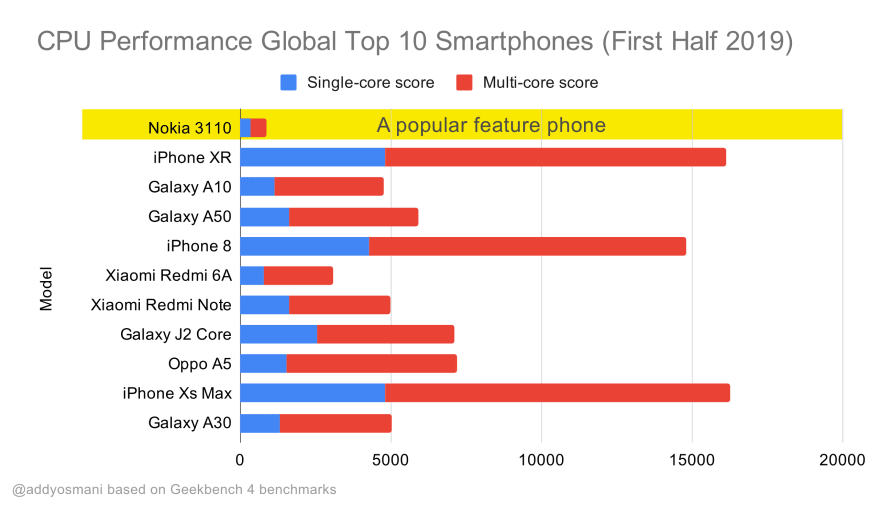
Geekbench CPU performance benchmarks for the highest selling smartphones globally in 2019. JavaScript stresses single-core performance (remember, it’s inherently more single-threaded than the rest of the Web Platform) and is CPU bound. From Addy’s article “Loading Web Pages Fast On A $20 Feature Phone”. (Large preview) We could also go beyond the bundle size budget though. For example, we could set performance budgets based on the activities of the browser’s main thread, i.e. paint time before start render, or track down front-end CPU hogs. Tools such as Calibre, SpeedCurve and Bundlesize can help you keep your budgets in check, and can be integrated into your build process.
Finally, a performance budget probably shouldn’t be a fixed value. Depending on the network connection, performance budgets should adapt, but payload on slower connection is much more "expensive", regardless of how they’re used.
Note: It might sound strange to set such rigid budgets in times of wide-spread HTTP/2, upcoming 5G and HTTP/3, rapidly evolving mobile phones and flourishing SPAs. However, they do sound reasonable when we deal with the unpredictable nature of the network and hardware, including everything from congested networks to slowly developing infrastructure, to data caps, proxy browsers, save-data mode and sneaky roaming charges.


Defining The Environment
- Choose and set up your build tools.
Don’t pay too much attention to what’s supposedly cool these days. Stick to your environment for building, be it Grunt, Gulp, Webpack, Parcel, or a combination of tools. As long as you are getting results you need and you have no issues maintaining your build process, you’re doing just fine.Among the build tools, Rollup keeps gaining traction, so does Snowpack, but Webpack seems to be the most established one, with literally hundreds of plugins available to optimize the size of your builds. Watch out for the Webpack Roadmap 2021.
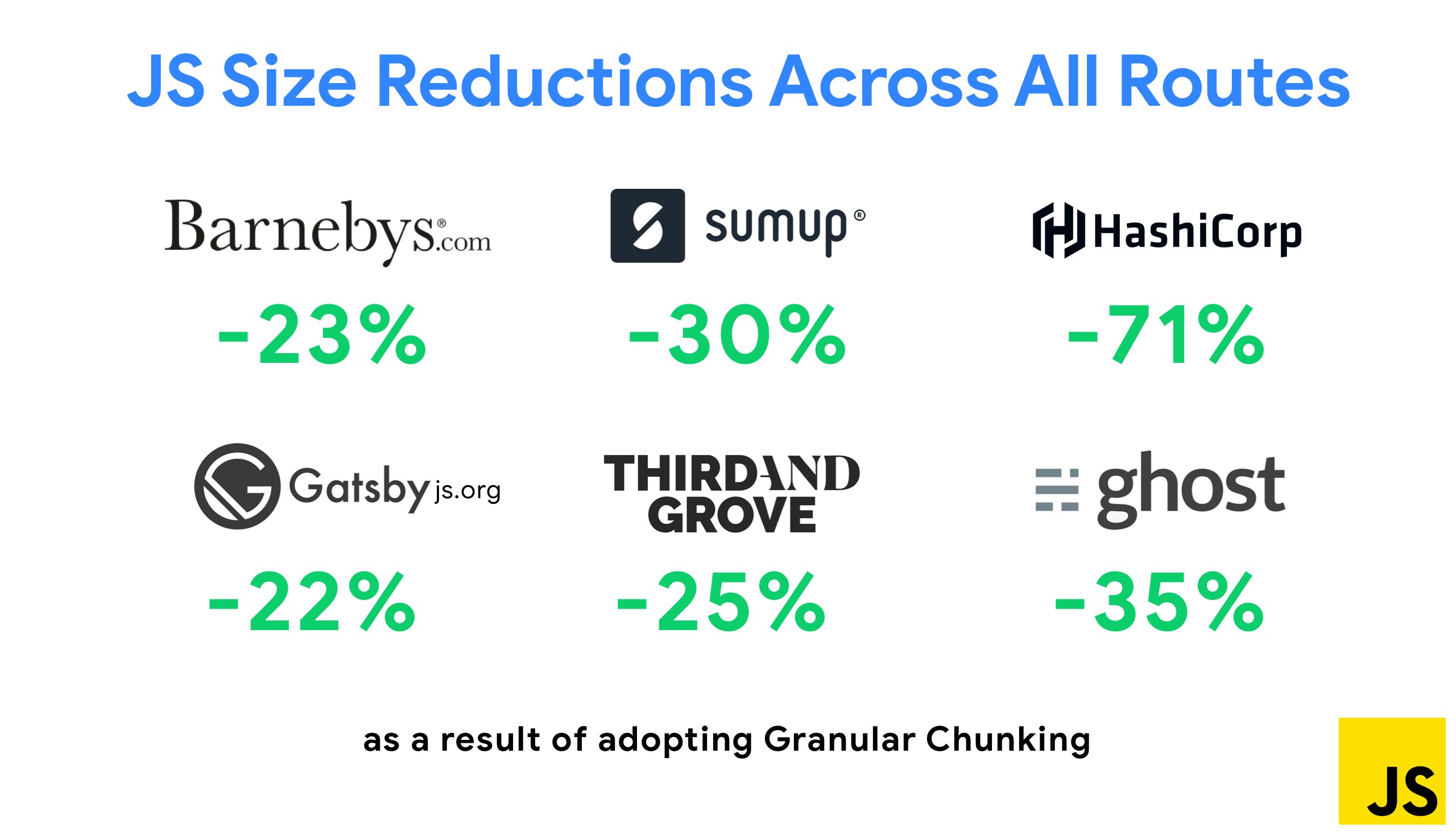
One of the most notable strategies that appeared recently is Granular chunking with Webpack in Next.js and Gatsby to minimize duplicate code. By default, modules that aren't shared in every entry point can be requested for routes that do not use it. This ends up becoming an overhead as more code is downloaded than necessary. With granular chunking in Next.js, we can use a server-side build manifest file to determine which outputted chunks are used by different entry points.

To reduce duplicate code in Webpack projects, we can use granular chunking, enabled in Next.js and Gatsby by default. Image credit: Addy Osmani. (Large preview) With SplitChunksPlugin, multiple split chunks are created depending on a number of conditions to prevent fetching duplicated code across multiple routes. This improves page load time and caching during navigations. Shipped in Next.js 9.2 and in Gatsby v2.20.7.
Getting started with Webpack can be tough though. So if you want to dive into Webpack, there are some great resources out there:
- Webpack documentation — obviously — is a good starting point, and so are Webpack — The Confusing Bits by Raja Rao and An Annotated Webpack Config by Andrew Welch.
- Sean Larkin has a free course on Webpack: The Core Concepts and Jeffrey Way has released a fantastic free course on Webpack for everyone. Both of them are great introductions for diving into Webpack.
- Webpack Fundamentals is a very comprehensive 4h course with Sean Larkin, released by FrontendMasters.
- Webpack examples has hundreds of ready-to-use Webpack configurations, categorized by topic and purpose. Bonus: there is also a Webpack config configurator that generates a basic configuration file.
- awesome-webpack is a curated list of useful Webpack resources, libraries and tools, including articles, videos, courses, books and examples for Angular, React and framework-agnostic projects.
- The journey to fast production asset builds with Webpack is Etsy’s case study on how the team switched from using a RequireJS-based JavaScript build system to using Webpack and how they optimized theird builds, managing over 13,200 assets in 4 mins on average.
- Webpack performance tips is a goldmine thread by Ivan Akulov, featuring many performance-focused tips, including the ones focused specifically on Webpack.
- awesome-webpack-perf is a goldmine GitHub repo with useful Webpack tools and plugins for performance. Also maintained by Ivan Akulov.
- Use progressive enhancement as a default.
Still, after all these years, keeping progressive enhancement as the guiding principle of your front-end architecture and deployment is a safe bet. Design and build the core experience first, and then enhance the experience with advanced features for capable browsers, creating resilient experiences. If your website runs fast on a slow machine with a poor screen in a poor browser on a sub-optimal network, then it will only run faster on a fast machine with a good browser on a decent network.In fact, with adaptive module serving, we seem to be taking progressive enhancement to another level, serving "lite" core experiences to low-end devices, and enhancing with more sophisticated features for high-end devices. Progressive enhancement isn’t likely to fade away any time soon.
- Choose a strong performance baseline.
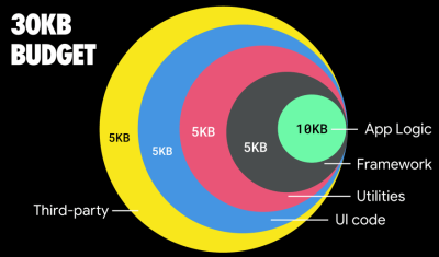
With so many unknowns impacting loading — the network, thermal throttling, cache eviction, third-party scripts, parser blocking patterns, disk I/O, IPC latency, installed extensions, antivirus software and firewalls, background CPU tasks, hardware and memory constraints, differences in L2/L3 caching, RTTS — JavaScript has the heaviest cost of the experience, next to web fonts blocking rendering by default and images often consuming too much memory. With the performance bottlenecks moving away from the server to the client, as developers, we have to consider all of these unknowns in much more detail.With a 170KB budget that already contains the critical-path HTML/CSS/JavaScript, router, state management, utilities, framework, and the application logic, we have to thoroughly examine network transfer cost, the parse/compile-time and the runtime cost of the framework of our choice. Luckily, we’ve seen a huge improvement over the last few years in how fast browsers can parse and compile scripts. Yet the execution of JavaScript is still the main bottleneck, so paying close attention to script execution time and network can be impactful.
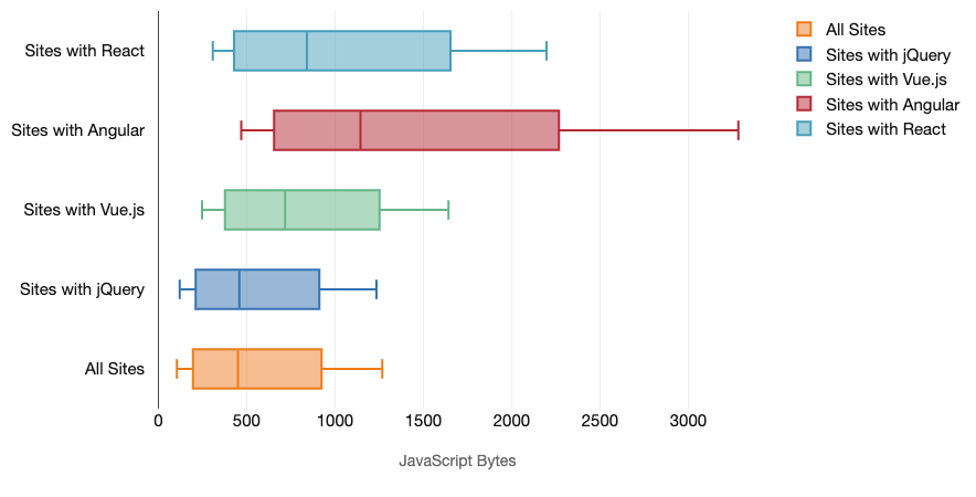
Tim Kadlec has conduct a fantastic research on the performance of modern frameworks, and summarized them in the article "JavaScript frameworks have a cost". We often speak about the impact of standalone frameworks, but as Tim notes, in practice, it's not uncommon to have multiple frameworks in use. Perhaps an older version of jQuery that's being slowly migrated to a modern framework, along with a few legacy applications using an older version of Angular. So it's more reasonable to explore the cumulative cost of JavaScript bytes and CPU execution time that can easily make user experiences barely usable, even on high-end devices.
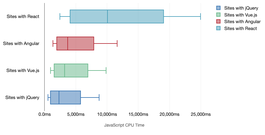
In general, modern frameworks aren't prioritizing less powerful devices, so the experiences on a phone and on desktop will often be dramatically different in terms of performances. According to research, sites with React or Angular spend more time on the CPU than others (which of course isn’t necessarily to say that React is more expensive on the CPU than Vue.js).
According to Tim, one thing is obvious: "if you’re using a framework to build your site, you’re making a trade-off in terms of initial performance — even in the best of scenarios."
- Evaluate frameworks and dependencies.
Now, not every project needs a framework and not every page of a single-page-application needs to load a framework. In Netflix’s case, "removing React, several libraries and the corresponding app code from the client-side reduced the total amount of JavaScript by over 200KB, causing an over-50% reduction in Netflix’s Time-to-Interactivity for the logged-out homepage." The team then utilized the time spent by users on the landing page to prefetch React for subsequent pages that users were likely to land on (read on for details).So what if you remove an existing framework on critical pages altogether? With Gatsby, you can check gatsby-plugin-no-javascript that removes all JavaScript files created by Gatsby from the static HTML files. On Vercel, you can also allow disabling runtime JavaScript in production for certain pages (experimental).
Once a framework is chosen, we’ll be staying with it for at least a few years, so if we need to use one, we need make sure our choice is informed and well considered — and that goes especially for key performance metrics that we care about.
Data shows that, by default, frameworks are quite expensive: 58.6% of React pages ship over 1 MB of JavaScript, and 36% of Vue.js page loads have a First Contentful Paint of <1.5s. According to a study by Ankur Sethi, "your React application will never load faster than about 1.1 seconds on an average phone in India, no matter how much you optimize it. Your Angular app will always take at least 2.7 seconds to boot up. The users of your Vue app will need to wait at least 1 second before they can start using it." You might not be targeting India as your primary market anyway, but users accessing your site with suboptimal network conditions will have a comparable experience.
Of course it is possible to make SPAs fast, but they aren't fast out of the box, so we need to account for the time and effort required to make and keep them fast. It's probably going to be easier by choosing a lightweight baseline performance cost early on.
So how do we choose a framework? It’s a good idea to consider at least the total cost on size + initial execution times before choosing an option; lightweight options such as Preact, Inferno, Vue, Svelte, Alpine or Polymer can get the job done just fine. The size of your baseline will define the constraints for your application’s code.
As noted by Seb Markbåge, a good way to measure start-up costs for frameworks is to first render a view, then delete it and then render again as it can tell you how the framework scales. The first render tends to warm up a bunch of lazily compiled code, which a larger tree can benefit from when it scales. The second render is basically an emulation of how code reuse on a page affects the performance characteristics as the page grows in complexity.
You could go as far as evaluating your candidates (or any JavaScript library in general) on Sacha Greif’s 12-point scale scoring system by exploring features, accessibility, stability, performance, package ecosystem, community, learning curve, documentation, tooling, track record, team, compatibility, security for example.
Perf Track tracks framework performance at scale. (Large preview) You can also rely on data collected on the web over a longer period of time. For example, Perf Track tracks framework performance at scale, showing origin-aggregated Core Web Vitals scores for websites built in Angular, React, Vue, Polymer, Preact, Ember, Svelte and AMP. You can even specify and compare websites built with Gatsby, Next.js or Create React App, as well as websites built with Nuxt.js (Vue) or Sapper (Svelte).
A good starting point is to choose a good default stack for your application. Gatsby (React), Next.js (React), Vuepress (Vue), Preact CLI, and PWA Starter Kit provide reasonable defaults for fast loading out of the box on average mobile hardware. Also, take a look at web.dev framework-specific performance guidance for React and Angular (thanks, Phillip!).
And perhaps you could take a slightly more refreshing approach to building single-page applications altogether — Turbolinks, a 15KB JavaScript-library that uses HTML instead of JSON to render views. So when you follow a link, Turbolinks automatically fetches the page, swaps in its
<body>, and merges its<head>, all without incurring the cost of a full page load. You can check quick detils and full documentation about the stack (Hotwire).


- Client-side rendering or server-side rendering? Both!
That’s a quite heated conversation to have. The ultimate approach would be to set up some sort of progressive booting: Use server-side rendering to get a quick First Contenful Paint, but also include some minimal necessary JavaScript to keep the time-to-interactive close to the First Contentful Paint. If JavaScript is coming too late after the FCP, the browser will lock up the main thread while parsing, compiling and executing late-discovered JavaScript, hence handcuffing the interactivity of site or application.To avoid it, always break up the execution of functions into separate, asynchronous tasks, and where possible use
requestIdleCallback. Consider lazy loading parts of the UI using WebPack’s dynamicimport()support, avoiding the load, parse, and compile cost until users really need them (thanks Addy!).As mentioned above, Time to Interactive (TTI) tells us the time between navigation and interactivity. In detail, the metric is defined by looking at the first five-second window after the initial content is rendered, in which no JavaScript tasks take longer than 50ms (Long Tasks). If a task over 50ms occurs, the search for a five-second window starts over. As a result, the browser will first assume that it reached Interactive, just to switch to Frozen, just to eventually switch back to Interactive.
Once we reached Interactive, we can then — either on demand or as time allows — boot non-essential parts of the app. Unfortunately, as Paul Lewis noticed, frameworks typically have no simple concept of priority that can be surfaced to developers, and hence progressive booting isn’t easy to implement with most libraries and frameworks.
Still, we are getting there. These days there are a couple of choices we can explore, and Houssein Djirdeh and Jason Miller provide an excellent overview of these options in their talk on Rendering on the Web and Jason's and Addy's write-up on Modern Front-End Architectures. The overview below is based on their stellar work.
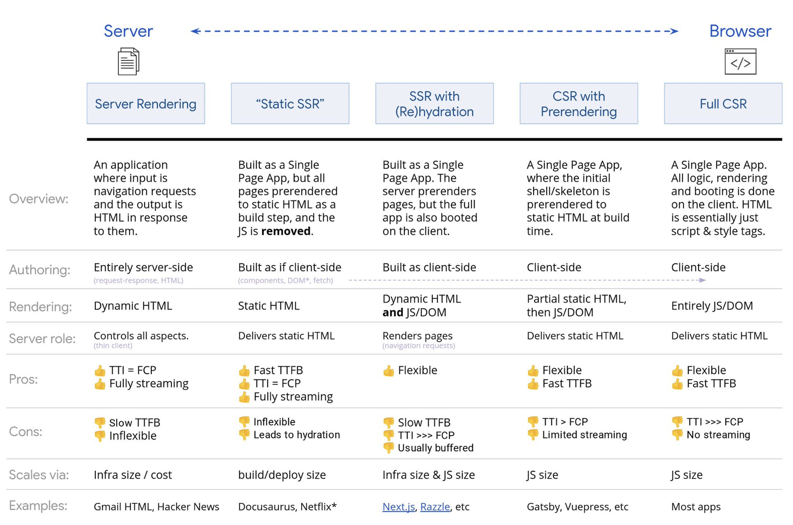
- Full Server-Side Rendering (SSR)
In classic SSR, such as WordPress, all requests are handled entirely on the server. The requested content is returned as a finished HTML page and browsers can render it right away. Hence, SSR-apps can’t really make use of the DOM APIs, for example. The gap between First Contentful Paint and Time to Interactive is usually small, and the page can be rendered right away as HTML is being streamed to the browser.This avoids additional round-trips for data fetching and templating on the client, since it’s handled before the browser gets a response. However, we end up with longer server think time and consequently Time To First Byte and we don’t make use of responsive and rich features of modern applications.
- Static Rendering
We build out the product as a single page application, but all pages are prerendered to static HTML with minimal JavaScript as a build step. That means that with static rendering, we produce individual HTML files for every possible URL ahead of time, which is something not many applications can afford. But because the HTML for a page doesn't have to be generated on the fly, we can achieve a consistently fast Time To First Byte. Thus, we can display a landing page quickly and then prefetch a SPA-framework for subsequent pages. Netflix has adopted this approach decreasing loading and Time-to-Interactive by 50%. - Server-Side Rendering With (Re)Hydration (Universal Rendering, SSR + CSR)
We can try to use the best of both worlds — the SSR and the CSR approches. With hydration in the mix, the HTML page returned from the server also contains a script that loads a fully-fledged client-side application. Ideally, that achieve a fast First Contentful Paint (like SSR) and then continue rendering with (re)hydration. Unfortunately, that's rarely the case. More often, the page does look ready but it can't respond to user's input, producing rage clicks and abandonments.With React, we can use
ReactDOMServermodule on a Node server like Express, and then call therenderToStringmethod to render the top level components as a static HTML string.With Vue.js, we can use the vue-server-renderer to render a Vue instance into HTML using
renderToString. In Angular, we can use@nguniversalto turn client requests into fully server-rendered HTML pages. A fully server-rendered experience can also be achieved out of the box with Next.js (React) or Nuxt.js (Vue).The approach has its downsides. As a result, we do gain full flexibility of client-side apps while providing faster server-side rendering, but we also end up with a longer gap between First Contentful Paint and Time To Interactive and increased First Input Delay. Rehydration is very expensive, and usually this strategy alone will not be good enough as it heavily delays Time To Interactive.
- Streaming Server-Side Rendering With Progressive Hydration (SSR + CSR)
To minimize the gap between Time To Interactive and First Contentful Paint, we render multiple requests at once and send down content in chunks as they get generated. So we don’t have to wait for the full string of HTML before sending content to the browser, and hence improve Time To First Byte.In React, instead of
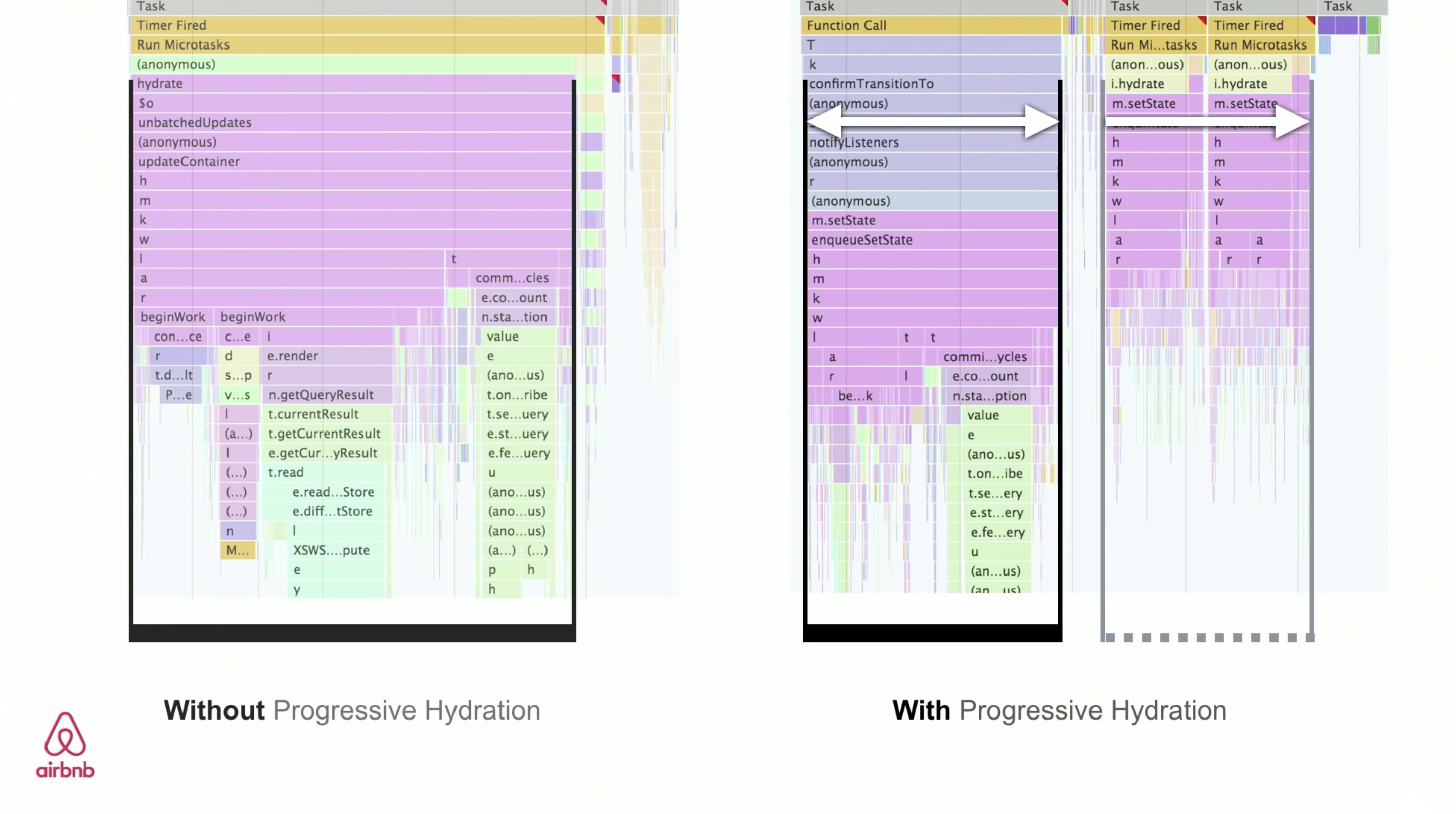
renderToString(), we can use renderToNodeStream() to pipe the response and send the HTML down in chunks. In Vue, we can use renderToStream() that can be piped and streamed. With React Suspense, we might use asynchronous rendering for that purpose, too.On the client-side, rather than booting the entire application at once, we boot up components progressively. Sections of the applications are first broken down into standalone scripts with code splitting, and then hydrated gradually (in order of our priorities). In fact, we can hydrate critical components first, while the rest could be hydrated later. The role of client-side and server-side rendering can then be defined differently per component. We can then also defer hydration of some components until they come into view, or are needed for user interaction, or when the browser is idle.
For Vue, Markus Oberlehner has published a guide on reducing Time To Interactive of SSR apps using hydration on user interaction as well as vue-lazy-hydration, an early-stage plugin that enables component hydration on visibility or specific user interaction. The Angular team works on progressive hydration with Ivy Universal. You can implement partial hydration with Preact and Next.js, too.
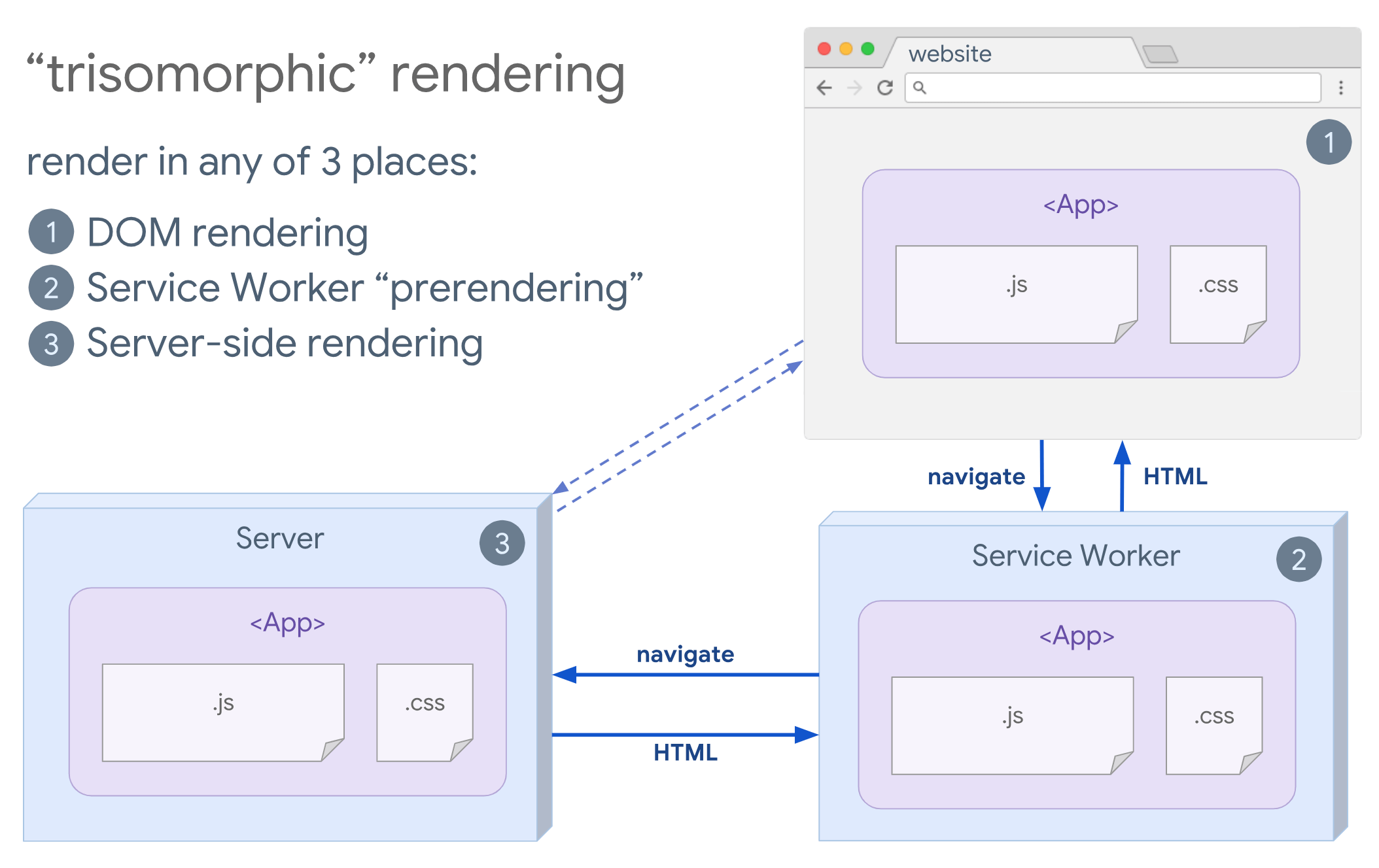
- Trisomorphic Rendering
With service workers in place, we can use streaming server rendering for initial/non-JS navigations, and then have the service worker taking on rendering of HTML for navigations after it has been installed. In that case, service worker prerenders content and enables SPA-style navigations for rendering new views in the same session. Works well when you can share the same templating and routing code between the server, client page, and service worker.
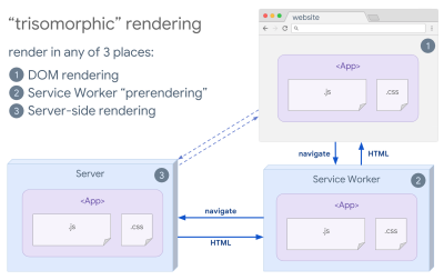
Trisomorphic rendering, with the same code rendering in any 3 places: on the server, in the DOM or in a service worker. (Image source: Google Developers) (Large preview) - CSR With Prerendering
Prerendering is similar to server-side rendering but rather than rendering pages on the server dynamically, we render the application to static HTML at build time. While static pages are fully interactive without much client-side JavaScript, prerendering works differently. Basically it captures the initial state of a client-side application as static HTML at build time, while with prerendering the application must be booted on the client for the pages to be interactive.With Next.js, we can use static HTML export by prerendering an app to static HTML. In Gatsby, an open source static site generator that uses React, uses
renderToStaticMarkupmethod instead ofrenderToStringmethod during builds, with main JS chunk being preloaded and future routes are prefetched, without DOM attributes that aren’t needed for simple static pages.For Vue, we can use Vuepress to achieve the same goal. You can also use prerender-loader with Webpack. Navi provides static rendering as well.
The result is a better Time To First Byte and First Contentful Paint, and we reduce the gap between Time To Interactive and First Contentful Paint. We can’t use the approach if the content is expected to change much. Plus, all URLs have to be known ahead of time to generate all the pages. So some components might be rendered using prerendering, but if we need something dynamic, we have to rely on the app to fetch the content.
- Full Client-Side Rendering (CSR)
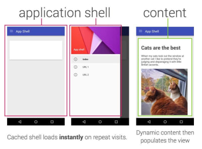
All logic, rendering and booting are done on the client. The result is usually a huge gap between Time To Interactive and First Contentful Paint. As a result, applications often feel sluggish as the entire app has to be booted on the client to render anything.As JavaScript has a performance cost, as the amount of JavaScript grow with an application, aggressive code-splitting and deferring JavaScript will be absolutely necessarily to tame the impact of JavaScript. For such cases, a server-side rendering will usually be a better approach in case not much interactivity is required. If it's not an option, consider using The App Shell Model.
In general, SSR is faster than CSR. Yet still, it’s a quite frequent implementation for many apps out there.
So, client-side or server-side? In general, it’s a good idea to limit the use of fully client-side frameworks to pages that absolutely require them. For advanced applications, it’s not a good idea to rely on server-side rendering alone either. Both server-rendering and client-rendering are a disaster if done poorly.
Whether you are leaning towards CSR or SSR, make sure that you are rendering important pixels as soon as possible and minimize the gap between that rendering and Time To Interactive. Consider prerendering if your pages don’t change much, and defer the booting of frameworks if you can. Stream HTML in chunks with server-side rendering, and implement progressive hydration for client-side rendering — and hydrate on visibility, interaction or during idle time to get the best of both worlds.
- Full Server-Side Rendering (SSR)
- How much can we serve statically?
Whether you're working on a large application or a small site, it's worth considering what content could be served statically from a CDN (i.e. JAM Stack), rather than being generated dynamically on the fly. Even if you have thousands of products and hundreds of filters with plenty of personalization options, you might still want to serve your critical landing pages statically, and decouple these pages from the framework of your choice.There are plenty of static-site generators and the pages they generate are often very fast. The more content we can pre-build ahead of time instead of generating page views on a server or client at request time, the better performance we will achieve.
In Building Partially Hydrated, Progressively Enhanced Static Websites, Markus Oberlehner shows how to build out websites with a static site generator and an SPA, while achieving progressive enhancement and a minimal JavaScript bundle size. Markus uses Eleventy and Preact as his tools, and shows how to set up the tools, add partial hydration, lazy hydration, client entry file, configure Babel for Preact and bundle Preact with Rollup — from start to finish.
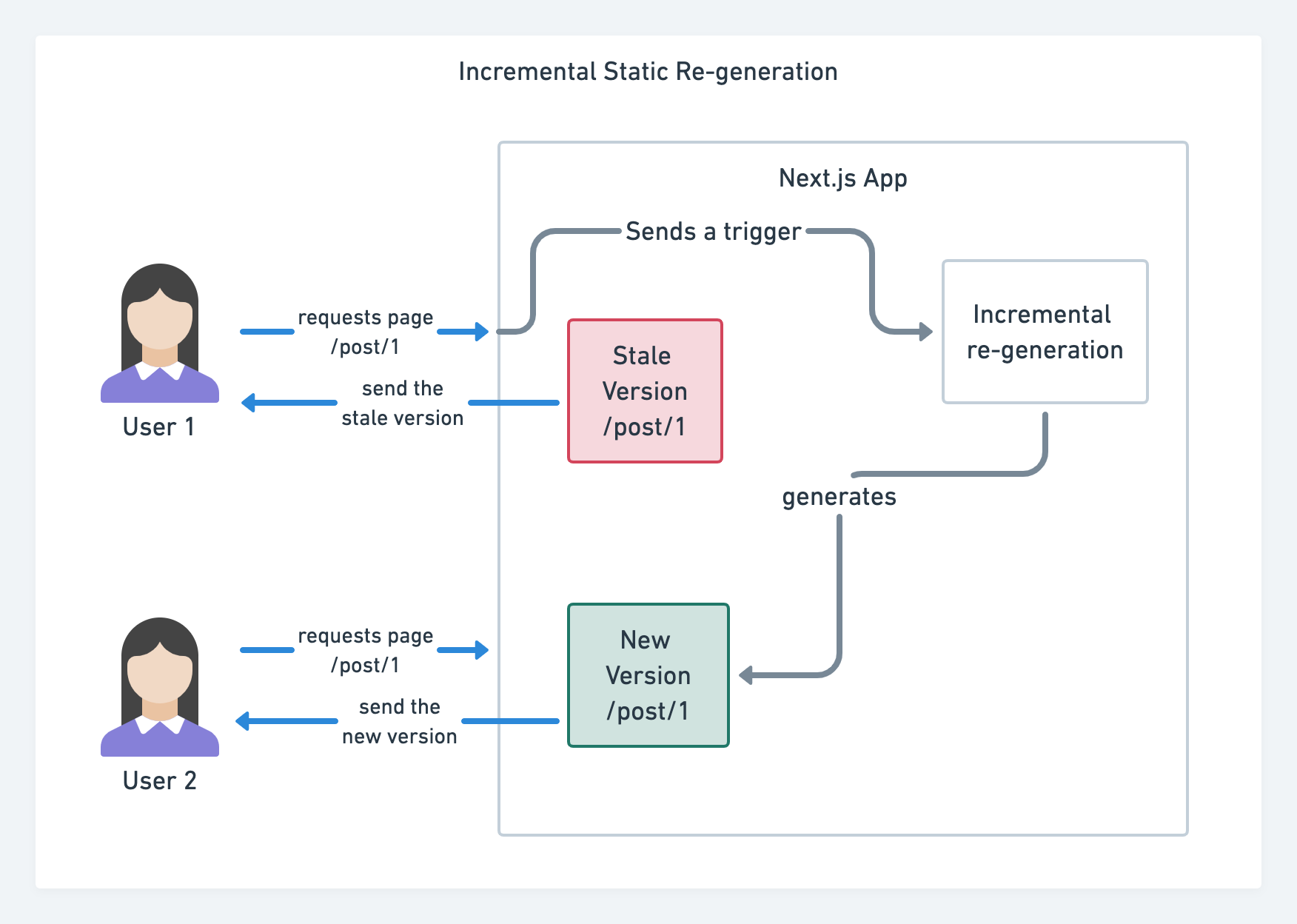
With JAMStack used on large sites these days, a new performance consideration appeared: the build time. In fact, building out even thousands of pages with every new deploy can take minutes, so it's promising to see incremental builds in Gatsby which improve build times by 60 times, with an integration into popular CMS solutions like WordPress, Contentful, Drupal, Netlify CMS and others.

Incremental static regeneration with Next.js. (Image credit: Prisma.io) (Large preview) Also, Next.js announced ahead-of-time and incremental static generation, which allows us to add new static pages at runtime and update existing pages after they've been already built, by re-rendering them in the background as traffic comes in.
Need an even more lightweight approach? In his talk on Eleventy, Alpine and Tailwind: towards a lightweight Jamstack, Nicola Goutay explains the differences between CSR, SSR and everything-in-between, and shows how to use a more lightweight approach — along with a GitHub repo that shows the approach in practice.
- Consider using PRPL pattern and app shell architecture.
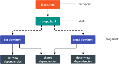
Different frameworks will have different effects on performance and will require different strategies of optimization, so you have to clearly understand all of the nuts and bolts of the framework you’ll be relying on. When building a web app, look into the PRPL pattern and application shell architecture. The idea is quite straightforward: Push the minimal code needed to get interactive for the initial route to render quickly, then use service worker for caching and pre-caching resources and then lazy-load routes that you need, asynchronously.
- Have you optimized the performance of your APIs?
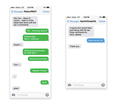
APIs are communication channels for an application to expose data to internal and third-party applications via endpoints. When designing and building an API, we need a reasonable protocol to enable the communication between the server and third-party requests. Representational State Transfer (REST) is a well-established, logical choice: it defines a set of constraints that developers follow to make content accessible in a performant, reliable and scalable fashion. Web services that conform to the REST constraints, are called RESTful web services.As with good ol' HTTP requests, when data is retrieved from an API, any delay in server response will propagate to the end user, hence delaying rendering. When a resource wants to retrieve some data from an API, it will need to request the data from the corresponding endpoint. A component that renders data from several resources, such as an article with comments and author photos in each comment, may need several roundtrips to the server to fetch all the data before it can be rendered. Furthermore, the amount of data returned through REST is often more than what is needed to render that component.
If many resources require data from an API, the API might become a performance bottleneck. GraphQL provides a performant solution to these issues. Per se, GraphQL is a query language for your API, and a server-side runtime for executing queries by using a type system you define for your data. Unlike REST, GraphQL can retrieve all data in a single request, and the response will be exactly what is required, without over or under-fetching data as it typically happens with REST.
In addition, because GraphQL is using schema (metadata that tells how the data is structured), it can already organize data into the preferred structure, so, for example, with GraphQL, we could remove JavaScript code used for dealing with state management, producing a cleaner application code that runs faster on the client.
If you want to get started with GraphQL or encounter performance issues, these articles might be quite helpful:
- A GraphQL Primer: Why We Need A New Kind Of API by Eric Baer,
- A GraphQL Primer: The Evolution Of API Design by Eric Baer,
- Designing a GraphQL server for optimal performance by Leonardo Losoviz,
- GraphQL performance explained by Wojciech Trocki.
- Will you be using AMP or Instant Articles?
Depending on the priorities and strategy of your organization, you might want to consider using Google’s AMP or Facebook’s Instant Articles or Apple’s Apple News. You can achieve good performance without them, but AMP does provide a solid performance framework with a free content delivery network (CDN), while Instant Articles will boost your visibility and performance on Facebook.The seemingly obvious benefit of these technologies for users is guaranteed performance, so at times they might even prefer AMP-/Apple News/Instant Pages-links over "regular" and potentially bloated pages. For content-heavy websites that are dealing with a lot of third-party content, these options could potentially help speed up render times dramatically.
Unless they don't. According to Tim Kadlec, for example, "AMP documents tend to be faster than their counterparts, but they don’t necessarily mean a page is performant. AMP is not what makes the biggest difference from a performance perspective."
A benefit for the website owner is obvious: discoverability of these formats on their respective platforms and increased visibility in search engines.
Well, at least that's how it used to be. As AMP is no longer a requirement for Top Stories, publishers might be moving away from AMP to a traditional stack instead (thanks, Barry!).
Still, you could build progressive web AMPs, too, by reusing AMPs as a data source for your PWA. Downside? Obviously, a presence in a walled garden places developers in a position to produce and maintain a separate version of their content, and in case of Instant Articles and Apple News without actual URLs (thanks Addy, Jeremy!).
- Choose your CDN wisely.
As mentioned above, depending on how much dynamic data you have, you might be able to "outsource" some part of the content to a static site generator, pushing it to a CDN and serving a static version from it, thus avoiding requests to the server. In fact, some of those generators are actually website compilers with many automated optimizations provided out of the box. As compilers add optimizations over time, the compiled output gets smaller and faster over time.Notice that CDNs can serve (and offload) dynamic content as well. So, restricting your CDN to static assets is not necessary. Double-check whether your CDN performs compression and conversion (e.g. image optimization and resizing at the edge), whether they provide support for servers workers, A/B testing, as well as edge-side includes, which assemble static and dynamic parts of pages at the CDN’s edge (i.e. the server closest to the user), and other tasks. Also, check if your CDN supports HTTP over QUIC (HTTP/3).
Katie Hempenius has written a fantastic guide to CDNs that provides insights on how to choose a good CDN, how to finetune it and all the little things to keep in mind when evaluating one. In general, it’s a good idea to cache content as aggressively as possible and enable CDN performance features like Brotli, TLS 1.3, HTTP/2, and HTTP/3.
Note: based on research by Patrick Meenan and Andy Davies, HTTP/2 prioritization is effectively broken on many CDNs, so be careful when choosing a CDN. Patrick has more details in his talk on HTTP/2 Prioritization (thanks, Barry!).

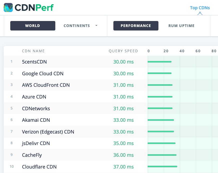
CDNPerf measures query speed for CDNs by gathering and analyzing 300 million tests every day. (Large preview) When choosing a CDN, you can use these comparison sites with a detailed overview of their features:
- CDN Comparison, a CDN comparison matrix for Cloudfront, Aazure, KeyCDN, Fastly, Verizon, Stackpach, Akamai and many others.
- CDN Perf measures query speed for CDNs by gathering and analyzing 300 million tests every day, with all results based on RUM data from users all over the world. Also check DNS Performance comparison and Cloud Peformance Comparison.
- CDN Planet Guides provides an overview of CDNs for specific topics, such as Serve Stale, Purge, Origin Shield, Prefetch and Compression.
- Web Almanac: CDN Adoption and Usage provides insights on top CDN providers, their RTT and TLS management, TLS negotiation time, HTTP/2 adoption and others. (Unfortunately, the data is only from 2019).
Assets Optimizations
- Use Brotli for plain text compression.
In 2015, Google introduced Brotli, a new open-source lossless data format, which is now supported in all modern browsers. The open sourced Brotli library, that implements an encoder and decoder for Brotli, has 11 predefined quality levels for the encoder, with higher quality level demanding more CPU in exchange for a better compression ratio. Slower compression will ultimately lead to higher compression rates, yet still, Brotli decompresses fast. It’s worth noting though that Brotli with the compression level 4 is both smaller and compresses faster than Gzip.In practice, Brotli appears to be much more effective than Gzip. Opinions and experiences differ, but if your site is already optimized with Gzip, you might be expecting at least single-digit improvements and at best double-digits improvements in size reduction and FCP timings. You can also estimate Brotli compression savings for your site.
Browsers will accept Brotli only if the user is visiting a website over HTTPS. Brotli is widely supported, and many CDNs support it (Akamai, Netlify Edge, AWS, KeyCDN, Fastly (currently only as a pass-through), Cloudflare, CDN77) and you can enable Brotli even on CDNs that don’t support it yet (with a service worker).
The catch is that because compressing all assets with Brotli at a high compression level is expensive, many hosting providers can’t use it at full scale just because of the huge cost overhead it produces. In fact, at the highest level of compression, Brotli is so slow that any potential gains in file size could be nullified by the amount of time it takes for the server to begin sending the response as it waits to dynamically compress the asset. (But if you have time during the build time with static compression, of course, higher compression settings are preferred.)
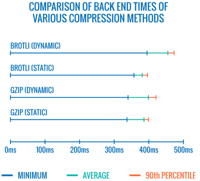
Comparison of back end times of various compression methods. Unsurprisingly, Brotli is slower than gzip (for now). (Large preview) This might be changing though. The Brotli file format includes a built-in static dictionary, and in addition to containing various strings in multiple languages, it also supports the option to apply multiple transformations to those words, increasing its versatility. In his research, Felix Hanau has discovered a way to improve the compression at levels 5 through 9 by using "a more specialized subset of the dictionary than the default" and relying on the
Content-Typeheader to tell the compressor if it should use a dictionary for HTML, JavaScript or CSS. The result was a "negligible performance impact (1% to 3% more CPU compared to 12% normally) when compressing web content at high compression levels, using a limited dictionary use approach."
With the improved dictionary approach, we can compress assets faster on higher compression levels, all while using only 1% to 3% more CPU. Normally, compression level 6 over 5 would increase CPU usage by up to 12%. (Large preview) On top of that, with Elena Kirilenko’s research, we can achieve fast and efficient Brotli recompression using previous compression artifacts. According to Elena, "once we have an asset compressed via Brotli, and we’re trying to compress dynamic content on-the-fly, where the content resembles content available to us ahead of time, we can achieve significant improvements in compression times."
How often is it the case? E.g. with delivery of JavaScript bundles subsets (e.g. when parts of the code are already cached on the client or with dynamic bundle serving with WebBundles). Or with dynamic HTML based on known-in-advance templates, or dynamically subsetted WOFF2 fonts. According to Elena, we can get 5.3% improvement on compression and 39% improvement on compression speed when removing 10% of the content, and 3.2% better compression rates and 26% faster compression, when removing 50% of the content.
Brotli compression is getting better, so if you can bypass the cost of dynamically compressing static assets, it’s definitely worth the effort. It goes without saying that Brotli can be used for any plaintext payload — HTML, CSS, SVG, JavaScript, JSON, and so on.
Note: as of early 2021, approximately 60% of HTTP responses are delivered with no text-based compression, with 30.82% compressing with Gzip, and 9.1% compressing with Brotli (both on mobile and on desktop). E.g., 23.4% of Angular pages are not compressed (via gzip or Brotli). Yet often turning on compression is one of the easiest wins to improve performance with a simple flip of a switch.
The strategy? Pre-compress static assets with Brotli+Gzip at the highest level and compress (dynamic) HTML on the fly with Brotli at level 4–6. Make sure that the server handles content negotiation for Brotli or Gzip properly.
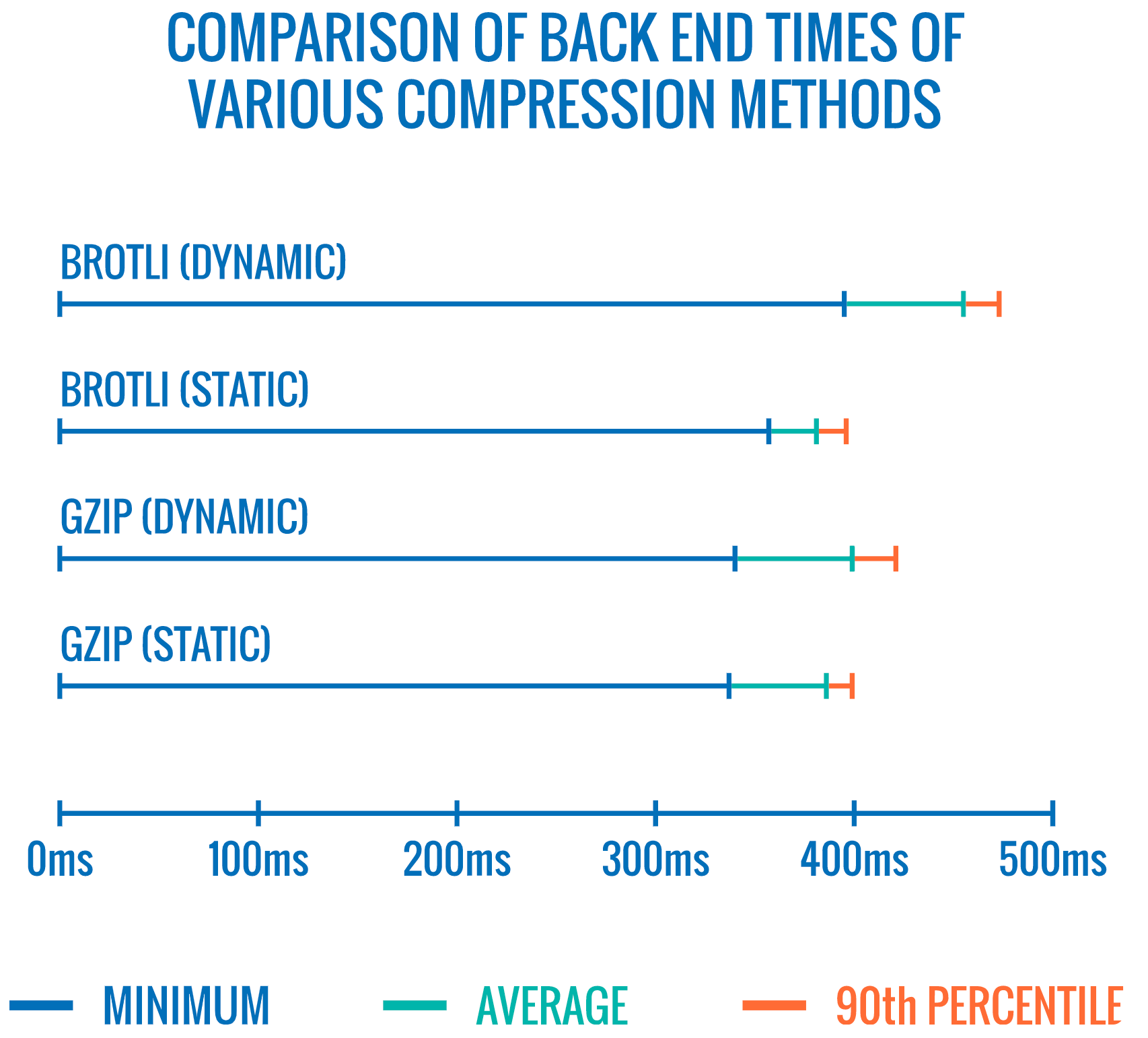

- Do we use adaptive media loading and client hints?
It’s coming from the land of old news, but it’s always a good reminder to use responsive images withsrcset,sizesand the<picture>element. Especially for sites with a heavy media footprint, we can take it a step further with adaptive media loading (in this example React + Next.js), serving light experience to slow networks and low-memory devices and full experience to fast network and high-memory devices. In the context of React, we can achieve it with client hints on the server and react-adaptive-hooks on the client.The future of responsive images might change dramatically with the wider adoption of client hints. Client hints are HTTP request header fields, e.g.
DPR,Viewport-Width,Width,Save-Data,Accept(to specify image format preferences) and others. They are supposed to inform the server about the specifics of user’s browser, screen, connection etc.As a result, the server can decide how to fill in the layout with appropriately sized images, and serve only these images in desired formats. With client hints, we move the resource selection from HTML markup and into the request-response negotiation between the client and server.

Adaptive media serving in use. We send a placeholder with text to users who are offline, a low-resolution image to 2G users, a high-resolution image to 3G users and an HD video to 4G users. Via Loading web pages fast on a $20 feature phone. (Large preview) As Ilya Grigorik noted a while back, client hints complete the picture — they aren’t an alternative to responsive images. "The
<picture>element provides the necessary art-direction control in the HTML markup. Client hints provide annotations on resulting image requests that enable resource selection automation. Service Worker provides full request and response management capabilities on the client."A service worker could, for example, append new client hints headers values to the request, rewrite the URL and point the image request to a CDN, adapt response based on connectivity and user preferences, etc. It holds true not only for image assets but for pretty much all other requests as well.
For clients that support client hints, one could measure 42% byte savings on images and 1MB+ fewer bytes for 70th+ percentile. On Smashing Magazine, we could measure 19-32% improvement, too. Client hints are supported in Chromium-based browsers, but they are still under consideration in Firefox.
However, if you supply both the normal responsive images markup and the
<meta>tag for Client Hints, then a supporting browser will evaluate the responsive images markup and request the appropriate image source using the Client Hints HTTP headers. - Do we use responsive images for background images?
We surely should! Withimage-set, now supported in Safari 14 and in most modern browsers except Firefox, we can serve responsive background images as well:background-image: url("fallback.jpg"); background-image: image-set( "photo-small.jpg" 1x, "photo-large.jpg" 2x, "photo-print.jpg" 600dpi);Basically we can conditionally serve low-resolution background images with a
1xdescriptor, and higher-resolution images with2xdescriptor, and even a print-quality image with600dpidescriptor. Beware though: browsers do not provide any special information on background images to assistive technology, so ideally these photos would be merely decoration. - Do we use WebP?
Image compression is often considered a quick win, yet it’s still heavily underutilized in practice. Of course images do not block rendering, but they contribute heavily to poor LCP scores, and very often they are just too heavy and too large for the device they are being consumed on.So at the very least, we could explore using the WebP format for our images. In fact, the WebP saga has been nearing the end last year with Apple adding support for WebP in Safari 14. So after many years of discussions and debates, as of today, WebP is supported in all modern browsers. So we can serve WebP images with the
<picture>element and a JPEG fallback if needed (see Andreas Bovens' code snippet) or by using content negotiation (usingAcceptheaders).WebP isn’t without its downsides though. While WebP image file sizes compared to equivalent Guetzli and Zopfli, the format doesn’t support progressive rendering like JPEG, which is why users might see the finished image faster with a good ol' JPEG although WebP images might be getting faster through the network. With JPEG, we can serve a "decent" user experience with the half or even quarter of the data and load the rest later, rather than have a half-empty image as it is in the case of WebP.
Your decision will depend on what you are after: with WebP, you’ll reduce the payload, and with JPEG you’ll improve perceived performance. You can learn more about WebP in WebP Rewind talk by Google’s Pascal Massimino.
For conversion to WebP, you can use WebP Converter, cwebp or libwebp. Ire Aderinokun has a very detailed tutorial on converting images to WebP, too — and so does Josh Comeau in his piece on embracing modern image formats.

A thorough talk about WebP: WebP Rewind by Pascal Massimino. (Large preview) Sketch natively supports WebP, and WebP images can be exported from Photoshop using a WebP plugin for Photoshop. But other options are available, too.
If you’re using WordPress or Joomla, there are extensions to help you easily implement support for WebP, such as Optimus and Cache Enabler for WordPress and Joomla’s own supported extension (via Cody Arsenault). You can also abstract away the
<picture>element with React, styled components or gatsby-image.Ah — shameless plug! — Jeremy Wagner even published a Smashing book on WebP which you might want to check if you are interested about everything around WebP.
- Do we use AVIF?
You might have heard the big news: AVIF has landed. It’s a new image format derived from the keyframes of AV1 video. It’s an open, royalty-free format that supports lossy and lossless compression, animation, lossy alpha channel and can handle sharp lines and solid colors (which was an issue with JPEG), while providing better results at both.In fact, compared to WebP and JPEG, AVIF performs significantly better, yielding median file size savings for up to 50% at the same DSSIM ((dis)similarity between two or more images using an algorithm approximating human vision). In fact, in his thorough post on optimizing image loading, Malte Ubl notes that AVIF "very consistently outperforms JPEG in a very significant way. This is different from WebP which doesn’t always produce smaller images than JPEG and may actually be a net-loss due to lack of support for progressive loading."
We can use AVIF as a progressive enhancement, delivering WebP or JPEG or PNG to older browsers. (Large preview). See plain text view below. Ironically, AVIF can perform even better than large SVGs although of course it shouldn’t be seen as a replacement to SVGs. It is also one of the first image formats to support HDR color support; offering higher brightness, color bit depth, and color gamuts. The only downside is that currently AVIF doesn’t support progressive image decoding (yet?) and, similarly to Brotli, a high compression rate encoding is currently quite slow, although decoding is fast.
AVIF is currently supported in Chrome, Firefox and Opera, and the support in Safari expected to be coming soon (as Apple is a member of the group that created AV1).
What’s the best way to serve images these days then? For illustrations and vector images, (compressed) SVG is undoubtedly the best choice. For photos, we use content negotiation methods with the
pictureelement. If AVIF is supported, we send an AVIF image; if it’s not the case, we fall back to WebP first, and if WebP isn’t supported either, we switch to JPEG or PNG as fallback (applying@mediaconditions if needed):<picture> <source srcset="image.avif" type="image/avif"> <source srcset="image.webp" type="image/webp"> <img src="image.jpg" alt="Photo" width="450" height="350"> </picture>Frankly, it’s more likely that we’ll be using some conditions within the
pictureelement though:<picture> <source sizes="(max-width: 608px) 100vw, 608px" srcset=" /img/Z1s3TKV-1920w.avif 1920w, /img/Z1s3TKV-1280w.avif 1280w, /img/Z1s3TKV-640w.avif 640w, /img/Z1s3TKV-320w.avif 320w" type="image/avif" /> <source sizes="(max-width: 608px) 100vw, 608px" srcset=" /img/Z1s3TKV-1920w.webp 1920w, /img/Z1s3TKV-1280w.webp 1280w, /img/Z1s3TKV-640w.webp 640w, /img/Z1s3TKV-320w.webp 320w" type="image/webp" /> <source sizes="(max-width: 608px) 100vw, 608px" srcset=" /img/Z1s3TKV-1920w.jpg 1920w, /img/Z1s3TKV-1280w.jpg 1280w, /img/Z1s3TKV-640w.jpg 640w, /img/Z1s3TKV-320w.jpg 320w" type="image/jpeg" /> <img src="fallback-image.jpg" alt="Photo" width="450" height="350"> </picture>You can go even further by swapping animated images with static images for customers who opt-in for less motion with
prefers-reduced-motion:<picture> <source media="(prefers-reduced-motion: reduce)" srcset="no-motion.avif" type="image/avif"></source> <source media="(prefers-reduced-motion: reduce)" srcset="no-motion.jpg" type="image/jpeg"></source> <source srcset="motion.avif" type="image/avif"></source> <img src="motion.jpg" alt="Animated AVIF"> </picture>Over the couple of months, AVIF has gained quite some traction:
- We can test WebP/AVIF fallbacks in the Rendering panel in DevTools.
- We can use Squoosh, AVIF.io and libavif to encode, decode, compress and convert AVIF files.
- We can use Jake Archibald’s AVIF Preact component that decodes an AVIF-file in a worker and displays the result on a canvas,
- To deliver AVIF only to supporting browsers, we can use a PostCSS plugin along with a 315B-script to use AVIF in your CSS declarations.
- We can progressively deliver new image formats with CSS and Cloudlare Workers to dynamically alter the returned HTML document, inferring information from the
acceptheader, and then add thewebp/avifetc. classes as appropriate. - AVIF is already available in Cloudinary (with usage limits), Cloudflare supports AVIF in Image Resizing, and you can enabled AVIF with Custom AVIF Headers in Netlify.
- When it comes to animation, AVIF performs as well as Safari’s
<img src=mp4>, outperforming GIF and WebP at large, but MP4 still performs better. - In general, for animations, AVC1 (h264) > HVC1 > WebP > AVIF > GIF, assuming that Chromium-based browsers will ever support
<img src=mp4>. - You can find more details about AVIF in AVIF for Next Generation Image Coding talk by Aditya Mavlankar from Netflix, and The AVIF Image Format talk by Cloudflare’s Kornel Lesiński.
- A great reference for everything AVIF: Jake Archibald’s comprehensive post on AVIF has landed.
So is the future AVIF then? Jon Sneyers disagrees: AVIF performs 60% worse than JPEG XL, another free and open format developed by Google and Cloudinary. In fact, JPEG XL seems to be performing way better across the board. However, JPEG XL is still only in the final stages of standardization, and does not yet work in any browser. (Not to mix up with Microsoft’s JPEG-XR coming from good ol' Internet Explorer 9 times).


- Are JPEG/PNG/SVGs properly optimized?
When you’re working on a landing page on which it’s critical that a hero image loads blazingly fast, make sure that JPEGs are progressive and compressed with mozJPEG (which improves the start rendering time by manipulating scan levels) or Guetzli, Google’s open-source encoder focusing on perceptual performance, and utilizing learnings from Zopfli and WebP. The only downside: slow processing times (a minute of CPU per megapixel).For PNG, we can use Pingo, and for SVG, we can use SVGO or SVGOMG. And if you need to quickly preview and copy or download all the SVG assets from a website, svg-grabber can do that for you, too.
Every single image optimization article would state it, but keeping vector assets clean and tight is always worth mentioning. Make sure to clean up unused assets, remove unnecessary metadata and reduce the number of path points in artwork (and thus SVG code). (Thanks, Jeremy!)
There are also useful online tools available though:
- Use Squoosh to compress, resize and manipulate images at the optimal compression levels (lossy or lossless),
- Use Guetzli.it to compress and optimize JPEG images with Guetzli, which works well for images with sharp edges and solid colors (but might be quite a bit slower)).
- Use the Responsive Image Breakpoints Generator or a service such as Cloudinary or Imgix to automate image optimization. Also, in many cases, using
srcsetandsizesalone will reap significant benefits. - To check the efficiency of your responsive markup, you can use imaging-heap, a command line tool that measure the efficiency across viewport sizes and device pixel ratios.
- You can add automatic image compression to your GitHub workflows, so no image can hit production uncompressed. The action uses mozjpeg and libvips that work with PNGs and JPGs.
- To optimize storage interally, you could use Dropbox’s new Lepton format for losslessly compressing JPEGs by an average of 22%.
- Use BlurHash if you’d like to show a placeholder image early. BlurHash takes an image, and gives you a short string (only 20-30 characters!) that represents the placeholder for this image. The string is short enough that it can easily be added as a field in a JSON object.
BlurHash is a tiny, compact representation of a placeholder for an image. (Large preview) Sometimes optimizing images alone won’t do the trick. To improve the time needed to start the rendering of a critical image, lazy-load less important images and defer any scripts to load after critical images have already rendered. The most bulletproof way is hybrid lazy-loading, when we utilize native lazy-loading and lazyload, a library that detects any visibility changes triggered through user interaction (with IntersectionObserver which we’ll explore later). Additionally:
- Consider preloading critical images, so a browser doesn’t discover them too late. For background images, if you want to be even more aggressive than that, you can add the image as a regular image with
<img src>, and then hide it off the screen. - Consider Swapping Images with the Sizes Attribute by specifying different image display dimensions depending on media queries, e.g. to manipulate
sizesto swap sources in a magnifier component. - Review image download inconsistencies to prevent unexpected downloads for foreground and background images. Watch out for images that are loaded by default, but might never be displayed — e.g. in carousels, accordions and image galleries.
- Make sure to always set
widthandheighton images. Watch out for theaspect-ratioproperty in CSS andintrinsicsizeattribute which will allow us to set aspect ratios and dimensions for images, so browser can reserve a pre-defined layout slot early to avoid layout jumps during the page load.
Should be just a matter of weeks or months now, with aspect-ratio landing in browsers. In Safari Technical Preview 118 already. Currently behind the flag in Firefox and Chrome. (Large preview) If you feel adventurous, you could chop and rearrange HTTP/2 streams using Edge workers, basically a real-time filter living on the CDN, to send images faster through the network. Edge workers use JavaScript streams that use chunks which you can control (basically they are JavaScript that runs on the CDN edge that can modify the streaming responses), so you can control the delivery of images.
With a service worker, it’s too late as you can’t control what’s on the wire, but it does work with Edge workers. So you can use them on top of static JPEGs saved progressively for a particular landing page.
A sample output by imaging-heap, a command line tool that measure the efficiency across viewport sizes and device pixel ratios. (Image source) (Large preview) Not good enough? Well, you can also improve perceived performance for images with the multiple background images technique. Keep in mind that playing with contrast and blurring out unnecessary details (or removing colors) can reduce file size as well. Ah, you need to enlarge a small photo without losing quality? Consider using Letsenhance.io.
These optimizations so far cover just the basics. Addy Osmani has published a very detailed guide on Essential Image Optimization that goes very deep into details of image compression and color management. For example, you could blur out unnecessary parts of the image (by applying a Gaussian blur filter to them) to reduce the file size, and eventually you might even start removing colors or turn the picture into black and white to reduce the size even further. For background images, exporting photos from Photoshop with 0 to 10% quality can be absolutely acceptable as well.
On Smashing Magazine, we use the postfix
-optfor image names — for example,brotli-compression-opt.png; whenever an image contains that postfix, everybody on the team knows that the image has already been optimized.Ah, and don’t use JPEG-XR on the web — "the processing of decoding JPEG-XRs software-side on the CPU nullifies and even outweighs the potentially positive impact of byte size savings, especially in the context of SPAs" (not to mix up with Cloudinary/Google’s JPEG XL though).


- Are videos properly optimized?
We covered images so far, but we’ve avoided a conversation about good ol' GIFs. Despite our love for GIFs, it’s really the time to abandon them for good (at least in our websites and apps). Instead of loading heavy animated GIFs which impact both rendering performance and bandwidth, it’s a good idea to switch either to animated WebP (with GIF being a fallback) or replace them with looping HTML5 videos altogether.Unlike with images, browsers do not preload
<video>content, but HTML5 videos tend to be much lighter and smaller than GIFs. Not an option? Well, at least we can add lossy compression to GIFs with Lossy GIF, gifsicle or giflossy.Tests by Colin Bendell show that inline videos within
imgtags in Safari Technology Preview display at least 20× faster and decode 7× faster than the GIF equivalent, in addition to being a fraction in file size. However, it’s not supported in other browsers.In the land of good news, video formats have been advancing massively over the years. For a long time, we had hoped that WebM would become the format to rule them all, and WebP (which is basically one still image inside of the WebM video container) will become a replacement for dated image formats. Indeed, Safari is now supporting WebP, but despite WebP and WebM gaining support these days, the breakthrough didn’t really happen.
Still, we could use WebM for most modern browsers out there:
<!-- By Houssein Djirdeh. https://web.dev/replace-gifs-with-videos/ -->
<!-- A common scenartio: MP4 with a WEBM fallback. -->
<video autoplay loop muted playsinline>
  <source src="my-animation.webm" type="video/webm">
  <source src="my-animation.mp4" type="video/mp4">
</video>
But perhaps we could revisit it altogether. In 2018, the Alliance of Open Media has released a new promising video format called AV1. AV1 has compression similar to the H.265 codec (the evolution of H.264) but unlike the latter, AV1 is free. The H.265 license pricing pushed browser vendors to adopt a comparably performant AV1 instead: AV1 (just like H.265) compresses twice as good as WebM.

AV1 has good chances of becoming the ultimate standard for video on the web. (Image credit: Wikimedia.org) (Large preview) In fact, Apple currently uses HEIF format and HEVC (H.265), and all the photos and videos on the latest iOS are saved in these formats, not JPEG. While HEIF and HEVC (H.265) aren’t properly exposed to the web (yet?), AV1 is — and it’s gaining browser support. So adding the
AV1source in your<video>tag is reasonable, as all browser vendors seem to be on board.For now, the most widely used and supported encoding is H.264, served by MP4 files, so before serving the file, make sure that your MP4s are processed with a multipass-encoding, blurred with the frei0r iirblur effect (if applicable) and moov atom metadata is moved to the head of the file, while your server accepts byte serving. Boris Schapira provides exact instructions for FFmpeg to optimize videos to the maximum. Of course, providing WebM format as an alternative would help, too.
Need to start rendering videos faster but video files are still too large? For example, whenever hou have a large background video on a landing page? A common technique to use is to show the very first frame as a still image first, or display a heavily optimized, short looping segment that could be interpreted as a part of the video, and then, whenever the video is buffered enough, start playing the actual video. Doug Sillars has a written a detailed guide to background video performance that could be helpful in that case. (Thanks, Guy Podjarny!).
For the above scenario, you might want to provide responsive poster images. By default,
videoelements only allow one image as the poster, which isn’t necessarily optimal. We can use Responsive Video Poster, a JavaScript library that allows you to use different poster images for different screens, while also adding a transitioning overlay and full styling control of video placeholders.The research shows that video stream quality impacts viewer behavior. In fact, viewers start to abandon the video if the startup delay exceeds about 2 seconds. Beyond that point, a 1-second increase in delay results in roughly a 5.8% increase in abandonment rate. So it’s not surprising that the median video start time is 12.8s, with 40% of videos having at least 1 stall, and 20% at least 2s of stalled video playback. In fact, video stalls are unavoidable on 3G as videos play back faster than the network can supply content.
So, what’s the solution? Usually small screen devices cannot handle the 720p and 1080p we are serving the desktop. According to Doug Sillars, we can either create smaller versions of our videos, and use Javascript to detect the source for smaller screens to ensure a fast and smooth playback on these devices. Alternatively, we can use streaming video. HLS video streams will deliver an appropriately sized video to the device — abstracting the need to create different videos for different screens. It will also negotiate the network speed, and adapt the video bitrate for the speed of the network you are using.
To avoid the waste on bandwidth, we could only add the video source for devices that actually can play the video well. Alternatively, we can remove the
autoplayattribute from thevideotag altogether and use JavaScript to insertautoplayfor larger screens. Additionally, we need to addpreload="none"onvideoto tell the browser to not download any of the video files until it actually needs the file:<!-- Based on Doug Sillars's post. https://dougsillars.com/2020/01/06/hiding-videos-on-the-mbile-web/ --> <video id="hero-video" preload="none" playsinline muted loop width="1920" height="1080" poster="poster.jpg"> <source src="video.webm" type="video/webm"> <source src="video.mp4" type="video/mp4"> </video>Then we can target specifically browsers that actually support AV1:
<!-- Based on Doug Sillars's post. https://dougsillars.com/2020/01/06/hiding-videos-on-the-mbile-web/ -->
<video id="hero-video"
          preload="none"
          playsinline
          muted
          loop
          width="1920"
          height="1080"
          poster="poster.jpg">
<source src="video.av1.mp4" type="video/mp4; codecs=av01.0.05M.08">
<source src="video.hevc.mp4" type="video/mp4; codecs=hevc">
<source src="video.webm" type="video/webm">
<source src="video.mp4" type="video/mp4">
</video>
We then could re-add the
autoplayover a certain threshold (e.g. 1000px):/* By Doug Sillars. https://dougsillars.com/2020/01/06/hiding-videos-on-the-mbile-web/ */ <script> window.onload = addAutoplay(); var videoLocation = document.getElementById("hero-video"); function addAutoplay() { if(window.innerWidth > 1000){ videoLocation.setAttribute("autoplay",""); }; } </script>
Number of Stalls by device and network speed. Faster devices on faster networks have virtually no stalls. According to Doug Sillars’ research. (Large preview) Video playback performance is a story on its own, and if you’d like to dive into it in details, take a look at another Doug Sillars' series on The Current State of Video and Video Delivery Best Practices that include details on video delivery metrics, video preloading, compression and streaming. Finally, you can check how slow or fast your video streaming will be with Stream or Not.
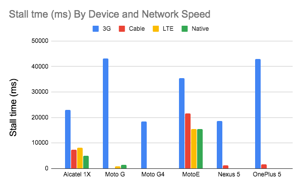
- Is web font delivery optimized?
The first question that’s worth asking is if we can get away with using UI system fonts in the first place — we just need to make sure to double check that they appear correctly on various platforms. If it’s not the case, chances are high that the web fonts we are serving include glyphs and extra features and weights that aren’t being used. We can ask our type foundry to subset web fonts or if we are using open-source fonts, subset them on our own with Glyphhanger or Fontsquirrel. We can even automate our entire workflow with Peter Müller’s subfont, a command line tool that statically analyses your page in order to generate the most optimal web font subsets, and then inject them into our pages.WOFF2 support is great, and we can use WOFF as fallback for browsers that don’t support it — or perhaps legacy browsers could be served system fonts. There are many, many, many options for web font loading, and we can choose one of the strategies from Zach Leatherman’s "Comprehensive Guide to Font-Loading Strategies," (code snippets also available as Web font loading recipes).
Probably the better options to consider today are Critical FOFT with
preloadand "The Compromise" method. Both of them use a two-stage render for delivering web fonts in steps — first a small supersubset required to render the page fast and accurately with the web font, and then load the rest of the family async. The difference is that "The Compromise" technique loads polyfill asynchronously only if font load events are not supported, so you don’t need to load the polyfill by default. Need a quick win? Zach Leatherman has a quick 23-min tutorial and case study to get your fonts in order.In general, it might be a good idea to use the
preloadresource hint to preload fonts, but in your markup include the hints after the link to critical CSS and JavaScript. Withpreload, there is a puzzle of priorities, so consider injectingrel="preload"elements into the DOM just before the external blocking scripts. According to Andy Davies, "resources injected using a script are hidden from the browser until the script executes, and we can use this behaviour to delay when the browser discovers thepreloadhint." Otherwise, font loading will cost you in the first render time.
When everything is critical, nothing is critical. preload only one or a maximum of two fonts of each family. (Image credit: Zach Leatherman – slide 93) (Large preview) It’s a good idea to be selective and choose files that matter most, e.g. the ones that are critical for rendering or that would help you avoiding visible and disruptive text reflows. In general, Zach advises to preload one or two fonts of each family — it also makes sense to delay some font loading if they are less critical.
It has become quite common to use
local()value (which refers to a local font by name) when defining afont-familyin the@font-facerule:/* Warning! Not a good idea! */ @font-face { font-family: Open Sans; src: local('Open Sans Regular'), local('OpenSans-Regular'), url('opensans.woff2') format ('woff2'), url('opensans.woff') format('woff'); }The idea is reasonable: some popular open-source fonts such as Open Sans are coming pre-installed with some drivers or apps, so if the font is available locally, the browser doesn’t need to download the web font and can display the local font immediately. As Bram Stein noted, "though a local font matches the name of a web font, it most likely isn’t the same font. Many web fonts differ from their "desktop" version. The text might be rendered differently, some characters may fall back to other fonts, OpenType features can be missing entirely, or the line height may be different."
Also, as typefaces evolve over time, the locally installed version might be very different from the web font, with characters looking very different. So, according to Bram, it’s better to never mix locally installed fonts and web fonts in
@font-facerules. Google Fonts has followed suit by disablinglocal()on the CSS results for all users, other than Android requests for Roboto.Nobody likes waiting for the content to be displayed. With the
font-displayCSS descriptor, we can control the font loading behavior and enable content to be readable immediately (withfont-display: optional) or almost immediately (with a timeout of 3s, as long as the font gets successfully downloaded — withfont-display: swap). (Well, it’s a bit more complicated than that.)However, if you want to minimize the impact of text reflows, we could use the Font Loading API (supported in all modern browsers). Specifically that means for every font, we’d creata a
FontFaceobject, then try to fetch them all, and only then apply them to the page. This way, we group all repaints by loading all fonts asynchronously, and then switch from fallback fonts to the web font exactly once. Take a look at Zach’s explanation, starting at 32:15, and the code snippet):/* Load two web fonts using JavaScript */ /* Zach Leatherman: https://noti.st/zachleat/KNaZEg/the-five-whys-of-web-font-loading-performance#sWkN4u4 */ // Remove existing @font-face blocks // Create two let font = new FontFace("Noto Serif", /* ... */); let fontBold = new FontFace("Noto Serif, /* ... */); // Load two fonts let fonts = await Promise.all([ font.load(), fontBold.load() ]) // Group repaints and render both fonts at the same time! fonts.forEach(font => documents.fonts.add(font));To initiate a very early fetch of the fonts with Font Loading API in use, Adrian Bece suggests to add a non-breaking space
nbsp;at the top of thebody, and hide it visually witharia-visibility: hiddenand a.hiddenclass:<body class="no-js"> <!-- ... Website content ... --> <div aria-visibility="hidden" class="hidden" style="font-family: '[web-font-name]'"> <!-- There is a non-breaking space here --> </div> <script> document.getElementsByTagName("body")[0].classList.remove("no-js"); </script> </body>This goes along with CSS that has different font families declared for different states of loading, with the change triggered by Font Loading API once the fonts have successfully loaded:
body:not(.wf-merriweather--loaded):not(.no-js) {
  font-family: [fallback-system-font];
  /* Fallback font styles */
}

.wf-merriweather--loaded,
.no-js {
  font-family: "[web-font-name]";
  /* Webfont styles */
}

/* Accessible hiding */
.hidden {
  position: absolute;
  overflow: hidden;
  clip: rect(0 0 0 0);
  height: 1px;
  width: 1px;
  margin: -1px;
  padding: 0;
  border: 0;
}
If you ever wondered why despite all your optimizations, Lighthouse still suggests to eliminate render-blocking resources (fonts), in the same article Adrian Bece provides a few techniques to make Lighthouse happy, along with a Gatsby Omni Font Loader, a performant asynchronous font loading and Flash Of Unstyled Text (FOUT) handling plugin for Gatsby.
Now, many of us might be using a CDN or a third-party host to load web fonts from. In general, it’s always better to self-host all your static assets if you can, so consider using google-webfonts-helper, a hassle-free way to self-host Google Fonts. And if it’s not possible, you can perhaps proxy the Google Font files through the page origin.
It's worth noting though that Google is doing quite a bit of work out of the box, so a server might need a bit of tweaking to avoid delays (thanks, Barry!)
This is quite important especially as since Chrome v86 (released October 2020), cross-site resources like fonts can’t be shared on the same CDN anymore — due to the partitioned browser cache. This behavior was a default in Safari for years.
But if it’s not possible at all, there is a way to get to the fastest possible Google Fonts with Harry Roberts' snippet:
<!-- By Harry Roberts.
https://csswizardry.com/2020/05/the-fastest-google-fonts/

- 1. Preemptively warm up the fonts’ origin.
- 2. Initiate a high-priority, asynchronous fetch for the CSS file. Works in
-    most modern browsers.
- 3. Initiate a low-priority, asynchronous fetch that gets applied to the page
-    only after it’s arrived. Works in all browsers with JavaScript enabled.
- 4. In the unlikely event that a visitor has intentionally disabled
-    JavaScript, fall back to the original method. The good news is that,
-    although this is a render-blocking request, it can still make use of the
-    preconnect which makes it marginally faster than the default.
-->

<!-- [1] -->
<link rel="preconnect"
      href="https://fonts.gstatic.com"
      crossorigin />

<!-- [2] -->
<link rel="preload"
      as="style"
      href="$CSS&display=swap" />

<!-- [3] -->
<link rel="stylesheet"
      href="$CSS&display=swap"
      media="print" onload="this.media='all'" />

<!-- [4] -->
<noscript>
  <link rel="stylesheet"
        href="$CSS&display=swap" />
</noscript>
Harry’s strategy is to pre-emptively warm up the fonts’ origin first. Then we initiate a high-priority, asynchronous fetch for the CSS file. Afterwards, we initiate a low-priority, asynchronous fetch that gets applied to the page only after it’s arrived (with a print stylesheet trick). Finally, if JavaScript isn’t supported, we fall back to the original method.
Ah, talking about Google Fonts: you can shave up to 90% of the size of Google Fonts requests by declaring only characters you need with `&text`. Plus, the support for font-display was added recently to Google Fonts as well, so we can use it out of the box.
A quick word of caution though. If you use
font-display: optional, it might be suboptimal to also usepreloadas it will trigger that web font request early (causing network congestion if you have other critical path resources that need to be fetched). Usepreconnectfor faster cross-origin font requests, but be cautious withpreloadas preloading fonts from a different origin wlll incur network contention. All of these techniques are covered in Zach’s Web font loading recipes.On the other hand, it might be a good idea to opt out of web fonts (or at least second stage render) if the user has enabled Reduce Motion in accessibility preferences or has opted in for Data Saver Mode (see
Save-Dataheader), or when the user has a slow connectivity (via Network Information API).We can also use the
prefers-reduced-dataCSS media query to not define font declarations if the user has opted into data-saving mode (there are other use-cases, too). The media query would basically expose if theSave-Datarequest header from the Client Hint HTTP extension is on/off to allow for usage with CSS. Currently supported only in Chrome and Edge behind a flag.Metrics? To measure the web font loading performance, consider the All Text Visible metric (the moment when all fonts have loaded and all content is displayed in web fonts), Time to Real Italics as well as Web Font Reflow Count after first render. Obviously, the lower both metrics are, the better the performance is.
What about variable fonts, you might ask? It’s important to notice that variable fonts might require a significant performance consideration. They give us a much broader design space for typographic choices, but it comes at the cost of a single serial request opposed to a number of individual file requests.
While variable fonts drastically reduce the overall combined file size of font files, that single request might be slow, blocking the rendering of all content on a page. So subsetting and splitting the font into character sets still matter. On the good side though, with a variable font in place, we’ll get exactly one reflow by default, so no JavaScript will be required to group repaints.
Now, what would make a bulletproof web font loading strategy then? Subset fonts and prepare them for the 2-stage-render, declare them with a
font-displaydescriptor, use Font Loading API to group repaints and store fonts in a persistent service worker’s cache. On the first visit, inject the preloading of scripts just before the blocking external scripts. You could fall back to Bram Stein’s Font Face Observer if necessary. And if you’re interested in measuring the performance of font loading, Andreas Marschke explores performance tracking with Font API and UserTiming API.Finally, don’t forget to include
unicode-rangeto break down a large font into smaller language-specific fonts, and use Monica Dinculescu’s font-style-matcher to minimize a jarring shift in layout, due to sizing discrepancies between the fallback and the web fonts.Alternatively, to emulate a web font for a fallback font, we can use @font-face descriptors to override font metrics (demo, enabled in Chrome 87). (Note that adjustments are complicated with complicated font stacks though.)
Does the future look bright? With progressive font enrichment, eventually we might be able to "download only the required part of the font on any given page, and for subsequent requests for that font to dynamically ‘patch’ the original download with additional sets of glyphs as required on successive page views", as Jason Pamental explains it. Incremental Transfer Demo is already available, and it’s work in progress.

Build Optimizations
- Have we defined our priorities?
It’s a good idea to know what you are dealing with first. Run an inventory of all of your assets (JavaScript, images, fonts, third-party scripts and "expensive" modules on the page, such as carousels, complex infographics and multimedia content), and break them down in groups.Set up a spreadsheet. Define the basic core experience for legacy browsers (i.e. fully accessible core content), the enhanced experience for capable browsers (i.e. an enriched, full experience) and the extras (assets that aren’t absolutely required and can be lazy-loaded, such as web fonts, unnecessary styles, carousel scripts, video players, social media widgets, large images). Years ago, we published an article on "Improving Smashing Magazine’s Performance," which describes this approach in detail.
When optimizing for performance we need to reflect our priorities. Load the core experience immediately, then enhancements, and then the extras.
- Do you use native JavaScript modules in production?
Remember the good ol' cutting-the-mustard technique to send the core experience to legacy browsers and an enhanced experience to modern browsers? An updated variant of the technique could use ES2017+script type="module", also known as module/nomodule pattern (also introduced by Jeremy Wagner as differential serving). The idea is to compile and serve two separate JavaScript bundles: the “regular” build, the one with Babel-transforms and polyfills and serve them only to legacy browsers that actually need them, and another bundle (same functionality) that has no transforms or polyfills. As a result, we help reduce blocking of the main thread by reducing the amount of scripts the browser needs to process. Jeremy Wagner has published a comprehensive article on differential serving and how to set it up in your build pipeline, from setting up Babel, to what tweaks you’ll need to make in Webpack, as well as the benefits of doing all this work.Native JavaScript module scripts are deferred by default, so while HTML parsing is happening, the browser will download the main module.

Native JavaScript modules are deferred by default. Pretty much everything about native JavaScript modules. (Large preview) One note of warning though: the module/nomodule pattern can backfire on some clients, so you might want to consider a workaround: Jeremy’s less risky differential serving pattern which, however, sidesteps the preload scanner, which could affect performance in ways one might not anticipate. (thanks, Jeremy!)
In fact, Rollup supports modules as an output format, so we can both bundle code and deploy modules in production. Parcel has module support in Parcel 2. For Webpack, module-nomodule-plugin automates the generation of module/nomodule scripts.
Note: It’s worth stating that feature detection alone isn’t enough to make an informed decision about the payload to ship to that browser. On its own, we can’t deduce device capability from browser version. For example, cheap Android phones in developing countries mostly run Chrome and will cut the mustard despite their limited memory and CPU capabilities.
Eventually, using the Device Memory Client Hints Header, we’ll be able to target low-end devices more reliably. At the moment of writing, the header is supported only in Blink (it goes for client hints in general). Since Device Memory also has a JavaScript API which is available in Chrome, one option could be to feature detect based on the API, and fall back to module/nomodule pattern if it’s not supported (thanks, Yoav!).
- Are you using tree-shaking, scope hoisting and code-splitting?
Tree-shaking is a way to clean up your build process by only including code that is actually used in production and eliminate unused imports in Webpack. With Webpack and Rollup, we also have scope hoisting that allows both tools to detect whereimportchaining can be flattened and converted into one inlined function without compromising the code. With Webpack, we can also use JSON Tree Shaking as well.Code-splitting is another Webpack feature that splits your codebase into "chunks" that are loaded on demand. Not all of the JavaScript has to be downloaded, parsed and compiled right away. Once you define split points in your code, Webpack can take care of the dependencies and outputted files. It enables you to keep the initial download small and to request code on demand when requested by the application. Alexander Kondrov has a fantastic introduction to code-splitting with Webpack and React.
Consider using preload-webpack-plugin that takes routes you code-split and then prompts browser to preload them using
<link rel="preload">or<link rel="prefetch">. Webpack inline directives also give some control overpreload/prefetch. (Watch out for prioritization issues though.)Where to define split points? By tracking which chunks of CSS/JavaScript are used, and which aren’t used. Umar Hansa explains how you can use Code Coverage from Devtools to achieve it.
When dealing with single-page applications, we need some time to initialize the app before we can render the page. Your setting will require your custom solution, but you could watch out for modules and techniques to speed up the initial rendering time. For example, here’s how to debug React performance and eliminate common React performance issues, and here’s how to improve performance in Angular. In general, most performance issues come from the initial time to bootstrap the app.
So, what’s the best way to code-split aggressively, but not too aggressively? According to Phil Walton, "in addition to code-splitting via dynamic imports, [we could] also use code-splitting at the package level, where each imported node modules get put into a chunk based on its package’s name." Phil provides a tutorial on how to build it as well.
- Can we improve Webpack's output?
As Webpack is often considered to be mysterious, there are plenty of Webpack plugins that may come in handy to further reduce Webpack's output. Below are some of the more obscure ones that might need a bit more attention.One of the interesting ones comes from Ivan Akulov's thread. Imagine that you have a function that you call once, store its result in a variable, and then don’t use that variable. Tree-shaking will remove the variable, but not the function, because it might be used otherwise. However, if the function isn't used anywhere, you might want to remove it. To do so, prepend the function call with
/*#__PURE__*/which is supported by Uglify and Terser — done!
To remove such a function when its result is not used, prepend the function call with /*#__PURE__*/. Via Ivan Akulov.(Large preview)Here are some of the other tools that Ivan recommends:
- purgecss-webpack-plugin removes unused classes, especially when you are using Bootstrap or Tailwind.
- Enable
optimization.splitChunks: 'all'with split-chunks-plugin. This would make webpack automatically code-split your entry bundles for better caching. - Set
optimization.runtimeChunk: true. This would move webpack’s runtime into a separate chunk — and would also improve caching. - google-fonts-webpack-plugin downloads font files, so you can serve them from your server.
- workbox-webpack-plugin allows you to generate a service worker with a precaching setup for all of your webpack assets. Also, check Service Worker Packages, a comprehensive guide of modules that could be applied right away. Or use preload-webpack-plugin to generate
preload/prefetchfor all JavaScript chunks. - speed-measure-webpack-plugin measures your webpack build speed, providing insights into which steps of the build process are most time-consuming.
- duplicate-package-checker-webpack-plugin warns when your bundle contains multiple versions of the same package.
- Use scope isolation and shorten CSS class names dynamically at the compilation time.

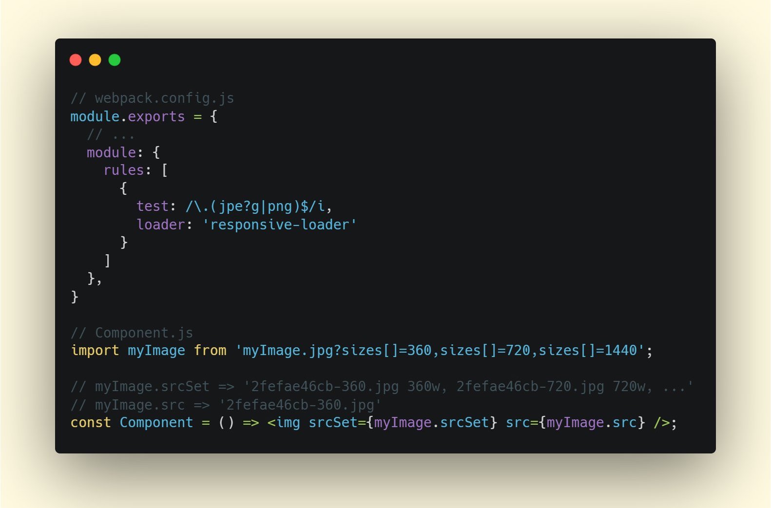
- Can you offload JavaScript into a Web Worker?
To reduce the negative impact to Time-to-Interactive, it might be a good idea to look into offloading heavy JavaScript into a Web Worker.As the code base keeps growing, the UI performance bottlenecks will show up, slowing down the user’s experience. That’s because DOM operations are running alongside your JavaScript on the main thread. With web workers, we can move these expensive operations to a background process that’s running on a different thread. Typical use cases for web workers are prefetching data and Progressive Web Apps to load and store some data in advance so that you can use it later when needed. And you could use Comlink to streamline the communication between the main page and the worker. Still some work to do, but we are getting there.
There are a few interesting case studies around web workers which show different approaches of moving framework and app logic to web workers. The conclusion: in general, there are still some challenges, but there are some good use cases already (thanks, Ivan Akulov!).
Starting from Chrome 80, a new mode for web workers with performance benefits of JavaScript modules has been shipped, called module workers. We can change script loading and execution to match
script type="module", plus we can also use dynamic imports for lazy-loading code without blocking execution of the worker.How to get started? Here are a few resources that are worth looking into:
- Surma has published an excellent guide on how to run JavaScript off the browser’s main thread and also When should you be using Web Workers?
- Also, check Surma's talk about off the main thread architecture.
- A Quest to Guarantee Responsiveness by Shubhie Panicker and Jason Miller provide a detailed insight into how to use web workers, and when to avoid them.
- Getting Out of Users' Way: Less Jank With Web Workers highlights useful patterns for working with Web Workers, effective ways to communicate between workers, handle complex data processing off the main thread, and test and debug them.
- Workerize allows you to move a module into a Web Worker, automatically reflecting exported functions as asynchronous proxies.
- If you’re using Webpack, you could use workerize-loader. Alternatively, you could use worker-plugin as well.
Use web workers when code blocks for a long time, but avoid them when you rely on the DOM, handle input response and need minimal delay. (via Addy Osmani) (Large preview) Note that Web Workers don’t have access to the DOM because the DOM is not "thread-safe", and the code that they execute needs to be contained in a separate file.
- Can you offload "hot paths" to WebAssembly?
We could offload computationally heavy tasks off to WebAssembly (WASM), a binary instruction format, designed as a portable target for compilation of high-level languages like C/C++/Rust. Its browser support is remarkable, and it has recently become viable as function calls between JavaScript and WASM are getting faster. Plus, it’s even supported on Fastly’s edge cloud.Of course, WebAssembly isn’t supposed to replace JavaScript, but it can complement it in cases when you notice CPU hogs. For most web apps, JavaScript is a better fit, and WebAssembly is best used for computationally intensive web apps, such as games.
If you’d like to learn more about WebAssembly:
- Lin Clark has written a thorough series to WebAssembly and Milica Mihajlija provides a general overview of how to run native code in the browser, why you might want to do that, and what it all means for JavaScript and the future of web development.
- How We Used WebAssembly To Speed Up Our Web App By 20X (Case Study) highlights a case study of how slow JavaScript calculations were replaced with compiled WebAssembly and brought significant performance improvements.
- Patrick Hamann has been speaking about the growing role of WebAssembly, and he’s debunking some myths about WebAssembly, explores its challenges and we can use it practically in applications today.
- Google Codelabs provides an Introduction to WebAssembly, a 60 min course in which you’ll learn how to take native code—in C and compile it to WebAssembly, and then call it directly from JavaScript.
- Alex Danilo has explained WebAssembly and how it works at his Google I/O talk. Also, Benedek Gagyi shared a practical case study on WebAssembly, specifically how the team uses it as output format for their C++ codebase to iOS, Android and the website.
Still not sure about when to use Web Workers, Web Assembly, streams, or perhaps WebGL JavaScript API to access the GPU? Accelerating JavaScript is a short but helpful guide that explains when to use what, and why — also with a handy flowchart and plenty of useful resources.


- Do we serve legacy code only to legacy browsers?
With ES2017 being remarkably well supported in modern browsers, we can usebabelEsmPluginto only transpile ES2017+ features unsupported by the modern browsers you are targeting.Houssein Djirdeh and Jason Miller have recently published a comprehensive guide on how to transpile and serve modern and legacy JavaScript, going into details of making it work with Webpack and Rollup, and the tooling needed. You can also estimate how much JavaScript you can shave off on your site or app bundles.
JavaScript modules are supported in all major browsers, so use use
script type="module"to let browsers with ES module support load the file, while older browsers could load legacy builds withscript nomodule.These days we can write module-based JavaScript that runs natively in the browser, without transpilers or bundlers.
<link rel="modulepreload">header provides a way to initiate early (and high-priority) loading of module scripts. Basically, it’s a nifty way to help in maximizing bandwidth usage, by telling the browser about what it needs to fetch so that it’s not stuck with anything to do during those long roundtrips. Also, Jake Archibald has published a detailed article with gotchas and things to keep in mind with ES Modules that’s worth reading.

- Identify and rewrite legacy code with incremental decoupling.
Long-living projects have a tendency to gather dust and dated code. Revisit your dependencies and assess how much time would be required to refactor or rewrite legacy code that has been causing trouble lately. Of course, it’s always a big undertaking, but once you know the impact of the legacy code, you could start with incremental decoupling.First, set up metrics that tracks if the ratio of legacy code calls is staying constant or going down, not up. Publicly discourage the team from using the library and make sure that your CI alerts developers if it’s used in pull requests. polyfills could help transition from legacy code to rewritten codebase that uses standard browser features.
- Identify and remove unused CSS/JS.
CSS and JavaScript code coverage in Chrome allows you to learn which code has been executed/applied and which hasn't. You can start recording the coverage, perform actions on a page, and then explore the code coverage results. Once you’ve detected unused code, find those modules and lazy load withimport()(see the entire thread). Then repeat the coverage profile and validate that it’s now shipping less code on initial load.You can use Puppeteer to programmatically collect code coverage. Chrome allows you to export code coverage results, too. As Andy Davies noted, you might want to collect code coverage for both modern and legacy browsers though.
There are many other use-cases and tools for Puppetter that might need a bit more exposure:
- Use-cases for Puppeteer, such as, for example, automatic visual diffing or monitoring unused CSS with every build,
- Web performance recipes with Puppeteer,
- Useful tooling for recording and generating Pupeeteer and Playwright scripts,
- Plus, you can even record tests right in DevTools,
- Comprehensive overview of Puppeteer by Nitay Neeman, with examples and use cases.
We can use Puppeteer Recorder and Puppeteer Sandbox to record browser interaction and generate Puppeteer and Playwright scripts. (Large preview) Furthermore, purgecss, UnCSS and Helium can help you remove unused styles from CSS. And if you aren’t certain if a suspicious piece of code is used somewhere, you can follow Harry Roberts' advice: create a 1×1px transparent GIF for a particular class and drop it into a
dead/directory, e.g./assets/img/dead/comments.gif.After that, you set that specific image as a background on the corresponding selector in your CSS, sit back and wait for a few months if the file is going to appear in your logs. If there are no entries, nobody had that legacy component rendered on their screen: you can probably go ahead and delete it all.
For the I-feel-adventurous-department, you could even automate gathering on unused CSS through a set of pages by monitoring DevTools using DevTools.

- Trim the size of your JavaScript bundles.
As Addy Osmani noted, there’s a high chance you’re shipping full JavaScript libraries when you only need a fraction, along with dated polyfills for browsers that don’t need them, or just duplicate code. To avoid the overhead, consider using webpack-libs-optimizations that removes unused methods and polyfills during the build process.Check and review the polyfills that you are sending to legacy browsers and to modern browsers, and be more strategic about them. Take a look at polyfill.io which is a service that accepts a request for a set of browser features and returns only the polyfills that are needed by the requesting browser.
Add bundle auditing into your regular workflow as well. There might be some lightweight alternatives to heavy libraries you’ve added years ago, e.g. Moment.js (now discontinued) could be replaced with:
- Native Internationalization API,
- Day.js with a familiar Moment.js API and patterns,
- date-fns or
- Luxon.
- You can also use Skypack Discover that combines human-reviewed package recommendations with a quality-focused search.
Benedikt Rötsch’s research showed that a switch from Moment.js to date-fns could shave around 300ms for First paint on 3G and a low-end mobile phone.
For bundle auditing, Bundlephobia could help find the cost of adding a npm package to your bundle. size-limit extends basic bundle size check with details on JavaScript execution time. You can even integrate these costs with a Lighthouse Custom Audit. This goes for frameworks, too. By removing or trimming the Vue MDC Adapter (Material Components for Vue), styles drop from 194KB to 10KB.
There are many further tools to help you make an informed decision about the impact of your dependencies and viable alternatives:
- webpack-bundle-analyzer
- Source Map Explorer
- Bundle Buddy
- Bundlephobia
- Webpack analyze shows why a specific module is included into the bundle.
- bundle-wizard also builds a map of dependencies for the whole page.
- Webpack size-plugin
- Import Cost for Visual Code
Alternatively to shipping the entire framework, you could trim your framework and compile it into a raw JavaScript bundle that does not require additional code. Svelte does it, and so does Rawact Babel plugin which transpiles React.js components to native DOM operations at build-time. Why? Well, as maintainers explain, "react-dom includes code for every possible component/HTMLElement that can be rendered, including code for incremental rendering, scheduling, event handling, etc. But there are applications that do not need all these features (at initial page load). For such applications, it might make sense to use native DOM operations to build the interactive user interface."
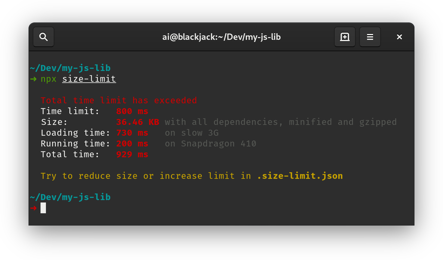
- Do we use partial hydration?
With the amount of JavaScript used in applications, we need to figure out ways to send as little as possible to the client. One way of doing so — and we briefly covered it already — is with partial hydration. The idea is quite simple: instead of doing SSR and then sending the entire app to the client, only small pieces of the app's JavaScript would be sent to the client and then hydrated. We can think of it as multiple tiny React apps with multiple render roots on an otherwise static website.In the article "The case of partial hydration (with Next and Preact)", Lukas Bombach explains how the team behind Welt.de, one of the news outlets in Germany, has achieved better performance with partial hydration. You can also check next-super-performance GitHub repo with explanations and code snippets.
You could also consider alternative options:
- partial hydration with Preact and Eleventy,
- progressive hydration in React GitHub repo,
- lazy-hydration in Vue.js (GitHub repo),
- Import on Interaction Pattern to lazy-load non-critical resources (e.g components, embeds) when a user interacts with UI that needs it.
Jason Miller has published working demos on how progressive hydration could be implemented with React, so you can use them right away: demo 1, demo 2, demo 3 (also available on GitHub). Plus, you can look into the react-prerendered-component library.

Import-on-interaction for first-party code should only be done if you’re unable to prefetch resources prior to interaction. (Large preview) - Have we optimized the strategy for React/SPA?
Struggling with performance in your single-page-application application? Jeremy Wagner has explored the impact of client-side framework performance on a variety of devices, highlighting some of the implications and guidelines we might want to be aware of when using one.As a result, here's a SPA strategy that Jeremy suggests to use for React framework (but it shouldn't change significantly for other frameworks):
- Refactor stateful components as stateless components whenever possible.
- Prerender stateless components when possible to minimize server response time. Render only on the server.
- For stateful components with simple interactivity, consider prerendering or server-rendering that component, and replace its interactivity with framework-independent event listeners.
- If you must hydrate stateful components on the client, use lazy hydration on visibility or interaction.
- For lazily-hydrated components, schedule their hydration during main thread idle time with
requestIdleCallback.
There are a few other strategies you might want to pursue or review:
- Performance considerations for CSS-in-JS in React apps
- Reduce Next.js Bundle Size by loading polyfills only when necessary, using dynamic imports and lazy hydration.
- Secrets of JavaScript: A tale of React, Performance Optimization and Multi-threading, a lengthy 7-part series on improving user interface challenges with React,
- How to measure React performance and How to profile React applications.
- Building mobile-first web animations in React, a fantastic talk by Alex Holachek, along with slides and GitHub repo (thanks for the tip, Addy!).
- webpack-libs-optimizations is a fantastic GitHub repo with plenty of useful Webpack-specific performance-related optimizations. Maintained by Ivan Akulov.
- React performance improvements in Notion, a guide by Ivan Akulov on how to improve performance in React, with plenty of useful pointers to make the app around 30% faster.
- React Refresh Webpack Plugin (experimental) allows for hot reloading that preserves component state, and supports hooks and function components.
- Watch out for zero-bundle-size React Server Components, a new proposed kind of components that will have no impact on bundle size. The project is currently in development, but any feedback from the community is much appreciated (great explainer by Sophie Alpert).
- Are you using predictive prefetching for JavaScript chunks?
We could use heuristics to decide when to preload JavaScript chunks. Guess.js is a set of tools and libraries that use Google Analytics data to determine which page a user is most likely to visit next from a given page. Based on user navigation patterns collected from Google Analytics or other sources, Guess.js builds a machine-learning model to predict and prefetch JavaScript that will be required on each subsequent page.Hence, every interactive element is receiving a probability score for engagement, and based on that score, a client-side script decides to prefetch a resource ahead of time. You can integrate the technique to your Next.js application, Angular and React, and there is a Webpack plugin which automates the setup process as well.
Obviously, you might be prompting the browser to consume unneeded data and prefetch undesirable pages, so it’s a good idea to be quite conservative in the number of prefetched requests. A good use case would be prefetching validation scripts required in the checkout, or speculative prefetch when a critical call-to-action comes into the viewport.
Need something less sophisticated? DNStradamus does DNS prefetching for outbound links as they appear in the viewport. Quicklink, InstantClick and Instant.page are small libraries that automatically prefetch links in the viewport during idle time in attempt to make next-page navigations load faster. Quicklink allows to prefetch React Router routes and Javascript; plus it’s data-considerate, so it doesn’t prefetch on 2G or if
Data-Saveris on. So is Instant.page if the mode is set to use viewport prefetching (which is a default).If you want to look into the science of predictive prefetching in full detail, Divya Tagtachian has a great talk on The Art of Predictive Prefetch, covering all the options from start to finish.
- Take advantage of optimizations for your target JavaScript engine.
Study what JavaScript engines dominate in your user base, then explore ways of optimizing for them. For example, when optimizing for V8 which is used in Blink-browsers, Node.js runtime and Electron, make use of script streaming for monolithic scripts.Script streaming allows
asyncordefer scriptsto be parsed on a separate background thread once downloading begins, hence in some cases improving page loading times by up to 10%. Practically, usescript defer>in the<head>, so that the browsers can discover the resource early and then parse it on the background thread.Caveat: Opera Mini doesn’t support script deferment, so if you are developing for India or Africa,
deferwill be ignored, resulting in blocking rendering until the script has been evaluated (thanks Jeremy!).You could also hook into V8’s code caching as well, by splitting out libraries from code using them, or the other way around, merge libraries and their uses into a single script, group small files together and avoid inline scripts. Or perhaps even use v8-compile-cache.
When it comes to JavaScript in general, there are also some practices that are worth keeping in mind:
- Clean Code concepts for JavaScript, a large collection of patterns for writing readable, reusable, and refactorable code.
- You can Compress data from JavaScript with the CompressionStream API, e.g. to gzip before uploading data (Chrome 80+).
- Detached window memory leaks and Fixing memory leaks in web apps are detailed guides on how to find and fix tricky JavaScript memory leaks. Plus, you can use queryObjects(SomeConstructor) from the DevTools Console (thanks, Mathias!).
- Reexports are bad for loading and runtime performance, and avoiding them can help reduce the bundle size significantly.
- We can improve scroll performance with passive event listeners by setting a flag in the
optionsparameter. So browsers can scroll the page immediately, rather than after the listener has finished. (via Kayce Basques). - If you have any
scrollortouch*listeners, passpassive: trueto addEventListener. This tells the browser you’re not planning to callevent.preventDefault()inside, so it can optimize the way it handles these events. (via Ivan Akulov) - We can achieve better JavaScript scheduling with isInputPending(), a new API that attempts to bridge the gap between loading and responsiveness with the concepts of interrupts for user inputs on the web, and allows for JavaScript to be able to check for input without yielding to the browser.
- You can also automatically remove an event listener after it has executed.
- Firefox’s recently released Warp, a significant update to SpiderMonkey (shipped in Firefox 83), Baseline Interpreter and there are a few JIT Optimization Strategies available as well.
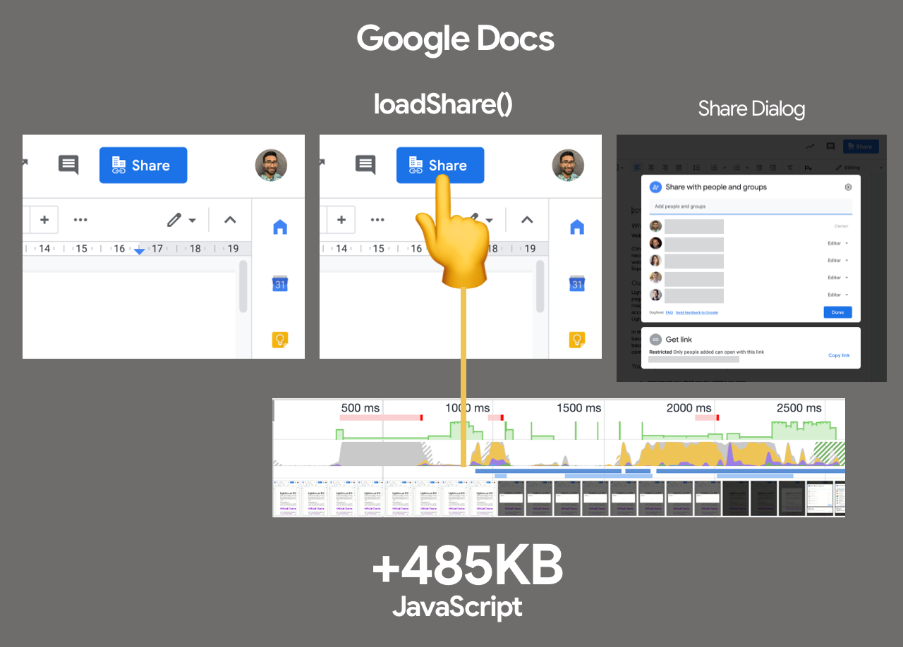
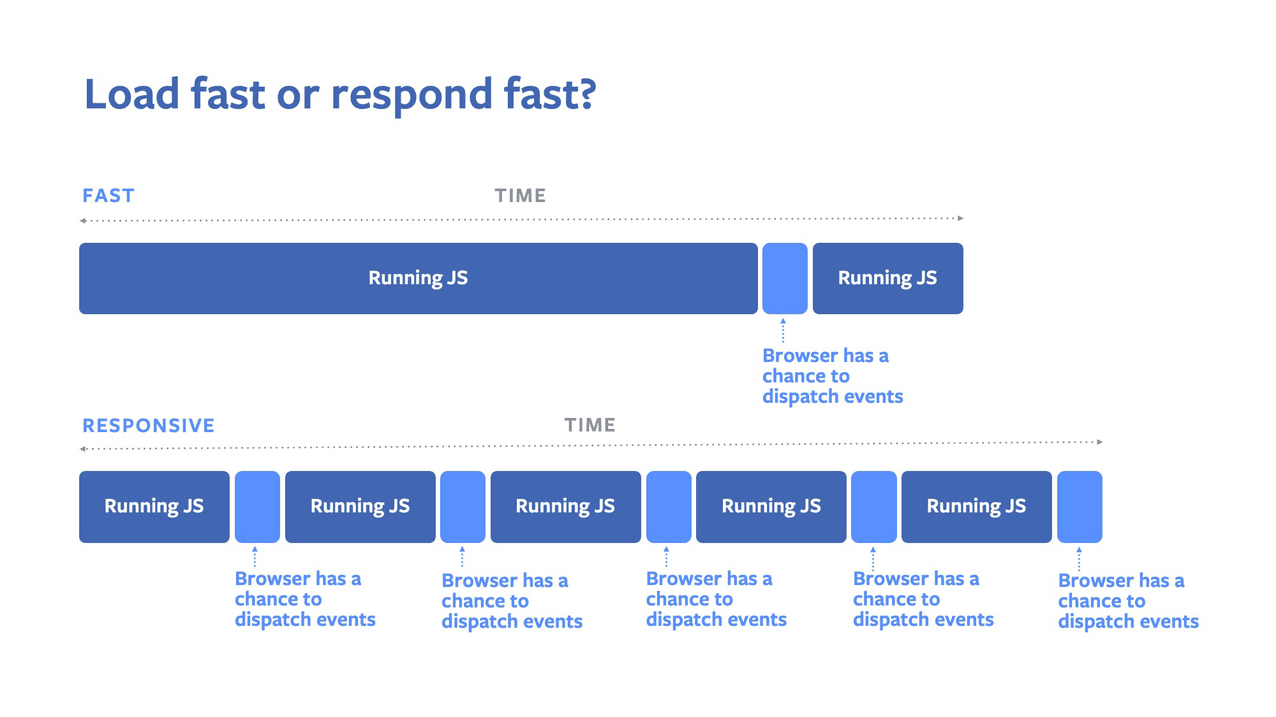

- Always prefer to self-host third-party assets.
Yet again, self-host your static assets by default. It’s common to assume that if many sites use the same public CDN and the same version of a JavaScript library or a web font, then the visitors would land on our site with the scripts and fonts already cached in their browser, speeding up their experience considerably. However, it’s very unlikely to happen.For security reasons, to avoid fingerprinting, browsers have been implementing partitioned caching that was introduced in Safari back in 2013, and in Chrome last year. So if two sites point to the exact same third-party resource URL, the code is downloaded once per domain, and the cache is "sandboxed" to that domain due to privacy implications (thanks, David Calhoun!). Hence, using a public CDN will not automatically lead to better performance.
Furthermore, it’s worth noting that resources don’t live in the browser’s cache as long as we might expect, and first-party assets are more likely to stay in the cache than third-party assets. Therefore, self-hosting is usually more reliable and secure, and better for performance, too.
- Constrain the impact of third-party scripts.
With all performance optimizations in place, often we can’t control third-party scripts coming from business requirements. Third-party-scripts metrics aren’t influenced by end-user experience, so too often one single script ends up calling a long tail of obnoxious third-party scripts, hence ruining a dedicated performance effort. To contain and mitigate performance penalties that these scripts bring along, it’s not enough to just defer their loading and execution and warm up connections via resource hints, i.e.dns-prefetchorpreconnect.Currently 57% of all JavaScript code excution time is spent on third-party code. The median mobile site accesses 12 third-party domains, with a median of 37 different requests (or about 3 requests made to each third party).
Furthermore, these third-parties often invite fourth-party scripts to join in, ending up with a huge performance bottleneck, sometimes going as far as to the eigth-party scripts on a page. So regularly auditing your dependencies and tag managers can bring along costly surprises.
Another problem, as Yoav Weiss explained in his talk on third-party scripts, is that in many cases these scripts download resources that are dynamic. The resources change between page loads, so we don’t necessarily know which hosts the resources will be downloaded from and what resources they would be.
Deferring, as shown above, might be just a start though as third-party scripts also steal bandwidth and CPU time from your app. We could be a bit more aggressive and load them only when our app has initialized.
/* Before */
const App = () => {
  return <div>
    <script>
      window.dataLayer = window.dataLayer || [];
      function gtag(){...}
      gtg('js', new Date());
    </script>
  </div>
}

/* After */
const App = () => {
  const[isRendered, setRendered] = useState(false);

  useEffect(() => setRendered(true));

  return <div>
  {isRendered ?
    <script>
      window.dataLayer = window.dataLayer || [];
      function gtag(){...}
      gtg('js', new Date());
    </script>
  : null}
  </div>
}
In a fantastic post on "Reducing the Site-Speed Impact of Third-Party Tags", Andy Davies explores a strategy of minimizing the footprint of third-parties — from identifying their costs towards reducing their impact.
According to Andy, there are two ways tags impact site-speed — they compete for network bandwidth and processing time on visitors’ devices, and depending on how they’re implemented, they can delay HTML parsing as well. So the first step is to identify the impact that third-parties have, by testing the site with and without scripts using WebPageTest. With Simon Hearne’s Request Map, we can also visualize third-parties on a page along with details on their size, type and what triggered their load.
Preferably self-host and use a single hostname, but also use a request map to exposes fourth-party calls and detect when the scripts change. You can use Harry Roberts' approach for auditing third parties and produce spreadsheets like this one (also check Harry's auditing workflow).
Afterwards, we can explore lightweight alternatives to existing scripts and slowly replace duplicates and main culprits with lighter options. Perhaps some of the scripts could be replaced with their fallback tracking pixel instead of the full tag.

Loading YouTube with facades, e.g. lite-youtube-embed that’s significantly smaller than an actual YouTube player. (Image source) (Large preview) If it’s not viable, we can at least lazy load third-party resources with facades, i.e. a static element which looks similar to the actual embedded third-party, but is not functional and therefore much less taxing on the page load. The trick, then, is to load the actual embed only on interaction.
For example, we can use:
- lite-vimeo-embed for the Vimeo player,
- lite-vimeo for the Vimeo player,
- lite-youtube-embed for the YouTube player,
- react-live-chat-loader for a live chat (case study, and another case-study),
- lazyframe for iframes.
One of the reasons why tag managers are usually large in size is because of the many simultaneous experiments that are running at the same time, along with many user segments, page URLs, sites etc., so according to Andy, reducing them can reduce both the download size and the time it takes to execute the script in the browser.
And then there are anti-flicker snippets. Third-parties such as Google Optimize, Visual Web Optimizer (VWO) and others are unanimous in using them. These snippets are usually injected along with running A/B tests: to avoid flickering between the different test scenarios, they hide the
bodyof the document withopacity: 0, then adds a function that gets called after a few seconds to bring theopacityback. This often results in massive delays in rendering due to massive client-side execution costs.
With A/B testing in use, customers would often see flickering like this one. Anti-Flicker snippets prevent that, but they also cost in performance. Via Andy Davies. (Large preview) Therefore keep track how often the anti-flicker timeout is triggered and reduce the timeout. Default blocks display of your page by up to 4s which will ruin conversion rates. According to Tim Kadlec, "Friends don’t let friends do client side A/B testing". Server-side A/B testing on CDNs (e.g. Edge Computing, or Edge Slice Rerendering) is always a more performant option.
If you have to deal with almighty Google Tag Manager, Barry Pollard provides some guidelines to contain the impact of Google Tag Manager. Also, Christian Schaefer explores strategies for loading ads.
Watch out: some third-party widgets hide themselves from auditing tools, so they might be more difficult to spot and measure. To stress-test third parties, examine bottom-up summaries in Performance profile page in DevTools, test what happens if a request is blocked or it has timed out — for the latter, you can use WebPageTest’s Blackhole server
blackhole.webpagetest.orgthat you can point specific domains to in yourhostsfile.What options do we have then? Consider using service workers by racing the resource download with a timeout and if the resource hasn’t responded within a certain timeout, return an empty response to tell the browser to carry on with parsing of the page. You can also log or block third-party requests that aren’t successful or don’t fulfill certain criteria. If you can, load the 3rd-party-script from your own server rather than from the vendor’s server and lazy load them.
Another option is to establish a Content Security Policy (CSP) to restrict the impact of third-party scripts, e.g. disallowing the download of audio or video. The best option is to embed scripts via
<iframe>so that the scripts are running in the context of the iframe and hence don’t have access to the DOM of the page, and can’t run arbitrary code on your domain. Iframes can be further constrained using thesandboxattribute, so you can disable any functionality that iframe may do, e.g. prevent scripts from running, prevent alerts, form submission, plugins, access to the top navigation, and so on.You could also keep third-parties in check via in-browser performance linting with feature policies, a relatively new feature that lets you
opt-in or out of certain browser features on your site. (As a sidenote, it could also be used to avoid oversized and unoptimized images, unsized media, sync scripts and others). Currently supported in Blink-based browsers. /* Via Tim Kadlec. https://timkadlec.com/remembers/2020-02-20-in-browser-performance-linting-with-feature-policies/ */ /* Block the use of the Geolocation API with a Feature-Policy header. */ Feature-Policy: geolocation 'none'As many third-party scripts are running in iframes, you probably need to be thorough in restricting their allowances. Sandboxed iframes are always a good idea, and each of the limitations can be lifted via a number of
allowvalues on thesandboxattribute. Sandboxing is supported almost everywhere, so constrain third-party scripts to the bare minimum of what they should be allowed to do.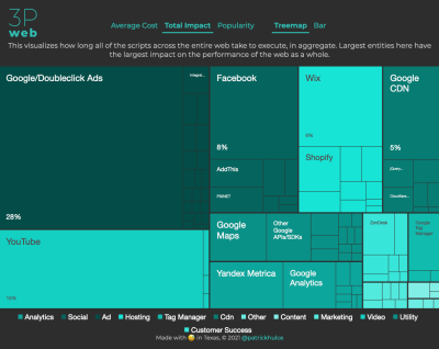
ThirdPartyWeb.Today groups all third-party scripts by category (analytics, social, advertising, hosting, tag manager etc.) and visualizes how long the entity’s scripts take to execute (on average). (Large preview) Consider using an Intersection Observer; that would enable ads to be iframed while still dispatching events or getting the information that they need from the DOM (e.g. ad visibility). Watch out for new policies such as Feature policy, resource size limits and CPU/Bandwidth priority to limit harmful web features and scripts that would slow down the browser, e.g. synchronous scripts, synchronous XHR requests, document.write and outdated implementations.
Finally, when choosing a third-party service, consider checking Patrick Hulce's ThirdPartyWeb.Today, a service that groups all third-party scripts by category (analytics, social, advertising, hosting, tag manager etc.) and visualizes how long the entity’s scripts take to execute (on average). Obviously, largest entities have the worst performance impact to the pages they’re on. Just by skimming the page, you’ll get an idea of the performance footprint you should be expecting.
Ah, and don't forget about the usual suspects: instead of third-party widgets for sharing, we can use static social sharing buttons (such as by SSBG) and static links to interactive maps instead of interactive maps.
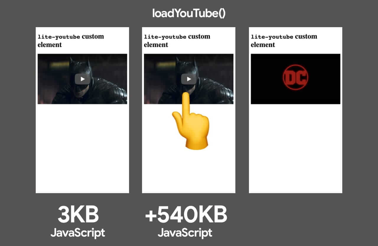

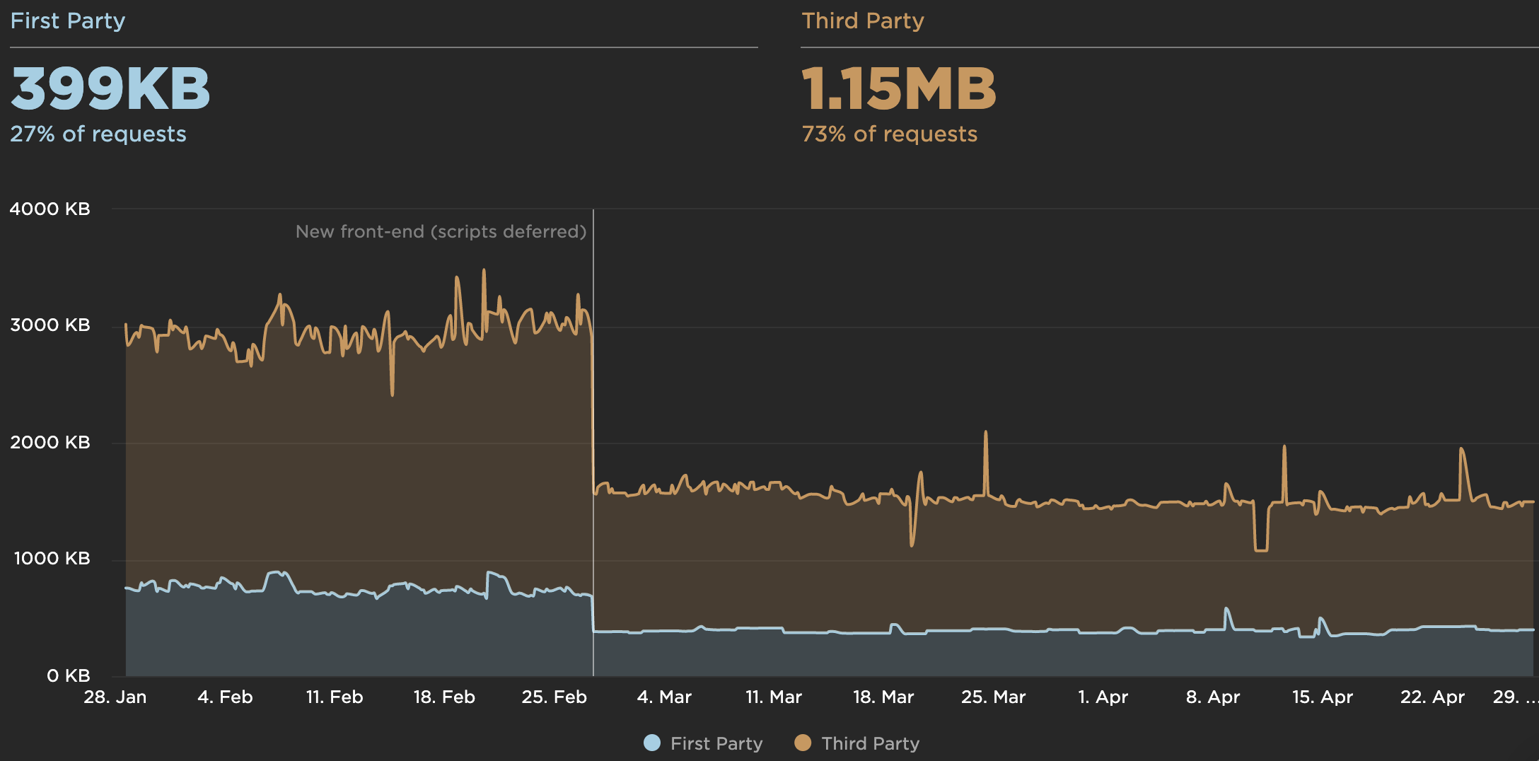
- Set HTTP cache headers properly.
Caching seems to be such an obvious thing to do, yet it might be quite tough to get right. We need to double-check thatexpires,max-age,cache-control, and other HTTP cache headers have been set properly. Without proper HTTP cache headers, browsers will set them automatically at 10% of elapsed time sincelast-modified, ending up with potential under- and over-caching.In general, resources should be cacheable either for a very short time (if they are likely to change) or indefinitely (if they are static) — you can just change their version in the URL when needed. You can call it a Cache-Forever strategy, in which we could relay
Cache-ControlandExpiresheaders to the browser to only allow assets to expire in a year. Hence, the browser wouldn’t even make a request for the asset if it has it in the cache.The exception are API responses (e.g.
/api/user). To prevent caching, we can useprivate, no store, and notmax-age=0, no-store:Cache-Control: private, no-storeUse
Cache-control: immutableto avoid revalidation of long explicit cache lifetimes when users hit the reload button. For the reload case,immutablesaves HTTP requests and improves the load time of the dynamic HTML as they no longer compete with the multitude of 304 responses.A typical example where we want to use
immutableare CSS/JavaScript assets with a hash in their name. For them, we probably want to cache as long as possible, and ensure they never get re-validated:Cache-Control: max-age: 31556952, immutableAccording to Colin Bendell’s research,
immutablereduces 304 redirects by around 50% as even withmax-agein use, clients still re-validate and block upon refresh. It’s supported in Firefox, Edge and Safari and Chrome is still debating the issue.According to Web Almanac, "its usage has grown to 3.5%, and it’s widely used in Facebook and Google third-party responses."
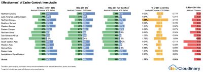
Cache-Control: Immutable reduces 304s by around 50%, according to Colin Bendell’s research at Cloudinary. (Large preview) Do you remember the good ol' stale-while-revalidate? When we specify the caching time with the
Cache-Controlresponse header (e.g.Cache-Control: max-age=604800), aftermax-ageexpires, the browser will re-fetch the requested content, causing the page to load slower. This slowdown can be avoided withstale-while-revalidate; it basically defines an extra window of time during which a cache can use a stale asset as long as it revalidates it async in the background. Thus, it "hides" latency (both in the network and on the server) from clients.In June–July 2019, Chrome and Firefox launched support of
stale-while-revalidatein HTTP Cache-Control header, so as a result, it should improve subsequent page load latencies as stale assets are no longer in the critical path. Result: zero RTT for repeat views.Be wary of the vary header, especially in relation to CDNs, and watch out for the HTTP Representation Variants which help avoiding an additional round trip for validation whenever a new request differs slightly (but not significantly) from prior requests (thanks, Guy and Mark!).
Also, double-check that you aren’t sending unnecessary headers (e.g.
x-powered-by,pragma,x-ua-compatible,expires,X-XSS-Protectionand others) and that you include useful security and performance headers (such asContent-Security-Policy,X-Content-Type-Optionsand others). Finally, keep in mind the performance cost of CORS requests in single-page applications.Note: We often assume that cached assets are retrieved instantly, but research shows that retrieving an object from cache can take hundreds of milliseconds. In fact, according to Simon Hearne, "sometimes network might be faster than cache, and retrieving assets from cache can be costly with a large number of cached assets (not file size) and the user’s devices. For example: Chrome OS average cache retrieval doubles from ~50ms with 5 cached resources up to ~100ms with 25 resources".
Besides, we often assume that bundle size isn’t a huge issue and users will download it once and then use the cached version. At the same time, with CI/CD we push code to production multiple times a day, cache gets invalidated every time, so being strategic about caching matters.
When it comes to caching, there are plenty of resources that are worth reading:
- Cache-Control for Civilians, a deep-dive into everything caching with Harry Roberts.
- Heroku’s primer on HTTP caching headers,
- Caching Best Practices by Jake Archibald,
- HTTP caching primer by Ilya Grigorik,
- Keeping things fresh with stale-while-revalidate by Jeff Posnick.
- CS Visualized: CORS by Lydia Hallie is a great explainer on CORS, how it works and how to make sense of it.
- Talking on CORS, here’s a little refresher on Same-Origin Policy by Eric Portis.
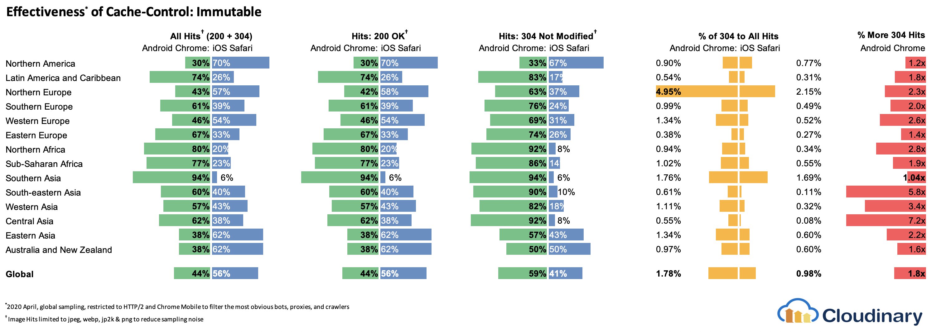
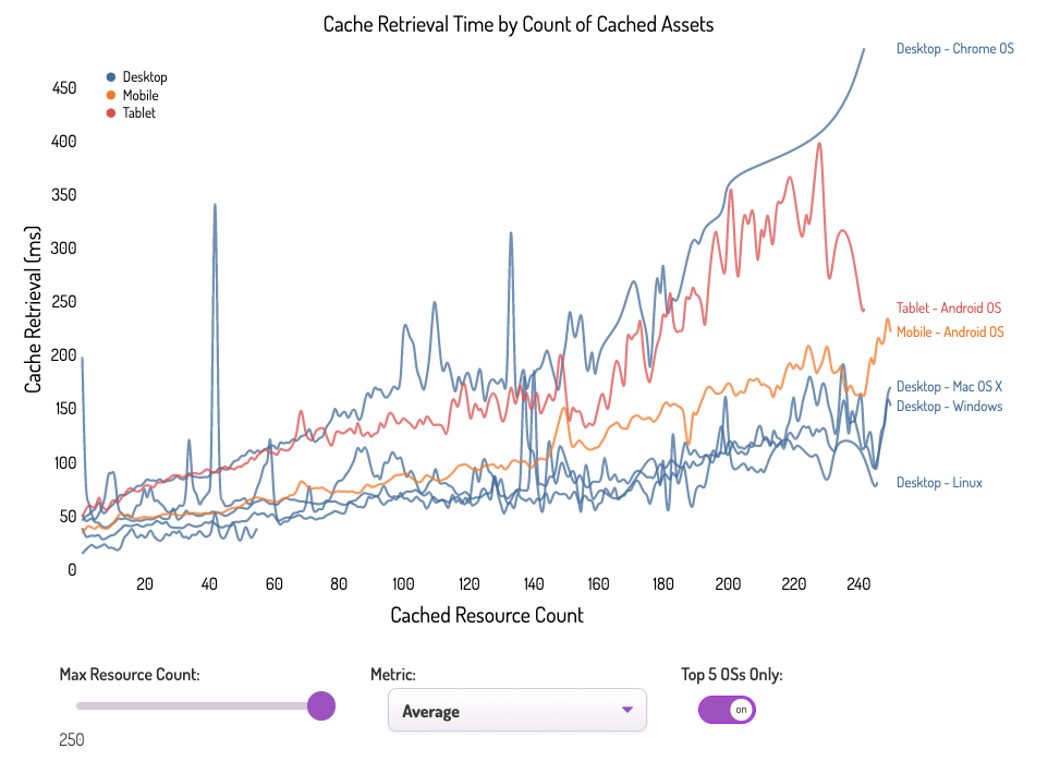
Delivery Optimizations
- Do we use
deferto load critical JavaScript asynchronously?
When the user requests a page, the browser fetches the HTML and constructs the DOM, then fetches the CSS and constructs the CSSOM, and then generates a rendering tree by matching the DOM and CSSOM. If any JavaScript needs to be resolved, the browser won’t start rendering the page until it’s resolved, thus delaying rendering. As developers, we have to explicitly tell the browser not to wait and to start rendering the page. The way to do this for scripts is with thedeferandasyncattributes in HTML.In practice, it turns out that it's better to use
deferinstead ofasync. Ah, what's the difference again? According to Steve Souders, onceasyncscripts arrive, they are executed immediately — as soon as the script is ready. If that happens very fast, for example when the script is in cache aleady, it can actually block HTML parser. Withdefer, browser doesn’t execute scripts until HTML is parsed. So, unless you need JavaScript to execute before start render, it’s better to usedefer. Also, multiple async files will execute in a non-deterministic order.It's worth noting that there are a few misconceptions about
asyncanddefer. Most importantly,asyncdoesn’t mean that the code will run whenever the script is ready; it means that it will run whenever the scripts is ready and all preceding sync work is done. In Harry Roberts' words, "If you put anasyncscript after sync scripts, yourasyncscript is only as fast as your slowest sync script."Also, it's not recommended to use both
asyncanddefer. Modern browsers support both, but whenever both attributes are used,asyncwill always win.If you'd like to dive into more details, Milica Mihajlija has written a very detailed guide on Building the DOM faster, going into the details of speculative parsing, async and defer.
- Lazy load expensive components with IntersectionObserver and priority hints.
In general, it’s recommended to lazy-load all expensive components, such as heavy JavaScript, videos, iframes, widgets, and potentially images. Native lazy-loading is already available for images and iframes with theloadingattribute (only Chromium). Under the hood, this attribute defers the loading of the resource until it reaches a calculated distance from the viewport.<!-- Lazy loading for images, iframes, scripts. Probably for images outside of the viewport. --> <img loading="lazy" ... /> <iframe loading="lazy" ... /> <!-- Prompt an early download of an asset. For critical images, e.g. hero images. --> <img loading="eager" ... /> <iframe loading="eager" ... />That threshold depends on a few things, from the type of image resource being fetched to effective connection type. But experiments conducted using Chrome on Android suggest that on 4G, 97.5% of below-the-fold images that are lazy-loaded were fully loaded within 10ms of becoming visible, so it should be safe.
We can also use
importanceattribute (highorlow) on a<script>,<img>, or<link>element (Blink only). In fact, it’s a great way to deprioritize images in carousels, as well as re-prioritize scripts. However, sometimes we might need a bit more granular control.<!-- When the browser assigns "High" priority to an image, but we don’t actually want that. --> <img src="less-important-image.svg" fetchpriority="low" ... /> <!-- We want to initiate an early fetch for a resource, but also deprioritize it. --> <link rel="preload" fetchpriority="low" href="/script.js" as="script" />The most performant way to do slightly more sophisticated lazy loading is by using the Intersection Observer API that provides a way to asynchronously observe changes in the intersection of a target element with an ancestor element or with a top-level document’s viewport. Basically, you need to create a new
IntersectionObserverobject, which receives a callback function and a set of options. Then we add a target to observe.The callback function executes when the target becomes visible or invisible, so when it intercepts the viewport, you can start taking some actions before the element becomes visible. In fact, we have a granular control over when the observer’s callback should be invoked, with
rootMargin(margin around the root) andthreshold(a single number or an array of numbers which indicate at what percentage of the target’s visibility we are aiming).Alejandro Garcia Anglada has published a handy tutorial on how to actually implement it, Rahul Nanwani wrote a detailed post on lazy-loading foreground and background images, and Google Fundamentals provide a detailed tutorial on lazy loading images and video with Intersection Observer as well.
Remember art-directed storytelling long reads with moving and sticky objects? You can implement performant scrollytelling with Intersection Observer, too.
Check again what else you could lazy load. Even lazy-loading translation strings and emoji could help. By doing so, Mobile Twitter managed to achieve 80% faster JavaScript execution from the new internationalization pipeline.
A quick word of caution though: it’s worth noting that lazy loading should be an exception rather than the rule. It’s probably not reasonable to lazy-load anything that you actually want people to see quickly, e.g. product page images, hero images or a script required for the main navigation to become interactive.
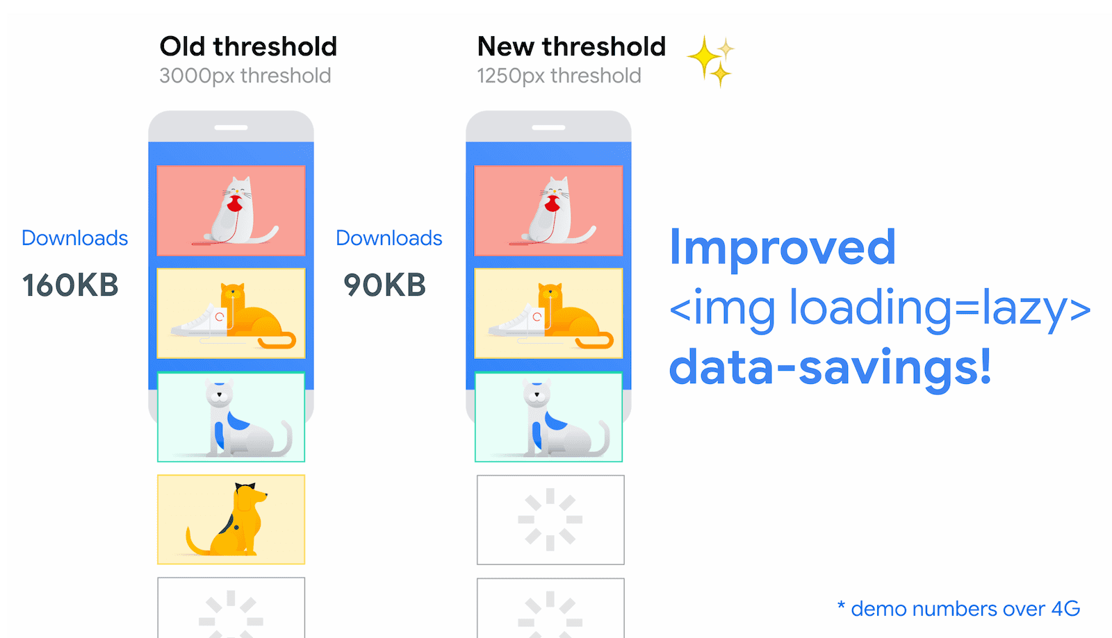
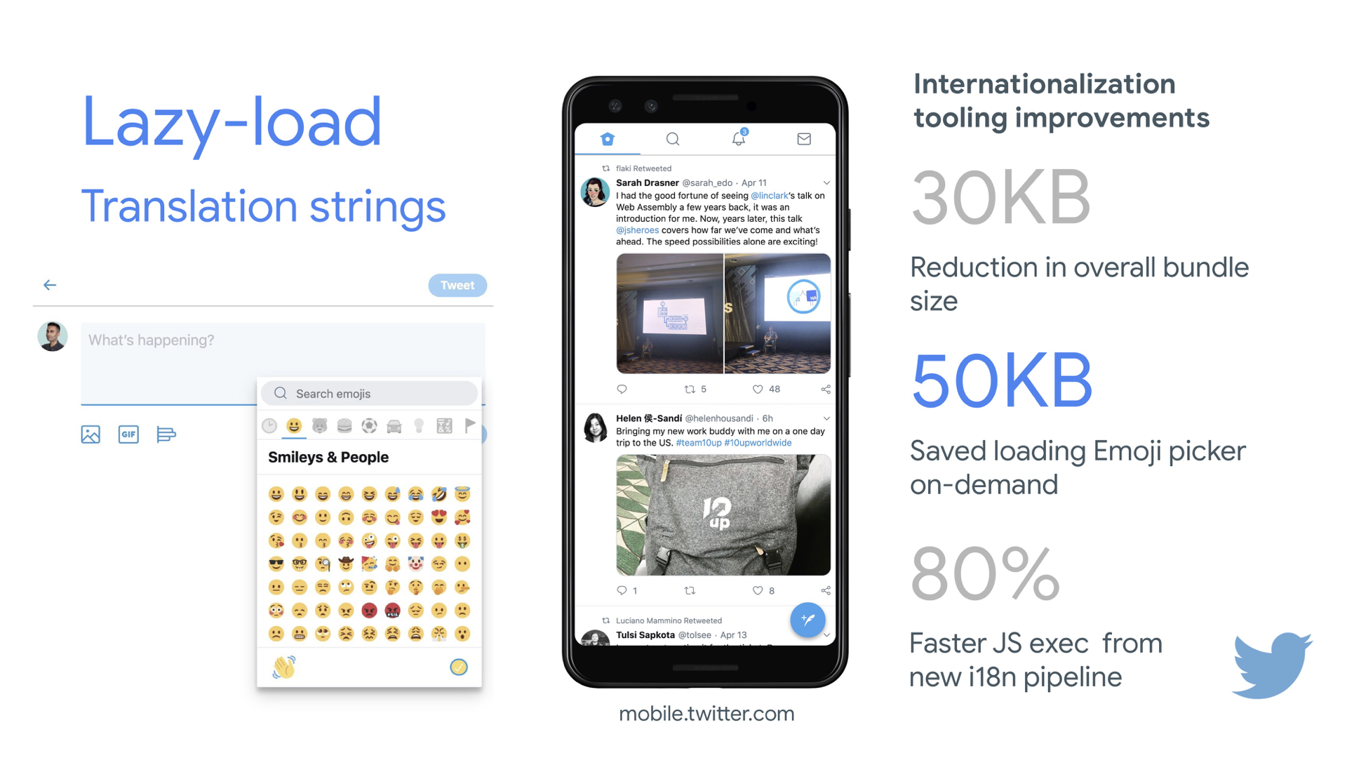
- Load images progressively.
You could even take lazy loading to the next level by adding progressive image loading to your pages. Similarly to Facebook, Pinterest, Medium and Wolt, you could load low quality or even blurry images first, and then as the page continues to load, replace them with the full quality versions by using the BlurHash technique or LQIP (Low Quality Image Placeholders) technique.Opinions differ if these techniques improve user experience or not, but it definitely improves time to First Contentful Paint. We can even automate it by using SQIP that creates a low quality version of an image as an SVG placeholder, or Gradient Image Placeholders with CSS linear gradients.
These placeholders could be embedded within HTML as they naturally compress well with text compression methods. In his article, Dean Hume has described how this technique can be implemented using Intersection Observer.
Fallback? If the browser doesn’t support intersection observer, we can still lazy load a polyfill or load the images immediately. And there is even a library for it.
Want to go fancier? You could trace your images and use primitive shapes and edges to create a lightweight SVG placeholder, load it first, and then transition from the placeholder vector image to the (loaded) bitmap image.
- Do you defer rendering with
content-visibility?
For complex layout with plentiful of content blocks, images and videos, decoding data and rendering pixels might be a quite expensive operation — especially on low-end devices. Withcontent-visibility: auto, we can prompt the browser to skip the layout of the children while the container is outside of the viewport.For example, you might skip the rendering of the footer and late sections on the initial load:
footer {
  content-visibility: auto;
  contain-intrinsic-size: 1000px;
  /* 1000px is an estimated height for sections that are not rendered yet. */
}
Note that content-visibility: auto; behaves like overflow: hidden;, but you can fix it by applying
padding-leftandpadding-rightinstead of the defaultmargin-left: auto;,margin-right: auto;and a declared width. The padding basically allows elements to overflow the content-box and enter the padding-box without leaving the box model as a whole and getting cut off.Also, keep in mind that you might introduce some CLS when new content eventually gets rendered, so it’s a good idea to use
contain-intrinsic-sizewith a placeholder properly sized (thanks, Una!).Thijs Terluin has way more details about both properties and how
contain-intrinsic-sizeis calculated by the browser, Malte Ubl shows how you can calculate it and a brief video explainer by Jake and Surma explains how it all works.And if you need to get a bit more granular, with CSS Containment, you can manually skip layout, style and paint work for descendants of a DOM node if you need only size, alignment or computed styles on other elements — or the element is currently off-canvas.

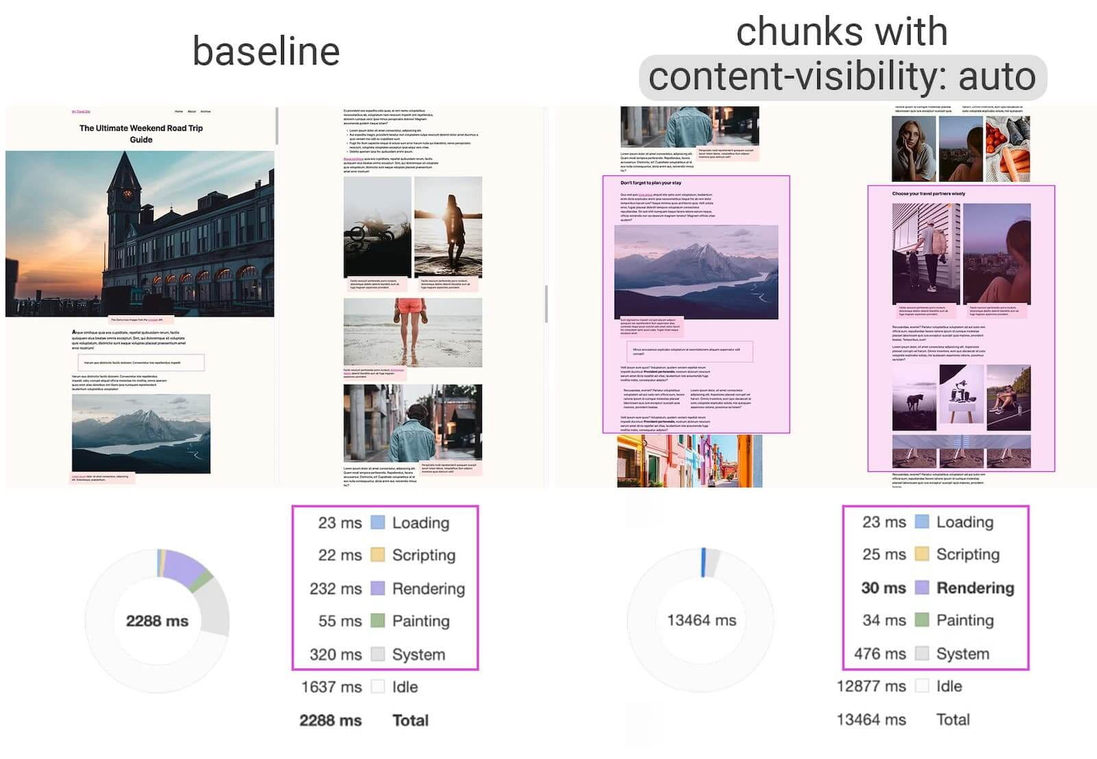
content-visibility: auto to chunked content areas gives a 7× rendering performance boost on initial load. (Large preview)- Do you defer decoding with
decoding="async"?
Sometimes content appears offscreen, yet we want to ensure that it’s available when customers need it — ideally, not blocking anything in the critical path, but decoding and rendering asynchronously. We can usedecoding="async"to give the browser a permission to decode the image off the main thread, avoiding user impact of the CPU-time used to decode the image (via Malte Ubl):<img decoding="async" … />Alternatively, for offscreen images, we can display a placeholder first, and when the image is within the viewport, using IntersectionObserver, trigger a network call for the image to be downloaded in background. Also, we can defer render until decode with img.decode() or download the image if the Image Decode API isn’t available.
When rendering the image, we can use fade-in animations, for example. Katie Hempenius and Addy Osmani share more insights in their talk Speed at Scale: Web Performance Tips and Tricks from the Trenches.
- Do you generate and serve critical CSS?
To ensure that browsers start rendering your page as quickly as possible, it’s become a common practice to collect all of the CSS required to start rendering the first visible portion of the page (known as "critical CSS" or "above-the-fold CSS") and include it inline in the<head>of the page, thus reducing roundtrips. Due to the limited size of packages exchanged during the slow start phase, your budget for critical CSS is around 14KB.If you go beyond that, the browser will need additional roundtrips to fetch more styles. CriticalCSS and Critical enable you to output critical CSS for every template you're using. In our experience though, no automatic system was ever better than manual collection of critical CSS for every template, and indeed that's the approach we've moved back to recently.
You can then inline critical CSS and lazy-load the rest with critters Webpack plugin. If possible, consider using the conditional inlining approach used by the Filament Group, or convert inline code to static assets on the fly.
If you currently load your full CSS asynchronously with libraries such as loadCSS, it’s not really necessary. With
media="print", you can trick browser into fetching the CSS asynchronously but applying to the screen environment once it loads. (thanks, Scott!)<!-- Via Scott Jehl. https://www.filamentgroup.com/lab/load-css-simpler/ --> <!-- Load CSS asynchronously, with low priority --> <link rel="stylesheet" href="full.css" media="print" onload="this.media='all'" />When collecting all the critical CSS for each template, it’s common to explore the "above-the-fold" area alone. However, for complex layouts, it might be a good idea to include the groundwork of the layout as well to avoid massive recalculation and repainting costs, hurting your Core Web Vitals score as a result.
What if a user gets a URL that’s linking directly to the middle of the page but the CSS hasn’t been downloaded yet? In that case, it has become common to hide non-critical content, e.g. with
opacity: 0;in inlined CSS andopacity: 1in full CSS file, and display it when CSS is available. It has a major downside though, as users on slow connections might never be able to read the content of the page. That’s why it’s better to always keep the content visible, even although it might not be styled properly.Putting critical CSS (and other important assets) in a separate file on the root domain has benefits, sometimes even more than inlining, due to caching. Chrome speculatively opens a second HTTP connection to the root domain when requesting the page, which removes the need for a TCP connection to fetch this CSS. That means that you could create a set of critical-CSS-files (e.g. critical-homepage.css, critical-product-page.css etc.) and serve them from your root, without having to inline them. (thanks, Philip!)
A word of caution: with HTTP/2, critical CSS could be stored in a separate CSS file and delivered via a server push without bloating the HTML. The catch is that server pushing was troublesome with many gotchas and race conditions across browsers. It was never supported consistently and had some caching issues (see slide 114 onwards of Hooman Beheshti’s presentation).
The effect could, in fact, be negative and bloat the network buffers, preventing genuine frames in the document from being delivered. So it wasn’t very surprising that for the time being, Chrome is planning to remove support for Server Push.
- Experiment with regrouping your CSS rules.
We’ve got used to critical CSS, but there are a few optimizations that could go beyond that. Harry Roberts conducted a remarkable research with quite surprising results. For example, it might be a good idea to split the main CSS file out into its individual media queries. That way, the browser will retrieve critical CSS with high priority, and everything else with low priority — completely off the critical path.Also, avoid placing
<link rel="stylesheet" />beforeasyncsnippets. If scripts don’t depend on stylesheets, consider placing blocking scripts above blocking styles. If they do, split that JavaScript in two and load it either side of your CSS.Scott Jehl solved another interesting problem by caching an inlined CSS file with a service worker, a common problem familiar if you’re using critical CSS. Basically, we add an ID attribute onto the
styleelement so that it’s easy to find it using JavaScript, then a small piece of JavaScript finds that CSS and uses the Cache API to store it in a local browser cache (with a content type oftext/css) for use on subsequent pages. To avoid inlining on subsequent pages and instead reference the cached assets externally, we then set a cookie on the first visit to a site. Voilà!It’s worth noting that dynamic styling can be expensive, too, but usually only in cases when you rely on hundreds of concurrently rendered composed components. So if you’re using CSS-in-JS, make sure that your CSS-in-JS library optimizes the execution when your CSS has no dependencies on theme or props, and don’t over-compose styled components. Aggelos Arvanitakis shares more insights into performance costs of CSS-in-JS.
- Do you stream responses?
Often forgotten and neglected, streams provide an interface for reading or writing asynchronous chunks of data, only a subset of which might be available in memory at any given time. Basically, they allow the page that made the original request to start working with the response as soon as the first chunk of data is available, and use parsers that are optimized for streaming to progressively display the content.We could create one stream from multiple sources. For example, instead of serving an empty UI shell and letting JavaScript populate it, you can let the service worker construct a stream where the shell comes from a cache, but the body comes from the network. As Jeff Posnick noted, if your web app is powered by a CMS that server-renders HTML by stitching together partial templates, that model translates directly into using streaming responses, with the templating logic replicated in the service worker instead of your server. Jake Archibald’s The Year of Web Streams article highlights how exactly you could build it. Performance boost is quite noticeable.
One important advantage of streaming the entire HTML response is that HTML rendered during the initial navigation request can take full advantage of the browser’s streaming HTML parser. Chunks of HTML that are inserted into a document after the page has loaded (as is common with content populated via JavaScript) can’t take advantage of this optimization.
Browser support? Still getting there with partial support in Chrome, Firefox, Safari and Edge supporting the API and Service Workers being supported in all modern browsers. And if you feel adventurous again, you can check an experimental implementation of streaming requests, which allows you to start sending the request while still generating the body. Available in Chrome 85.
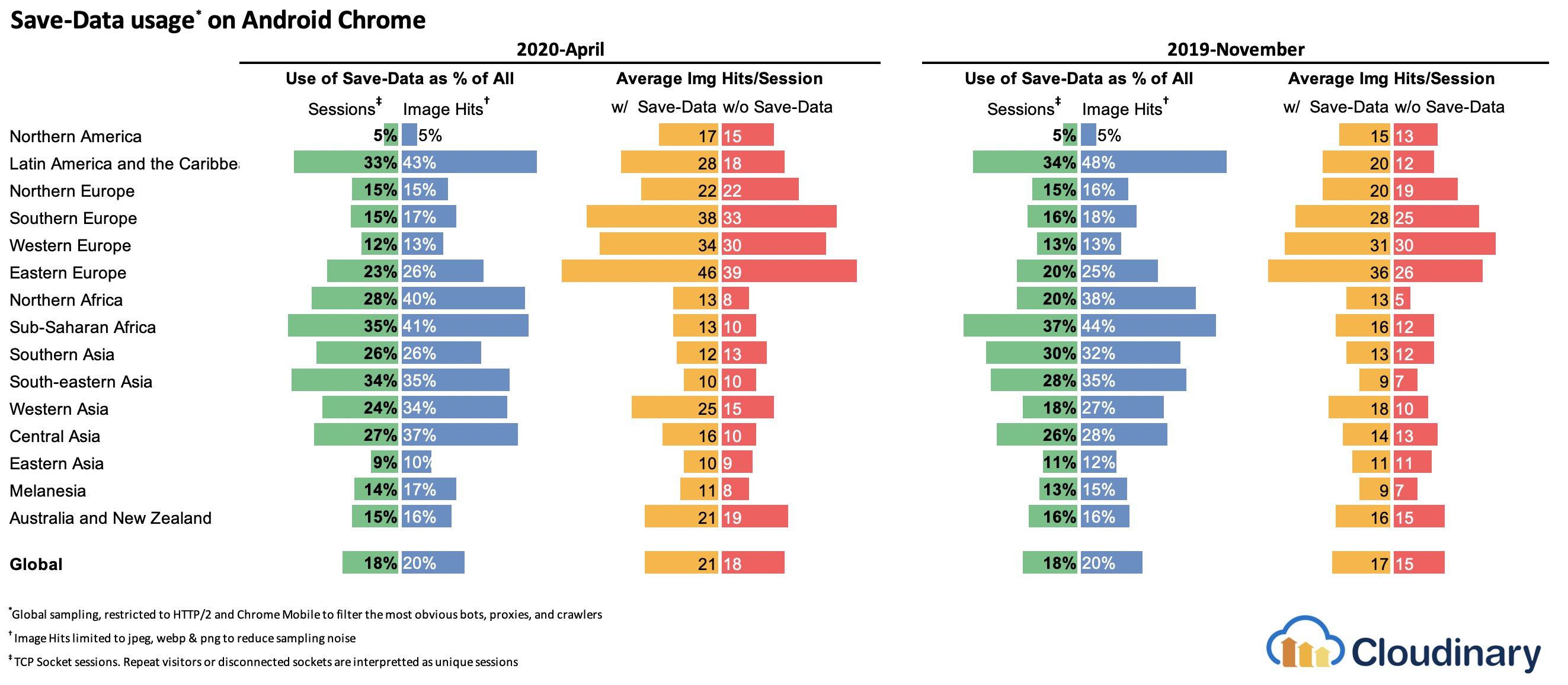
- Consider making your components connection-aware.
Data can be expensive and with growing payload, we need to respect users who choose to opt into data savings while accessing our sites or apps. The Save-Data client hint request header allows us to customize the application and the payload to cost- and performance-constrained users.In fact, you could rewrite requests for high DPI images to low DPI images, remove web fonts, fancy parallax effects, preview thumbnails and infinite scroll, turn off video autoplay, server pushes, reduce the number of displayed items and downgrade image quality, or even change how you deliver markup. Tim Vereecke has published a very detailed article on data-s(h)aver strategies featuring many options for data saving.
Who is using
save-data, you might be wondering? 18% of global Android Chrome users have Lite Mode enabled (withSave-Dataon), and the number is likely to be higher. According to Simon Hearne’s research, the opt-in rate is highest on cheaper devices, but there are plenty of outliers. For example: users in Canada have an opt-in rate of over 34% (compared to ~7% in the US) and users on the latest Samsung flagship have an opt-in rate of almost 18% globally.With the
Save-Datamode on, Chrome Mobile will provide an optimized experience, i.e. a proxied web experience with deferred scripts, enforcedfont-display: swapand enforced lazy loading. It’s just more sensible to build the experience on your own rather than relying on the browser to make these optimizations.The header is currently supported only in Chromium, on the Android version of Chrome or via the Data Saver extension on a desktop device. Finally, you can also use the Network Information API to deliver costly JavaScript modules, high-resolution images and videos based on the network type. Network Information API and specifically
navigator.connection.effectiveTypeuseRTT,downlink,effectiveTypevalues (and a few others) to provide a representation of the connection and the data that users can handle.In this context, Max Böck speaks of connection-aware components and Addy Osmani speaks of adaptive module serving. For example, with React, we could write a component that renders differently for different connection types. As Max suggested, a
<Media />component in a news article might output:Offline: a placeholder withalttext,2G/save-datamode: a low-resolution image,3Gon non-Retina screen: a mid-resolution image,3Gon Retina screens: high-res Retina image,4G: an HD video.
Dean Hume provides a practical implementation of a similar logic using a service worker. For a video, we could display a video poster by default, and then display the "Play" icon as well as the video player shell, meta-data of the video etc. on better connections. As a fallback for non-supporting browsers, we could listen to
canplaythroughevent and usePromise.race()to timeout the source loading if thecanplaythroughevent doesn’t fire within 2 seconds.If you want to dive in a bit deeper, here are a couple of resources to get started:
- Addy Osmani shows how to implement adaptive serving in React.
- React Adaptive Loading Hooks & Utilities provides code snippets for React,
- Netanel Basel explores Connection-Aware Components in Angular,
- Theodore Vorilas shares how Serving Adaptive Components Using the Network Information API in Vue works.
- Umar Hansa show how to selectively download/execute expensive JavaScript.
- Consider making your components device memory-aware.
Network connection gives us only one perspective at the context of the user though. Going further, you could also dynamically adjust resources based on available device memory, with the Device Memory API.navigator.deviceMemoryreturns how much RAM the device has in gigabytes, rounded down to the nearest power of two. The API also features a Client Hints Header,Device-Memory, that reports the same value.Bonus: Umar Hansa shows how to defer expensive scripts with dynamic imports to change the experience based on device memory, network connectivity and hardware concurrency.
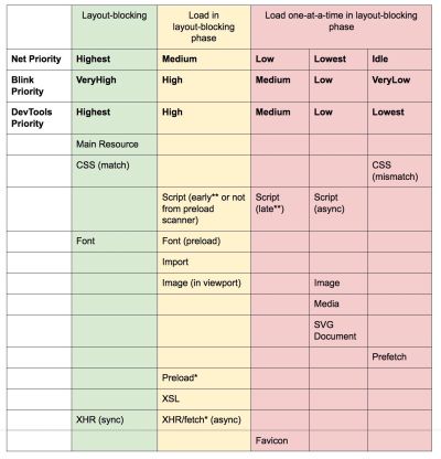
- Warm up the connection to speed up delivery.
Use resource hints to save time ondns-prefetch(which performs a DNS lookup in the background),preconnect(which asks the browser to start the connection handshake (DNS, TCP, TLS) in the background),prefetch(which asks the browser to request a resource) andpreload(which prefetches resources without executing them, among other things). Well supported in modern browsers, with support coming to Firefox soon.Remember
prerender? The resource hint used to prompt browser to build out the entire page in the background for next navigation. The implementations issues were quite problematic, ranging from a huge memory footprint and bandwidth usage to multiple registered analytics hits and ad impressions.Unsurprinsingly, it was deprecated, but the Chrome team has brought it back as NoState Prefetch mechanism. In fact, Chrome treats the
prerenderhint as a NoState Prefetch instead, so we can still use it today. As Katie Hempenius explains in that article, "like prerendering, NoState Prefetch fetches resources in advance; but unlike prerendering, it does not execute JavaScript or render any part of the page in advance."NoState Prefetch only uses ~45MiB of memory and subresources that are fetched will be fetched with an
IDLENet Priority. Since Chrome 69, NoState Prefetch adds the header Purpose: Prefetch to all requests in order to make them distinguishable from normal browsing.Also, watch out for prerendering alternatives and portals, a new effort toward privacy-conscious prerendering, which will provide the inset
previewof the content for seamless navigations.Using resource hints is probably the easiest way to boost performance, and it works well indeed. When to use what? As Addy Osmani has explained, it’s reasonable to preload resources that we know are very likely to be used on the current page and for future navigations across multiple navigation boundaries, e.g. Webpack bundles needed for pages the user hasn’t visited yet.
Addy’s article on "Loading Priorities in Chrome" shows how exactly Chrome interprets resource hints, so once you’ve decided which assets are critical for rendering, you can assign high priority to them. To see how your requests are prioritized, you can enable a "priority" column in the Chrome DevTools network request table (as well as Safari).
Most of the time these days, we’ll be using at least
preconnectanddns-prefetch, and we’ll be cautious with usingprefetch,preloadandprerender. Note that even withpreconnectanddns-prefetch, the browser has a limit on the number of hosts it will look up/connect to in parallel, so it’s a safe bet to order them based on priority (thanks Philip Tellis!).Since fonts usually are important assets on a page, sometimes it’s a good idea to request the browser to download critical fonts with
preload. However, double check if it actually helps performance as there is a puzzle of priorities when preloading fonts: aspreloadis seen as high importance, it can leapfrog even more critical resources like critical CSS. (thanks, Barry!)<!-- Loading two rendering-critical fonts, but not all their weights. --> <!-- crossorigin="anonymous" is required due to CORS. Without it, preloaded fonts will be ignored. https://github.com/w3c/preload/issues/32 via https://twitter.com/iamakulov/status/1275790151642423303 --> <link rel="preload" as="font" href="Elena-Regular.woff2" type="font/woff2" crossorigin="anonymous" media="only screen and (min-width: 48rem)" /> <link rel="preload" as="font" href="Mija-Bold.woff2" type="font/woff2" crossorigin="anonymous" media="only screen and (min-width: 48rem)" />Since
<link rel="preload">accepts amediaattribute, you could choose to selectively download resources based on@mediaquery rules, as shown above.Furthermore, we can use
imagesrcsetandimagesizesattributes to preload late-discovered hero images faster, or any images that are loaded via JavaScript, e.g. movie posters:<!-- Addy Osmani. https://addyosmani.com/blog/preload-hero-images/ --> <link rel="preload" as="image" href="poster.jpg" imagesrcset=" poster_400px.jpg 400w, poster_800px.jpg 800w, poster_1600px.jpg 1600w" imagesizes="50vw">We can also preload the JSON as fetch, so it’s discovered before JavaScript gets to request it:
<!-- Addy Osmani. https://addyosmani.com/blog/preload-hero-images/ -->
<link rel="preload" as="fetch" href="foo.com/api/movies.json" crossorigin>
We could also load JavaScript dynamically, effectively for lazy execution of the script.
/* Adding a preload hint to the head */
var preload = document.createElement("link");
link.href = "myscript.js";
link.rel = "preload";
link.as = "script";
document.head.appendChild(link);

/* Injecting a script when we want it to execute */
var script = document.createElement("script");
script.src = "myscript.js";
document.body.appendChild(script);
A few gotchas to keep in mind:
preloadis good for moving the start download time of an asset closer to the initial request, but preloaded assets land in the memory cache which is tied to the page making the request.preloadplays well with the HTTP cache: a network request is never sent if the item is already there in the HTTP cache.Hence, it’s useful for late-discovered resources, hero images loaded via
background-image, inlining critical CSS (or JavaScript) and pre-loading the rest of the CSS (or JavaScript).
Preload important images early; no need to wait on JavaScript to discover them. (Image credit: “Preload Late-Discovered Hero Images Faster” by Addy Osmani) (Large preview) A
preloadtag can initiate a preload only after the browser has received the HTML from the server and the lookahead parser has found thepreloadtag. Preloading via the HTTP header could be a bit faster since we don’t to wait for the browser to parse the HTML to start the request (it’s debated though).Early Hints will help even further, enabling preload to kick in even before the response headers for the HTML are sent (on the roadmap in Chromium, Firefox). Plus, Priority Hints will help us indicate loading priorities for scripts.
Beware: if you’re using
preload,asmust be defined or nothing loads, plus preloaded fonts without thecrossoriginattribute will double fetch. If you’re usingprefetch, beware of theAgeheader issues in Firefox.
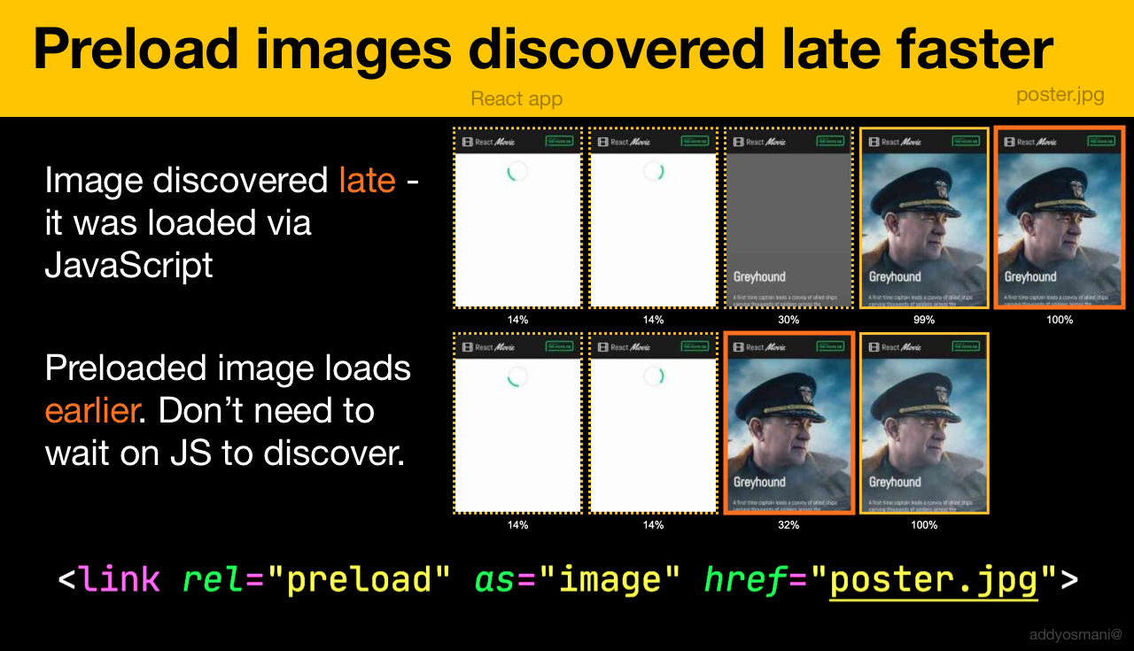
- Use service workers for caching and network fallbacks.
No performance optimization over a network can be faster than a locally stored cache on a user’s machine (there are exceptions though). If your website is running over HTTPS, we can cache static assets in a service worker cache and store offline fallbacks (or even offline pages) and retrieve them from the user’s machine, rather than going to the network.As suggested by Phil Walton, with service workers, we can send smaller HTML payloads by programmatically generating our responses. A service worker can request just the bare minimum of data it needs from the server (e.g. an HTML content partial, a Markdown file, JSON data, etc.), and then it can programmatically transform that data into a full HTML document. So once a user visits a site and the service worker is installed, the user will never request a full HTML page again. The performance impact can be quite impressive.
Browser support? Service workers are widely supported and the fallback is the network anyway. Does it help boost performance? Oh yes, it does. And it’s getting better, e.g. with Background Fetch allowing background uploads/downloads via a service worker as well.
There are a number of use cases for a service worker. For example, you could implement "Save for offline" feature, handle broken images, introduce messaging between tabs or provide different caching strategies based on request types. In general, a common reliable strategy is to store the app shell in the service worker’s cache along with a few critical pages, such as offline page, frontpage and anything else that might be important in your case.
There are a few gotchas to keep in mind though. With a service worker in place, we need to beware range requests in Safari (if you are using Workbox for a service worker it has a range request module). If you ever stumbled upon
DOMException: Quota exceeded.error in the browser console, then look into Gerardo’s article When 7KB equals 7MB.As Gerardo writes, “If you are building a progressive web app and are experiencing bloated cache storage when your service worker caches static assets served from CDNs, make sure the proper CORS response header exists for cross-origin resources, you do not cache opaque responses with your service worker unintentionally, you opt-in cross-origin image assets into CORS mode by adding the
crossoriginattribute to the<img>tag.”There is plenty of great resources to get started with service workers:
- Service Worker Mindset, which helps you understand how service workers work behind the scenes and things to understand when building one.
- Chris Ferdinandi provides a great series of articles on service workers, explaining how to create offline applications and covering a variety of scenarios, from saving recently viewed pages offline to setting an expiration date for items in a service worker cache.
- Service Worker Pitfalls and Best Practices, with a few tips about the scope, delaying registering a service worker and service worker caching.
- Great series by Ire Aderinokun on "Offline First" with Service Worker, with a strategy on precaching the app shell.
- Service Worker: An Introduction with practical tips on how to use service worker for rich offline experiences, periodic background syncs and push notifications.
- It's always worth referring to good ol' Jake Archibald’s Offline Cookbook with a number of recipes on how to bake your own service worker.
- Workbox is a set of service worker libraries built specifically for building progressive web apps.
- Are you running servers workers on the CDN/Edge, e.g. for A/B testing?
At this point, we are quite used to running service workers on the client, but with CDNs implementing them on the server, we could use them to tweak performance on the edge as well.For example, in A/B tests, when HTML needs to vary its content for different users, we could use Service Workers on the CDN servers to handle the logic. We could also stream HTML rewriting to speed up sites that use Google Fonts.
- Optimize rendering performance.
Whenever the application is sluggish, it's noticeable right away. So we need to make sure that there is no lag when scrolling the page or when an element is animated, and that you’re consistently hitting 60 frames per second. If that’s not possible, then at least making the frames per second consistent is preferable to a mixed range of 60 to 15. Use CSS’will-changeto inform the browser of which elements and properties will change.Whenever you are experiencing, debug unnecessary repaints in DevTools:
- Measure runtime rendering performance. Check some useful tips on how to make sense of it.
- To get started, check Paul Lewis’ free Udacity course on browser-rendering optimization and Georgy Marchuk’s article on Browser painting and considerations for web performance.
- Enable Paint Flashing in "More tools → Rendering → Paint Flashing" in Firefox DevTools.
- In React DevTools, check "Highlight updates" and enable "Record why each component rendered",
- You can also use Why Did You Render, so when a component is re-rendered, a flash will notify you of the change.
Are you using a Masonry layout? Keep in mind that might be able to build a Masonry layout with CSS grid alone, very soon.
If you want to dive deeper into the topic, Nolan Lawson has shared tricks to accurately measure layout performance in his article, and Jason Miller suggested alternative techniques, too. We also have a lil' article by Sergey Chikuyonok on how to get GPU animation right.

Browsers can animate transform and opacity cheaply. CSS Triggers is useful for checking if CSS triggers re-layouts or reflows. (Image credit: Addy Osmani)(Large preview) Note: changes to GPU-composited layers are the least expensive, so if you can get away by triggering only compositing via
opacityandtransform, you’ll be on the right track. Anna Migas has provided a lot of practical advice in her talk on Debugging UI Rendering Performance, too. And to understand how to debug paint performance in DevTools, check Umar’s Paint Performance audit video. - Have you optimized for perceived performance?
While the sequence of how components appear on the page, and the strategy of how we serve assets to the browser matter, we shouldn’t underestimate the role of perceived performance, too. The concept deals with psychological aspects of waiting, basically keeping customers busy or engaged while something else is happening. That’s where perception management, preemptive start, early completion and tolerance management come into play.What does it all mean? While loading assets, we can try to always be one step ahead of the customer, so the experience feels swift while there is quite a lot happening in the background. To keep the customer engaged, we can test skeleton screens (implementation demo) instead of loading indicators, add transitions/animations and basically cheat the UX when there is nothing more to optimize.
In their case study on The Art of UI Skeletons, Kumar McMillan shares some ideas and techniques on how to simulate dynamic lists, text, and the final screen, as well as how to consider skeleton-thinking with React.
Beware though: skeleton screens should be tested before deploying as some tests showed that skeleton screens can perform the worst by all metrics.
- Do you prevent layout shifts and repaints?
In the realm of perceived performance probably one of the more disruptive experiences is layout shifting, or reflows, caused by rescaled images and videos, web fonts, injected ads or late-discovered scripts that populate components with actual content. As a result, a customer might start reading an article just to be interrupted by a layout jump above the reading area. The experience is often abrupt and quite disorienting: and that’s probably a case of loading priorities that need to be reconsidered.The community has developed a couple of techniques and workarounds to avoid reflows. In general, it’s a good idea to avoid inserting new content above existing content, unless it happens in response to a user interaction. Always set width and height attributes on images, so modern browsers allocate the box and reserve the space by default (Firefox, Chrome).
For both images or videos, we can use an SVG placeholder to reserve the display box in which the media will appear in. That means that the area will be reserved properly when you need to maintain its aspect ratio as well. We can also use placeholders, or fallback images for ads and dynamic content, as well as pre-allocate layout slots.
Instead of lazy-loading images with external scripts, consider using native lazy-loading, or hybrid lazy-loading when we load an external script only if native lazy-loading isn’t supported.
As mentioned above, always group web font repaints and transition from all fallback fonts to all web fonts at once — just make sure that that switch isn’t too abrupt, by adjusting line-height and spacing between the fonts with font-style-matcher.
To override font metrics for a fallback font to emulate a web font, we can use @font-face descriptors to override font metrics (demo, enabled in Chrome 87). (Note that adjustments are complicated with complicated font stacks though.)
For late CSS, we can ensure that layout-critical CSS is inlined in the header of each template. Even further than that: for long pages, when the vertical scrollbar is added, it does shift the main content 16px to the left. To display a scrollbar early, we can add
overflow-y: scrollonhtmlto enforce a scrollbar at first paint. The latter helps because scrollbars can cause non-trivial layout shifts due to above the fold content reflowing when width changes. Should mostly happen on platforms with non-overlay scrollbars like Windows though. But: breaksposition: stickybecause those elements will never scroll out of the container.If you deal with headers that become fixed or sticky positioned to the top of the page on scroll, reserve space for the header when it becomes pineed, e.g. with a placeholder element or
margin-topon the content. An exception should be cookie consent banners that shouldn’t have impact on CLS, but sometimes they do: it depends on the implementation. There are a few interesting strategies and takeaways in this Twitter thread.For a tab component that might include various amount of texts, you can prevent layout shifts with CSS grid stacks. By placing the content of each tab in the same grid area, and hiding one of them at a time, we can ensure that the container always takes the height of the larger element, so no layout shifts will occur.
Ah, and of course, infinite scrolling and "Load more" can cause layout shifts as well if there is content below the list (e.g. footer). To improve CLS, reserve enough space for content that would be loaded in before the user scrolls to that part of the page, remove the footer or any DOM elements at the bottom of the page that may be pushed down by content loading in. Also, prefetch data and images for below-the-fold content so that by the time a user scrolls that far, it’s already there. You can use list virtualization libraries like react-window to optimize long lists as well (thanks, Addy Osmani!).
To ensure that the impact of reflows is contained, measure the layout stability with the Layout Instability API. With it, you can calculate the Cumulative Layout Shift (CLS) score and include it as a requirement in your tests, so whenever a regression appears, you can track it and fix it.
To calculate the layout shift score, the browser looks at the viewport size and the movement of unstable elements in the viewport between two rendered frames. Ideally, the score would be close to
0. There is a great guide by Milica Mihajlija and Philip Walton on what CLS is and how to measure it. It’s a good starting point to measure and maintain perceived performance and avoid disruption, especially for business-critical tasks.Quick tip: to discover what caused a layout shift in DevTools, you can explore layout shifts under "Experience" in the Performance Panel.
Bonus: if you want to reduce reflows and repaints, check Charis Theodoulou’s guide to Minimising DOM Reflow/Layout Thrashing and Paul Irish’s list of What forces layout / reflow as well as CSSTriggers.com, a reference table on CSS properties that trigger layout, paint and compositing.

Networking And HTTP/2
- Is OCSP stapling enabled?
By enabling OCSP stapling on your server, you can speed up your TLS handshakes. The Online Certificate Status Protocol (OCSP) was created as an alternative to the Certificate Revocation List (CRL) protocol. Both protocols are used to check whether an SSL certificate has been revoked.However, the OCSP protocol does not require the browser to spend time downloading and then searching a list for certificate information, hence reducing the time required for a handshake.
- Have you reduced the impact of SSL certificate revocation?
In his article on "The Performance Cost of EV Certificates", Simon Hearne provides a great overview of common certificates, and the impact a choice of a certificate may have on the overall performance.As Simon writes, in the world of HTTPS, there are a few types of certificate validation levels used to secure traffic:
- Domain Validation (DV) validates that the certificate requestor owns the domain,
- Organisation Validation (OV) validates that an organisation owns the domain,
- Extended Validation (EV) validates that an organisation owns the domain, with rigorous validation.
It’s important to note that all of these certificates are the same in terms of technology; they only differ in information and properties provided in those certificates.
EV certificates are expensive and time-consuming as they require a human to reviewing a certificate and ensuring its validity. DV certificates, on the other hand, are often provided for free — e.g. by Let’s Encrypt — an open, automated certificate authority that’s well integrated into many hosting providers and CDNs. In fact, at the time of writing, it powers over 225 million websites (PDF), although it makes for only 2.69% of the pages (opened in Firefox).
So what’s the problem then? The issue is that EV certificates do not fully support OCSP stapling mentioned above. While stapling allows the server to check with the Certificate Authority if the certificate has been revoked and then add ("staple") this information to the certificate, without stapling the client has to do all the work, resulting in unnecessary requests during the TLS negotiation. On poor connections, this might end up with noticeable performance costs (1000ms+).
EV certificates aren’t a great choice for web performance, and they can cause a much bigger impact on performance than DV certificates do. For optimal web performance, always serve an OCSP stapled DV certificate. They are also much cheaper than EV certificates and less hassle to acquire. Well, at least until CRLite is available.
Compression matters: 40–43% of uncompressed certificate chains are too large to fit in a single QUIC flight of 3 UDP datagrams. (Image credit:) Fastly) (Large preview) Note: With QUIC/HTTP/3 upon us, it’s worth noting that the TLS certificate chain is the one variable-sized content that dominates the byte count in the QUIC Handshake. The size varies between a few hundred byes and over 10 KB.
So keeping TLS certificates small matters a lot on QUIC/HTTP/3, as large certificates will cause multiple handshakes. Also, we need to make sure that the certificates are compressed, as otherwise certificate chains would be too large to fit in a single QUIC flight.
You can find way more detail and pointers to the problem and to the solutions on:
- EV Certificates Make The Web Slow and Unreliable by Aaron Peters,
- The impact of SSL certificate revocation on web performance by Matt Hobbs,
- The Performance Cost of EV Certificates by Simon Hearne,
- Does the QUIC handshake require compression to be fast? by Patrick McManus.
- Have you adopted IPv6 yet?
Because we’re running out of space with IPv4 and major mobile networks are adopting IPv6 rapidly (the US has almost reached a 50% IPv6 adoption threshold), it’s a good idea to update your DNS to IPv6 to stay bulletproof for the future. Just make sure that dual-stack support is provided across the network — it allows IPv6 and IPv4 to run simultaneously alongside each other. After all, IPv6 is not backwards-compatible. Also, studies show that IPv6 made those websites 10 to 15% faster due to neighbor discovery (NDP) and route optimization. - Make sure all assets run over HTTP/2 (or HTTP/3).
With Google pushing towards a more secure HTTPS web over the last few years, a switch to HTTP/2 environment is definitely a good investment. In fact, according to Web Almanac, 64% of all requests are running over HTTP/2 already.It’s important to understand that HTTP/2 isn’t perfect and has prioritization issues, but it’s supported very well; and, in most cases, you’re better off with it.
A word of caution: HTTP/2 Server Push is being removed from Chrome, so if your implementation relies on Server Push, you might need to revisit it. Instead, we might be looking at Early Hints, which are integrated as experiment in Fastly already.
If you’re still running on HTTP, the most time-consuming task will be to migrate to HTTPS first, and then adjust your build process to cater for HTTP/2 multiplexing and parallelization. Bringing HTTP/2 to Gov.uk is a fantastic case study on doing just that, finding a way through CORS, SRI and WPT along the way. For the rest of this article, we assume that you’re either switching to or have already switched to HTTP/2.
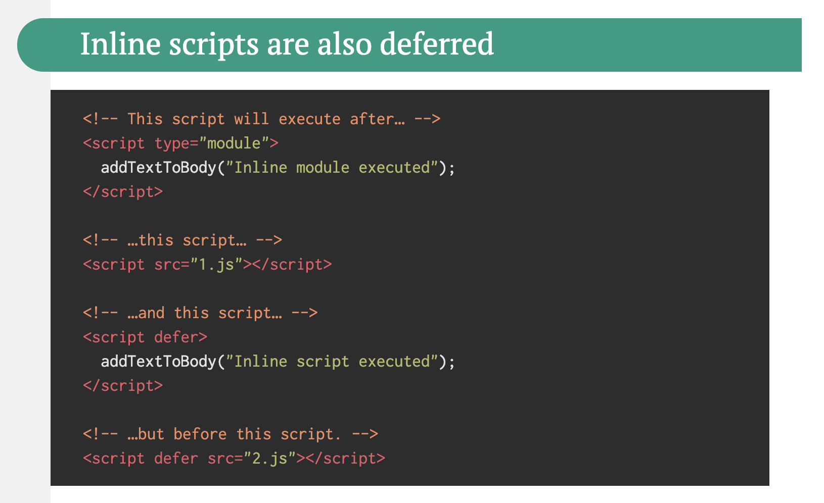
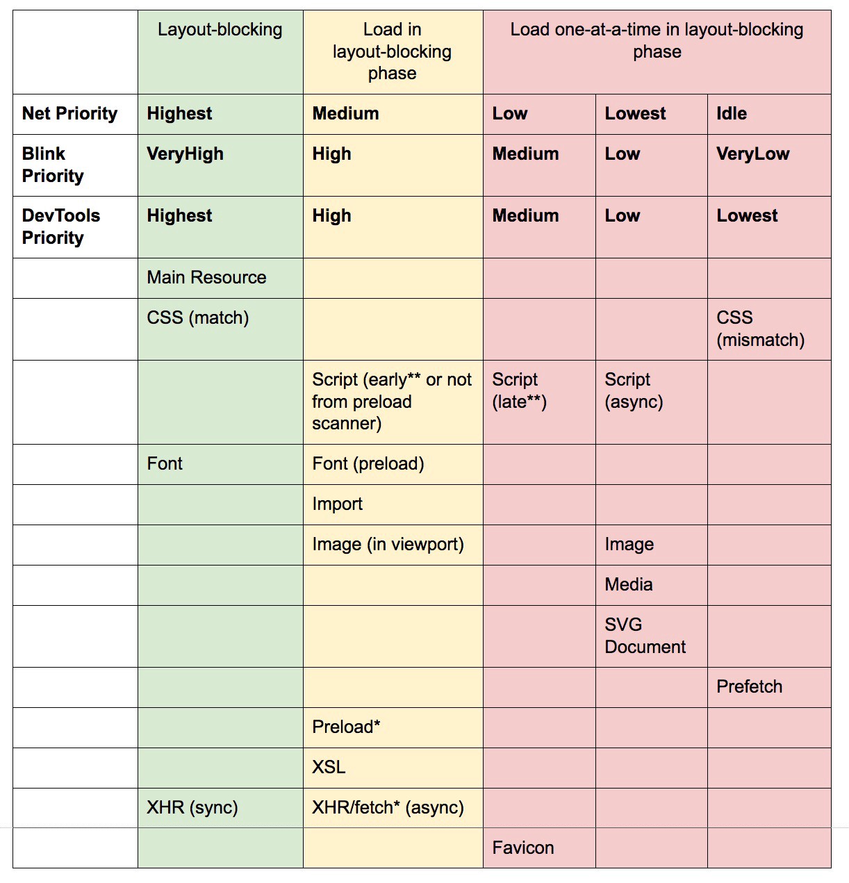
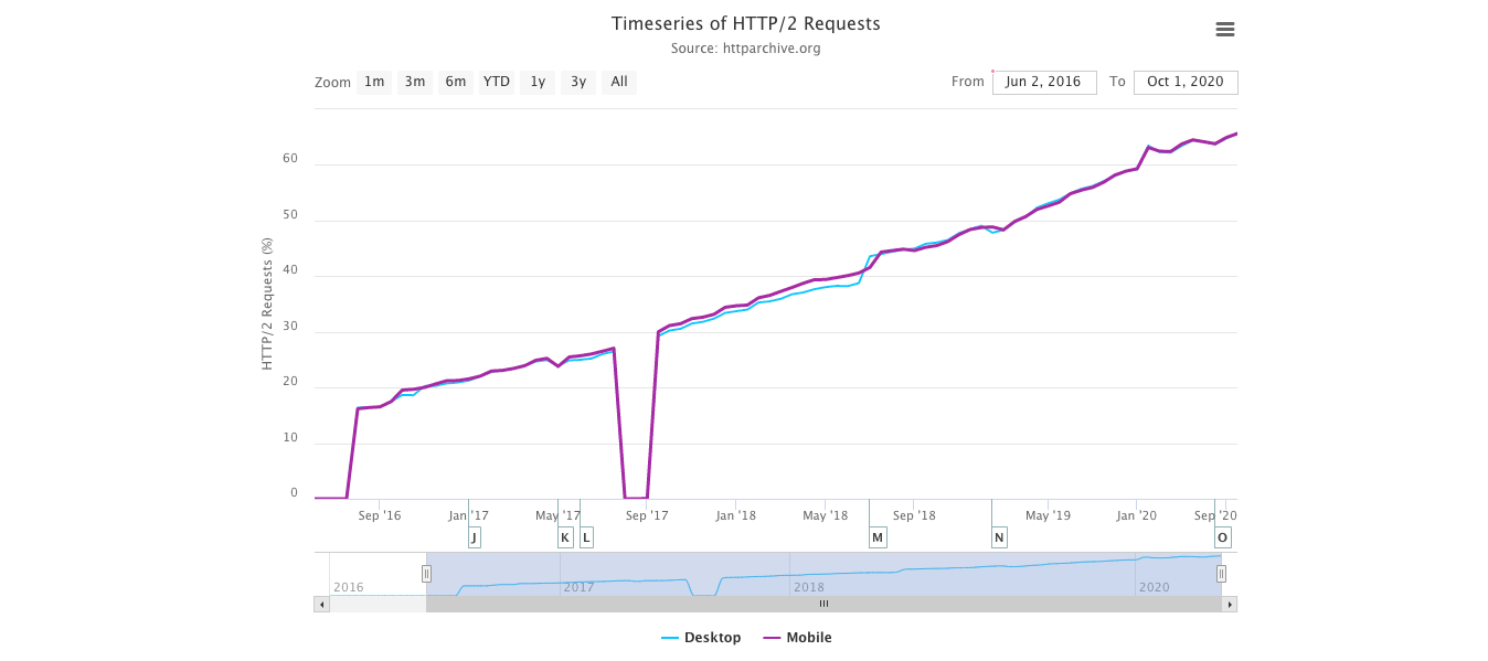
- Properly deploy HTTP/2.
Again, serving assets over HTTP/2 can benefit from a partial overhaul of how you’ve been serving assets so far. You’ll need to find a fine balance between packaging modules and loading many small modules in parallel. At the end of the day, still the best request is no request, however, the goal is to find a fine balance between quick first delivery of assets and caching.On the one hand, you might want to avoid concatenating assets altogether, instead of breaking down your entire interface into many small modules, compressing them as a part of the build process and loading them in parallel. A change in one file won’t require the entire style sheet or JavaScript to be re-downloaded. It also minimizes parsing time and keeps the payloads of individual pages low.
On the other hand, packaging still matters. By using many small scripts, overall compression will suffer and the cost of retrieving objects from the cache will increase. The compression of a large package will benefit from dictionary reuse, whereas small separate packages will not. There’s standard work to address that, but it’s far out for now. Secondly, browsers have not yet been optimized for such workflows. For example, Chrome will trigger inter-process communications (IPCs) linear to the number of resources, so including hundreds of resources will have browser runtime costs.
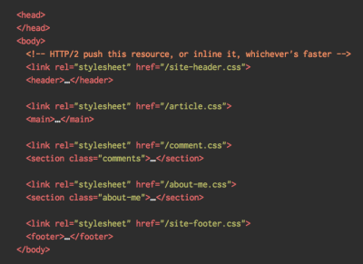
To achieve best results with HTTP/2, consider to load CSS progressively, as suggested by Chrome’s Jake Archibald. Still, you can try to load CSS progressively. In fact, in-body CSS no longer blocks rendering for Chrome. But there are some prioritization issues so it’s not as straightforward, but worth experimenting with.
You could get away with HTTP/2 connection coalescing, which allows you to use domain sharding while benefiting from HTTP/2, but achieving this in practice is difficult, and in general, it’s not considered to be good practice. Also, HTTP/2 and Subresource Integrity don’t always get on.
What to do? Well, if you’re running over HTTP/2, sending around 6–10 packages seems like a decent compromise (and isn’t too bad for legacy browsers). Experiment and measure to find the right balance for your website.
- Do we send all assets over a single HTTP/2 connection?
One of the main advantages of HTTP/2 is that it allows us to send assets down the wire over a single connection. However, sometimes we might have done something wrong — e.g. have a CORS issue, or misconfigured thecrossoriginattribute, so the browser would be forced to open a new connection.To check whether all requests use a single HTTP/2 connection, or something’s misconfigured, enable the "Connection ID" column in DevTools → Network. E.g., here, all requests share the same connection (286) — except manifest.json, which opens a separate one (451).
- Do your servers and CDNs support HTTP/2?
Different servers and CDNs (still) support HTTP/2 differently. Use CDN Comparison to check your options, or quickly look up how your servers are performing and which features you can expect to be supported.Consult Pat Meenan’s incredible research on HTTP/2 priorities (video) and test server support for HTTP/2 prioritization. According to Pat, it’s recommended to enable BBR congestion control and set
tcp_notsent_lowatto 16KB for HTTP/2 prioritization to work reliably on Linux 4.9 kernels and later (thanks, Yoav!). Andy Davies did a similar research for HTTP/2 prioritization across browsers, CDNs and Cloud Hosting Services.While on it, double check if your kernel supports TCP BBR and enable it if possible. It’s currently used on Google Cloud Platform, Amazon Cloudfront, Linux (e.g. Ubuntu).
- Is HPACK compression in use?
If you’re using HTTP/2, double-check that your servers implement HPACK compression for HTTP response headers to reduce unnecessary overhead. Some HTTP/2 servers may not fully support the specification, with HPACK being an example. H2spec is a great (if very technically detailed) tool to check that. HPACK’s compression algorithm is quite impressive, and it works. - Make sure the security on your server is bulletproof.
All browser implementations of HTTP/2 run over TLS, so you will probably want to avoid security warnings or some elements on your page not working. Double-check that your security headers are set properly, eliminate known vulnerabilities, and check your HTTPS setup.Also, make sure that all external plugins and tracking scripts are loaded via HTTPS, that cross-site scripting isn’t possible and that both HTTP Strict Transport Security headers and Content Security Policy headers are properly set.
- Do your servers and CDNs support HTTP/3?
While HTTP/2 has brought a number of significant performance improvements to the web, it also left quite some area for improvement — especially head-of-line blocking in TCP, which was noticeable on a slow network with a significant packet loss. HTTP/3 is solving these issues for good (article).To address HTTP/2 issues, IETF, along with Google, Akamai and others, have been working on a new protocol that has recently been standardized as HTTP/3.
Robin Marx has explained HTTP/3 very well, and the following explanation is based on his explanation. In its core, HTTP/3 is very similar to HTTP/2 in terms of features, but under the hood it works very differently. HTTP/3 provides a number of improvements: faster handshakes, better encryption, more reliable independent streams, better encryption and flow control. A noteable difference is that HTTP/3 uses QUIC as the transport layer, with QUIC packets encapsulated on top of UDP diagrams, rather than TCP.
QUIC fully integrates TLS 1.3 into the protocol, while in TCP it’s layered on top. In the typical TCP stack, we have a few round-trip times of overhead because TCP and TLS need to do their own separate handshakes, but with QUIC both of them can be combined and completed in just a single round trip. Since TLS 1.3 allows us to set up encryption keys for a consequent connection, from the second connection onward, we can already send and receive application layer data in the first round trip, which is called "0-RTT".
Also, header compression algorithm of HTTP/2 was entirely rewritten, along with its prioritization system. Plus, QUIC support connection migration from Wi-Fi to cellular network via connection IDs in the header of each QUIC packet. Most of the implementations are done in the user space, not kernel space (as it’s done with TCP), so we should be expecting the protocol to be evolving in the future.
Would it all make a big difference? Probably yes, especially having an impact on loading times on mobile, but also on how we serve assets to end users. While in HTTP/2, multiple requests share a connection, in HTTP/3 requests also share a connection but stream independently, so a dropped packet no longer impacts all requests, just the one stream.
That means that while with one large JavaScript bundle the processing of assets will be slowed down when one stream pauses, the impact will be less significant when multiple files stream in parallel (HTTP/3). So packaging still matters.
HTTP/3 is still work in progress. Chrome, Firefox and Safari have implementations already. Some CDNs support QUIC and HTTP/3 already. In late 2020, Chrome started deploying HTTP/3 and IETF QUIC, and in fact all Google services (Google Analytics, YouTube etc.) are already running over HTTP/3. LiteSpeed Web Server supports HTTP/3, but neither Apache, nginx or IIS support it yet, but it’s likely to change quickly in 2021.
The bottom line: if you have an option to use HTTP/3 on the server and on your CDN, it’s probably a very good idea to do so. The main benefit will come from fetching multiple objects simultaneously, especially on high-latency connections. We don’t know for sure yet as there isn’t much research done in that space, but first results are very promising.
If you want to dive more into the specifics and advantages of the protocol, here are some good starting points to check:
- HTTP/3 Explained, a collaborative effort to document the HTTP/3 and the QUIC protocols. Available in various languages, also as PDF.
- Leveling Up Web Performance With HTTP/3 with Daniel Stenberg.
- An Academic’s Guide to QUIC with Robin Marx introduces basic concepts of the QUIC and HTTP/3 protocols, explains how HTTP/3 handles head-of-line blocking and connection migration, and how HTTP/3 is designed to be evergreen (thanks, Simon!).
- You can check if your server is running on HTTP/3 on HTTP3Check.net.
Testing And Monitoring
- Have you optimized your auditing workflow?
It might not sound like a big deal, but having the right settings in place at your fingertips might save you quite a bit of time in testing. Consider using Tim Kadlec’s Alfred Workflow for WebPageTest for submitting a test to the public instance of WebPageTest. In fact, WebPageTest has many obscure features, so take the time to learn how to read a WebPageTest Waterfall View chart and how to read a WebPageTest Connection View chart to diagnose and resolve performance issues faster.You could also drive WebPageTest from a Google Spreadsheet and incorporate accessibility, performance and SEO scores into your Travis setup with Lighthouse CI or straight into Webpack.
Take a look at the recently released AutoWebPerf, a modular tool that enables automatic gathering of performance data from multiple sources. For example, we could set a daily test on your critical pages to capture the field data from CrUX API and lab data from a Lighthouse report from PageSpeed Insights.
And if you need to debug something quickly but your build process seems to be remarkably slow, keep in mind that "whitespace removal and symbol mangling accounts for 95% of the size reduction in minified code for most JavaScript — not elaborate code transforms. You can simply disable compression to speed up Uglify builds by 3 to 4 times."

- Have you tested in proxy browsers and legacy browsers?
Testing in Chrome and Firefox is not enough. Look into how your website works in proxy browsers and legacy browsers. UC Browser and Opera Mini, for instance, have a significant market share in Asia (up to 35% in Asia). Measure average Internet speed in your countries of interest to avoid big surprises down the road. Test with network throttling, and emulate a high-DPI device. BrowserStack is fantastic for testing on remote real devices, and complement it with at least a few real devices in your office as well — it’s worth it.
- Have you tested the performance of your 404 pages?
Normally we don’t think twice when it comes to 404 pages. After all, when a client requests a page that doesn’t exist on the server, the server is going to respond with a 404 status code and the associated 404 page. There isn’t that much to it, isn’t it?An important aspect of 404 responses is the actual response body size that is being sent to the browser. According to the 404 pages research by Matt Hobbs, the vast majority of 404 responses are coming from missing favicons, WordPress uploads requests, broken JavaScript requests, manifest files as well as CSS and font files. Every time a client requests an asset that doesn’t exist, they’ll receive a 404 response — and often that response is huge.
Make sure to examine and optimize the caching strategy for your 404 pages. Our goal is to serve HTML to the browser only when it expects an HTML response, and return a small error payload for all other responses. According to Matt, "if we place a CDN in front of our origin, we have the chance to cache the 404 page response on the CDN. That’s useful because without it, hitting a 404 page could be used as a DoS attack vector, by forcing the origin server to respond to every 404 request rather than letting the CDN respond with a cached version."
Not only can 404 errors hurt your performance, but they can also cost in traffic, so it’s a good idea to include a 404 error page in your Lighthouse testing suite, and track its score over time.
- Have you tested the performance of your GDPR consent prompts?
In times of GDPR and CCPA, it has become common to rely on third-parties to provide options for EU customers to opt in or opt out from tracking. However, like with any other third-party script, their performance can have a quite devastating impact on the entire performance effort.Of course, the actual consent is likely to change the impact of scripts on the overall performance, so, as Boris Schapira noted, we might want to study a few different web performance profiles:
- Consent was entirely refused,
- Consent was partially refused,
- Consent was entirely given.
- User hasn’t acted on consent prompt (or the prompt was blocked by a content blocker),
Normally cookie consent prompts shouldn’t have an impact on CLS, but sometimes they do, so consider using free and open source options Osano or cookie-consent-box.
In general, it’s worth looking into the pop-up performance as you will need to determine the horizontal or vertical offset of the mouse event and correctly position the popup relatively to the anchor. Noam Rosenthal shares Wikimedia team’s learnings in the article Web performance case study: Wikipedia page previews (also available as video and minutes).
- Do you keep a performance diagnostics CSS?
While we can include all kinds of checks to ensure that non-performant code gets deployed, often it's useful to get a quick idea of some of the low-hanging fruits that could be solved easily. For that, we could use Tim Kadlec's brilliant Performance Diagnostics CSS (inspired by Harry Roberts' snippetwhich highlights lazy-loaded images, unsized images, legacy format images and synchronous scripts.E.g. you might want to ensure that no images above the fold are lazy loaded. You can customize the snippet for you needs, e.g. to highlight web fonts that aren't used, or detect icon fonts. A great little tool to ensure that mistakes are visible during debugging, or just to audit the current project very quickly.
/* Performance Diagnostics CSS */
/* via Harry Roberts. https://twitter.com/csswizardry/status/1346477682544951296 */
img[loading=lazy] {
  outline: 10px solid red;
}
- Have you tested the impact on accessibility?
When the browser starts to load a page, it builds a DOM, and if there is an assistive technology like a screen reader running, it also creates an accessibility tree. The screen reader then has to query the accessibility tree to retrieve the information and make it available to the user — sometimes by default, and sometimes on demand. And sometimes it takes time.When talking about fast Time to Interactive, usually we mean an indicator of how soon a user can interact with the page by clicking or tapping on links and buttons. The context is slightly different with screen readers. In that case, fast Time to Interactive means how much time passes by until the screen reader can announce navigation on a given page and a screen reader user can actually hit keyboard to interact.
Léonie Watson has given an eye-opening talk on accessibility performance and specifically the impact slow loading has on screen reader announcement delays. Screen readers are used to fast-paced announcements and quick navigation, and therefore might potentially be even less patient than sighted users.
Large pages and DOM manipulations with JavaScript will cause delays in screen reader announcements. A rather unexplored area that could use some attention and testing as screen readers are available on literally every platform (Jaws, NVDA, Voiceover, Narrator, Orca).
- Is continuous monitoring set up?
Having a private instance of WebPagetest is always beneficial for quick and unlimited tests. However, a continuous monitoring tool — like Sitespeed, Calibre and SpeedCurve — with automatic alerts will give you a more detailed picture of your performance. Set your own user-timing marks to measure and monitor business-specific metrics. Also, consider adding automated performance regression alerts to monitor changes over time.Look into using RUM-solutions to monitor changes in performance over time. For automated unit-test-alike load testing tools, you can use k6 with its scripting API. Also, look into SpeedTracker, Lighthouse and Calibre.
Quick Wins
This list is quite comprehensive, and completing all of the optimizations might take quite a while. So, if you had just 1 hour to get significant improvements, what would you do? Let’s boil it all down to 17 low-hanging fruits. Obviously, before you start and once you finish, measure results, including Largest Contentful Paint and Time To Interactive on a 3G and cable connection.
- Measure the real world experience and set appropriate goals. Aim to be at least 20% faster than your fastest competitor. Stay within Largest Contentful Paint < 2.5s, a First Input Delay < 100ms, Time to Interactive < 5s on slow 3G, for repeat visits, TTI < 2s. Optimize at least for First Contentful Paint and Time To Interactive.
- Optimize images with Squoosh, mozjpeg, guetzli, pingo and SVGOMG, and serve AVIF/WebP with an image CDN.
- Prepare critical CSS for your main templates, and inline them in the
<head>of each template. For CSS/JS, operate within a critical file size budget of max. 170KB gzipped (0.7MB decompressed). - Trim, optimize, defer and lazy-load scripts. Invest in the config of your bundler to remove redundancies and check lightweight alternatives.
- Always self-host your static assets and always prefer to self-host third-party assets. Limit the impact of third-party scripts. Use facades, load widgets on interaction and beware of anti-flicker snippets.
- Be selective when choosing a framework. For single-page-applications, identify critical pages and serve them statically, or at least prerender them, and use progressive hydration on component-level and import modules on interaction.
- Client-side rendering alone isn't a good choice for performance. Prerender if your pages don’t change much, and defer the booting of frameworks if you can. If possible, use streaming server-side rendering.
- Serve legacy code only to legacy browsers with
<script type="module">and module/nomodule pattern. - Experiment with regrouping your CSS rules and test in-body CSS.
- Add resource hints to speed up delivery with faster
dns-lookup,preconnect,prefetch,preloadandprerender. - Subset web fonts and load them asynchronously, and utilize
font-displayin CSS for fast first rendering. - Check that HTTP cache headers and security headers are set properly.
- Enable Brotli compression on the server. (If that’s not possible, at least make sure that Gzip compression is enabled.)
- Enable TCP BBR congestion as long as your server is running on the Linux kernel version 4.9+.
- Enable OCSP stapling and IPv6 if possible. Always serve an OCSP stapled DV certificate.
- Enable HPACK compression for HTTP/2 and move to HTTP/3 if it's available.
- Cache assets such as fonts, styles, JavaScript and images in a service worker cache.
Download The Checklist (PDF, Apple Pages)
With this checklist in mind, you should be prepared for any kind of front-end performance project. Feel free to download the print-ready PDF of the checklist as well as an editable Apple Pages document to customize the checklist for your needs:
- Download the checklist PDF (PDF, 166 KB)
- Download the checklist in Apple Pages (.pages, 275 KB)
- Download the checklist in MS Word (.docx, 151 KB)
If you need alternatives, you can also check the front-end checklist by Dan Rublic, the "Designer’s Web Performance Checklist" by Jon Yablonski and the FrontendChecklist.
Off We Go!
Some of the optimizations might be beyond the scope of your work or budget or might just be overkill given the legacy code you have to deal with. That’s fine! Use this checklist as a general (and hopefully comprehensive) guide, and create your own list of issues that apply to your context. But most importantly, test and measure your own projects to identify issues before optimizing. Happy performance results in 2021, everyone!
A huge thanks to Guy Podjarny, Yoav Weiss, Addy Osmani, Artem Denysov, Denys Mishunov, Ilya Pukhalski, Jeremy Wagner, Colin Bendell, Mark Zeman, Patrick Meenan, Leonardo Losoviz, Andy Davies, Rachel Andrew, Anselm Hannemann, Barry Pollard, Patrick Hamann, Gideon Pyzer, Andy Davies, Maria Prosvernina, Tim Kadlec, Rey Bango, Matthias Ott, Peter Bowyer, Phil Walton, Mariana Peralta, Pepijn Senders, Mark Nottingham, Jean Pierre Vincent, Philipp Tellis, Ryan Townsend, Ingrid Bergman, Mohamed Hussain S. H., Jacob Groß, Tim Swalling, Bob Visser, Kev Adamson, Adir Amsalem, Aleksey Kulikov and Rodney Rehm for reviewing this article, as well as our fantastic community which has shared techniques and lessons learned from its work in performance optimization for everybody to use. You are truly smashing!
Further Reading
- 55 Free High Quality Icon Sets
- The Ultimate Guide To Cloning In Photoshop
- Hand-Sketching: Things You Didn’t Know Your Doodles Could Accomplish
- Switching From Adobe Fireworks To Sketch: Ten Tips And Tricks
 (il)
(il)