How We Improved SmashingMag Performance

Email Newsletter
Weekly tips on front-end & UX.
Trusted by 200,000+ folks.
This article is kindly supported by our dear friends at Media Temple who deliver a full spectrum of web hosting solutions for designers, developers, and your clients. Thank you, dear friends!
Every web performance story is similar, isn’t it? It always starts with the long-awaited website overhaul. A day when a project, fully polished and carefully optimized, gets launched, ranking high and soaring above performance scores in Lighthouse and WebPageTest. There is a celebration and a wholehearted sense of accomplishment prevailing in the air — beautifully reflected in retweets and comments and newsletters and Slack threads.
Yet as time passes by, the excitement slowly fades away, and urgent adjustments, much-needed features, and new business requirements creep in. And suddenly, before you know it, the code base gets a little bit overweight and fragmented, third-party scripts have to load just a little bit earlier, and shiny new dynamic content finds its way into the DOM through the backdoors of fourth-party scripts and their uninvited guests.
We’ve been there at Smashing as well. Not many people know it but we are a very small team of around 12 people, many of whom are working part-time and most of whom are usually wearing many different hats on a given day. While performance has been our goal for almost a decade now, we never really had a dedicated performance team.
After the latest redesign in late 2017, it was Ilya Pukhalski on the JavaScript side of things (part-time), Michael Riethmueller on the CSS side of things (a few hours a week), and yours truly, playing mind games with critical CSS and trying to juggle a few too many things.
As it happened, we lost track of performance in the busyness of day-to-day routine. We were designing and building things, setting up new products, refactoring the components, and publishing articles. So by late 2020, things got a bit out of control, with yellowish-red Lighthouse scores slowly showing up across the board. We had to fix that.
That’s Where We Were
Some of you might know that we are running on JAMStack, with all articles and pages stored as Markdown files, Sass files compiled into CSS, JavaScript split into chunks with Webpack and Hugo building out static pages that we then serve directly from an Edge CDN. Back in 2017 we built the entire site with Preact, but then have moved to React in 2019 — and use it along with a few APIs for search, comments, authentication and checkout.
The entire site is built with progressive enhancement in mind, meaning that you, dear reader, can read every Smashing article in its entirety without the need to boot the application at all. It’s not very surprising either — in the end, a published article doesn’t change much over the years, while dynamic pieces such as Membership authentication and checkout need the application to run.
The entire build for deploying around 2500 articles live takes around 6 mins at the moment. The build process on its own has become quite a beast over time as well, with critical CSS injects, Webpack’s code splitting, dynamic inserts of advertising and feature panels, RSS (re)generation, and eventual A/B testing on the edge.
In early 2020, we’ve started with the big refactoring of the CSS layout components. We never used CSS-in-JS or styled-components, but instead a good ol’ component-based system of Sass-modules which would be compiled into CSS. Back in 2017, the entire layout was built with Flexbox and rebuilt with CSS Grid and CSS Custom Properties in mid-2019. However, some pages needed special treatment due to new advertising spots and new product panels. So while the layout was working, it wasn’t working very well, and it was quite difficult to maintain.
Additionally, the header with the main navigation had to change to accommodate for more items that we wanted to display dynamically. Plus, we wanted to refactor some frequently used components used across the site, and the CSS used there needed some revision as well — the newsletter box being the most notable culprit. We started off by refactoring some components with utility-first CSS but we never got to the point that it was used consistently across the entire site.
The larger issue was the large JavaScript bundle that — not very surprisingly — was blocking the main-thread for hundreds of milliseconds. A big JavaScript bundle might seem out of place on a magazine that merely publishes articles, but actually, there is plenty of scripting happening behind the scenes.
We have various states of components for authenticated and unauthenticated customers. Once you are signed in, we want to show all products in the final price, and as you add a book to the cart, we want to keep a cart accessible with a tap on a button — no matter what page you are on. Advertising needs to come in quickly without causing disruptive layout shifts, and the same goes for the native product panels that highlight our products. Plus a service worker that caches all static assets and serves them for repeat views, along with cached versions of articles that a reader has already visited.
So all of this scripting had to happen at some point, and it was draining on the reading experience even although the script was coming in quite late. Frankly, we were painstakingly working on the site and new components without keeping a close eye on performance (and we had a few other things to keep in mind for 2020). The turning point came unexpectedly. Harry Roberts ran his (excellent) Web Performance Masterclass as an online workshop with us, and throughout the entire workshop, he was using Smashing as an example by highlighting issues that we had and suggesting solutions to those issues alongside useful tools and guidelines.
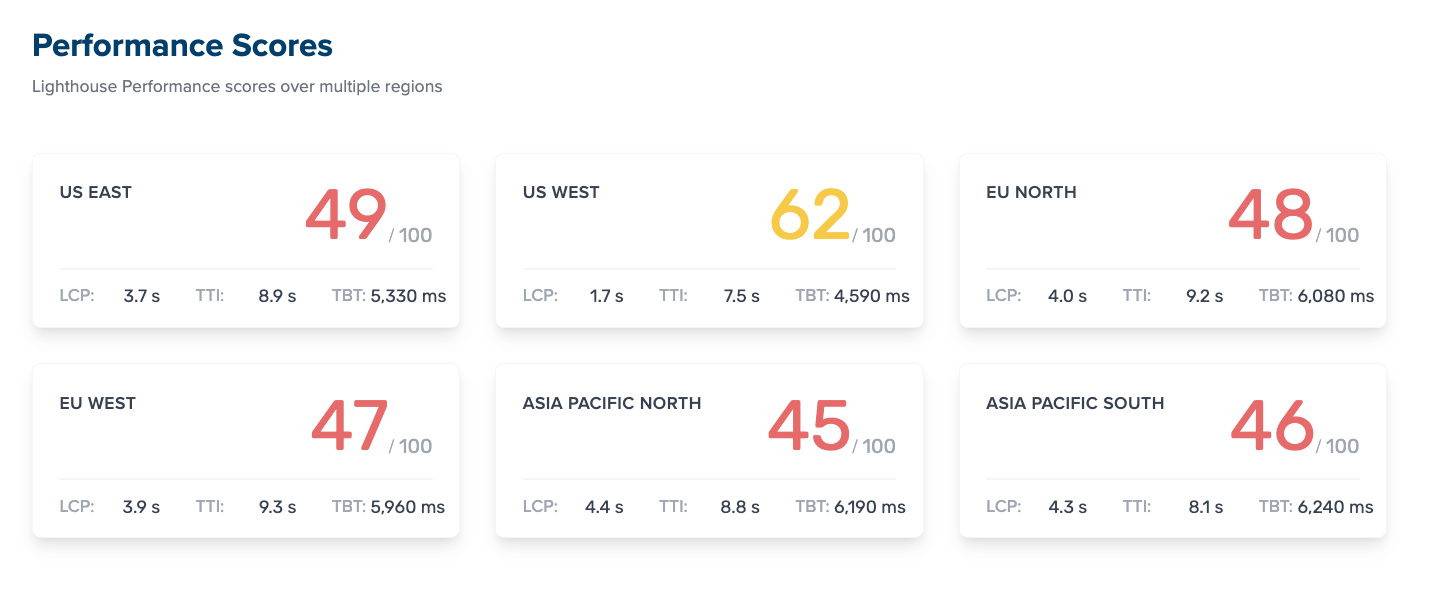
Throughout the workshop, I was diligently taking notes and revisiting the codebase. At the time of the workshop, our Lighthouse scores were 60–68 on the homepage, and around 40-60 on article pages — and obviously worse on mobile. Once the workshop was over, we got to work.
Identifying The Bottlenecks
We often tend to rely on particular scores to get an understanding of how well we perform, yet too often single scores don’t provide a full picture. As David East eloquently noted in his article, web performance isn’t a single value; it’s a distribution. Even if a web experience is heavily and thoroughly an optimized all-around performance, it can’t be just fast. It might be fast to some visitors, but ultimately it will also be slower (or slow) to some others.
The reasons for it are numerous, but the most important one is a huge difference in network conditions and device hardware across the world. More often than not we can’t really influence those things, so we have to ensure that our experience accommodates them instead.
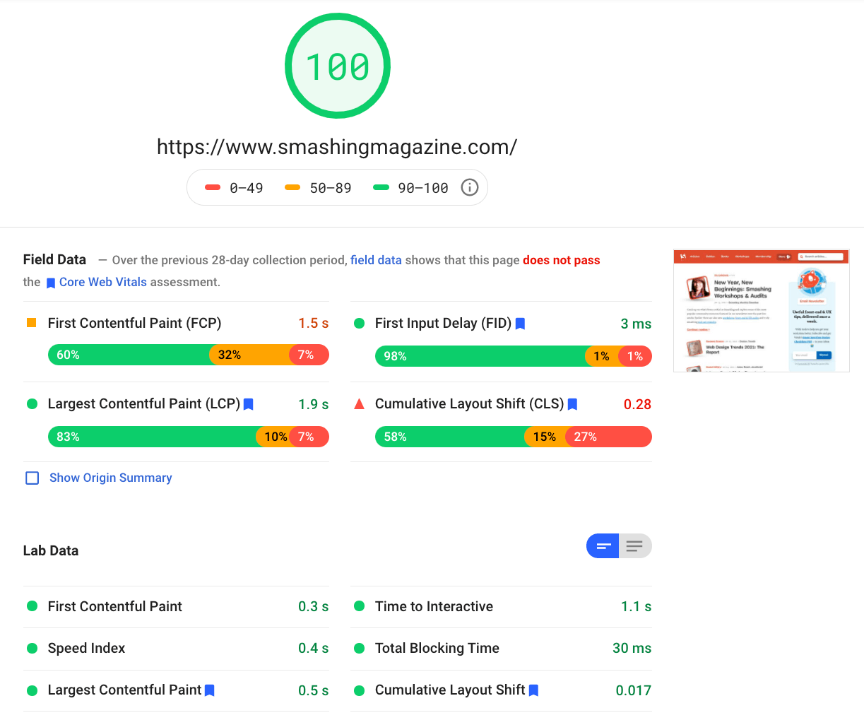
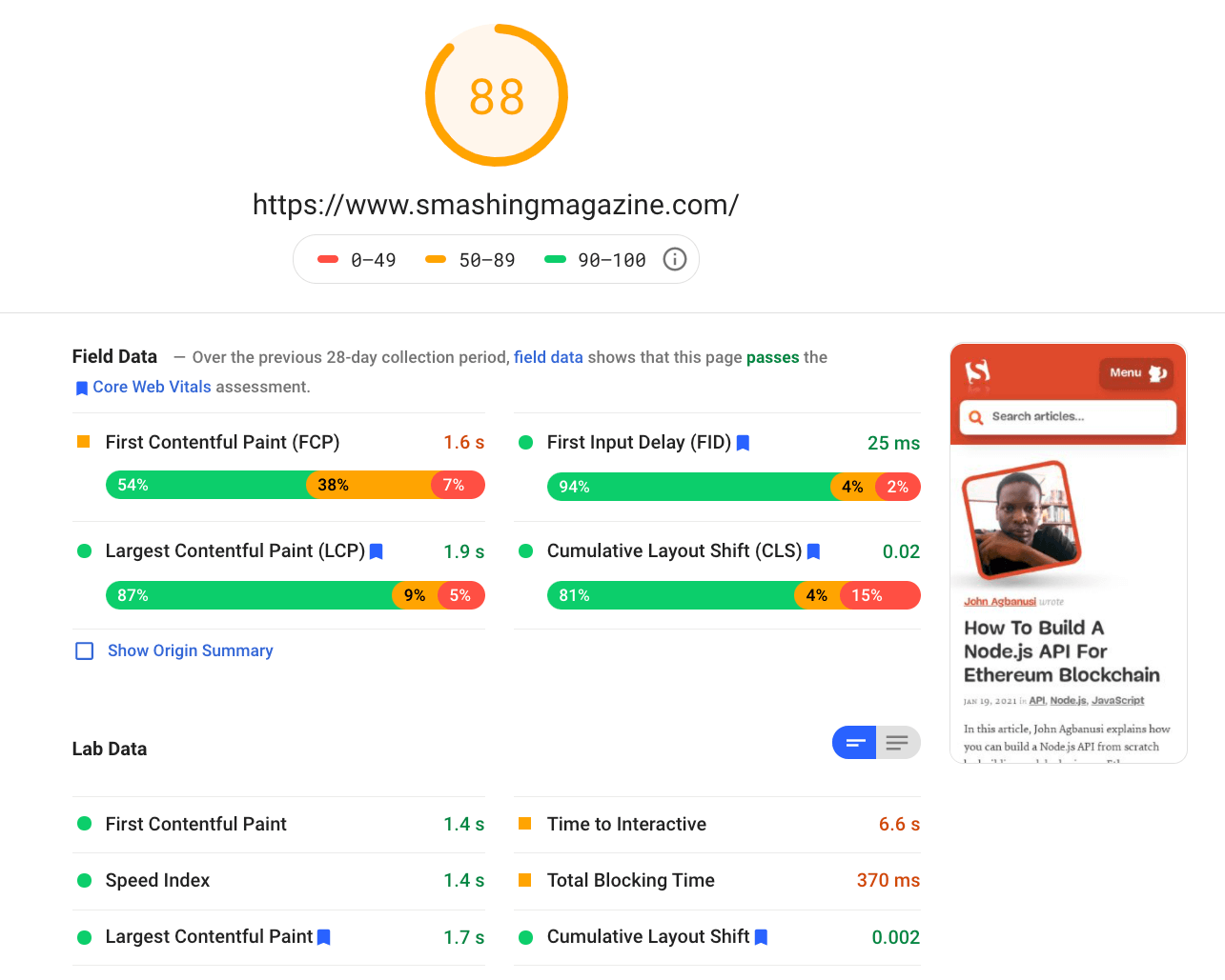
In essence, our job then is to increase the proportion of snappy experiences and decrease the proportion of sluggish experiences. But for that, we need to get a proper picture of what the distribution actually is. Now, analytics tools and performance monitoring tools will provide this data when needed, but we looked specifically into CrUX, Chrome User Experience Report. CrUX generates an overview of performance distributions over time, with traffic collected from Chrome users. Much of this data related to Core Web Vitals which Google has announced back in 2020, and which also contribute to and are exposed in Lighthouse.
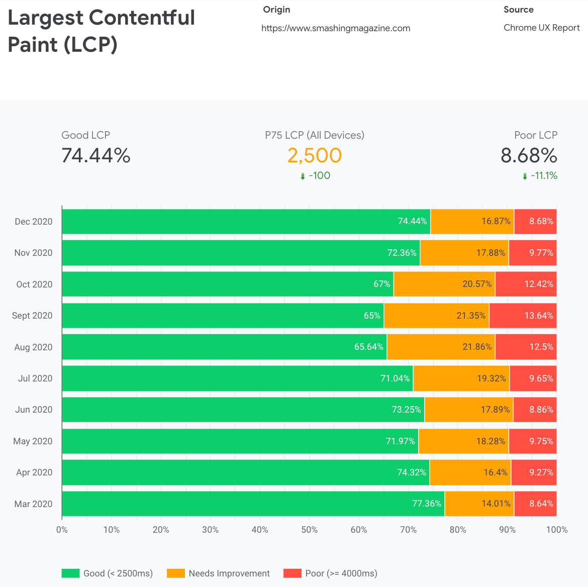
We noticed that across the board, our performance regressed dramatically throughout the year, with particular drops around August and September. Once we saw these charts, we could look back into some of the PRs we’ve pushed live back then to study what has actually happened.
It didn’t take a while to figure out that just around these times we launched a new navigation bar live. That navigation bar — used on all pages — relied on JavaScript to display navigation items in a menu on tap or on click, but the JavaScript bit of it was actually bundled within the app.js bundle. To improve Time To Interactive, we decided to extract the navigation script from the bundle and serve it inline.
Around the same time we switched from an (outdated) manually created critical CSS file to an automated system that was generating critical CSS for every template — homepage, article, product page, event, job board, and so on — and inline critical CSS during the build time. Yet we didn’t really realize how much heavier the automatically generated critical CSS was. We had to explore it in more detail.
And also around the same time, we were adjusting the web font loading, trying to push web fonts more aggressively with resource hints such as preload. This seems to be backlashing with our performance efforts though, as web fonts were delaying rendering of the content, being overprioritized next to the full CSS file.
Now, one of the common reasons for regression is the heavy cost of JavaScript, so we also looked into Webpack Bundle Analyzer and Simon Hearne’s request map to get a visual picture of our JavaScript dependencies. It looked quite healthy at the start.
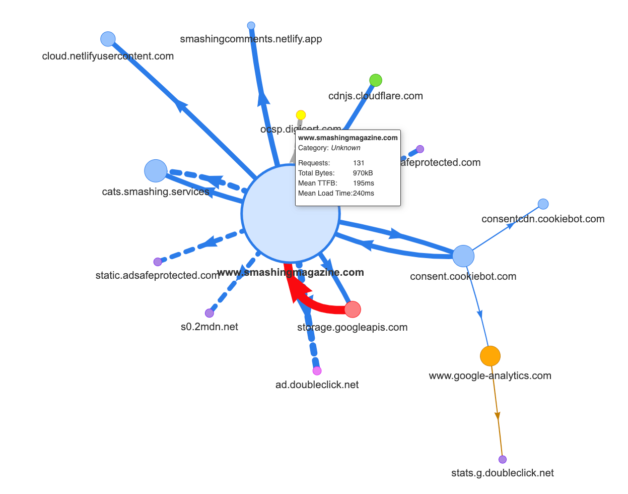
A few requests were coming to the CDN, a cookie consent service Cookiebot, Google Analytics, plus our internal services for serving product panels and custom advertising. It didn’t appear like there were many bottlenecks — until we looked a bit more closely.
In performance work, it’s common to look at the performance of some critical pages — most likely the homepage and most likely a few article/product pages. However, while there is only one homepage, there might be plenty of various product pages, so we need to pick ones that are representative of our audience.
In fact, as we’re publishing quite a few code-heavy and design-heavy articles on SmashingMag, over the years we’ve accumulated literally thousands of articles that contained heavy GIFs, syntax-highlighted code snippets, CodePen embeds, video/audio embeds, and nested threads of never-ending comments.
When brought together, many of them were causing nothing short of an explosion in DOM size along with excessive main thread work — slowing down the experience on thousands of pages. Not to mention that with advertising in place, some DOM elements were injected late in the page’s lifecycle causing a cascade of style recalculations and repaints — also expensive tasks that can produce long tasks.
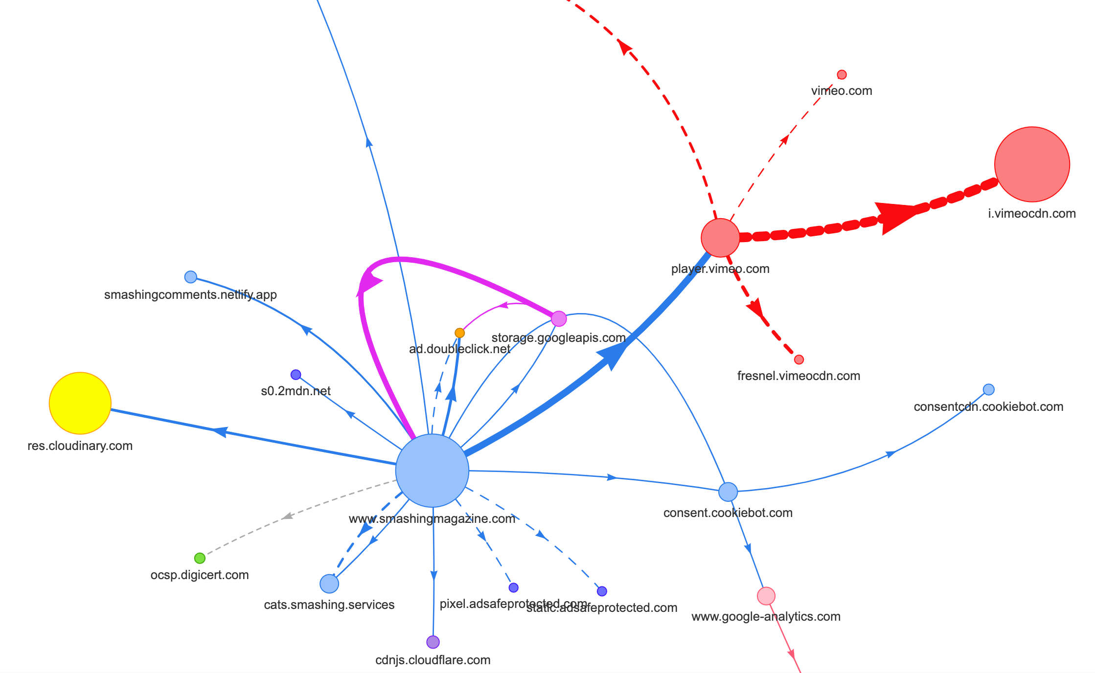
All of this wasn’t showing up in the map we generated for a quite lightweight article page in the chart above. So we picked the heaviest pages we had — the almighty homepage, the longest one, the one with many video embeds, and the one with many CodePen embeds — and decided to optimize them as much as we could. After all, if they are fast, then pages with a single CodePen embed should be faster, too.
With these pages in mind, the map looked a little bit differently. Note the huge thick line heading to the Vimeo player and Vimeo CDN, with 78 requests coming from a Smashing article.
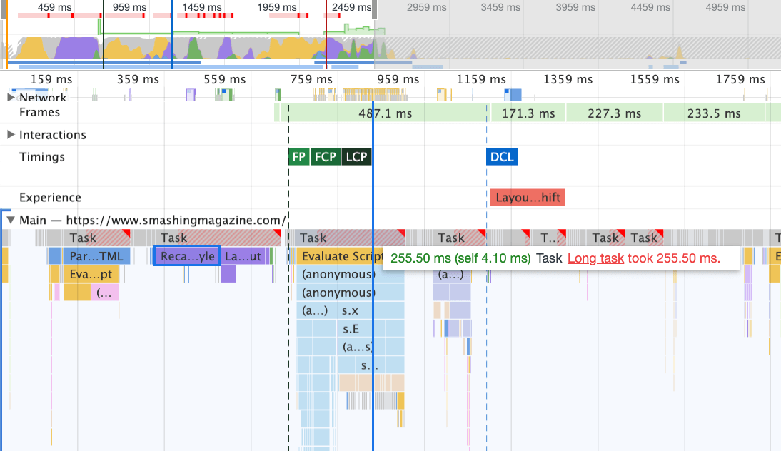
To study the impact on the main thread, we took a deep-dive into the Performance panel in DevTools. More specifically, we were looking for tasks that last longer than 50ms (highlighted with a red rectangle in the right upper corner) and tasks that contain Recalculation styles (purple bar). The first would indicate expensive JavaScript execution, while the latter would expose style invalidations caused by dynamic injections of content in the DOM and suboptimal CSS. This gave us some actionable pointers of where to start. For example, we quickly discovered that our web font loading had a significant repaint cost, while JavaScript chunks were still heavy enough to block the main thread.
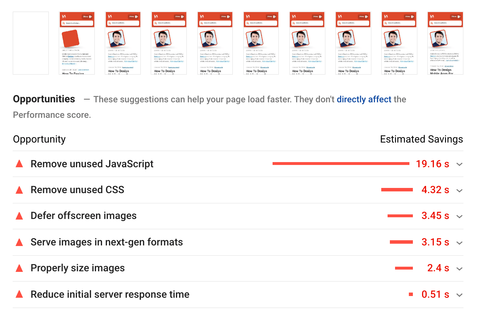
As a baseline, we looked very closely at Core Web Vitals, trying to ensure that we are scoring well across all of them. We chose to focus specifically on slow mobile devices — with slow 3G, 400ms RTT and 400kbps transfer speed, just to be on the pessimistic side of things. It’s not surprising then that Lighthouse wasn’t very happy with our site either, providing fully solid red scores for the heaviest articles, and tirelessly complaining about unused JavaScript, CSS, offscreen images and their sizes.
Once we had some data in front of us, we could focus on optimizing the three heaviest article pages, with a focus on critical (and non-critical) CSS, JavaScript bundle, long tasks, web font loading, layout shifts and third-party-embeds. Later we’d also revise the codebase to remove legacy code and use new modern browser features. It seemed like a lot of work ahead of was, and indeed we were quite busy for the months to come.
Improving The Order Of Assets In The <head>
Ironically, the very first thing we looked into wasn’t even closely related to all the tasks we’ve identified above. In the performance workshop, Harry spent a considerable amount of time explaining the order of assets in the <head> of each page, making a point that to deliver critical content quickly means being very strategic and attentive about how assets are ordered in the source code.
Now it shouldn’t come as a big revelation that critical CSS is beneficial for web performance. However, it did come as a bit of a surprise how much difference the order of all the other assets — resource hints, web font preloading, synchronous and asynchronous scripts, full CSS and metadata — has.
We’ve turned up the entire <head> upside down, placing critical CSS before all asynchronous scripts and all preloaded assets such as fonts, images etc. We’ve broken down the assets that we’ll be preconnecting to or preloading by template and file type, so that critical images, syntax highlighting and video embeds will be requested early only for a certain type of articles and pages.
In general, we’ve carefully orchestrated the order in the <head>, reduced the number of preloaded assets that were competing for bandwidth, and focused on getting critical CSS right. If you’d like to dive deeper into some of the critical considerations with the <head> order, Harry highlights them in the article on CSS and Network Performance. This change alone brought us around 3–4 Lighthouse score points across the board.
Moving From Automated Critical CSS Back To Manual Critical CSS
Moving the <head> tags around was a simple part of the story though. A more difficult one was the generation and management of critical CSS files. Back in 2017, we manually handcrafted critical CSS for every template, by collecting all of the styles required to render the first 1000 pixels in height across all screen widths. This of course was a cumbersome and slightly uninspiring task, not to mention maintenance issues for taming a whole family of critical CSS files and a full CSS file.
So we looked into options on automating this process as a part of the build routine. There wasn’t really a shortage of tools available, so we’ve tested a few and decided to run a few tests. We’ve managed to set them up and running quite quickly. The output seemed to be good enough for an automated process, so after a few configuration tweaks, we plugged it in and pushed it to production. That happened around July–August last year, which is nicely visualized in the spike and performance drop in the CrUX data above. We kept going back and forth with the configuration, often having troubles with simple things like adding in particular styles or removing others. E.g. cookie consent prompt styles that aren’t really included on a page unless the cookie script has initialized.
In October, we’ve introduced some major layout changes to the site, and when looking into the critical CSS, we’ve run into exactly the same issues yet again — the generated outcome was quite verbose, and wasn’t quite what we wanted. So as an experiment in late October, we all bundled our strengths to revisit our critical CSS approach and study how much smaller a handcrafted critical CSS would be. We took a deep breath and spent days around the code coverage tool on key pages. We grouped CSS rules manually and removed duplicates and legacy code in both places — the critical CSS and the main CSS. It was a much-needed cleanup indeed, as many styles that were written back in 2017–2018 have become obsolete over the years.
As a result, we ended up with three handcrafted critical CSS files, and with three more files that are currently work in progress:
- critical-homepage-manual.css (8.2 KB, Brotlified)
- critical-article-manual.css (8 KB, Brotlified)
- critical-articles-manual.css (6 KB, Brotlified)
- critical-books-manual.css (work to be done)
- critical-events-manual.css (work to be done)
- critical-job-board-manual.css (work to be done)
The files are inlined in the head of each template, and at the moment they are duplicated in the monolithic CSS bundle that contains everything ever used (or not really used anymore) on the site. At the moment, we are looking into breaking down the full CSS bundle into a few CSS packages, so a reader of the magazine wouldn’t download styles from the job board or book pages, but then when reaching those pages would get a quick render with critical CSS and get the rest of the CSS for that page asynchronously — only on that page.
Admittedly, handcrafted critical CSS files weren’t much smaller in size: we’ve reduced the size of critical CSS files by around 14%. However, they included everything we needed in the right order from top to finish without duplicates and overriding styles. This seemed to be a step in the right direction, and it gave us a Lighthouse boost of another 3–4 points. We were making progress.
Changing The Web Font Loading
With font-display at our fingertips, font loading seems to be a problem in the past. Unfortunately, it isn’t quite right in our case. You, dear readers, seem to visit a number of articles on Smashing Magazine. You also frequently return back to the site to read a yet another article — perhaps a few hours or days later, or perhaps a week later. One of the issues that we had with font-display used across the site was that for readers who moved between articles a lot, we noticed plenty of flashes between the fallback font and the web font (which shouldn’t normally happen as fonts would be properly cached).
That didn’t feel like a decent user experience, so we looked into options. On Smashing, we are using two main typefaces — Mija for headings and Elena for body copy. Mija comes in two weights (Regular and Bold), while Elena is coming in three weights (Regular, Italic, Bold). We dropped Elena’s Bold Italic years ago during the redesign just because we used it on just a few pages. We subset the other fonts by removing unused characters and Unicode ranges.
Our articles are mostly set in text, so we’ve discovered that most of the time on the site the Largest Contentful Paint is either the first paragraph of text in an article or the photo of the author. That means that we need to take extra care of ensuring that the first paragraph appears quickly in a fallback font, while gracefully changing over to the web font with minimal reflows.
Take a close look at the initial loading experience of the front page (slowed down three times):
We had four primary goals when figuring out a solution:
- On the very first visit, render the text immediately with a fallback font;
- Match font metrics of fallback fonts and web fonts to minimize layout shifts;
- Load all web fonts asynchronously and apply them all at once (max. 1 reflow);
- On subsequent visits, render all text directly in web fonts (without any flashing or reflows).
Initially, we actually tried to use font-display: swap on font-face. This seemed to be the simplest option, however, as mentioned above, some readers will visit a number of pages, so we ended up with a lot of flickering with the six fonts that we were rendering throughout the site. Also, with font-display alone, we couldn’t group requests or repaints.
Another idea was to render everything in fallback font on the initial visit, then request and cache all fonts asynchronously, and only on subsequent visits deliver web fonts straight from the cache. The issue with this approach was that a number of readers are coming from search engines, and at least some of them will only see that one page — and we didn’t want to render an article in a system font alone.
So what’s then?
Since 2017, we’ve been using the Two-Stage-Render approach for web font loading which basically describes two stages of rendering: one with a minimal subset of web fonts, and the other with a complete family of font weights. Back in the day, we created minimal subsets of Mija Bold and Elena Regular which were the most frequently used weights on the site. Both subsets include only Latin characters, punctuation, numbers, and a few special characters. These fonts (ElenaInitial.woff2 and MijaInitial.woff2) were very small in size — often just around 10–15 KBs in size. We serve them in the first stage of font rendering, displaying the entire page in these two fonts.
We do so with a Font Loading API which gives us information about which fonts have loaded successfully and which haven’t yet. Behind the scenes, it happens by adding a class .wf-loaded-stage1 to the body, with styles rendering the content in those fonts:
.wf-loaded-stage1 article,
.wf-loaded-stage1 promo-box,
.wf-loaded-stage1 comments {
    font-family: ElenaInitial,sans-serif;
}

.wf-loaded-stage1 h1,
.wf-loaded-stage1 h2,
.wf-loaded-stage1 .btn {
    font-family: MijaInitial,sans-serif;
}
Because font files are quite small, hopefully they get through the network quite quickly. Then as the reader can actually start reading an article, we load full weights of the fonts asynchronously, and add .wf-loaded-stage2 to the body:
.wf-loaded-stage2 article,
.wf-loaded-stage2 promo-box,
.wf-loaded-stage2 comments {
    font-family: Elena,sans-serif;
}

.wf-loaded-stage2 h1,
.wf-loaded-stage2 h2,
.wf-loaded-stage2 .btn {
    font-family: Mija,sans-serif;
}
So when loading a page, readers are going to get a small subset web font quickly first, and then we switch over to the full font family. Now, by default, these switches between fallback fonts and web fonts happen randomly, based on whatever comes first through the network. That might feel quite disruptive as you have started reading an article. So instead of leaving it to the browser to decide when to switch fonts, we group repaints, reducing the reflow impact to the minimum.
/* Loading web fonts with Font Loading API to avoid multiple repaints. With help by Irina Lipovaya. */
/* Credit to initial work by Zach Leatherman: https://noti.st/zachleat/KNaZEg/the-five-whys-of-web-font-loading-performance#sWkN4u4 */

// If the Font Loading API is supported...
// (If not, we stick to fallback fonts)
if ("fonts" in document) {

    // Create new FontFace objects, one for each font
    let ElenaRegular = new FontFace(
        "Elena",
        "url(/fonts/ElenaWebRegular/ElenaWebRegular.woff2) format('woff2')"
    );
    let ElenaBold = new FontFace(
        "Elena",
        "url(/fonts/ElenaWebBold/ElenaWebBold.woff2) format('woff2')",
        {
            weight: "700"
        }
    );
    let ElenaItalic = new FontFace(
        "Elena",
        "url(/fonts/ElenaWebRegularItalic/ElenaWebRegularItalic.woff2) format('woff2')",
        {
            style: "italic"
        }
    );
    let MijaBold = new FontFace(
        "Mija",
        "url(/fonts/MijaBold/Mija_Bold-webfont.woff2) format('woff2')",
        {
            weight: "700"
        }
    );

    // Load all the fonts but render them at once
    // if they have successfully loaded
    let loadedFonts = Promise.all([
        ElenaRegular.load(),
        ElenaBold.load(),
        ElenaItalic.load(),
        MijaBold.load()
    ]).then(result => {
        result.forEach(font => document.fonts.add(font));
        document.documentElement.classList.add('wf-loaded-stage2');

        // Used for repeat views
        sessionStorage.foutFontsStage2Loaded = true;
    }).catch(error => {
        throw new Error(`Error caught: ${error}`);
    });

}
However, what if the first small subset of fonts isn’t coming through the network quickly? We’ve noticed that this seems to be happening more often than we’d like to. In that case, after a timeout of 3s expires, modern browsers fall back to a system font (in our font stack it would be Arial), then switch over to ElenaInitial or MijaInitial, just to be switched over to full Elena or Mija respectively later. That produced just a bit too much flashing at our tasting. We were thinking about removing the first stage render only for slow networks initially (via Network Information API), but then we decided to remove it altogether.
So in October, we removed the subsets altogether, along with the intermediate stage. Whenever all weights of both Elena and Mija fonts are successfully downloaded by the client and ready to be applied, we initiate stage 2 and repaint everything at once. And to make reflows even less noticeable, we spent a bit of time matching fallback fonts and web fonts. That mostly meant applying slightly different font sizes and line heights for elements painted in the first visible portion of the page.
For that, we used font-style-matcher and (ahem, ahem) a few magic numbers. That’s also the reason why we initially went with -apple-system and Arial as global fallback fonts; San Francisco (rendered via -apple-system) seemed to be a bit nicer than Arial, but if it’s not available, we chose to use Arial just because it’s widely spread across most OSes.
In CSS, it would look like this:
.article__summary {
    font-family: -apple-system,Arial,BlinkMacSystemFont,Roboto Slab,Droid Serif,Segoe UI,Ubuntu,Cantarell,Georgia,sans-serif;
    font-style: italic;

    /* Warning: magic numbers ahead! */
    /* San Francisco Italic and Arial Italic have larger x-height, compared to Elena */
    font-size: 0.9213em;
    line-height: 1.487em;
}

.wf-loaded-stage2 .article__summary {
    font-family: Elena,sans-serif;
    font-size: 1em; /* Original font-size for Elena Italic */
    line-height: 1.55em; /* Original line-height for Elena Italic */
}
This worked fairly well. We do display text immediately, and web fonts come in on the screen grouped, ideally causing exactly one reflow on the first view, and no reflows altogether on subsequent views.
Once the fonts have been downloaded, we store them in a service worker’s cache. On subsequent visits we first check if the fonts are already in the cache. If they are, we retrieve them from the service worker’s cache and apply them immediately. And if not, we start all over with the fallback-web-font-switcheroo.
This solution reduced the number of reflows to a minimum (one) on relatively fast connections, while also keeping the fonts persistently and reliably in the cache. In the future, we sincerely hope to replace magic numbers with f-mods. Perhaps Zach Leatherman would be proud.
Identifying And Breaking Down The Monolithic JS
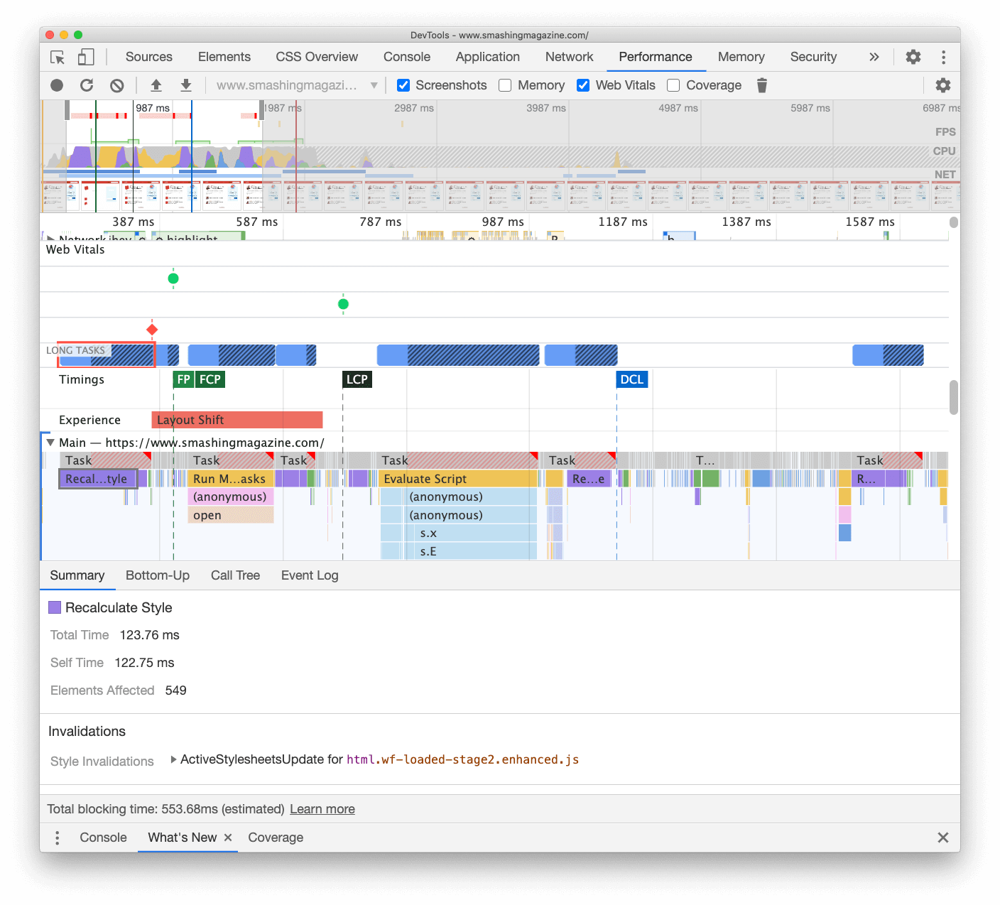
When we studied the main thread in the DevTools’ Performance panel, we knew exactly what we needed to do. There were eight Long Tasks that were taking between 70ms and 580ms, blocking the interface and making it non-responsive. In general, these were the scripts costing the most:
- uc.js, a cookie prompt scripting (70ms)
- style recalculations caused by incoming full.css file (176ms) (the critical CSS doesn’t contain styles below the 1000px height across all viewports)
- advertising scripts running on load event to manage panels, shopping cart, etc. + style recalculations (276ms)
- web font switch, style recalculations (290ms)
- app.js evaluation (580ms)
We focused on the ones that were most harmful first — so-to-say the longest Long Tasks.
The first one was occurring due to expensive layout recalculations caused by the change of the fonts (from fallback font to web font), causing over 290ms of extra work (on a fast laptop and a fast connection). By removing stage one from the font loading alone, we were able to gain around 80ms back. It wasn’t good enough though because were way beyond the 50ms budget. So we started digging deeper.
The main reason why recalculations happened was merely because of the huge differences between fallback fonts and web fonts. By matching the line-height and sizes for fallback fonts and web fonts, we were able to avoid many situations when a line of text would wrap on a new line in the fallback font, but then get slightly smaller and fit on the previous line, causing major change in the geometry of the entire page, and consequently massive layout shifts. We’ve played with letter-spacing and word-spacing as well, but it didn’t produce good results.
With these changes, we were able to cut another 50-80ms, but we weren’t able to reduce it below 120ms without displaying the content in a fallback font and display the content in the web font afterwards. Obviously, it should massively affect only first time visitors as consequent page views would be rendered with the fonts retrieved directly from the service worker’s cache, without costly reflows due to the font switch.
By the way, it’s quite important to notice that in our case, we noticed that most Long Tasks weren’t caused by massive JavaScript, but instead by Layout Recalculations and parsing of the CSS, which meant that we needed to do a bit of CSS cleaning, especially watching out for situations when styles are overwritten. In some way, it was good news because we didn’t have to deal with complex JavaScript issues that much. However, it turned out not to be straightforward as we are still cleaning up the CSS this very day. We were able to remove two Long Tasks for good, but we still have a few outstanding ones and quite a way to go. Fortunately, most of the time we aren’t way above the magical 50ms threshold.
The much bigger issue was the JavaScript bundle we were serving, occupying the main thread for a whopping 580ms. Most of this time was spent in booting up app.js which contains React, Redux, Lodash, and a Webpack module loader. The only way to improve performance with this massive beast was to break it down into smaller pieces. So we looked into doing just that.
With Webpack, we’ve split up the monolithic bundle into smaller chunks with code-splitting, about 30Kb per chunk. We did some package.json cleansing and version upgrade for all production dependencies, adjusted the browserlistrc setup to address the two latest browser versions, upgraded to Webpack and Babel to the latest versions, moved to Terser for minification, and used ES2017 (+ browserlistrc) as a target for script compilation.
We also used BabelEsmPlugin to generate modern versions of existing dependencies. Finally, we’ve added prefetch links to the header for all necessary script chunks and refactored the service worker, migrating to Workbox with Webpack (workbox-webpack-plugin).
Remember when we switched to the new navigation back in mid-2020, just to see a huge performance penalty as a result? The reason for it was quite simple. While in the past the navigation was just static plain HTML and a bit of CSS, with the new navigation, we needed a bit of JavaScript to act on opening and closing of the menu on mobile and on desktop. That was causing rage clicks when you would click on the navigation menu and nothing would happen, and of course, had a penalty cost in Time-To-Interactive scores in Lighthouse.
We removed the script from the bundle and extracted it as a separate script. Additionally, we did the same thing for other standalone scripts that were used rarely — for syntax highlighting, tables, video embeds and code embeds — and removed them from the main bundle; instead, we granularly load them only when needed.
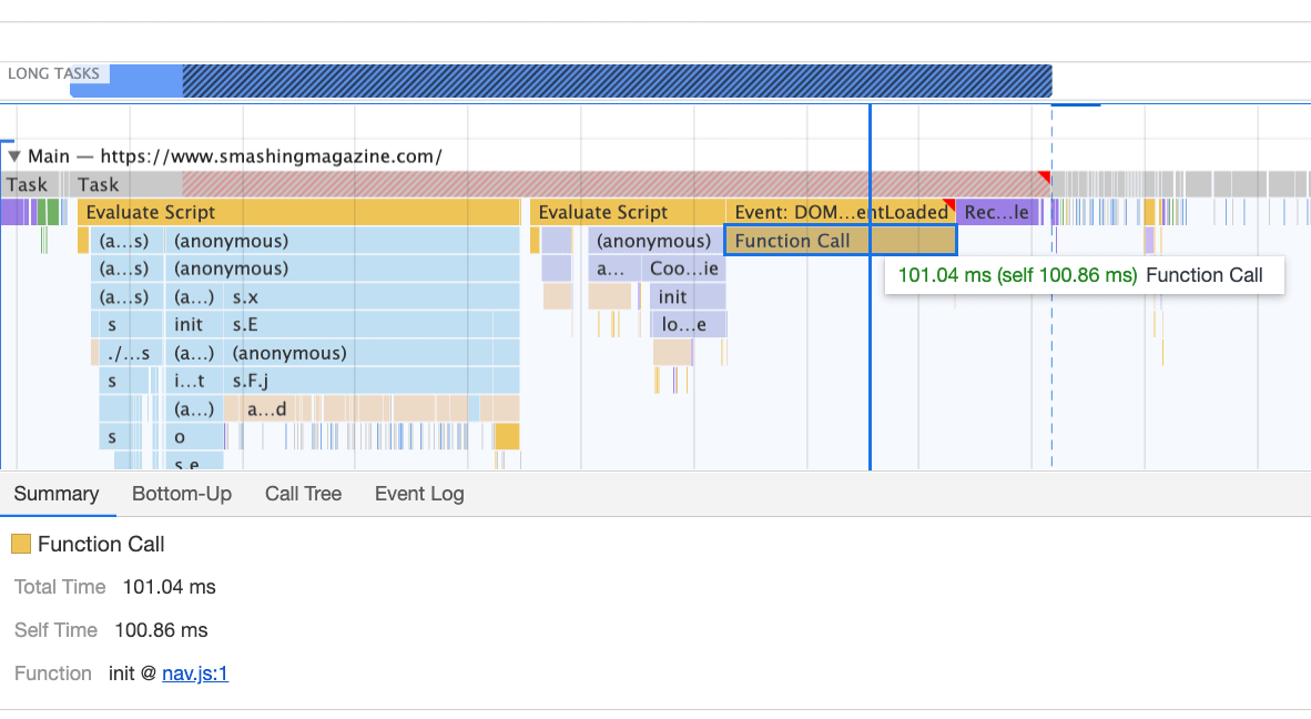
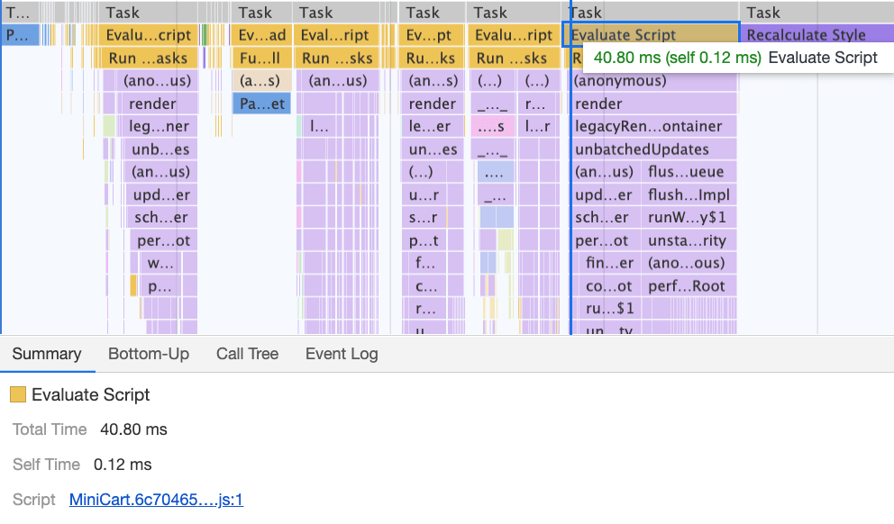
However, what we didn’t notice for months was that although we removed the navigation script from the bundle, it was loading after the entire app.js bundle was evaluated, which wasn’t really helping Time-To-Interactive (see image above). We fixed it by preloading nav.js and deferring it to execute in the order of appearance in the DOM, and managed to save another 100ms with that operation alone. By the end, with everything in place we were able to bring the task to around 220ms.
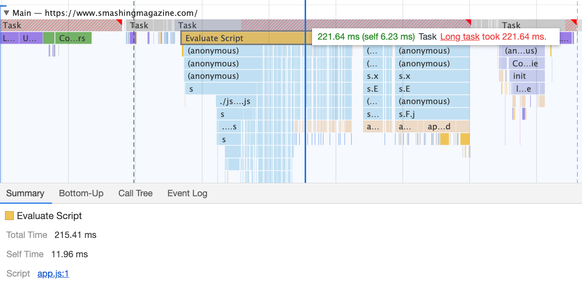
We managed to get some improvement in place, but still have quite a way to go, with further React and Webpack optimizations on our to-do list. At the moment we still have three major Long Tasks — font switch (120ms), app.js execution (220ms) and style recalculations due to the size of full CSS (140ms). For us, it means cleaning up and breaking up the monolithic CSS next.
It’s worth mentioning that these results are really the best-scenario-results. On a given article page we might have a large number of code embeds and video embeds, along with other third-party scripts and customer’s browser extensions that would require a separate conversation.
Dealing With 3rd-Parties
Fortunately, our third-party scripts footprint (and the impact of their friends’ fourth-party-scripts) wasn’t huge from the start. But when these third-party scripts accumulated, they would drive performance down significantly. This goes especially for video embedding scripts, but also syntax highlighting, advertising scripts, promo panels scripts and any external iframe embeds.
Obviously, we defer all of these scripts to start loading after the DOMContentLoaded event, but once they finally come on stage, they cause quite a bit of work on the main thread. This shows up especially on article pages, which are obviously the vast majority of content on the site.
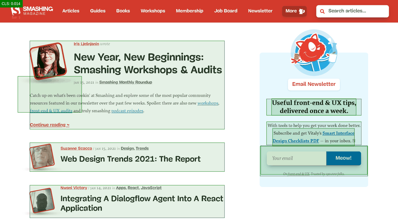
The first thing we did was allocating proper space to all assets that are being injected into the DOM after the initial page render. It meant width and height for all advertising images and the styling of code snippets. We found out that because all the scripts were deferred, new styles were invalidating existing styles, causing massive layout shifts for every code snippet that was displayed. We fixed that by adding the necessary styles to the critical CSS on the article pages.
We’ve re-established a strategy for optimizing images (preferably AVIF or WebP — still work in progress though). All images below the 1000px height threshold are natively lazy-loaded (with <img loading=lazy>), while the ones on the top are prioritized (<img loading=eager>). The same goes for all third-party embeds.
We replaced some dynamic parts with their static counterparts — e.g. while a note about an article saved for offline reading was appearing dynamically after the article was added to the service worker’s cache, now it appears statically as we are, well, a bit optimistic and expect it to be happening in all modern browsers.
As of the moment of writing, we’re preparing facades for code embeds and video embeds as well. Plus, all images that are offscreen will get decoding=async attribute, so the browser has a free reign over when and how it loads images offscreen, asynchronously and in parallel.

To ensure that our images always include width and height attributes, we’ve also modified Harry Roberts’ snippet and Tim Kadlec’s diagnostics CSS to highlight whenever an image isn’t served properly. It’s used in development and editing but obviously not in production.
One technique that we used frequently to track what exactly is happening as the page is being loaded, was slow-motion loading.
First, we’ve added a simple line of code to the diagnostics CSS, which provides a noticeable outline for all elements on the page.
* {
  outline: 3px solid red
}
* { outline: 3px red } and observing the boxes as the browser is rendering the page. (Large preview)Then we record a video of the page loaded on a slow and fast connection. Then we rewatch the video by slowing down the playback and moving back and forward to identify where massive layout shifts happen.
Here’s the recording of a page being loaded on a fast connection:
And here’s the recording of a recording being played to study what happens with the layout:
By auditing the layout shifts this way, we were able to quickly notice what’s not quite right on the page, and where massive recalculation costs are happening. As you probably have noticed, adjusting the line-height and font-size on headings might go a long way to avoid large shifts.
With these simple changes alone, we were able to boost performance score by a whopping 25 Lighthouse points for the video-heaviest article, and gain a few points for code embeds.
Enhancing The Experience
We’ve tried to be quite strategic in pretty much everything from loading web fonts to serving critical CSS. However, we’ve done our best to use some of the new technologies that have become available last year.
We are planning on using AVIF by default to serve images on SmashingMag, but we aren’t quite there yet, as many of our images are served from Cloudinary (which already has beta support for AVIF), but many are directly from our CDN yet we don’t really have a logic in place just yet to generate AVIFs on the fly. That would need to be a manual process for now.
We’re lazy rendering some of the offset components of the page with content-visibility: auto. For example, the footer, the comments section, as well as the panels way below the first 1000px height threshold, are all rendered later after the visible portion of each page has been rendered.
We’ve played a bit with link rel="prefetch" and even link rel="prerender" (NoPush prefetch) some parts of the page that are very likely to be used for further navigation — for example, to prefetch assets for the first articles on the front page (still in discussion).
We also preload author images to reduce the Largest Contentful Paint, and some key assets that are used on each page, such as dancing cat images (for the navigation) and shadow used for all author images. However, all of them are preloaded only if a reader happens to be on a larger screen (>800px), although we are looking into using Network Information API instead to be more accurate.
We’ve also reduced the size of full CSS and all critical CSS files by removing legacy code, refactoring a number of components, and removing the text-shadow trick that we were using to achieve perfect underlines with a combination of text-decoration-skip-ink and text-decoration-thickness (finally!).
Work To Be Done
We’ve spent a quite significant amount of time working around all the minor and major changes on the site. We’ve noticed quite significant improvements on desktop and a quite noticeable boost on mobile. At the moment of writing, our articles are scoring on average between 90 and 100 Lighthouse score on desktop, and around 65-80 on mobile.
The reason for the poor score on mobile is clearly poor Time to Interactive and poor Total Blocking time due to the booting of the app and the size of the full CSS file. So there is still some work to be done there.
As for the next steps, we are currently looking into further reducing the size of the CSS, and specifically break it down into modules, similarly to JavaScript, loading some parts of the CSS (e.g. checkout or job board or books/eBooks) only when needed.
We also explore options of further bundling experimentation on mobile to reduce the performance impact of the app.js although it seems to be non-trivial at the moment. Finally, we’ll be looking into alternatives to our cookie prompt solution, rebuilding our containers with CSS clamp(), replacing the padding-bottom ratio technique with aspect-ratio and looking into serving as many images as possible in AVIF.
That’s It, Folks!
Hopefully, this little case-study will be useful to you, and perhaps there are one or two techniques that you might be able to apply to your project right away. In the end, performance is all about a sum of all the fine little details, that, when added up, make or break your customer’s experience.
While we are very committed to getting better at performance, we also work on improving accessibility and the content of the site. So if you spot anything that’s not quite right or anything that we could do to further improve Smashing Magazine, please let us know in the comments to this article.
Finally, if you’d like to stay updated on articles like this one, please subscribe to our email newsletter for friendly web tips, goodies, tools and articles, and a seasonal selection of Smashing cats.
 (il)
(il)