Obscure Mobile Design Techniques That Boost UX

Email Newsletter
Weekly tips on front-end & UX.
Trusted by 182,000+ folks.

 Custom Web Forms for Angular, React, & Vue. Your backend.


 Celebrating 10 million developers
It’s no secret that smartphone usage has doubled over the last five years, accounting for an estimated 3.8 billion users this year. This tells us clearly where people’s attention is and how important mobile web designers are to improving the user experience.
We’ve seen plenty of web design experiments in recent years adopted by companies of all sizes. These changes include trends such as the infamous parallax scrolling, non-traditional layouts, and improved accessibility with dark mode. However, many paths are still left to explore, if we’re willing to break out of trends.
To get those creative juices flowing, let’s look at some hidden design gems related to navigation and confirmation dialogs, the waiting experience, and swiping animations. While these solutions are mostly unconventional, the point isn’t to highlight them for their own sake. Design solutions have to be built with the pillars of accessibility and usability, but they can be refined according to your ultimate goals for user interaction and experience.
So, let’s bring these elegant off-the-beaten-path design solutions into the spotlight.
Rethinking Navigation
The change of pinning the navigation menu to the bottom has been a game-changer for handheld devices because it allows for more natural thumb-controlled navigation. But as smartphone screens get more expansive, the thumb’s reach gets more restricted. Therefore, we’re long overdue for new mobile design solutions that allow easy access using only the thumb.
Some creative approaches to this problem combine elegant design and functionality. Let’s look at a couple of examples.
Nature Encyclopedia
Nature Encyclopedia is a great learning resource for youth and adults alike. It features interactive infographics and on-point illustrations, but that’s not the part that captures our curiosity.
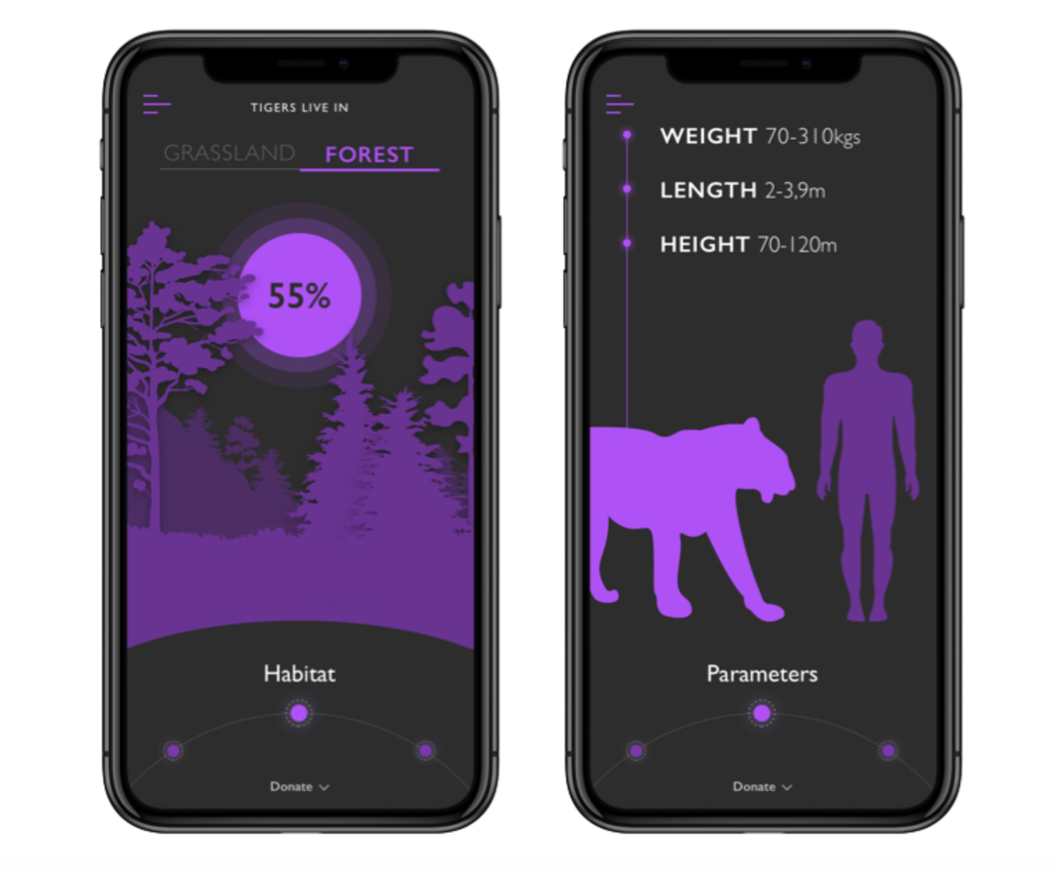
In addition to all of the swiping functionality that we’ve become accustomed to in other mobile apps, there’s a nifty feature that allows you to change the information displayed by scrolling a wheel. You can also access previously shown information simply by scrolling the other way.
While the action wheel was implemented to ease access to information, it could also be used to navigate between screens. This could potentially address the restriction of the thumb’s reach at the left and right edges of the screen, as you would now be able to effortlessly swipe left or right to navigate.
V For Wiki
You can already access Wikipedia in your phone’s browser. However, V for Wiki has made it even more accessible by featuring an elegant style of presenting the content. It features a nifty world map that instantly pops up information related to the area you’re browsing from.
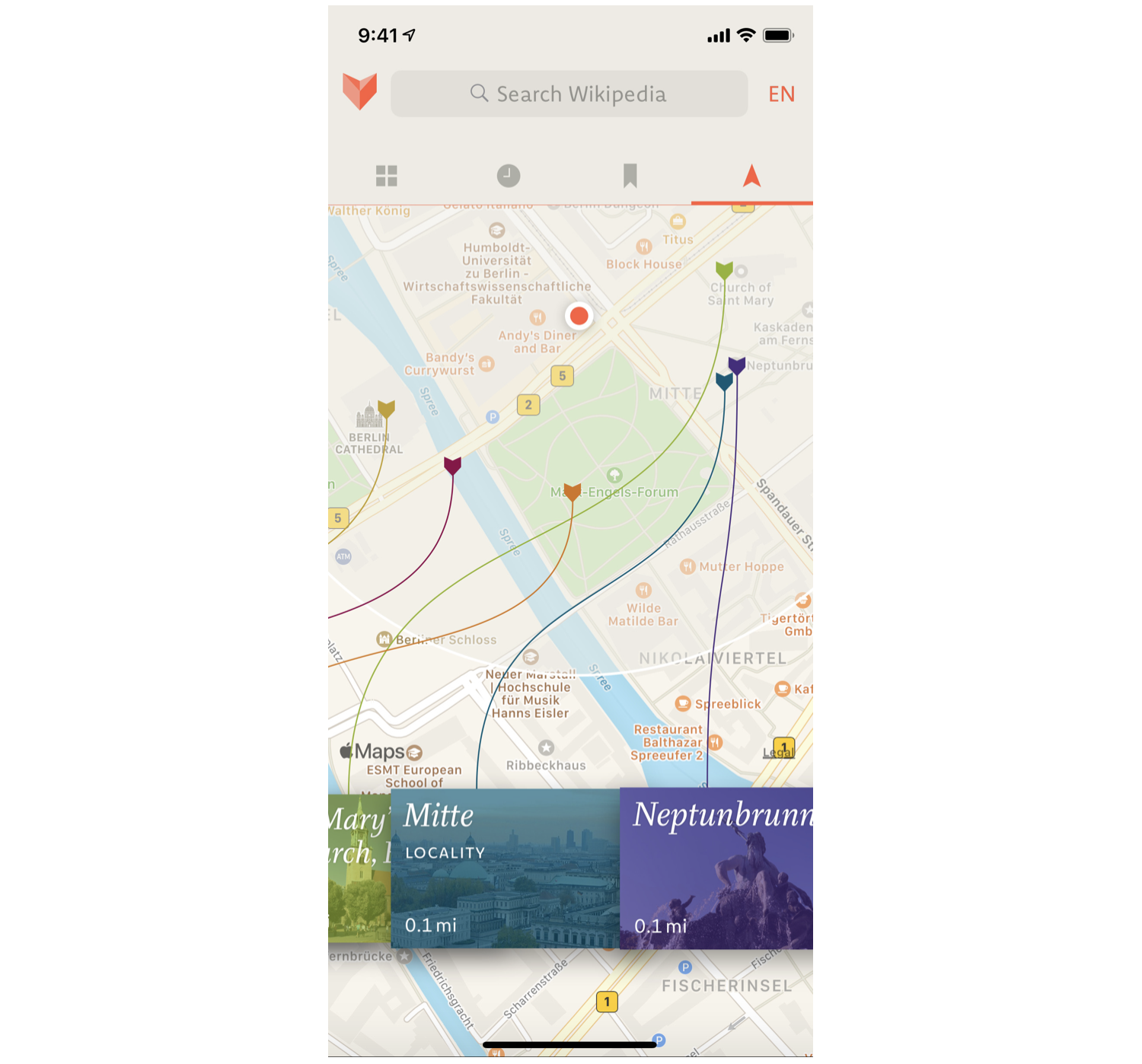
While the interactive map makes browsing a lot more entertaining, it’s not the feature that first caught our eye.
If you look at the navigation, on top of the guide you’ll see interactive lines to various landmarks, and you can scroll between the locations horizontally. This is a beautifully designed alternate way to navigate the menu because you can use your thumb effortlessly.
This approach could serve as inspiration for a scrolling navigation menu, in which a customer can bring the far-left or far-right menu items closer by scrolling the wheel.
Ada
Ada is an application for the startup Ada Health, which aims to revolutionize how we approach going to the doctor with modern solutions, such as AI, video calls, and interactive design. We’ve all gone through the rabbit hole of looking on Google for advice on symptoms, so getting straightforward access to reliable information is a godsend.

Apart from the app’s clean look, it’s clear from the start that it’s designed to be used effortlessly with the thumb, because the navigation button is on the bottom right and opens the menu in a sidebar on the right. Furthermore, all of the actionable elements are within reach of the thumb, so the user would generally only need to click on the bottom or the right sidebar to get to where they want to go.
Ada, then, is another example of solid navigation built into the app’s concept from the start. The experience of navigating the app feels natural and accessible.
Overhauling Confirmation Dialogs
Confirmation dialogs face the same challenges as navigation menus as a result of people holding their smartphones with one hand. The options are usually binary, one on the left side and the other on the right. As handheld devices get wider, access to one of the two dialog choices becomes complicated due to the limited range of thumb movement.
Let’s look at some unconventional solutions to hard-to-reach confirmation dialogs.
Vice Versa
Vice versa is a diagonal UI pattern for binary options. It takes into account the thumb’s natural movement and acknowledges the limitations of abnormal movement. On a small screen, you could reach to the opposite side with your thumb, but that creates tension and feels uncomfortable.
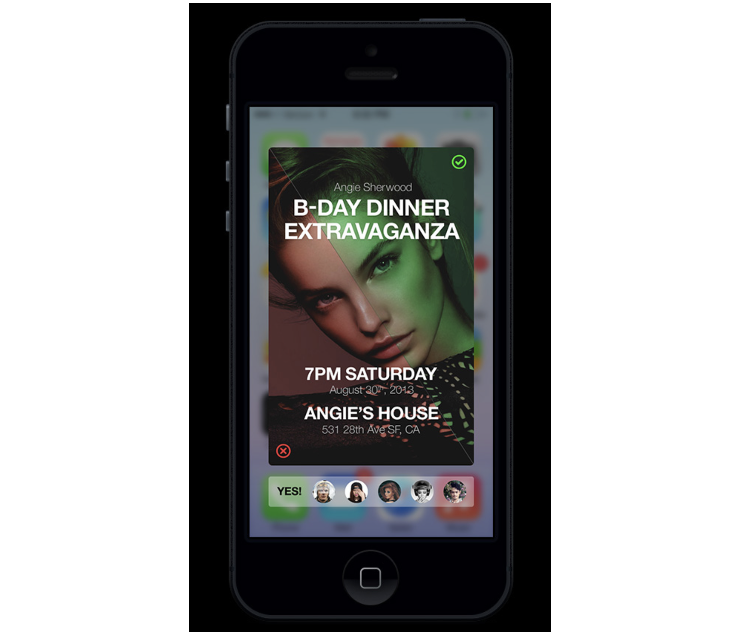
The vice versa pattern addresses this problem by diagonally dividing the screen in two, allowing binary options to be made using only the thumb. Not only does it make it easier for the thumb to reach both options, but the accuracy issue is solved by giving users a larger area to touch.
While the concept is intended to make voting mechanisms easily accessible, you could adapt this interactive design to all kinds of binary options.
One of the obvious downsides of the pattern is that it’s heavily optimized for right-handed usage. The solution to this problem is that a customer can shake the phone, and the orientation will change. Good solution? We don’t know, but definitely an interesting alternative for confirmation dialogs.
Omni Swipe
Another solution for hard-to-reach confirmation buttons (or navigation, for that matter) is found in Omni Swipe. While this concept is meant for personalizing a smartphone’s UI, it could also be adapted to standalone applications.
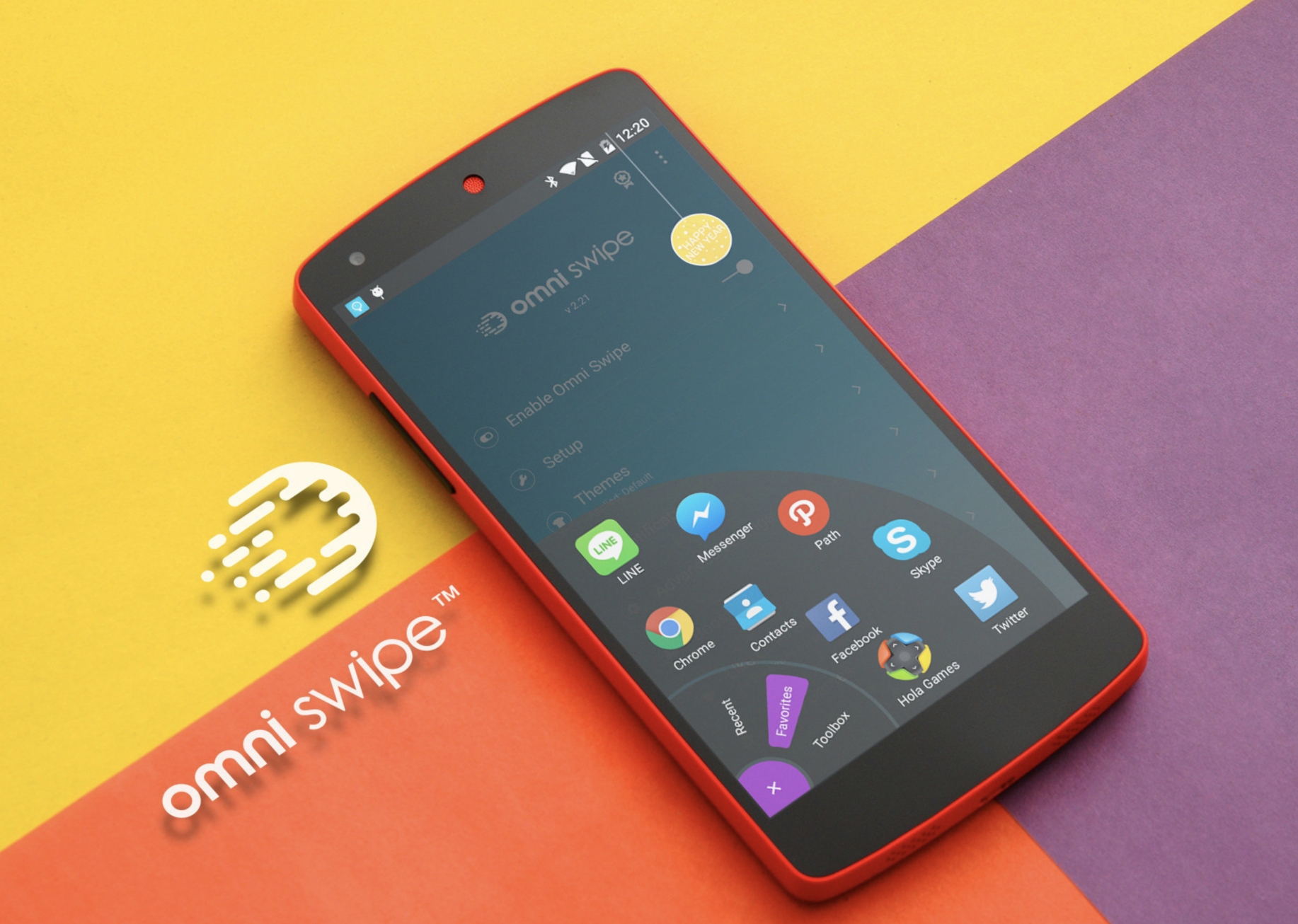
While most navigation buttons open the menu horizontally or vertically, Omni Swipe allows users to access the controls in the thumb’s range of movement. This solves the complex challenge of creating a confirmation solution for all screen widths, because, regardless of size, the actionable elements would appear under the user’s thumb.
Unlike the last concept explored, which allows only binary options, this solution has virtually no limitation to the choices you can add to the menu.
Gamifying The Waiting Experience
In a study by Statista in 2020, 65% of respondents in the US said they used a smartphone for online shopping in the past 12 months. This indicates that e-commerce UX and mobile design go hand in hand. Furthermore, if we look at modern e-commerce platforms, we can see that pretty much all of them highlight mobile-optimized themes. Together, both of these factors paint a clear picture of where the online retail industry is headed.
However, even the slightest disturbance can cause a cart to be abandoned or create a negative shopping experience. Research into the psychology of speed perception shows that a person’s mood affects how they perceive time. In a relaxed and happy environment, you’ll sense time flying by. However, if you’re grumpy, in a bad mood, or anxious, time seems almost to stand still.
Loading screens, shipping flows, preparation stages, and so on all keep users waiting. Let’s look at examples of how mobile designers have tackled the perception of speed in the online food-ordering and food-delivery industry.
Wolt
We used to get anxious waiting in line at a canteen. Well, we still do, but nowadays, we can comfortably order food online and have it delivered to us. However, we still need to wait until the courier arrives.
Wolt is one of the many apps that enable you to purchase food and have it delivered to your doorstep by a courier. If you didn’t have anything better to do, you’d feel like, instead of waiting in line, you’d be waiting for the courier instead.
Wolt has numerous nifty features that target this perception of speed. It shows you the progress in stages, notifying you once a step is complete and showing you the courier’s GPS location. There’s also a clever little game hidden away that helps you to pass the time more quickly and elevate your mood (if you’re OK with being a little competitive). In this minigame, you tap the screen as many times as you can in five seconds, trying to beat Wolt’s team.
While a simple feature, it plays straight into human psychology. Even though the gaming element doesn’t take away your feeling of hunger, it helps you to pass the time more quickly.
Bolt Food
In the previous example, we saw how gamifying waiting times helps users to pass the time more quickly. Bolt Food is another example of a food courier facing the same challenge of waiting times.
Their approach to showing progress is to animate the delivery steps. While not a straightforward game, it still combines a sense of movement with the user’s perception of time. In short, the principle is that if something is moving, then it’s making progress. If the user were to stare at a lifeless screen, their sense of time would slow down, and, with an empty stomach, that would make them more anxious.
So, if your service relies on multiple steps, instead of taking the order and sending a confirmation email afterward, engage with the customer by showing progress at all stages.
Using Animation For Swiping
Card screens have long been a favorite of designers. Customers can easily access different parts of an app simply by swiping and switching cards. However, instead of just applying the swiping function’s UI aspects, you could gamify the app to enhance the user experience.
It’s common for people to react to movement and get drawn into animation. Let’s look at a couple of examples that use the gamify principle in action.
Bookotel
Bookotel is an online reservation app for restaurants and cafes. What strikes home with this app’s design is the innovative way they’ve created the swiping animation in the intro cards.
Instead of just switching to the next card, the whole application seems to move and transform to the following image, message, and prompt.
We don’t see this interaction applied to other parts of the application, so we’re left with some guesswork about how it would look on a larger scale. However, you can’t deny that it would draw the user in and get them to play around with the app.
It’s worth noting that these movements might need to be readjusted if the customer opts-in for reduced motion to prevent accessibility issues from creeping in.
Teatr Lalka
Teatr Lalka was one of the first puppet theatres in Poland and is now over 75 years old. However, its website is anything but ancient. Its dominant motif is interactivity, which is what you’d hope to see on an entertainment-related website.
The first animations you see when visiting Teatr Lalka’s website are the puppets. While representing the actual puppets used in the shows, they also serve another purpose: gamification. You can swipe through animated puppets in a carousels and interact with them by clicking on them, prompting sound and vibrations from your smartphone. The puppets also react to tilting. It’s a wonderful example of how a mobile website can engage with the user from the very first page.
You can apply the same techniques to other applications and websites, enhancing the user experience and playfully engaging with visitors.
Unconventional Solutions Pave The Way For Future Mobile Design
There you have some clever solutions to seemingly simple problems; solutions that hopefully improve the user experience in turn. While following trends isn’t necessarily bad, veering to the edge of innovation can yield a more rewarding result.
With user experience becoming an ever more critical part of our digital lives, it pays to see things from a psychological perspective. Don’t be afraid to test cutting-edge solutions that play into people’s habits, psychology, and sense of convenience. It might be worth it.
Other Resources
- Interaction Design Foundation
- Dribbble (for inspiration)
- “App & Mobile”, Think With Google
Further Reading
- The Ultimate Guide To Push Notifications For Developers
- Bottom Navigation Pattern On Mobile Web Pages: A Better Alternative?
- Touch Design For Mobile Interfaces: Defining Mobile Devices (Excerpt)
- Eye-Tracking In Mobile UX Research
 (vf, yk, il, al, mrn)

