An In-Depth Guide To Measuring Core Web Vitals
Google has announced that from May 2021 (edit: the date was just moved to June 2021), they will start to consider “Page Experience” as part of Search ranking, as measured by a set of metrics called Core Web Vitals. That date is approaching quickly and I’m sure lots of us are being asked to ensure we are passing our Core Web Vitals, but how can you know if you are?
Answering that question is actually more difficult than you might presume and while lots of tools are now exposing these Core Web Vitals, there are many important concepts and subtleties to understand. even the Google tools like PageSpeed Insights and the Core Web Vitals report in Google Search Console seem to give confusing information.
Why is that and how can you be sure that your fixes really have worked? How can you get an accurate picture of the Core Web Vitals for your site? In this post, I’m going to attempt to explain a bit more about what’s going on here and explain some of the nuances and misunderstandings of these tools.
What Are The Core Web Vitals?
The Core Web Vitals are a set of three metrics designed to measure the “core” experience of whether a website feels fast or slow to the users, and so gives a good experience.

Web pages will need to be within the green measurements for all three Core Web Vitals to get the full benefit of any ranking boost. Outside of the good range, differing values of a Core Web Vital metric across two pages could result in differing page experience ranking.
1. Largest Contentful Paint (LCP)
This metric is probably the easiest understood of these — it measures how quickly you get the largest item drawn on the page — which is probably the piece of content the user is interested in. This could be a banner image, a piece of text, or whatever. The fact that it’s the largest contentful element on the page is a good indicator that it’s the most important piece. LCP is relatively new, and we used to measure the similarly named First Contentful Paint (FCP) but LCP has been seen as a better metric for when the content the visitor likely wants to see is drawn.
LCP is supposed to measure loading performance and is a good proxy for all the old metrics we in the performance community used to use (i.e. Time to First Byte (TTFB), DOM Content Loaded, Start Render, Speed Index) — but from the experience of the user. It doesn’t cover all of the information covered by those metrics but is a simpler, single metric that attempts to give a good indication of page load.
2. First Input Delay (FID)
This second metric measures the time between when the user interacts with a page, clicking on a link or a button for example, and when the browser processes that click. It’s there to measure the interactivity of a page. If all the content is loaded, but the page is unresponsive, then it’s a frustrating experience for the user.
An important point is that this metric cannot be simulated as it really depends on when a user actually clicks or otherwise interacts with a page and then how long that takes to be actioned. Total Blocking Time (TBT) is a good proxy for FID when using a testing tool without any direct user interaction, but also keep an eye on Time to Interactive (TTI) when looking at FID.
3. Cumulative Layout Shift (CLS)
A very interesting metric, quite unlike other metrics that have come before for a number of reasons. It is designed to measure the visual stability of the page — basically how much it jumps around as new content slots into place. I’m sure we’ve all clicked on an article, started reading, and then had the text jump around as images, advertisements, and other content is loaded.
This is quite jarring and annoying for users so best to minimize it. Worse still is when that button you were about to click suddenly moves and you click another button instead! CLS attempts to account for these layout shifts.
Lab Versus RUM
One of the key points to understand about Core Web Vitals is that they are based on field metrics or Real User Metrics (RUM). Google uses anonymized data from Chrome users to feedback metrics and makes these available in the Chrome User Experience Report (CrUX). That data is what they are using to measure these three metrics for the search rankings. CrUX data is available in a number of tools, including in Google Search Console for your site.
The fact that RUM data is used, is an important distinction because some of these metrics (FID excepted) are available in synthetic or “lab-based” web performance tools like Lighthouse that have been the staple of web performance monitoring for many in the past. These tools run page loads on simulated networks and devices and then tell you what the metrics were for that test run.
So if you run Lighthouse on your high-powered developer machine and get great scores, that may not be reflective of what the users experience in the real world, and so what Google will use to measure your website user experience.
LCP is going to be very dependent on network conditions and the processing power of devices being used (and a lot more of your users are likely using lower-powered devices than you realize!). A counterpoint however is that, for many Western sites at least, our mobiles are perhaps not quite as low-powered as tools such as Lighthouse in mobile mode suggest, as these are quite throttled. So you may well notice your field data on mobile is better than testing with this suggests (there are some discussions on changing the Lighthouse mobile settings).
Similarly, FID is often dependent on processor speed and how the device can handle all this content we’re sending to it — be it images to process, elements to layout on the page and, of course, all that JavaScript we love to send down to the browser to churn through.
CLS is, in theory, more easily measured in tools as it’s less susceptible to network and hardware variations, so you would think it is not as subject to the differences between LAB and RUM — except for a few important considerations that may not initially be obvious:
- It is measured throughout the life of the page and not just for page load like typical tools do, which we’ll explore more later in this article. This causes a lot of confusion when lab-simulated page loads have a very low CLS, but the field CLS score is much higher, due to CLS caused by scrolling or other changes after the initial load that testing tools typically measure.
- It can depend on the size of the browser window — typically tools like PageSpeed Insights, measure mobile and desktop, but different mobiles have different screen sizes, and desktops are often much larger than these tools set (Web Page Test recently increased their default screen size to try to more accurately reflect usage).
- Different users see different things on web pages. Cookie banners, customized content like promotions, Adblockers, A/B tests to name but a few items that might be different, all impact what content is drawn and so what CLS users may experience.
- It is still evolving and the Chrome team has been busy fixing “invisible” shifts and the like that should not count towards the CLS. Bigger changes to how CLS is actually measured are also in progress. This means you can see different CLS values depending on which version of Chrome is being run.
Using the same name for the metrics in lab-based testing tools, when they may not be accurate reflections of real-life versions is confusing and some are suggesting we should rename some or all of these metrics in Lighthouse to distinguish these simulated metrics from the real-world RUM metrics which power the Google rankings.
Previous Web Performance Metrics
Another point of confusion is that these metrics are new and different from the metrics we traditionally used in the past to measure web performance and that are surfaced by some of those tools, like PageSpeed Insights — a free, online auditing tool. Simply enter the URL you want an audit on and click Analyze, and a few seconds later you will be presented with two tabs (one for mobile and one for desktop) that contain a wealth of information:
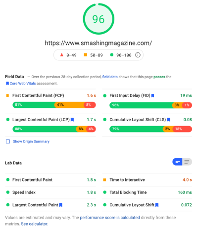
At the top is the big Lighthouse performance score out of 100. This has been well-known within web performance communities for a while now and is often quoted as a key performance metric to aim for and to summarise the complexities of many metrics into a simple, easy-to-understand number. That has some overlap with the Core Web Vitals goal, but it is not a summary of the three Core Web Vitals (even the lab-based versions), but of a wider variety of metrics.
Currently, six metrics make up the Lighthouse performance score — including some of the Core Web Vitals and some other metrics:
- First Contentful Paint (FCP)
- SpeedIndex (SI)
- Largest Contentful Paint (LCP)
- Time to Interactive (TTI)
- Total Blocking Time (TBT)
- Cumulative Layout Shift (CLS)
To add to the complexity, each of these six is weighted differently in the Performance score and CLS, despite being one of the Core Web Vitals, is currently only 5% of the Lighthouse Performance score (I’ll bet money on this increasing soon after the next iteration of CLS is released). All this means you can get a very high, green-colored Lighthouse performance score and think your website is fine, and yet still fail to pass the Core Web Vitals threshold. You therefore may need to refocus your efforts now to look at these three core metrics.
Moving past the big green score in that screenshot, we move to the field data and we get another point of confusion: First Contentful Paint is shown in this field data along with the other three Core Web Vitals, despite not being part of the Core Web Vitals and, like in this example, I often find it is flagged as a warning even while the others all pass. (Perhaps the thresholds for this need a little adjusting?) Did FCP narrowly miss out on being a Core Web Vital, or maybe it just looks better balanced with four metrics? This field data section is important and we’ll come back to that later.
If no field data is available for the particular URL being tested, then origin data for the whole domain will be shown instead (this is hidden by default when field data is available for that particular URL as shown above).
After the field data, we get the lab data, and we see the six metrics that make up the performance score at the top. If you click on the toggle on the top right you even get a bit more of a description of those metrics:
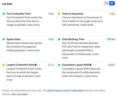
As you can see, the lab versions of LCP and CLS are included here and, as they are part of Core Web Vitals, they get a blue label to mark them as extra important. PageSpeed Insights also includes a helpful calculator link to see the impact of these scores on the total score at the top, and it allows you to adjust them to see what improving each metric will do to your score. But, as I say, the web performance score is likely to take a backseat for a bit while the Core Web Vitals bask in the glow of all the attention at the moment.
Lighthouse also performs nearly 50 other checks on extra Opportunities and Diagnostics. These don’t directly impact the score, nor Core Web Vitals, but can be used by web developers to improve the performance of their site. These are also surfaced in PageSpeed Insights below all the metrics so just out of shot for the above screenshot. Think of these as suggestions on how to improve performance, rather than specific issues that necessarily need to be addressed.
The diagnostics will show you the LCP element and the shifts that have contributed to your CLS score which are very useful pieces of information when optimizing for your Core Web Vitals!
So, while in the past web performance advocates may have heavily concentrated on Lighthouse scores and audits, I see this zeroing in on the three Core Web Vital metrics — at least for the next period while we get our heads around them. The other Lighthouse metrics, and the overall score, are still useful to optimize your site’s performance, but the Core Web Vitals are currently taking up most of the ink on new web performance and SEO blog posts.
Viewing The Core Web Vitals For Your Site
The easiest way to get a quick look at the Core Web Vitals for an individual URL, and for the whole origin, is to enter a URL into PageSpeed Insights as discussed above. However, to view how Google sees the Core Web Vitals for your whole site, get access to Google Search Console. This is a free product created by Google that allows you to understand how Google “sees” your whole site, including the Core Web Vitals for your site (though there are some — shall we say — “frustrations” with how often the data updates here).
Google Search Console has long been used by SEO teams, but with the input that site developers will need to address Core Web Vitals, development teams should really get access to this tool too if they haven’t already. To get access you will need a Google account, and then to verify your ownership of the site through various means (placing a file in your webserver, adding a DNS record…etc.).
The Core Web Vitals report in Google Search Console gives you a summary of how your site is meeting the Core Web Vitals over the last 90 days:
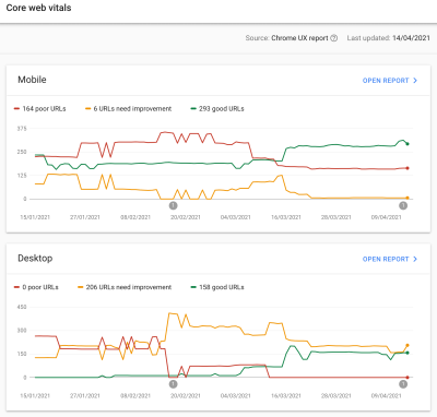
Ideally, to be considered to be passing the Core Web Vitals completely, you want all your pages to be green, with no ambers nor reds. While an amber is a good indicator you’re close to passing, it’s really only greens that count to get the full benefit, so don’t settle for second best. Whether you need all your pages passing or just your key ones is up to you, but often there will be similar issues on many pages, and fixing those for the site can help bring the number of URLs that don’t pass to a more manageable level where you can make those decisions.
Initially, Google is only going to apply Core Web Vitals ranking to mobile, but it’s surely only a matter of time before that rolls out to desktop too, so do not ignore desktop while you are in there reviewing and fixing your pages.
Clicking on one of the reports will give you more detail as to which of the web vitals are failing to be met, and then a sampling of URLs affected. Google Search Console groups URLs into buckets to, in theory, allow you to address similar pages together. You can then click on a URL to run PageSpeed Insights to run a quick performance audit on the particular URL (including showing the Core Web Vitals field data for that page if they are available). You then fix the issues it highlights, rerun PageSpeed Insights to confirm the lab metrics are now correct, and then move on to the next page.
However, once you start looking at that Core Web Vitals report (obsessively for some of us!), you may have then been frustrated that this report doesn’t seem to update to reflect your hard work. It does seem to update every day as the graph is moving, yet it’s often barely changing even once you have released your fixes — why?
Similarly, the PageSpeed Insights field data is stubbornly still showing that URL and site as failing. What’s the story here then?
The Chrome User Experience Report (CrUX)
The reason that the Web Vitals are slow to update, is that the field data is based on the last 28-days of data in Chrome User Experience Report (CrUX), and within that, only the 75th percentile of that data. Using 28 days worth of data, and the 75th percentiles of data are good things, in that they remove variances and extremes to give a more accurate reflection of your site’s performance without causing a lot of noise that’s difficult to interpret.
Performance metrics are very susceptible to the network and devices so we need to smooth out this noise to get to the real story of how your website is performing for most users. However, the flip side to that is that they are frustratingly slow to update, creating a very slow feedback loop from correcting issues, until you see the results of that correction reflected there.
The 75th percentile (or p75) in particular is interesting and the delay it creates, as I don’t think that is well understood. It looks at what metric 75% of the page views of your visitors over those 28 days for each of the Core Web Vitals.
It is therefore the highest Core Web Vital score of 75% of your page views (or conversely the lowest Core Web Vitals score that 75% of your page views will have less than). So it is not the average of this 75% of page views, but the worst value of that set of users.
This creates a delay in reporting that a non-percentile-based rolling average would not. We’ll have to get a little mathsy here (I’ll try to keep it to a minimum), but let’s say, for simplicity sake that everyone got an LCP of 10 seconds for the last month, and you fixed it so now it only takes 1 second, and let’s say you had the exact same number of visitors every day and they all scored this LCP.
In that overly-simplistic scenario, you would get the following metrics:
| Day | LCP | 28 day Mean | 28 day p75 |
|---|---|---|---|
| Day 0 | 10 | 10 | 10 |
| Day 1 | 1 | 9.68 | 10 |
| Day 2 | 1 | 9.36 | 10 |
| Day 3 | 1 | 9.04 | 10 |
| ... | ... | ... | ... |
| Day 20 | 1 | 3.57 | 10 |
| Day 21 | 1 | 3.25 | 10 |
| Day 22 | 1 | 2.93 | 1 |
| Day 23 | 1 | 2.61 | 1 |
| ... | ... | ... | ... |
| Day 27 | 1 | 1.32 | 1 |
| Day 28 | 1 | 1 | 1 |
So you can see you don’t see your drastic improvements in the CrUX score until day 22 when suddenly it jumps to the new, lower value (once we cross 75% of the 28-day average — by no coincidence!). Until then, over 25% of your users were based on data gathered prior to the change, and so we’re getting the old value of 10, and hence your p75 value was stuck at 10.
Therefore it looks like you’ve made no progress at all for a long time, whereas a mean average (if it was used) would show a gradual tick down starting immediately and so progress could actually be seen. On the plus side, for the last few days, the mean is actually higher than the p75 value since p75, by definition, filters out the extremes completely.
The example in the table above, while massively simplified, explains one reason why many might see Web Vitals graphs like below, whereby one day all your pages cross a threshold and then are good (woohoo!):
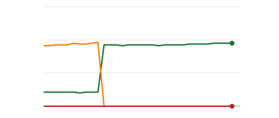
This may be surprising to those expecting more gradual (and instantaneous) changes as you work through page issues, and as some pages are visited more often than others. On a related note, it is also not unusual to see your Search Console graph go through an amber period, depending on your fixes and how they impact the thresholds, before hitting that sweet, sweet green color:
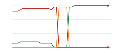
Dave Smart, ran a fascinating experiment Tracking Changes in Search Console’s Report Core Web Vitals Data, where he wanted to look at how quickly it took to update the graphs. He didn’t take into account the 75th percentile portion of CrUX (which makes the lack of movement in some of his graphs make more sense), but still a fascinating real-life experiment on how this graph updates and well worth a read!
My own experience is that this 28-day p75 methodology doesn’t fully explain the lag in the Core Web Vitals report, and we’ll discuss some other potential reasons in a moment.
So is that the best you can do, make the fixes, then wait patiently, tapping your fingers, until CrUX deems your fixes as worthy and updates the graph in Search Console and PageSpeed Insights? And if it turns out your fixes were not good enough, then start the whole cycle again? In this day of instant feedback to satisfy our cravings, and tight feedback loops for developers to improve productivity, that is not very satisfying at all!
Well, there are some things you can do in the meantime to try to see whether any fixes will get the intended impact.
Delving Into The Crux Data In More Detail
Since the core of the measurement is the CrUX data, let’s delve into that some more and see what else it can tell us. Going back to PageSpeed Insights, we can see it surfaces not only the p75 value for the site, but also the percentage of page views in each of the green, amber and red buckets shown in the colour bars beneath:

The above screenshot shows that CLS is failing the Core Web Vitals scoring with a p75 value of 0.11, which is above the 0.1 passing limit. However, despite the color of the font being red, this is actually an amber ranking (as red would be above 0.25). More interestingly is that the green bar is at 73% — once that hits 75% this page is passing the Core Web Vitals.
While you cannot see the historical CrUX values, you can monitor this over time. If it goes to 74% tomorrow then we are trending in the right direction (subject to fluctuations!) and can hope to hit the magic 75% soon. For values that are further away, you can check periodically and see the increase, and then project out when you might start to show as passing.
CrUX is also available as a free API to get more precise figures for those percentages. Once you’ve signed up for an API key, you can call it with a curl command like this (replacing the API_KEY, formFactor, and URL as appropriate):
curl -s --request POST 'https://chromeuxreport.googleapis.com/v1/records:queryRecord?key=API_KEY' \
    --header 'Accept: application/json' \
    --header 'Content-Type: application/json' \
    --data '{"formFactor":"PHONE","url":"https://www.example.com"}'
And you’ll get a JSON response, like this:
{
  "record": {
    "key": {
      "formFactor": "PHONE",
      "url": "https://www.example.com/"
    },
    "metrics": {
      "cumulative_layout_shift": {
        "histogram": [
          {
            "start": "0.00",
            "end": "0.10",
            "density": 0.99959769344240312
          },
          {
            "start": "0.10",
            "end": "0.25",
            "density": 0.00040230655759688886
          },
          {
            "start": "0.25"
          }
        ],
        "percentiles": {
          "p75": "0.00"
        }
      },
      "first_contentful_paint": {
        ...
      }
    }
  },
  "urlNormalizationDetails": {
    "originalUrl": "https://www.example.com",
    "normalizedUrl": "https://www.example.com/"
  }
}
Incidentally, if above is scaring you a bit and you want a quicker way to get a look at this data for just one URL, then PageSpeed Insights also returns this precision which you can see by opening DevTools and then running your PageSpeed Insights test, and finding the XHR call it makes:
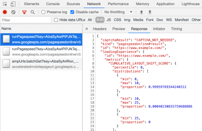
There is also an interactive CrUX API explorer which allows you to make sample queries of the CrUX API. Though, for regular calling of the API, getting a free key and using Curl or some other API tool is usually easier.
The API can also be called with an “origin”, instead of a URL, at which point it will give the summarised value of all page visits to that domain. PageSpeed Insights exposes this information, which can be useful if your URL has no CrUX information available to it, but Google Search Console does not. Google hasn’t stated (and is unlikely to!) exactly how the Core Web Vitals will impact ranking. Will the origin-level score impact rankings, or only individual URL scores? Or, like PageSpeed Insights will Google fall back to original level scores when individual URL data does not exist? Difficult to know at the moment and the only hint so far is this in the FAQ:
Q: How is a score calculated for a URL that was recently published, and hasn’t yet generated 28 days of data?
A: Similar to how Search Console reports page experience data, we can employ techniques like grouping pages that are similar and compute scores based on that aggregation. This is applicable to pages that receive little to no traffic, so small sites without field data don’t need to be worried.
The CrUX API can be called programmatically, and Rick Viscomi from the Google CrUX team created a Google Sheets monitor allowing you to bulk check URLs or origins, and even automatically track CrUX data over time if you want to closely monitor a number of URLs or origins. Simply clone the sheet, go into Tools → Script editor, and then enter a script property of CRUX_API_KEY with your key (this needs to be done in the legacy editor), and then run the script and it will call the CrUX API for the given URLs or origins and add rows to the bottom of the sheet with the data. This can then be run periodically or scheduled to run regularly.
I used this to check all the URLs for a site with a slow updating Core Web Vitals report in Google Search Console and it confirmed that CrUX had no data for a lot of the URLs and most of the rest had passed, so again showing that the Google Search Console report is behind — even from the CrUX data it is supposed to be based on. I’m not sure if it is due to URLs that had previously failed but have now not enough traffic to get updated CrUX data showing them passing, or if it’s due to something else, but this proves to me that this report is definitely slow.
I suspect a large part of that is due to URLs without data in CrUX and Google Search doing its best to proxy a value for them. So this report is a great place to start to get an overview of your site, and one to monitor going forward, but not a great report for working through the issues where you want more immediate feedback.
For those that want to delve into CrUX even more, there are monthly tables of CrUX data available in BigQuery (at origin level only, so not for individual URLs) and Rick has also documented how you can create a CrUX dashboard based on that which can be a good way of monitoring your overall website performance over the months.
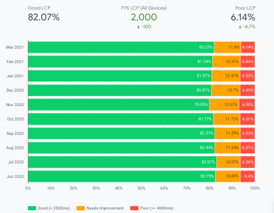
Other Information About The Crux Data
So, with the above, you should have a good understanding of the CrUX dataset, why some of the tools using it seem to be slow and erratic to update, and also how to explore it a little more. But before we move on to alternatives to it, there are some more things to understand about CrUX to help you to really understand the data it is showing. So here’s a collection of other useful information I’ve gathered about CrUX in relation to Core Web Vitals.
CrUX is Chrome only. All those iOS users, and other browsers (Desktop Safari, Firefox, Edge…etc.), not to mention older browsers (Internet Explorer — hurry up and fade out would you!) are not having their user experience reflected in CrUX data and so on Google’s view of Core Web Vitals.
Now, Chrome’s usage is very high (though perhaps not for your site visitors?), and in most cases, the performance issues it highlights will also affect those other browsers, but it is something to be aware of. And it does feel a little “icky” to say the least, that the monopoly position of Google in search, is now encouraging people to optimize for their browser. We’ll talk below about alternative solutions for this limited view.
The version of Chrome being used will also have an impact as these metrics (CLS in particular) are still evolving as well as bugs are being found and fixed. This adds another dimension of complexity to understanding the data. There have been continual improvements to CLS in recent versions of Chrome, with a bigger redefinition of CLS that landed in Chrome 91. Again the fact that field data is being used means it might take some time for these changes to feed through to users, and then into the CrUX data.
CrUX is only for users logged into Chrome, or to quote the actual definition:
“[CrUX is] aggregated from users who have opted-in to syncing their browsing history, have not set up a Sync passphrase, and have usage statistic reporting enabled.”
— Chrome User Experience Report, Google Developers
So if you’re looking for information on a site mostly visited from corporate networks, where such settings are turned off by central IT policies, then you might not be seeing much data — especially if those poor corporate users are still being forced to use Internet Explorer too!
CrUX includes all pages, including those not typically surfaced to Google Search such as “noindexed / robboted / logged in pages will be included” (though there are minimum thresholds for a URL and origin to be exposed in CrUX). Now those categories of pages will likely not be included in Google Search results and so the ranking impact on them is probably unimportant, but they still will be included in CrUX. The Core Web Vitals report in Google Search Console however seems to only show indexed URLs, so they will not show up there.
The origin figure shown in PageSpeed Insights and in the raw CrUX data will include those non-indexed, non-public pages, and as I mentioned above, we’re not sure of the impact of that. A site I work on has a large percentage of visitors visiting our logged-in pages, and while the public pages were very performant the logged-in pages were not, and that severely skewed the origin Web Vitals scores.
The CrUX API can be used to get the data of these logged-in URLs, but tools like PageSpeed Insights cannot (since they run an actual browser and so will be redirected to the login pages). Once we saw that CrUX data and realized the impact, we fixed those, and the origin figures have started to drop down but, as ever, it’s taking time to feed through.
Noindexed or logged-in pages are also often “apps” as well, rather than individual collections of pages so may be using a Single Page Application methodology with one real URL, but many different pages underneath that. This can impact CLS in particular due to it being measured over the whole life of the page (though hopefully the upcoming changes to CLS will help with that).
As mentioned previously, the Core Web Vitals report in Google Search Console, while based on CrUX, is definitely not the same data. As I stated earlier, I suspect this is primarily due to Google Search Console attempting to estimate Web Vitals for URLs where no CrUX data exists. The sample URLs in this report are also out of whack with the CrUX data.
I’ve seen many instances of URLs that have been fixed, and the CrUX data in either PageSpeed Insights, or directly via the API, will show it passing Web Vitals, yet when you click on the red line in the Core Web Vitals report and get sample URLs these passing URLs will be included as if they are failing. I’m not sure what heuristics Google Search Console uses for this grouping, or how often it and sample URLs are updated, but it could do with updating more often in my opinion!
CrUX is based on page views. That means your most popular pages will have a large influence on your origin CrUX data. Some pages will drop in and out of CrUX each day as they meet these thresholds or not, and perhaps the origin data is coming into play for those? Also if you had a big campaign for a period and lots of visits, then made improvements but have fewer visits since, you will see a larger proportion of the older, worse data.
CrUX data is separated into Mobile, Desktop and Tablet — though only Mobile and Desktop are exposed in most tools. The CrUX API and BigQuery allows you to look at Tablet data if you really want to, but I’d advise concentrating on Mobile and then Desktop. Also, note in some cases (like the CrUX API) it’s marked as PHONE rather than MOBILE to reflect it’s based on the form factor, rather than that the data is based on being on a mobile network.
All in all, a lot of these issues are impacts of field (RUM) data gathering, but all these nuances can be a lot to take on when you’ve been tasked with “fixing our Core Web Vitals”. The more you understand how these Core Web Vitals are gathered and processed, the more the data will make sense, and the more time you can spend on fixing the actual issues, rather than scratching your head wondering why it’s not reporting what you think it should be.
Getting Faster Feedback
OK, so by now you should have a good handle on how the Core Web Vitals are collected and exposed through the various tools, but that still leaves us with the issue of how we can get better and quicker feedback. Waiting 21–28 days to see the impact in CrUX data — only to realize your fixes weren’t sufficient — is way too slow. So while some of the tips above can be used to see if CrUX is trending in the right direction, it’s still not ideal. The only solution, therefore, is to look beyond CrUX in order to replicate what it’s doing, but expose the data faster.
There are a number of great commercial RUM products on the market that measure user performance of your site and expose the data in dashboards or APIs to allow you to query the data in much more depth and at much more granular frequency than CrUX allows. I’ll not give any names of products here to avoid accusations of favoritism, or offend anyone I leave off! As the Core Web Vitals are exposed as browser APIs (by Chromium-based browsers at least, other browsers like Safari and Firefox do not yet expose some of the newer metrics like LCP and CLS), they should, in theory, be the same data as exposed to CrUX and therefore to Google — with the same above caveats in mind!
For those without access to these RUM products, Google has also made available a Web Vitals JavaScript library, which allows you to get access to these metrics and report them back as you see fit. This can be used to send this data back to Google Analytics by running the following script on your web pages:
<script type="module">
  import {getFCP, getLCP, getCLS, getTTFB, getFID} from 'https://unpkg.com/web-vitals?module';

  function sendWebVitals() {
    function sendWebVitalsGAEvents({name, delta, id, entries}) {
      if ("function" == typeof ga) {
        ga('send', 'event', {
          eventCategory: 'Web Vitals',
          eventAction: name,
          // The `id` value will be unique to the current page load. When sending
          // multiple values from the same page (e.g. for CLS), Google Analytics can
          // compute a total by grouping on this ID (note: requires `eventLabel` to
          // be a dimension in your report).
          eventLabel: id,
          // Google Analytics metrics must be integers, so the value is rounded.
          // For CLS the value is first multiplied by 1000 for greater precision
          // (note: increase the multiplier for greater precision if needed).
          eventValue: Math.round(name === 'CLS' ? delta * 1000 : delta),
          // Use a non-interaction event to avoid affecting bounce rate.
          nonInteraction: true,
          // Use `sendBeacon()` if the browser supports it.
          transport: 'beacon'
        });
      }
    }

    // Register function to send Core Web Vitals and other metrics as they become available
    getFCP(sendWebVitalsGAEvents);
    getLCP(sendWebVitalsGAEvents);
    getCLS(sendWebVitalsGAEvents);
    getTTFB(sendWebVitalsGAEvents);
    getFID(sendWebVitalsGAEvents);

  }

  sendWebVitals();
</script>
Or alternatively, you can include this as an external script instead:
<script type="module" src="/javascript/send-web-vitals.js"></script>Now I realize the irony of adding another script to measure the impact of your website, which is probably slow in part because of too much JavaScript, but as you can see above, the script is quite small and the library it loads is only a further 1.7 kB compressed (4.0 kB uncompressed). Additionally, as a module (which will be ignored by older browsers that don’t understand web vitals), its execution is deferred so shouldn’t impact your site too much, and the data it can gather can be invaluable to help you investigate your Core Web Vital, in a more real-time manner than the CrUX data allows.
The script registers a function to send a Google Analytics event when each metric becomes available. For FCP and TTFB this is as soon as the page is loaded, for FID after the first interaction from the user, while for LCP and CLS it is when the page is navigated away from or backgrounded and the actual LCP and CLS are definitely known. You can use developer tools to see these beacons being sent for that page, whereas the CrUX data happens in the background without being exposed here.
The benefit of putting this data in a tool like Google Analytics is you can slice and dice the data based on all the other information you have in there, including form factor (desktop or mobile), new or returning visitors, funnel conversions, Chrome version, and so on. And, as it’s RUM data, it will be affected by real usage — users on faster or slower devices will report back faster or slower values — rather than a developer testing on their high spec machine and saying it’s fine.
At the same time, you need to bear in mind that the reason the CrUX data is aggregated over 28 days, and only looks at the 75th percentile is to remove the variance. Having access to the raw data allows you to see more granular data, but that means you’re more susceptible to extreme variations. Still, as long as you keep that in mind, keeping early access to data can be very valuable.
Google’s Phil Walton created a Web-Vitals dashboard, that can be pointed at your Google Analytics account to download this data, calculate the 75th percentile (so that helps with the variations!) and then display your Core Web Vitals score, a histogram of information, a time series of the data, and your top 5 visited pages with the top elements causing those scores.
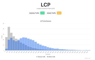
Using this dashboard, you can filter on individual pages (using a ga:pagePath==/page/path/index.html filter), and see a very satisfying graph like this within a day of you releasing your fix, and know your fix has been successful and you can move on to your next challenge!:

With a little bit more JavaScript you can also expose more information (like what the LCP element is, or which element is causing the most CLS) into a Google Analytics Custom Dimension. Phil wrote an excellent Debug Web Vitals in the field post on this which basically shows how you can enhance the above script to send this debug information as well, as shown in this version of the script.
These dimensions can also be reported in the dashboard (using ga:dimension1 as the Debug dimension field, assuming this is being sent back in Google Analytics Customer Dimension 1 in the script), to get data like this to see the LCP element as seen by those browsers:
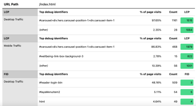
As I said previously, commercial RUM products will often expose this sort of data too (and more!), but for those just dipping their toe in the water and not ready for the financial commitment of those products, this at least offers the first dabble into RUM-based metrics and how useful they can be to get that crucial faster feedback on the improvements you’re implementing. And if this whets your appetite for this information, then definitely look at the other RUM products out there to see how they can help you, too.
When looking at alternative measurements and RUM products, do remember to circle back round to what Google is seeing for your site, as it may well be different. It would be a shame to work hard on performance, yet not get all the ranking benefits of this at the same time! So keep an eye on those Search Console graphs to ensure you’re not missing anything.
Conclusion
The Core Web Vitals are an interesting set of key metrics looking to represent the user experience of browsing the web. As a keen web performance advocate, I welcome any push to improve the performance of sites and the ranking impact of these metrics has certainly created a great buzz in the web performance and SEO communities.
While the metrics themselves are very interesting, what’s perhaps more exciting is the use of CrUX data to measure these. This basically exposes RUM data to websites that have never even considered measuring site performance in the field in this way before. RUM data is what users are actually experiencing, in all their wild and varied setups, and there is no substitute for understanding how your website is really performing and being experienced by your users.
But the reason we’ve been so dependent on lab data for so long is because RUM data is noisy. The steps CrUX takes to reduce this does help to give a more stable view, but at the cost of it making it difficult to see recent changes.
Hopefully, this post goes some way to explaining the various ways of accessing the Core Web Vitals data for your website, and some of the limitations of each method. I also hope that it goes some way to explaining some of the data you’ve been struggling to understand, as well as suggesting some ways to work around those limitations.
Happy optimizing!
Further Reading
- How To Monitor And Optimize Google Core Web Vitals
- How To Benchmark And Improve Web Vitals With Real User Metrics
- SVG Coding Examples: Useful Recipes For Writing Vectors By Hand
- How We Optimized Performance To Serve A Global Audience


 SurveyJS: White-Label Survey Solution for Your JS App
 Try ProtoPie AI free →

 Register Free Now

