CSS Container Queries: Use-Cases And Migration Strategies
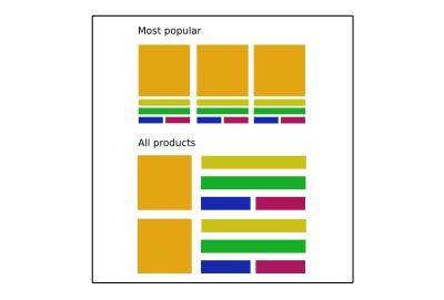
When we write media queries for a UI element, we always describe how that element is styled depending on the screen dimensions. This approach works well when the responsiveness of the target element media query should only depend on viewport size. Let’s take a look at the following responsive page layout example.

However, responsive Web Design (RWD) is not limited to a page layout — the individual UI components usually have media queries that can change their style depending on the viewport dimensions.

You might have already noticed a problem with the previous statement — individual UI component layout often does not depend exclusively on the viewport dimensions. Whereas page layout is an element closely tied to viewport dimensions and is one of the topmost elements in HTML, UI components can be used in different contexts and containers. If you think about it, the viewport is just a container, and UI components can be nested within other containers with styles that affect the component’s dimensions and layout.

Even though the same product card component is used in both the top and bottom sections, component styles not only depend on the viewport dimensions but also depend on the context and the container CSS properties (like the grid in the example) where it’s placed.
Of course, we can structure our CSS so we support the style variations for different contexts and containers to address the layout issue manually. In the worst-case scenario, this variation would be added with style override which would lead to code duplication and specificity issues.
.product-card {
    /* Default card style */
}

.product-card--narrow {
   /* Style variation for narrow viewport and containers */
}

@media screen and (min-width: 569px) {
 .product-card--wide {
     /* Style variation for wider viewport and containers */
  }
}
However, this is more of a workaround for the limitations of media queries rather than a proper solution. When writing media queries for UI elements we are trying to find a “magic” viewport value for a breakpoint when the target element has minimum dimensions where the layout doesn’t break. In short, we are linking a “magical” viewport dimension value to element dimensions value. This value is usually different from than viewport dimension and is prone to bugs when inner container dimensions or layout changes.

The following example showcases this exact issue — even though a responsive product card element has been implemented and it looks good in a standard use-case, it looks broken if it’s moved to a different container with CSS properties that affect element dimensions. Each additional use-case requires additional CSS code to be added which can lead to duplicated code, code bloat, and code that is difficult to maintain.
See the Pen Product Cards: Various Containers by Adrian Bece.
This is one of the issues that container queries attempting to fix. Container queries extend existing media queries functionality with queries that depend on the target element dimensions. There are three major benefits of using this approach:
- Container query styles are applied depending on the dimensions of the target element itself. UI components will be able to adapt to any given context or container.
- Developers won’t need to look for a “magic number” viewport dimension value that links a viewport media query to a target dimension of UI component in a specific container or a specific context.
- No need to add additional CSS classes or media queries for different contexts and use-cases.
“The ideal responsive website is a system of flexible, modular components that can be repurposed to serve in multiple contexts.”
— “Container Queries: Once More Unto the Breach,” Mat Marquis
Before we dive deep into container queries, we need to check out the browser support and see how we can enable the experimental feature in our browser.
Browser Support
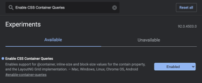
Container queries are an experimental feature, available currently in Chrome Canary version at the time of writing this article. If you want to follow along and run the CodePen examples in this article you’ll need to enable container queries in the following settings URL.
chrome://flags/#enable-container-queries
In case you are using a browser that doesn’t support container queries, an image showcasing the intended working example will be provided alongside the CodePen demo.
Working With Container Queries
Container queries are not as straightforward as regular media queries. We’ll have to add an extra line of CSS code to our UI element to make container queries work, but there’s a reason for that and we’ll cover that next.
Containment Property
CSS contain property has been added to the majority of modern browsers and has a decent 75% browser support at the time of writing this article. The contain property is mainly used for performance optimization by hinting to the browser which parts (subtrees) of the page can be treated as independent and won’t affect the changes to other elements in a tree. That way, if a change occurs in a single element, the browser will re-render only that part (subtree) instead of the whole page. With contain property values, we can specify which types of containment we want to use — layout, size, or paint.
There are many great articles about the contain property that outline available options and use-cases in much more detail, so I’m going to focus only on properties related to container queries.
What does the CSS contentment property that’s used for optimization have to do with container queries? For container queries to work, the browser needs to know if a change occurs in the element’s children layout that it should re-render only that component. The browser will know to apply the code in the container query to the matching component when the component is rendered or the component’s dimension changes.
We’ll use the layout and style values for the contain property, but we’ll also need an additional value that signals the browser about the axis in which the change will occur.
inline-size
Containment on the inline axis. It’s expected for this value to have significantly more use-cases, so it’s being implemented first.block-size
Containment on block axis. It’s still in development and is not currently available.
One minor downside of the contain property is that our layout element needs to be a child of a contain element, meaning that we are adding an additional nesting level.
<section>
  <article class="card">
      <div class="card__wrapper">
          <!-- Card content -->
      </div>
  </article>
</section>
.card {
contain: layout inline-size style;
}
.card__wrapper {
display: grid;
grid-gap: 1.5em;
grid-template-rows: auto auto;
/* ... */
}Notice how we are not adding this value to a more distant parent-like section and keeping the container as close to the affected element as possible.
“Performance is the art of avoiding work and making any work you do as efficient as possible. In many cases, it’s about working with the browser, not against it.”
— “Rendering Performance,” Paul Lewis
That is why we should correctly signal the browser about the change. Wrapping a distant parent element with a contain property can be counter-productive and negatively affect page performance. In worst-case scenarios of misusing the contain property, the layout may even break and the browser won’t render it correctly.
Container Query
After the contain property has been added to the card element wrapper, we can write a container query. We’ve added a contain property to an element with card class, so now we can include any of its child elements in a container query.
Just like with regular media queries, we need to define a query using min-width or max-width properties and nest all selectors inside the block. However, we’ll be using the @container keyword instead of @media to define a container query.
@container (min-width: 568px) {
  .card__wrapper {
    align-items: center;
    grid-gap: 1.5em;
    grid-template-rows: auto;
    grid-template-columns: 150px auto;
  }

  .card__image {
    min-width: auto;
    height: auto;
  }
}
Both card__wrapper and card__image element are children of card element which has the contain property defined. When we replace the regular media queries with container queries, remove the additional CSS classes for narrow containers, and run the CodePen example in a browser that supports container queries, we get the following result.

See the Pen Product Cards: Container Queries by Adrian Bece.
Please note that container queries currently don’t show up in Chrome developer tools, which makes debugging container queries a bit difficult. It’s expected that the proper debugging support will be added to the browser in the future.
You can see how container queries allow us to create more robust and reusable UI components that can adapt to virtually any container and layout. However, proper browser support for container queries is still far away in the feature. Let’s try and see if we can implement container queries using progressive enhancement.
Progressive Enhancement & Polyfills
Let’s see if we can add a fallback to CSS class variation and media queries. We can use CSS feature queries with the @supports rule to detect available browser features. However, we cannot check for other queries, so we need to add a check for a contain: layout inline-size style value. We’ll have to assume that browsers that do support inline-size property also support container queries.
/* Check if the inline-size value is supported */
@supports (contain: inline-size) {
  .card {
    contain: layout inline-size style;
  }
}

/* If the inline-size value is not supported, use media query fallback */
@supports not (contain: inline-size) {
    @media (min-width: 568px) {
       /* ... */
  }
}

/* Browser ignores @container if it’s not supported */
@container (min-width: 568px) {
  /* Container query styles */
}
However, this approach might lead to duplicated styles as the same styles are being applied both by container query and the media query. If you decide to implement container queries with progressive enhancement, you’d want to use a CSS pre-processor like SASS or a post-processor like PostCSS to avoid duplicating blocks of code and use CSS mixins or another approach instead.
See the Pen Product Cards: Container Queries with progressive enhancement by Adrian Bece.
Since this container query spec is still in an experimental phase, it’s important to keep in mind that the spec or implementation is prone to change in future releases.
Alternatively, you can use polyfills to provide a reliable fallback. There are two JavaScript polyfills I’d like to highlight, which currently seem to be actively maintained and provide necessary container query features:
cqfillby Jonathan Neal
JavaScript polyfill for CSS and PostCSSreact-container-queryby Chris Garcia
Custom hook and component for React
Migrating From Media Queries To Container Queries
If you decide to implement container queries on an existing project that uses media queries, you’ll need to refactor HTML and CSS code. I’ve found this to be the fastest and most straightforward way of adding container queries while providing a reliable fallback to media queries. Let’s take a look at the previous card example.
<section>
      <div class="card__wrapper card__wrapper--wide">
          <!-- Wide card content -->
      </div>
</section>

/* ... */

<aside>
      <div class="card__wrapper">
          <!-- Narrow card content -->
      </div>
</aside>
.card__wrapper {
display: grid;
grid-gap: 1.5em;
grid-template-rows: auto auto;
/* ... */
}
.card__image {
/* ... */
}
@media screen and (min-width: 568px) {
.card__wrapper--wide {
align-items: center;
grid-gap: 1.5em;
grid-template-rows: auto;
grid-template-columns: 150px auto;
}
.card__image {
/* ... */
}
}
First, wrap the root HTML element that has a media query applied to it with an element that has the contain property.
<section>
  <article class="card">
      <div class="card__wrapper">
          <!-- Card content -->
      </div>
  </article>
</section>
@supports (contain: inline-size) {
.card {
contain: layout inline-size style;
}
}Next, wrap a media query in a feature query and add a container query.
@supports not (contain: inline-size) {
    @media (min-width: 568px) {
    .card__wrapper--wide {
       /* ... */
    }

    .card__image {
       /* ... */
    }
  }
}


@container (min-width: 568px) {
  .card__wrapper {
     /* Same code as .card__wrapper--wide in media query */
  }

  .card__image {
    /* Same code as .card__image in media query */
  }
}
Although this method results in some code bloat and duplicated code, by using SASS or PostCSS you can avoid duplicating development code, so the CSS source code remains maintainable.
Once container queries receive proper browser support, you might want to consider removing @supports not (contain: inline-size) code blocks and continue supporting container queries exclusively.
Stephanie Eckles has recently published a great article on container queries covering various migration strategies. I recommend checking it out for more information on the topic.
Use-Case Scenarios
As we’ve seen from the previous examples, container queries are best used for highly reusable components with a layout that depends on the available container space and that can be used in various contexts and added to different containers on the page.
Other examples include (examples require a browser that supports container queries):
- Modular components like cards, form elements, banners, etc.
- Adaptable layouts
- Pagination with different functionalities for mobile and desktop
- Fun experiments with CSS resize
Conclusion
Once the spec has been implemented and widely supported in browsers, container queries might become a game-changing feature. It will allow developers to write queries on component level, moving the queries closer to the related components, instead of using the distant and barely-related viewport media queries. This will result in more robust, reusable, and maintainable components that will be able to adapt to various use-cases, layouts, and containers.
As it stands, container queries are still in an early, experimental phase and the implementation is prone to change. If you want to start using container queries in your projects today, you’ll need to add them using progressive enhancement with feature detection or use a JavaScript polyfill. Both cases will result in some overhead in the code, so if you decide to use container queries in this early phase, make sure to plan for refactoring the code once the feature becomes widely supported.
References
- “Container Queries: A Quick Start Guide” by David A. Herron
- “Say Hello To CSS Container Queries,” Ahmad Shadeed
- “CSS Containment In Chrome 52,” Paul Lewis
- “Helping Browsers Optimize With The CSS Contain Property,” Rachel Andrew
Further Reading
- Modern CSS Layouts: You Might Not Need A Framework For That
- In Praise Of The Basics
- Solving Media Object Float Issues With CSS Block Formatting Contexts
- Frankenstein Migration: Framework-Agnostic Approach (Part 1)


 SurveyJS: White-Label Survey Solution for Your JS App
 Register Free Now
 Celebrating 10 million developers

