Three Insights I Gained While Researching Vue.js Accessibility

Email Newsletter
Weekly tips on front-end & UX.
Trusted by 182,000+ folks.
 Custom Web Forms for Angular, React, & Vue. Your backend.
 Celebrating 10 million developers


JavaScript frameworks like React, Angular and Vue have a very bad reputation when it comes to web accessibility. But is this due to inherent technical limitations or insurmountable problems of those tools? I think not. During the research phase of my book, “Accessible Vue,” I gained three insights regarding web app accessibility in general and the framework in particular. Considering these, perhaps it’s worth taking another perspective around accessible Vue apps.
Insight 1: JavaScript Framework Features For Accessibility Are Underused
Component-based design, enabled and enforced by modern JavaScript frameworks, does not only provide great developer experiences and project ergonomics when used in a smart way, but it can also offer advantages for accessibility. The first is the factor of reusability, i.e. when your component gets used in several places within your app (perhaps in different forms or shapes) and it only has to be made accessible only once. In this case, an increased developer experience actually helps the user and “baking accessibility into components” (as Hidde de Vries puts it) creates a win-win scenario for everyone.
The second aspect that comes with component based-designs are props — namely in the form that one component can inherit or get context from its parent environment. This forwarding of “environment data” can serve accessibility as well.
Take headlines, for example. A solid and comprehensible headline structure is not only good for SEO but especially for people using screen readers. When they encounter a sound document outline, constructed with headlines that structure a web page or app, screen reader users gain a quick overview of the web page they are on. Just like visually-abled users don’t read every word on a page but scan for interesting things, blind screen reader users don’t make their software read each and every word. Instead, they are checking a document for content and functionality they are interested in. Headlines, for that matter, are keeping pieces of content together and are at the same time providing a structural frame of a document (think timber frame houses).
What makes headlines providing a structure is not only their mere existence. It is also their nesting that creates an image inside a user’s mind. For that, a web developer’s headline toolbox contains six levels (<h1> to <h6>). By applying these levels, both editors and developers can create an outline of content and a reliable functionality that users can expect in the document.
For example, let’s take the (abridged) headline tree from the GOV.UK website:
1 — Welcome to GOV.UK
  2 — Popular on GOV.UK
  2 — Services and information
    3 — Benefits
    3 — Births, deaths, marriages and care
    3 — Business and self-employment
    // …etc
  2 — Departments and policy
    3 — Coronavirus (COVID 19)
    3 — Travel abroad: step by step
…etc
Even without visiting the actual page and without actually perceiving it visually, this headline tree created a table of contents helping you understand what sections can be expected on the front page. The creators used headline elements to herald data following it and didn’t skip headline levels.
So far, so familiar (at least in correlation with search engines, I guess). However, because a component can be used in different places of your app, hardwired headline levels inside them can sometimes create a suboptimal headline tree overall. Relations between headlines possibly aren’t conveyed as clear as in the example above (“Business and self-employment” does not stand on its own but is related to “Services and information”).
For example, imagine a listing of a shop’s newest products that can be placed both in the main content and a sidebar — it’s quite possible that both sections live in different contexts. A headline such as <h1>Our latest arrivals</h1> would make sense above the product list in the main content — given it is the central content of the whole document or view.
The same component sporting the same <h1> but placed in a sidebar of another document, however, would suggest the most important content lives in the sidebar and competes with the <h1> in the main content. While what I described above is a peculiarity of component-based design in general this gives us a perfect opportunity to put both aspects together — the need for a sound headline tree and our knowledge about props:
Context Via props
Let’s progress from theoretical considerations into hands-on code. In the following code block, you see a component listing the newest problems in an online shop. It is extremely simplyified but the emphasis is on line 3, the hardcoded <h1>:
<template>
    <div>
        <h1>Our latest arrivals</h1>
        <ol>
            <li>Product A</li>
            <li>Product B</li>
            <!-- etc -->
        </ol>
  </div>
</template>
To use this component in different places of the app without compromising the document’s headline tree, we want to make the headline level dynamic. To achieve this, we replace the <h1> with Vue’s dynamic component name helper called, well, component:
<component :is="headlineElement">Our latest arrivals</component>
In the script part of our component, we now have to add two things:
- A component prop that receives the exact headline level as a string,
headlineLevel; - A computed property (
headlineElementfrom the code example above) that builds a proper HTML element out of the stringhand the value ofheadlineLevel.
So our simplified script block looks like this:
<script>
export default {
    props: {
      headlineLevel: {
        type: String
    },
    computed: {
        headlineElement() {
          return "h" + this.headlineLevel;
        }
    }
}
</script>
And that’s all!
Of course, adding checks and sensible defaults on the prop level is necessary — for example, we have to make sure that headlineLevel can only be a number between 1 and 6. Both Vue’s native Prop Validation, as well as TypeScript, are tools at your disposal to do just that, but I wanted to keep it out of this example.
If you happen to be interested in learning how to accomplish the exact same concept using React, friend of the show magazine Heydon Pickering wrote about the topic back in 2018 and supplied React/JSX sample code. Tenon UI’s Heading Components, also written for React, take this concept even further and aim to automate headline level creation by using so-called “LevelBoundaries” and a generic <Heading> element. Check it out!
Insight 2: There Are Established Strategies To Tackle Web App Accessibility Problems
While web app accessibility may look daunting the first time you encounter the topic, there’s no need to despair: vested accessibility patterns to tackle typical web app characteristics do exist. In the following Insight, I will introduce you to strategies for supplying accessible notifications, including an easy implementation in Vue.js (Strategy 1), then point you towards recommended patterns and their Vue counterparts (Strategy 2). Lastly, I recommend taking a look at both Vue’s emerging (Strategy 3) and React’s established accessibility community (Strategy 4).
Strategy 1: Announcing Dynamic Updates With Live Regions
While accessibility is more than making things screen reader compatible, improving the screen reader experience plays a big part of web app accessibility. This is rooted in the general working principle of this form of assistive technology: screen reader software transforms content on the screen into either audio or braille output, thus enabling blind people to interact with the web and technology in general.
Like keyboard focus, a screen reader’s output point, the so-called virtual cursor, can only be at one place at once. At the same time, one core aspect of web apps is a dynamic change in parts of the document without page reload. But what happens, for example, when the update in the DOM is actually above the virtual cursor’s position in the document? Users likely would not notice the change because do not tend to traverse the document in reverse — unless they are somehow informed of the dynamic update.
In the following short video, I demonstrate what happens (or rather, what not happens) if an interaction causes a dynamic DOM change nowhere near the virtual cursor — the screen reader just stays silent:
But by using ARIA Live Regions, web developers can trigger accessible announcements, namely screen reader output independent of the virtual cursor’s position. The way live regions work is that a screen reader is instructed to observe certain HTML elements’ textContent. When it changes due to scripting, the screen reader picks up the update, and the new text will be read out.
As an example, imagine a list of products in an online shop. Products are listed in a table and users can add every product to their shopping cart without a page reload by the click of a button. The expected asynchronous update of the DOM, while perceivable for visual users, is a perfect job for live regions.
Let’s write a piece of simplified dream code for this situation. Here’s the HTML:
<button id="addToCartOne">Add to cart</button>

<div id="info" aria-live="polite">
<!-- I’m the live region. For the sake of this example, I'll start empty.
     But screen readers detect any text changes within me! -->
</div>
Now, both DOM updates and live regions announcements are only possible with JavaScript. So let’s look at the equally simplified script part of our “Add to Cart” button click handler:
<script>
const buttonAddProductOneToCart = document.getElementById('addToCartOne');
const liveRegion = document.getElementById('info');

buttonAddProductOneToCart.addEventListener('click', () => {
        // The actual adding logic magic 🪄

        // Triggering the live region:
        liveRegion.textContent = "Product One has been added to your cart";
});
</script>
You can see in the code above that when the actual adding happens (the actual implementation depends on your data source and tech stack, of course), an accessible announcement gets triggered. The once empty <div> with the ID of info changes its text content to “Product One has been added to your cart”. Because screen readers observe the region for changes like this, a screen reader output regardless of the virtual cursor position is prompted. And because the live region is set to polite, the announcement waits in case there is a current output.
If you really want to convey an important announcement that doesn’t respect the current screen reader message but interrupts it, the aria-live attribute can also be set to assertive. Live regions in themselves are powerful tools that should be used with caution, which is even more valid for this more “aggressive” kind. So please limit their use to urgent error messages the user must know about, for example, “Autosave failed, please save manually”.
Let’s visit our example from above again, this time with implemented live regions: Screen reader users are now informed that their button interaction has worked and that the particular item has been added to (or removed from) their shopping cart:
If you want to use live regions in Vue.js applications, you can, of course, recreate the code examples above. However, an easier way would be to use the library vue-announcer. After installing it with npm install -S @vue-a11y/announcer (or npm install -S @vue-a11y/announcer@next for the Vue 3 version) and registering it a Vue plugin, there are only two steps necessary:
- The placement of
<VueAnnouncer />in yourApp.vue’s template. This renders an empty live region (like the one from above that had the ID ofinfo).
Note: It is recommended only to use one live region instance, and it makes sense to place it in a central place, so that many components can refer to it.
<template>
  <div>
    <VueAnnouncer />
    <!-- ... -->
  </div>
</template>
- The triggering of the live region, for example from within a method or lifecycle hook. The easiest way to accomplish this is using the
.setmethod orthis.$announcer. The method’s first parameter is the text the live regions is updated with (equivalent to the text that the screen reader will output). As a second parameter, you can explicitly supplypoliteandassertiveas a setting). But, as you’ll notice it is optional — in case the parameter gets omitted the announcement will be a polite one:
methods: {
  addProductToCart(product) {
    // Actual adding logic here

    this.$announcer.set(`${product.title} has been added to your cart.`);
  }
}
This was just a small peek into the amazing world of ARIA live regions. As a matter of fact, more options than polite and assertive are available (such as log, timer and even marquee) but with varying support in screen readers.
If you want to dive deeper into the topic, here are three recommended resources:
- “ARIA Live Regions,” MDN Web Docs
- “The Many Lives Of A Notification,” Sarah Higley (video)
- NerdeRegion, a Chrome extension that lets you roughly emulate live region output in your dev tools without the need to fire up a screen reader. However, this should not replace conscientious testing in real screen readers!
Strategy 2: Using Undisputed WAI-ARIA Authoring Practices
The moment you encounter WAI-ARIA’s authoring practices, you’ll likely feel a great relief. It seems that the web’s standard body, the W3 Consortium, offers some kind of pattern library that you just have to use (or convert to your framework of choice), and boom, all your web app accessibility challenges are solved.
The reality, however, is not so simple. While it is true that the W3C offers a plethora of typical web app patterns like combo boxes, sliders, menus and treeviews, not all authoring practices are in a state that they are recommended for production. The actual idea behind authoring practices was to demonstrate the “pure” use of ARIA states, roles and widget patterns.
But in order to be a truly vetted pattern, its authors have to make sure that every practice has solid support among assistive technologies and also works seamlessly for touch devices. Alas, that’s the place where some patterns listed in the Authoring Practices fall short. Web development is in a state of constant flux, and likely web app evolution even more so. A good place to stay updated with the state of single authoring practices is W3C’s authoring-practices repo on GitHub. In the Issues section, web accessibility experts exchange their current ideas, experiences, and testing research for every pattern.
All that being said does not mean that the practices have no value at all for your web app accessibility ventures, though. While there are widgets that are mere proofs of concept there are solid patterns. In the following, I want to highlight three undisputed Authoring Practices and their counterparts in built-in Vue.js:
Disclosure Widgets are simple and straightforward concepts that can be used in a variety of ways: as a basis for your accessible accordion, as part of a robust dropdown navigation menu, or to show and hide additional information, like extended image descriptions.
The great thing about the pattern is that it only consists of two elements: A trigger (1) that toggles the visibility of a container (2). In HTML terms, trigger and container must directly follow each other in the DOM. To learn more about the concept and the implementation in Vue, read my blog article about Disclosure Widgets in Vue, or check out the corresponding demo on CodeSandBox.Modal dialogs are also considered an established pattern. What makes a dialog “modal” is its property to render the parts of the interface that are not the modal’s content inactive when it’s open.
Furthermore, developers must ensure that the keyboard focus is sent into the modal upon activation, can’t leave an open modal and is being sent back to the triggering control after deactivation. Kitty Giraudel’s A11y Dialog component takes care of all the things I just described. For developers using Vue.js, there is a plugin called vue-a11y-dialog available.Tab Components are a common dynamic pattern that works with the metaphor of physical folder tabs and thus, helps authors to pack larger amounts of content into “tab panels”. The authoring practice comes in two variants related to panel activation (automatic or manual).
What is even more important, tab components enjoy good support in assistive technology and can be therefore considered a recommended pattern (as long as you test which activation mode works best for your users). Architecturally speaking, there are multiple ways to build the tab component with the help of Vue.js: In this CodeSandBox, I decided to go for a slot-based approach and automatic activation.
Strategy 3: View And Help Vue’s Accessibility Initiatives Grow
While there is still a way to go, it is true to state that the topic of accessibility in Vue.js is finally on the rise. A milestone for the topic was the addition of an “Accessibility” section in Vue’s official docs, which happened related to the release of Vue 3.
But even apart from official resources, the following people from the Vue community are worth following because they provide either education material, accessible components, or both:
- Maria Lombardo has the status of “Vue community partner”, penned the accessibility documentation linked above, is giving a11y-related workshops at Vue conferences, and has a (paid) Web Accessibility Fundamentals course at vueschool.io.
- An article about accessibility in Vue.js would not be complete without a mention of Alan Ktquez, project lead of vue-a11y.com. He and his community initiative create and maintain plugins like the aforementioned vue-announcer, vue-skipto for creating skip links, vue-axe as a Vue wrapper around Deque’s
axe-coretesting engine, and especially awesome-vue-a11y, an ever-growing link list of accessibility resources in the Vueniverse. - Fellow Berliner Oscar Braunert has a special focus on inclusive inputs and shows how to implement them in Vue.js, for example in the form of talks and articles. With the tournant UI library, Oscar and I are aiming to supply accessible components both based on (undisputed) WAI Authoring Practices (see Strategy 2) and Heydon Pickering’s Inclusive Components.
- Moritz Kröger built a Vue wrapper for Kitty Giraudel’s a11y-dialog dubbed vue-a11y-dialog, which provides everything a developer needs in term of semantics and focus management (see above).
Strategy 4: Learn From React Accessibility Leads
If you compare it with the top dog React.js, Vue.js is not a niche product, but you must admit that it has (not yet?) reached its popularity. However, this does not have to be a disadvantage when it comes to accessibility. React — and Angular before it — are in a sense pioneering in accessibility by their proliferation alone.
The more popular frameworks become, the higher the likelihood of good work in terms of inclusivity. Be it due to community initiatives on the subject or simply government authorities with web accessibility obligations doing a “buy-in”. If they also share their findings and accessible code via open-source, it’s a win-win-win situation. Not only for the framework itself and its community but also for “competitors”.
This actually has happened in the case of React (and the government project that I talked about so abstractly is the Australian Government Design System). Teams and developers caring for accessibility and working with React can check out projects like these and use the provided components and best practices.
Teams and developers caring for accessibility but using Vue.js, Angular, Svelte etc. can look into the React code and learn from it. Although there may be natural differences in the syntax of each framework, they have many basic concepts in common. Other React libraries that are considered accessible and are available as a basis for learning:
- Cauldron from Deque
- Tenon UI from Tenon
- BaseWeb Components from Uber
For improving Vue.js accessibility, it’s also worth following accessibility people from the React world:
- Marcy Sutton is a freelance web accessibility expert who worked in the past for Deque and improved accessibility and related documentation at Gatsby.js, which is a static site generator based on React. She is very hands-on, conducts research and conveys important topics regarding web app accessibility in great presentations, blog posts, and workshops. You can find Marcy Sutton on Twitter at @marcysutton, web app-related courses on Egghead.io and TestingAccessibility.com or an overview of all of her projects by visiting her website.
- Lindsey Kopacz is a web developer specializing in inaccessibility. She cares for inclusive experiences on the web, about overcoming ableism and educating her fellow web developers about the importance of accessibility. Apart from writing on her blog a11ywithlindsey.com, she also has courses on Egghead.io and lately published her ebook “The Bootcampers Guide to Web Accessibility”. On Twitter, she is @littlekope.
- Ryan Florence and Michael Jackson created Reach UI, a collection of components and tools that aims “to become the accessible foundation of your React-based design system.” Besides the fact that they have created some accessible standard components, it is especially noteworthy that their “Reach UI Router” (along with its accessibility features) will merge with the “official” React Router in the future.
Although React does not do “first-class plugins” like Vue.js, this is excellent news because they created their router with inbuilt focus management. A feature and accessibility enhancement that will soon benefit everyone using React Router and their users.
Insight 3: Vue’s $refs Are Great For Focus Management
Focus Management?
You encountered a way of sending accessible announcements by the use of ARIA Live Regions in the last Insight. Another way to deal with the problems a highly dynamic document presents to screen-reader and keyboard users is to manage focus programmatically. Before I start explaining focus management any further, please be aware: Usually, it is bad to change focus via scripting, and you should refrain from doing so.
Users don’t want their focus to be messed with. If a focus change does happen and is entirely unexpected, such an intervention is either a nuisance or even becomes a real barrier. On the other hand, changing focus programmatically is sometimes the only sensible option in JavaScript-based widgets or apps to help users who rely on keyboard usage. However, in this case, the focus change has to be predictable. A good way of ensuring this predictability is to ensure that a focus change only happens after an interaction, such as a button or link click.
What are circumstances in which focus management is can improve an app’s accessibility?
- Focus management is needed when the content that is being affected by an interaction (e.g.
<div>) does not follow the trigger (e.g.<button>) directly in the document. For example, the disclosure widget concept assumes the container the button toggles is directly below the button in the DOM tree.
This document structure, this proximity of trigger and reacting container, cannot be ensured in every widget, so the focus has to be managed actively. When a modal dialog opens after a button activation, it can’t be ensured that its HTML nodes directly follow the triggering button in the DOM. Thus, the focus has actively sent into the modal, ensuring that keyboard-only and screen reader users can use the particular widget. - When parts of the document have changed without a page reload or parts of the DOM have been updated (again, after an interaction such as a button click), it is appropriate to send focus to the added or changed content.
An example of this is the navigation between routes (“pages”) in Single Page Apps: Since they don’t reload the HTML document (like static websites do), a keyboard-only or screen reader user is not sent to the top of the “new page”. Because what is happening is not a “proper” page load — but a modification of a certain part of the same page.
You can see examples of bad and good focus management in the following demos, provided by Manuel Matuzović. Although the underlying framework (React) and the underlying UI pattern (modal dialog) differs, the problem remains the same:
An example for lack of focus management:
An example for good focus management:
That leaves responsible developers with the task of sending the keyboard focus to particular elements for your template. Luckily, JavaScript frameworks have the concept of DOM node references, or “refs”. In Vue.js, it is sufficient to add the ref attribute in an HTML node. Subsequently, a reference to this node is available in the $this.refs object. Finally, focusing an element programmatically is as easy as calling JavaScript’s native .focus() method on it.
For the next example, let’s assume we have a button somewhere in our component and apply a ref named triggerButton to it. We want to set focus to it once the user hits the ESC key. Our code for this would look as follows:
<template>
    <div @keydown.esc="focusTriggerBtn">
        <button ref="triggerButton">Trigger</button>
    </div>
</template>
<script>
export default {
//...
methods: {
    focusTriggerBtn() {
        this.$refs.triggerButton.focus();
    }
}
//...
}
</script>
Modal Off-Canvas Navigation
Another use of both refs and focus management would be the accessible implementation of an off-canvas navigation.
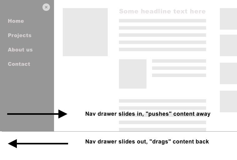
In this case, you need to establish at least two refs: One for the trigger button that opens the navigation (let’s call it navTrigger), and one for the element that gains focus as soon as the navigation is visible (navContainer in this example, an element which needs tabindex="-1" to be programmatically focusable). So that, when the trigger button is clicked, the focus will be sent into the navigation itself. And vice versa: As soon as the navigation closes, the focus must return to the trigger.
After having read the paragraphs above, I hope one thing becomes clear for you, dear reader: Once you understand the importance of focus management, you realize that all the necessary tools are at your fingertips — namely Vue’s this.$refs and JavaScript’s native .focus()
Conclusion
By highlighting some of my core findings regarding web app accessibility, I hope that I have been able to help reduce any diffuse fear of this topic that may have existed, and you now feel more confident to build accessible apps with the help of Vue.js (if you want to dive deeper into the topic, check out if my little ebook “Accessible Vue” can help you along the journey).
More and more websites are becoming more and more app-like, and it would be sad if these amazing digital products were to remain so barrier-laden only because web developers don’t know exactly where to start with the topic. It’s a genuinely enabling moment once you realize that a vast majority of web app accessibility is actually “good old” web accessibility, and for the rest of it, cowpaths are already paved.
 (vf, il)

