The Autofill Dark Pattern
A newspaper sign-up form had fields for name, email, and password. So, I started typing on the name field, and the autofill suggested my profile. But there was something funky. The autocomplete suggestion included my mailing address. Needless to say, it was puzzling: the address was not a field in the form. Why was it even suggested?
By the time this question started forming in my mind, my brain had already signaled my finger to click on the suggestion, and it was done. Next, I was taken to a second form page which requested additional information like address, phone, date of birth, and so on. And all those fields had been pre-populated by the autofill functionality, too.
I sighed in relief. It was a “multi-stepped” form and not a trick by the website. It was a reputable newspaper, after all. I deleted all the optional information from the second page, completed the sign-up, and moved on.
That (troubled) interaction highlighted one of the risks of using autocompletion features.
Autocomplete And Autofill
They may sound similar, but autocomplete and autofill are not the same thing. Although they are closely related:
- Autofill is a browser feature that allows people to save information (on the browser or the OS) and use it on web forms.
autocompleteis an HTML attribute that provides guidelines to the browser on how to (or not to) autofill in fields in a web form.
We could say that autofill is the “what,” while autocomplete the “how”, i.e. autofill stores data and tries to match it in a web form (based on the fields’ name, type, or id), and autocomplete guides the browser on how to do it (what information is expected in each field).
Autocomplete is a powerful feature with many options that allows specifying many different types of values:
- Personal: Name, address, phone, date of birth;
- Financial: credit card number, name, expiration date;
- Demographics: location, age, sex, language;
- Professional: company and job title.
Autofill is a widespread feature either by choice or by accident: who hasn’t accepted to let the browser save/use web form information, either on purpose or by mistake? And that could be a problem — especially combined with bad use of autocomplete (and the added outrageous number of phishing emails and SMS messages nowadays.)
Privacy Risks
Both of these features present (at least) two main risks for the user, both related to their personal data and its privacy:
- Non-visible fields are populated (this is not the same as fields with a hidden type);
- Autocompleted information can be read via JavaScript even before the user submits the form.
This means that once a user selects to autofill the information, all the fields will be available for the developer to read. Again, independently of the user submitting the form or not, without the user knowing what fields were actually populated.
This last part is relative: knowing what fields are populated will depend on the browser. Safari and Firefox do a good job at this (as we’ll soon see below). On the other hand, Chrome, the most popular browser at the moment, offers a bad experience that may trick even the most knowledgeable users into sharing their personal information.
If we also consider the times in which the user accidentally chooses to populate the fields, this issue becomes more relevant. Let’s check it in more detail with an example.
A Little Experiment
I ran a little experiment creating a form with many fields and attaching the autocomplete attribute with different values. Then, I played a little with the form’s structure:
- I hid most of the fields by putting them in a container offscreen (instead of using
hiddenortype="hidden"); - I removed the visually hidden fields from the tab order (so keyboard users would overlook the hidden fields);
- I tried sorting the fields in a different order (and to my surprise, this impacted the autofill!).
In the end, the code for the form looked like this:
<form method="post" action="javascript:alertData()">
  <label for="name">Full name</label><input id="name" name="name" autocomplete="name" /><br/>
  <label for="email">Email</label><input id="email" name="email"/><br/>
  <label for="postal-code">ZIP</label><input id="postal-code" name="postal-code" autocomplete="postal-code"/>
  <div style="position:absolute;top:-10000in" class="hide-this">
    <!-- Hidden -->
    <label for="firstname">First name</label><input tabindex="-1" type="hidden" id="firstname" name="firstname" autocomplete="given-name" /><br/>
    <label for="lastname">Last name</label><input tabindex="-1"  id="lastname" name="lastname" autocomplete="family-name" /><br/>

    <label for="honorific-prefix">honorific-prefix</label><input tabindex="-1" id="honorific-prefix" name="honorific-prefix" autocomplete="honorific-prefix"/><br/>
    <label for="organization">Organization</label><input tabindex="-1" id="organization" name="organization" /><br/>
    <label for="phone">Phone</label><input tabindex="-1" id="phone" name="phone" autocomplete="tel" /><br/>

    <label for="address">address</label><input tabindex="-1" id="address" name="address" autocomplete="street-address" /><br/>
    <label for="city">City</label><input tabindex="-1" id="city" name="city" autocomplete="address-level2" /><br/>
    <label for="state">State</label><input tabindex="-1" id="state" name="state" autocomplete="address-level1" /><br/>
    <label for="level3">Level3</label><input tabindex="-1" id="level3" name="state" autocomplete="address-level3" /><br/>
    <label for="level4">Level4</label><input tabindex="-1" id="level4" name="state" autocomplete="address-level4" /><br/>
    <label for="country">Country</label><input tabindex="-1" id="country" name="country" autocomplete="country" /><br/>

    <label for="birthday">Birthday</label><input tabindex="-1" id="birthday" name="birthday" autocomplete="bday" /><br/>
    <label for="language">Language</label><input tabindex="-1" id="language" name="language" autocomplete="language" /><br/>
    <label for="sex">Sex</label><input tabindex="-1" id="sex" name="sex" autocomplete="sex" /><br/>
    <label for="url">URL</label><input tabindex="-1" id="url" name="url" autocomplete="url" /><br/>
    <label for="photo">Photo</label><input tabindex="-1" id="photo" name="photo" autocomplete="photo" /><br/>
    <label for="impp">IMPP</label><input tabindex="-1" id="impp" name="impp" autocomplete="impp" /><br/>

    <label for="username">Username</label><input tabindex="-1" id="username" name="username" autocomplete="username" /><br/>
    <label for="password">Password</label><input tabindex="-1" id="password" name="password" autocomplete="password" /><br/>
    <label for="new-password">Password New</label><input tabindex="-1" id="new-password" name="new-password" autocomplete="new-password" /><br/>
    <label for="current-password">Password Current</label><input tabindex="-1" id="current-password" name="current-password" autocomplete="current-password" /><br/>

    <label for="cc">CC#</label><input tabindex="-1" id="cc" name="cc" autocomplete="cc-number" /><br/>
    <label for="cc-name">CC Name</label><input tabindex="-1" id="cc-name" name="cc-name" autocomplete="cc-name" /><br/>
    <label for="cc-expiration">CC expiration</label><input tabindex="-1" id="cc-expiration" name="cc-expiration" autocomplete="cc-expiration" /><br/>
    <label for="cc-zipcode">CC Zipcode</label><input tabindex="-1" id="cc-zipcode" name="cc-zipcode" autocomplete="cc-postalcode" /><br/>
  </div>
  <button>Submit</button>
</form>
Note: I created this demo a while back, and the standard is a living document. Since then, some of the autocomplete names have changed. For example, now we can specify new-password and current-password or more details for address or credit card that were not available before.
That form had three visible fields (name, email and zipcode). While that form is common among insurance companies, cable, and other service providers, it may not be too widespread, so I reduced the form even more with a single email field. We see that everywhere to sign up to websites, newsletters, or updates. You can see a running demo here:
See the Pen [Showing autofill/autocomplete dark pattern (II)](https://codepen.io/smashingmag/pen/xxLKVga) by Alvaro Montoro.
If you used autocomplete to fill in the form, you already shared more information than what you wanted (don’t worry, it’s all local and not shared with me). And in Chrome, it might have even looked like a perfectly normal subscription form.
If you don’t have/use autofill, don’t worry. Here’s a summary of how the experience is on three different browsers.
Note: All of these tests assume the use of Autofill and are based on a fake profile!
Safari
When you click on a form control, Safari will show an icon on the right side of the field. Clicking on it will show a pop-up with the information that the browser will share with the form:
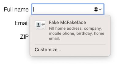
A good thing: it displays all the data that will be shared as part of the form. Not only the data for the visible fields but all of them. At this point, the user may suspect something is not quite alright. There’s something fishy.
When I reduced the form to just the email field, Safari did something interesting. The autofill popup was different:
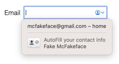
It states that it will only share the email (and it only does share that piece of information). But the contact info below may be trickier. When we click on that button, the browser shows a summary of the profile with its shared data. But that is not clearly stated anywhere. It simply looks like a regular contact card with some “share/do not share” options. After clicking on the “Autofill” button, the form is populated with all the data. Not only the email:
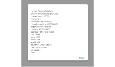
So there is a way for a user to share information with the form inadvertently. It’s tricky but not too far-fetched considering that it is the one “highlighted” with an icon out of the two possible options.
Funny thing, browsers separate the personal data from the credit card data, but Safari populated part of the credit card information based on the personal data (name and ZIP.)
Firefox
Using the autofill in Firefox is a bit more complex. It is not automatic like in Chrome, and there’s no icon like in Safari. Users will have to start typing or click a second time to see the autofill popup, which will have a note with every category that the browser will fill in, not only the visible fields:
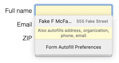
Testing with the email-only form, Firefox presented the same autofill popup stating which fields categories it would populate. No difference whatsoever.
And similarly to the other browsers, after the autofill ran, we could read all the values with JavaScript.

Firefox was the best of the three: it clearly stated what information would be shared with the form independently of the fields or their order. And it hid the autofill functionality a second user interaction happened.
A keyboard user could select the autofill without realizing, by getting inside the popup bubble and pressing the tab key.
Chrome
Then it came the turn for Chrome. (Here I use “Chrome,” but the results were similar for several Chromium-based browsers tested.) I clicked on the field and, without any further interaction, the autofill popup showed. While Firefox and Safari had many things in common, Chrome is entirely different: it only shows two values, and both are visible.
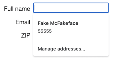
This display was by design. I picked the order of the fields on purpose to get that particular combination of visible controls and autocomplete suggestions. However, it looks like Chrome gives some autocomplete properties more “weight” for the second value. And that makes the popup change depending on the order of the fields in the form.
Testing with the second version of the form was not much better:
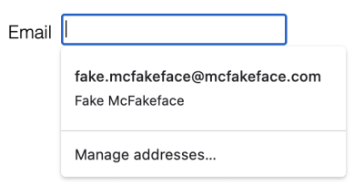
While the popup shows a field that is not visible (the name), it is unclear what the purpose of the name is on the popup. An experienced user may know this happens because the name is shared, but an average user (and even the experienced ones) may think the email is associated with the profile with that name. There is zero indication of the data that the browser will share with the form.
And as soon as the user clicks on the autofill button, the data is available for the developer to read with JavaScript:
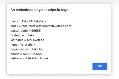
Chrome was the worst offender: it shared the information automatically, it was unclear what data was involved, and the autofill suggestions changed based on the controls’ order and attributes.
The first two issues are common to all/many browsers, to the point that it may even be considered a feature. However, the third issue is exclusive to Chromium browsers, and it facilitates a sketchy dark pattern.
This behavior would be more of an anecdote and not a problem if it wasn’t because Chrome takes a considerable market share of the browsers online (includes Chrome and Chromium-based).
The Dark Pattern
As you probably know, a dark pattern is a deceptive UX pattern that tricks users into doing things they may not really want to do.
“When you use websites and apps, you don’t read every word on every page — you skim read and make assumptions. If a company wants to trick you into doing something, they can take advantage of this by making a page look like it is saying one thing when it is in fact saying another.”
— Harry Brignull, darkpatterns.org
The behavior described in the previous points is clearly a deceptive user experience. Non-experienced users will not realize that they are sharing their personal data. Even more tech-savvy people may get tricked by it as Chrome makes it look like the selected option belongs to a profile instead of clearly stating what information is being shared.
The browser implementations cause this behavior, but it requires the developer to set it in place to exploit it. Unfortunately, there already are companies willing to exploit it, selling it as a feature to get leads.
As long as a dark pattern goes, it may also be an illegal one. This is because it breaks many principles relating to the processing of personal data specified in article 5 of the European General Data Protection Regulation (GDPR):
- Lawfulness, fairness, and transparency
The process is all but transparent. - Purpose limitation
The data is processed in a way incompatible with the initial purpose. - Data minimization
It is quite the opposite. Data maximization: get as much information as possible.
For example, if you want to sign up for a newsletter or request information about a product, and you provide your email, the website has no legal right to get your name, address, date of birth, phone number, or anything else without your consent or knowledge. Even if you considered that the user gave permission when clicking on the autofill, the purpose of the obtained data does not match the original intent of the form.
Possible Solutions
To avoid the problem, all actors need to contribute and help fix the issue:
1. Users
The only thing on the user side would be to ensure that the data displayed in the autofill popup is correct.
But we need to remember that the user is the victim here. We could blame them for not paying enough attention when clicking on the autofill, but that would be unfair. Plus, there are many reasons why a person could click on the button by mistake and share their data by accident. So even well-intentioned and savvy users may fall for it.
2. Developers And Designers
Let’s be honest. While the developers are not the root cause of the problem, they play a key role in exploiting the dark pattern. Either accidentally or with malicious intent.
And let’s be responsible and honest (this time in a literal way), because that’s the thing that developers and designers can do to build trust and make good use of the autofill and autocomplete features:
- Only auto-complete the data that you need.
- State clearly which data will be collected.
- Do not hide form fields that will be later submitted.
- Do not mislead or trick users into sending more data.
As an extreme measure, maybe try to avoid autocompleting certain fields. But, of course, this brings other issues as it will make the form less usable and accessible. So finding a balance may be tricky.
All this is without considering the possibility of an XSS vulnerability that could exploit the dark pattern. Of course, that would be a completely different story and an even more significant problem.
3. Browsers
Much of the work would need to be done from the browser side (especially on the Chromium side). But let me start by stating that not all is bad with how web browsers handle autofill/autocomplete. Many things are good. For example:
- They limit the data that can be shared
Browsers have a list of fields for auto-complete that may not include all the values described in the HTML standard. - They encapsulate and group data
Browsers separate personal and financial information to protect critical values like credit cards. Safari had some issues with this, but it was minor. - They warn about the data that will be shared
Sometimes this may be incomplete (Chrome) or not clear (Safari), but they do alert the user.
Still, some things can be improved by many or all of the web browsers.
Show All Fields That Will Be Autocompleted
Browsers should always show a list of all the fields that will be autocompleted within the autofill popup (instead of just a partial list.) Also, the information should be clearly identified as data to be shared instead of being displayed as a regular contact card that could be misleading.
Firefox did an excellent job at this point, Safari did a nice job in general, and Chrome was subpar compared to the other two.
Do Not Trigger The onChange Event On Autofill
This would be a problematic request because this behavior is part of the Autofill definition in the HTML standard:
“The autocompletion mechanism must be implemented by the user agent acting as if the user had modified the control’s data [...].”
This means that browsers should treat the autocompleted data as if it had been entered by the user, thus triggering all the events, showing the values, etc. Even on a non-visually available field.
Preventing this behavior on non-visible elements could solve the problem. But validating if a form control is visible or not could be costly for the browser. Also, this solution is only partial because developers could still read the values even without the inputs triggering events.
Do Not Allow Devs To Read Autocompleted Fields Before Submission
This would also be problematic because many developers often rely on reading the field values before submission to validate the values (e.g., when the user moves away from the inputs.) But it would make sense: the user doesn’t want to share the information until they submit the form, so the browser shouldn’t either.
An alternative to this would be providing fake data when reading autocompleted values. Web browsers already do something like this with visited links, why not do the same with autocompleted form fields? Provide gibberish as the name, a valid address that matches local authorities instead of the user’s address, a fake phone number? This could solve the developer validation needs while protecting the user’s personal information.
Displaying a complete list of the fields/values that the browser will clearly share with the form would be a great step forward. The other two are ideal but more of stretch goals. Still, they are initiatives that would considerably improve privacy.
Would the autofill dark pattern still be possible to exploit? Unfortunately, yes. But it would be a lot more complicated. And at this point, it would be the user’s responsibility and the developer’s duty to avoid such a situation.
Conclusion
We can argue that autocomplete is not a huge security issue (not even on Chrome) because it requires user interaction to select the information. However, we could also argue that the potential loss of data justifies proper action. And Chrome has done more changes for (relatively) less important security/usability concerns (see alert(), prompt(), and confirm() than what could be done to protect key personal information.
Then we have the issue of the dark pattern. It can be avoided if everyone does their part:
- Users should be careful with what forms/data they autofill;
- Developers should avoid exploiting that data;
- Browsers should do a better job at protecting people’s data.
At the root, this dark pattern is a browser issue (and mainly a Chrome issue), and not a small one (privacy should be key online). But there is a choice. In the end, exploiting the dark pattern or not is up to the developers. So let’s pick wisely and do the right thing.
Further Reading
- Better Form Design: One Thing Per Page (Case Study), Adam Silver
- Common Concerns And Privacy In Web Forms, Vitaly Friedman
- Simplifying Form Styles With
accent-color, Michelle Barker - HTML5 Input Types: Where Are They Now?, Drew McLellan


 Register Free Now
 Celebrating 10 million developers
 SurveyJS: White-Label Survey Solution for Your JS App


