Composable CSS Animation In Vue With AnimXYZ

Email Newsletter
Weekly tips on front-end & UX.
Trusted by 182,000+ folks.
 Celebrating 10 million developers
 Register Free Now
 Try ProtoPie AI free →
 SurveyJS: White-Label Survey Solution for Your JS App
In this article, you will learn how to use the AnimXYZ toolkit to create unique, interactive, and visually engaging animations in Vue.js and plain HTML. By the end of this article, you will have learned how adding a few CSS classes to elements in Vue.js components can give you a lot of control over how those elements move in the DOM.
This tutorial will be beneficial to readers who are interested in creating interactive animations with few lines of code.
Note: This article requires a basic understanding of Vue.js and CSS.
What Is AnimXYZ?
AnimXYZ is a composable, performant, and customizable CSS animation toolkit powered by CSS variables. It is designed to enable you to create awesome and unique animations without writing a line of CSS keyframes. Under the hood, it uses CSS variables to create custom CSS properties. The nice thing about AnymXYZ is its declarative approach. An element can be animated in one of two ways: when entering or leaving the page. If you want to animate an HTML element with this toolkit, adding a class of xyz-out will animate the item out of the page, while xyz-in will animate the component into the page.
This awesome toolkit can be used in a regular HTML project, as well as in a Vue.js or React app. However, as of the time of writing, support for React is still under development.
Why Use AnimXYZ?
Composable
Animation with AnimXYZ is possible by adding descriptive class names to your markup. This makes it easy to write complex CSS animation without writing complex CSS keyframes. Animating an element into the page is as easy as adding a class of xyz-in in the component and declaring a descriptive attribute.
<p class="xyz-in" xyz="fade">Composable CSS animation with AnimXYZ</p>The code above will make the paragraph element fade into the page, while the code below will make the element fade out of the page. Just a single class with a lot of power.
<p class="intro xyz-out" xyz="fade">Composable CSS animation with AnimXYZ</p>Customizable
For simple animations, you can use the out-of-the-box utilities, but AnimXYZ can do so much more. You can customize and control AnimXYZ to create exactly the animations you want by setting the CSS variables that drive all AnimXYZ animations. We will create some custom animations later on in this tutorial.
Performant
With AnimXYZ, you can create powerful and smooth animations out of the box, and its size is only 2.68 KB for the base functionality and 11.4 KB if you include the convenient utilities.
Easy to Learn and Use
AnimXYZ works perfectly with regular HTML and CSS, and it can be integrated in a project using the content delivery network (CDN) link. It can also be used in Vue.js and React, although support for React is still under development. Also, the learning curve with this toolkit is not steep when compared to animation libraries such as GSAP and Framer Motion, and the official documentation makes it easy to get started because it explains how the package works in simple terms.
Key Concepts in AnimXYZ
Contexts
When you want a particular flow of animation to be applied to related groups of element, the xyz attribute provides the context. Let’s say you want three divs to be animated in the same way when they enter the page. All you have to do is add the xyz attribute to the parent element, with the composable utilities and variable that you want to apply.
<div class="shape-wrapper xyz-in" xyz="fade flip-up flip-left">
  <div class="shape"></div>
  <div class="shape"></div>
  <div class="shape"></div>
</div>
The code above will apply the same animation to all divs with a class of shape. All child elements will fade into the page and flip to the upper left, because the attribute xyz="fade flip-up flip-left" has been applied to the parent element.
See the Pen [Contexts in AnimXYZ](https://codepen.io/smashingmag/pen/abyoqdY) by Ejiro Asiuwhu.
AnimXYZ makes it easy to animate a child element differently from its parent. To achieve this, add the xyz attribute with a different animation variable and different utilities to the child element, which will reset all animation properties that it has inherited from its parent.
See the Pen [Override Parent contexts in AnimXYZ](https://codepen.io/smashingmag/pen/porzayR) by Ejiro Asiuwhu.
Utilities
AnimXYZ comes with a lot of utilities that will enable you to create engaging and powerful CSS animations without writing any custom CSS.
xyz="fade up in-left in-rotate-left out-right out-rotate-right"For example, the code above has a fade up utility, which will make the element fade from top to bottom when coming into the page. It will come in and rotate from the left. When the element leaves the page, it will go to the right and rotate out of the page.
With the out-of-the-box utilities, you can, say, flip a group of elements to the right and make them fade while leaving the page. The possibilities of what can be achieved with the utilities are endless.
Staggering
The stagger utility controls the animation-delay CSS property for each of the elements in a list, so that their animations are triggered one after another. It specifies the amount of time to wait between applying the animation to an element and beginning to perform the animation. Essentially, it is used to queue up animation so that elements can be animated in sequence.
<div class="shape-wrapper" xyz="fade up-100% origin-top flip-down flip-right-50% rotate-left-100% stagger">
  <div class="shape xyz-in"></div>
  <div class="shape xyz-in"></div>
  <div class="shape xyz-in"></div>
  <div class="shape xyz-in"></div>
</div>
By adding the stagger utility, each element in a parent div will animate one after another from left to right. The order can be revered by using stagger-rev.
With stagger:
See the Pen [Staggering with AnimXYZ](https://codepen.io/smashingmag/pen/abyoqNG) by Ejiro Asiuwhu.
Without stagger:
See the Pen [!Staggering Animation - AnimXYZ](https://codepen.io/smashingmag/pen/BadBYzN) by Ejiro Asiuwhu.
Using AnimXYZ With HTML and CSS
Let’s build a card and add some cool animation with AnimeXYZ.
See the Pen [Animxyz Demo](https://codepen.io/smashingmag/pen/jOLNZrV) by Ejiro Asiuwhu.
First, we need to add the AnimXYZ toolkit to our project. The easiest way is via a CDN. Grab the CDN, and add it to the head of your HTML document.
Add the following lines of code to your HTML.
<p class="intro xyz-in" xyz="fade">Composable CSS Animation with Animxyz</p>
  <div class="glass xyz-in" id="glass"
        xyz="fade flip-down flip-right-50%  duration-10">
        <img src="https://cdn.dribbble.com/users/238864/screenshots/15043450/media/7160a9f4acc18f4ec2cbe38eb167de62.jpg"
            alt="" class="avatar xyz-in">
        <p class="des xyz-in">Image by Jordon Cheung</p>
  </div>
This is where the magic happens. At the top of the page, we have a paragraph tag with a class of xyz-in and an xyz attribute with a value of fade. This means that the p element will fade into the page.
Next, we have a card with an id of glass, with the following xyz attribute:
xyz="fade flip-down flip-right-50% duration-10"The composable utilities above will make the card fade into the page. The flip-down value will set the card to flip into the page from the bottom, and the flip-right value will flip the card by 50% when leaving the page. An animation duration of 10 (i.e. 1 second) sets the length of time that the animation will take to complete one cycle.
Integrating AnimXYZ in Vue.js
Scaffold a Vue.js Project
Using the Vue.js command-line interface (CLI), run the command below to generate the application:
vue create animxyz-vueInstall VueAnimXYZ
npm install @animxyz/vueThis will install both the core package and the Vue.js package. After installation, we will have to import the VueAnimXYZ package into our project and add the plugin globally to our Vue.js application. To do this, open your main.js file, and add the following block of code accordingly:
import VueAnimXYZ from '@animxyz/vue'  // import AnimXZY vue package
import '@animxyz/core' // import AnimXZY core package

Vue.use(VueAnimXYZ)
The XyzTransition Component
The XyzTransition component is built on top of Vue.js’ transition component. It’s used to animate individual elements into and out of the page.
Here is a demo of how to use the XyzTransition component in Vue.js.
Notice that a lot of the complexity that comes with Vue.js’ transition component has been abstracted away in order to reduce complexity and increase efficiency. All we need to care about when using the XyzTransition component are the appear, appear-visible, duration, and mode props.
For a more detailed guide, check out the official documentation.
Let’s use the XYZTransition component to animate an element when a button is clicked.
<div id="app">
    <button @click="isAnimate = !isAnimate">Animate</button>
    <XyzTransition
      appear
      xyz="fade up in-left in-rotate-left out-right out-rotate-right"
    >
      <div class="square" v-if="isAnimate"></div>
    </XyzTransition>
</div>
Notice how the element that we intend to transition is wrapped in the XYZTransition component. This is important because the child element <div class="square" v-if="isAnimate"></div> will inherit the utilities that are applied to the XYZTransition component. The child element is also conditionally rendered when isAnimate is set to true. When the button is clicked, the child element with a class of square is toggled into and out of the DOM.
XyzTransitionGroup
The XyzTransitionGroup component is built on top of Vue.js’ transition-group component. It is used to animate groups of elements into and out of the page.
Below is an illustration of how to use the XyzTransitionGroup component in Vue.js. Notice here again that a lot of the complexity that comes with Vue.js’ transition-group component has been abstracted away in order to reduce complexity and increase efficiency. All we need to care about when using the XyzTransitionGroup component are appear, appear-visible, duration, and tag. The following is taken from the documentation:
<XyzTransitionGroup
  appear={ boolean }
  appear-visible={ boolean | IntersectionObserverOptions }
        duration={ number | 'auto' | { appear: number | 'auto', in: number | 'auto',
                   out: number | 'auto' } }
        tag={ string } >
        <child-component />
        <child-component />
        <child-component />
</XyzTransitionGroup>
Build an Animated Modal With AnimXYZ and Vue.js
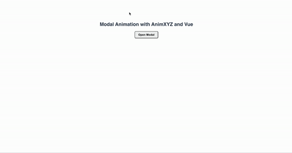
Let’s build modal components that will animate as they enter and leave the DOM.
Here is a demo of what we are going to build:
By adding the xyz="fade out-delay-5" property to the XyzTransition component, the modal will fade.
Notice that we are adding .xyz-nested to almost all child elements of the modal component. This is because we want to trigger their animations when a modal component’s element is open.
The ease-out-back property that we added to the dialog container will add a slight overshoot when the dialog is opened and when it has been closed.
Adding in-delay to the child elements of the modal component will make the animation feel more natural, because the element will be delayed until the other contents of the modal have animated in:
<section class="xyz-animate">
<div class="alerts__wrap copy-content">
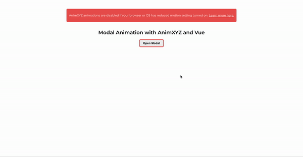
<div class="alert reduced-motion-alert">
<p>
AnimXYZ animations are disabled if your browser or OS has
reduced-motion setting turned on.
<a href="https://web.dev/prefers-reduced-motion/" target="_blank">
Learn more here.
</a>
</p>
</div>
</div>
<h1>Modal Animation With AnimXYZ and Vue.js</h1>
<button
class="modal-toggle modal-btn-main"
data-modal-text="Open Modal"
data-modal-title="Title"
data-modal-close-text="Close"
id="label_modal_kdf8e87cga"
aria-haspopup="dialog"
ref="openButton"
@click="open"
autofocus
>
Open Modal
</button>
<span
id="js-modal-overlay"
class="simple-modal-overlay"
data-background-click="enabled"
title="Close this window"
v-if="isModal"
@click="close"
>
<span class="invisible">Close this window</span>
</span>
<div
role="dialog"
class="simple-modal__wrapper"
aria-labelledby="modal-title"
>
<XyzTransition duration="auto" xyz="fade out-delay-5">
<section
id="modal1"
aria-labelledby="modal1_label"
aria-modal="true"
class="modal xyz-nested"
xyz="fade small stagger ease-out-back"
v-if="isModal"
tabindex="-1"
ref="modal"
@keydown.esc="close"
>
<div class="modal_top flex xyz-nested" xyz="up-100% in-delay-3">
<header
id="modal1_label modal-title"
class="modal_label xyz-nested"
xyz="fade right in-delay-7"
>
Join our community on Slack
</header>
<button
type="button"
aria-label="Close"
xyz="fade small in-delay-7"
class="xyz-nested"
@click="close"
title="Close"
>
<svg viewBox="0 0 24 24" focusable="false" aria-hidden="true">
<path
fill="currentColor"
d="M.439,21.44a1.5,1.5,0,0,0,2.122,2.121L11.823,14.3a.25.25,0,0,1,.354,0l9.262,9.263a1.5,1.5,0,1,0,2.122-2.121L14.3,12.177a.25.25,0,0,1,0-.354l9.263-9.262A1.5,1.5,0,0,0,21.439.44L12.177,9.7a.25.25,0,0,1-.354,0L2.561.44A1.5,1.5,0,0,0,.439,2.561L9.7,11.823a.25.25,0,0,1,0,.354Z"
></path>
</svg>
</button>
</div>
<div class="modal_body xyz-nested" xyz="up-100% in-delay-3">
<div class="modal_body--top flex justify_center align_center">
<img
src="../assets/slack.png"
alt="slack logo"
class="slack_logo"
/>
<img src="../assets/plus.png" alt="plus" class="plus" />
<img
src="../assets/discord.png"
alt="discord logo"
class="discord_logo"
/>
</div>
<p><span class="bold">929</span> users are registered so far.</p>
</div>
<form class="modal_form" autocomplete>
<label for="email"
><span class="sr-only">Enter your email</span></label
>
<input
id="email"
type="email"
placeholder="johndoe@email.com"
autocomplete="email"
aria-describedby="email"
class="modal_input"
required
/>
<button type="submit" class="modal_invite_btn">
Get my invite
</button>
<p>Already joined?</p>
<button
type="button"
aria-describedby="open_slack"
class="
modal_slack_btn
flex
align_center
justify_center
xyz-nested
"
xyz="fade in-right in-delay-7"
id="open_slack"
>
<span
><img src="../assets/slack.png" alt="slack logo" role="icon"
/></span>
Open Slack
</button>
</form>
</section>
</XyzTransition>
</div>
</section>Then, in our modal, we would use the v-if="isModal" directive to specify that we want the modal to be hidden from the page by default. Then, when the button is clicked, we open the modal by calling the open() method, which sets the isModal property to true. This will reveal the modal on the page and also apply the animation properties that we specified using AnimXYZ’s built-in utilities.
<script>
export default {
  data() {
    return {
      isModal: false,
    };
  },
  methods: {
    open() {
      if (!this.isModal) {
        this.isModal = true;
        this.$nextTick(() => {
          const modalRef = this.$refs.modal;
          console.log(modalRef);
          modalRef.focus();
        });
      }
    },
    close() {
      if (this.isModal) {
        this.isModal = false;
        this.$nextTick(() => {
          const openButtonRef = this.$refs.openButton;
          openButtonRef.focus();
        });
      }
    },
  },
};
</script>
AnimXYZ’s animations are disabled when the reduced-motion setting in the browser or operating system is turned on. Let’s display a helper message to users who have opted in to reduced motion.
Using the @media screen and (prefers-reduced-motion) media query, we’ll display a message notifying those users that they’ve turned off the animation feature in our modal component. To do this, add the following block of code to your styles:
<style>
@media (prefers-reduced-motion: reduce) {
  .alerts__wrap {
    display: block;
  }
}
</style>
Conclusion
We’ve gone through the basics of AnimXYZ and how to use it with plain HTML and Vue.js. We’ve also implemented some demo projects that give us a glimpse of the range of CSS animations that we can create simply by adding the composable utility classes provided by this toolkit, and all without writing a single line of a CSS keyframe. Hopefully, this tutorial has given you a solid foundation to add some sleek CSS animations to your own projects and to build on them over time for any of your needs.
The final demo is on GitHub. Feel free to clone it and try out the toolkit for yourself.
That’s all for now! Let me know in the comments section below what you think of this article. I am active on Twitter and GitHub. Thank you for reading, and stay tuned.
Resources
- Documentation, AnimXYZ
- AnimXYZ, Chris Coyier, CSS Tricks
Further Reading
- How To Deal With Big Tooling Upgrades In Large Organizations
- Sticky Headers And Full-Height Elements: A Tricky Combination
- An Introduction To CSS Scroll-Driven Animations: Scroll And View Progress Timelines
- The Design Leader Dilemma
 (ks, vf, yk, il, al, mrn)

