From Good To Great In Dashboard Design: Research, Decluttering And Data Viz

Email Newsletter
Weekly tips on front-end & UX.
Trusted by 182,000+ folks.

 Celebrating 10 million developers

 Custom Web Forms for Angular, React, & Vue. Your backend.
Even if it’s a blessing in disguise, discarding elements of your work is no fun. Tossing out suboptimal parts of our design can be a daunting task, especially after you’ve invested hours of work into it. But make no mistake, this is a bias most designers are prone to. We can get too attached to things we’ve created, despite them not providing any real value to our users. Here lies the difference between okay and great dashboard design. The former is fairly easy to achieve. The latter isn’t.
I’ve compiled a few things that I’ve learned throughout my career with regard to dashboard design. In this article, we’ll talk about research, decluttering, and data visualization, as well as how these things can make your dashboard design better.
Definition
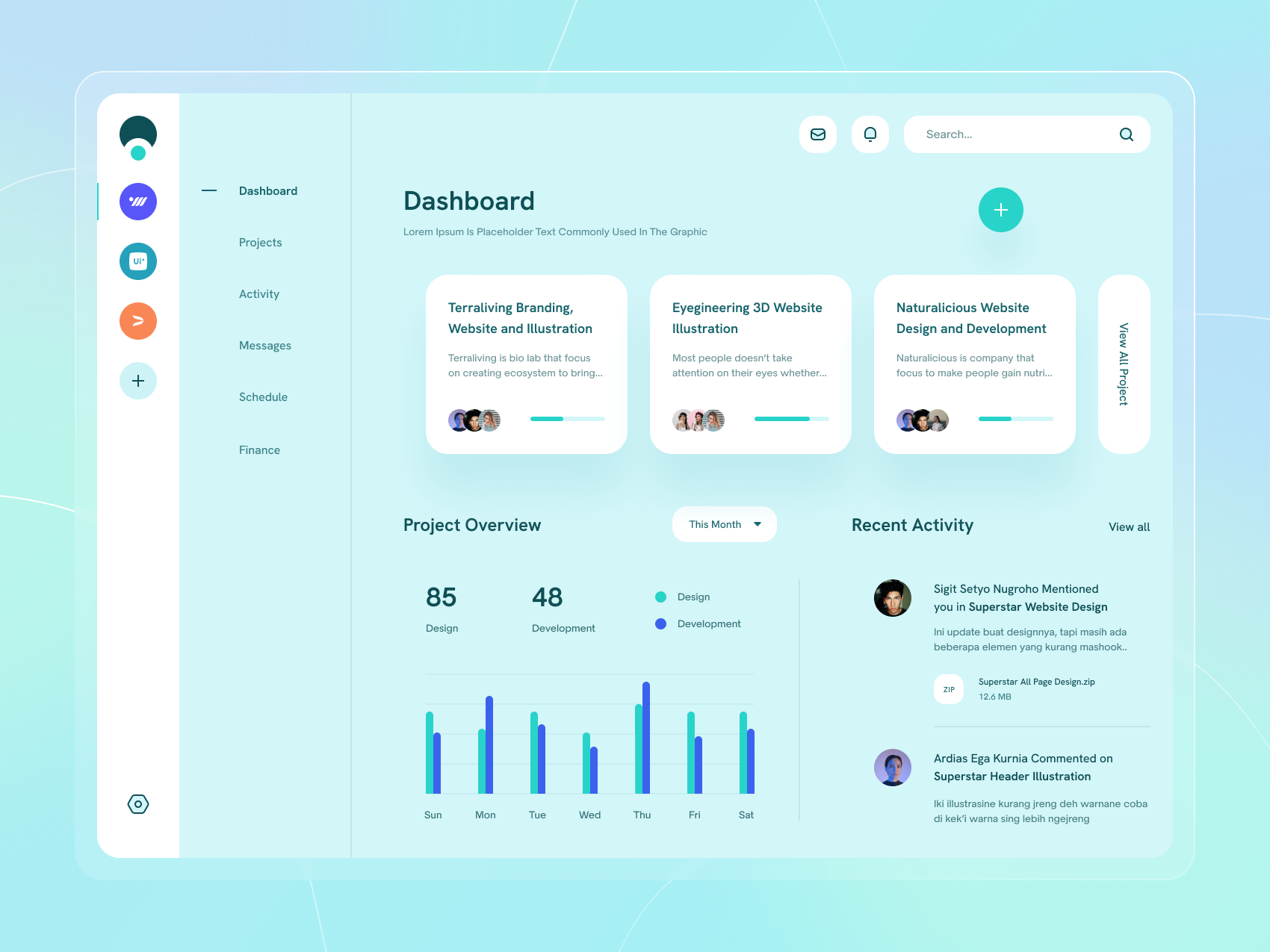
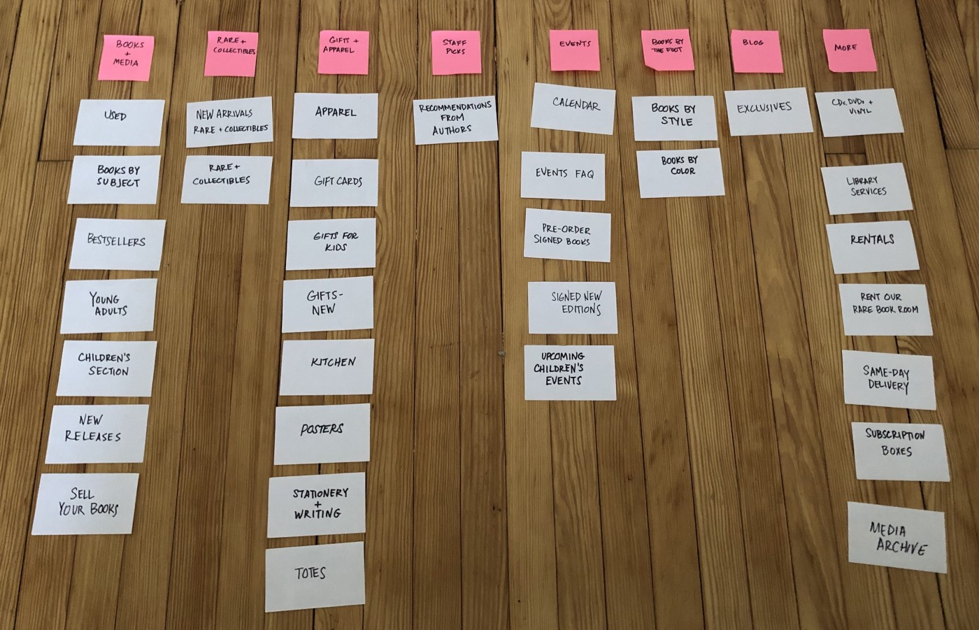
A dashboard is a part of an application that displays global information about the app’s usage or any other external data. They come in different kinds, from relatively simplistic one-layered dashboards like this one:
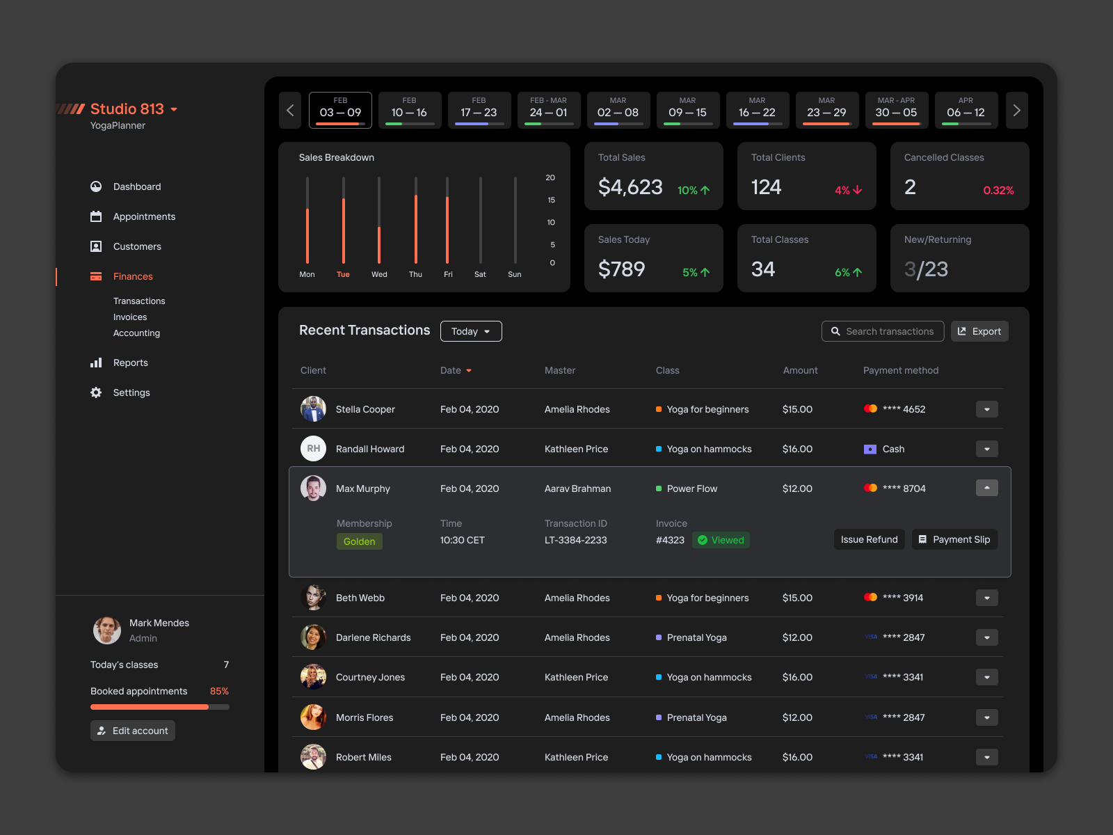
While others are more complex and multilayered ones like the one below:
The recommendations we will provide in this article apply to a wide range of dashboards, regardless of their complexity.
Before diving into our arguments, first, let’s sort out what I mean by “mediocre” and “great”. These terms imply a value system that isn’t exactly conventional, so I owe you an explanation.
Mediocre Vs Great Dashboard Design
The difference between “mediocre” and “great”, I believe, lies in the process. There’s also a continuum involved between these two categories. In the context of this article, the axes of this continuum are as follows:
- Sourcing inspiration (copying),
- Research (referred to in the next section as “homework”),
- Design Validation (substantiating design decisions with data),
- Data Visualization,
- Color Palette.
| Mediocre | Great | |
|---|---|---|
| Sourcing inspiration | ✅ | ✅ |
| Research | Limited and fragmented | Consistent and purposeful |
| Design Validation | Limited to internal stakeholders | Inclusive of both internal and end-users |
| Data Visualization | Heavily focused on aesthetics and trends | Data viz solutions are consistent with its purpose; a good balance between efficiency and complexity; |
| Color palette | Arbitrary / trend-based | Utilizable of color connotations, and alignment with brand values |
(Throughout this article, all references to mediocrity are based on these distinctions)
Now that we’ve sorted out the definitions, let’s quickly give an overview of my arguments. In this article, I suggest that, as opposed to mediocre dashboards, great ones require:
- Research,
- A healthy dose of cluttering & decluttering,
- A thought-through color palette.
First, let’s break down research, or “homework” as I like to call it. How do you even do “homework” as a designer? Is it ok to copy someone else’s work as long as you don’t make it obvious? Or do you start from scratch every time? — Let’s think this through.
Doing Your Own Homework VS Copying Your Peers
Sure, there’s always the option of copying and tweaking what your competitors already offer. Or, if there are no close equivalents, you can just “Frankenstein” the elements together from similar dashboards. This indeed sounds easier than “reinventing the wheel”. “*Good artists copy, great artists steal,*” as Picasso’s quote goes — but, unfortunately, this approach is likely to doom your design to mediocrity. Let me elaborate.
A quick disclaimer: if what you’re looking for is to learn, then by all means copy great designs and try to learn from them. However, if you’re working on commercial / “real” projects, then copying alone doesn’t do.
First of all, theoretically speaking, you could strike gold by copying great dashboards. There’s a catch, however. What is the likelihood that your source of inspiration is well-researched, practical, and most importantly applicable to your particular situation? Are the dashboards you’ve found worth stealing? Who knows. If you ask me, however, I wouldn’t bet on it. This ties in well with the ideas Austin Kleon outlined in his book Steal like an artist.
Secondly, when you’re sourcing inspiration, all you see is the end product: a colorful nice-looking dashboard. Rarely can you find inspiration accompanied by a thorough analysis of the process, research, and decision-making involved. This leads to something akin to a cargo cult, i.e. replicating the patterns you see without understanding why.
Finally, another unfortunate side effect of merely copying is that it’s not consistent. You can’t play the odds and win every time. That’s not to say that a “proper” design process is foolproof. I believe that following the principles I outline in this article will make your designs consistently better, so you can “strike gold” with a higher degree of reliability and replicability.
“
So how do you strike a balance between “copying” and “doing your own homework”? Here’s what I think. On top of “stealing” (ahem.. looking for inspiration), also talk to your users.
I 👏 can’t 👏 stress 👏 this 👏enough.
I bet we’re all (myself included) tired of hearing this mantra. “Talking to users” is like exercising or eating healthy — everyone knows they should do more of it, but few actually do it.
“People ignore design that ignores people”.
— Frank Chimero
Is there a worse way to ignore users than excluding them from the conversation altogether?
Alright, talking to users is important. That much is clear. What isn’t self-explanatory though is how exactly this communication should take place — let’s go over a couple of activities to examine a couple of ways.
User interviews:
Here are a few questions worth looking into when designing a dashboard.
- What information do users need the most?
- What is the purpose of this dashboard?
- What do users consult this dashboard for?
- How do they go about looking for this information currently?
In this piece, Stelian Suboti, a UI & UX designer with more than 7 years of experience, the author claims that:
“
Doing research (user interviews in this case) is the first step of the design thinking process (empathy), as well as the UX process in general.

Card-Sorting
“Card sorting by its very nature, is a method you would use when you want to discover categories, groups, or interrelationships. Use this method when you want to know how users respond to visual cues and you want to capture the similarities and differences.”
— Think Design
As we’ve just learned, card sorting helps us understand how users group and categorize information. In practical terms, card sorting looks something like this 👇
You generally want to split your dashboard into “atoms”, bits of information of the smallest size, so that the participants can establish the relationships among these elements. This is how you could build the information hierarchy within the dashboard that’s consistent with users’ mental models.
Usability Testing
Usability testing is arguably the most important and insightful research activity you can conduct with regard to dashboard design. Playing by ear and skipping this step altogether just might be the biggest cardinal sin of UX design.
Here’s what Nielsen Norman Group, the world’s leading product design authority, has to say about usability testing:
“Even the best UX designers can’t design a perfect — or even good enough — user experience without iterative design driven by observations of real users and of their interactions with the design.”
In practical terms, you would want to conduct usability testing sessions after card sorting and user interviews. The latter two activities blended with your own assumptions should result in early dashboard versions. These rough ideas will then need to be tested and iterated on from sketches, and low-fi wireframes all the way to a high-fidelity prototype.
Now that we discussed the research methods, we can safely move on to my second argument, which is all about decluttering. How do you know if your dashboard is cluttered? Does the “less is more” principle work every time? — These are the topics we’re tackling next.
To Declutter Or Not To Declutter
In a conventional sense, decluttering is nearly synonymous with simplifying. Moreover, the practice of “keep it simple stupid” (KISS) has become somewhat of a design truism. The simpler the better, right? I wish it was that simple (no pun intended).
A cluttered design, by definition, overwhelms its users. That’s not to say that an app can’t have a learning curve. Adobe products are probably a textbook definition of what “overwhelming a first-time user” means.
Let’s take a look at the following dashboard:
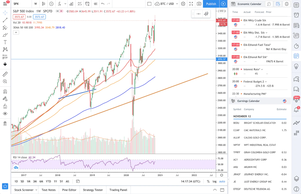
This is an excellent example of what might be considered “cluttered”. A closer look at the dashboard will tell you that it has to do with stock (index) price movement, trading volume, economic events, etc. If you think that this looks intimidating — you’re right. For an average user, it probably is. I’d wager, though, that the people qualified to use this kind of software actually benefit from this complexity — it allows them to work efficiently. Obscuring much of the information presented in this dashboard will only result in unnecessary clicks and excessive friction.
Now let’s try to take a look at something seemingly decluttered and “clean”. By the way, this particular dashboard, designed by Bhojendra Rauniyar, won in the minimal dashboard challenge by UpLabs. Congrats to Bhojendra!
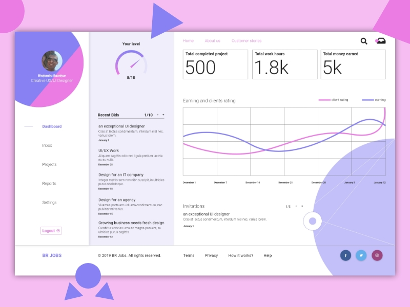
Before I start critiquing the dashboard above, here’s a disclaimer. First of all, this is a dribbble shot, so we can’t be certain whether it’s an isolated piece of design or a part of a product. Secondly, I don’t have access to the designer to ask for his rationale behind certain design decisions. Thirdly, I do not know whether this design has been tested and the full context of its usage. As such, all I have left is to speculate and assume. I hope, for educational purposes, that will do.
Let’s start with the chart. It compares client ratings with earnings. I’m left to wonder though what values define these two categories? The values have to be the same since both curves are on the same graph. So do we measure earnings in average rating or rating in dollars? Additionally, there are no labels for the scale, so I can’t even be sure of the units of measurement. What would probably be more useful is having separate graphs for key metrics with clear labels, i.e. to introduce “extra complexity”.
Additionally, the stats alone are not very valuable. Is earning “5k” in “1.8k” hours a good result? How does that compare to my peers? What are my dynamics?
That’s not to say that the dashboard I mentioned first is perfect and the second one is bad. You could argue that both of these require further work. My point is that decluttering for the sake of decluttering is a poor design maxim.
Cluttered apps are unnecessarily overwhelming and hard to navigate. How do you know if an app is all of the above? Presto! That’s right, you talk to the users and have usability testing sessions with them. Other than usability testings, there are a few other practices that will help ensure that your interface is not cluttered:
- Clear information hierarchy;
- The use of modals or panels;
- On-hover interactions;
- Two to three colors;
- White space, plenty of it.
Now that we went through research and cluttering, we can move on to data visualization. Data visualization is irreplaceable for many reasons. It allows you to:
- See patterns,
- Compare data,
- Articulate the information visually,
- Track data dynamics.
Does this ring a bell? Exactly — this is pretty much everything that a dashboard should do. It’s no coincidence that almost all dashboards feature graphs and charts. Therefore, being competent at data visualization directly translates into being a competent dashboard designer. Let’s zoom in on that.
Step Up Your Data Visualization Game
There are multiple types of charts available, thus we need to choose wisely. The sunburst chart does look awesome, but is it as clear and transparent as the pie chart? Perhaps. That really does depend on your users. Types of charts aside, there are also colors, their semantics and so many other things that add to the complexity of data visualization in dashboard design.
In this section, I will do my best to outline some of the data visualization best practices and their application in dashboard design. Let’s start with colors.
This section is largely based on the research of Claus O. Wilke, Professor in Molecular Evolution at The University of Texas at Austin, and the author of Fundamentals of Data Visualization.
Color In Dashboard Design
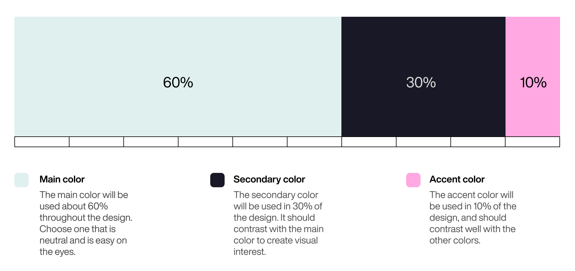
Let’s address the issue with numbers first. How many colors should you use in UI design and dashboard design in particular? — Frankly, there’s no magic number of colors that works no matter what. However, if I were to recommend you a number, it would be 5. That doesn’t include shades if the intensity of the color represents a value or semantic colors if you need them (e.g. red for error messages or green for success messages).
Why 5? Well, there’s a 6:3:1 “golden” rule of visual design. These numbers represent the proportion among three brand colors: main, secondary, and accent. However, you should remember that on top of these three colors, you’re likely going to need some variation of white and black for text and its background.
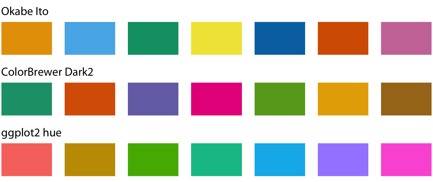
Another thing to use colors for is to distinguish among different entities. Here are a few common color palettes.
Use monochromatic color palettes if showing information within a single category. That way you can introduce another dimension to your chart that’s easy to read. For example, the more intense the colors, the higher the value and vice versa.

Here’s an example:

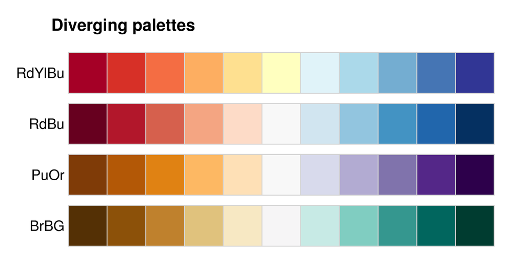
What you can also do is pick two colors to represent the opposite ends of a spectrum. That way you can easily tell apart values that belong to different extremes. Here’s an example:
Here are a few color palettes for this approach you can choose:
Beware Of Colors Semantics
Now that we went through the approaches you can take with using colors, it should also be noted that colors elicit subconscious reactions. These reactions are often referred to as “color semantics”.
When comparing 2 groups, using colors like red and green (because of the semantics associated with these colors) might lead to misrepresentation. Red, for instance, is often associated with danger, failure, and poor performance.
Take a look at the graphs below, which illustrate the math performance of two classes. We might automatically assume that students on the graph on the left in Class A are performing poorly, due to the fact that the values are represented with red. Red, especially in combination with green, often elicits such an interpretation.
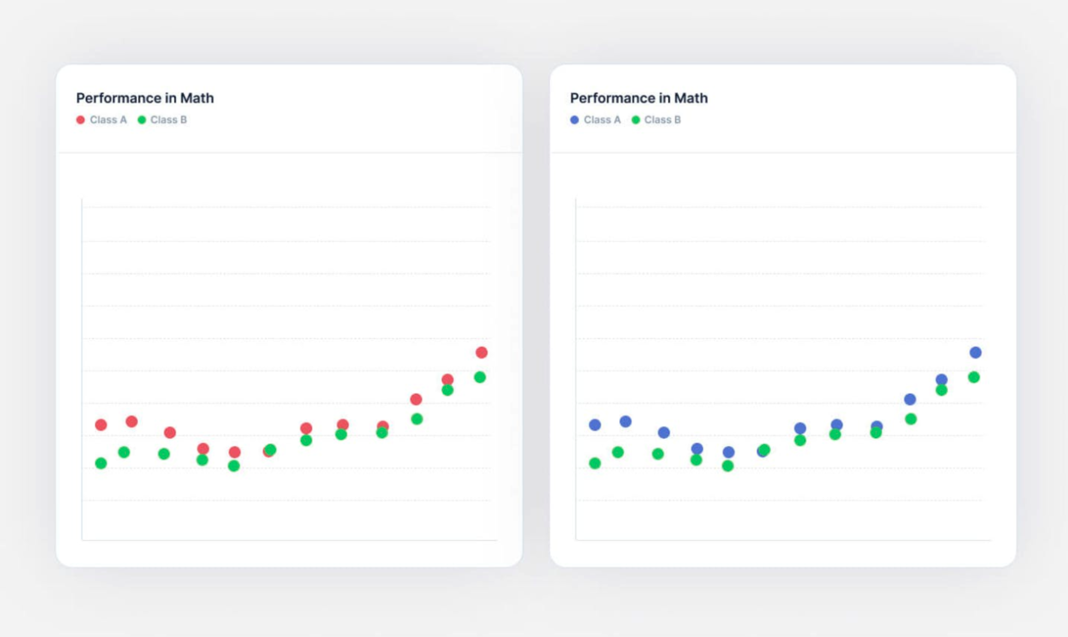
However, there are cases where this semantic difference can be used to our advantage like in the example below, i.e. using red to display performance that’s below average, and green for above. Also, note that it’s more natural for people to instinctively associate values on top as greater than those below. The graph below illustrates the last point.
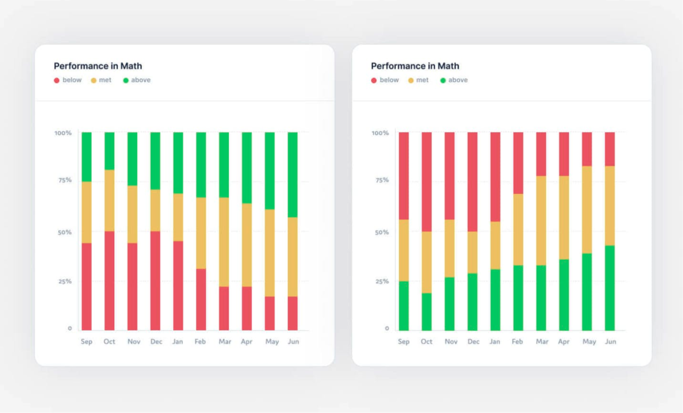
As you can see, green represents students who perform above average, while red is reserved for those who underperform. Semantic color cues make this chart a lot more readable than it would otherwise be with another color scheme.
On Which Charts To Use
Data visualization can induce a fair amount of friction when done incorrectly. Make sure to choose the most suitable type of chart to deliver the right kind of data. Below, you’ll find a more or less comprehensive list of charts you can use to represent the information featured in your dashboard, depending on the roles they fulfill.
NB: Most charts serve more than one purpose. For instance, a pie chart is used to compare values, show composition, and data distribution. As such, I will mention these charts multiple times depending on the use case. However, I will only give a brief explanation for each chart once.
Compare
- Pie
Typically used to represent fractions of a whole. Pie charts work great whenever you need to compare a relatively low number of segments that are comparable in terms of their size. Conversely, having too many segments or tiny segments makes the chart too hard to read. A major con of pie charts is their inability to show changes over time.

- Stacked Bar
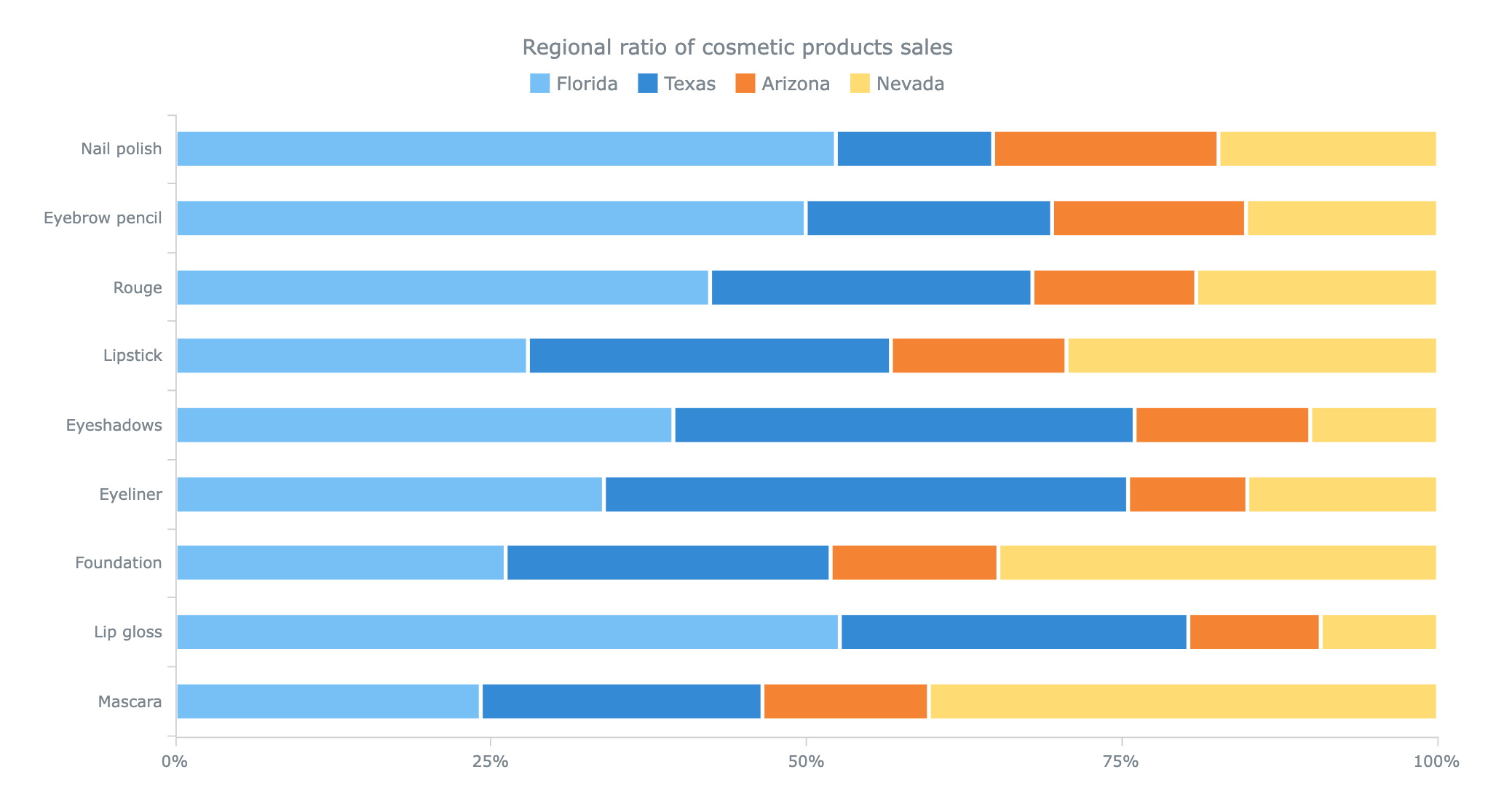
Especially useful when comparing categories. Just like the pie charts, the more complex they get (more series & categories), the harder they are to read. An advantage that stacked bar charts have over pie charts is the ability to see changes over time. Another thing to look out for is that when you have series that vary in their value, it gets harder to compare them visually. For example, take a look at the example below, it’s not obvious whether the orange series for “Eyebrow pencil” is larger or smaller than that of “Foundation”.
- Mekko
Perfect for visualizing the differences of certain categories within multiple dimensions. Just like the rest of the charts we’ve gone over so far, they’re easy to read but get increasingly harder to grasp once the categories and dimensions start to pile up. Additionally, you should avoid using Mekko charts if the differences among elements are too drastic.

- Stacked Column
A great way to show comparisons between categories. You might have noticed that this chart type bears a strong resemblance to a stacked bar chart. Though there are differences in naming, you should know that horizontal bars usually go from highest to lowest value (or vice versa), while vertical ones imply another order rationale.
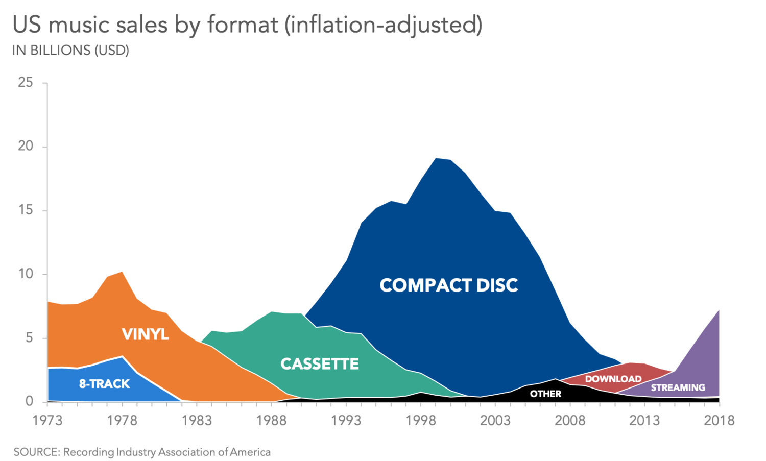
- Area
A really common way of representing quantitative data. Often used to show the increase or decrease of various data series over time. The major con of this type of visualization is that it’s hard to connect a specific point of the graph to a value on both axes. And, as always, the more information you cram in, the less readable it becomes. Finally, if the graphs overlap, then one area will go over another and vice versa. Therefore, area charts are good for helping see the big picture without too much regard for being extremely precise.
You might also notice a similarity between area and line charts. The former should be used when there’s an emphasis on a part-to-whole relationship.
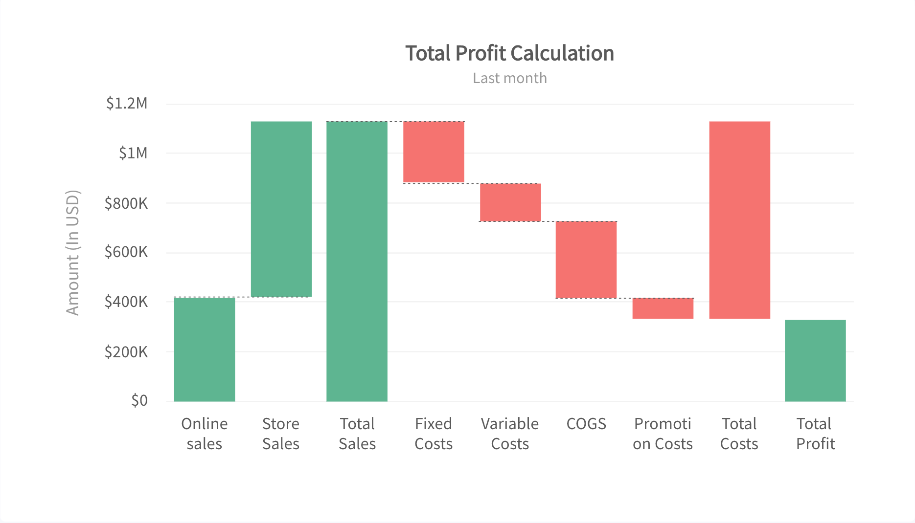
- Waterfall
This kind of chart is often used in the financial industry to display the movement of value and its incremental path towards an endpoint. These charts, not being all too common, might not be the most intuitive to read, so they should better be reserved for professionals who deal with waterfall charts often.
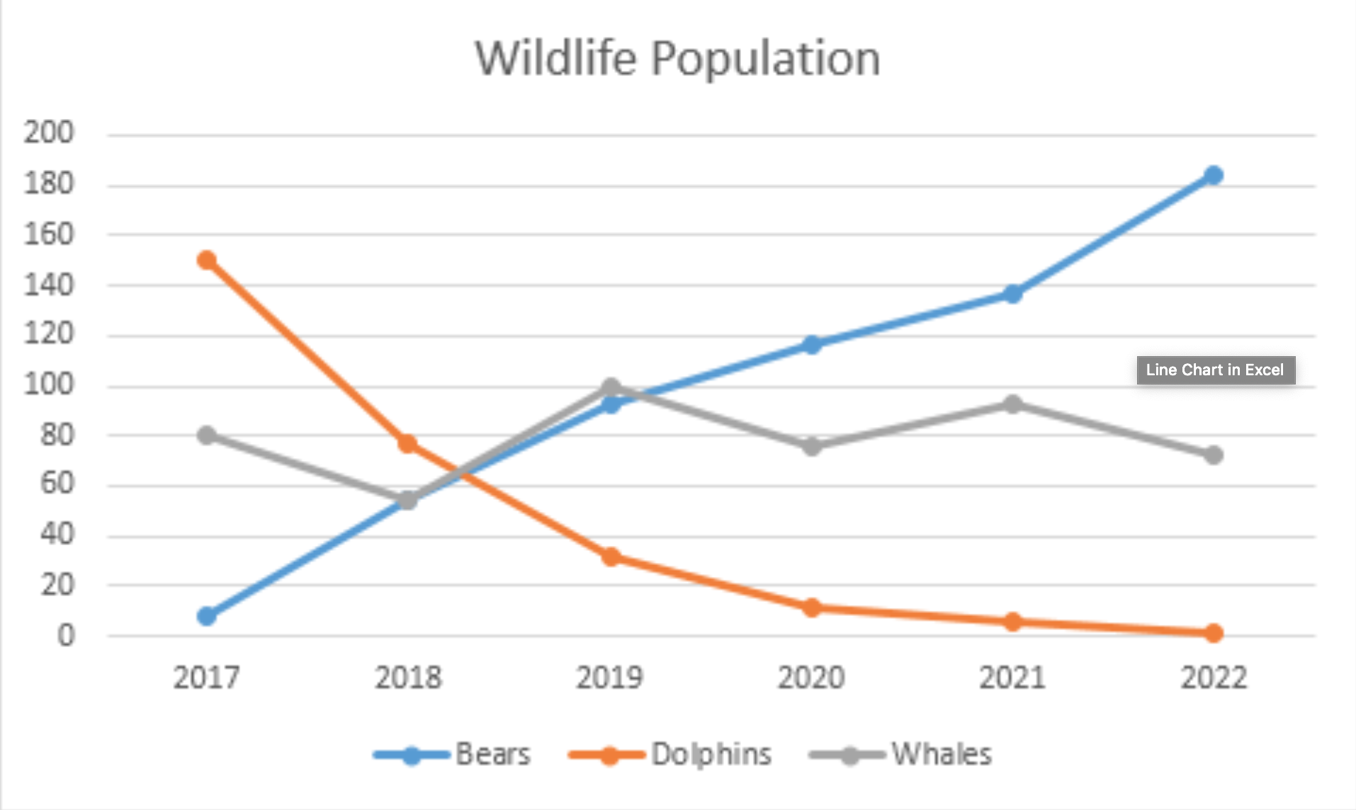
- Line
A good choice when you’re looking to present a series of values. These values (also called markers) are typically connected by straight line segments. The line chart mimics the disadvantages of the area chart, except for the color overlapping problem.
Showcase the composition:
- Pie,
- Stacked Bar,
- Mekko,
- Stacked Column,
- Waterfall.
Distribution of Data:
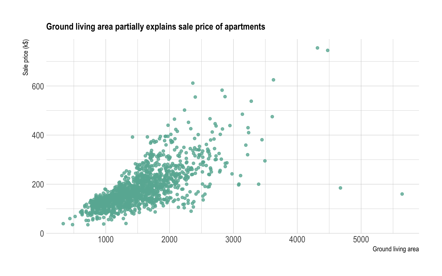
- Scatter Plot
A great way to emphasize the relationships between one or multiple numeric variables and/or their distribution across two axes. The major problem with using scatter plots for UX purposes, it’s that this type of chart is considerably harder to read than all of the other ones we’ve discussed so far. As such, scatter plots should be reserved for experienced users only.
- Mekko
- Column
- Bubble
Commonly used to present financial data. Bubble charts are similar to scatter plots, however, they provide a more in-depth understanding of the data, since they have 3 axes.
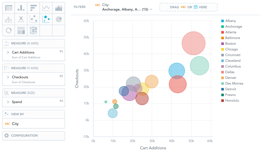
Correlation and relationship between values:
- Scatter Plot,
- Bubble,
- Line.
If we were to summarize the charts above in a matrix, it would look something like this.
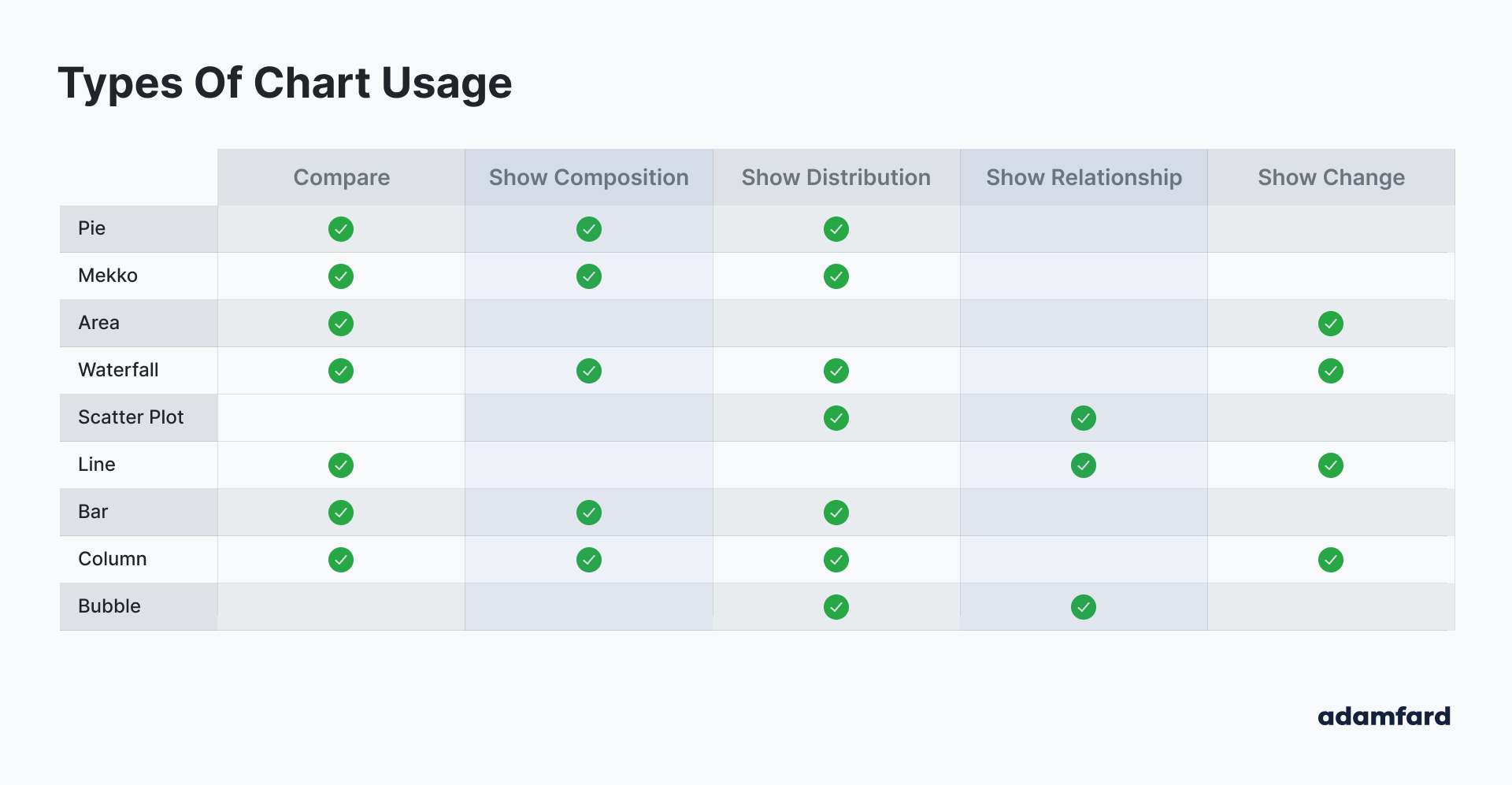
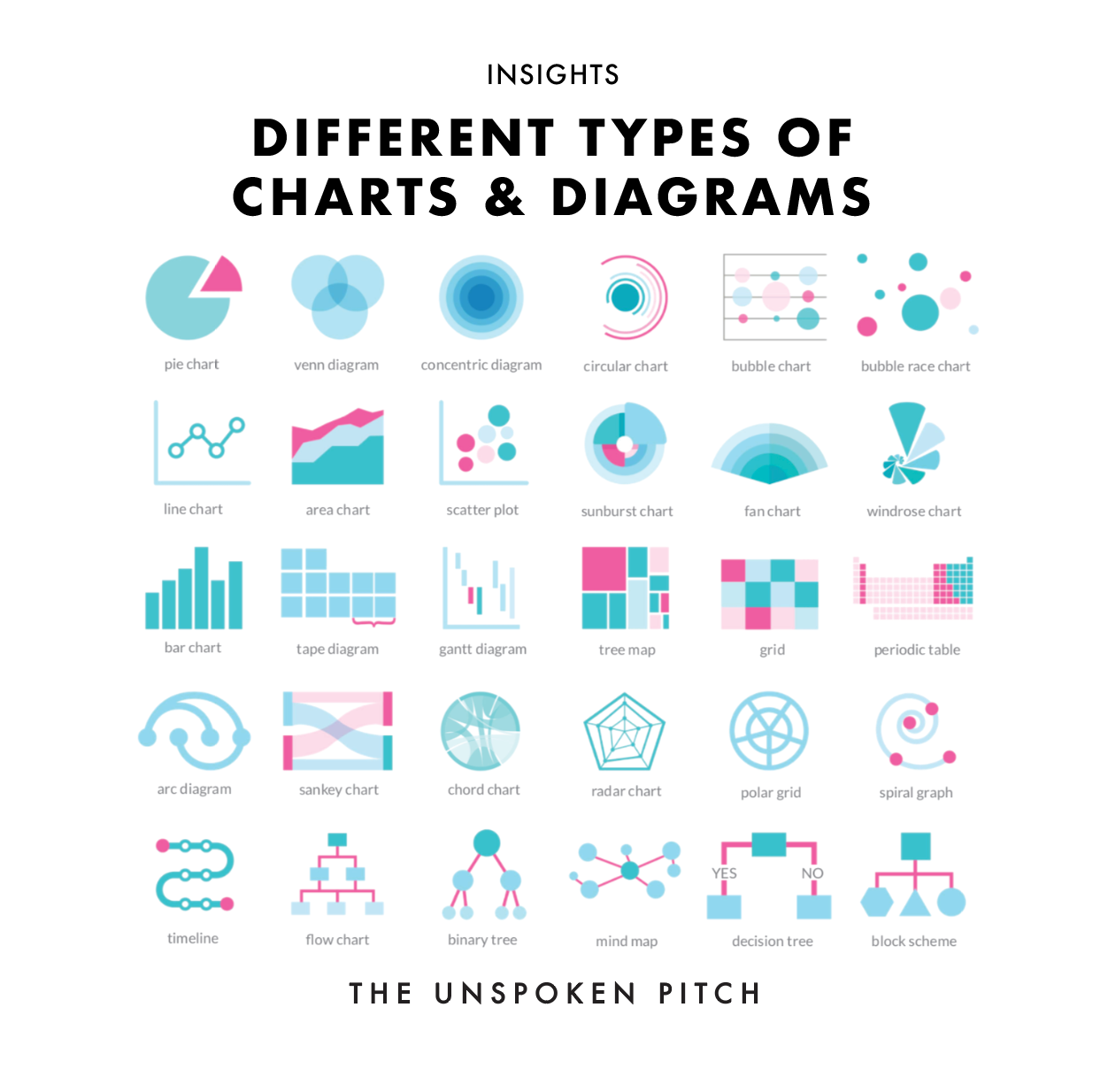
It is only fitting that we summarized the types of charts and their usage as an infographic. 😄
Be advised though, that I’ve indicated what these charts are generally used for. Theoretically, if you wanted to, you could do a bubble chart, where each bubble is a pie chart. Voila, your bubble chart can now also show the composition of each bubble. Of course, it’s easier said than done, because usually, bubbles vary in their size drastically. Anyhow, you get the idea: the matrix is a general guideline, but you can get more creative with charts if you want to at your own discretion.
Balancing Between The Complexity And Efficiency
So here’s a thing. As you might have noticed, lots of charts can be used for similar purposes. That doesn’t mean, however, that these charts are equally good for a certain task.
Generally, once you narrow down your choice to a few charts that seem to work best, you then want to make sure that they’re the least complex they could be. Below, I’ve outlined some of the charts we’ve mentioned by the degree of their complexity and efficiency.
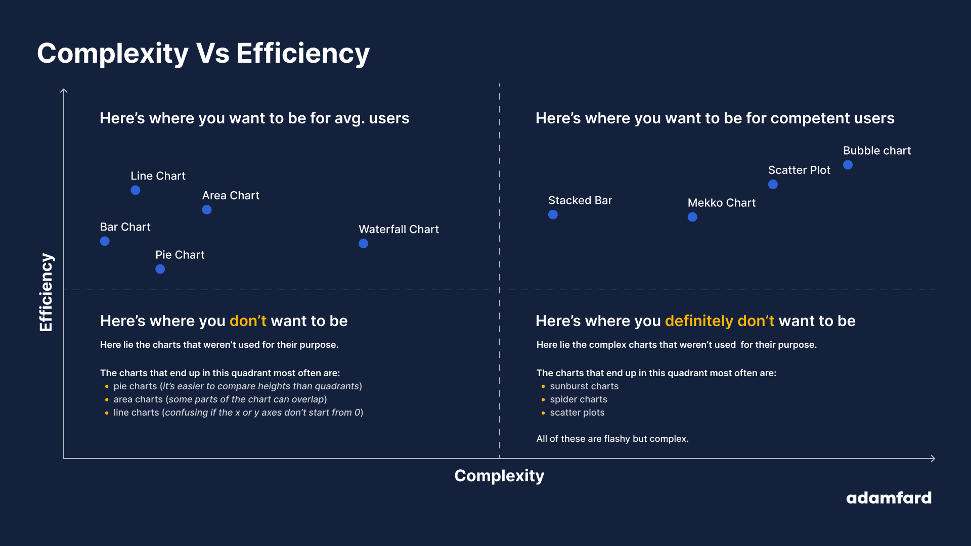
In a nutshell, you want to maximize efficiency and minimize complexity. This is the top-left quadrant. These charts are easy enough to be understood by middle school students. You should stick to those for the “consumer” persona, i.e. an average Joe. The more you move toward the right, the more reasons you should have to believe your users would be comfortable with reading them.
What’s Next?
In case you’d like to continue learning about dashboards and the aspects of their design, here are some resources my team and I have found helpful (to an increasing degree of complexity):
Articles
- Data-heavy applications: How to design perfect charts
- Top 16 Types of Chart in Data Visualization
- Dashboard Design: best practices and examples
- How to design and build a great dashboard
- Dashboard UI Design: 14 Best Practices for Stakeholders
Books
- Refactoring UI
- Beautiful Visualization: Looking at Data through the Eyes of Experts (Theory in Practice)
- Functional Art, The: An introduction to information graphics and visualization (Voices That Matter)
Scientific Papers
- Visualization Criticism - The Missing Link Between Information Visualization and Art
- Principles of Effective Data Visualization
Further Reading
- Designing for Accessibility: Best Practices for Closed Captioning and Subtitles UX
- The Role Of Illustration Style In Visual Storytelling
- Creating An Effective Multistep Form For Better User Experience
- Lesser Known Uses Of Better Known Attributes


