A Recipe For A Good Design System
This article has been kindly supported by our dear friends at Backlight, a collaborative platform empowering front-end teams to build and ship great design systems. Thank you!

In theory, everybody has a relatively similar concept for what a “Design System” means, though nuances start showing up as we approach the real world. The target may still be the same, but different organizations will require diverse strategies to accomplish them. As with many complicated tasks in engineering and architecture, there is no silver bullet for what makes a good Design System.
Although successful endeavors share a few common patterns that have allowed for tooling and best practices to arise. In this article, we will have a look at what solutions fit inside the umbrella of a Design System, and a few important steps and checkpoints you need to keep an eye on throughout your projects. Our experience may diverge, but hopefully, there will be learnings for you where I personally failed and succeeded.
Goal And Meaning
If we consider a “system” as a combination of parts working together, and “design” as the plan of look and function of something. Then we can understand the Design System as a collective of definitions that will dictate patterns in which the interconnecting parts of a system will look, feel, and work. This is still quite abstract, but enough to understand it as more than looks.
It’s not a component library you assemble like a puzzle and arrive at a consistent layout. A design system indeed has a presentation aspect, but it is also about function and integration. It is about experience.
- User Experience
With a reliable and functionally consistent user interface. - Developer Experience
With easy-to-integrate components and defined patterns. - Stakeholder Experience
With a general overview of how the product evolves and grows.
With so many moving pieces, it is understandable there isn’t a single answer for all design systems.
Intentional Vs Organic
When a team decides to create a Design System, there are two approaches where they need to decide up front:
- Organic
Take an existing app as a reference, extract pieces of it and abstract them enough to be used by another app. This approach carries fewer decisions from the get-go but requires more reactive effort from the team to accommodate newly found requirements by adopters. Architectural decisions tend to be made as the need arises instead of proactively. - Intentional
Tokens, patterns, and components are thought ahead of time. Boundaries of a minimal viable product (MVP) are defined and the work starts. For this approach, having goals and requirements is an important step to align expectations with stakeholders.
Organic
When allowing the Design System to develop organically the success of the endeavor comes down to buy-in from stakeholders and adopters. And how effectively the team will be able to react as they clear all the unknowns they find along the way without being excessively disruptive with continuous support. It’s a tricky road and communication is key. There isn’t a clear path of action as it’s tightly coupled with team’s context.
Additionally, it’s hard to tweak as a system while it’s running (ask your local electrician) and as tasks take time, requirements may change: the market will not wait for your component library. A usual “make it or break it” moment for an organic Design System is finding out the development story for a component MVP (minimum viable product).
On one hand, we have developers and designers wanting to craft the best possible experience and quintessential code quality; on the other, there are KPIs, ROIs, and its band of acronyms to measure success. Finding the balance and remaining scalable is tricky. How to abstract something unfinished is even trickier, and avoiding those follow-up tasks from being forgotten at the backlog is the one-million-dollar question of product management.
Being able to iterate quickly and incrementally on your Design System becomes a basic requirement when dealing with the organic approach. And it also requires an extra level of clarity from your consumer developers (in case there are separate teams: one creating the Design System, the other creating product features). Both must align expectations clearly on product requirements and developer experience requirements in order to have a proper symbiosis. Because a Design System is nothing if it’s annoying to use, or if it makes the user experience worse in any way.
Intentional
There is much more planning required, unknowns to be cleared, and infrastructure to prepare when making the conscious choice of building the Design System before having a product to use it on. The flipside brings more clarity with constraints. goals, and expectations. If the sails are double-checked before leaving the harbor, the storm is less frightening.
The predictability of the system also grows when planning ahead, and this is because the Design System becomes its own product and not the tool to make others better. With this abstraction, patterns and solutions used in others are more easily transported.
Though choosing Intentional over Organic may seem counterproductive at first for teams with less experience by not having a proof-of-concept to test on, it is especially helpful to avoid common pitfalls when getting started. “Standing on the shoulders of giants” is a common jargon and holds truthful in this case. So, the best recipe going forward on this should be roughly:
- Identify basic requirements;
- Research early and thoroughly for similar cases;
- Skim results from 2 for implied solutions and strategies;
- Make it all your own by assembling a combination of common solutions and adding your own sauce;
- Iterate.
Those five steps may sound simple and obvious, but they’re not. It’s easy to skip one of the requirement gatherings or cut research short. Piece of advice, though: you will pay interest on step 4 if you forgot either of those.
Build For Efficiency
No package consumer enjoys when a dependency update breaks their app in any way. It’s no different when the package in question is part of a Design System. Actually, one could point out it’s worse. The backlash of an in-house dependency breaking an app tends to be bigger than when it’s an open-source package, additionally, UI changes tend to “break silently” in front of the end-users first: which is particularly frustrating.
With that in mind, we can already line up a few issues:
- API Documentation
Make it easy to discover and use. - Versioning
Indicates how releases are expected to impact consumers. - Changelog
Indicates what changes each release carries. - Releasing
A sane way to keep stable code easy to deliver for all consumers. - Development Environment
There is no app using it yet, must figure out how to showcase and develop artifacts.
Important to point out, how much of a priority each of these items is may vary according to your mileage. But the necessity for them will increase as the Design System scales, adoption increases, and the features grow. They may not be enough to prevent a team from moving forward, but they will for sure hinder productivity if capacity is skewed to figure out those solutions.
Source-Of-Truth
Another eventual pain point many teams face is identifying the source of truth in a Design System. Is it code, UI, or documentation? For many kinds of products, we just look to the consumer side and we can easily identify what is the main output. The reason it gets tricky in this case is because each kind of consumer will use it differently and therefore the answer will vary based on the demographic asked.
A Design System is often a mix of a component library, documentation, and a style guide. And not only the consumer is different for each one of those artifacts, but the craftsperson is also different. A developer, a designer, a technical writer; different people will be necessary to create each output.
Hot Potato
In order to keep delivery consistent, communication and collaboration are key. And the already established waterfall-like process is not encouraging for either.
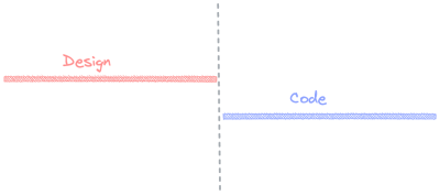
There is no designed (pun-intended) space for collaboration or iteration based on each specialty. Often times designer is unaware of some code limitations, and the developer is clueless about the UX intended for the output. This approach is not extremely prejudicial, it is possible to create a good product with it. But a great one is hard, each part of the process is almost disconnected unless the team makes an active effort to correct it.
The always amazing Dan Mall and Brad Frost have coined the equally great name for a new process: Hot Potato. This process not only encourages communication but also straight-up imposes collaboration to the team by unifying the source of truth of the work. With that, not only does each delivered artifact share a common origin, they also are a product of the combined team’s expertise.

Making this kind of collaboration frictionless is easier said than done, though. Even sitting side-by-side to dodge the “you are muted”, “my connection dropped”, and “can you hear me?” annoyances, when collocated the information exchange tends to go informal easily, and then the process may end up hard to document or too synchronous. We want fewer bottlenecks, not more.
Live collaboration has come to great lengths between peers. Like VSCode Share or Figma’s FigJams, cloud IDEs, there are many options. But when it comes to iterating between different specialties, it’s not super straightforward. Add this to the pile of tooling, architecture, or processes mentioned in the previous sections and you got a pile of work to do before even starting to work.
Architecting A System
As pointed out above, maintaining a design system is a lot of work. The best advice is probably to try and not to do things from scratch whenever possible. Use community resources where convenient. Doing so will make it up for less time to maintain specific points of the system and it will help onboarding engineers and designers if they are already familiar with certain chunks of the system.
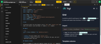
In comes Backlight. It’s a platform as a service that puts together a series of tools in an opinionated-but-flexible way to speed up this whole architecture setup. You can either start from scratch or pick a starter template that fits your project best. No wheels are reinvented if not completely necessary, they use community resources in all of their starters (the one I tried, Yogi, is based on ChakraUI), less maintenance for them, and the consumer doesn’t worry about being locked-in. Additionally, code will be pushed to your versioning platform, so it’s just a few shell commands away from moving out if necessary.
Once there, it will arrange integration with a versioning platform (Gitlab and GitHub are supported), a Storybook based sandbox, a VSCode based IDE, unit tests, and even publishing to NPM registry (this last will depend on your plan with them, it can be to your account or theirs).
Multiple Outputs
We mapped previously there are at least 3 different outputs most Design Systems require: documentation, code, user interface. Once architecture is ready to output each of them, the team usually finds out another challenge: keeping them in sync. Developers are always eager to make changes atomical, you touch one place and they spread out to every place consuming that information. Within a Design System, that isn’t always clear how to accomplish.
If you aren’t following the Hot Potato Process, it’s easy to lose track on which UI updates were already addressed by developers. And even if you do, then there’s documentation. Backlight addresses this problem by collocating everything.
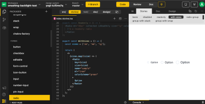
And once changes are done, without leaving the platform’s dashboard. It is possible to check the updated live documentation.
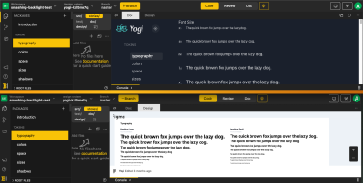
And all this is only scratching the surface of what they can boost your architecture with. You also get:
- Screenshot testing on Pull Requests with their “Visual Review” feature
- Test Driven-Development support with built-in Unit Tests
- Sandbox with live-preview
It is a complete development environment for your Design System. And you still get all those integrations even if you decide not to use their starters. The infrastructure is there for you to build the component library that will feed your Design System from scratch.
Real-Time Remote Collaboration
As mentioned before, the Hot Potato Process can become troublesome for teams to set up a remote and asynchronous way of working. Backlight addresses that with a combo of two features:
- Design integration;
- Share a live link.
Design integration brings the design artifact from your designing tool within the same platform. So the rest of the team can look, add comments, and reference work straight from the same dashboard:
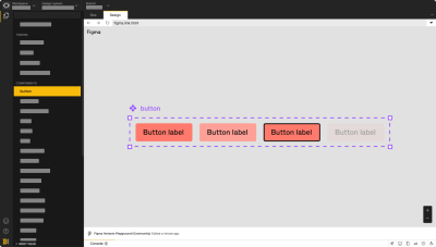
With this feature, the hot potato process starts right at the drawing board no matter where your team is located. And without switching tabs, it smooths back and forth the coding process too with the link-sharing feature, better explained with their promotional gif than anything I could do myself. Developers can share a real-time remote link of their work without publishing things anywhere, no in-between process, that’s a big boost for teams that need to rapidly iterate on detailed work.
Takeaways
In case it wasn’t yet, hopefully, it’s clearer now what creating and maintaining a Design System entails. Much more than a handful of CSS classes, token definitions, and typefaces; it’s tooling, active support, and advocacy. The usefulness of a project is dictated by the quality of its output and how fast it can adapt to the ever-changing requirements.
So if nothing else, prepare yourself to be productive and efficient when creating your project. If you’re still finding your ground, tools like Backlight will help you with sensible defaults and a great User Experience out of the box. If already seasoned with a specific architecture, pick your battles wisely and use the community to handle the rest.
Further Reading
- Transitioning Top-Layer Entries And The Display Property In CSS
- The Digital Playbook: A Crucial Counterpart To Your Design System
- The Importance Of Graceful Degradation In Accessible Interface Design
- Making Your Collaboration Problems Go Away By Sharing Components

