Lesser-Known And Underused CSS Features In 2022

Email Newsletter
Weekly tips on front-end & UX.
Trusted by 182,000+ folks.
 Register for Free
 Celebrating 10 million developers
 Custom Web Forms for Angular, React, & Vue. Your backend.


After reading Louis Lazaris’ insightful article “Those HTML Attributes You Never Use”, I’ve asked myself (and the community) which properties and selectors are lesser-known or should be used more often. Some answers from the community surprised me, as they’ve included some very useful and often-requested CSS features which were made available in the past year or two.
The following list is created with community requests and my personal picks. So, let’s get started!
all Property
This is a shorthand property which is often used for resetting all properties to their respective initial value by effectively stopping inheritance, or to enforce inheritance for all properties.
initial
Sets all properties to their respective initial values.inherit
Sets all properties to their inherited values.unset
Changes all values to their respective default value which is eitherinheritorinitial.revert
Resulting values depend on the stylesheet origin where this property is located.revert-layer
Resulting values will match a previous cascade layer or the next matching rule.
See the Pen [all property](https://codepen.io/smashingmag/pen/NWyRvZL) by Adrian Bece.
This property can be used effectively for resetting styles or when refactoring CSS to stop inheritance and prevent unwanted styles for leaking in.
h2 {
   color: var(--color-primary);
   font-size: var(--font-size-large);
   line-height: 1.5;
   text-decoration: underline;
   margin-bottom: 2rem;
}

.article h2 {
  padding: 2em;
  border-bottom: 2px solid currentColor;
}

.article__title {
  /* We don't want styles from previous selector. We only need a margin and a font size. */
  all: unset;
  margin-bottom: 2rem;
  font-size: var(--font-size-medium);
}
With revert-layer we can skip to a next cascade layer, to inherit styles from another selector but to prevent styles from the closest selector in the cascade from leaking in.
While playing around with this property, I’ve discovered an interesting behavior — underline color won’t update to a currently assigned color unless text-decoration: underline; is applied again to the .title selector which contains the all property.
See the Pen [all property - revert-layer](https://codepen.io/smashingmag/pen/bGLwoGx) by Adrian Bece.
currentColor
Often referred to as “the first CSS variable”, currentColor is a value equal to the element’s color property. It can be used to assign a value equal to the value of the color property to any CSS property which accepts a color value. It forces a CSS property to inherit the value of the color property.
This value can be very useful to avoid assigning the same value to multiple CSS properties which accept color like border-color, background, box-shadow, etc. within the same selector.
See the Pen [curentColor alerts](https://codepen.io/smashingmag/pen/MWQjEYN) by Adrian Bece.
In my opinion, one of the best use-cases for currentColor is styling inlined SVG elements. Whenever we export an icon from a design tool, it comes with a specific fill and other color values defined in the design. We can manually replace all those color values with currentColor, and that way we can easily customize the color of SVG without having to go into the SVG markup and override the fill or other color-based attributes for an individual path, or other SVG elements, and make our CSS selectors complex and convoluted.
<!-- Before -->
<path fill="#bbdb44" d="..."/>

<!-- After -->
<path fill="currentColor" d="..."/>
/* Before */
.icon:hover path {
fill: #112244;
}
/* After */
.icon {
color: #bbdb44;
}
.icon:hover {
color: #112244;
}See the Pen [currentColor svg](https://codepen.io/smashingmag/pen/MWQjEKN) by Adrian Bece.
Custom Property Fallback Value
Custom properties brought significant improvements to CSS by allowing developers to create reusable values in their stylesheet without the need for CSS preprocessor like SASS. Custom properties were instantly adopted and are widely used today to great effect, especially in theming and interaction with JavaScript.
However, I feel like the fallback value was somewhat ignored. If you are unfamiliar with the fallback value, it’s the second value that can be assigned to var function which is applied if the first value is not set.
color: var(--color-icon, #9eeb34);We can also set another variable as a fallback.
color: var(--color-icon-primary, var(--color-icon-default));You can probably already see how this value can be used to provide a reliable fallback to default styles while allowing for customization.
This secondary value also allows for an elegant way to override theme colors without increasing specificity.
We can easily change custom variable values by overriding them.
:root {
  --theme-color-background: #f5f5f5;
  --theme-color-text: #111111;
}

/* Global override on a parent class on <body> or <html> element */
.theme--dark {
  --theme-color-background: #111111;
  --theme-color-text: #f5f5f5;
}
But what about the cases where this global override is not ideal for all components, and we want to fine-tune the properties for individual components? In such cases, we would have to override the styles.
.box {
    color: var(--color-theme-default);
}

.theme--dark .box {
  color: var(--color-component-override);
}
We have increased specificity as a result which is not ideal and can cause issues in more complex cases or in cases where specificity is left unmanaged. What we can do instead is use the fallback value to apply theming without increasing specificity inside the component. This makes the component more themable and portable, as it doesn’t introduce any parent class names for the component and other similar dependencies.
:root {
--theme-color-default: darkgoldenrod;
--color-some-other-color: cyan;
}

.theme--dark {
/* Dark theme */
  --color-component-override: var(--color-some-other-color);
}

.box {
  color: var(--color-component-override, var(--theme-color-default));
}
See the Pen [Custom properties fallback theme](https://codepen.io/smashingmag/pen/wvyzroQ) by Adrian Bece.
Counters
CSS allows developers to define named counters that can be incremented, decremented, and displayed using CSS content property.
counter-reset
This property is used for initializing single or multiple counters. A default starting value can also be assigned.reversed
Function used when defining a counter withcounter-resetto make the counter count down instead of up.counter-increment
Specify a counter to increment (or decrements if counter is defined asreversedor if a negative value is passed tocounter-increment). Default increment value is 1, but a custom value value can also be passed to this property.counter
Used for accessing counter value. Usually used incontentproperty.
In the following example, we are initializing two counters articles which keeps count of the main sections and notes which keeps count of the notes on the page. A single section section can have multiple notes.
See the Pen [counters articles and notes](https://codepen.io/smashingmag/pen/RwQGLpQ) by Adrian Bece.
What if we want to easily identify which note belongs to which article on a page? We need to add an article number to each note. For example, a second note of the third article — “Note 3.2.”.
We can easily adjust how notes counters are initialized and displayed. We can use multiple counter values in a single content property.
See the Pen [counters articles and notes - nested](https://codepen.io/smashingmag/pen/vYdXemd) by Adrian Bece.
Using CSS counters, allows us to easily add, remove, and rearrange these elements without having to worry about updating the counter values manually and without the need for using JavaScript.
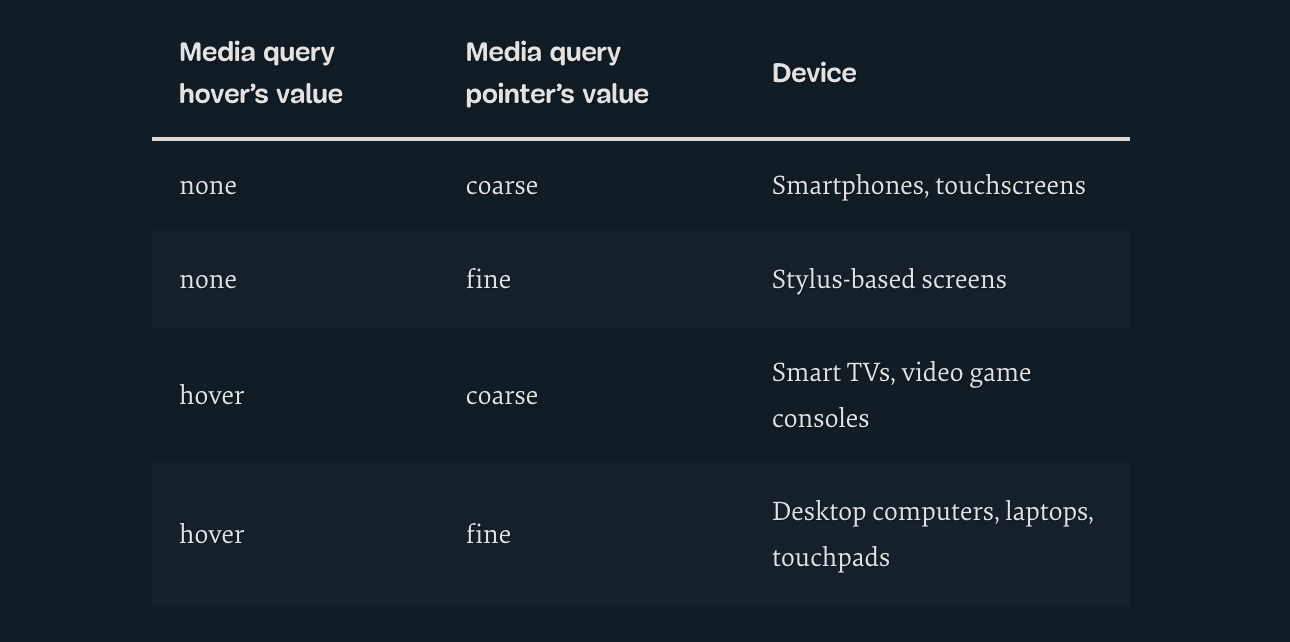
Interaction Media Queries
Cristian Díaz covered this topic in his recent article. When creating responsive websites, we often make assumptions about input mechanisms based on their screen size. We assume that the screen size of 1920px belongs to a desktop computer or laptop and the user is interacting with the website using a mouse and keyboard, but what about laptops with touchscreen or smart TV screens?
This is where Interaction Media Features come in and allow us to fine-tune the usability of our components that users can interact with (inputs, offcanvas menus, dropdowns, modals, etc.) depending on the primary input mechanism — touch, stylus, mouse pointer, etc.
@media (pointer: fine) {
  /* using a mouse or stylus */
}
@media (pointer: coarse) {
  /* using touch */
}
@media (hover: hover) {
  /* can be hovered */
}
@media (hover: none) {
  /* can't be hovered */
}
aspect-ratio For Sizing Control
When aspect-ratio was initially released, I thought I won’t use it outside image and video elements and in very narrow use-cases. I was surprised to find myself using it in a similar way I would use currentColor — to avoid unnecessarily setting multiple properties with the same value.
With aspect-ratio, we can easily control size of an element. For example, equal width and height buttons will have an aspect ratio of 1. That way, we can easily create buttons that adapt to their content and varying icon sizes, while maintaining the required shape.
See the Pen [aspect-radio buttons](https://codepen.io/smashingmag/pen/qBxaPoX) by Adrian Bece.
Better Gradients
We’ve been using gradients on the Web for a while, and they’ve become a staple in design. However, as Josh W. Comeau points out, the middle part of the gradient can sometimes look gray and washed out, depending on the colors you are using.
In the following example, we are setting two gradients between the same two values (green and red). Notice in the first example how the colors in the middle part look muddy and washed out, because the browser is using RGB color interpolation by default. We cannot change that at the moment, but we might in the future with new CSS features. However, we can fix that by adding some midpoints to the gradient.
The second example uses an interpolation technique with multiple midpoints, which is generated using Josh W. Comeau’s Gradient generator tool. Notice how the middle part is now darker yellow and orange, and it looks much more vibrant and beautiful than in the first example.
See the Pen [Gradients](https://codepen.io/smashingmag/pen/BaYLwxM) by Adrian Bece.
:where And :is Pseudo-Selectors
These two pseudo-selectors gained wider browser support last year, and although there was much talk around them, I haven’t seen all those many uses around the Web. Stephanie Eckles has talked in-depth about these two pseudo-selectors in her article.
Both of these selectors deal with grouping and specificity, so let’s start with :is pseudo-selector.
Let’s take a look at the following example. We want to set the following default styles for list items and nested lists. We need to cover both ordered and unordered lists and their combinations.
ol li,
ul li {
  margin-bottom: 0.25em;
}

ol ol,
ul ul,
ol ul,
ul ol {
  margin: 0.25em 0 1em;
}
With :is pseudo-selector, we can easily turn these selectors into a single expression.
:is(ol,ul) li {
  margin-bottom: 0.25em;
}

:is(ol,ul) :is(ol,ul) {
  margin: 0.25em 0 1em;
}
See the Pen [Nested lists](https://codepen.io/smashingmag/pen/jOZMGvO) by Adrian Bece.
:where works the same as :is, but it reduces the specificity of the expression to zero. Now, why is this important? Let’s go back to our example and change the markup a bit. Let’s add a .list selector, so we can add styles to list by assigning a class. Let’s add an additional class for a nested list .list-highlight which adds a background color and adjusts paddings and margins, so the nested list looks more prominent.
/* Default styles for nested lists */
.list :is(ol,ul) {
  margin: 0.25em 0 1em;
}

/* Utility class for a nested list */
.list-highlight  {
  background: #eeeeee;
  padding: 1em 1em 1em 2em;
  margin: 0.5em 0;
}
However, when we apply list-highlight class to any of the nested lists, the margins look off, because that style doesn’t apply. What is going on?
Resulting specificity for :is selector matches the highest one in the list. So, margin styles from our .list-highlight util class will never win against it.
We want to avoid increasing specificity and adding dependencies for our utility classes, so let’s switch :is with :where and see what happens.
.list :where(ol,ul) {
  /* ... */
}
See the Pen [Nested lists - :where](https://codepen.io/smashingmag/pen/mdXrBzz) by Adrian Bece.
Our utility class works without the need for a higher specificity or other overrides! :where sets the specificity of the selectors in the list to zero and allows us to override the default styles.
We can use :is and :where to group multiple selectors into a single expression. With :where, we can set safe default styles with complex selectors which can be easily overridden with simple utility classes without needlessly increasing specificity.
scroll-padding
One of my pet-peeves, when implementing a fixed page header, used to be how the on-page scroll links cause fixed page header to cover part of the content. We had to use JavaScript to fix this issue and implement custom scroll logic to take into account the fixed header offset. And things would only become more complicated if the header height changed on breakpoints, so we needed to cover those cases with JavaScript, too.
Luckily, we don’t have to rely on JavaScript for that anymore. We can specify scroll-padding-top and change its value using standard CSS media queries.
html {
  scroll-padding-top: 6rem;
  scroll-behavior: smooth;
}
See the Pen [Scroll offset](https://codepen.io/smashingmag/pen/QWQKqzW) by Adrian Bece.
We can also set other directions or use a longhand scroll-padding.
scroll-padding: /* ... */;

scroll-padding-top: /* ... */;
scroll-padding-right: /* ... */;
scroll-padding-bottom: /* ... */;
scroll-padding-left: /* ... */;
Font Rendering Options
I’ve recently worked on animating numeric values on a project where a value would increment from zero to a final value. I’ve noticed that the text kept jumping left and right during the animation due to individual characters having different widths.
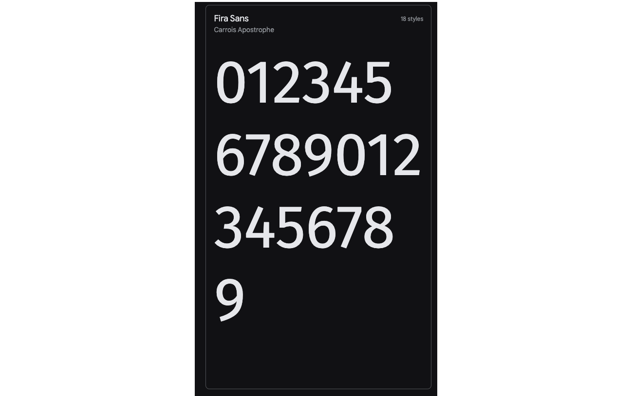
I assumed that this issue cannot be fixed, and I moved on. One of the tweets from the community poll suggested that I should look into font-variant-numeric: tabular-nums, and I was surprised to find a plethora of options that affect font rendering.
For example, tabular-nums fixed the aforementioned issue by setting the equal width for all numeric characters.
See the Pen [font-variant-numeric](https://codepen.io/smashingmag/pen/ZErpayJ) by Adrian Bece.
Please note that available features depend on the font itself, and some features might not be supported. For a complete list of options, consult the documentation. There is also a font-variant CSS property that allows us to activate even more features for all characters, not just the numeric.
Here are a few more examples of font-variant-numeric that are available in the font Source Sans 3.
See the Pen [font-variant](https://codepen.io/smashingmag/pen/ExQgbvE) by Adrian Bece.
Creating Stacking Context With isolate
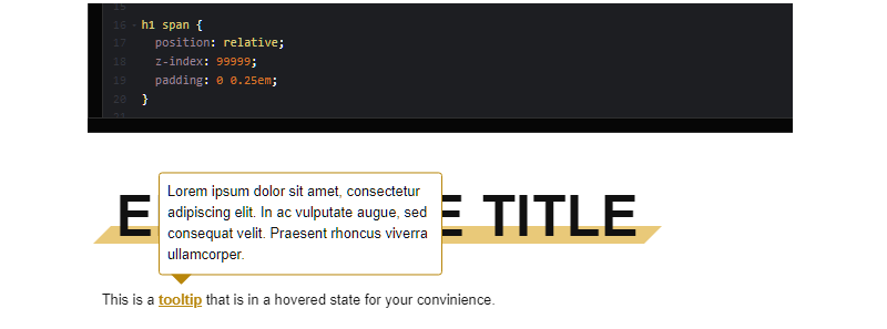
This property may be confusing to developers, and I wasn’t aware of it until I read Josh W. Comeau’s awesome article on the topic of z-index and stacking contexts. In short, it allows us to compartmentalize our z-index stacks.
You probably ran into a case where you, for example, added a reusable tooltip component to your page, only to find out that the tooltip element has a z-index lower than some other adjacent element on the page, causing the tooltip to display below it. We would usually solve it by increasing the z-index value of the tooltip, but that could potentially cause regressions and similar issues somewhere else in the projects.
This is exactly what happens in the example below. The tooltip is locked in a hovered state for demo purposes.
See the Pen [stacking context - no isolate](https://codepen.io/smashingmag/pen/ZErpaXX) by Adrian Bece.
Let’s see what is going on here. A developer made a styled title component that has a decorative element behind it, as defined in a design. But they went overboard with z-index values:
- title text has
z-index: 2; - decorative background element has a
z-index: 1.
This component works as expected and was merged with a main codebase. After some time had passed, someone else made a tooltip component with a z-index: 1. There is no reason to assign a higher value to z-index: 1, as the tooltip needs to be just above the text. After a while, an edge case happened where title text ended up above the tooltip.
We could mess around with z-index values for title component and tooltip component or assign a z-index to their respective parent elements with position: relative to create a new stacking context, but we are relying on magic numbers!
Let’s think about the issue differently — what if we could create a new stacking context without relying on z-index magic numbers? This is exactly what isolation: isolate does! It creates a new stacking context or a group. It tells the browser not to mix these two stacking groups, not even if we increase title z-index value to highest possible value. So, we can keep the z-index values low and not worry if value should be 2, 10, 50, 100, 999999, etc.
Let’s create a new stacking context at the root of our title component and at the root of our tooltip component and see what happens.
.title {
  isolation: isolate;
  /* ... */
}

.tooltip-root {
  isolation: isolate;
  /* ... */
}
See the Pen [stacking context - isolate](https://codepen.io/smashingmag/pen/oNEzooJ) by Adrian Bece.
And we fixed the issue by isolating the stacking contexts for our two conflicting components without messing around with magic numbers for z-index values.
Render Performance Optimization
When it comes to rendering performance, it’s very rare to run into these issues when working on regular projects. However, in the case of large DOM trees with several thousands of elements or other similar edge cases, we can run into some performance issues related to CSS and rendering. Luckily, we have a direct way of dealing with these performance issues that cause lag, unresponsiveness to user inputs, low FPS, etc.
This is where contain property comes in. It tells the browser what won’t change in the render cycle, so the browser can safely skip it. This can have consequences on the layout and style, so make sure to test if this property doesn’t introduce any visual bugs.
.container {
  /* child elements won't display outside of this container so only the contents of this container should be rendered*/
  contain: paint;
{
This property is quite complex, and Rachel Andrew has covered it in great detail in her article. This property is somewhat difficult to demonstrate, as it is most useful in those very specific edge cases. For example, Johan Isaksson covered one of those examples in his article, where he noticed a major scroll lag on Google Search Console. It was caused by having over 38 000 elements on a page and was fixed by containing property!
As you can see, contain relies on the developer knowing exactly which properties won’t change and knowing how to avoid potential regressions. So, it’s a bit difficult to use this property safely.
However, there is an option where we can signal the browser to apply the required contain value automatically. We can use the content-visibility property. With this property, we can defer the rendering of off-screen and below-the-fold content. Some even refer to this as “lazy-rendering”.
Una Kravets and Vladimir Levin covered this property in their travel blog example. They apply the following class name to the below-the-fold blog sections.
.story {
  content-visibility: auto; /* Behaves like overflow: hidden; */
  contain-intrinsic-size: 100px 1000px;
}
With contain-intrinsic-size, we can estimate the size of the section that is going to be rendered. Without this property, the size of the content would be 0, and page dimensions would keep increasing, as content is loaded.
Going back to Una Kravets and Vladimir Levin’s travel blog example. Notice how the scrollbar jumps around, as you scroll or drag it. This is because of the difference between the placeholder (estimated) size set with contain-intrinsic-size and the actual render size. If we omit this property, the scroll jumps would be even more jarring.
See the Pen [Content-visibility Demo: Base (With Content Visibility)](https://codepen.io/smashingmag/pen/jOZMapm) by Vladimir Levin.
Thijs Terluin covers several ways of calculating this value including PHP and JavaScript. Server-side calculation using PHP is especially impressive, as it can automate the value estimation on larger set of various pages and make it more accurate for a subset of screen sizes.
Keep in mind that these properties should be used to fix issues once they happen, so it’s safe to omit them until you encounter render performance issues.
Conclusion
CSS evolves constantly, with more features being added each year. It’s important to keep up with the latest features and best practices, but also keep an eye out on browser support and use progressive enhancement.
I’m sure there are more CSS properties and selectors that aren’t included here. Feel free to let us know in the comments which properties or selectors are less known or should be used more often, but may be a bit convoluted or there is not enough buzz around them.
Further Reading
- Transitioning Top-Layer Entries And The Display Property In CSS
- Mastering SVG Arcs
- Why Optimizing Your Lighthouse Score Is Not Enough For A Fast Website
- The Era Of Platform Primitives Is Finally Here
 (vf, yk, il, mrn)

