How Even Small UX Changes Can Result In An Increase In Conversion (A Case Study)

Email Newsletter
Weekly tips on front-end & UX.
Trusted by 182,000+ folks.


 Custom Web Forms for Angular, React, & Vue. Your backend.
 Celebrating 10 million developers
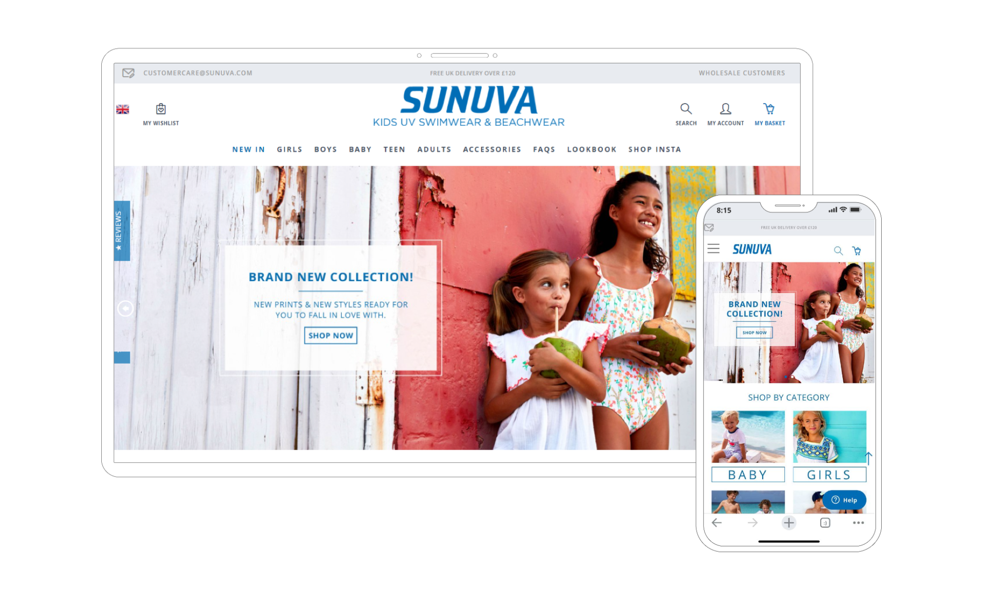
Sunuva is a global fashion brand for kids established in 2007. Today, their products are featured in famous luxury store brands, such as Bloomingdale’s, Harrods, Barneys, Harvey Nichols, and other luxury department store chains. This is a great example of how — after conducting a UX audit — the team and I at Turum-burum established changes based on analytics data that can have significant results.
UX Audit And Support Over The Implementation Of Recommendations
Since our customer, Sunuva, already had a development team, our task was to conduct a thorough UX Audit with further support over the implementation of the recommendations.
Turum-burum was hired by the swimwear company to do the following:
- Perform a thorough site usability audit with each site detail deeply researched;
- Provide optimal solutions and explanations for the users’ problems;
- Be on hand to advise the customer’s development team for any further clarifications.
We conducted a thorough audit of the website by using data analytics tools, Hotjar recordings and click maps and data of known user snag points provided by the customer.
The process of the project review consisted of the following three main stages:
- UX auditing of the website (mobile and desktop);
- Interviewing business representatives;
- Providing further support and advice on any further clarifications.
After the audit was completed, we have done the following:
- Created a document listing the problems for each key page;
- Prioritized all those issues;
- Provided a full detailed proposal of amendments with documented examples and indications of how each amendment could improve the user experience.
Key Problems And Recommendations
The analysis of the website metrics showed that the website had engagement indicators, traffic composition, and the conversion rate for both new and returning users along the bounce and exit rate were within the normal range for this segment.
Yet, we found several issues that needed to be addressed, such as the interface mistakes that adversely affected the key metrics and prevented customers from converting. The main points of growth include:
- Increase the conversion rate on the mobile;
- Increase the number of views of the product detail pages;
- Increase the add-to-basket rate on the desktop;
- Minimize the shopping cart abandonment rate;
- Increase the checkout completion percentage rate.
The most critical points that we found were the following:
- Catalog structure,
- Absence of prevention of users’ mistakes,
- The checkout page pitfalls,
- Absence of priority in header elements,
- Absence of “Recently viewed” blocks,
- Issues with category blocks.
They are all outlined and described in detail below. Let’s dive in!
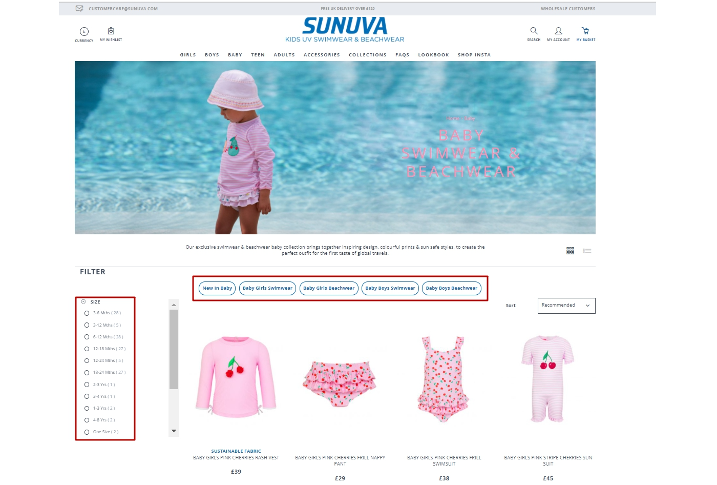
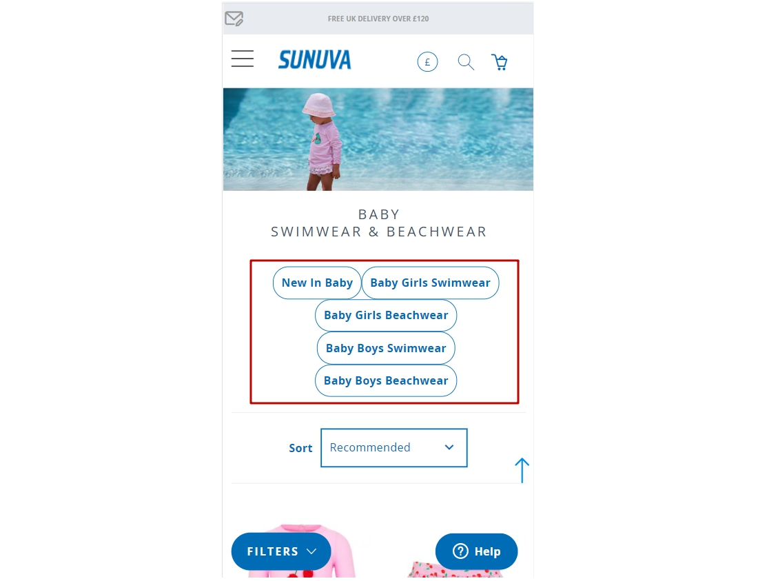
Catalog Structure
Problem
The catalog structure resulted in the product list containing a wide range of mixed products. In turn, it became more difficult for users to find the products they needed. According to heat maps, users often used filters — size (age) and gender, if it’s not specified in the selected category. Those who have never used a filter had difficulty finding items on the list. According to our analytics data, only 37% of users who viewed the product list found the product they needed, became interested in them, and decided to go to the product details page.
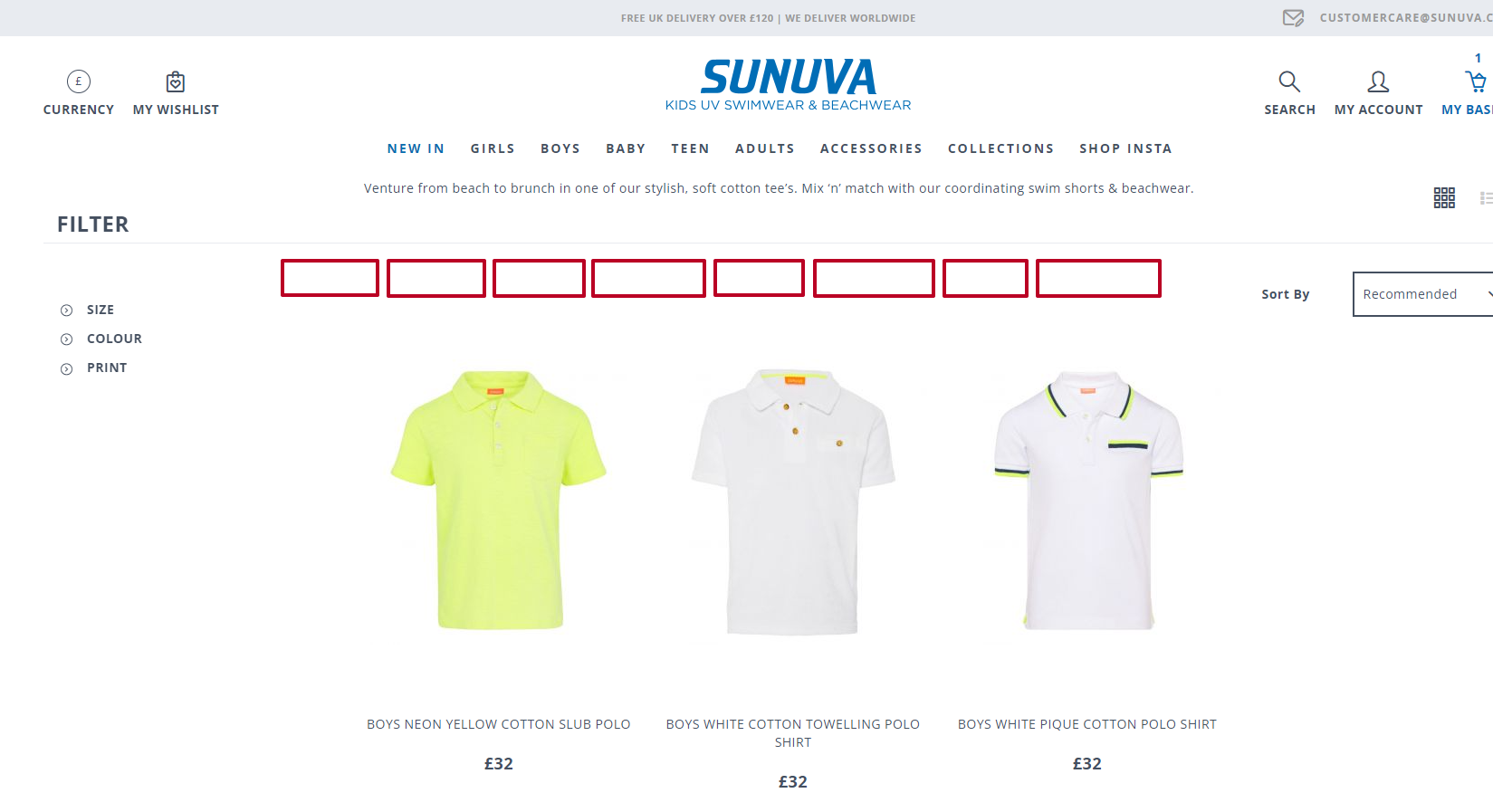
Recommendation
To ease the search for the products, fast tags under the product list with common groups (for example, Boys, Girls, Baby, Kids, Teen; Shorts, Suits, Vests) should be added. Also, it’s recommended to show an expanded list of sizes and gender filters by default, so that users can find them quickly and use them. This should shorten the time needed for the search. In the mobile, the filter button should always stay in a fixed position, while the user scrolls down the page.
Users’ Mistakes
Problem
No error notification would pop up whenever users clicked on the “Add to basket” button without selecting a size beforehand. It made them go back, select a size, and click the button again.
Recommendation
Whenever users don’t select a size and click on the “Add to basket” button, the size list would open automatically, and users tend to shift their focus to it.
Incorrect Notification On The Checkout Page
Problem
Whenever users go to the checkout page, they would see a notification about some amount missing from free shipping. This will make the users leave the checkout page and continue shopping. In this case, users might never return to the checkout page. According to our analytics data, up to 38% of users never complete the transaction on the checkout page, and, most likely, this is the reason why they never complete the transaction.
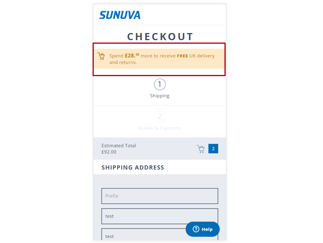
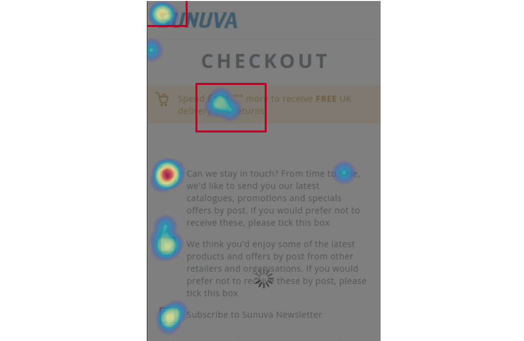
Recommendation
It would be better not to show the notification that some amount is missing from free shipping on the checkout page. Adding a progress bar in the basket or adding an info message about free shipping and all the details should work much better.

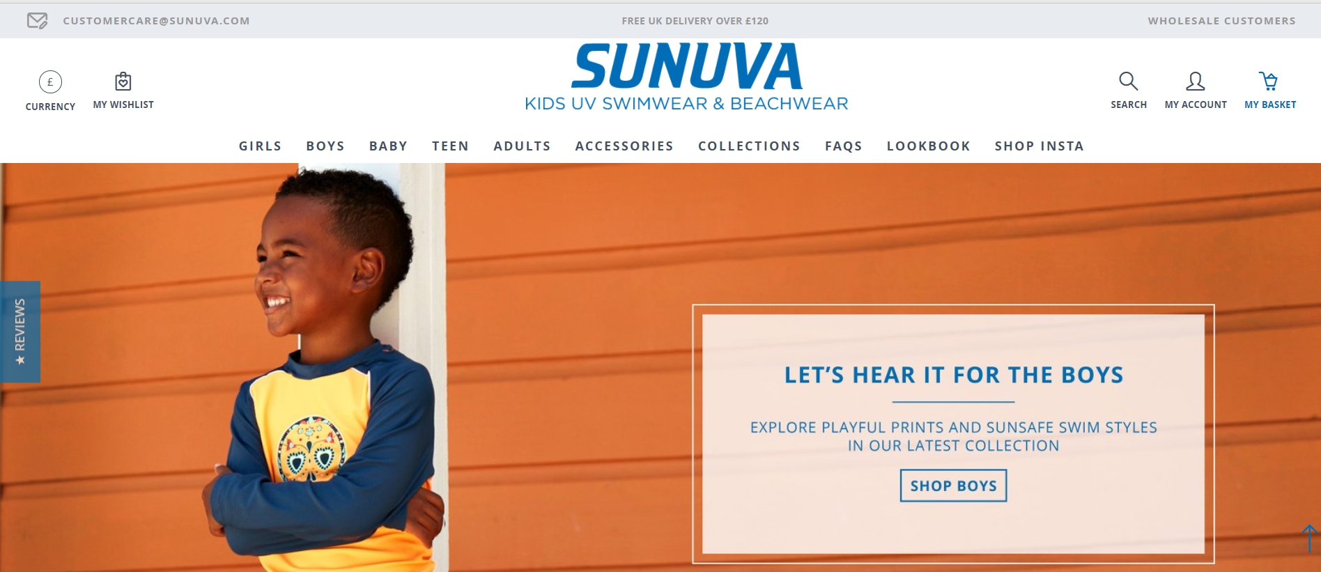
No Priority In Header Elements And Information
Problem
There was no priority in the information and sufficient differences in the visual accent in the header elements. The incorrect placement of the accent confused many users. This issue ruined the customer experience.
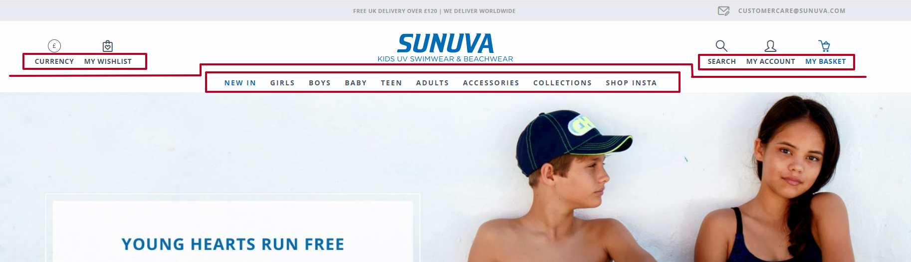
Recommendation
- Visually separate elements, such as Currency, Wishlist, Search, My Account, and Basket.
- Place more emphasis on the catalog categories.
- Align the currency, wishlist, search, account elements, and so on with the logo. It helps users focus on the more important parts of the site and shortens the time to search for the necessary products.
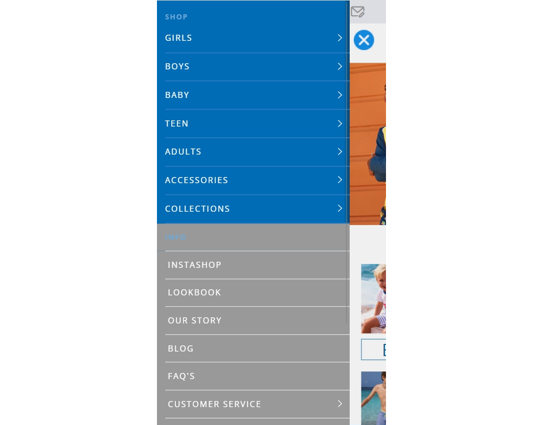
Problem
It was difficult to notice the catalog categories in the burger menu and differentiate them from the info categories. Users had to spend more time finding the necessary category and its items.
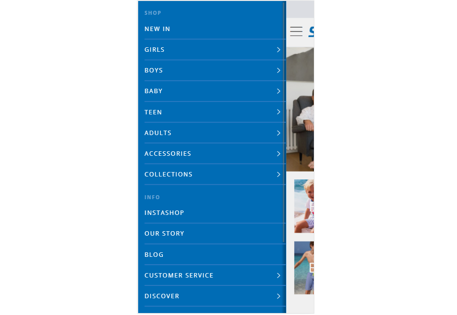
Recommendation
It’s better to visually differentiate the catalog categories from the info categories. Make less emphasis on the info categories. It will help users to focus on the product categories and faster find the needed items.
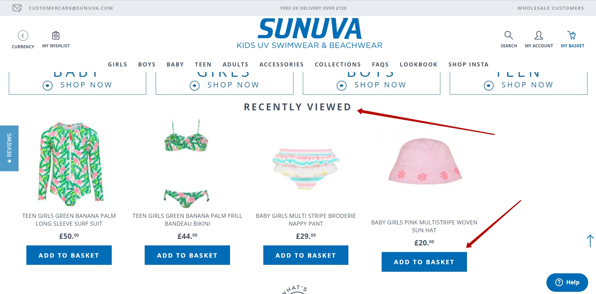
Absence Of “Recently Viewed” Blocks
Problem
There were no blocks or lists with recently viewed items and no quick “Add to basket” button. According to the analytics data, users would be 2.5 times more likely to return than to buy goods during the next session. In this case, they have already seen some goods and may be ready to buy them quicker. Users might not be able to find the items again or spend too much time doing that. This drastically affected the conversion rate.
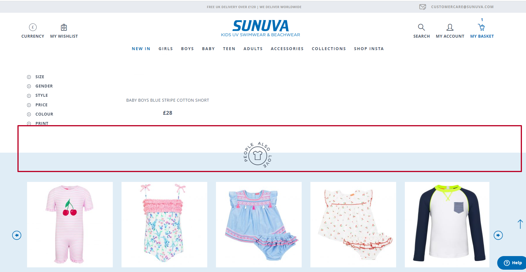
Recommendation
Show the viewed item list. Add the “Add to basket” buttons on the product list cards, hover on desktop, and fixed on the mobile. It will help users find the products they are interested in much quicker.
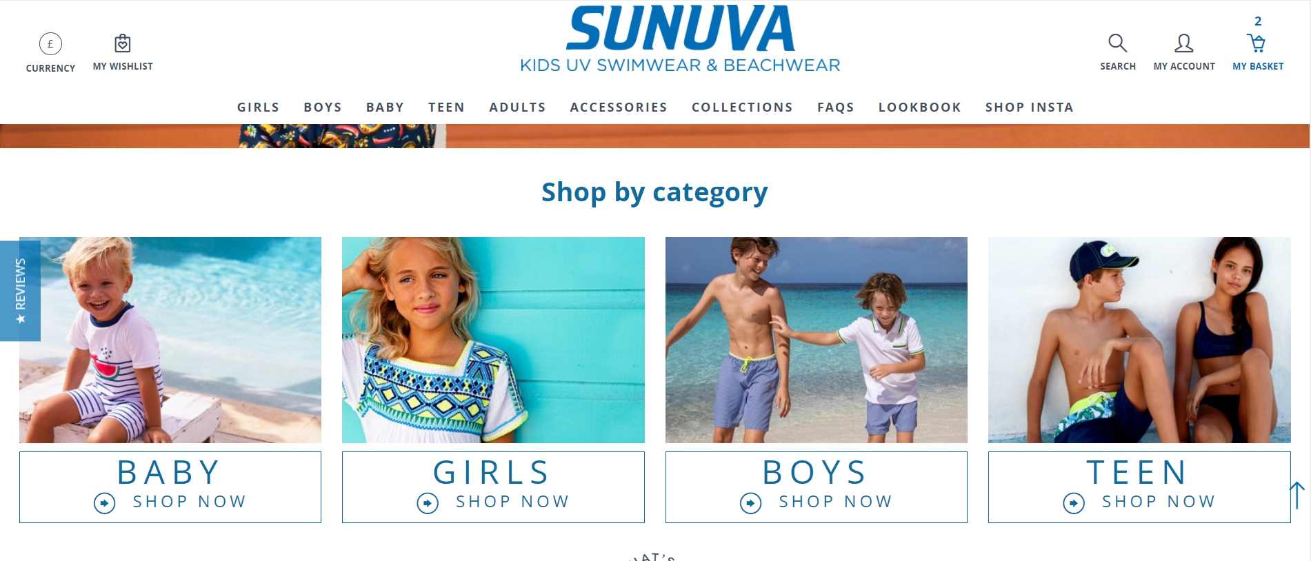
Not So Obvious Category Blocks
Problem
Users never clicked on the category blocks, because the labels were too hard to read, and it seemed to block part of the banner. That’s why it was hard for users to find the necessary items quickly and took more time to search for them.
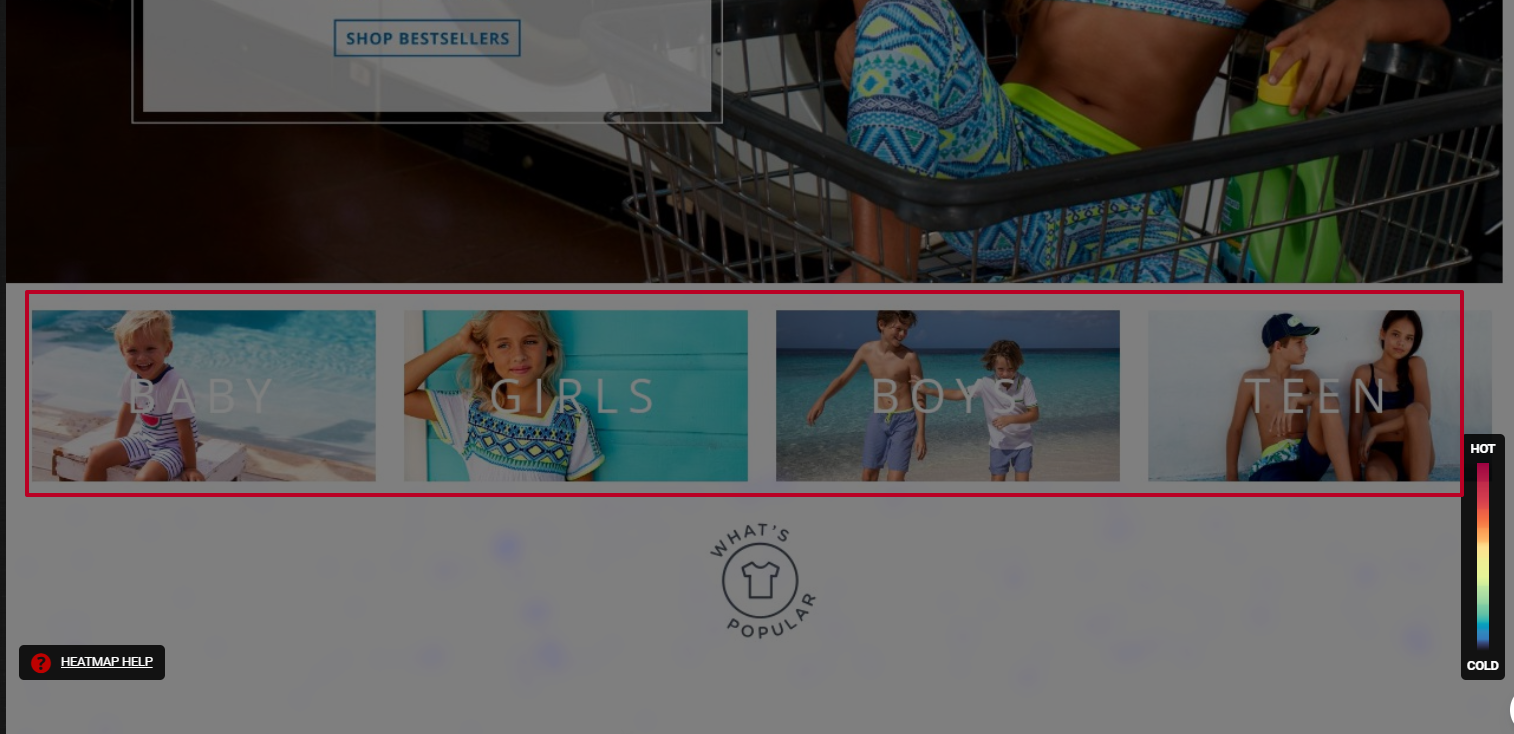
Recommendation
Change the appearance of the title and the blocks. Visually detach them from the banner, so that users know they are clickable and lead to the category listing.
Results Of The Work Done On The Sunuva Website
Our team has utilized analytic tools, session recordings, heat maps, and other customer data to execute their tasks and provide recommendations. As a result, our customer has reported an increase in the conversion rate and site traffic after nearly implementing every recommendation.
“Turum-burum’s work drove an increase in the client’s conversion rate and site traffic. Proactive and detail-oriented, they took the time to understand all of the available data to provide optimal solutions and explanations for the client’s problems. They were supportive and transparent throughout.”
— Jennifer Tully, E-Commerce Manager, Sunuva
How To Get Started With UX/UI Changes To Increase The Conversion Rate?
These are seven simple steps that you can follow in order to conduct a UX audit on your own that will help you find and eliminate some interface mistakes:
| Steps | |
|---|---|
| 1. Follow the user’s footsteps. | Make a purchase like you are the customer |
| 2. Analyze micro and macro conversions. | Using GTM and GA |
| 3. Conduct audience research. | What is your target audience portrait? |
| 4. Conduct a technical audit. | Is everything working on your website? |
| 5. Check heatmaps and scroll maps. | Hotjar and Plerdy could be helpful. |
| 6. Watch session recordings. | |
| 7. Analyze feedback. | (Hotjar, Survio) |
After these steps are taken, establish several hypotheses on how your website could be improved and prioritize them according to their impact on conversion. Following that, start checking these hypotheses with A/B testing or measuring the changes in analytics. This process can be endless.
Converting a user who has already visited your site can cost your business much less than attracting new ones with the help of marketing tools. That’s why you should constantly improve the interface to meet new business goals, new market demand, and new user behavior patterns. If you can’t do this on your own, hire a team of UX/UI experts regularly.
Find Out More About UX/UI Agency Turum-burum
🇺🇦 Turum-burum, a UX/UI and CRO company from Ukraine, has over 12 years of UX/UI experience, and its primary focus is on e-commerce and SaaS projects. They influence key website metrics to increase clients’ revenue with the help of design.
They are Google UX Partners and take part in Retail Development Programs from Google in Ukraine. They cooperate with Baymard Institute, CXL, Hotjar, etc.
Further Reading
- The Role Of Illustration Style In Visual Storytelling
- The Case For Minimal WordPress Setups: A Contrarian View On Theme Frameworks
- Lesser Known Uses Of Better Known Attributes
- Navigating The Challenges Of Modern Open-Source Authoring: Lessons Learned


