Designing Effective Pricing Plans UX

Email Newsletter
Weekly tips on front-end & UX.
Trusted by 182,000+ folks.
 See User Testing Live

 Celebrating 10 million developers

 Custom Web Forms for Angular, React, & Vue. Your backend.
Imagine that you need to design a pricing page. The page is intended for a product that has four different pricing plans. All plans are designed for different audiences, vary in features, include some customization options, and are available in various currencies. For such a table, we should probably consider addressing specific groups with appropriate plan’s names and descriptions. We should also allow users to highlight differences between the plans and probably provide a fully-fledged feature comparison matrix.
Now, this doesn’t sound like a particularly challenging task at first, does it? After all, we’ve seen something quite similar already with our good ol’ feature comparison tables. In fact, many design patterns discussed there are very much applicable to pricing plans as well, so please take a look there first and come back afterward.
Surely not every pricing plan is as complex as a comparison of sophisticated 4K TVs or digital cameras, yet often pricing plans have plenty of fine intricacies and caveats of their own — hidden somewhere between tooltips, tabs, scrollable panes, and sizeable accordions. There is just a lot of information to display, and we need to show it well, driving users towards an option that works best for them, both on desktop and on mobile.
So if we wanted to design a better pricing table, what would we do? Well, let’s start with the very basic question: how do people actually compare attributes on a pricing page in the first place?
This article is part of our ongoing series on design patterns. It’s also a part of the upcoming 4-weeks live UX training 🍣 and is in our recently released video course already.
Pricing Plans Comparison UX
When a customer lands on a pricing page, we can presume that they are looking for the pricing of a product that would fit their needs best. They might be just exploring what we have to offer, or they might be comparing our product with the offers of our competitors. Either way, we need to provide them with a neatly packaged bundle of features and a competitive pricing tag for those features.
For a given product, however, there might be literally hundreds and hundreds and hundreds of features. Comparing pricing plans by exploring every single feature one by one can be quite an adventure, time-consuming and cumbersome, and often not particularly exciting.
1. Lawn Mower Pattern
Usability studies show that users often rely on the lawn mower pattern when exploring feature comparison tables. That means that they begin in the top-left cell, move to the right until the end of the row, then drop down to the last cell of the next row and move back to the left until the end of the row.
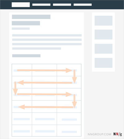
Every now and again, however, they randomly jump into one of the attributes and study it in detail, stubbornly and passionately. While doing so, however, there are often jumps back to the headers of the table to verify that they are still exploring the right plan.
2. Frequent Verification Of Table Headers
A typical problem that appears especially in complex pricing pages is the loss of orientation. Once users are in the middle of a pricing plan, they often refer back to the heading of the column to verify that they are exploring the right plan and review the plan’s price.
However, if headers aren’t visible, users tend to scroll up and down the page repeatedly, often losing focus while comparing. This is especially frustrating on mobile, where both the attributes and plans are often out of view, making any comparison within a table very challenging and tiring.
3. Sense Of Progression: From Left To Right
If you need to locate the free plan or the enterprise plan, where would you expect it to be on the pricing page? Indeed, the free plan is likely to be on the left, and the enterprise plan either in a separate tab or on the right. Indeed, in left-to-right interfaces, we intuitively assume that there is a sort of progression from simple basic plans to expensive enterprise plans from left to right.
“Standard” and “most popular” plans are, of course, expected somewhere in the center. For customizable features and add-ons arranged vertically, the default selection or recommended features are expected to appear first, with more features listed next, from least to more expensive.
4. Complete List Of Features Used As Reference
We might assume that customers often know which features are relevant to them, and in fact, that is going to be the case in many scenarios. But when it comes to complex products, all bets are off. Some features might sound familiar or important, but their description might be somewhat cryptic. Other features might be irrelevant at the moment, yet become helpful for some tasks in the near future. As it turns out, “relevance” might be very much a moving target: while some features are known to be important up front, and others are definitely not, some might be relevant, yet they need to be discovered first.
And with hundreds of features in front of us, we might have a hard time finding these possibly relevant features without going through the entire list first. That’s why having a detailed comparison view of all features across all plans is very much needed: at the very least to understand what exactly a particular plan entails. Some users see it as the ultimate reference, used to clarify all the fine details that go into a plan.
Although it is indeed valuable, at the first glance, it also is overwhelming, often requiring minutes of tireless interaction, with thousands of eye gazes along the way. Going from row to row is exhausting, but many users see it as a necessary part of the process. (As we will see later, a feature comparison has to be available on the page, but it doesn’t have to be the front and center of the pricing page design).
5. Multiple Comparison Scans
In usability testing, one can observe at least two comparison scans that users perform when comparing pricing plans. For the first scan, we try to assess the scope of the features at large and understand the differences between available options. Once it’s done, we try to navigate towards a plan that seems to be fitting our role or our scope best. Not a big surprise there.
But eventually, we return to the top of the feature comparison table yet again, focus on that plan that we’ve pre-selected earlier, and explore it line by line in a second, more focused comparison scan. With mouse users, sometimes you can even see the user’s mouse pointer eloquently moving within the column representing that plan, from top to bottom, and lingering there for a while.
While the first scan allows us to find a plausible plan, the second scan helps us verify that that plan is indeed a good fit across all major features — plus to make sure that we didn’t miss anything important so far.
6. Not All Features Are Equal
Chances are high that not every prospective customer will want to explore all available features. In testing, users will often jump between rows or entire sections to skip attributes that aren’t relevant to them. There surely will be some important key features that need to be displayed at all times, but there will be some secondary, less significant features as well. Many of these features will be relevant for some customers but not for everyone.
So finding a good way to break down those features into groups and display them upon request will probably be quite helpful in keeping the comparison relatively simple. Also, we could provide shortcuts by associating each plan with a particular user profile or a company to help customers quickly locate a plan that might be working best for them.
With these behavior patterns in mind, let’s explore some design patterns and features that might come in handy when incorporating all these details into a pricing page design.
Simple Prices, No Surprises
The design of a pricing page heavily depends on how complicated the pricing is in the first place. In some cases, we might not even need to reinvent the wheel as long as the pricing is quite straightforward. We just need to make sure customers understand the drill and the price for the offering.
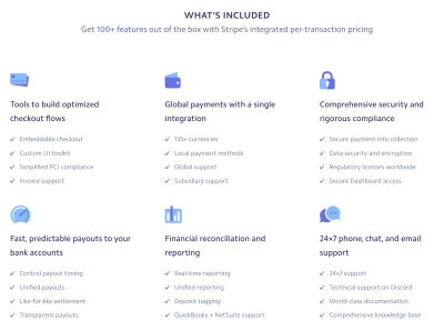
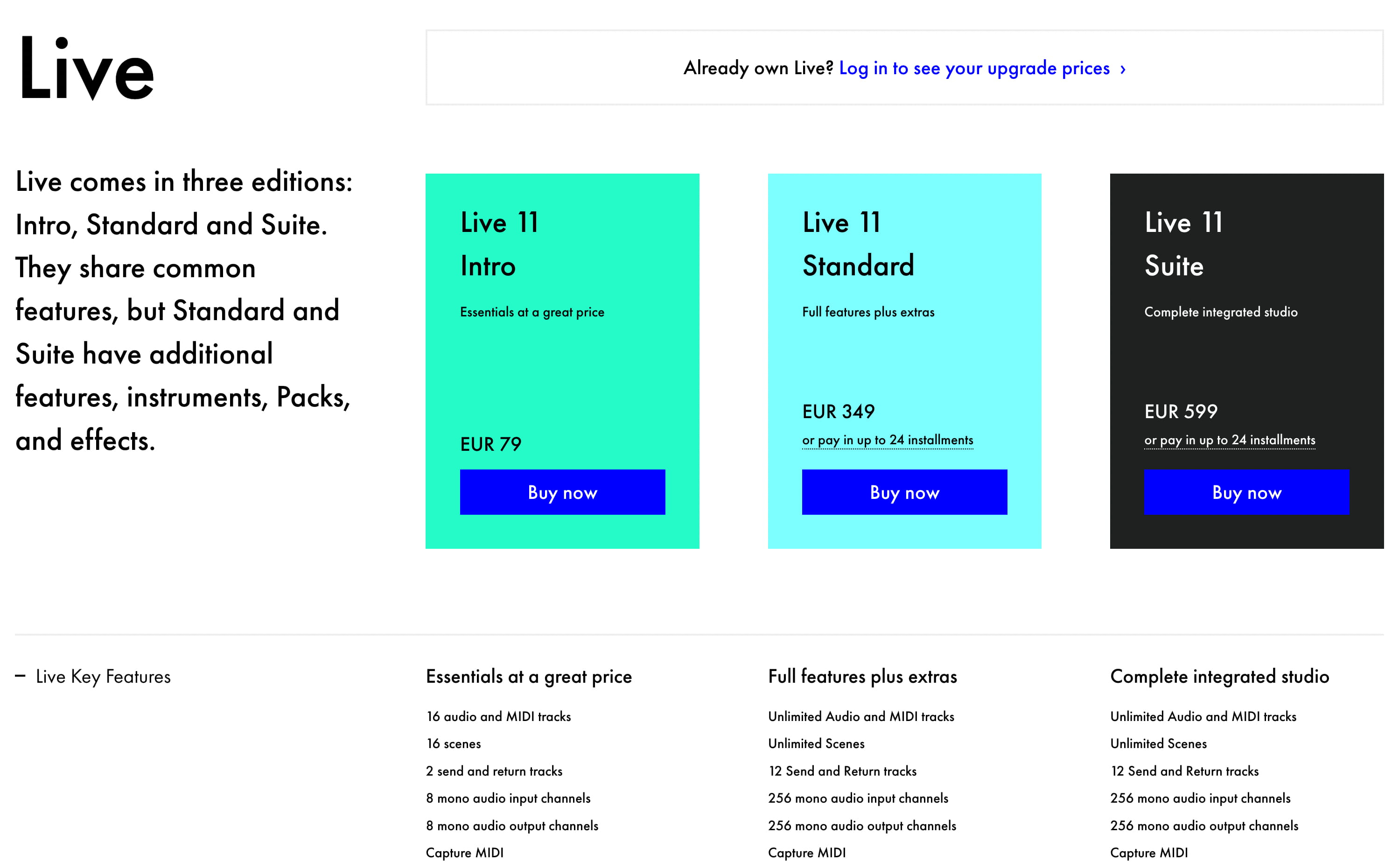
Stripe gets away with a simple pricing for everyone except for large customers. All features are highlighted, but further down the page, along with testimonials, existing customers, integration options, and FAQ. If you have a simple pricing, that’s a reference example to keep close.
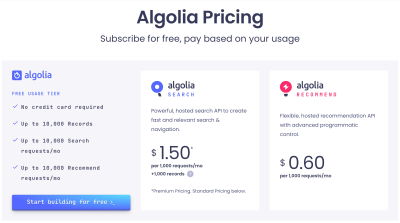
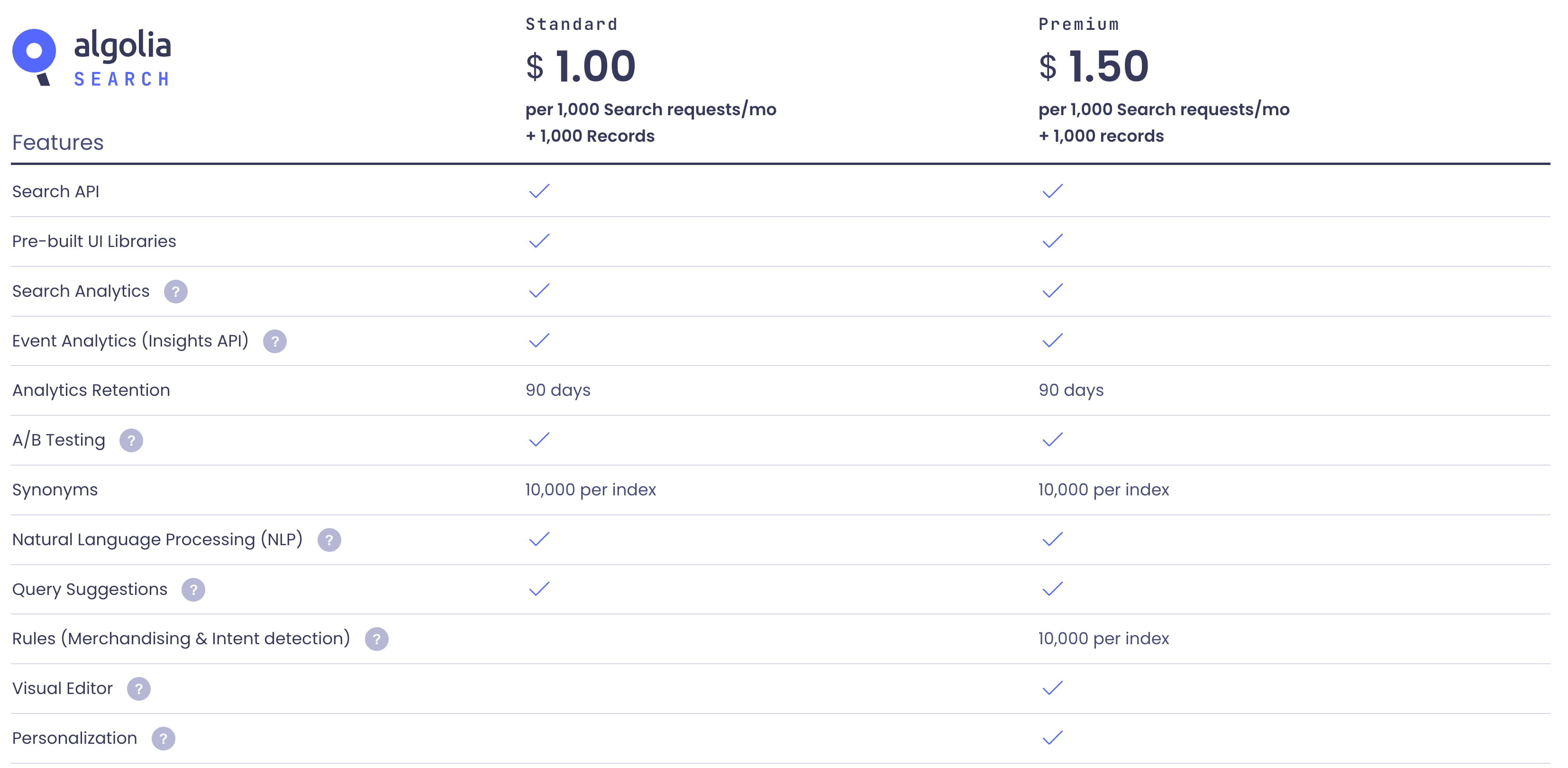
Algolia follows a similar approach. Rather than highlighting every individual feature at the top, the feature matrix is placed further down the page, with the enterprise option only visible closer to the footer of the page. There are also add-ons, further plans, and FAQ featured there.
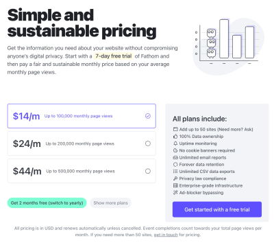
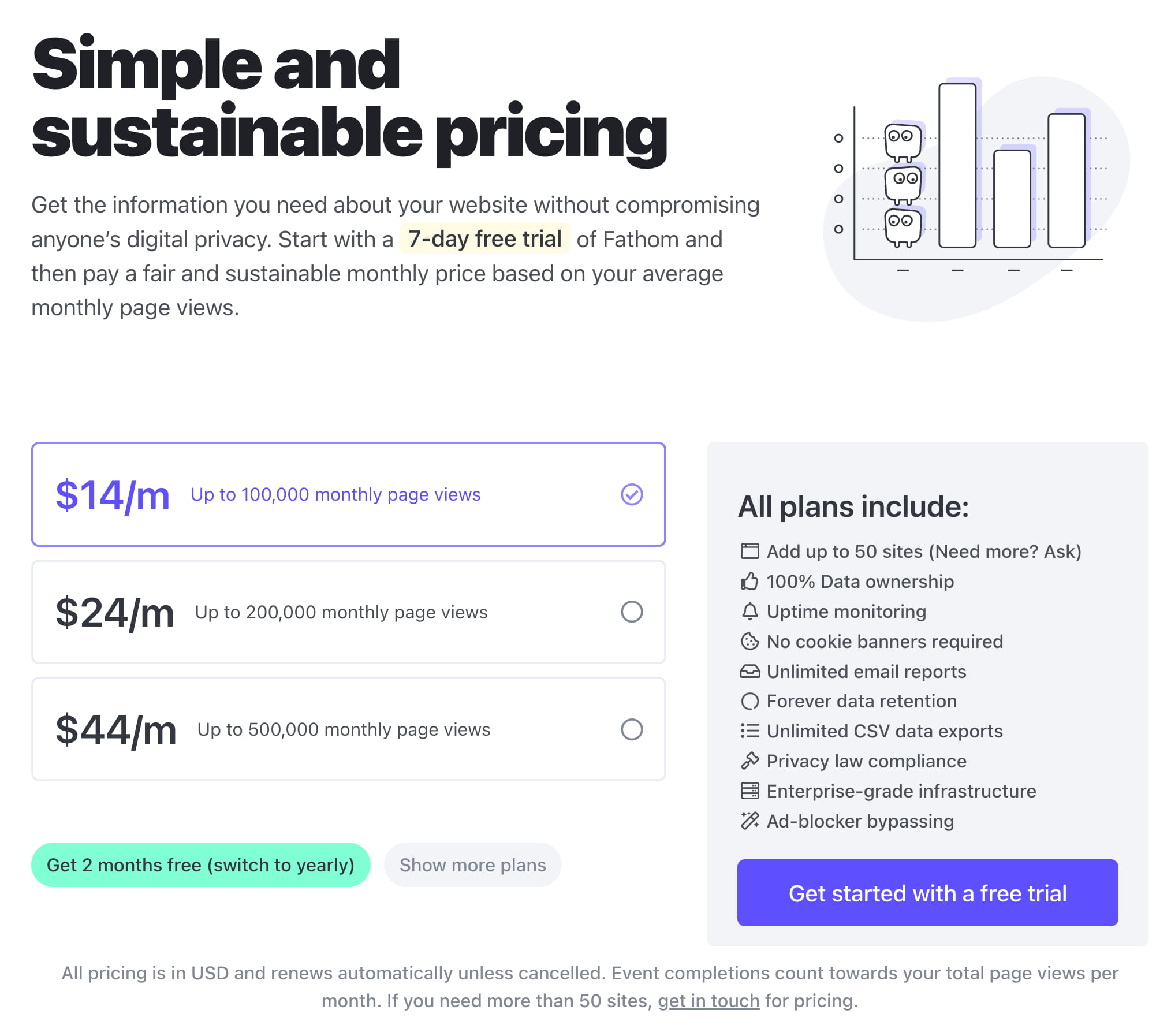
Fathom Analytics changes the pricing based on a single attribute: the number of monthly page views. Rather than displaying features for each plan, all features are listed separately in the right column, while the pricing options are displayed on the left. Also, notice the call to action “Get started with a free trial,” and an option to get 2 months free by switching to the yearly payment. Simple.
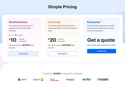
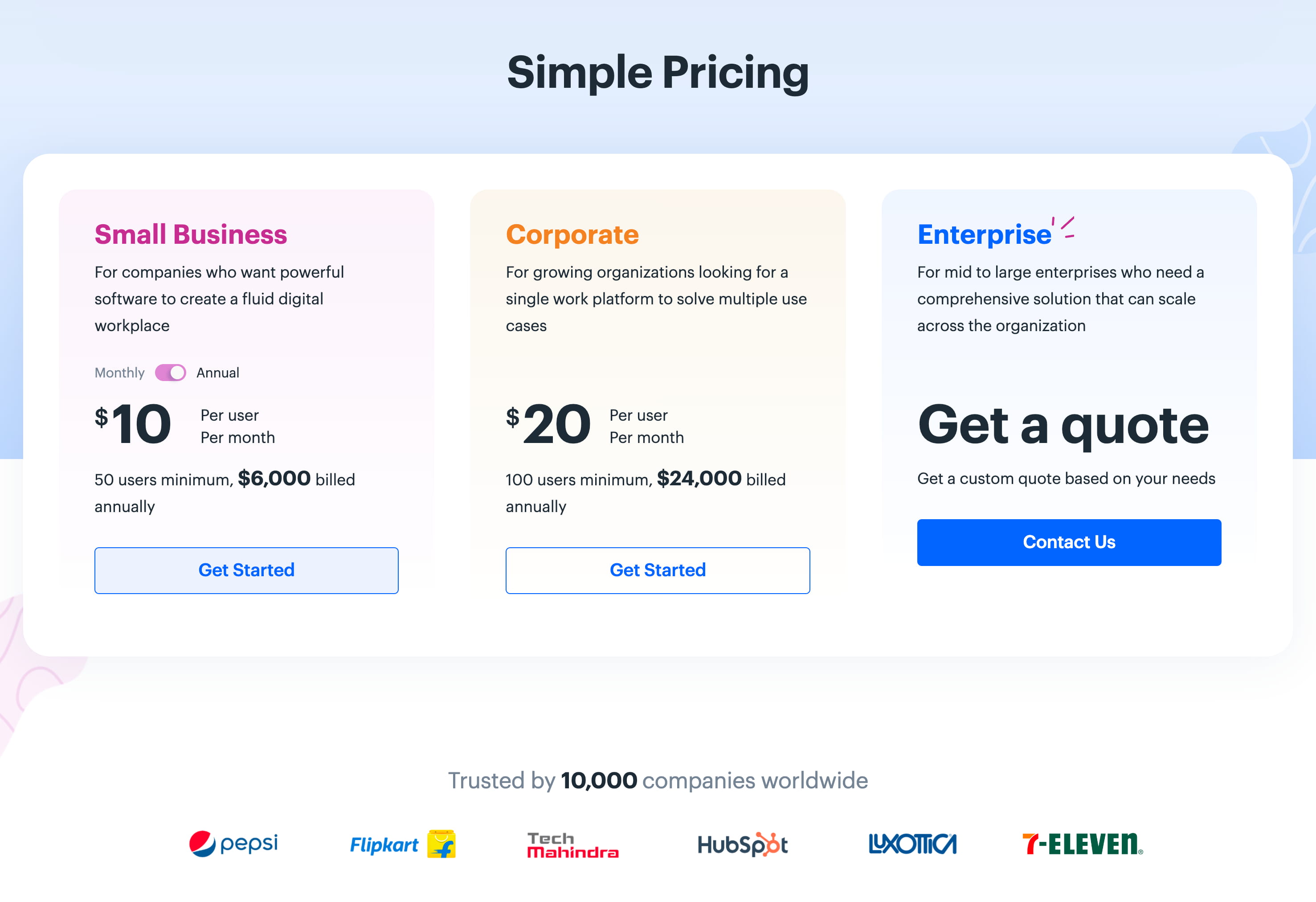
Kissflow doesn’t include a feature comparison matrix; nor are there any lengthy essays about available features or existing customers. Just three simple options with calls to action. While it might be enough for some companies, it might not be enough for others.
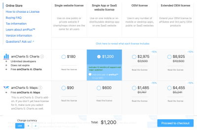
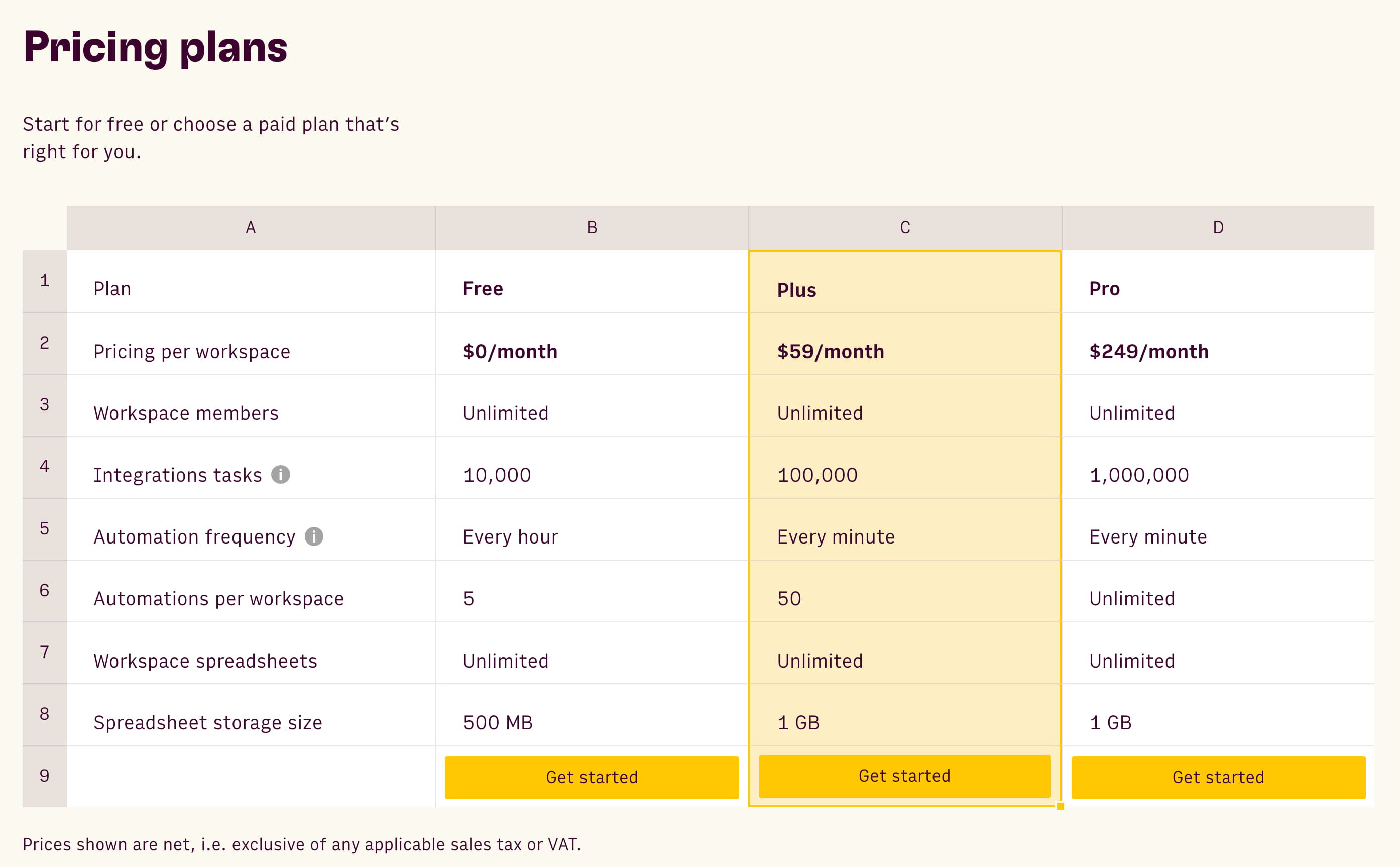
Sometimes pricing plans are slightly more nuanced and complicated. amCharts features 4 different kinds of licenses available for every individual product. The pricing is displayed in a matrix, similar to the pattern we often see when booking flights, trains, or cinema tickets. Overall, we see a similar amount of options here, but they are displayed right away, while in the examples above, extended pricing options are hidden and revealed only once a user contacts customer support.
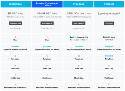
For comparison, HelloSign’s pricing page appears to be quite complicated, mostly due to plenty of cells all appearing as standalone blocks. Every attribute is repeated multiple times, making the pricing plans slightly more difficult to scan. Showing attributes separately in one column with checkmarks in each column might be a good idea here.
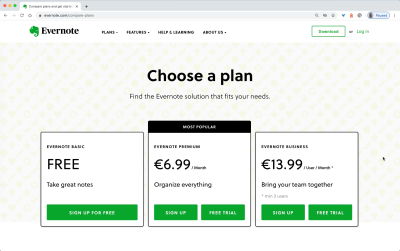
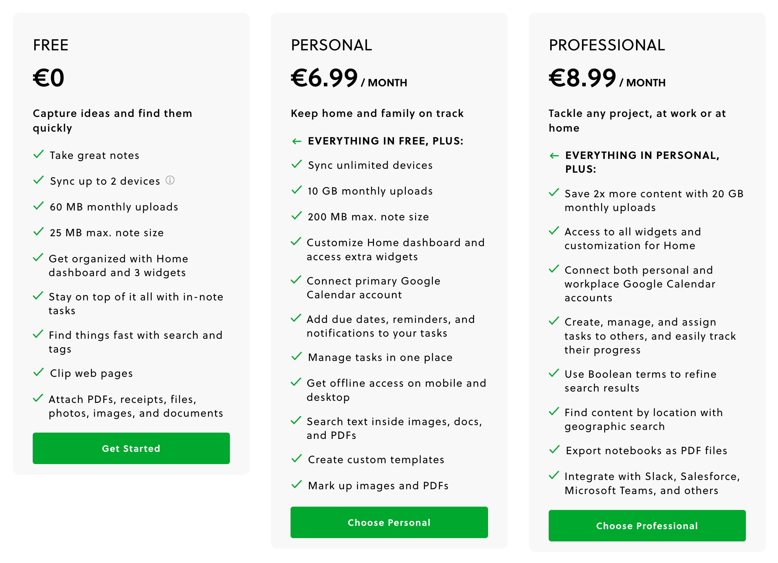
However, it’s important to show enough details to make it clear to customers what the differences between plans are. For a while, Evernote was just displaying the plans within a table but not explaining the difference between them. Also, it might not be very obvious how “Sign up” and “Free trial” differ. That’s slightly confusing and oversimplified.
Simple pricing definitely helps, but sometimes it might not be an option. For such cases, let’s explore how to turn some of the pricing plans above into slightly more scannable and digestible alternatives.
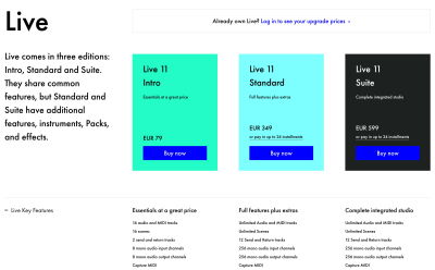
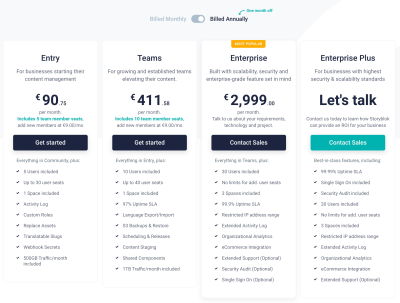
The Obvious: The Pricing Table
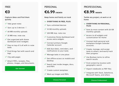
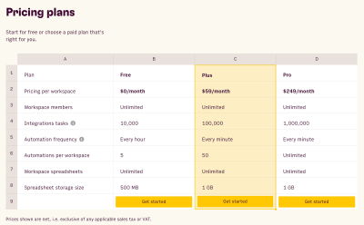
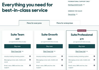
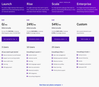
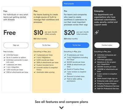
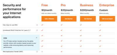
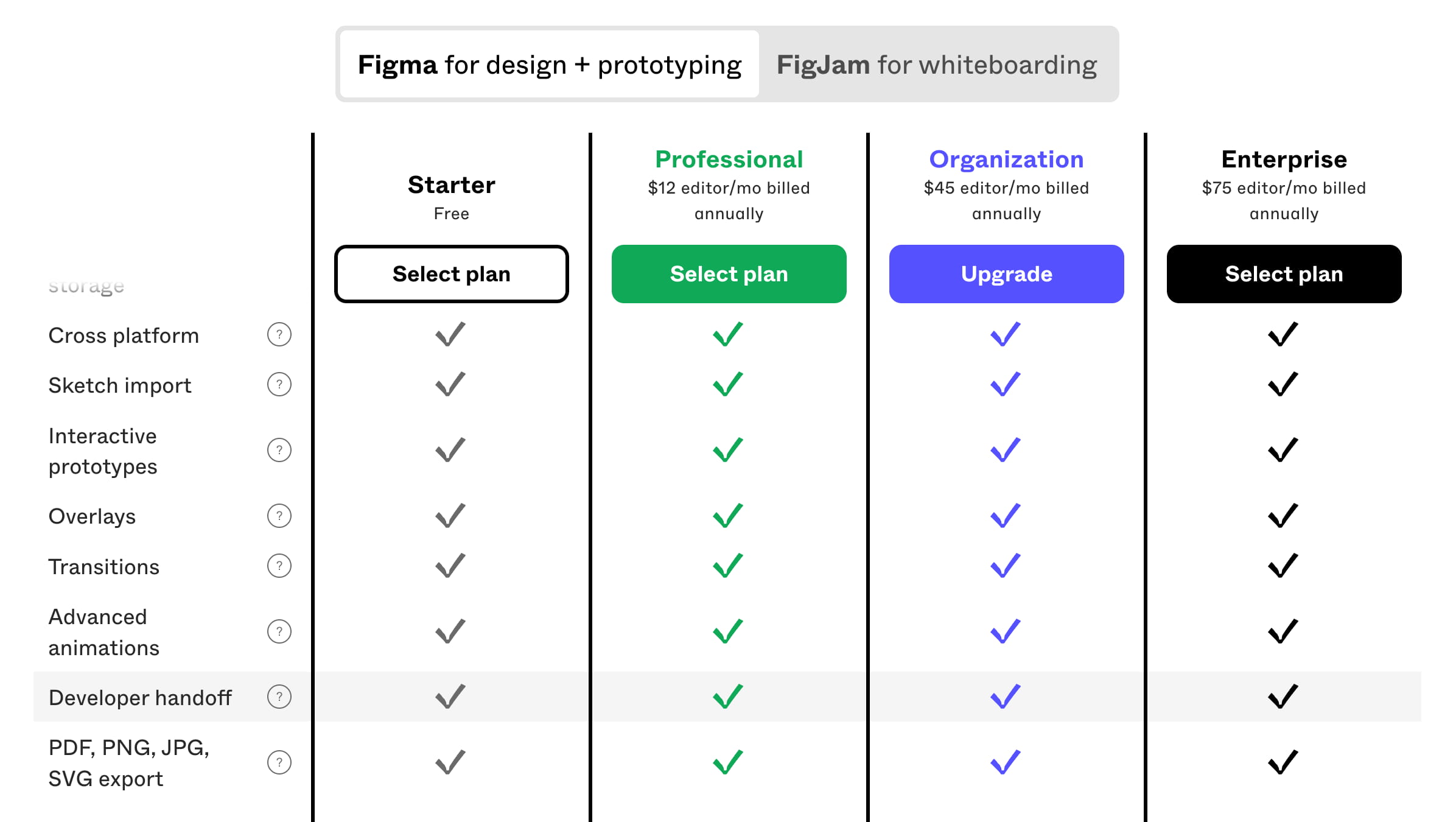
Not much should surprise us about the design of pricing plans on a pricing page. Surely we’ll present them as columns side-by-side, with the main features presented for all plans and a call-to-action in-between. Also, at the top of the pricing table, we usually will find a toggle between the monthly and annual pricing and sometimes a currency selector.
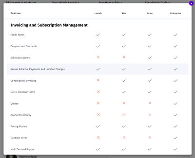
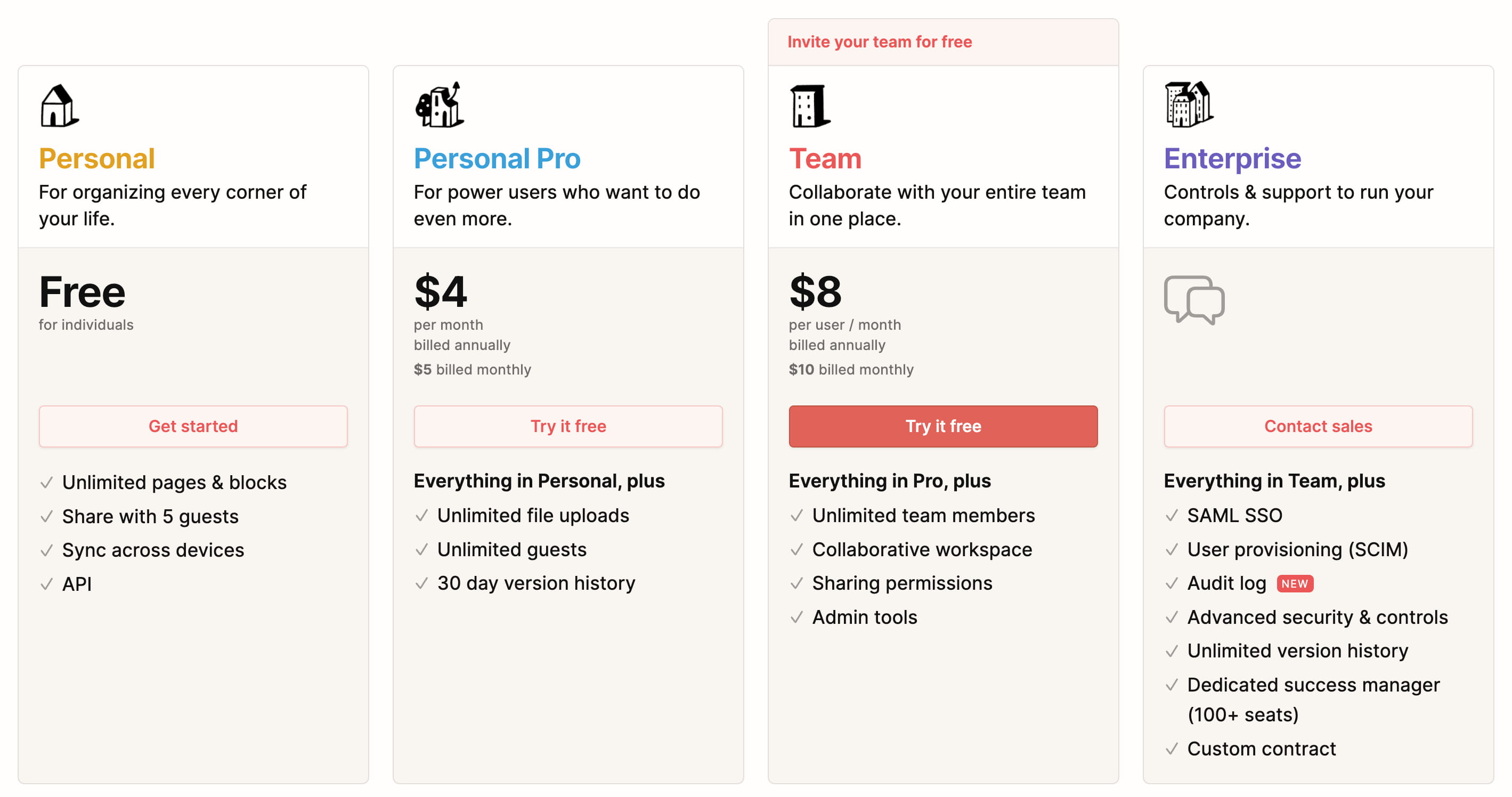
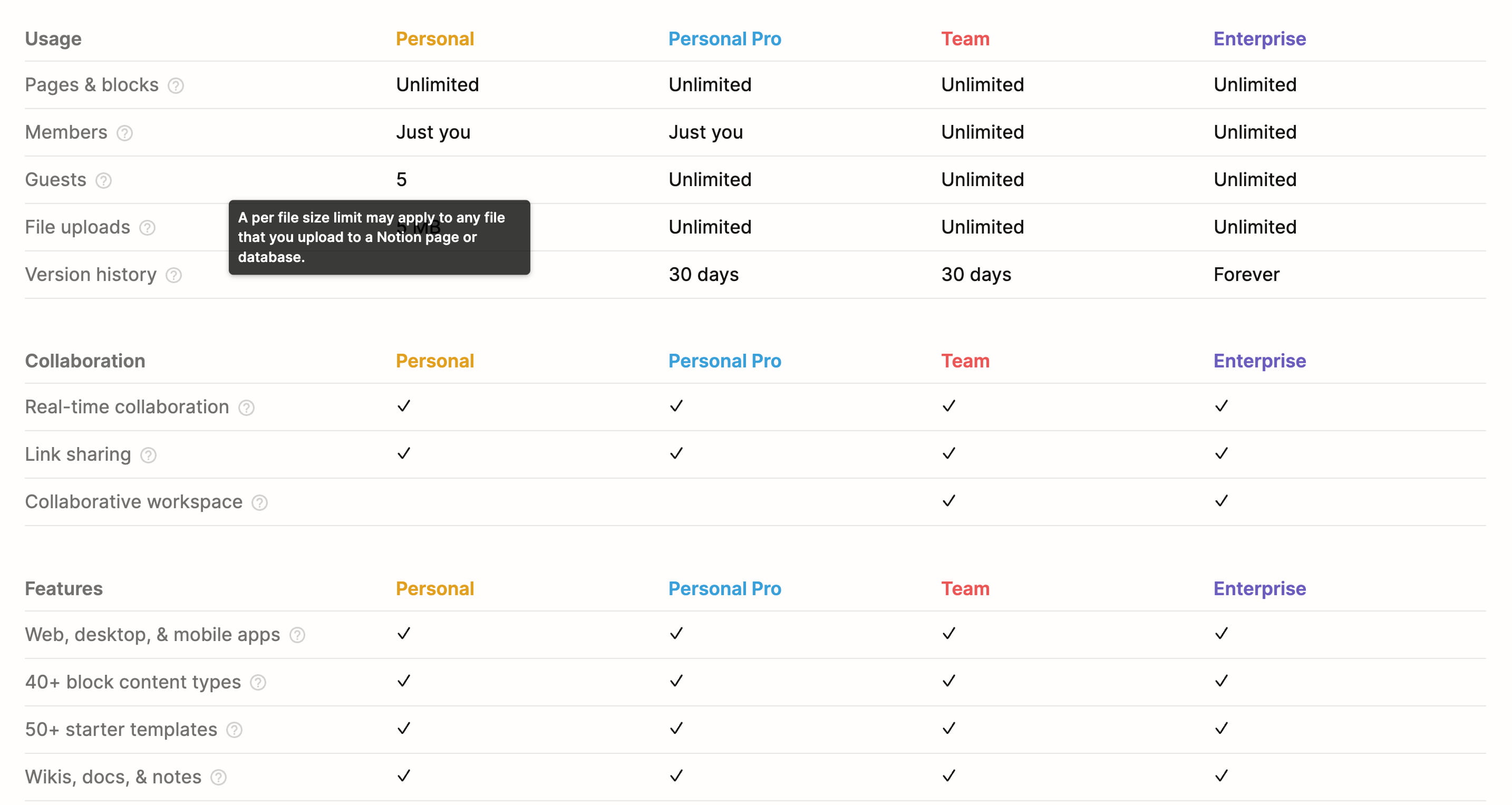
Notion pricing page is a great example of it, albeit a little bit different. All pricing plans are billed annually by default, with an option to switch to a monthly payment when signing up. Each plan explains the role for which it’s been created as long as the features of that plan. As we move from left to right, we keep adding more features.

A comprehensive feature comparison matrix is displayed further down the page, with headings repeating for each new section and with tooltips that users can interact with to learn more details about every individual feature.
On Rows, pricing plans are beautifully presented within a spreadsheet, making it feel like a regular sheet that customers might use on their own when making their calculations. On mobile, each column becomes a standalone card, appearing one under another.
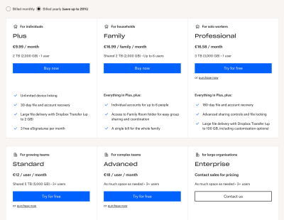
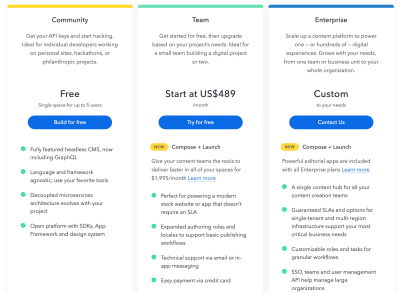
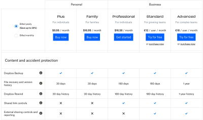
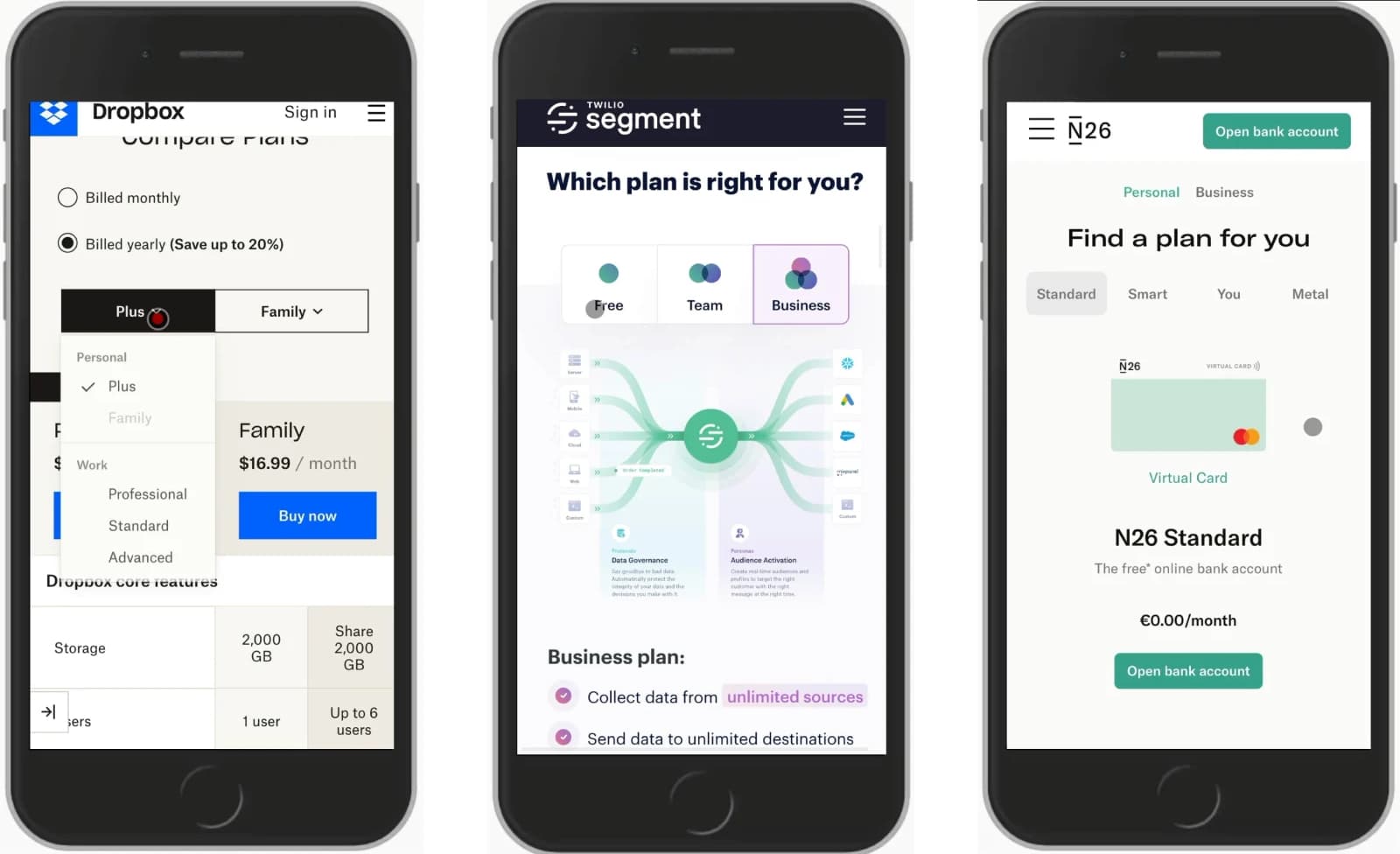
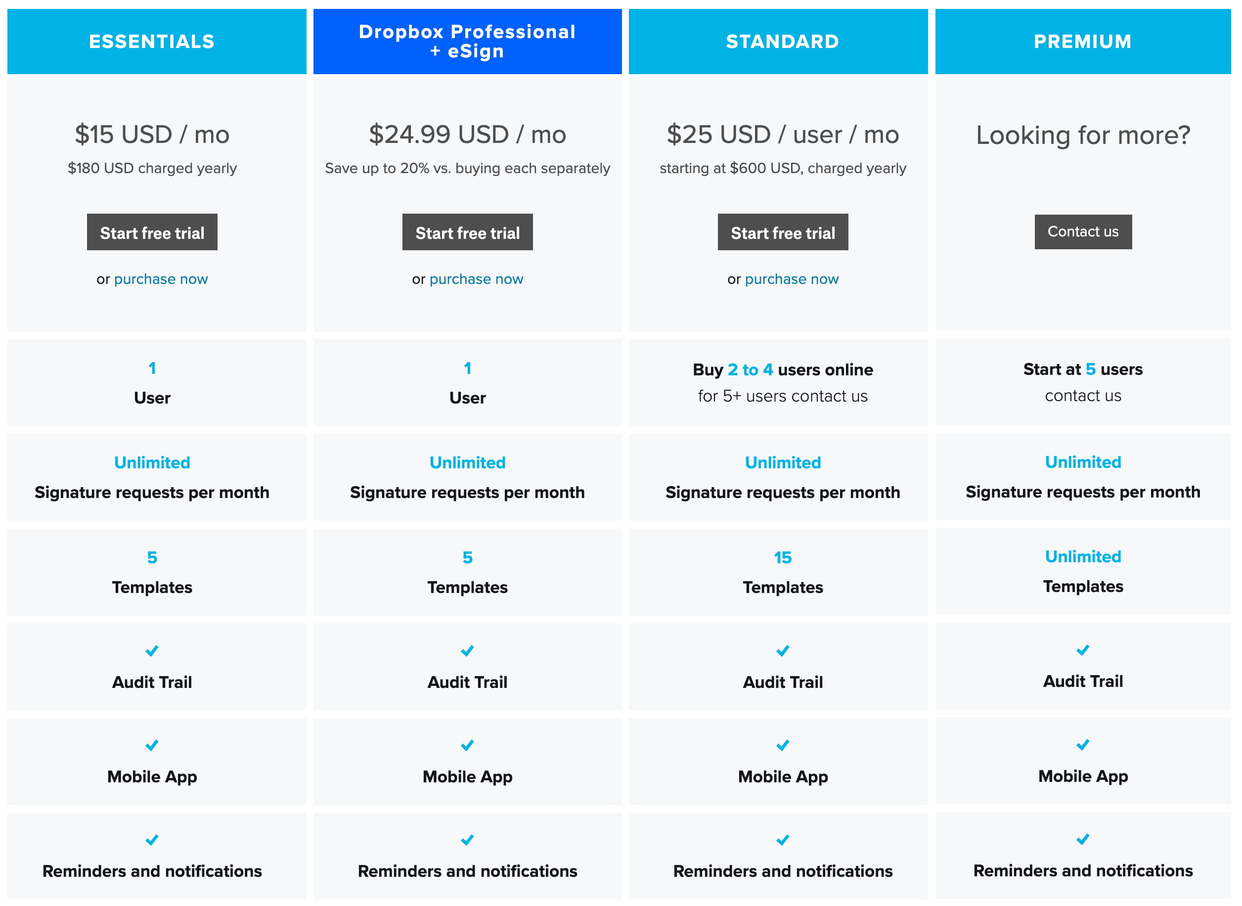
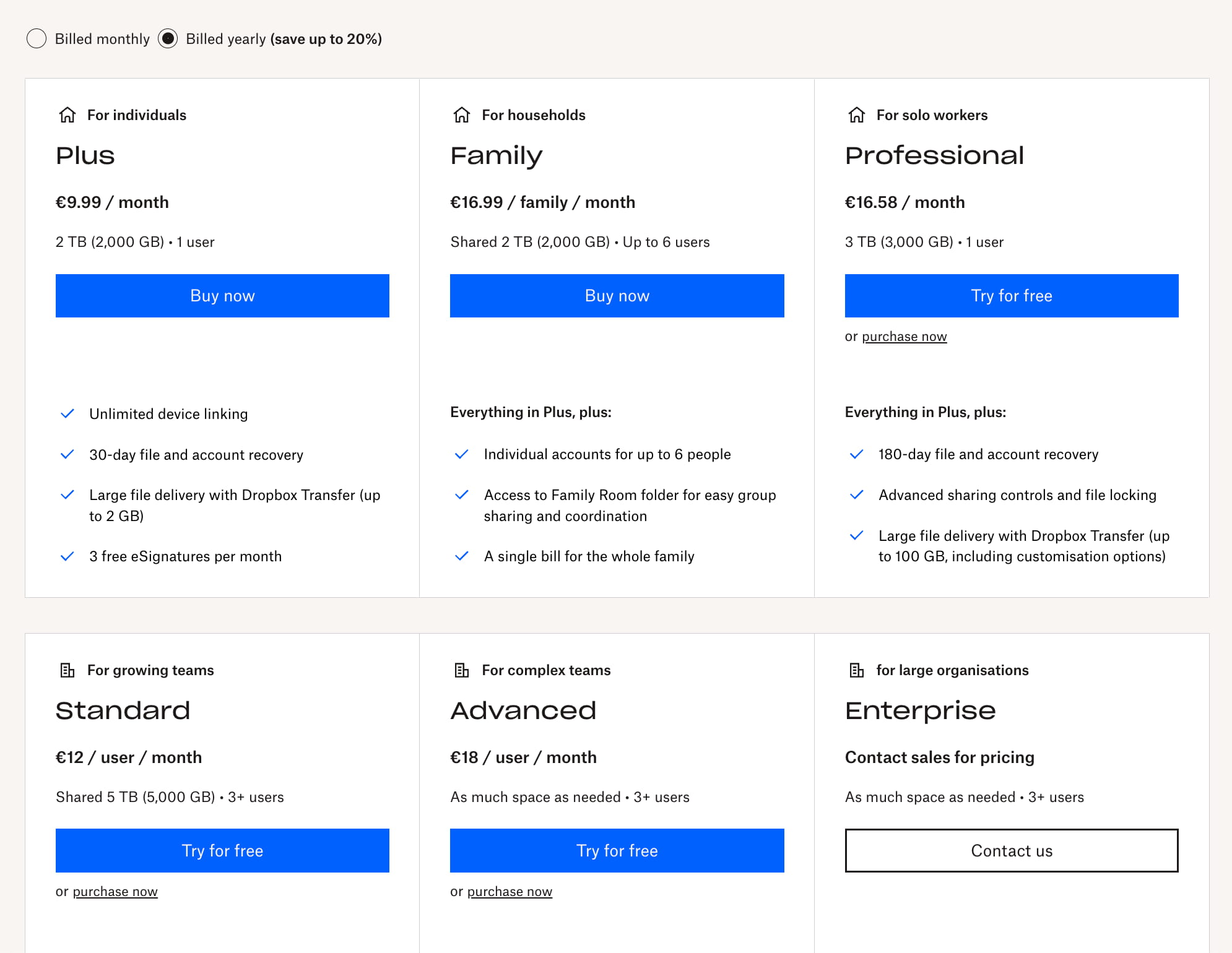
Sometimes all plans wouldn’t fit comfortably in one single row. For their six pricing plans, Dropbox wraps them all onto two separate rows. It definitely is a better idea than showing all plans in a condensed 6-column view. Rather than requiring a checkout, customers can also try out some plans for free.
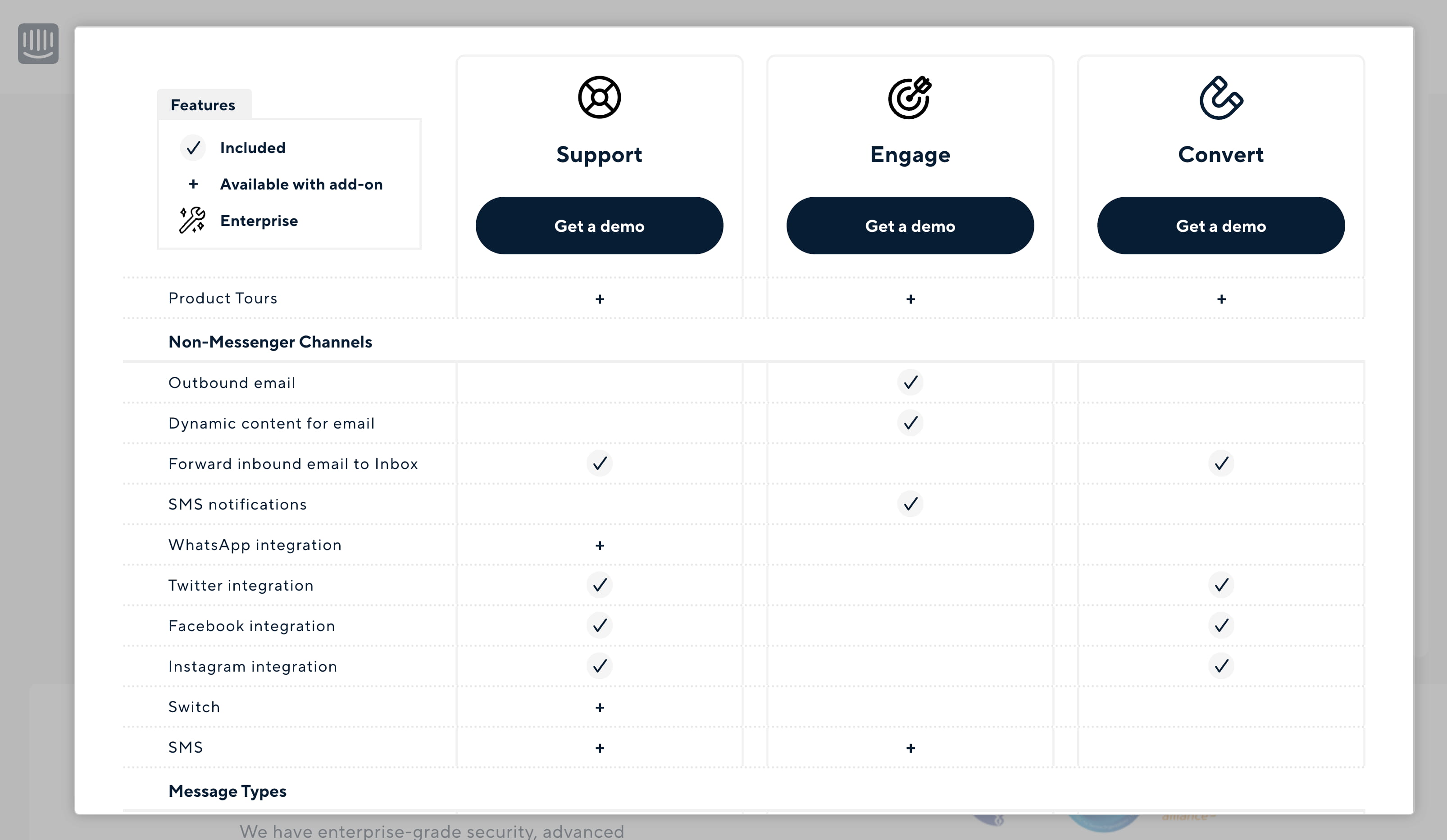
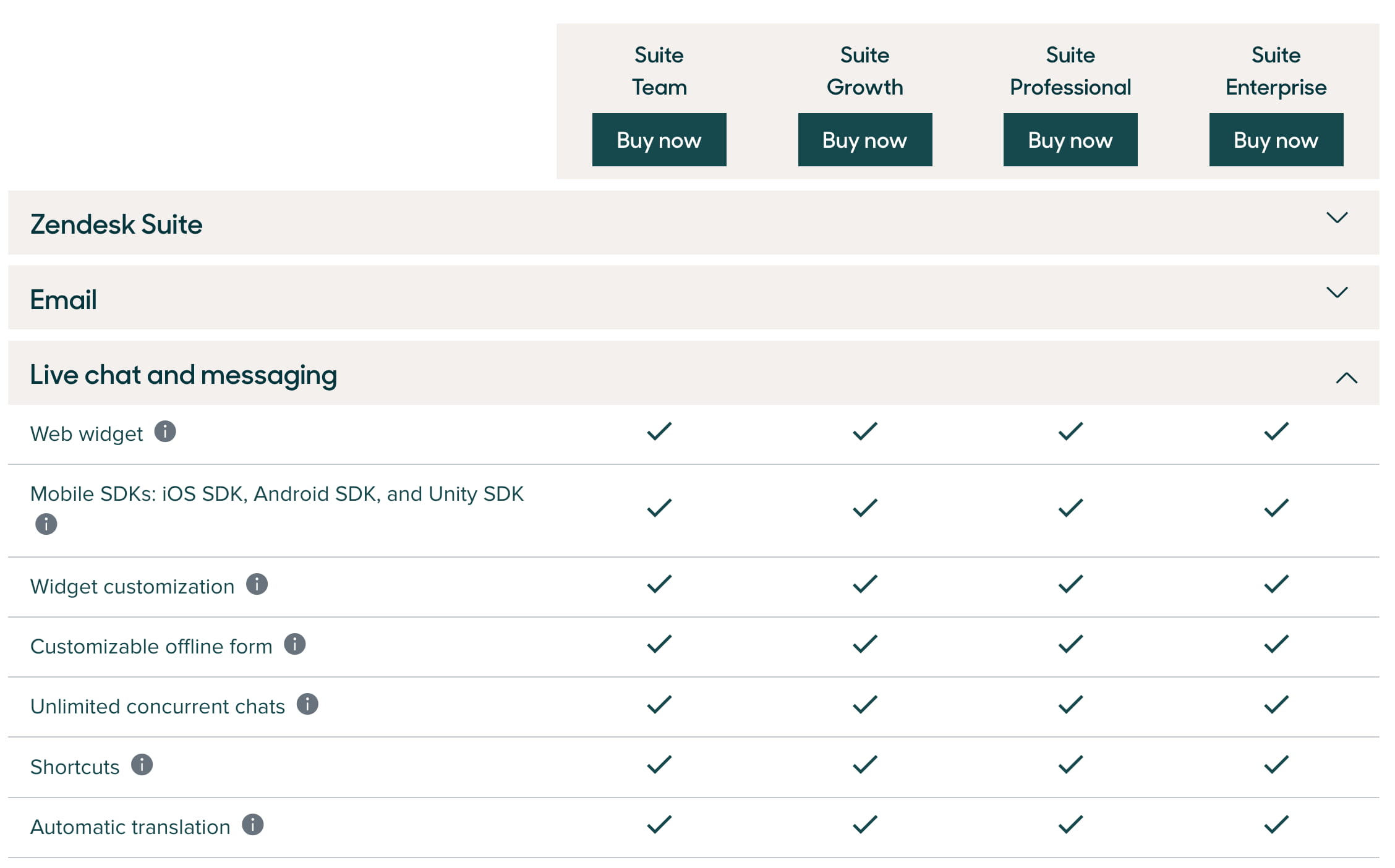
Zendesk groups their plans into tabs. Not all plans are displayed at all times, and users are encouraged to specify what is it they are after first: individual plans or enterprise plans. There is also a dedicated comparison view to compare all 4 plans at once.
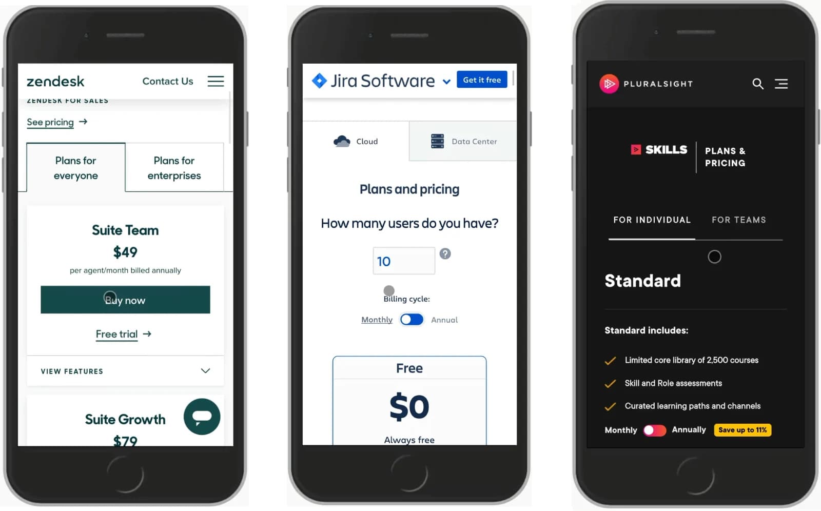
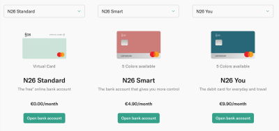
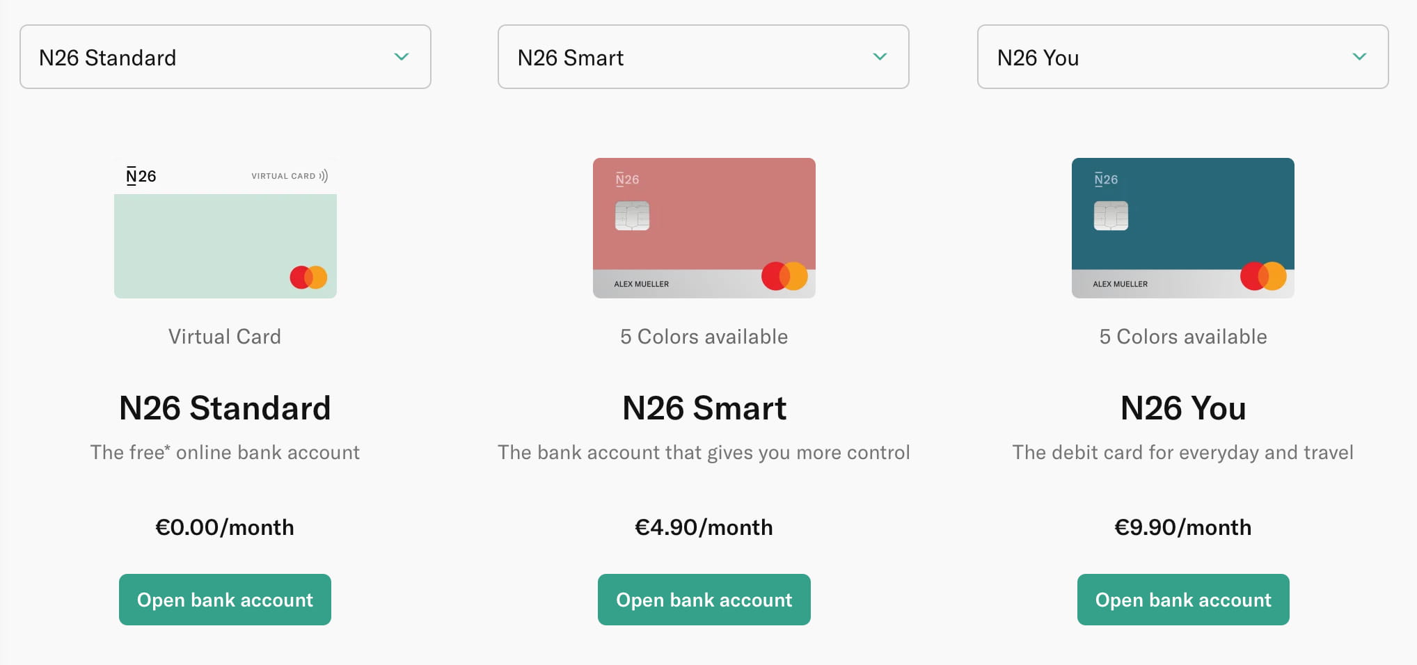
An alternative way to display plans is to allow users to choose which plans appear to be most relevant to them. N26 displays a drop-down menu — which allows users to choose which plans they’d like to study side-by-side. Depending on user’s screen, customers can compare up to 3 plans at once.
Once you have more than a handful of plans to display, you can explore the option of grouping them into tabs, showing a few options in dropdowns, or wrapping them across multiple lines. What wouldn’t work well though, is squeezing all plans into one single space in a table, hence making users scroll the table horizontally. Usually, it’s a very good idea to avoid this experience at all costs.
Focus On Key Features
As we keep designing and building and releasing all these wonderful features in our products, it might seem tempting for us to highlight all of them in our pricing plans. However, that’s usually the reason why pricing plans start appearing a bit too complicated, and require significant effort to figure out. An alternative approach is to focus on key features first, and display all the other features only if requested.
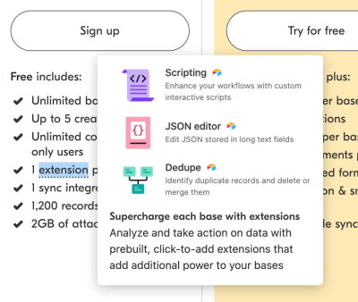
On Contentful, the pricing page doesn’t set focus on a lengthy feature comparison table; instead, the three main plans are highlighted at the top of the page, with just a few key distinguished features. The fully-fledged feature list is also available, but further down the page, rather than being the front and center of the experience. That’s simpler and better.
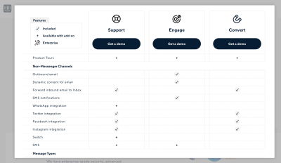
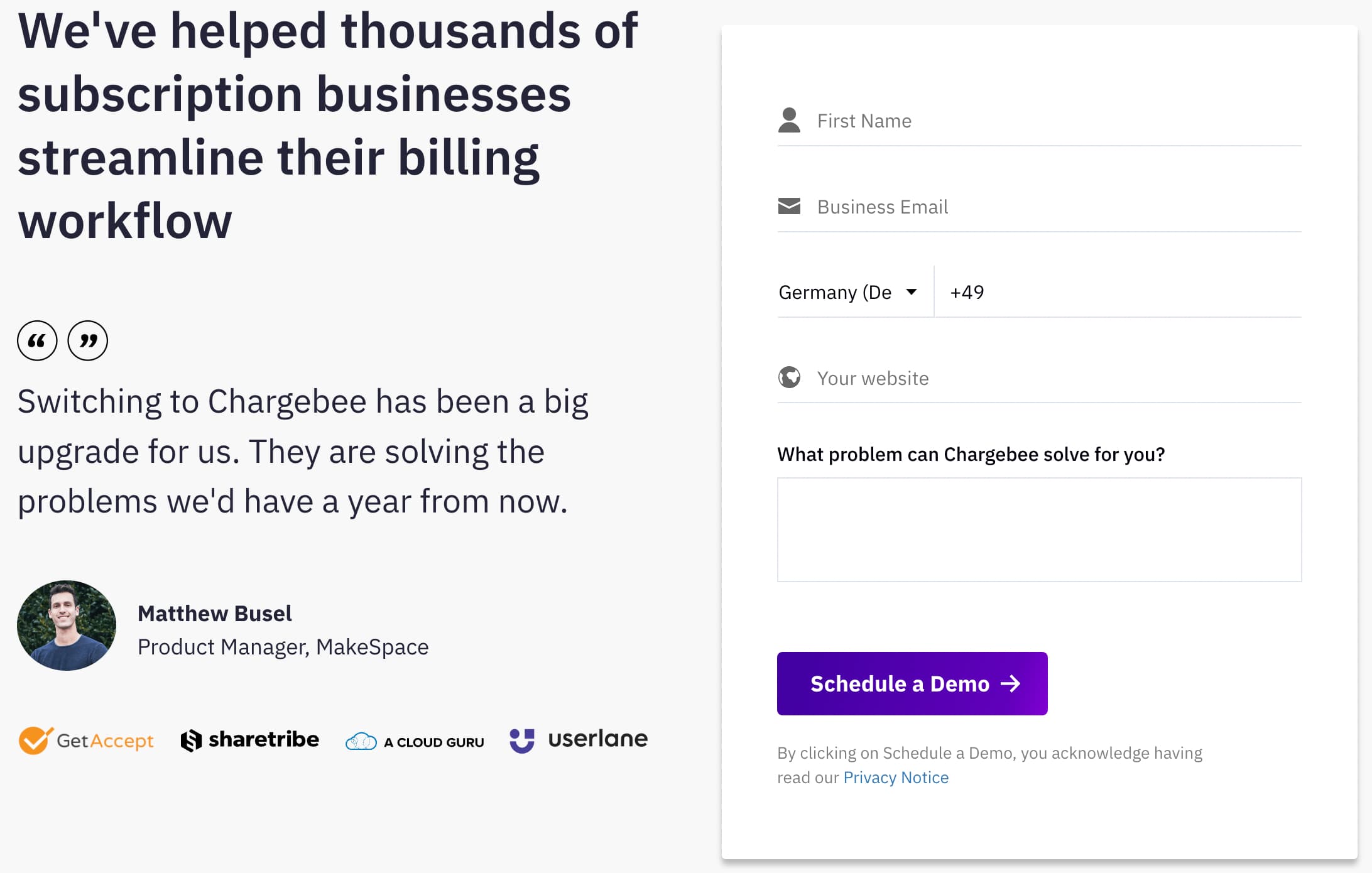
Chargebee does highlight plenty of features of each plan, but a full comparison table appears only if the user actually chooses to see how the plans compare. On click, a modal window opens with all options lined out in a table.
Airtable shows a few more features in a dense, compact view. With a bit of color-coding, each plan is highlighted slightly differently with a different background color. Notice that all prices, calls to action, and lists of features are aligned, so scanning the table is relatively easy. The list of all features and a plan comparison appear further down the page.
More color-coding plans on Codepen. As users scan the features matrix, they can always rely not only on the position of the column but also on the visual clues to understand what plans they are exploring at the moment.

In general, it’s worth testing just how necessary a large list of all features is, and whether a pricing page design would work better by showing only a handful of distinguishable key features instead. We could start with a design containing just a few items in the list, and add more once we know that the differences between the plans aren’t clear enough for our prspect customers.
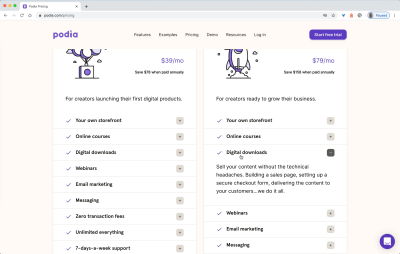
Show Differences Within Rows
In many examples above, features from one plan are fully included in the list of features from a higher-tier plan, but sometimes it’s not the case. You might have differences in charging fees or slightly different limitations depending on the select plan. In that case, you can follow Podia’s example and hide unavailable features. While the contrast could be increased quite a bit, it makes it easy to compare each plan by scanning each row individually.
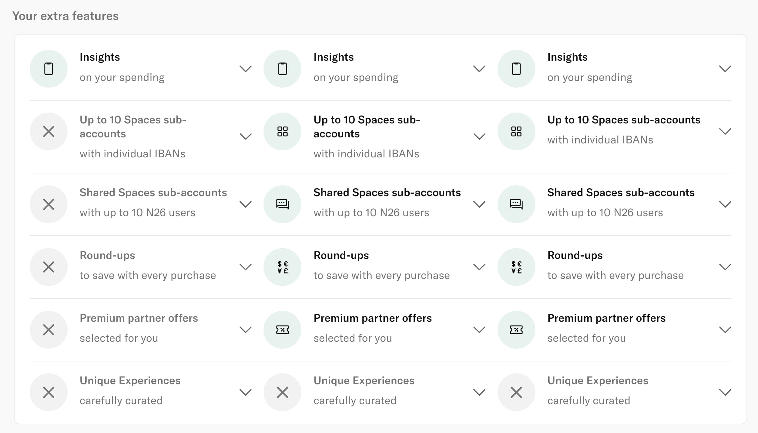
N26 follows suit by highlighting both available and unavailable options in the same row. Each row can be expanded with a click on one of the chevrons and provides more details about each feature.

Dovetailapp explains differences by highlighting the availability of features rather than the lack thereof. It makes the feature comparison matrix slightly easier to scan.
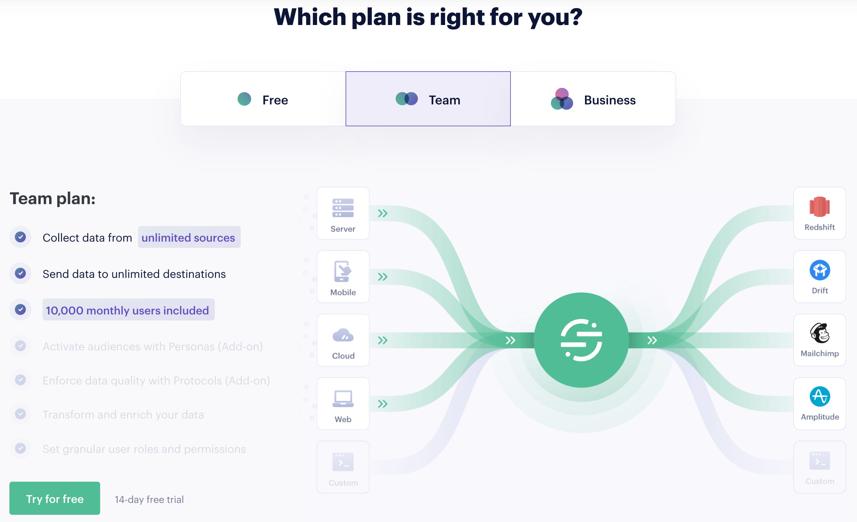
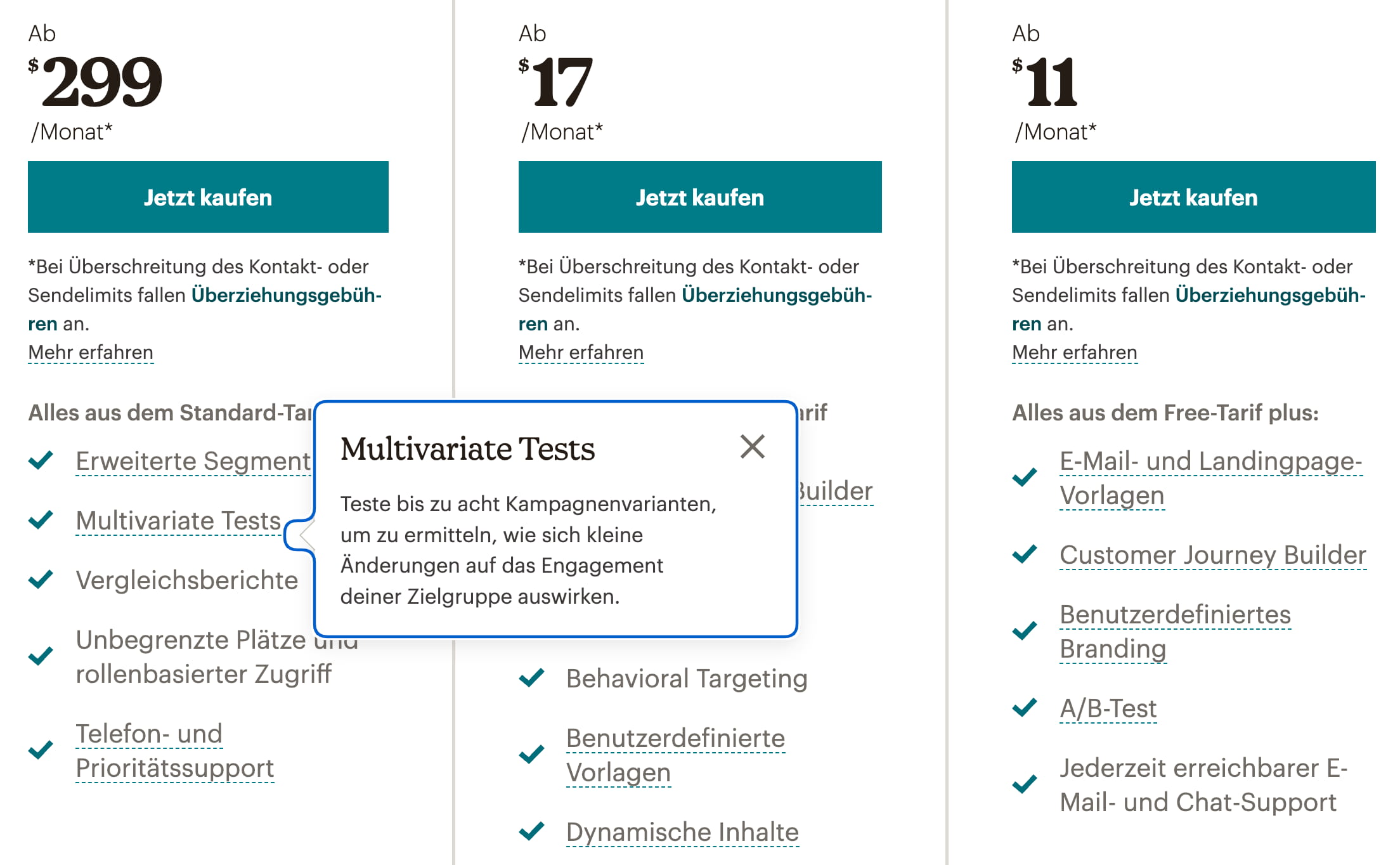
When pricing plans are slightly more nuanced, with significant differences between various tiers, we can show all key features across all columns and highlight in which plan they are available. More details about each feature could appear within an accordion, rather than within tooltips. But we could also build up on top of these ideas, by explaining differences visually.
Explain Differences Visually
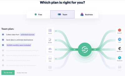
Alternatively to a comparison matrix, we could try to visualize differences between plans within tabs, with a few animations that would explain a particular plan. Twilio Segment does just that. As users switch between tabs, the list of features is updated. This isn’t quite a side-by-side comparison, but it might be good enough to visualize how plans differ.
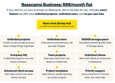
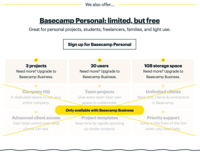
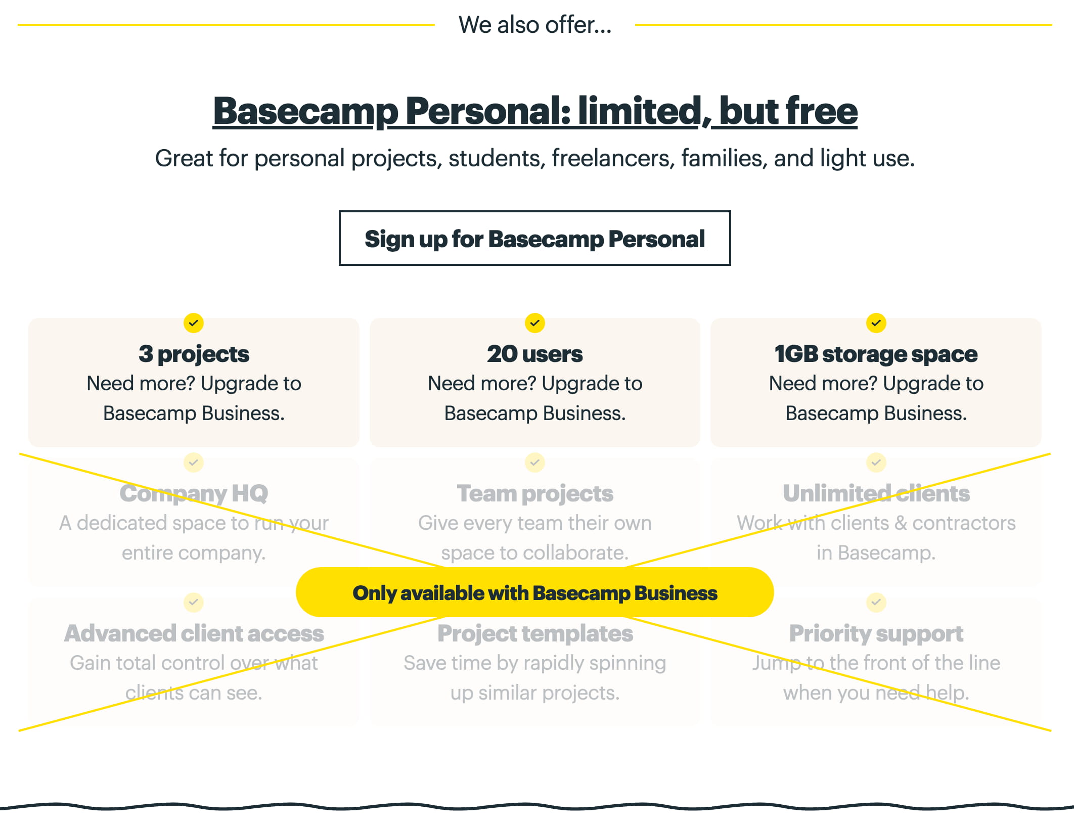
Basecamp takes a similar approach by highlighting the main “business” plan but also explaining how the personal plan is different: it just doesn’t have some features that the main plan does. We can illustrate it by literally crossing out the features that are missing in that plan.
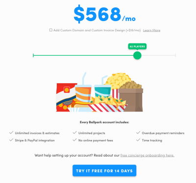
Ballpark visualizes the pricing plan by building up a ballpark bundle with a slider. It also explains all features that go along with the plan, and there is an option to use a free concierge onboarding as well.
The examples featured above have one detail in common: they don’t include a table, but rather choose a slightly different, more simplified, way to highlight how the pricing plans differ. As we will see later, that’s usually a very good approach to avoid complexity that we usually get with feature comparison matrices.
Allow Users To See Only Differences And Only Similarities
Rather than showing the entire feature comparison matrix for complex plans, we could help customers make sense of the differences between the products by highlighting these differences immediately.
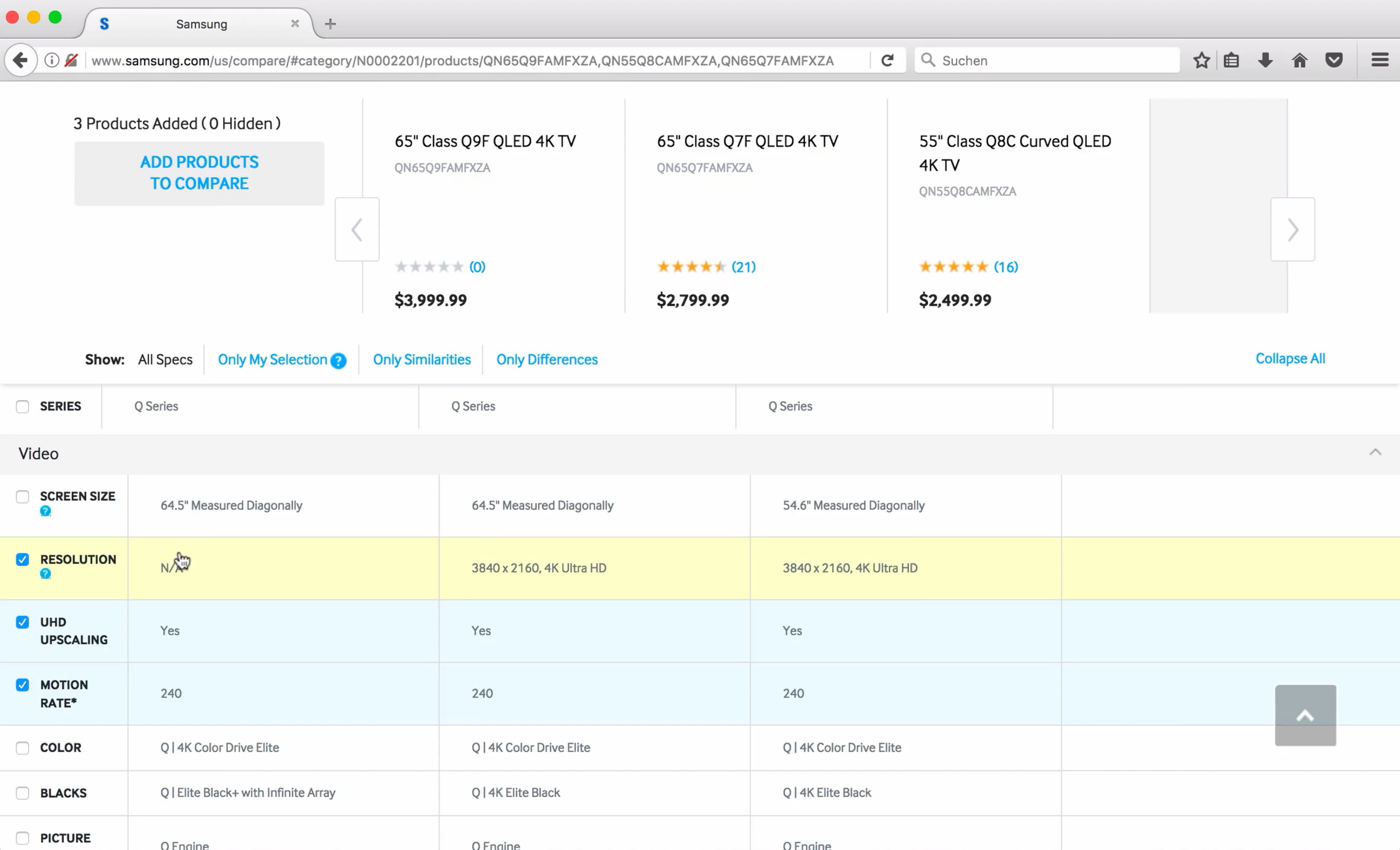
Samsung’s comparison page of course isn’t a pricing page, but as a part of a feature comparison matrix, it allows users to select features that they are interested in, as well as show differences and similarities of each option. Also, users can collapse entire groups of features, should they wish to do so.

It’s probably obvious why we’d want to show the differences between plans to our customers, but why would we want to show similarities only? As it turns out, users often tend to choose a slightly more expensive plan, although they know that they won’t need all the features in that plan. What they are looking for next is the closest cheaper plan that is good enough as it covers most of the features available in a more expensive plan. For that reason, they might want to compare by showing only similarities to ensure that one plan is close enough compared to another.
Use Sticky Headers
Since users often rely on table headers to verify that they are studying the right pricing plan, we can help them keep the headers in view at all times. We do so by making headers floating as users start scrolling down the page in a comparison table. Contentful’s pricing page does just that. Both the title and the call to action are floating on top of the feature comparison matrix.

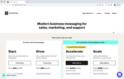
Intercom highlights all features in a modal window, with the pricing plans floating as users scroll the table and explore their options.
Additionally, to the titles of each pricing plans and calls to action, Dropbox keeps the actual pricing points and a yearly/monthly payment toggle floating on the top of the page as well.
Figma also sticks to floating bars. Additionally to pricing and calls to action, there are also tabs at the top, allowing users to switch between offered tools.

As we saw ealerier, sticky headers always provide a much needed reference of what exactly customers are exploring at a given time. They do take a bit of space, but the comfort users get from comparing things without having to scroll up and down repeatedly is very much worth it.
Group Attributes As Collapsible Sections
In the Contentful example above, we’ve seen that all features are not only grouped but also entire groups of features can be collapsed and opened at once. In fact, due to the sheer amount of available features, the option to skip some less important sections can significantly aid in navigation. Just like with regular cards, we make the entire bar act as an expander, so customers can skip over entire groups of features easily.
On Zendesk, all features are grouped and packaged into accordions that can be open and collapsed at once. This allows for a faster scan of categories and makes the full list of features slightly more manageable.

On Ableton, all attributes are also grouped into accordions. Instead of using a chevron on the right, the + icon is used on the left. A click on any of the items opens a card for the entire row.
So, for tables on desktop, we group features into accordions, allow users to collapse them, and keep plans floating as users explore the table. Additionally, we keep features such as currency selection, monthly/annual pricing, and showing differences or similarities on the top of the table as well. This should give us a good starting point for our pricing page. But hold on, how do we now translate it all to mobile?
Comparison Matrix On Mobile
Unfortunately, feature comparison tables just don’t translate well to narrow screens at all. Once there are a few dozens of feautures to display and, let’s say, at least 3 pricing plans, we need to provide some sort of navigation within the table. Usually, this ends up with a horizontal scroll within the table, which tends to be slow, problematic, and tiring.
If you have a relatively simple product, perhaps with just under 20 features, you might not need a feature comparison matrix at all — Canva avoids it on mobile and uses accordions instead, while on desktop, the comparison table does make its appearance.
Comparing within a table with horizontal scroll is rarely a fun experience. On Contentful and on Hotjar, neither the attributes nor the corresponding pricing plan are obvious once you dive deep into the comparison matrix. Surely customers can scroll horizontally, yet this adds friction to the comparison.

As it turns out, we might not need to display the table at all. In fact, displaying any kind of complex tables on mobile is rarely a good idea, and there are a few other options that we could explore.
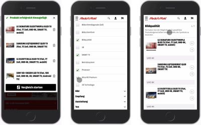
One of them is provided by Mediamarkt. Instead of displaying a feature comparison table, we ask users what features they are interested in, or perhaps what role would apply best for them, and then display each feature as a separate step. In each step, we explain the differences between plans for each feature — rather than showing a table which would leave it to the user to make the comparison on their own.
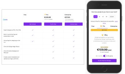
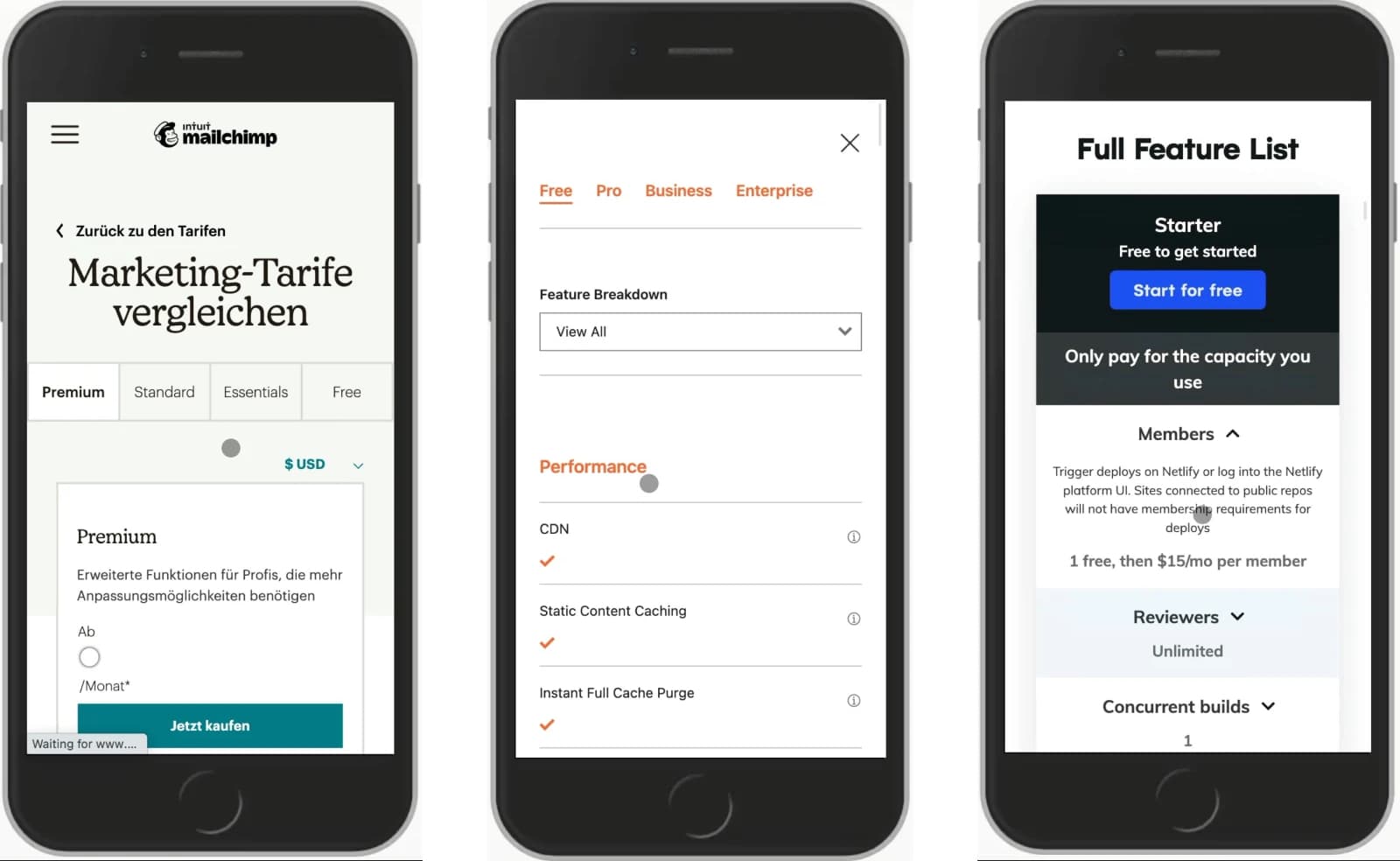
Another option is to use floating tabs, following the example of Mailchimp, Cloudflare and Canva. On mobile, all pricing plans appear as sticky tabs on the top of the screen. As users scroll through features, they can flick through tabs to compare values.
It might be a good idea to move the tabs to the bottom of the screen to avoid situations when users’ fingers obstruct some of the content on the screen, but comparing values by moving between tabs is worth testing.
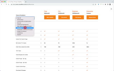
Cloudflare is similar but also allows users to jump between various groups of features via a drop-down.
But it’s not necessary to allow users to see only one plan at a time. In fact, it’s likely that at least two plans could be displayed side-by-side. We can allow users to choose the plans of interest and show them next to each other. That’s the approach that Dropbox uses on mobile. Customers can choose 2 plans from the list of 5 existing plans and compare them side-by-side. Both Twilio Segment and N26 use tabs and swiping gestures to move between plans.
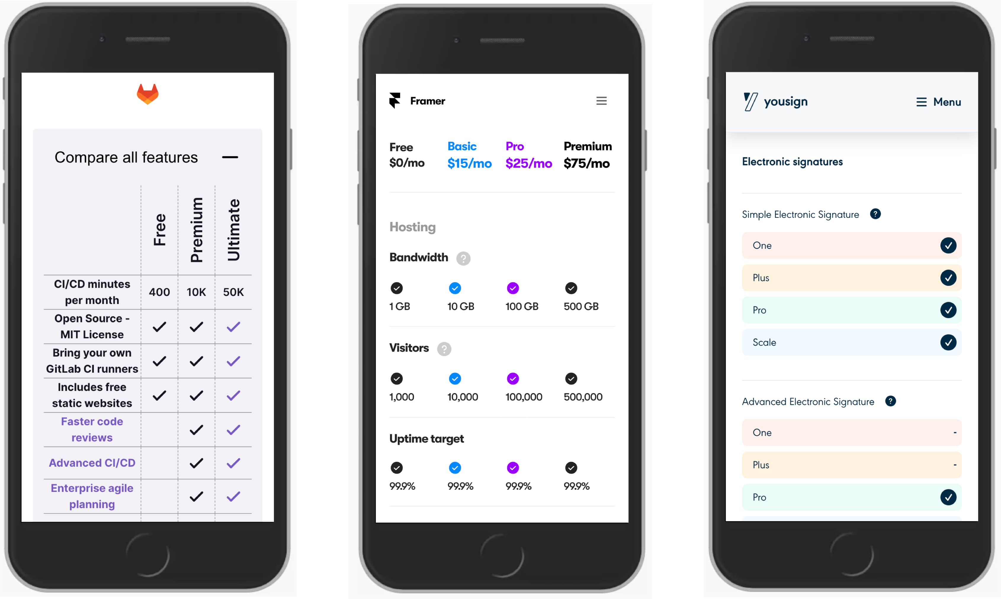
Finally, another way of managing a feature comparison matrix is by either tilting headings (Gitlab), or showing attributes on a separate row to make space for the 4 pricing plans values to appear in one single row (Framer) or arrange all attributes vertically, one under another, one row at a time (Yousign). These all are fantastic options to avoid horizontal scrolling and make a feature comparison slightly easier to perform.
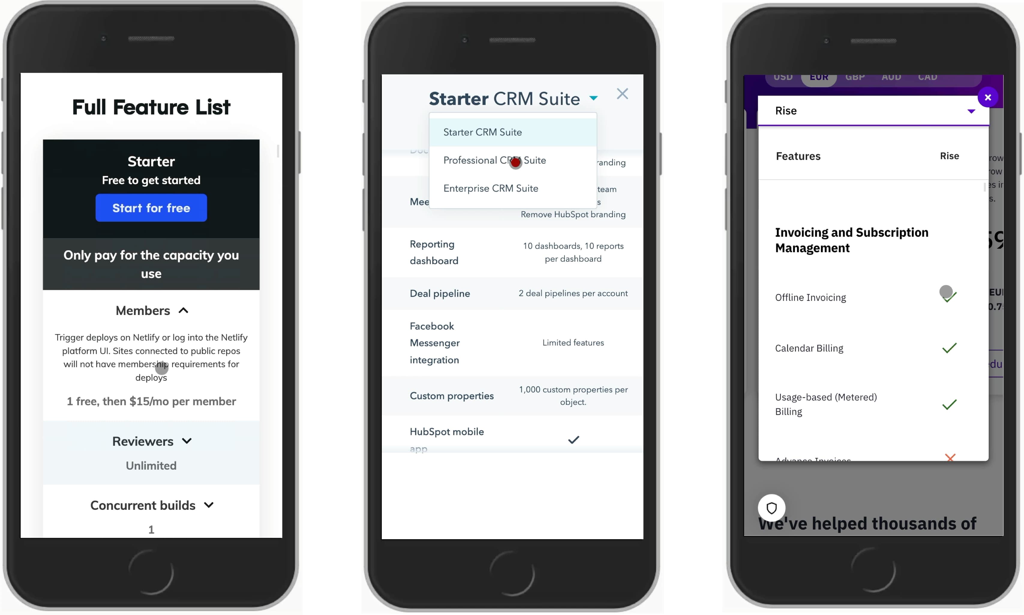
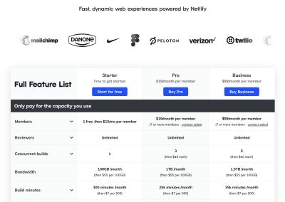
On Netlify, as you scroll down the page, all features are repeated multiple times, with a new section appearing as a sticky bar on the top, and hence indicating what the current plan is. On Hubspot and Chargebee, a modal view with a drop-down is used to jump between the plans. That’s quite a bit slower compared to tabs and usually not really necessary. It’s a good idea to see them here as the method of last resort.
In general, if we could avoid dropdowns to navigate between plans, it’s a good idea to do so. There, using tabs or showing all features on a separate row might be a better option. Plus, we might want to explore ways to avoid tooltips as they can be quite difficult to get right as well.
Tooltips And Feature Previews
Not all features listed in a comparison matrix are self-explanatory. Sometimes features might sound a bit unclear at first, so we need to explain what these features represent and how they could be valuable for customers. A common pattern to explain it is with tooltips. This usually happens by hovering/tapping on a dedicated tooltip-icon or the feature itself.
On Notion, hints explaining each feature are displayed when a user chooses to hover over the question mark icon. Unfortunately, they aren’t focusable and hence not keyboard-accessible. On mobile, the feature comparison table disappears altogether.
On Airtable, not only text hints but also visual previews appear on hover, including short animations that highlight and explain a feature. Unfortunately, there are no focus styles, nor are featured keyboard-accessible, so navigating between the features in a table is difficult.
Mailchimp solves accessibility issues by expecting a tap/click on a feature to open a nonmodal. Focus styles are in use, and keyboard users can move from one feature to another with Tab.
On Cloudflare, tooltips cover features listed further down the list, making it difficult to move between features quickly. Also, notice that the position of the “info” icon doesn’t match the position of the “close” button in the tooltip, which slows down users who want to explore many features quickly.
Yet again, a problem that’s too common: tooltips cover upcoming features and make it difficult to navigate from one feature to the next quickly. Point in case: Fantastical.
You might have seen a common thread in the examples above. Indeed, at this point, it’s worth mentioning that tooltips are problematic; they cover content and require focus trapping, and if could replace them with accordions, we probably should. This goes hand in hand with the Podia example featured below.
On Podia and Netlify, every feature is explained in a separate accordion. Frankly, not every feature has to be explained, and one issue might be that some customers might assume that + represents an option to add an add-on to the current price, which it isn’t. Perhaps having a chevron instead would be a bit more bulletproof.
N26 uses three chevrons per row, but a tap/click on any of them expands the entire row and explains the differences of that feature across the plans.

Confrere doesn’t have any tooltips nor accordions. There are lengthy descriptions of each feature, but these descriptions are provided on separate pages where each feature is explained in detail.
When thinking about showing details about each feature, we could explore the option to rely not just on textual descrition but show an actual feature preview and even use cases when it could be helpful. The details could appear on tap/click, or even better within accordions, expanding a row as users interact with it.
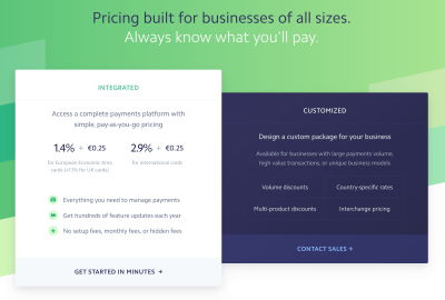
Flexibility With Customization Options
Ideally, we want to nudge users towards a plan that is a perfect fit for them. This is difficult to get right if we create a generic plan that’s supposed to be for everyone. Slack’s pricing for active users is a good example of flexible plans that accommodate well for the needs of the teams.
In the context of pricing plans, we can allow customers to be more granular about pricing by specifying the exact number of required seats and bandwidth and even customize the plan based on packages and add-ons that might be required. The end goal is to provide a final price quickly — not a random plan; a relevant plan that would work best for the user.
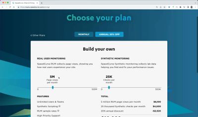
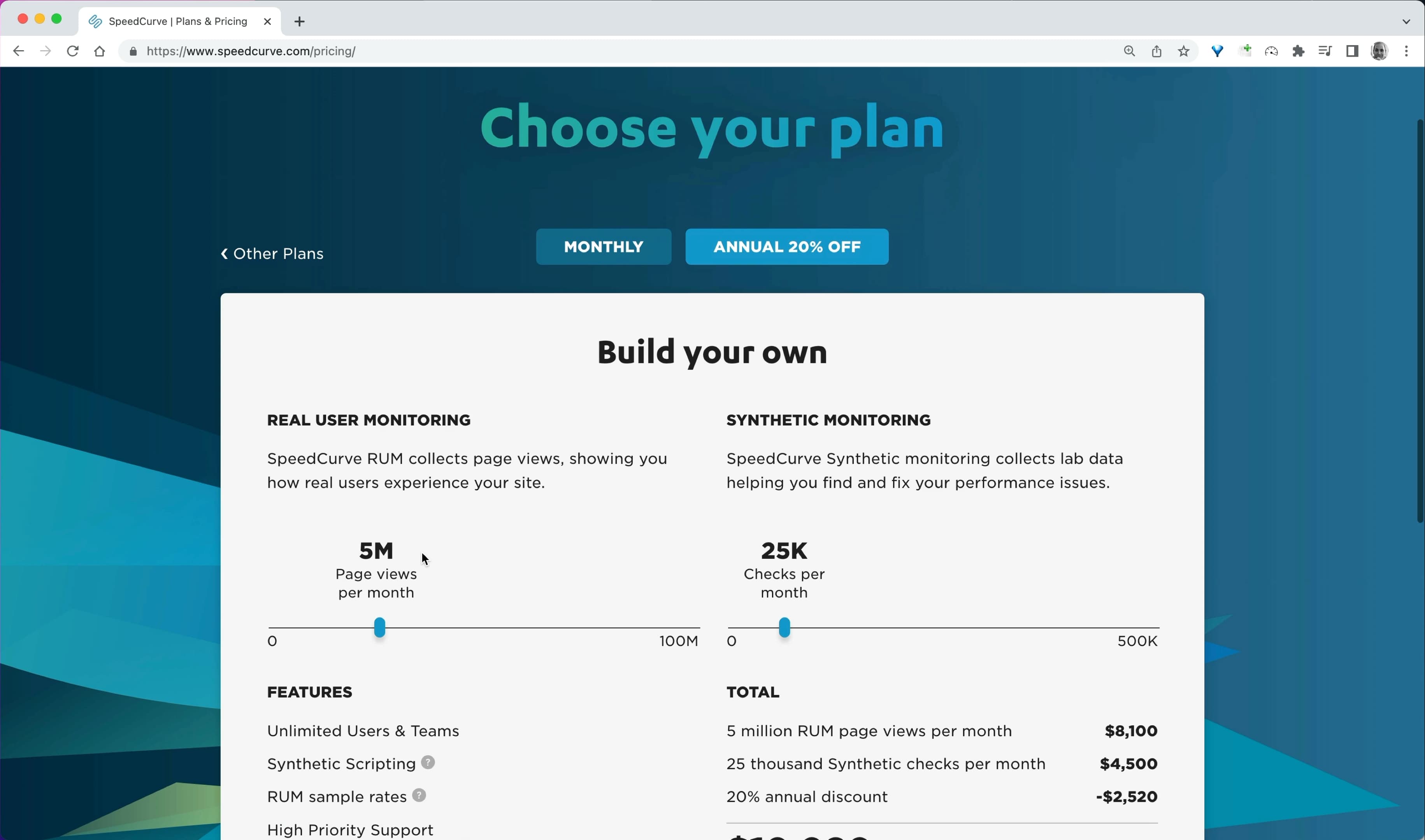
Speedcurve allows users to build their own plan by specifying the amount of page views per month and the number of checks per month.
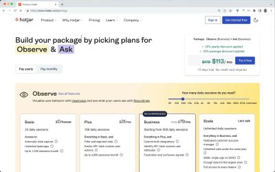
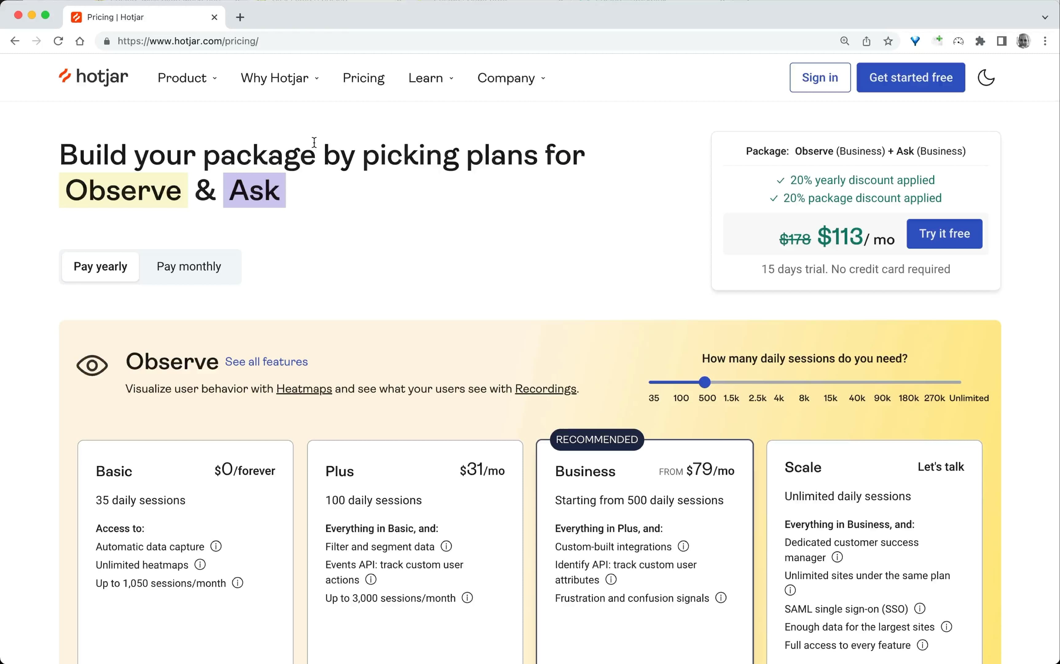
Hotjar changes its pricing based on whether packages are being used and based on how many daily sessions are expected to be used.
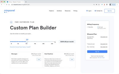
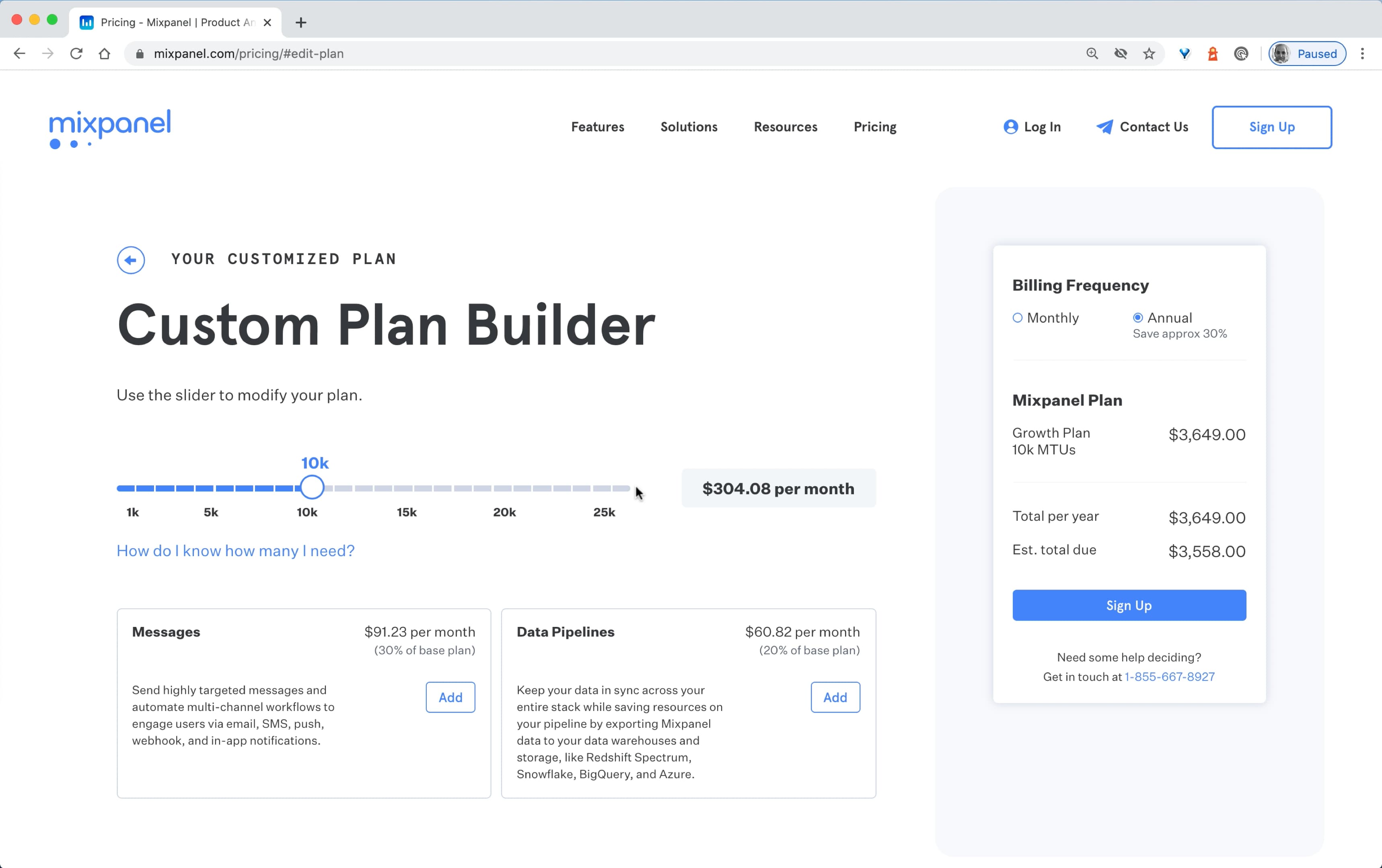
Mixpanel takes the number of MTUs into account, as well as any add-ons that the user might want to consider.
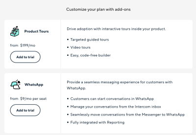
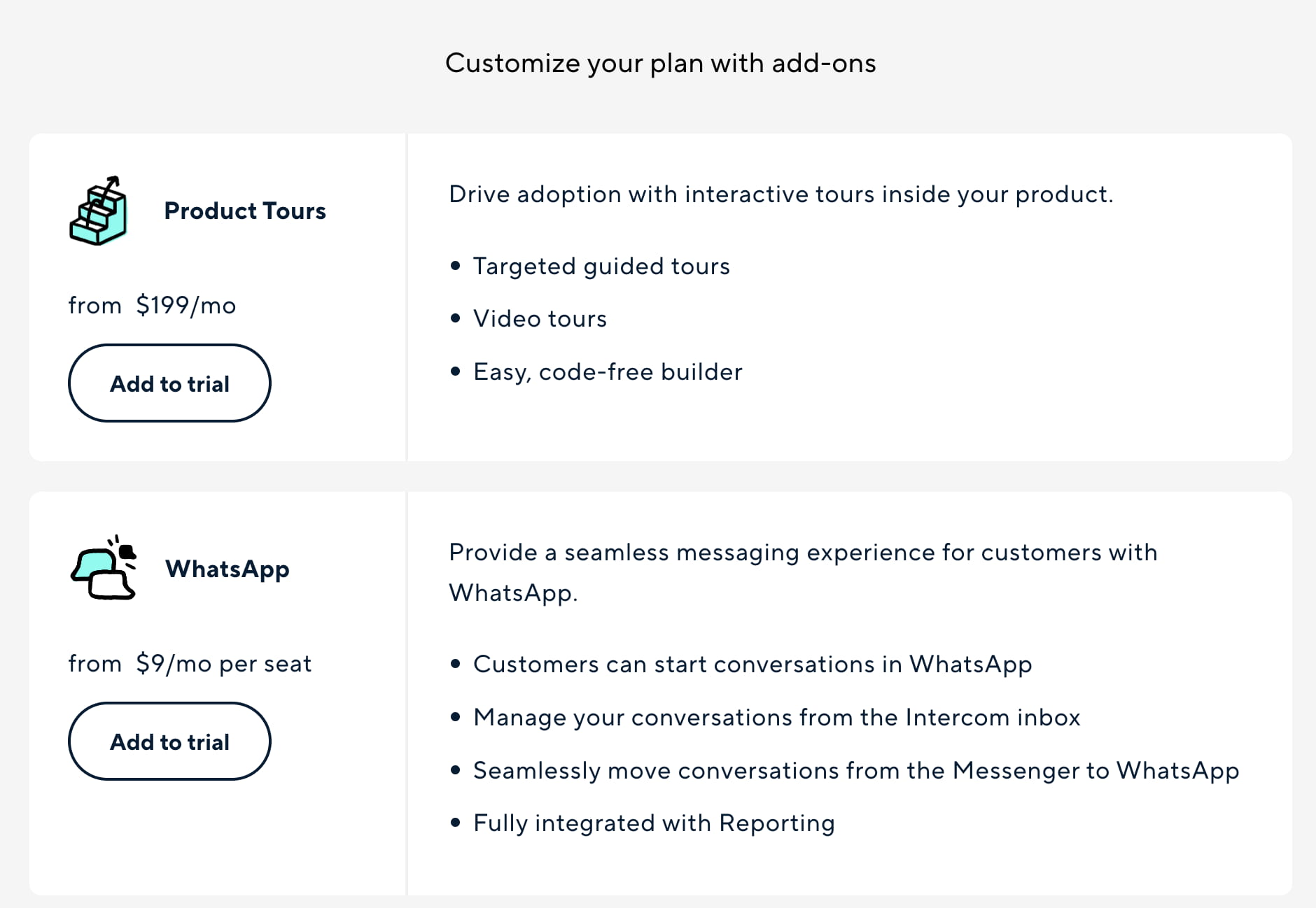
Intercom focuses on add-ons and extras that can be added to the basic plan. This gives users an overview of the final price early on.
Our ultimate design KPIs is to reduce the time to relevance in finding a perfect pricing plan. We can achieve it by being a bit more attentive to the exact needs that our customers have and provide a custom option that would be a perfect fit for them.
Show A Transparent Pricing Example
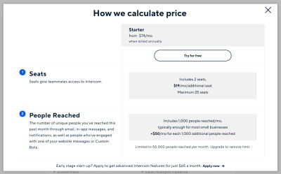
Some pricing plans might be complex, and sometimes it’s not very obvious just what exactly is included and what isn’t included. We could eliminate all doubts and concerns by making it very clear how the price is calculated, what it includes, and if there are any hidden costs included. Stating that there are no hidden costs seems unnecessary but might very well help remove concerns.
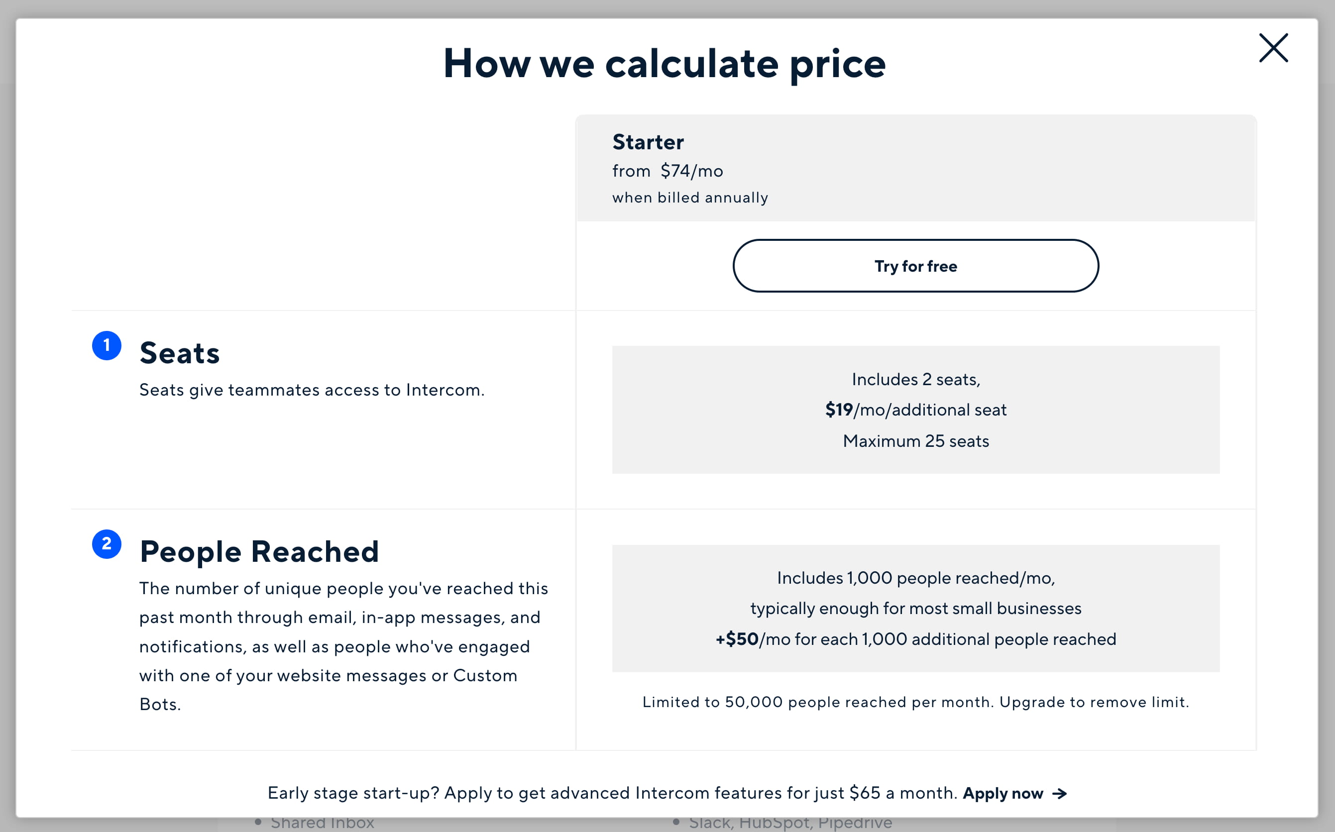
Intercom explains how the price is calculated as well as any limitations and important facts to keep in mind when choosing a plan.
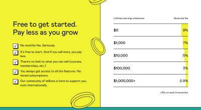
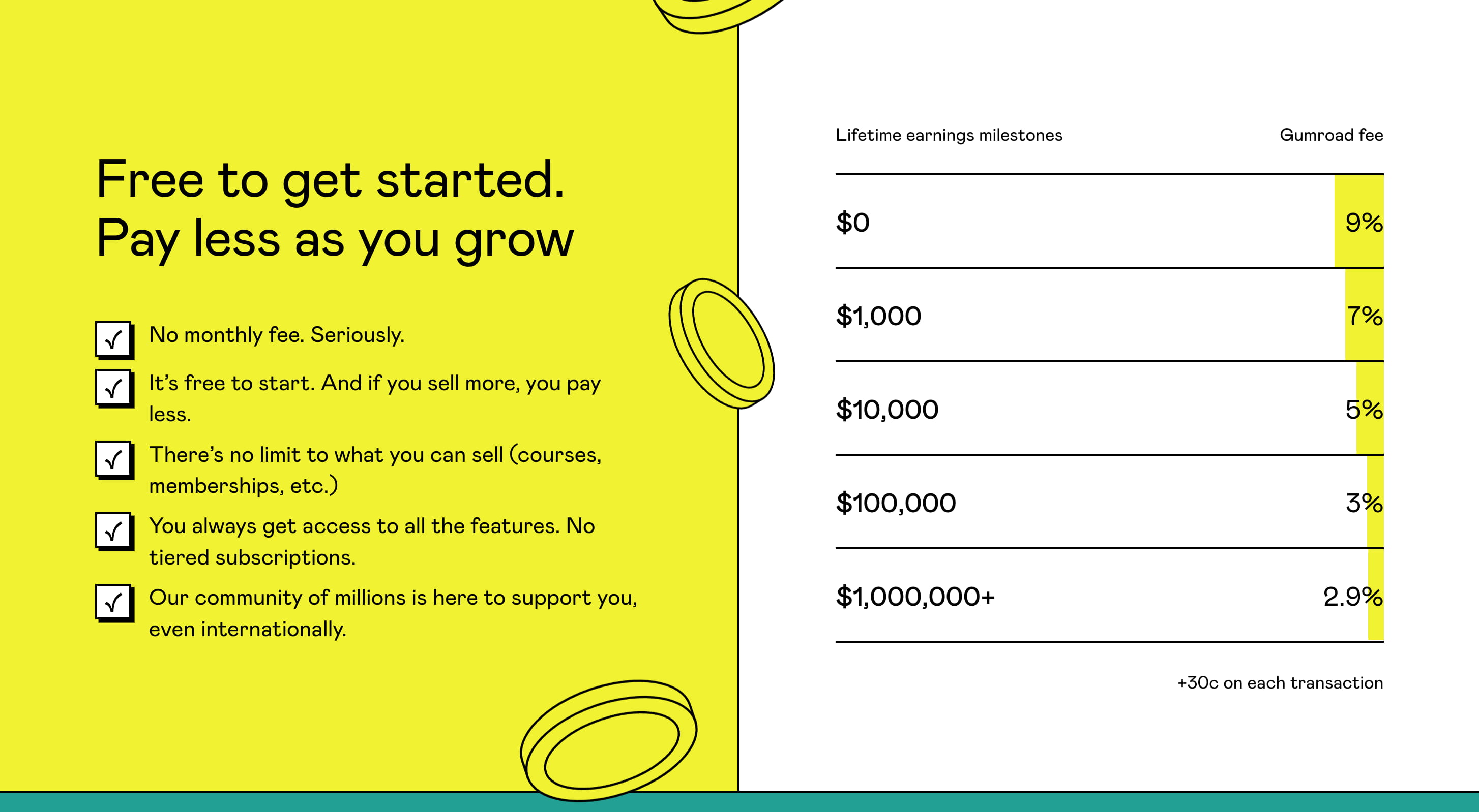
Gumroad doesn’t leave any chance for any concerns. On their pricing page, a large area explains how the service works and what the pricing plan entails, along with a pricing example next to it.
Use Social Proof
But perhaps we can help out our users before they even start thinking about feature comparison at all. We can do so by explaining in detail for whom the plan is designed, what kind of companies would benefit from it, and what kind of companies already use it. That’s the social proof at its best.
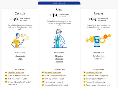
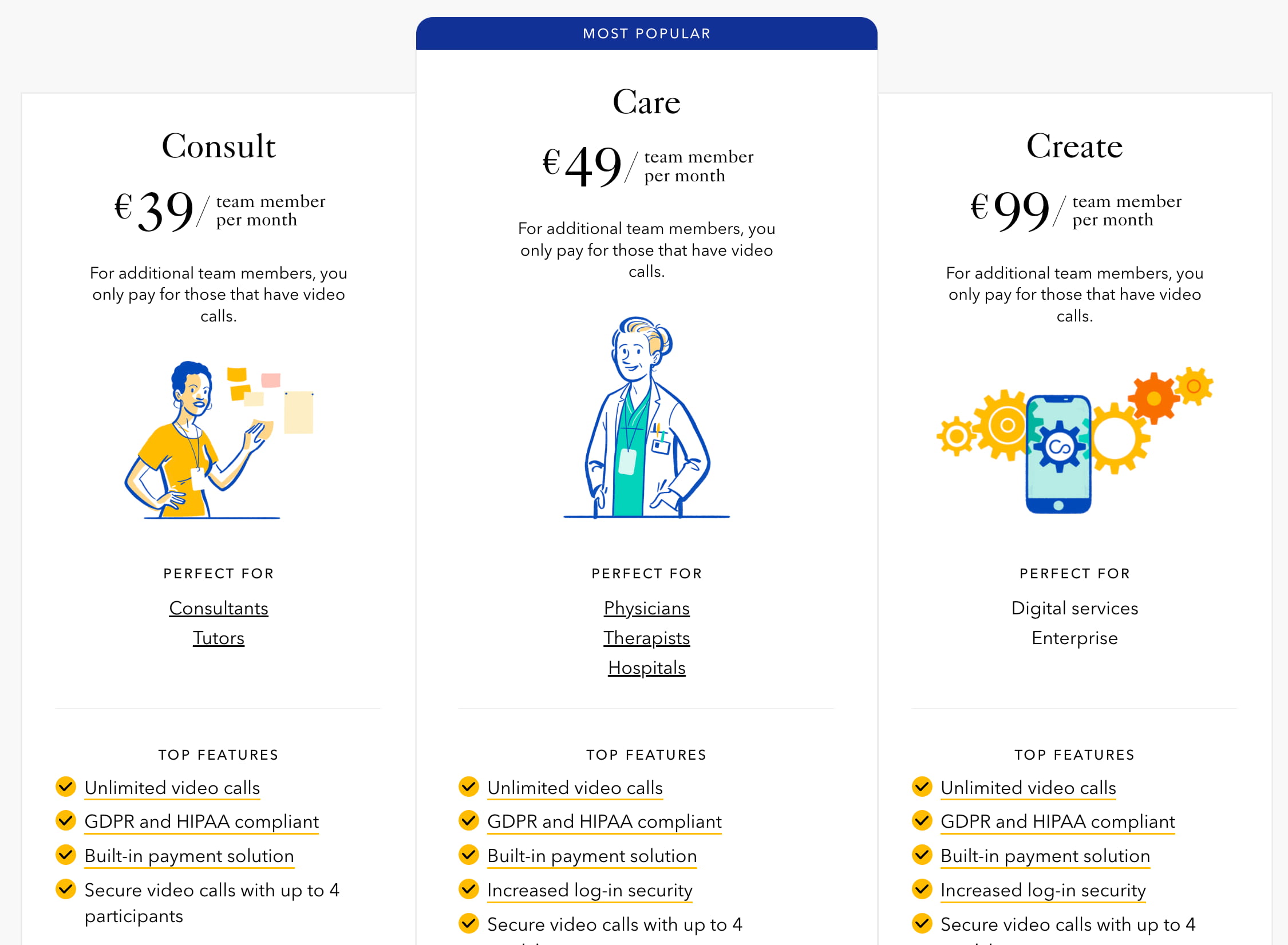
Intercom allows customers to select between a plan intended for very small businesses or regular businesses. Confrere explains the roles that a plan is designed for — consultants, physicians, therapists, or hospitals. Instead of focusing on generic plan titles, Adobe XD highlights plans for individuals, students, businesses, and schools.

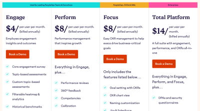
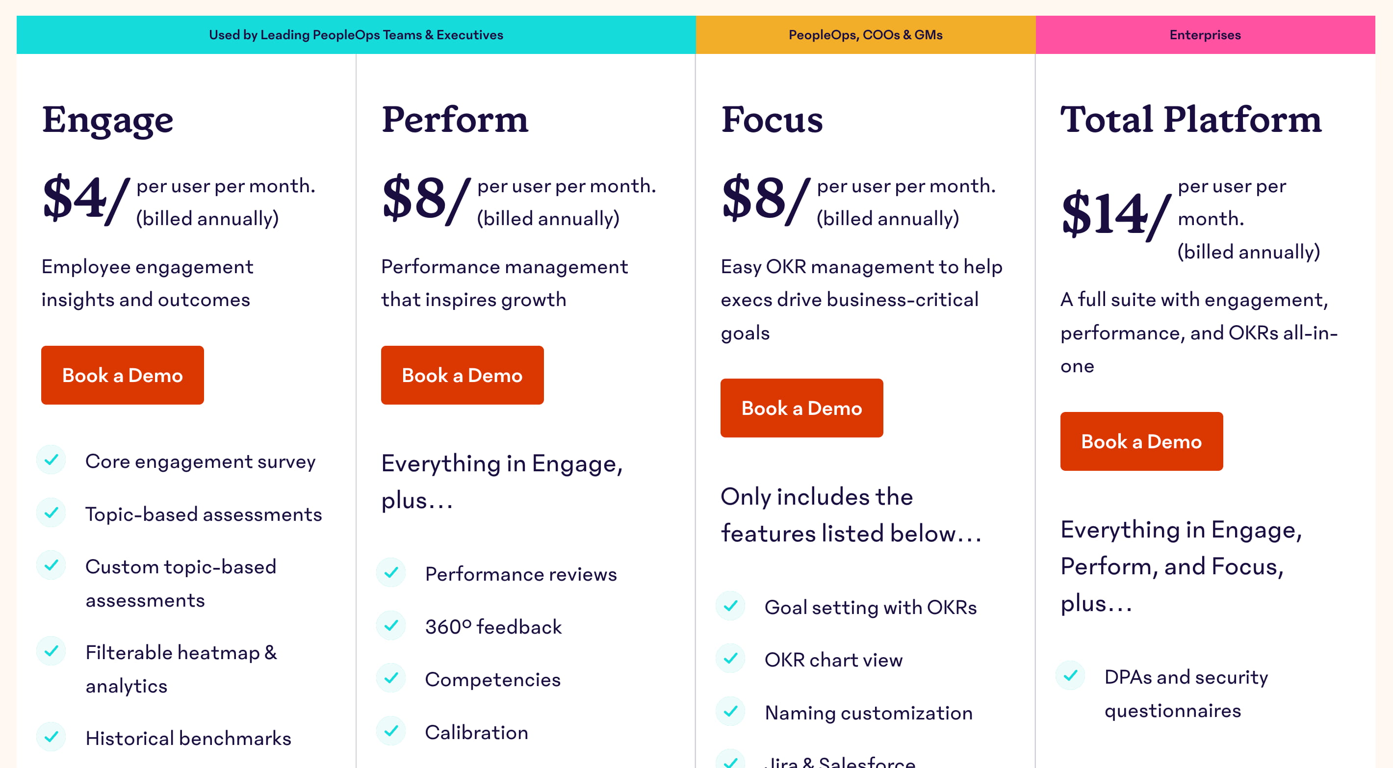
15five explains by whom each plan is typically used — from PeopleOps teams to COOs and enterprises. This might nudge the decision enough without having to compare the features at all!
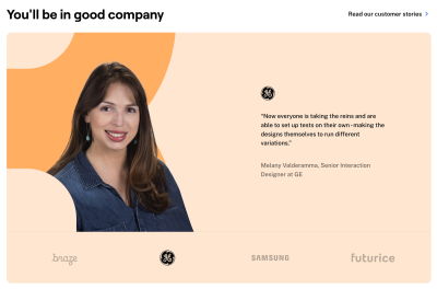
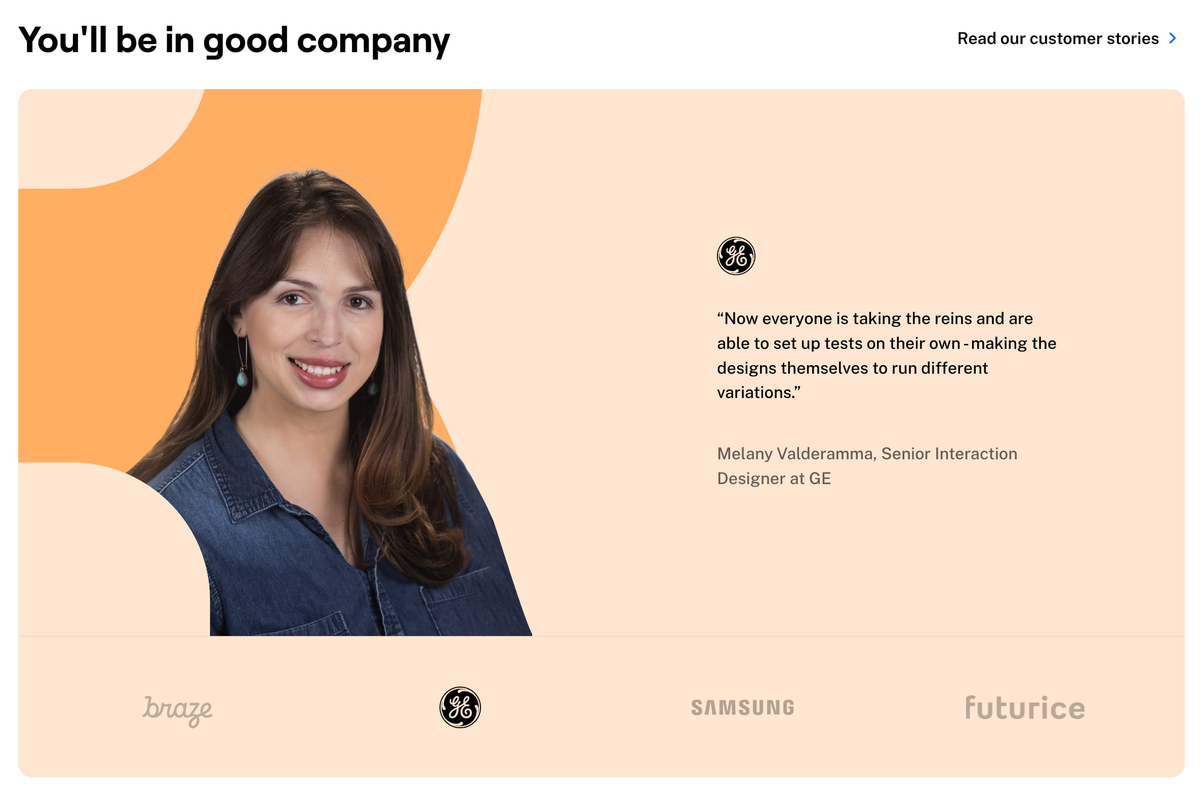
Maze explains how a company might be a good fit for a plan by using testimonials and short case studies with photos by various brands explaining how the plan helped them.
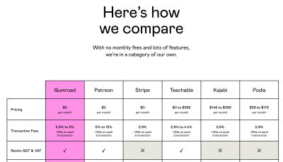
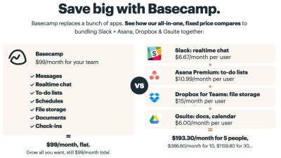
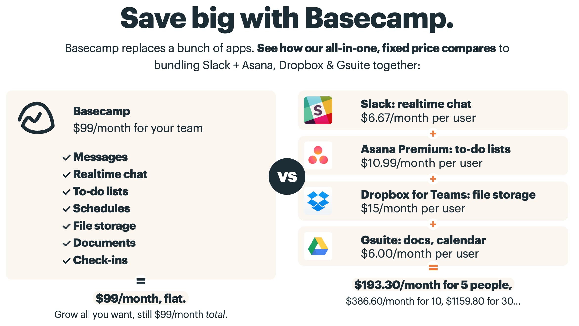
Gumroad provides a competitive matrix comparing their pricing with the pricing of their main competitors. So does Basecamp.
Intercom suggests that a particular plan was chosen by 53% of businesses, so chances are pretty high that your business would be in a good place with that product.
And often, pricing plans are complemented with brands that use the product already, sometimes along with a few testimonials from actual people working in these companies. Twilio Segment, Airtable, Netlify and Chargebee are good examples of just that.

Wrapping Up
Pricing plans seem to be obvious at first, but once we look a little bit closer, there are plenty of important considerations that need to be explored before heading into the design phase. Here’s a quick overview of some of the important things to think of when designing one:
- Simple pricing is always better, so always prefer it if possible.
- For complex plans, consider wrapping, tabs, and maybe dropdowns.
- No need to show all features at once: focus on key features first, and display the rest on request.
- Show differences within rows or explain differences visually.
- Allow users to display only differences and only similarities.
- Use sticky headers and group attributes within accordions.
- On mobile, avoid horizontal scrolling in tables.
- Consider turning every section into a standalone evaluation step of the best plan, use tabs, tilt headings, and show one attribute at a time. Avoid drop-downs.
- Avoid hover tooltips and show feature previews on tap/click.
- Expand details about each attribute on a separate row as an accordion.
- Provide customization options to allow for flexible custom plans.
- Prefer transparent, honest, clear pricing and don’t leave any chance to doubts or uncertainties.
- Use social proof to help users gain trust and understand what plan is the best fit for them.
Meet Smart Interface Design Patterns
If you are interested in similar insights around UX, take a look at Smart Interface Design Patterns, our shiny new 10h-video course with 100s of practical examples from real-life projects. Design patterns and guidelines on everything from mega-dropdowns to complex enterprise tables — with 5 new segments added every year. Just sayin’! Check a free preview.

100 design patterns & real-life
examples.
10h-video course + live UX training. Free preview.
If you find this article useful, here’s an overview of similar articles we’ve published over the years — and a few more are coming your way.
Related Articles
- Designing A Perfect Infinite Scroll
- Designing Perfect Breadcrumbs
- Designing A Perfect Accordion
- Designing A Perfect Responsive Configurator
- Designing A Perfect Birthday Picker
- Designing A Perfect Date and Time Picker
- Designing A Perfect Feature Comparison
- Designing A Perfect Slider
- “Form Design Patterns Book,” written by Adam Silver
Further Reading
- Designing Better Links For The Web
- Mobile Accessibility Barriers For Assistive Technology Users
- The Role Of Illustration Style In Visual Storytelling
- Conducting Accessibility Research In An Inaccessible Ecosystem
 (nl, mrn)

