What Makes A Great Toggle Button? (Case Study, Part 1)

Email Newsletter
Weekly tips on front-end & UX.
Trusted by 182,000+ folks.
 Register for Free
 Celebrating 10 million developers

 Custom Web Forms for Angular, React, & Vue. Your backend.
In this first part of a two-part article, we will analyze the characteristics of effective toggle buttons. These characteristics serve as visual cues for helping users recognize which of the button’s options is actively switched on. We have conducted a comprehensive research study with real users to evaluate the effectiveness of visual cues from a variety of categories. As part of our experiment, we assessed how the perception of visual cues changes if the user has more time to observe them.
In the second part, we discuss our results: which cues work better than others, which are the best, which are the worst, and why. Certain findings challenge some of the traditional beliefs in toggle button design. Finally, we present a list of best practices for how to create optimal toggle buttons based on our discoveries.
The problem of how to design an effective toggle button that shows the selected option clearly is a long-term open question among UI/UX designers. In this article, we discuss a study that we’ve conducted to find the final answers to the following questions:
- What does a good, clear and readable toggle button look like?
- What visual characteristics of a toggle button make it error-proof and prevent confusion and frustration of users?
First, we’ll talk a bit about toggle buttons themselves, when it’s the right time to use them, and which principles to bear in mind while doing so.
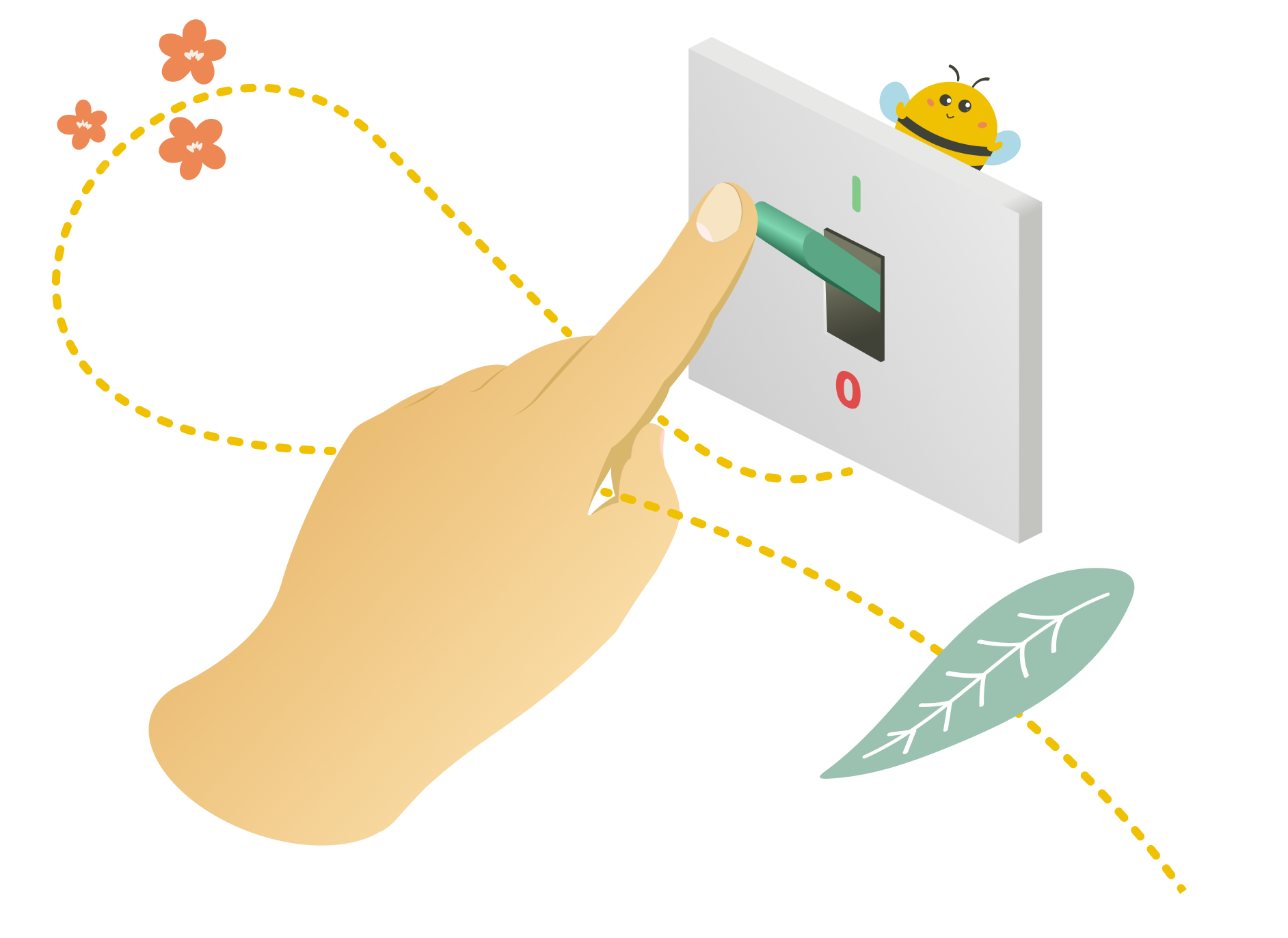
Let’s discuss a common scenario: imagine you’re buying an airline ticket. You pick the date and your destination when you suddenly come across something like this next to your ticket details:

If you’re confused about whether your ticket lets you come back home, don’t worry, you’re not the only one. The marvelous piece of UI seen above is called a toggle button.
What Are Toggles?
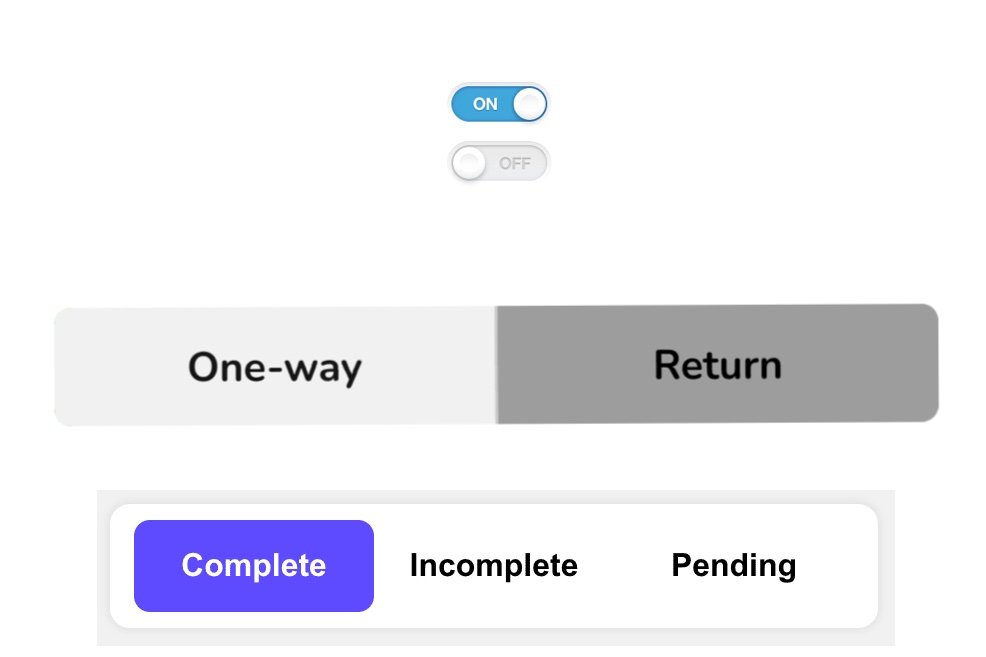
A toggle button. As the name suggests, it refers to a control used for switching (or toggling) between two or more states or options. Both its name and function are part of a skeuomorphic metaphor, meaning they’re based on something older and more familiar. In this case, a physical forerunner. To better understand the basis of a digital toggle button, let’s talk about the qualities of a physical toggle — the common light switch.
- As you can see, there are two states that a light switch can be in: on or off, with nothing in between. Similarly, a digital toggle is a control with two (or sometimes more) mutually exclusive states with one of them always set as the default value.
- You can see the result of interacting with a light switch straight away as the lightbulb will immediately light up or go dark. In the same way, a well-designed toggle should perform a visible change in the system — you should get direct feedback without the need to press another (Save or Submit) button.
When To Use A Toggle Button?
In short, when designing a toggle button, for the sake of your users, it’s good to hold on to these basic principles:
- Use them only when they have an immediate effect, without any Save or Submit.
- Apply them when the setting has a default value.
In other cases, a checkbox or a group of radio buttons may be the better option.
Toggle Switch vs. Toggle Button
There are two ways in which you can use a toggle-type element. For binary options (mostly on/off, as discussed above), you can go with a toggle switch. It’s very simple. You just activate or deactivate a function.
A toggle button is a suitable solution for switching between opposing (even multiple) options. It’s composed of two or more buttons next to each other. The selected button needs to “highlight” in some manner to signify the toggled state.
The goal is to design toggle buttons distinct enough to signal the difference in visual weight between selected and unselected options. At the same time, the buttons should be alike enough to be perceived as two (or more) parts of the same whole. The challenge is to make evident which button is active.
With toggle switches, it’s relatively simple. With a direct label present (on/off), you can read the toggle state quite easily. However, toggle buttons don’t contain the text “on” or “off.” Their label stands for explaining the state’s quality rather than showing the state itself.
Thus, when reading toggle buttons, users have to rely on other visual cues. Which, when not used right, can do more harm than good. One thing is for sure, though, the state that’s currently active should be emphasized, not the possible command for changing it. This brings us to the main focus of this article. There’s a hot question going around among UI and UX designers: How to make a good toggle switch?
When we asked this question ourselves, we found there were no general rules founded on solid user research. This is why we’ve conducted our own case study to remedy this.
Case Study: Data-based Approach To Designing Clear And Effective Toggle Buttons
With enough experience and some usability testing, you can ensure your toggle design isn’t an issue. But what if you could just tell right away what will or won’t work based on comprehensive research and cold hard data? Further, what design features help users distinguish which toggle option is the active one? How do you combine visual cues, such as colors, text size, and frames, to make the state of toggles instantly recognizable? In our study, we’ve explored the field of visual cues and focused on the question of which design characteristics signal that a button in a toggle pair is active or not.
Visual Cues
Visual cues are aspects of elements on a website that draw the user’s attention and provide information about how to use the design. They help users spot clickable features, distinguish between active or inactive states, and introduce the possibilities presented to them by a website. The signal they send should be clear and easily readable.
Research Path To Designing Toggles
Although how to design toggle buttons is a commonly discussed topic among designers, there are (to our knowledge) no clear guidelines on picking the most effective visual cues for toggle buttons. Therefore, we have decided to look closely at specific ways to highlight the active button in a toggle pair.
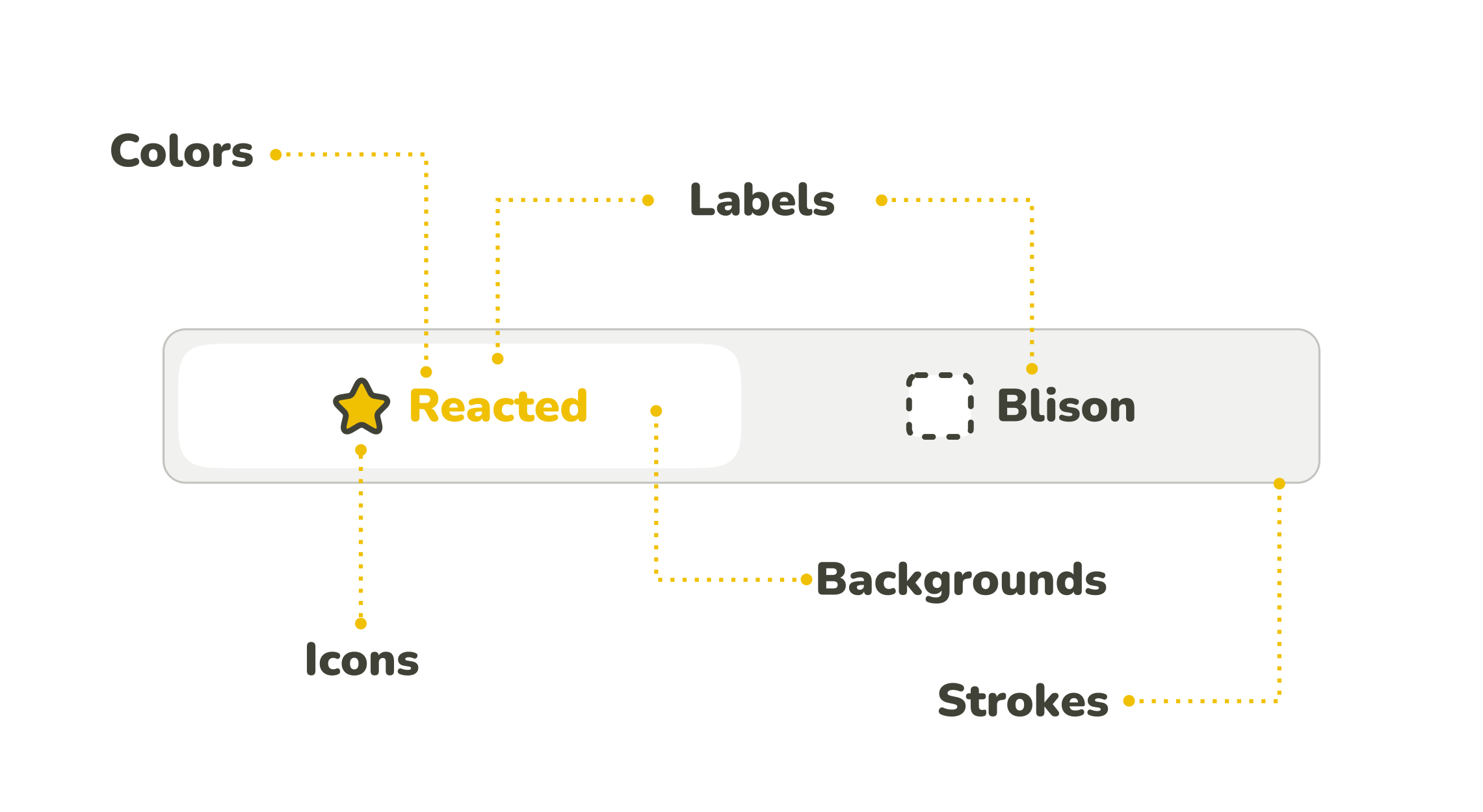
The anatomy of toggle buttons can usually be described as a combination of label, filling, outline, and sometimes a specific icon, whereas not all of these components have to be present at the same time. Each of them can be emphasized somehow (can stand as a visual cue), and there are many different ways to combine them together.
Standalone Visual Cues
To start from the base, we focused on standalone visual cues concerning each of the button’s possible components: label, filling, frame, and icons. Based on our assumptions of how these components influence the perception of an active/inactive button, we have formulated several specific research questions.
To test our assumptions, we have designed a set of toggle buttons that individually represent our research question for the visual cues. We wanted only one visual cue in focus on each toggle button to shape the user’s perception of an in/active state of the button. Therefore the visual cue should be the only thing that differentiates the buttons.
When designing the toggles for the study, we came across one challenge: what labels to choose? Of course, we wanted to replicate the real-life experience on the web, but at the same time, we didn’t want participants to be influenced by a particular verbal meaning. Therefore, we needed to choose the labels carefully.
The first idea was to use “Option A/Option B,” but since letters A and B implicitly imply alphabetical order, this would mean risking having a subconscious effect on the participant’s choice. Similarly, using words with meaning such as “Cat/Dog” could mean an individual preference would play its part — a cat or dog lover’s subconscious may get involved, etc.
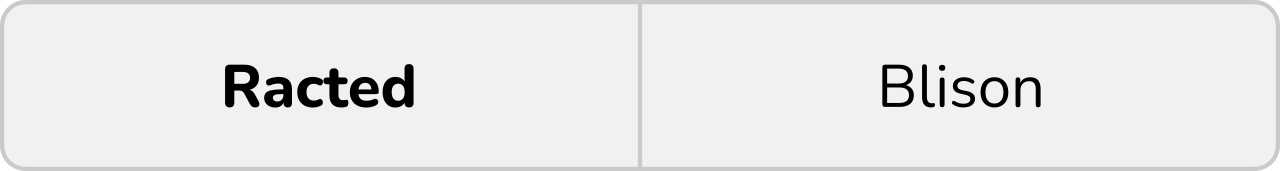
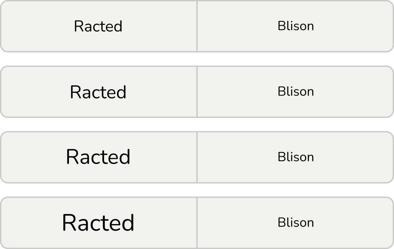
To prevent the label’s meaning from affecting the selection, we have finally decided to label the buttons with nonsensical words without any clear associations: “Racted” and “Blison”. This way, only visual characteristics can affect the users’ perception of the button’s active and inactive state. Even if users didn’t determine a toggle’s state, they would need to choose the answers randomly instead of defaulting to another cognitive pattern.
Without further ado, here is the list of visual cues and our research questions related to them.
Label
With the label as a visual cue, we consider its key properties, such as its thickness, text size, and color.
Research question 1: Bold text
We assume that the button with the emboldened label will be perceived as active rather than the regular text.
Research question 2: Text size
When two buttons with labels differing in the size of the text inside are next to each other, we expect that the one with the larger label will be perceived as active. We also expect that the larger the difference is, the easier it will be to determine the active state.
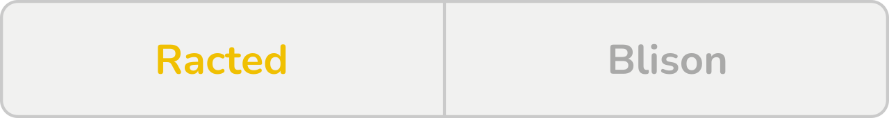
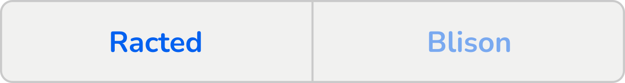
Research question 3: Contrast of inverted colors in text labels
Contrasting colors are good for distinguishing between options. However, if you need to emphasize one of them, and therefore you need one of them to have more visual weight, it’s not that convenient. Inverted colors evoke equal options.
We expect the combination of inverted black and white to be perceived as equal options. The same would be the case with other inverted colors, such as blue and orange, seen in the figure below. Therefore, we assume participants won’t be consistent in determining which button signals the active state.
For this study, we presume the buttons with darker text colors (black and blue) to be considered active. Their darkness could evoke emphasized buttons, but as mentioned, we mainly expect inconsistency.
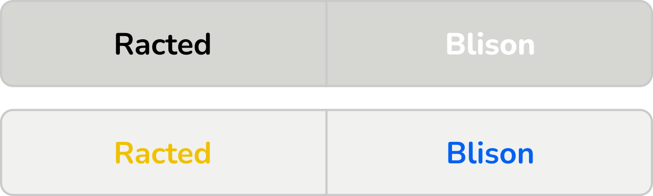
It needs to be said that for people with color vision deficiency, contrast and colors, in general, are insufficient cues. We mustn’t forget that according to the NHS (National Health Service), about 8 % of men suffer from daltonism, which means they can’t rely on color cues and will need more than just a color to determine the button’s in/activation.
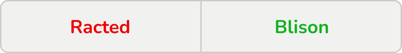
Research question 4: Cultural perception of red vs. green in text labels
Even though it raises the same concerns as the research question above, since red and green are contrasting colors, there is a culturally determined consensus about this specific pair. In western cultures, the color green is associated with the “on” (or active/open) state, while the color red is associated with the “off” (inactive/closed) state. We expect this phenomenon will manifest in the test.
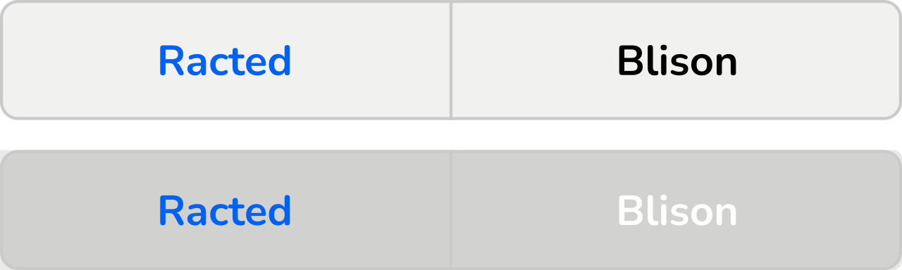
Research question 5: Color vs. black/white in text labels
When combining colors and black/white, we expect the colored label to be perceived as a signal of activation because it carries more visual weight.
Research question 6: Primary color vs. neutral colors (shades of gray) in text labels
The principle is the same as with research question 5. Neutral colors carry less visual weight. Therefore our expectation is that the colored label will signal an active state.
Research question 7: Different saturation of the same color in text labels
Our assumption is that the more saturated the color is, the more visual weight it carries. Therefore, a more intense color is expected to evoke the button’s activation.
Filling
The filling or the background of the toggle is all about color combinations. We assume that many of the same principles seen with label colors also apply here.
Research question 8: Contrast of inverted colors in background
The relationship between inverted colors of the button filling is analogical to the one between inverted colorations of toggle text. Since inverted colors carry the same visual weight, we expect the contrasting colors to be confusing. Which button is active will not be clear. Therefore, we expect the responses to be inconsistent.
For this research, we have labeled the buttons with darker filings as active since the darker shade could be perceived as the active state (however, we still expect the responses to be mostly inconsistent).
Research question 9: Cultural perception of red vs. green in background
Since red and green are a specific case of contrasting colors (due to our western cultural perception of this pair, rather than color inversion), we assume that the green button will be perceived as the active one.

Research question 10: Different saturations of the same color in background
As we stated with label colorations, color saturation carries a visual weight. We assume that the more saturated color will be perceived as the activation signal. In the case of a neutral color such as gray, we expect the higher value (from the HSV color model) of the filling to function as a clue.
We expect this effect to be more evident with more saturated colors (in this case, orange) than neutral colors (gray) since saturated colors carry more visual weight.
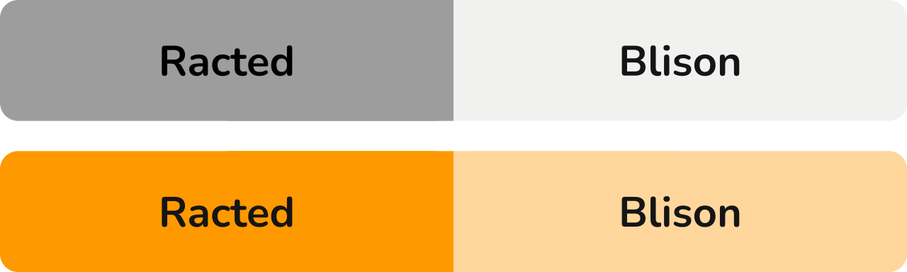
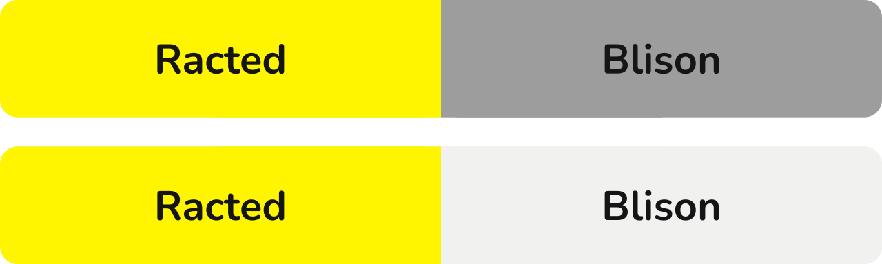
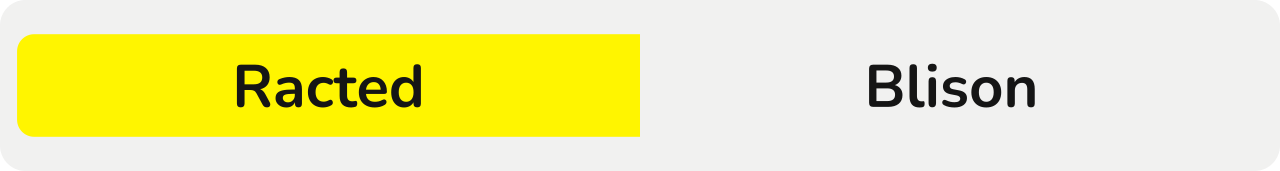
Research question 11: Saturated and grayscale colors in background
We expect that since the button filled with the saturated (yellow) color carries more visual weight, it will be perceived as emphasized. Therefore, it will signal an active state when standing opposite a grayscale-colored button.
Additionally, we predict that the distinction will be easier to make with the combination of yellow and less saturated gray because of the more evident contrast.
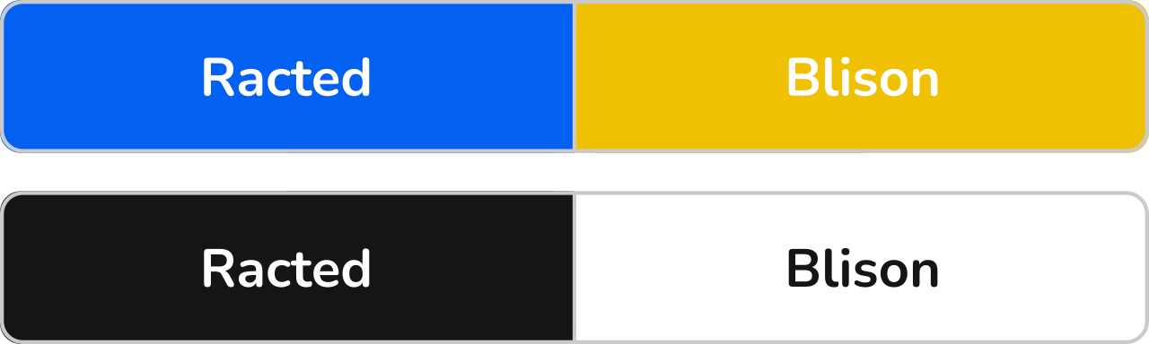
Research question 12: Inverted design of buttons
A common way to design toggles is to invert the color of the background with the color of the text. The problem with this visual cue is that both buttons in the pair carry a part of it: on the left, there’s the colored filling, and on the right, there’s the colored text. The blue filling might have a stronger visual weight, but we expect the distinction between the active and inactive button to be more difficult for users to interpret consistently than some other visual cues, such as color saturation.

Outline
This category of research questions focuses on the presence/absence of an outline, as well as on its placement. Although outlines can differ in several aspects, such as color or thickness, these are parallel to visual cues, which are already covered in categories Label and Filling. Hence we have dedicated this category to determine the effect of an outline in general, as well as some cues which are outline-specific.
Regarding the color, we have discussed its impact in the previous sections, and we expect the effect to be analogical when used on the outline.
Research question 13: Highlighted outline of the active button
We expect the button with a highlighted outline to be perceived as the active one.
This one may seem obvious, but it never does any harm to check up on it or compare its effectiveness to other visual cues.

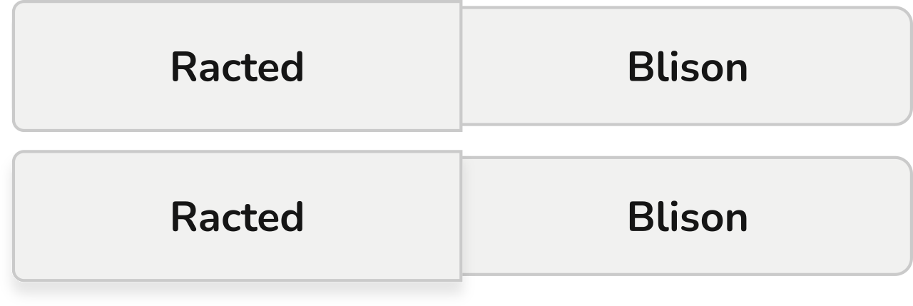
Research question 14: Inactive button coincides with the background
This is a hybrid between background and border-based visual cues. It attempts to improve a saturated vs. grayscale background color cue, as seen in RQ11, by making it clearer that the gray-colored button is blending into the background while the colored active button is separated from it. Our concern, however, is that when the outline is missing, and the inactive button coincides with the background, it may be harder for participants to decide about the active state, since the inactive button may not be perceived as a button at all.
Research question 15: Embossed vs. debossed button
Making something embossed is a common way to highlight something on a website. However, should we follow the guidance of making toggle buttons resemble physical buttons, then, in this case, it should be the other way around. The button that’s pushed (aka debossed) is active. Therefore, to verify whether this is true, we hypothesize that the button that’s pushed in will be perceived as “on,” while the button which is embossed and hence isn’t pushed in will be perceived as “off.” This pushed look should be even stronger when supported with a shadow effect.
However, the embossed button appears more “in your face,” which might signal its activation as well. We expect the distinction to be inconsistent.
Icons
Icons provide yet another way to highlight an active button. Can they possibly outweigh all the other visual cues? To confirm the effectiveness of the icons, the designs in this research question category abandon all of the other visual stimuli in favor of including icons.
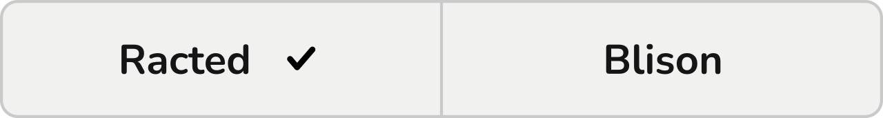
Research question 16: Check sign
We expect the presence of a check sign on one button to evoke an active state.
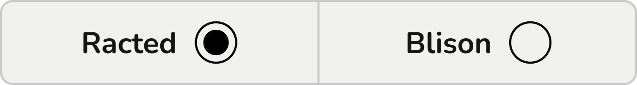
Research question 17: Radio button
One possibility of designing toggle buttons is to combine them with radio buttons. Radio buttons usually stand by themselves and are used in different contexts from toggle buttons. However, their signature radio button circles are an easy and clear mechanism for communicating selection, which could be used to emphasize the active side of a toggle.
We expect the button with the filled radio button to appear as active.
Testing The Effectiveness Of Standalone Visual Cues
We verified our assumptions in a quantitative online study. We needed to support our findings with a reliably good amount of hard data and the online research with UXtweak tools was an easy way to get them. We used two versions of UXtweak’s Five Second Test. UXtweak allows you to adjust the display time of the Five Second Test to your needs, so we ran one test where we showed the toggles to participants for 5 seconds and another one where we did the same for 20 seconds. We did this to see whether there would be a difference in results when the participants had more time to think about the toggles before they made decisions and answered questions.
We designed two variants of every tested toggle button, where either the left button (Racted) or the right button (Blison) was designed as active. We then split these variants randomly into two groups. One-half of the participants completed the research with stimulus group A while the second half was presented with group B. We did this to negate the effect of whether the visual cue was on the left or the right side.
Five Second Test
In the Five Second Test, the participants were shown toggle button designs one by one. Their task, given to them before each stimulus, was to first look at a toggle button for 5 seconds, then answer some questions. The same two questions were always asked. This is the first one:
“Which option was turned on?”
The answer was given via a radio button group, the available options being Racted (left) and Blison (right) for easy identification.
We considered several wordings of how this question should be formulated during our study’s design. Although this might seem marginal, the wrong wording could affect the participant’s understanding of the task and, with it, the whole study. For example, consider one of the other proposals: “Which button was pushed?” When you look at the designs, usually it’s the active button that is more visually expressive, highlighted in some way.
The psychology of perception of 2D pictures, specifically the atmospheric perspective principle, states that we perceive the objects which are less saturated and somehow blurred as further from us than the more visible ones. And if we’d asked which button was pushed, which in accordance with the physical world means further from us, we could get exactly the opposite answers than needed.
The second question aimed to verify the level of certainty about why the toggle option is currently active:
“How sure do you feel about your answer?”
Participants could answer on 5 points Likert scale, starting at “Not sure at all” and ending with an “Absolutely sure.” This gave us additional information about the clarity of the visual cues. Since some answer to a first question was required to continue, having a secondary means of comparing visual cues was useful in case the number of participants who picked the expected answer was the same in both.
To make sure that the instructions were understood correctly, in the first warm-up task (which wasn’t analyzed later), we asked participants one more question: “Which option have you chosen? The one that was…”, following with two answer options: “On” and “Off.” This question made the participants think about what they were supposed to do, and it verified whether they would perform the study how they were meant to.
Twenty Second Test
Analogically to the Five Second Test, the participant’s task was to look at the designs for a limited amount of time, although this time, the period was 20 seconds. We decided to conduct this variant of the study as well to check whether the performance gets better with more time to observe the designs.
The time period was the only thing different from the 5-second variant.
Questionnaire During The Study
At the beginning of the study, each participant was asked to fill in a small survey to help us profile the participants. We were interested in:
- The age of the participants,
- Their gender,
- Their highest achieved level of education,
- The frequency at which they browse the web,
- The purpose of why they browse the web most,
- A self-evaluation of their skills as a web user.
Having this data would let us understand the composition of our user sample but also search for detailed insights, such as whether the frequency of web browsing corresponds to the performance in the test or whether the perception of toggles is age-dependent (younger people who are more active online may have more experience with using them).
After the test was completed, we gave the participants an opportunity to leave us a message in a post-study question.
Participants
In total, we aimed to collect 100 responses to represent the general population. This data background would allow us later to generalize our findings during the interpretation of results.
For recruitment, we used UXtweak’s User Panel, which was perfect for an online unmoderated study with the need for a large number of participants. With the User Panel, we could comfortably order the participants and select some characteristics they should possess. We involved people from 16 to 75 years old, and we selected English-speaking countries’ participants (Canada, USA, GB, and Australia) to run the recruitment since our study was designed in English.
Results
Let’s continue in Part 2 to learn about our findings and how to make your toggle buttons clear to everyone at first sight.
Related Reading on Smashing Magazine
- “When Is A Button Not A Button?,” Vadim Makeev
- “Designing A Better Back Button UX,” Vitaly Friedman
- “Building Inclusive Toggle Buttons,” Heydon Pickering
- “Frustrating Design Patterns: Disabled Buttons,” Vitaly Friedman
- “Ghost Button Design: Is This Really Still A Thing (And Why)?,” Suzanne Scacca
 (ah, vf, yk, il)

