The Realities And Myths Of Contrast And Color

Email Newsletter
Weekly tips on front-end & UX.
Trusted by 182,000+ folks.


 Celebrating 10 million developers
 Custom Web Forms for Angular, React, & Vue. Your backend.
A long, long time ago, in a land far, far away…
By “long ago,” I mean circa 1924, and by “far away,” I mean London, UK., scientists W. D. Wright and J. Guild conducted color-matching experiments measuring the boundaries of human color vision. Their work was combined by the International Commission on Illumination (the CIE) into the 1931 CIE “standard observer “, a sort of “mathematical eyeball” that models how we see color. And with that, modern colorimetry was born.

Colorimetry is the basic science that made color television possible, and of course, our modern displays and smartphones — all our modern electronic color technology traces back to the 1931 CIE color space.
This colorful, kidney-shaped graphic represents the limits of human color vision — the smaller triangle inside marks the colors that can be displayed on a standard sRGB monitor, and the larger triangle represents P3 displays.
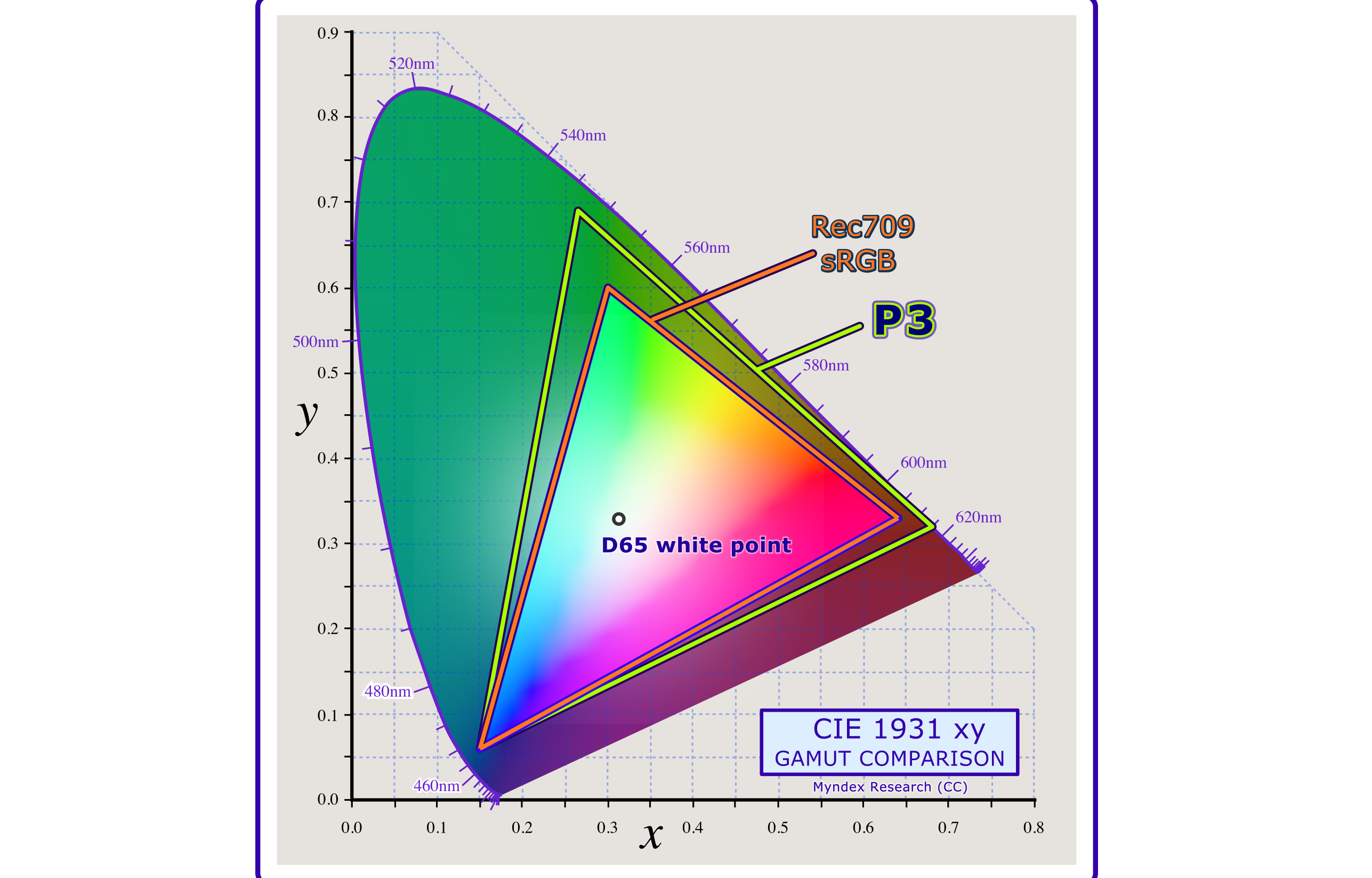
Each corner of the triangle is one of the three “primaries” of light: red, green, and blue. The area inside the triangle represents how those three colors appear when added together in various combinations, hence the term “additive color model.”
The use of the term “primary” is a bit of a misnomer, though, as there is no set of three real colors in the real world that can be mixed to create all the other colors. Only a subset of colors, as defined by these triangles.
In The Eye Of The Beholder Or The Mind?
A Simple Overview Of Human Vision
Light is focused by the eye’s lens onto the light-sensitive cells in the back of the eye, known as the retina. The cells we are most interested in are called cones, which are responsible for our daylight and color vision. A different kind of cells, called rods, gives us night vision, but rods are not particularly helpful for tasks like reading, and rods essentially shut down in daylight conditions.
Standard or “normal” vision uses three cone types. They are sometimes but inaccurately called “red,” “green,” and “blue” cones, but there is much more to this story.
Color Is Not Real
Is color not real? That’s a provocative statement for an article on color and contrast. But the reality is that “color” and “contrast” are not strictly real in an absolute sense. “Colored” light is simply light of different wavelengths or frequencies, like different notes on a piano. In fact, the scientific names for the cone cells in our eye are L, M, and S cones which stand for the long, medium, and short wavelengths of light they are most sensitive to.
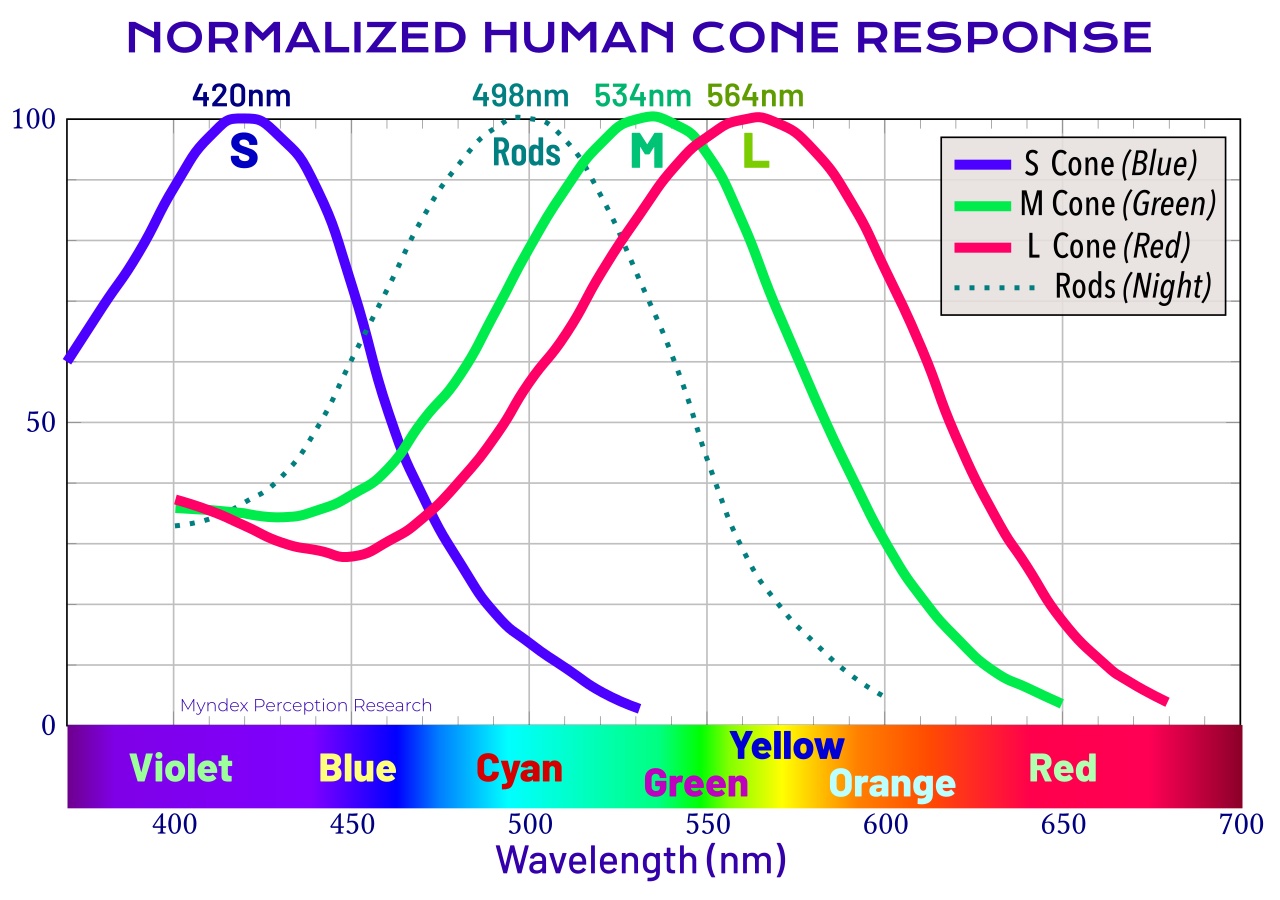
The L cone actually has a peak sensitivity near yellow/green. But the fact its response curve extends into deep reds gives a differential from the M cone that allows humans to perceive “red” as a unique hue. As you can see from the graphic, the responses of the cones all overlap very substantially.
One reason the L cone is thought of as “the red cone” is that the primary red light from a display or television is intended to stimulate the L cone as much as practical while not stimulating the M cone. So the color used in a display is not at the peak response of the L cone but at a much longer wavelength to reduce “crosstalk” to the M cone.
Nevertheless, this is not where the sensation of color really takes place — that rabbit hole is just a bit deeper.
The first stage of the visual cortex, located at the back of the brain, looks at the lightness/darkness contrasts first, finding edges and fine details. Later stages separately process the color information, meaning hue and chroma (chroma is the “colorfulness” and related to “saturation”). Over 20% of our brain is dedicated to visual processing, and in total, 62% of our brain involves vision, often shared with other senses such as touch or hearing.
Some of the visual information may be “steered” to the Visual Word Form Area (VWFA), where letter pairs and whole words are recognized and sent to the language center. Other information may be sent to areas of the brain specializing in motion detection or object recognition. The information “steered” to the VWFA is essentially luminance only, that is, devoid of color, while the object recognition area relies more on color for discrimination.
The Imaginary Reality Of Perception
What might not be apparent from the above discussion of the mechanics of our vision is that colors are just perceptions, and as perceptions, they are affected very much by context. In other words, the nature of the surrounding visual material has a substantial effect on the colors and contrasts that we perceive and how we perceive them.
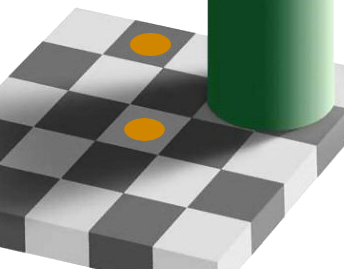 In this graphic, both yellow dots emit the same exact “colors” from your monitor, yet they look decidedly different. And while such images are often referred to as *optical illusions*, ones such as this are really *neurological* illusions — they are literally a figment of your brain, no matter how much we want to believe it as reality.
Monitors present us with nothing but illusions. On your computer’s display, the “yellow” you perceive is only separate red and green, with the red and green in amounts that create the perception of yellow. The red and green do not mix in the air like paint — the red and green “mixes” in the neurology of the vision system.
Throwing You A Curve (Eye) Ball
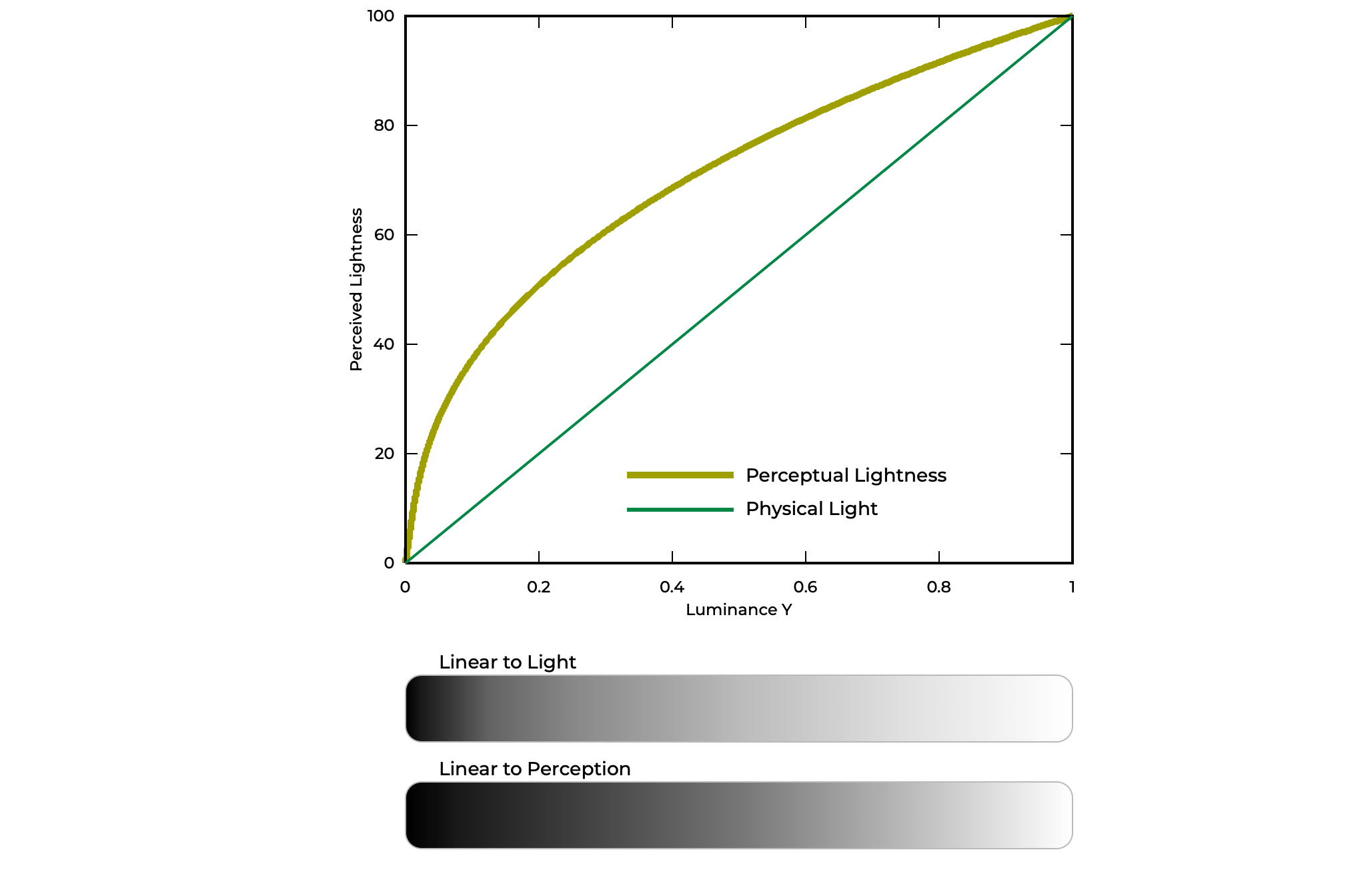
And to add to this, our perception is what you’d call non-linear, while light in the real world is “linear,” by which I mean if you have 100 photons of light and triple that, you then have 300 photons of light. But our vision does not see that change as a “tripling” — we see it as only a modest increase. This is particularly important for understanding the perception of contrast.
To help, when we talk about light or luminance, we are talking about linear, additive quantities. But when we talk about lightness/darkness/brightness, we talk about a qualitative and context-dependent perception. Stevens et alia found that we can use power-curves to model our perception in a useful way.
Do You See What I See?
The answer is maybe, but also, maybe not. First of all, your own visual perception changes with age. It takes the first 20 years of life to develop a peak contrast sensitivity. And as you age, your aging eye loses sensitivity, particularly in blue, as the eye’s optics become more yellow.
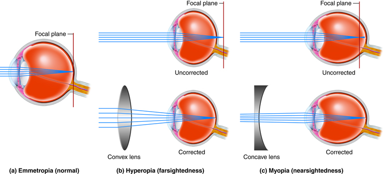
Contrast, Focus, And Other Vision Problems
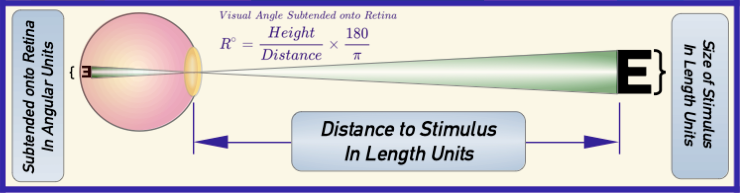
Visual acuity (VA) relates to how well our eyes can focus on the things we see, which is obviously rather important for reading. The small, thin nature of letters makes reading the most demanding visual task for most people. We measure acuity using an eye chart, where normal vision is defined as 20⁄20 (America) or 6⁄6 (EU).
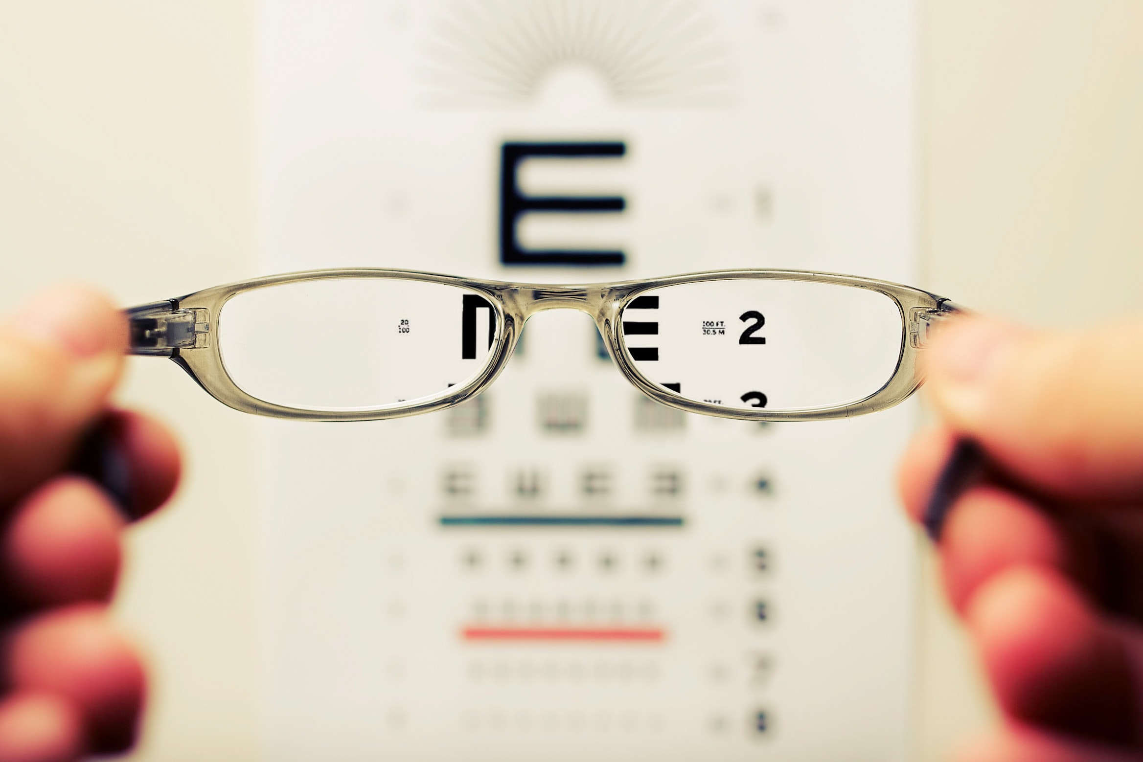
20⁄20 means “the size that someone with standard vision can see standing 20 feet away” and 6⁄6 is the same but refers to 6 meters instead of 20 feet.
In both cases, it means the size of the capital E of the 20⁄20 (or 6⁄6) line of the eye chart as projected into the retina of the eye. Vision science measures the size of the “retinal image” of the 20⁄20 E as five arc minutes of visual angle.
20⁄20 (or 6⁄6) is not perfect vision — but it is called “standard” vision. Human “perfect vision” is closer to 20⁄12 to 20⁄16, and 20⁄09 is the world record here. By comparison, an eagle’s vision is about 20⁄04.
Contrast sensitivity (CS) is another very important measure of the health and well-being of our visual system and one aspect that is most often misunderstood. In fact, our understanding of our contrast sensitivity has really only developed in the last few decades of vision research, and there is still active research relating to our contrast perception.
Color Vision Deficiency (CVD) About 5% of the world’s population is insensitive to some colors, a condition inaccurately referred to as “color blind.” In the most common cases, one of the cone types is either not working as it should or is missing altogether. The deutan type has a problem with or is missing the M/Green cone, and the protan type is missing or has an issue with the L/red cone. There are also some very rare types, such as tritan, having problems with the S/Blue cone, and even non-color (achromatic) forms of vision, missing two or all three cones.
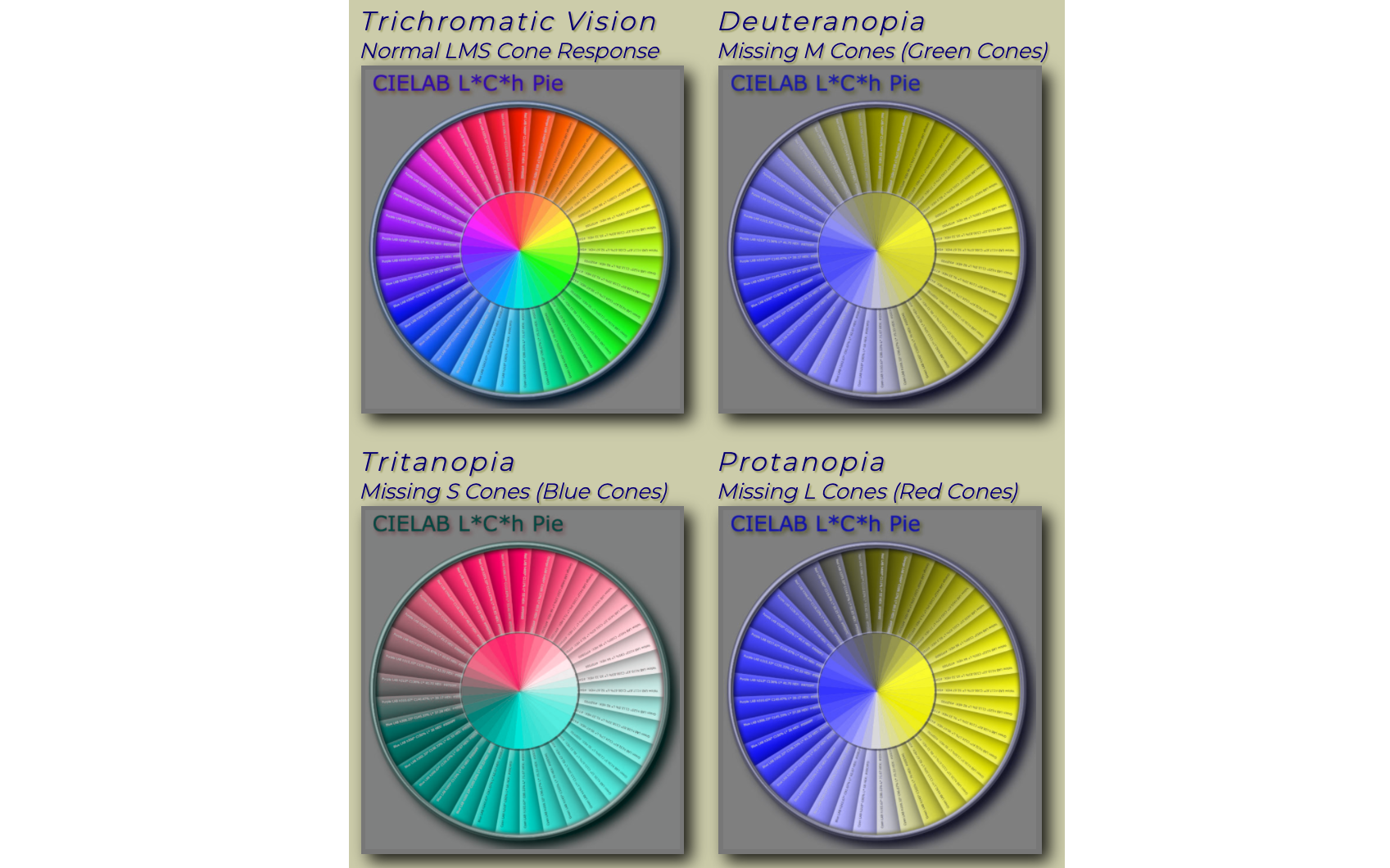
The non-color types are extremely rare and the only types that could be described as actually “color blind “. They usually face other vision issues, including low visual acuity (poor focus) and severe photophobia, where light brighter than twilight over-powers the rod cells, which in standard eyesight are only used for night vision. These actually color-blind users typically wear dark glasses even indoors and use assistive technologies for reading.
Color Insensitive and Readability: while CVD impairs the ability to distinguish some colors, luminance perception is the same as standard vision for the common types of CVD. Therefore for readability, deutan, protan, tritan types have the same needs for lightness contrast as standard vision. The singular exception is when pairing red and black, as those with the protan forms of CVD are insensitive to red. As a result, red against black has greatly diminished contrast for the protan, and red/black as a pair should be avoided for text or semantic non-text.
Understanding vision at this basic level helps understand important design choices for color and contrast. The author hosts a color vision simulator that simulates some of these types of color-insensitive vision for further demonstration.
Shedding Light On Contrast
There are many forms of contrast, such as contrasts of size, shape, or position, contrasts of content, theme, or emotion. But for the bulk of this article, we will focus on “perceived lightness contrast”. This is closely related to luminance contrast, as luminance is a measure of light, which we perceive as lightness/darkness/brightness. In other words, luminance is a physical quantity in the real world, but lightness is our human perception of it, and our perception is shaded by context.
Like lightness and color, contrast is also a human perception, so sometimes it is more correct to consider it a “lightness contrast.” Importantly, we consider contrasts of color meaning hue and saturation, separately from lightness.
Lightness/darkness and hue/colorfulness serve different purposes in our design work. Moreover, luminance and color are processed separately in our brains and are used differently for our cognitive understanding of how we perceive the world around us.
Reading and readability are primarily concerned with lightness/darkness differences — the fine details of fonts need ample luminance contrasts to be “decoded” by the Visual Word Form Area (VWFA) of the brain as whole-words or letter-pairs. On the other hand, contrasts of color are important for things like object recognition and categorizing.
Spatial Cases
One aspect of contrast perception that might not be intuitive is that contrast is driven more by “spatial frequency” than by the difference or ratio between two colors. For the designer, spatial frequency relates to font weight and font size or line thickness. A higher spatial frequency means smaller, thinner fonts or lines that are closer together. A lower spatial frequency relates to larger elements with greater distances between them.
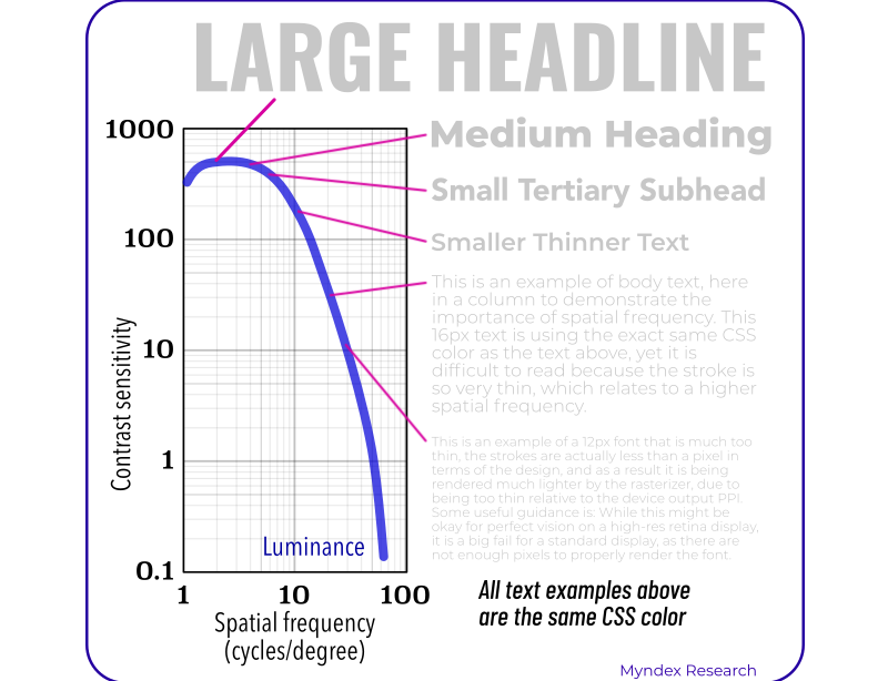
This graph shows the human contrast sensitivity curve. As the curve moves to the right, we are defining smaller and thinner items. Each of the sample fonts shown around the curve uses the exact same color of gray. But as you can see, the perceived contrast and readability of the big, bold headline is much higher than that of the small samples of body text.
To complicate matters, consider the effects of antialiasing or font-smoothing techniques. When a font is rasterized to the screen, small amounts of blur are added to reduce a jagged appearance. Here are magnified screenshots of text rasterized to a standard sRGB display. Notice how normal weight fonts about 18px and smaller just become subsumed by the background due to typical antialiasing effects.
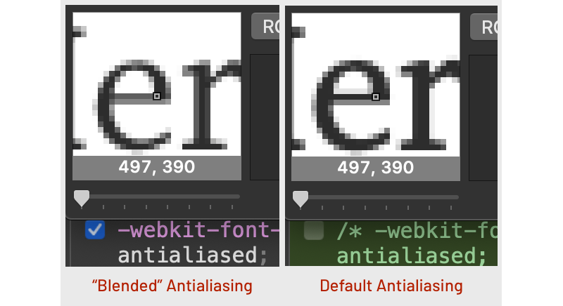
This also presents issues with how you, the designer, preview a graphic or web page. Retina screens at twice or three times standard resolution can present sharper text with less blending. Some systems or devices are set up with a form of antialiasing called sub-pixel, which can be sharper, but if a design uses -webkit-font-smoothing:antialiased; that overrides the display’s default antialiasing, replacing it with a soft blending that further damages contrast and sharpness. Apple introduced -webkit-font-smoothing to go along with retina displays, but it wreaks havoc on standard resolution displays with small fonts. Any use of -webkit-font-smoothing should be behind a resolution media query and implemented carefully.
To compensate for these factors, small, thin body text needs a much greater lightness/darkness difference. Also, relating to columns of body text, the density of the text results in further contrast reduction. A near-maximum contrast is good for most body text. Other instances of thin fonts have problems with font smoothing as well. For instance, some weight 100 fonts are so thin they need to be larger than 42px or even larger before font-smoothing techniques can be safely employed.
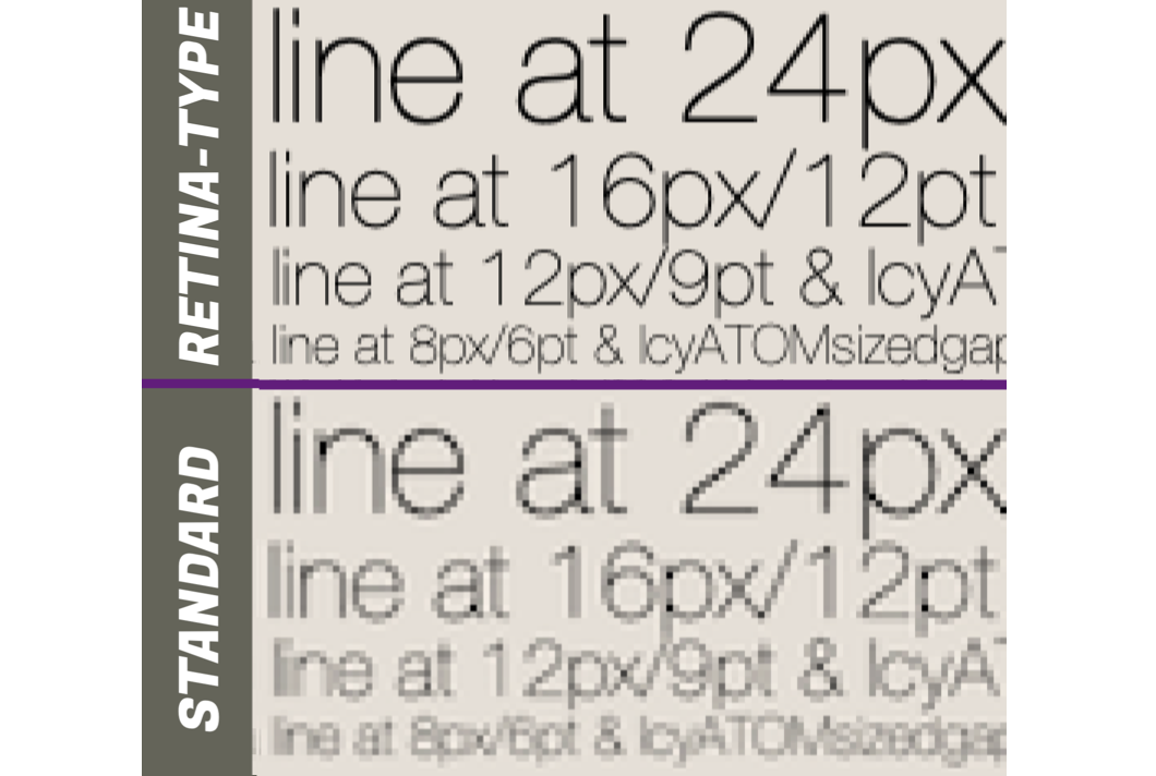
This also means that your designs need to be tested and viewed on standard resolution monitors. Design decisions made on a beautiful P3 retina display may have unexpected design problems, including poor readability, when viewed on a standard resolution sRGB device.
Predicting Contrast
For design guidance, we need a way to predict contrast. For some years, the WCAG 2 contrast method was used. Unfortunately, WCAG 2 contrast maths do not predict the contrast of text in accordance with human perception, which is especially noticeable with dark color pairs. The result is that WCAG 2 contrast is less than useful for dark mode, not to mention light text on saturated colors and a few other anomalies.
The author’s new method is the candidate contrast method for the future WCAG 3 guidelines. This new method directly considers perceptual lightness/darkness differences of text against a background, and generates a “lightness contrast” value, noted as Lc. From here, we can determine the minimum size and weight of a font that is going to be fluently readable, and together these calculated predictions can guide our design choices.
Readability Contrast
This leads us to the idea of “readability contrast” — the contrast needed for a particular use-case and the level of readability needed. The seminal readability research of S.Whittaker, J.Lovie-Kitchin brought us the ideas of “critical contrast” and “critical size.”
By critical, we mean the point where increasing the size, or contrast, will not improve reading speed and comprehension any further. Their research also introduced the concept of “contrast reserve” and defined the contrast needs for sub-fluent levels, where text is still readable but not at the highest speed or comprehension. This last part is important because, in a design hierarchy, not everything can be at maximum contrast.
For example, a column of body text requires the highest contrast to ensure the best fluent readability. But at the other end of the spectrum, non-content text, such as a copyright bug on the side of an image, does not need to be anywhere near that same high level of contrast. In fact, to keep the design uncluttered, and keep the focus on the actual content, something like a copyright bug should arguably be much lower in contrast — high enough to read if focused on, but low enough that it is not distracting or taking attention away from the primary subject.
Side Note: It’s not the size... it’s the x-size
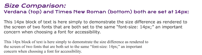
The CSS property font-size: is easy to use... and inaccurate. Setting the font size by specifying the font’s body height can have significantly different results depending on the font family. Therefore it is important to determine the x-height of the fonts used in the design and then set the font size with an offset as needed to achieve the desired rendered size.
Conflicts Of Contrast
The spectrum of the human experience is wide and diverse. With this diversity is the reality that what is best for one person, may create problems for another. This is especially true for visual accessibility. The ideal text size for one user may be too big or too small for another. What one user prefers for color coding of information may make that same information oblique to another.
Our visual perception and cognition can be impaired in ways that are not even apparent to the individual with the impairment. Our brain adapts or tries to, to our current situation. For instance, the visual cortex has a “sharpening filter” to improve perceived acuity, so a user with an acuity problem that is accustomed to sight without correction may not realize that they could benefit from glasses.
And the potential visual impairments don’t stop at the lens of the eye and basic focus, which is what defines acuity. Visual impairments extend past the retina and optic nerve to our brain’s neurology and cognitive processes. And the individual user needs are as varied as the many ways we can be impaired.
What this points to is the importance of user options for visual preferences, and this is an area of emerging technologies. The content creator is responsible for providing a baseline of accessible design and ensuring that users are not prevented from making adjustments they need, such as by zooming in text size, changing to the dark mode, or a special color palette. This is, in a very real way, a functional part of responsive design.
Flexible Foundations
A clear visual hierarchy is an important accessibility feature as well, particularly for cognitive and neurological reasons, such as dyslexia and ADHD. Good design guides our vision through the content, using multiple types of contrast: not just luminance contrast, but contrasts of size, weight, color, position, and distance, with this variety of contrasts creating a semantic flow through the content.
The structure of an HTML document has built-in tags supporting semantic markup, and the CSS styling for these tags should follow their semantic structural meaning. Semantic markup is important for all users sighted and without vision. Screen reader systems for the blind rely on the semantic markup for navigating through content. Sighted users need a visual semantic hierarchy to arrange the content and visual flow in a logical way that aids comprehension and reduces fatigue.
For all sighted users, there are some essential minimums for visual contrast, based on the expected use-case of the element and allowing for user-adjusted variations. Use-case also informs the essential minimums for visual size, which also needs to consider expected screen resolution and the font’s glyph design, as these can be substantially affected by antialiasing at smaller sizes.
A Bridge To The Future
WCAG 2 contrast guidelines suggest a 4.5:1 ratio for fonts smaller than 24px at 400 weight (normal), or 18.8px at 700 weight (bold), and 3:1 for other contrasts. While this guideline is simple to implement, these minimums can be very insufficient in some cases, yet paradoxically, more than needed in some other cases. These guidelines trace their origins to standards of the 1980s and are set to be replaced in the near future.
One future standard in development is WCAG 3, and the candidate method for contrast is APCA (Accessible Perceptual Contrast Algorithm), currently being evaluated as a public beta. In full disclosure, this author created APCA as research lead of the Visual Contrast subgroup of the W3C Accessibility Guidelines Working Group’s Silver (WCAG 3) task force, developing WCAG 3 as the next generation of web content standards.
APCA follows the human visual perception of contrast of text and non-text elements and is derived from decades of peer-reviewed vision science, tuned specifically for the readability of text on self-illuminated displays. The associated readability guidelines covering text size and luminance contrast are based on the seminal peer-reviewed research of Whittaker, Bailey, Lovie-Kitchin, G. Legge, and others.
APCA-related guidelines differ from the older WCAG 2 in that APCA considers human visual perception, use-case, and spatial features (weight and size) and provides a comprehensive set of useful design guidance. The actual conformance specifications for WCAG 3 are in development, so rather than rattle off specifications that may be subject to change, see “Why APCA” for further reading.
A question often asked is if APCA can be used now, and the answer is “it depends.” APCA is usable as a public beta, and beta users are highly encouraged to submit issues and discussions at the APCA GitHub repo. That said, one needs to determine if they have any contractual or other legal requirements to follow the older WCAG 2, regardless of WCAG 2’s deficiencies, such as for some governmental websites.
In the interim, there is a method that is fully backward compatible with WCAG 2, known as “Bridge-PCA”, intended as a way to provide better readability and calculate for dark mode but still follow the older WCAG 2 success criterion. While Bridge PCA fixes some problems, what is lost is the greater design flexibility offered by the full APCA implementation.
Practical Guidelines
During this transitional period, where we know that existing guidelines are expected to be revised or replaced, it’s helpful to see the road ahead. Here are some things designers can do now to improve readability, compliance, and actual accessibility while being better situated for future guidelines.
Size, Weight And Antialiasing
To emphasize, I’ll reiterate that weight and size are most important to readability contrast long before we get into the difference or ratios of lightnesses and colors. In this example graphic, the colors used for all the outlines are the same for each, with a 3:1 contrast ratio. First a thin 1px outline, next a 2px outline, then as you see in the 3px outline, the stroke is encroaching on the letters, so in the final example, with a 4px outline, we set the stroke to the outside only, which also increases the inner font-weight.
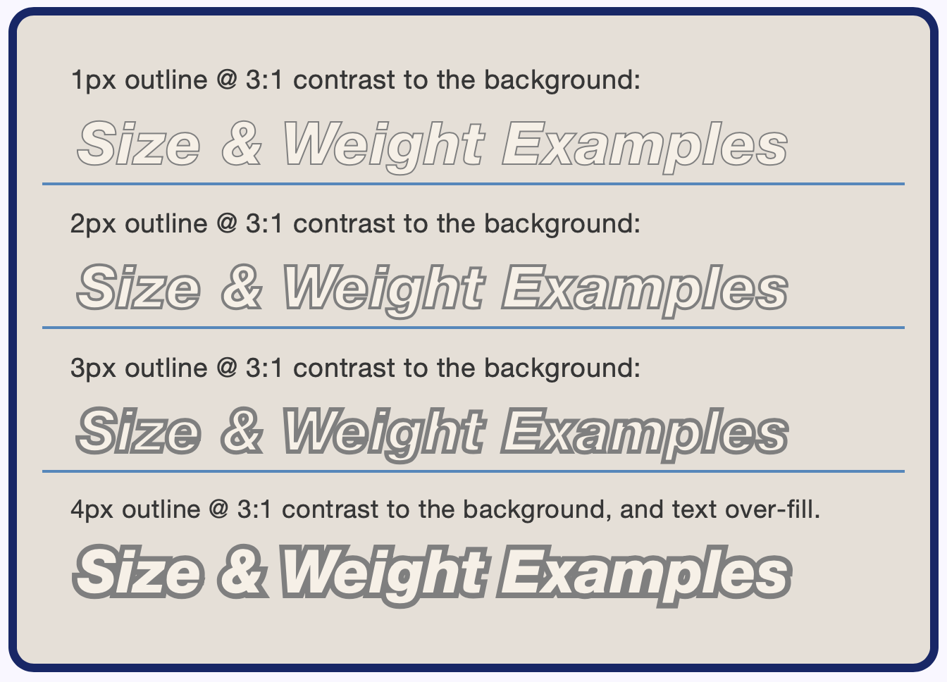
In each case, the same exact colors are used, but the spatial frequency of each row goes lower as it gets thicker and therefore becomes more contrasty and easier to read than the one above.
Let’s try that again, but this time, we’ll use colors with a much higher contrast of 7:1.
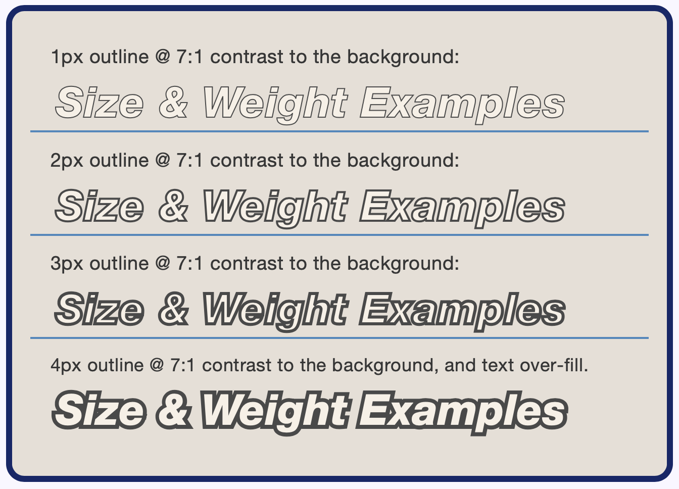
Notice that these rows are only a little more contrasty than the ones at 3:1, despite using 7:1 colors. The biggest changes, in contrast, are still the spatial changes of making the outline stroke thicker.
The reality is we need to spend more time thinking about improving the weight and size and remembering that not everyone has access to ultra-high-resolution retina-type displays. The antialiasing on lower resolution displays effectively lowers color contrast and can make thin fonts appear even thinner.
Side Note: Weighty decisions
Be aware that the CSS weight value (i.e. 300, 400, 700) is not consistent between different font families. For instance, “Arial Black” is indicated as normal (400 weight) even though it is clearly extra-bold. And Courier New indicates 400 weight even though it is clearly ultra light.
Also, in-between weights such as 500 or 600 will only render at that weight if that weight has been specifically imported (or is a supported variable weight font). And fallbacks to default fonts will usually not support anything other than 400 (normal) and 700 (bold). In this case, 500 will render as 400, and 600 will render as 700.
Because font weight is a primary factor in perceived contrast, the implications of unexpected weight changes from missing fonts, fallbacks, and the fact that there is no “standard” when it comes to how weight is defined, are important considerations when planning your page design.
Improved Contrast Values
The following recommendations are based on the use-case of the text; the text’s importance to the understandability of the content informs us of the needed readability contrast. In order of importance:
- Body Text: Columns or blocks of readable body text. (See Side Note: Body Double)
- Other Fluent Text: Headings, menu items, main navigation, tooltips, and photo captions which are required for understanding.
- Sub-Fluent Text: Colorized code blocks, DataViz callouts, informative placeholders, sub-text, photo captions that are duplicative of content text or not required for understanding.
- Non-Text: Icons, pictograms, buttons, controls.

- WCAG 2 values shown are intended for light-mode only, meaning the background is never darker than the equivalent of approximately
#aaa. - Also, the WCAG 2 values listed here are higher than those listed in the official WCAG 2 guidelines to help compensate for certain deficiencies in the older math/methods.
- APCA and WCAG 3 are still in development and not yet official recommendations of the W3C.
- The APCA maximum recommended contrast for fonts larger than
24pxisLc 90. More is not always better.
Side Note: Body Double
Columns of body text have significant extra needs compared to other textural elements. Letter and word spacing (kerning, tracking), paragraph spacing, and especially line spacing (leading), which is line height: in CSS, become much more important in blocks of body text.
As a practical definition, we define body text as a block or column of text that is more than 2½ lines, where the font is less than 32px (or less than an x-height of 16px), and the line height is less than four times the x-height.
Side Note: All My ex Live en TeX
When we are considering line-height, which is the CSS equivalent of leading, we are usually concerned with the distance between lines of mostly lower case letters. Therefore, we’d prefer to set line height relative to x-height.
And while we currently can’t set font-size using the font’s x-height, we can use the font’s x-height to set certain layout parameters, by using the CSSexlength.1exequals the vertical size of a font’s lowercasex. (Or at least it should; some fonts may not properly report the x-height.) We can put theexunit to good use in line-height. A baseline to baseline distance of three times the x-height is a good place to start.p{line-height: 3ex;}
Some font’s may need more than this. For paragraph spacing, we’d like to see an additional1.5exof padding, or more.
General Body Text Guidelines
- Font: Verdana is a good example of a readable body font. It has a large x-height ratio and clearly defined glyphs.
- Minimum font size: For Latin and similar alphabets, it’s best to think in terms of a minimum x-height. For best fluent readability of body text, a minimum x-height is about 9.4px, which accommodates standard 20⁄20 vision.
- For a font like Helvetica, this is a font size of 18px, but for Times, it’s 21px.
- Impaired vision is better accommodated with a 24px to 32px font size.
- For point sizes, divide the px size by 1.33.
- For non-Latin writing systems, related but different minimums may be needed.
- Font weight: normal 400 weight is usually ideal for most well-designed fonts.
- 300 weight is getting too thin, especially for fonts less than 24px.
- 100 and 200 weights should not be used for body text.
- Column width: blocks of text are most readable when lines are short enough for the eye to scan without head movement but long enough that the eye is not starting a new line too often.
- This ends up as about 50 to 60 characters per full line on average.
- 80 characters is the upper limit, and full lines shorter than 35 characters are typically too short.
- Line spacing (leading): The CSS
line-height:property sets the baseline to baseline distance between lines. Given a unitless value, it’s essentially the same asem, but we are more concerned about line spacing relative to the actual glyph size, so line height as a multiple of the x-height is preferable.- We can use the
exunit to do this. Three times the x-height is a good place to start, though some fonts may be better with a bit more or less than that value. p{line-height: 3ex;}
- We can use the
- Alignment: for the left to right reading languages, columns should be left-justified, aka left-aligned, but never center justified nor full justified.
- For best readability, the start of all lines should be aligned to help the eye find the beginning of the next line. For columns of text, center justification interferes with this.
- Center alignment can be okay for non-body text, such as some headings or menu items.
- Full justification is not appropriate for web content.
- Proper full justified columns need the skill of a typesetter, but unlike print, web content is dynamic and can be zoomed and reflowed.
- And attempting to “fix” text in place interferes with accessibility.
- For best readability, the start of all lines should be aligned to help the eye find the beginning of the next line. For columns of text, center justification interferes with this.
Side Note: Too much of a good thing?
While it is possible to have too much contrast, particularly for large and bold elements, this does not suggest making dark text lighter. Excess contrast is nearly always due to excess brightness. When something is so contrasty that it seems to have "halos", the first thing to try is to make the lightest element a little darker.
Side Note: Splitting hairs between dark and light
For the darkest color, depending on your monitor's calibration, you probably won't see any difference for colors darker than about#222orrgb(34,34,34). In fact, you could say that#222and darker is not functionally different than#000, except that for small thin fonts,#000is helpful to help "cut through" antialiasing.
On the other hand, the difference between#fff, and#eeeor#dddcan be significant in terms of reducing visual fatigue due to brightness.
Conclusion
The printing press with movable type has existed for over a thousand years in Asia. Nearly 600 years ago, Johannes Gutenberg introduced the movable-type printing press to the western world. Comparatively speaking, the internet has been with us for a fraction of that time, and the transition to electronic type still poses challenges for good readability.
I mention the long history of print because most of the “contrast guidelines” relate to printing dark text on white or light paper, and printing is something that is fixed in place. But today, on the internet, we have multiple options such as dark mode and the ability of users to choose variations of color schemes. Dark mode, in particular, has demonstrated that older metrics and WCAG_2 contrast included here are not up to the task of calculating contrasts over the visual range.
Thus the emerging importance of perceptually uniform contrast methods and guidelines. And while this article covered the basics, there is more to uncover and new design considerations to reveal, all for future articles.
Finally, thank the technical peer reviewers and editors of Smashing Magazine for their constructive help toward clarity of this challenging subject matter.
Thank you for reading.
Resources
- “How the CIE 1931 RGB Color Matching Functions Were Developed from the Initial Color Matching Experiments”, Yuhao Zhu
- The Wright – Guild Experiments and the Development of the CIE 1931 RGB and XYZ Color Spaces
- “Evaluating the 1931 CIE Color-Matching Functions”, Mark Shaw and Mark Fairchild
- International Commission on Illumination
- Stevens’s power law, Wikipedia
- “An event-related functional MRI study of the stroop color word interference task”, H. C. Leung, P. Skudlarski, J. C. Gatenby, B. S. Peterson, J. C. Gore
- “Visual requirements for reading”, S. G. Whittaker and J. Lovie-Kitchin
- “Contrast sensitivity of patients with congenital color vision deficiency”, Cagri Ilhan, Mehmet Ali Sekeroglu, Sibel Doguizi, and Pelin Yilmazbas
- “A Contrast of Errors. The WCAG 2 color contrast guidelines”, Andrew Somers
- W3C Accessibility Guidelines (WCAG) 3.0
- Color Vision Deficiency Simulator
- Why APCA as a New Contrast Method?
- Bridge PCA Contrast Calculator
 (vf, yk, il)

