Boosting Productivity For Designers With Efficient Tools
There is a multitude of ways to do anything on a computer — and some are faster than others. As knowledge workers that push pixels on our screens all day, for us, every second saved by working faster is that much more time to do the things that we love, be that spending time with friends and family or simply squeezing in that one more project for the month.
This is probably why I’m obsessed with productivity — finding ways to do things faster and evaluating tools that improve my workflow has been my passion for as long as I’ve used computers in my life. (And I started when MS DOS was a thing, so that’s a very long time!)

Here I’ll share some of my favorite ways to do things faster, better, and probably more fun. We will look at how to improve your day-to-day tasks and the tools that can help you with them. On the desktop front, I switch between my primary Windows computer and a MacBook regularly, so I’ll cover tools on both operating systems. On the smartphone side, I’m primarily an Android user, but I’ll try to include a few iOS-specific tips as and wherever possible.
Note: The article is for designers of all levels working on both Windows and Mac platforms. I know that a designer who prefers Windows and Android over a Mac and an iPhone is a rarity. I’ve been on both sides of the fence over the years, but now I prefer the non-Apple ecosystems for several reasons we won’t need to get into here. (Maybe a topic for another time.)
Superpowered Clipboards
If there’s one trick in here that saves me more time in the most literal sense than all others, it is the ability to access my clipboard history. Given how much we copy-paste on any given day, the ability to copy multiple items from one source and then paste them one after another without going back and forth can make a huge difference.
There are dozens of great clipboard managers out there, so it really comes down to the way you work and hence what features you prefer. For me, the primary clipboard manager I use is an open-source one called Ditto. It is easy, no-nonsense, and plug-n-play on Windows, but with a fair bit of customization available under the hood. On Mac, I use Clipy for pretty much the same set of reasons.
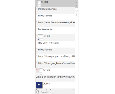
There are fancier options, like Paste on the Mac, but I personally prefer open-source tools and the ones above get the job done just fine without any compromise.
Snippets And More
Copy-pasting multiple items is great, but you don’t always want to do that round-trip for commonly used text. That’s where text expansion apps come into play. Things like email IDs (way too many in my case), phone numbers, addresses, ID card numbers, and so on are all examples of text snippets you will need often.
Most folks I know either type these out or have them in a note or document somewhere on their computer for quick copy/paste access. I prefer to avoid bothering with the extra step of finding and opening that document to be able to do the copy-paste. Instead, I just map them to text shortcuts using an app like Espanso on both my Windows and Mac computers. It may not be for everyone because it involves editing a YAML file to add your snippets, but I like the feature-set — including the ability to set the cursor wherever I want in the phrase.
If you prefer a more UI-focused approach with more bells and whistles, TextExpander or PhraseExpress may be more up your alley.
For example, I’ve set things up so that typing ;em and space automatically replaces it with my email ID. Similarly, ;ph is for my phone number, ;adr is for my address, and so on.
Commands For Everything
Continuing with the theme of workflow optimization, one of the best ways I’ve found to work more quickly and efficiently is to use a tool like Spotlight on the Mac. Although launching apps without having to open the Applications menu seems like a primary function, Spotlight can do so much more! Everything from searching for files on the computer to searching the Web to basic math calculations and currency conversions, it is one of the most versatile and time-saving tools on the Mac side. Raycast — a fairly new Mac app — takes this concept even further with more functionality and integrations with other apps and services.
Although Windows does not have a built-in tool that works in exactly the same way, there are many alternatives. My favorite is Ueli, which does pretty much everything Spotlight can except file search, and then Everything search fills that gap just fine.
A short trip into history:
The latest Windows 10 and 11 have pretty solid built-in options for starting applications and searching, but it wasn’t always like this. When Windows XP was a hit — which spanned over a really very long period, way over a decade — it didn’t have a way of starting applications by just typing their names.
This sparked the creation of third-party tools for this specific purpose, and one of the most popular ones was perhaps Colibri. With Colibri, you could launch programs and open web pages, manage your bookmarks, search the web and your own computer, and even control Winamp player — all without touching the mouse! Now we have built-in tools and many third-party tools that do the same things and even more, and of course, Colibri wasn’t the only app doing these things (I think Launchy, FARR, Keypirinha, Ueli — all of them also deserve an honorable mention) but we should not forget that it all started long ago, when launching any program on the computer required you to painfully navigate through multiple menus and sub-menus.
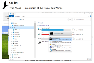
The sheer power of command panels like these has to be experienced first-hand in order to understand how they can improve your life. Hit a hotkey, start typing what you’re looking for, and the list of suggestions will instantly update; this list will even change over time as the tool learns from you and the things you’re looking for most often. It is not surprising then that many applications and services have started adopting this pattern, from Visual Studio Code to Notion to Obsidian.
Organized Workspaces
A lot of us in the design field use external displays with our laptops, and if you’re like me and like to set the resolution of that fancy 4K monitor to the maximum, there’s lots of screen real estate to arrange a bunch of windows around. Although both Windows and Mac have their own built-in window-snapping tools, those pre-built layouts are not always enough.
This is why on Windows, I like to use the FancyZones feature available in the PowerToys app, which allows me to create a custom set of frames to hold my windows in, suited just right for my workflow. FancyZones even lets you overlap these frames, and you can snap windows to frames by dragging them while holding the Shift key. Since the built-in toolset on the Mac is even more limited than on Windows, on the Mac side, I would highly recommend a third-party app like Rectangle Pro or Magnet for this.
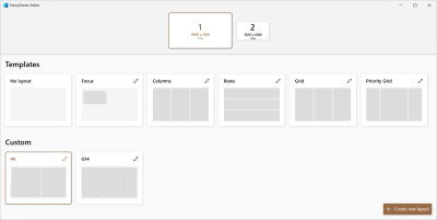
Note: PowerToys for Windows is a toolkit with much more in it than the FancyZone feature I mentioned. You also get a command panel called ‘Run,’ a tool to keep Windows from going to sleep, a color picker, a keyboard remapping tool, a powerful file and folder renaming utility, and much more. This project is open source, and the official Microsoft PowerToys app is just the icing on the cake.
Visual Bookmarking
As a designer, I’m always on the lookout for inspiration. It can come from anywhere, and given how much of an information overload we all deal with every day, it can be hard to keep track of all the bits and pieces, so you have quick access when you really need them.
I like to keep all such visual elements neatly organized and available by using a very underrated app called Eagle. It is available on both Windows and Mac and can keep your image library synced across computers using any cloud storage platform like Dropbox, Google Drive, iCloud, and others. It is a great way to keep tons of images organized and searchable.

Since it supports pretty much every image format out there (and also animated GIFs, videos, PDFs, and more), I use it as my one-stop shop for managing inspiration, source files, templates, and other resources. Each image can have a description, source URL(s), and an automatically generated color palette, making it super-easy to find exactly what I’m looking for when I need it.
Note: It is weird how the landscape for applications like this one has changed over the years. Many apps that designers used to swear by have ceased development during the last few years, so I’m glad this app is still being actively developed and updated.
Collaboration And Sharing In The Era Of Remote Work
One of the biggest outcomes of the COVID-19 pandemic was the huge boost to remote work. As some companies struggle to bring people back to the offices full-time, one thing that is becoming very clear is that remote work is here to stay. And with that, new ways to collaborate virtually with teammates and clients have become more important than ever.
While some companies continue to thumb their noses at The Great Resignation and insist that employees come back into the office, data scientists at Ladders insist that the writing is on the wall. Remote work is here to stay. According to their projections, 25% of all professional jobs in North America will be remote by the end of 2022, and remote opportunities will continue to increase through 2023.
— Forbes, “Remote Work Is Here To Stay And Will Increase Into 2023”
Using Zoom, Meet, or Microsoft Teams for calls is fine, but when it comes to communicating asynchronously, I find myself relying on screenshots and screen recordings to share with my colleagues. Personally, I use the open-source app Sharex for this on Windows. On the Mac, the app that comes closest to what I need is CloudApp. They both let you take screenshots and annotate them or record a video of the screen and then share it with your team or clients.
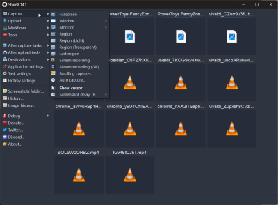
Almost all the clients we work with use Slack, so that’s the primary way my team and I communicate. It wasn’t great with audio and video chat early on, but the recent addition of huddles has changed that and reduced the need to get on to Zoom calls for quick conversations or shareouts.
Extending The Toolset
To wrap things up on the desktop apps front, I want to mention a few tools that don’t have many features and instead are really, really good at only one thing. I need such tools daily, too, so here’s a rundown of those:
- Caesium (Windows) or ImageOptim (Mac) to quickly compress images before adding them as assets for web projects.
- Soundswitch on Windows to quickly switch between audio input and output devices with keyboard shortcuts. It is especially great for when you have multiple speakers and microphones, each for a specific use case. I haven’t found a Mac equivalent for this yet.
- Eartrumpet (Windows) or Background Music (Mac) for setting different volumes for each app — to keep music on Spotify playing in the background on low volume while I’m reviewing a Zoom recording.
- X Mouse Button (Windows) to remap those extra buttons on my 6-button mouse. BetterTouchTool (Mac) does this and a lot more. How I wish it was available on Windows!
- Quicklook on Windows to replicate Mac’s built-in press-space-to-preview feature.
- One Commander (Windows) or Path Finder (Mac) to replace the built-in file managers with something more powerful, with a lot of extra features that I simply can’t lose now that I’m used to them.
Faster And Easier Web Browsing
As more and more computing moves to the cloud, we’re spending more time and doing more work in our web browsers. If you had told me ten years ago that my primary design application (Adobe Photoshop at that time) would be replaced by a web app (Figma), I wouldn’t have believed you for one second. Yet, that is exactly what today looks like. And it is not just design — my animation app, video editor, office apps, email client, and more are all web apps now!
Chrome is great, but I prefer Vivaldi as my primary browser. It is based on the same Chromium engine that Chrome (and Edge, Opera, Brave, and so on) are built on, so it supports all the same browser extensions. I like it because of some of the built-in functionality that I’ve become used to, particularly the following things:
- The ability to split multiple tabs in the same view.
It is great for copy-pasting between two Figma files without having to switch between tabs and also when comparing two documents or keeping a checklist visible while reviewing a document. - Quick Commands, which is like Spotlight for the browser.
A command line interface that you can use to find and switch to open tabs, open bookmarks, write notes that are saved in the built-in notepad, run simple math calculations, and even execute multiple actions as a single command chain. - Web panels, which let you open websites in the sidebar as an overlay.
I use this to keep a mobile view of my todo list app (Todoist), my Twitter feed, the Material Design color palette for quickly copying the color codes, and so on.
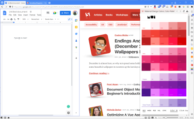
I also use quite a few browser extensions in addition to the built-in features; these should work on Chrome, Edge, Opera, Brave, or any Chromium-based browser. And if you prefer Firefox, most of these are also available as add-ons:
- Most images you see on web pages are actually larger than what you see. I use an extension called Imagus that automatically pops up the larger image when hovering over it (I’ve set this, so it works only when I press the Shift key and hover). This is great if I want to copy or save the image or just to see the image details better.
- I use the Material theme a lot, and one of the most repetitive things I used to do was go to the color palette to copy/paste the color values. The Simple Material Design Palette solves this by adding the palette in the browser header: click the extension icon, scroll to the color I’m looking for, and click-to-copy the
#hexcode to the clipboard. - If you prefer to use the keyboard over the mouse wherever possible, here’s a great time-saver. I use an extension called Vimium to browse the web with just my keyboard. It lets me open links on a site, scroll through the page, switch tabs, quickly get to the input fields, select and copy text, and much more without the need to move the mouse at all. This is one of the first extensions I install whenever I’m working with a new browser.
- I prefer reading articles on my laptop, so Pocket comes in handy when I find something on my phone and want to save it for later reading. The problem is that you need to open the Pocket site to see the list. Instead, I prefer using an extension called IwillriL, which shows your saved articles in a small popup for quick access. There’s also Toby for managing tab overload by saving tabs and tab sessions for later.
Conclusion
There are many more apps and browser extensions I have installed, but these are what I find most useful on a day-to-day basis. They’re what I’ve settled on because they suit the way I work. Not everything will work for you, but I’m hoping this gave you some ideas for what you can do to optimize your time on the computer and save some time here and there.
Remember that if you have a problem, it is more than likely that many others had it, too, and some enterprising folks decided to solve it by creating an app or an extension for it. So be sure to look around, try things out, and build your own toolbox with tools that work for you. Happy exploring!
Resources
Here’s a highlight list of some of the key apps mentioned in the article:
- Ditto clipboard manager (Windows)
- Clipy clipboard manager (Mac)
- Espanso text expansion app (Windows/Mac)
- TextExpander text expansion app (Windows/Mac/Chrome)
- PhraseExpress text expansion app (Windows/Mac)
- Raycast app launcher (Mac)
- Ueli app launcher (Windows/Mac)
- Everything search utility (Windows)
- PowerToys — includes FancyZones window manager (Windows)
- Rectangle Pro window management (Mac)
- Magnet window management (Mac)
- Eagle app for organizing your design files (Windows/Mac)
- ShareX screen capture and file sharing tool (Windows)
- CloudApp visual communication tool for teams (Mac)
- Vivaldi Chromium-based browser (Windows/Mac)
- Firefox browser (Windows/Mac)
- Todoist personal task manager (Windows/Mac)
- Imagus (Chromium extension)
- Simple Material Design Palette (Chromium extension)
- Vimium (Chromium extension)
- Pocket personal reading list + IwillriL (Chromium extension for Pocket)


 Register Free Now

 SurveyJS: White-Label Survey Solution for Your JS App
 Celebrating 10 million developers

