Product Reviews And Ratings UX: A Designer’s Guide

Email Newsletter
Weekly tips on front-end & UX.
Trusted by 182,000+ folks.
 Register for Free
 Custom Web Forms for Angular, React, & Vue. Your backend.


 Celebrating 10 million developers
When we make purchasing decisions, we often rely on expertise from people like us who happen to have purchased that item already. And so we seek user reviews, often looking for a high enough average score, a good number of these reviews, and a good number of ratings.
In fact, 95% of users rely on reviews to make their decisions and learn more about how well a product fits their needs. Unfortunately, too often, the way we design reviews and ratings UX confuses and frustrates users, rather than helps them. Let’s fix that.
This article is part of our ongoing series on design patterns. It’s also a part of the video library on Smart Interface Design Patterns 🍣 and is available in the live UX training as well.
What Customers Search In Reviews
We often assume that the only thing that a best-selling product needs is a high number of positive reviews. Positive reviews indeed are needed to build up trust, but just as many users need to be convinced that a product would work for them. This shows up in a few attributes that customers seek to verify in reviews:
- The product is indeed of high quality as advertised,
- They aren’t overpaying: the pricing is fair and acceptable,
- They’ve chosen the right product that addresses their needs well,
- People like them (similar age group, experience, needs) were satisfied with the product,
- They haven’t missed any critical details (accessories not included, different sizing),
- The risk is low and manageable (simple return policy, cancellation process, 30-days-money-back-guarantee),
- The worst thing that could happen to them due to purchase (poor customer service that’s hard to reach, fraudulent activities that have been flagged).
All these fine little details are quite difficult to decipher from a standalone, beautiful 5-star rating on a landing page. So how can we communicate with them to remove doubts and concerns? Well, we can start off with negative reviews, which often can be way more helpful than not.
Reward Negative Reviews
We shouldn’t be surprised by the fact that most customers, when shopping online, meticulously study negative reviews first, and they need enough of those to tackle the concerns and skepticism most customers almost instinctively come with. The more specific negative reviews are, the easier customers can connect the dots and reach that threshold of trust. Especially if all negative reviews simply don’t apply to them.
Most negative reviews focus on specific things that went wrong during the purchase. For most decent products and most decent brands, that isn’t going to be a particularly long list. It might be that the customer service reaches its busyness spikes every now and again, or that promised delivery times weren’t achieved during holidays, or that there is a high severity bug in the application that’s being solved that week. These things, however, wouldn’t be relevant throughout the entire year (hopefully!).

However, it might be that a product is incredibly faulty, confusing, malicious, or intricately complex — and that the cancellation process is designed to keep as many paying customers as possible. Users will watch out for any red flags that might indicate just that. And the lack of negative reviews altogether is one of those red flags, as it might be hiding some critical underlying issues.
Not every negative review is negative, though. It’s worth repeating that customers tend to seek customer feedback from people like themselves on issues that are relevant to them. If negative reviews mostly focus on poor packaging for shipping overseas or low brightness outdoors, it might be less of an issue for a customer ordering in the same country with the intent to use a device at home. These issues are definitely less critical than any notion of “extremely buggy,” “horrible customer support,” “major refund troubles,” or “severe cancellation issues.”
Chances are high that you will need some negative reviews to appear trustworthy; they will, in fact, increase conversion rates and boost customers’ confidence. That’s why you should consider encouraging customers to write honest negative reviews and ask them to be very specific about the parts of the experience they didn’t like. Also, prompt them to explain if the issue has been successfully resolved in the end. To do that, you could reward users with bonus points or coupon codes that they could redeem with their next billing cycle or with their next purchase.
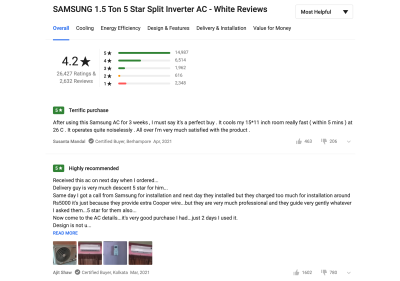
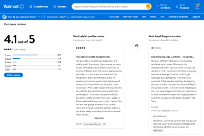
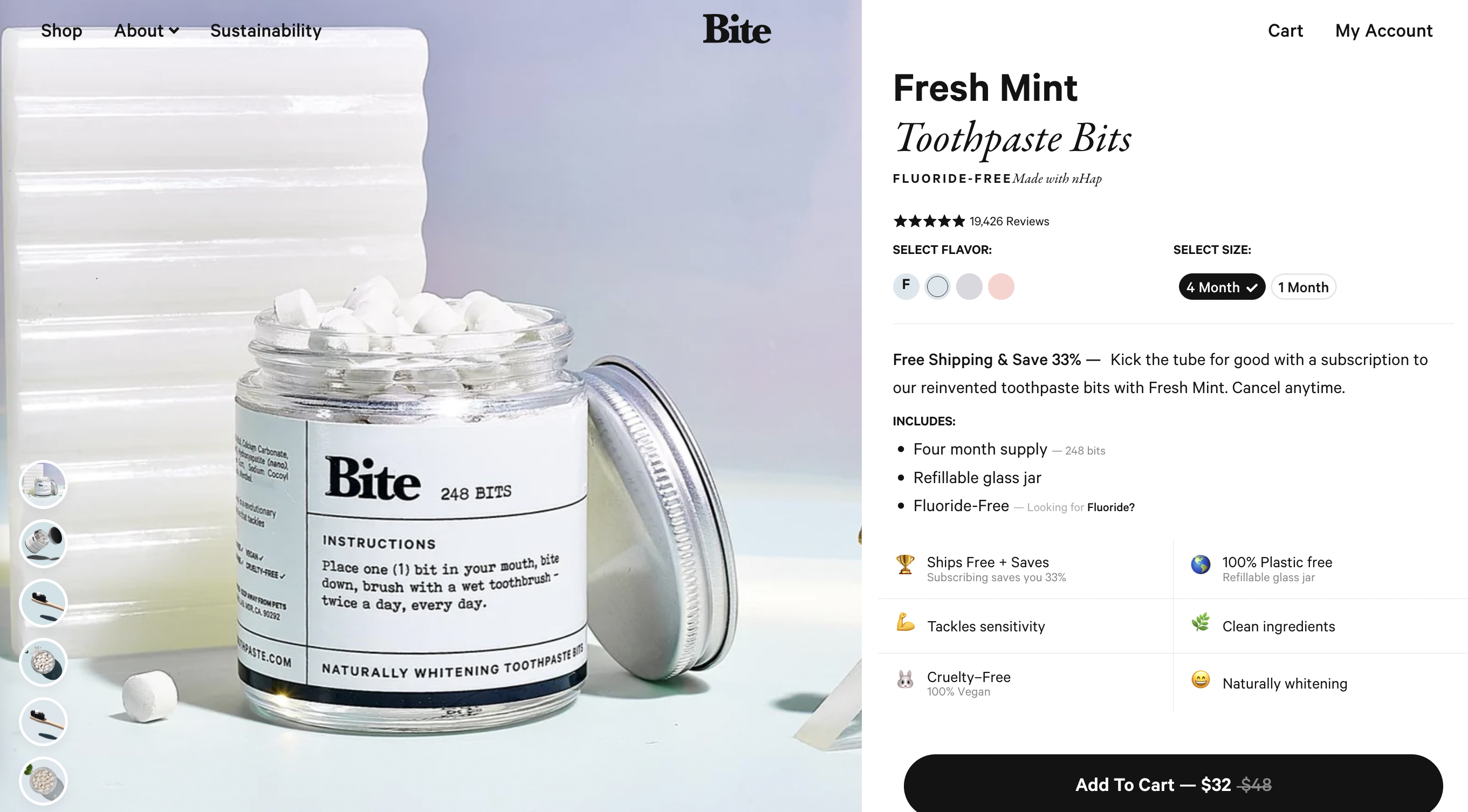
Always Show Decimal Ratings And Number Of Ratings
Another detail that customers often rely on is a precise estimation of the experience that similar customers have had. In that regard, many websites don’t go far enough, though. Frequently we can spot bright orange stars used as indicators of how great or poor the experience has been, but there are vast differences and nuances between “4 stars”- and “5 stars”-experiences, yet they are somehow getting lost between two aggressively rounded scores.
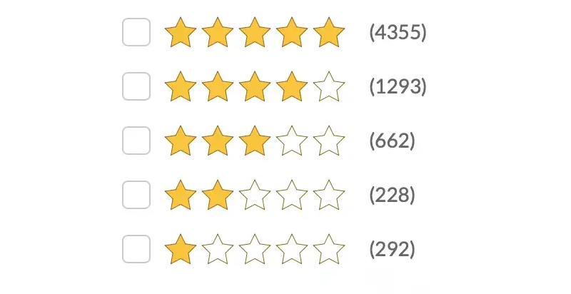
The problem is that stars alone don’t provide enough context, nor do they provide a detailed enough explanation. With this pattern,
- we can’t easily tell what exactly customers liked or disliked;
- we can’t tell how satisfied users with a profile similar to ours are;
- we can’t say what’s particularly good or particularly bad about the product;
- it’s impossible to distinguish between products with a rating closer to 4.0 and a rating closer to 5.0. The difference between them, however, is vast.
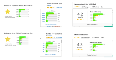
In order for us to provide a slightly better assessment, our rating scores could be a bit more precise. As a general rule, it’s always a good idea to display a decimal average score (e.g., 4.7 out of 5) and the total number of reviews (78 reviews) together. The average decimal score provides a more granular estimate, while the total number of reviews guarantees a high enough number of reviewers contributing to that score.

Bite prominently highlights the total number of reviews, but it doesn’t reveal an average score. However, once a product reaches 19,348 reviews (overwhelmingly positive), displaying an average score might not be as necessary.
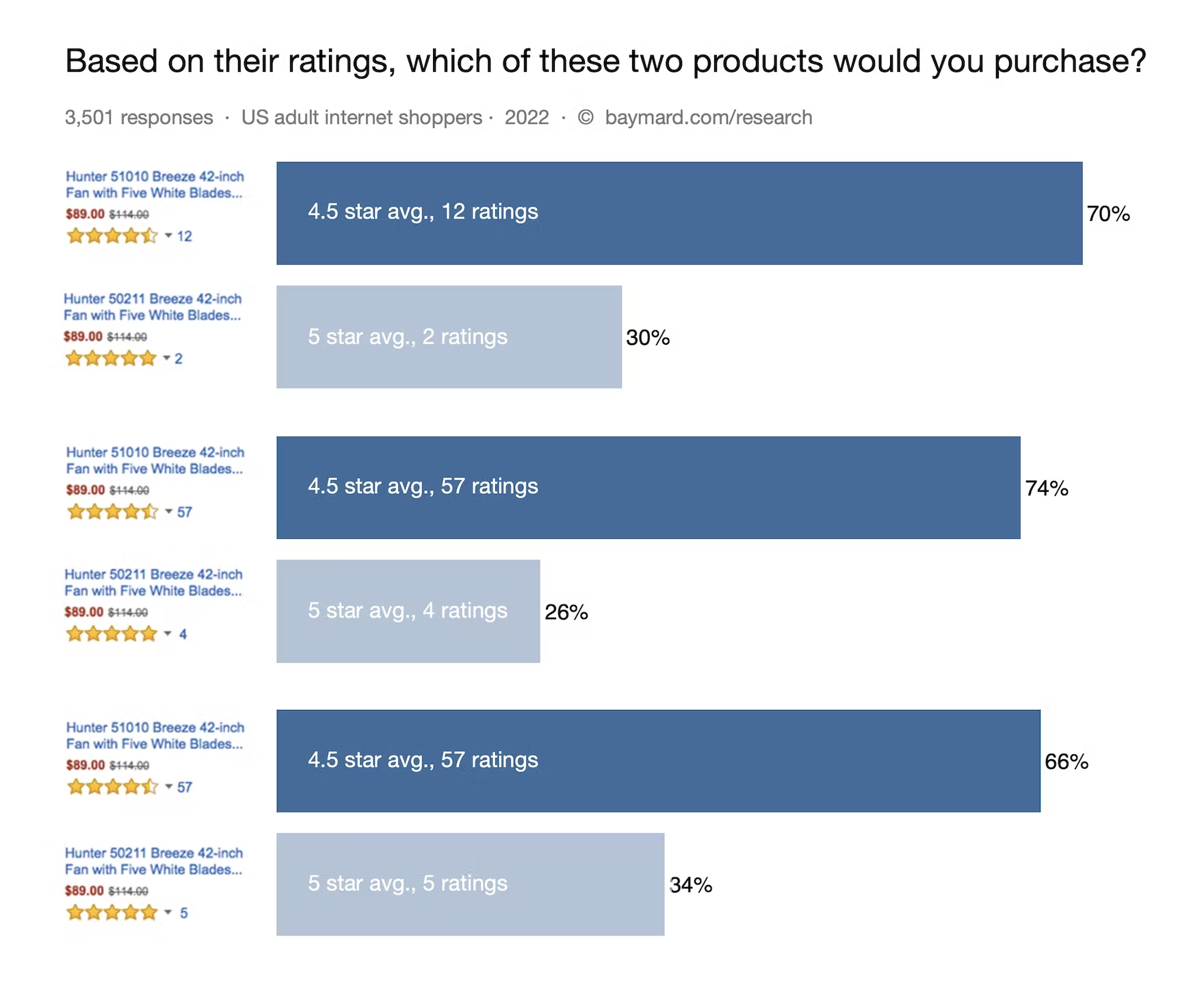
In fact, the number of reviews matters significantly. In usability testing, customers “often show greater preference towards some products with 4.5-star averages than some with perfect 5-star ratings due to the number of reviews that these averages are based on”. In fact, 70% of customers would pick the one with the higher number of ratings despite its lower average.

For example, for two otherwise identical products, where one product has a product ranking of 4.5 with 180 reviews and another has 4.8 with 39 reviews, a majority of customers are likely to choose the first one, despite a lower average. That’s also why it’s critical to mix the number of ratings and average score to avoid the bias towards products with a better ranking but lower number of reviews.
Is there a perfect score, by the way? Well, as long as your product’s score is somewhere between 4.5 and 4.89 — with a high enough (75+) number of reviews, you probably shouldn’t be worrying too much about its competitiveness. When a rating score hits anywhere beyond 4.9, customers start getting suspicious; that’s when they slow down and search for traps and flaws that aren’t explicitly stated. Unsurprisingly it doesn’t help in closing sales.
Why is that? Because in real life, anything sincere with a score above 4.9 is very hard to come by and hence less likely to be true — unless it’s based on a very small sample of biased and dishonest reviews. Don’t feel tempted or pressured to hit that average user rating, though, as it’s not the only detail that customers pay attention to.
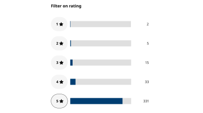
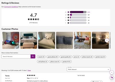
Display A Full Rating Distribution Summary
In addition to bright yellow stars, over the years, we’ve learned to rely on distribution summaries for ratings. They explain the relation between high-score reviews vs. low-score reviews and give customers a more granular overview of how good the product is on average for most people. There, we can tell quicker if most customers had an overwhelmingly positive or negative experience.
We do so by looking for specific patterns in the rating distribution summary. As users, we quickly eliminate options with a disproportionate number of low-score reviews. We quickly eliminate options with a disproportionate number of mid-score reviews. And we abandon options without any low-score reviews.
We almost instinctively search for the pattern — the one perfect, trustworthy distribution that is representative of good products. In it, we need to find a lot of positive reviews and enough negative reviews.
Typically this means that a vast majority of ratings will be 5-star-reviews, followed by plenty of 4-star reviews, and eventually followed by a large enough (but not too large!) number of low-score reviews. Most importantly, there must be enough negative reviews to give customers pointers about the most negative experience they might have. Usually, products that match that perfect pattern appear most trustworthy and perform best.
In user research, this “perfect” pattern is called the J-shaped distribution pattern. However, as it turns out, it’s not really that perfect and conceals some troubles for businesses.
The J-Shaped Distribution Issues
You might be wondering why that particular rating distribution has such an unusual name. The distribution resembles a capital letter “J”, with a small spike of the most negative reviews (★), a flat middle ground (★★, ★★★), and a high spike of the most positive ones (★★★★★). It is very different from the omnipresent, classic bell curve that we might have expected initially.
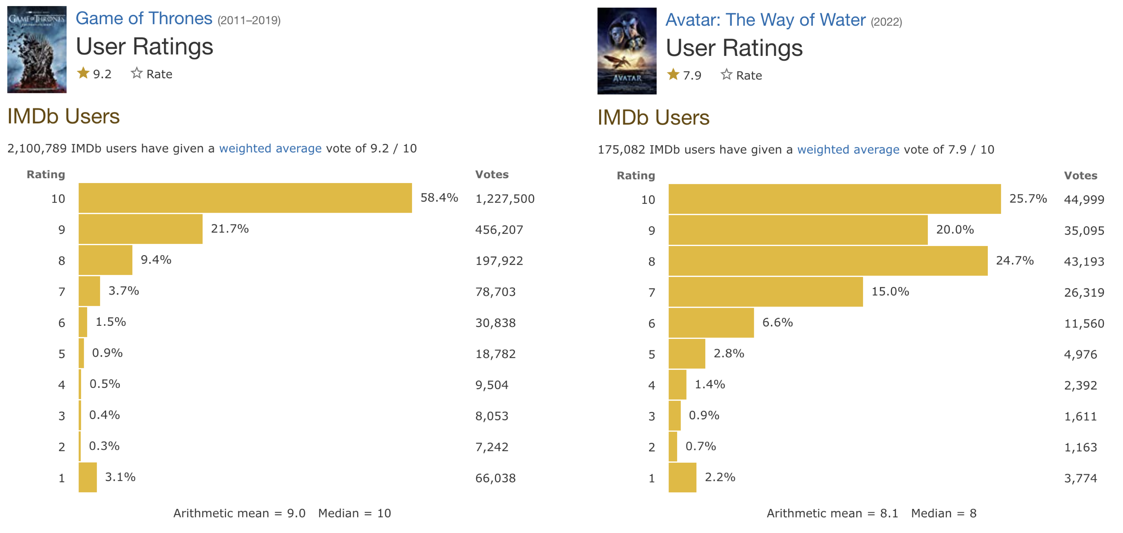
In the examples for IMDB scores of “Game of Thrones” and “Avatar: The Way of Water,” you’ll notice that the distribution in the top scores is much clearer for “Game of Thrones” and much less conclusive for “Avatar: The Way of Water.” Despite a stronger negative scoring in the lower ratings, the distribution of “Game of Thrones” is likely to perform much better — both in movies and for any other products.
We can also notice that in both cases, the lowest score (Rating 1) gets a disproportionate amount of attention. That’s the “J”-shaped distribution in action. Why does it happen?
As Sav Sidorov and Nikita Sharaev explain, user feedback is often skewed towards the extremes. Customers who are just satisfied may not take the time to leave a review or rating, but those who are either extremely happy or extremely frustrated are more likely to do so. This makes rating scores very vulnerable to the strongest opinions of the extremes and hence biased and inaccurate.
An alternative design that Sav has suggested includes four options: ↑, ↓, ↑↑, and ↓↓. When providing a review, customers could click or tap multiple times to provide a stronger assessment. This might eliminate the large spread between the extremes.
Another option is to introduce a delay for reviews. As Marianna Alshina noticed, Etsy doesn’t allow its customers to review products straight away. They have to wait for one week to have a “full” experience with the product, and only then leave pictures and their review.
Will it work? Maybe.
Either way, the distribution needs context that explains it. And that’s where breaking the rating distribution summary by product attributes can help.
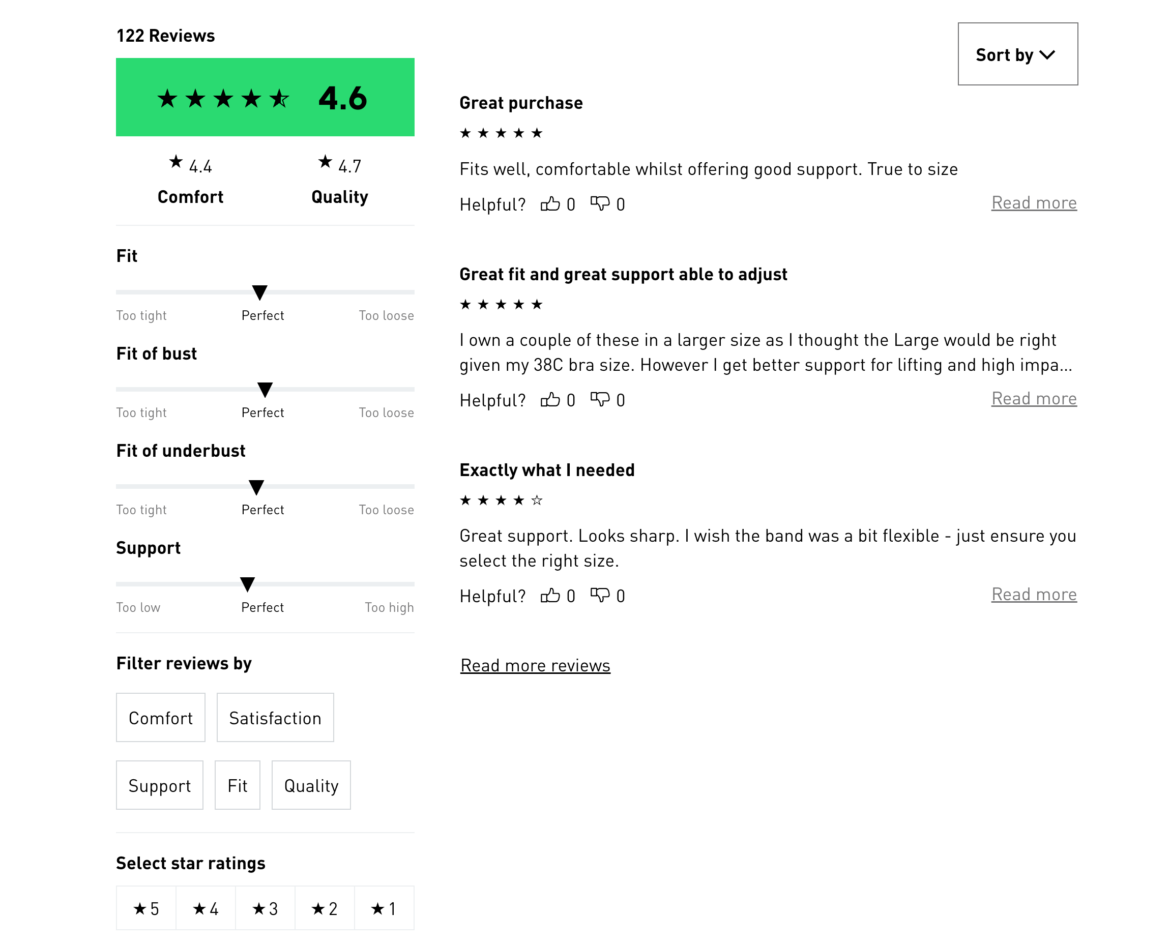
Break Rating Distribution Summary By Product Attributes
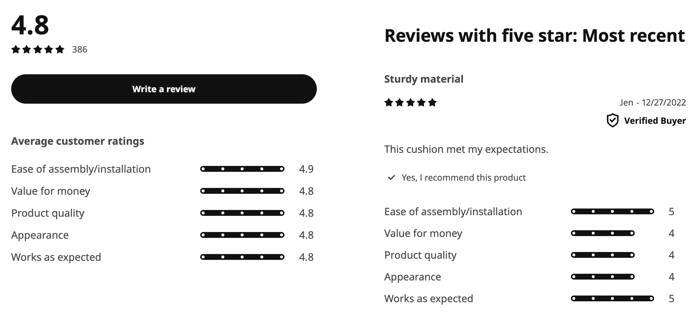
Showing a distribution summary provides a better overview to customers, but it still requires quite a bit of effort to discover how well-performing a specific product attribute is. For example, a customer might be interested in how long the battery life is or how sophisticated a particular feature is. To learn both, they’ll need to sip through dozens or even hundreds of reviews, often without any success.

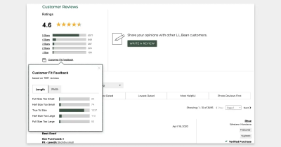
A useful approach to help out customers there is to break down the distribution summary even further. For each standalone product attribute — appearance, value for money, product quality, battery life, etc. — we could gather and highlight average scores, based on user reviews. When a customer chooses to provide their feedback, we could ask them to evaluate specific qualities of the product and then calculate a separate average score for each attribute.
On Flipkart (pictured above), customers are encouraged to provide feedback broken down into groups of attributes that are very specific for the product. The “Value for Money” is a classic one that is being used across all products. The color coding is used to indicate “good” and “bad” reviews, but a slightly different color scheme would be more accessible. Also, unfortunately, customers can’t filter reviews by a particular score.
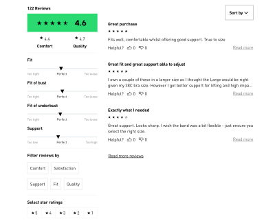
On Adidas and LL Bean, customers can explore specific qualities of a product in a bit more detail. It can be a position on a scale or yet another distribution summary. Both patterns make it clear to customers how well a product performs in relation to that one specific attribute.
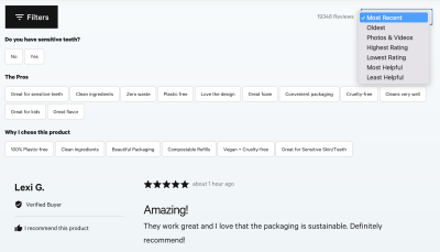
Enhance User Reviews With Suggested Tags
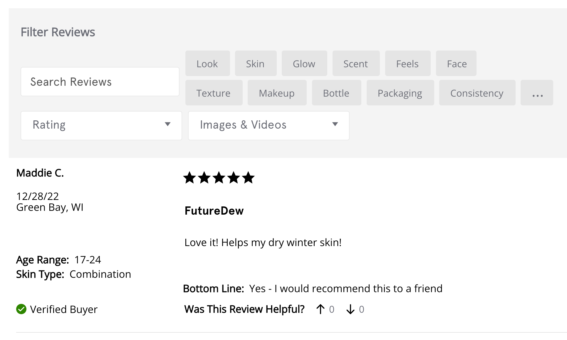
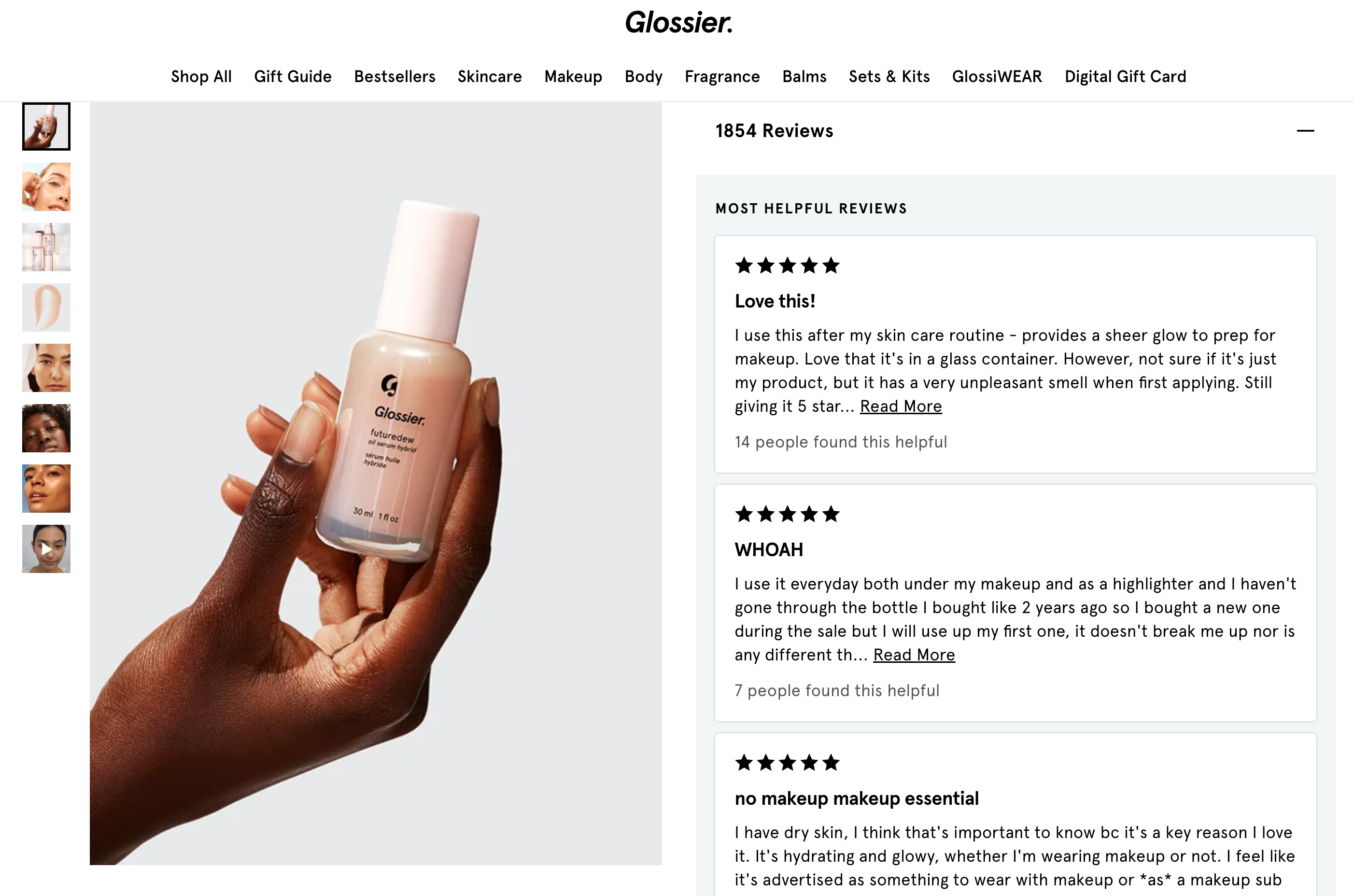
The quality of the experience can’t be measured by product attributes alone. A skillfully designed and manufactured product might not be a good fit for some customers, and learning it from a product description spec is impossible. To help there, we could suggest relevant tags when customers write a review. Typically, it could be something along the lines of “great fit,” “great for kids,” “easy to use,” “love the design,” “beautiful packaging,” etc.
These tags could also be slightly more personal and individual; they could relate to the product but also to the customers who have already purchased that product. The goal here is to gather and surface insights and personal details that would make it easier for prospective customers to relate to published reviews. In other words, we try to help prospective customers find similarities with already existing customers and explore their reviews in that light.
Personal details could be anything from the frequency of use and level of experience to age range and current location. But it would differ depending on the product, of course. For skin products, for example, we could ask about the preferred look, skin type, shade, glow, scent, characteristics of the face, but also texture and typical type of makeup. That’s exactly what Glossier and Sephora do.

These tags, then, could be displayed as additional rating filters — and hence help customers find relevant reviews faster, and perhaps even scores for important attributes, based on feedback from customers like them. And that’s much more valuable than any general feedback based on averages could be.
Highlight Social Proof From Reviews
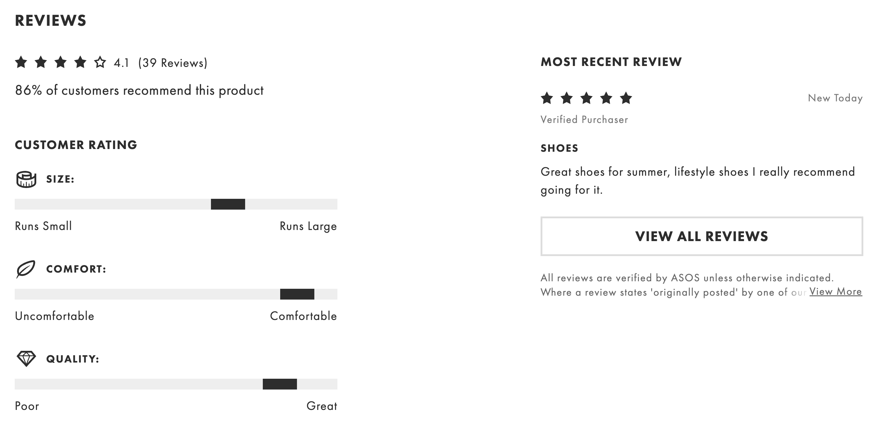
In addition to suggested tags, one of the questions we could ask existing customers at the very end of the review is if they’d recommend this product to their friends, colleagues, or total strangers. As a result, we could calculate a quite significant number that’s often neglected but can be quite a game-changer: the recommendation score.

Asos (pictured above) highlights that “86% of customers recommend this product.” This is quite different from 5-star ratings or 1-star ratings because even customers who aren’t quite happy with the product and would perhaps give it a 3-star rating might still recommend it to their friends. It might not be a perfect fit for them, but they are quite satisfied with its quality.
Highlighting prominently how many customers actually recommend the product is definitely a good idea. A magical number to stay above is 90% recommendation score; yet again, if you climb over 95%, it’s getting a bit suspicious.
To make it even stronger, you could specify the group of customers that actually has recommended the product and allow customers to choose the group that would fit them best. There, we could include fine details such as level of experience, frequency of use, type of projects, and others.
A statement such as “86% of customers (5+ years of experience, enterprise-level) recommend this product” would probably perform the strongest for people who fit that particular group.
Provide Quick Summaries Of Pros And Cons
We’ve come quite far already, yet customers still need to filter and explore reviews on their own. We could help them faster grasp the good bits and the bad bits about the products though. To do that, we could highlight the pros and cons of a product, along with quick summaries of positive and negative reviews.
Ideally, these quick summaries would be analyzing user reviews and listing pros and cons as bullet points. This information is precious and often not displayed at the right time. For example, it would be a very impactful add-on for a category listing page, a product page, and a feature comparison page where users land when they try to compare a couple of products side-by-side.
Allow Users To Mark Helpful Reviews
Not every review is helpful. Some reviews appear very generic, others lack important details, and others again focus too much on irrelevant details. To make sure that relevant reviews get surfaced to the top of the reviews list, we could kindly prompt users to mark if they find a review helpful — both for positive and negative reviews.

Marked reviews — a few of each kind — could then be highlighted at the top of the reviews section, along with the number of users who found them helpful. This dramatically boosts trustworthiness and reduces time to relevance, as highlighted reviews have been validated by other customers. This appears authentic and builds trust.
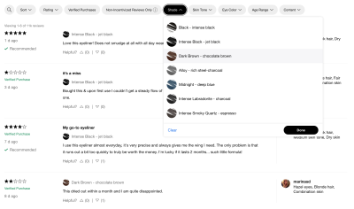
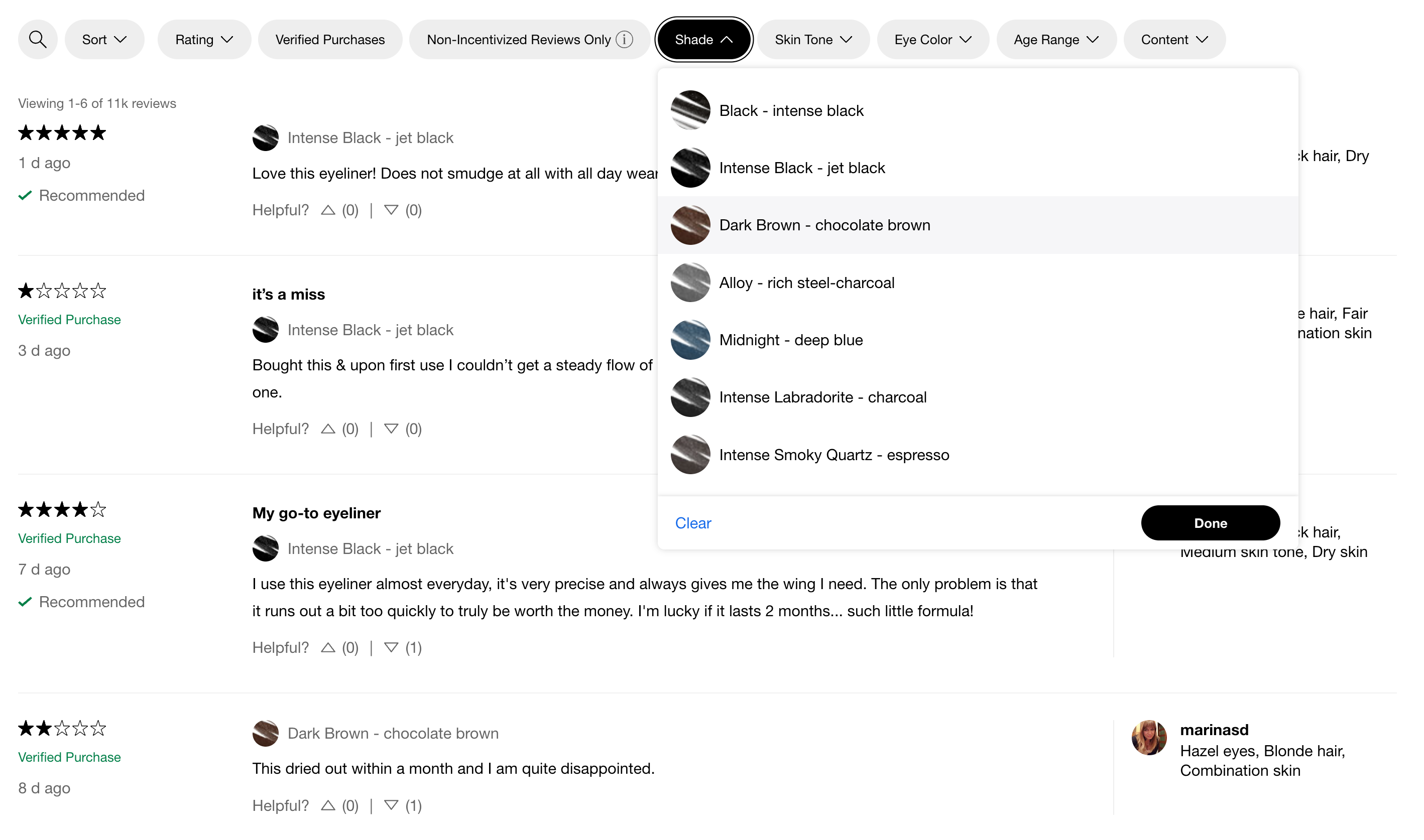
Provide Helpful Sorting Types and Search Autocomplete
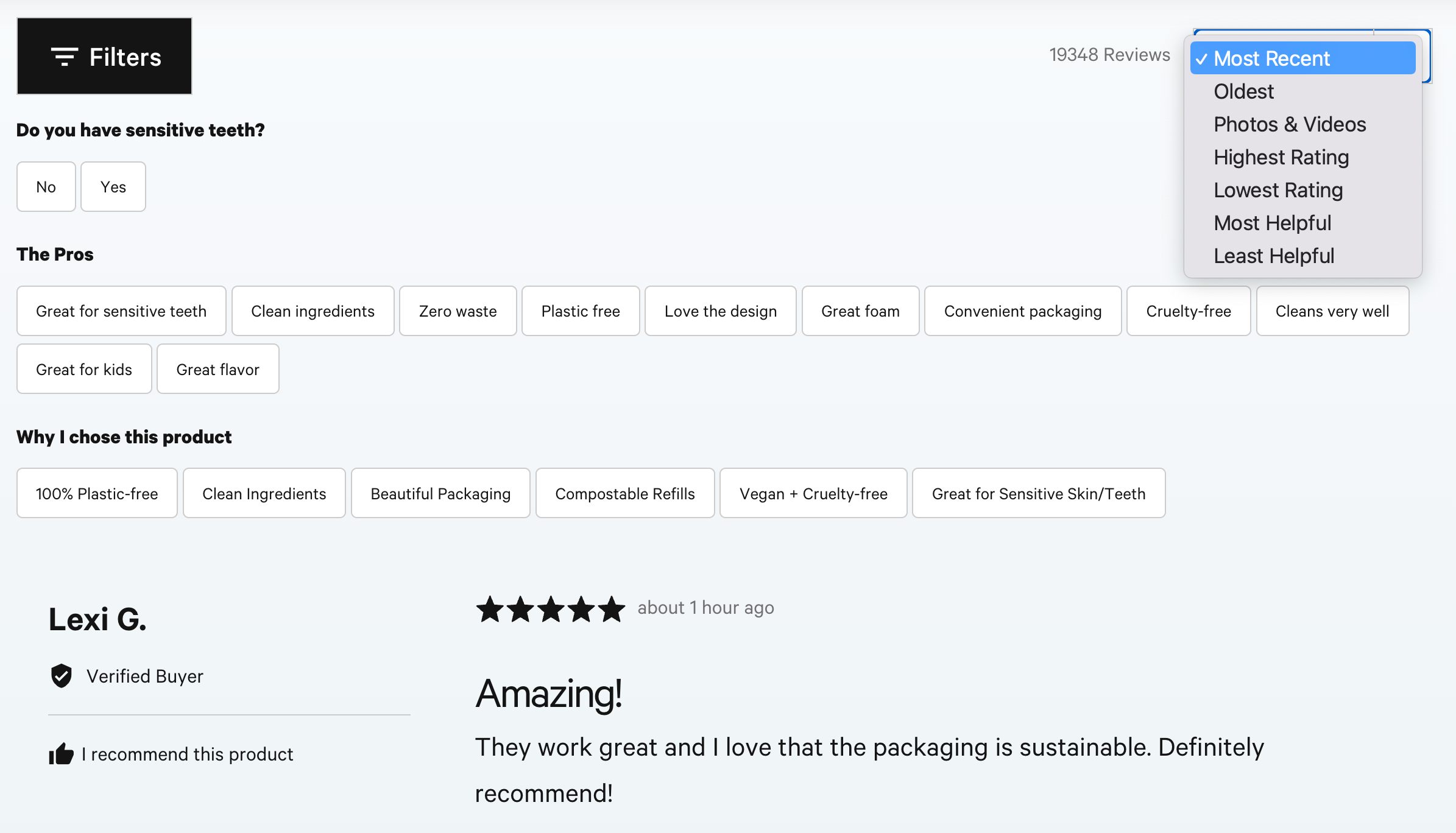
We typically allow users to filter reviews by a particular rating score, but what if a customer is interested in specific details within a particular score range? Once a filter has been applied, we can allow users to sort by specific details of reviews. On Bite, for example, users can sort by the date of review, available photos and videos, as well as highest and lowest ratings and most and least helpful reviews. That’s better.
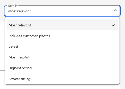
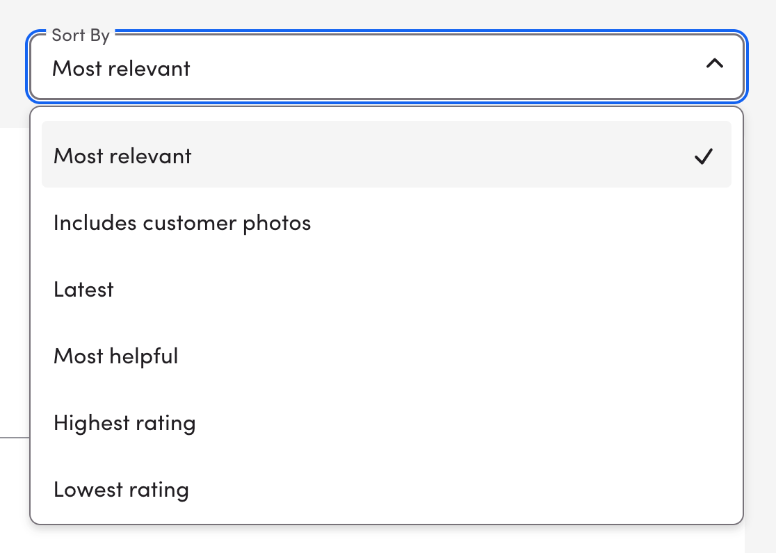
Additionally, customers on Glossier and Wayfair can sort by reviews that include customer photos and search in reviews, and that’s where an autocomplete feature could be particularly helpful as well. Notice how Wayfair (pictured below) not only displays the tags used for products and customer photos but also highlights how often the keywords have been mentioned in reviews. That’s helpful.
Enhance Reviews With Personal Details
For a review to be convincing, it needs to appear trustworthy, be written by an actual person with credentials and a public social presence, or be recommended by a brand or person that carries some weight. This is why testimonials and logos of big brands work well; this is also why video reviews and customer success stories are quite impactful.
If possible, prompt your users to add some personal details to their reviews, such as:
- full name,
- location,
- age (range),
- current role or job title,
- link to a social media account (LinkedIn, Twitter, Instagram),
- a casual personal photo,
- a casual personal video (less than 30 sec),
- a photo of the product,
- the logo of the brand they work for (if applicable).

One of the most effective ways to build authenticity with a review is to display customer photos prominently next to reviews. Because many customers don’t trust marketing illustrations or can’t reliably visualize product specs, they often rely on customers’ (unedited) product photos to get a more realistic preview of what they should be expecting.
Any personal details are very valuable. Hence it’s a good idea to always prompt users to upload personal product photos and more details about themselves and reward such reviews as well.
Wrapping Up
Getting user ratings right requires quite a bit of work. We need to gather and highlight relevant reviews, present distribution charts with the number of ratings and decimal averages, and allow users to use filters, tags, or search to find reviews faster from people who are very much like them.
Users need:
- The average score presented with decimal numbers;
- An overall number of ratings;
- A full distribution chart of ratings;
- Customer’s unedited product photos;
- Ratings for individual features (size, fit, support, etc.);
- The number of reviews for intermediate values (1.0, 2.0, 3.0, 4.0, 5.0);
- Tags and filters to find relevant reviews;
- Personal details that will help customers find people like them in the reviews;
- The date of when the review was written or published;
- How many people find it helpful;
- How many customers (%) recommend the product for purchase.
Sounds like a lot of effort — and it actually is. The impact of a proper user rating design can be remarkable and drive your sales efforts much stronger than any other campaign could have. And once it’s done, it can work for you long-term, building up a community of people who trust your brand and recommend it online and offline. Without any doubt, that’s very much worth the effort.
Useful Resources
- UX tips: featuring customer reviews to increase conversion rates by Sepre Boyer,
- User Ratings Design UX Research, by Baymard Institute,
- How To Design User Rating and Reviews by Nick Babich,
- The Problem of J-Curves (in Online Ratings Systems), by Sav Sidorov.
Meet “Smart Interface Design Patterns”
If you are interested in similar insights around UX, take a look at Smart Interface Design Patterns, our shiny 10h-video course with 100s of practical examples from real-life projects. Design patterns and guidelines on everything from mega-dropdowns to complex enterprise tables — with 5 new segments added every year. Just sayin’! Check a free preview.

100 design patterns & real-life
examples.
10h-video course + live UX training. Free preview.


