How To Build A Magazine Layout With CSS Grid Areas
In this article, I want to talk about the amazing possibilities of a CSS grid and how it allows for complex layouts that are closer to a print design. The design we’ll discuss is actually one I got to work on for a client (modified slightly to a demo case). It will cover two big use cases of a CSS grid:
- Having a static grid where we define the specified start and end points for each element;
- Using CSS grid template areas to reorder a simple HTML layout easily without updating the HTML.
As a bonus, we will also touch on object-fit and aspect-ratio, which come in handy as well.
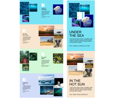
Here you can see the design we will be implementing: desktop on the left and a cropped version for mobile on the right (imagine the mobile view to continue with sections 3 and 4). There is quite a lot going on here, and nothing really fits into neat rows and columns. The images are laid out on an uneven grid, sometimes even overlapping, and we have some narrow text and a numbering element that double as a design element.
Artisanal Image Layouts
Let us first look at the image grid elements inside each colored component. While we have four colored components, there are only two variants that get repeated. For easier comparison, I have cut the desktop version in half and put the two halves next to one another — this makes it easier to compare. As you can see, the first and third are the same, as are the second and fourth. If we compare just the first and second variants, they differ, but the basic building blocks are very similar (a full-sized background color, a big image block, a column with a number, and some text). Due to this, we can consider it the same component, just with two alternatives.
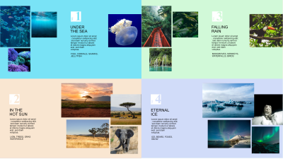
In the olden days, we would have had to do the image grid in Photoshop and then add it as one image to the page. Obviously, we could still do this, but that solution has never been particularly good for responsive websites, and using the picture element would work, but we would have to do several layouts in Photoshop and redo everything if we want to change a picture. We would need to do this every time this element gets added with different pictures.
But we wouldn’t be at this part in this article if there wasn’t an alternative! For a while now, it has been safe to use CSS grid, and it is able to solve this layout quite neatly with only a few lines of CSS.
CSS Grid allows us to define a formal grid definition — columns and rows — on the parent element and specify for the children where they should go within the grid. We also get the same justify and align capabilities that flex offers. This removes a lot of the need for wrapping divs and also makes the CSS slimmer.
One thing to note: As a result, your graphical layout can be different from the document structure in HTML.
Screen readers will still rely on the HTML structure, though, so put the most important information first and try to keep everything in a sensible order.
Now let’s get to our images. What is it that we need at a minimum? A container for the images and the images themselves. And you know what? With CSS Grid, that is actually enough — say goodbye to five layers of wrapping divs!
<div class="grid image-grid-3-m4">
   <img class="image-0 " src="" />
   <img class="image-1 " src="" />
   <img class="image-2 " src="" />
   <img class="image-3 " src="" />
</div>
A bit more on the markup. To make the styling easier, I added an index to each image (since we want to re-use them, it has to be a class, not an ID) and two classes on the surrounding div, which we will use to define the base styling: a grid utility class and a second one used for identifying the variant. For the variant with three images on the left and a fourth on the right in desktop view, I spent some time thinking about how to best solve the fourth image’s problem: do we add it to the container with the other images and try and move it to the other side, or do we move it on mobile, and so on. In the end, I decided to add the fourth image in the container for the images but hide it on the desktop via CSS and have a separate div in a second location with the same image for displaying in the desktop version. Using display:none will also hide that version from screen readers.
Now that we have the basic HTML and our images in place, it is time to focus on the CSS. If you are completely new to a CSS grid, this helpful article goes into the full syntax and explains it in detail. Unfortunately, I cannot describe the full syntax in this article.
First off, we need to define our grid. Since I had a design to work with, I used a tool that allowed me to put lines on top of the image, position one line at each edge of the image, and see the pixel dimensions in between. It would have been great if the designer had already used a formal grid and told me about it, but unfortunately, that was not the case, so I used the proportionate dimensions as an approximation of what I should use in the grid. Basically, I asked myself what the smallest common divisible number was for each — with some wiggle room — and used that. (Welcome to math class.) My goal was to have the same size for all grid columns and rows while being flexible on the number of columns or rows.
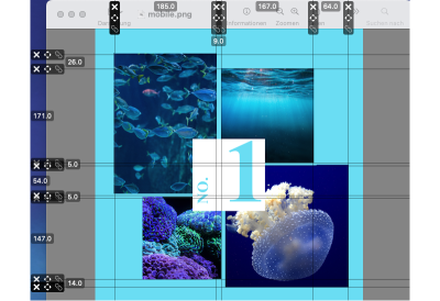
With this method, I determined that I wanted to have 14 columns on mobile and 7 rows plus some uniform gaps. This allowed me to approximate the distribution in the layout while keeping the aspect ratios close to what they had envisioned. Based on that, we get the following CSS:
.grid {
  display: grid;
}

.image-grid-3-m4 {
  grid-template-rows: repeat(7, 1fr);
  grid-template-columns: repeat(14, 1fr);
    gap: 0.5rem;
}
With these four lines of CSS, we have a grid that is ready to be filled. If you follow along, you will notice that the images are now filling one grid cell each in the first row. This is the automatic layout mechanism that the browser uses, and depending on what you want to do, it can be ideal for defining an evenly laid-out design in seconds.
See the Pen [Basic CSS for the grid [forked]](https://codepen.io/smashingmag/pen/gOjKgqM) by Pfenya.
But obviously, we want to get fancy, so no even layouts for us. To achieve this, we need a few more CSS rules: grid-column and grid-row to be precise. These allow us to specify how an element should position itself within the grid. Add to that my trusty lines and crooked math, and I could place each image. For example, the first image begins at the top left corner, so we start on grid column line 1 and row 1, and it shall span 6 of our 14 columns and 4 rows. Instead of telling an element how many cells to span, you can also specify the end value. Personally, I prefer the span since it is easier to keep track of and read.
.image-0 {
  grid-column: 1 / span 6;
  grid-row: 1 / span 4;
}
In addition to the information on where the images will be placed, there are three more rules that do a lot of very heavy lifting here:
img {
  object-fit:cover;
  height: 100%;
  width: 100%;
}
With these, we tell the browser to have the images always span their full container, the size of which is determined by the grid. Then we use object-fit to make sure all the space will be taken up by the image with the overflow hidden (if you want to find out more about object-fit, here is a great primer). Obviously, this means that parts of the images will not be displayed — and you need to keep that in mind when deciding on the images to use for this — especially if their aspect ratio does not match perfectly.
Speaking of aspect ratios, the top right image sure looks square. Wouldn’t it be neat if we could tell it to be square, regardless of how the image itself is sized? We can actually do that now. There is a CSS property by the name of aspect-ratio that does just that, and in this case, it allows us to tell the image that it should be square (which is hip, as we all know). (Backward compatibility is an issue, though, especially on iOS. So in some use cases, you may want to use a polyfill.) But the aspect-ratio property is something that will be very useful in the future, and you can read in more detail about it in this article by Stephanie Eckles.
With all of that in place, we can now have a first look at how it looks with all four images:
See the Pen [Untitled [forked]](https://codepen.io/smashingmag/pen/yLqEgrK) by Pfenya.
For the desktop version, all we really want to do is shift where the images start and end. To do so, we need a media query where we redefine the grid and positionings. Again I calculated the rows and columns I would need and where to position each element and added information for each to my CSS.
See the Pen [Untitled [forked]](https://codepen.io/smashingmag/pen/yLqEgdj) by Pfenya.
Now we have an image grid that changes its layout based on the viewport, and once we put it into an element with a flexible width, the images will update their display size accordingly.
The hardest thing here is understanding the syntax and getting to grips with explicitly positioning elements. But once you have done so, a whole world of possibilities opens up. Obviously, this is not something you can always do, especially when you have reusable components, but for specific use cases, it can add something special or solve a hard case.
Shifting Blocks In The Main Component
Now that we have the most difficult part of the images done, it is time to have a look at the component itself. Once again, we are staying with CSS Grid, and this time we will be working with grid-template-areas. Personally, I am absolutely enamored with this functionality because it gives us a ton of flexibility for the main structural layout between desktop and mobile without having to add a lot of encapsulating divs or duplicated information. This component is a great showcase, so let’s get on it.
If we turn to the design again, there are only a handful of elements. We have several images, which in larger viewports may be divided into two sections: the number in a white box and all text elements.
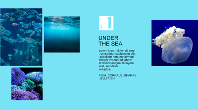
What is the minimum HTML for that? Again we do not need a lot of extras; a surrounding div and then one for each part is all that we need:
<div class="container">
  <div class="images"></div>
  <div class="numbering"></div>
  <div class="text"></div>
  <div class="single-image"></div>
</div>
For our example, all areas have a class name that identifies what they will hold later. If we look at the mobile layout, though, the number is on top of the images! The cool thing about a CSS grid is that you can layer elements. We already used that for the images above. As you can see, two of them overlap, and we can also do that for whole areas. The layering will be controlled by our old friend, the z-index. Same rules as always: the higher z-index wins and comes to the front.
With that in mind, let’s create two areas: one at the top with the images filling the area and the number as a top layer with most of it transparent to show the images, and the second area below for the text. We could use the grid columns and rows syntax we used earlier, but in this case, we can make our lives even easier with grid-template-areas. With this, you can add names to parts of your grid and then decide for each element which grid area it should appear in. Especially for the page or component frame, this is a much easier and faster way to work and be able to read it all again later than using all of the non-descript numbers.
I think this will be easier to understand with an example.
.container {
  display: grid;
  grid-template-columns: 1fr;
  grid-template-rows: repeat(2, 1fr);
  gap: 1.2rem;
  grid-auto-flow: row;
  grid-template-areas:
    "numerology"
    "text";
}

.images { grid-area: numerology; }

.numbering { grid-area: numerology; }

.text { grid-area: text; }
.single-image {display:none}
We define the container as a grid once again, add two rows to it, and then use ‘grid-template-areas’ to give these rows a name. The syntax for this is very unusual for CSS, but it gives you a mini-view of your layout: Numerology is the name of the cell in the first row and Text in the second.
With those rows now having names, we can easily position our elements. Both the images and the container for the number go into the first row, and the text will go to the second row. So in the example above, we add the grid-area to the CSS for the class we applied to the div in the HTML. With those few lines, we have defined the layout.
To achieve the overlay effect for the number, the white box will be in its container and gets a fixed width and height. We can then use flex to center it in the container.
But how do we get from this to the desktop version, you may ask? Pretty easily, actually! For the overall design of the website, we are already using a 14-column grid on the desktop for all elements. If we overlay the design with some grid markers, we see the widths everything should take approximately.
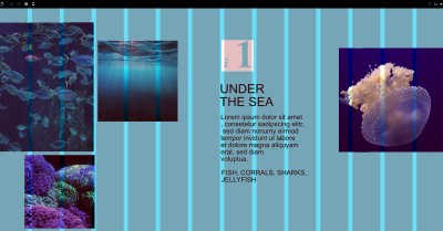
Obviously, our named areas from the mobile view will not really help us for this version, but we can simply update them in a media query for our desktop view and also define different area names:
.container {  display: grid;
  grid-template-columns: repeat(14, minmax(0, 1fr));
  grid-template-rows: repeat(2, 1fr);
  gap: 1.2rem;
  grid-auto-flow: row;
  grid-template-areas:
    "images images images images images . numbering numbering numbering single-image single-image single-image single-image single-image"
    "images images images images images . text text text single-image single-image single-image single-image single-image";
}

.images { grid-area: images; }

.numbering { grid-area: numbering; }

.text { grid-area: text; }

.single-image { grid-area: single-image; }
Let me be the first one to say that, yes, this is really not a pretty way of defining this, but unfortunately, the template-areas syntax does not include the repeat keyword as the column definition does.
But take a moment and have a closer look. What you can see is that we define the first five columns to belong to the images name in both rows, then we have a period, which means nothing goes here, then we have three columns for the numbering in row one and three for the text in row two, and at the end, five columns for single-image. Personally, I like to use an online generator that allows me to visually define these areas and copy the needed CSS.
Now with just under 20 lines of code, we have completely changed the layout without having touched the very simple HTML structure at all! But what about the alternative version for 2 and 4? They only use a slightly different layout, so why not add some classes for .version-a and .version-b on the container and have the grid-template-areas defined by that on the desktop? It is that simple. Look at the following:
  .version-1 {
      grid-template-areas:
    "images images images images images . numbering numbering numbering single-image single-image single-image single-image single-image"
    "images images images images images . text text text single-image single-image single-image single-image single-image";
  }
.version-1 .single-image {
  grid-area: single-image;
  display:block;
 }
  .version-2 {
        grid-template-areas:
    ". numbering numbering numbering . . images images images images images images images images"
    ". text text text . . images images images images images images images images";
  }
To me, this is still pretty crazy, to be honest. For the longest time, a layout like this would have been completely out of reach or very complicated to make and having shared HTML between versions 1 and 2 would have been near impossible, at least for the complete HTML. Now we can just wave a magic wand and update where it should show up. Pretty heady stuff.
Another practical example where this helped me a lot was defining areas for a product detail page on an e-commerce website. Being able to move elements around to where they make sense in different contexts is amazing, but it also means that you need to adjust your mental model a bit to how HTML and CSS are connected. And this is even just the beginning. With container queries and layers, there is much on the horizon that will open up a lot more possibilities in the future, and I am totally here for it!
Finally, here is the full version of the design with everything pulled together:
See the Pen [Untitled [forked]](https://codepen.io/smashingmag/pen/VwBdpma) by Pfenya.
Additionally, if you are curious about the final live webpage, it can be found here.


 Register Free Now
 Celebrating 10 million developers
 SurveyJS: White-Label Survey Solution for Your JS App


