Building Future-Proof High-Performance Websites With Astro Islands And Headless CMS
This article has been kindly supported by our dear friends at Storyblok, a friendly headless CMS with a visual editor, nested components and customizable content blocks for websites and apps. Thank you!
Nowadays, web performance is one of the crucial factors for the success of any online project. Most of us have probably experienced the situation that you left a website due to its unbearable slowness. This is certainly frustrating for a website’s user, but even more so for its owner: in fact, there is a direct correlation between web performance and business revenue which has been corroborated time and again in a plethora of case studies.
As developers, optimizing web performance must therefore be an integral part of our value proposition. However, before moving on, let’s actually define the term. According to the MDN Web Docs, “web performance is the objective measurement and perceived user experience of a website or application”. Primarily, it involves optimizing a site’s initial overall load time, making the site interactive as soon as possible, and ensuring it is enjoyable to use throughout.
Achieving an excellent measurable performance as well as an outstanding perceived performance certainly constitutes a potentially very strenuous challenge for developers, especially when dealing with increasingly complex, large-scale websites. Fortunately, while it is easy to get lost in the subtle details of performance optimization measures, there are a few factors that should be the focus points of our efforts due to their extraordinarily high impact. One of these is image optimization, a topic that has been thoroughly covered in ‘A Guide To Image Optimization On Jamstack Sites’ by my colleague Alba Silvente.
Another key factor? Shipping less JavaScript (JS). A large JS bundle size takes longer to be transmitted, parsed, and executed. As a consequence, the initial page load and Time to Interactive can be delayed quite significantly. In recent years, we have witnessed the rise of extremely powerful JS frontend frameworks that offer client-side rendering and strive for an app-like experience. While their versatility, their features, and their developer experience is impressive by all means, they all share one major disadvantage in regard to performance optimization: their JS bundle size is comparably heavy, negatively impacting both the initial page load and the time-to-interactive quite substantially.
Depending on the type of your project, the question arises whether a less JS-centric approach might be feasible. In fact, if you think of your average content-driven marketing website, you would probably conclude that only a fraction of the functionality actually relies on JavaScript, whereas the majority of the site could probably be rendered as static HTML.
And that is precisely where Astro enters the game, shipping zero JS by default and letting you partially hydrate only those components that de facto rely on interactivity. Importantly, Astro accomplishes all of that without sacrificing the wonderful developer experience (DX) that we have been getting spoiled by, but actually even improving it. Let’s take a closer look.
Introducing Astro
Astro defines itself as an “all-in-one web framework for building fast, content-focused websites”. One of its key features is that it replaces unused JS with HTML on the server, effectively resulting in zero JavaScript runtime out-of-the-box. This, in turn, leads to very fast load times and quicker interactivity. Notably, Astro explicitly states that it is specifically designed for content-driven websites, such as marketing, documentation, or eCommerce sites. The Astro team transparently acknowledges that other frameworks may be a much better fit if your project classifies as a web application rather than a mostly content-driven site.
Moreover, Astro provides a powerful Islands architecture that utilizes the technical concept of partial hydration. In a nutshell, this allows you to hydrate only those components that you actually need to be interactive. Importantly, this happens in isolation, leaving the rest of the site as static HTML. All in all, the impact on web performance is huge, making developers’ lives a lot easier along the way. And it gets even better: it is possible to bring your own framework. Thus, you could effortlessly use, for example, Vue, Svelte or React components in your Astro project.
Speaking of isolated islands, it is worth pointing out that developers actually rarely work alone: most larger-scale web projects typically rely on close collaboration between teams of developers and content creators. Therefore, let’s explore how going Headless with Storyblok can improve the experience and productivity of everyone involved.
Introducing Storyblok
Storyblok is a powerful headless CMS that meets the requirements of developers and content creators alike. Completely framework-agnostic, you can connect Storyblok and your favorite technology within minutes. Storyblok’s Visual Editor allows you to create and manage your content with ease, even when dealing with complex layouts. Furthermore, localizing and personalizing your content becomes a breeze. Beyond that, Storyblok’s API-first design allows you to create outstanding cross-platform experiences.
Let’s explore in a case study how we can effectively combine the power of Astro and Storyblok.
Case Study: Interactive Components In Storyblok And Astro
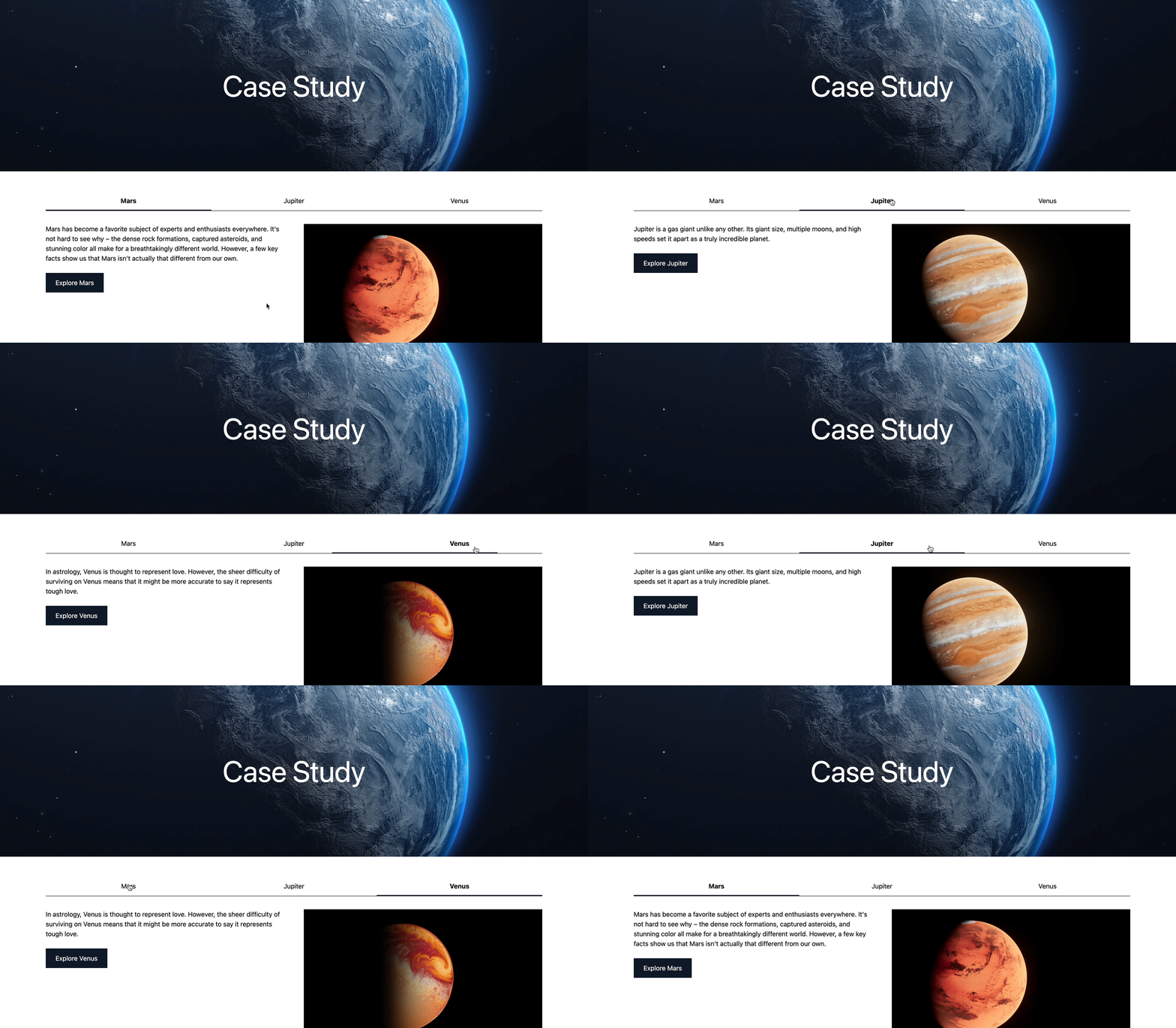
In this example, we will create a simple landing page consisting of a hero component and a tabbed content component. Whereas the former will be a basic Astro component, the latter will be rendered as a dynamic island. In order to demonstrate the flexibility of this technology stack, we will examine how to render the tabbed content component using both Vue and Svelte.
This is what we will build:
Step 1: Create The Astro Project And The Storyblok Space
Once we’ve created an account on Storyblok (the Community plan is free forever), we can create a new space.

Now, we can copy and run the command to run Storyblok’s CLI in order to quickly create a project that is connected to your fresh new space:
npx @storyblok/create-demo@latest --key <your-access-token>
You can copy the complete command, including your personal access token, from the Get Started section of your space:
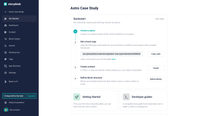
In the scaffolding steps, choose Astro, the package manager of your choice, the region of your space, and a local folder for your project. Now, in your chosen folder, you can run npm install && npm run dev to install all dependencies and launch the development server.
For the Storyblok Visual Editor to work, we need to go to Settings > Visual Editor and specify https://127.0.0.1:3000/ as the default environment.

Next, let’s go to the Content section and open our Home story. Here, we need to open the Entry configuration and set the Real path to / in order for src/pages/index.astro to be able to load this story correctly.
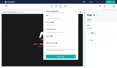
After having saved, you should now see the page being rendered correctly in the Visual Editor.
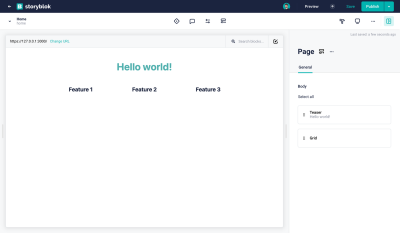
Perfect, we’re ready to move on.
Step 2: Create The Hero Component In Storyblok
In the Block Library, which you can easily access from within your Home story, you will find four default components. Let’s delete all of the nestable blocks (Grid, Teaser, and Feature). For our case study, we just need the Page content type block.
Note: In order to learn more about nestable and content type blocks, you can read the Structures of Content tutorial.
Now, we can create the first component that we will need for our case study: A nestable block called Hero (hero) and the following fields:
caption(Text)image(Asset > Images)
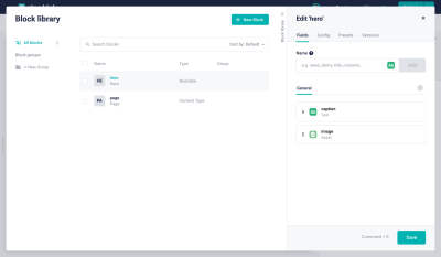
Next, close the Block Library, delete the instances of the Teaser and Grid blocks, and create a Hero, providing any caption and image of your choice.
Step 3: Create The Hero Component In Astro
The next step is to create a matching counterpart for our Hero component in our Astro project. Let’s open up the project.
First of all, let’s modify astro.config.mjs in order to register our Hero component properly:
storyblok({
  accessToken: '<your-access-token>', // ideally, you would want to use an environment variable for the token
  components: {
    page: 'storyblok/Page',
    hero: 'storyblok/Hero',
  },
})
Next, let’s delete the Grid, Feature and Teaser components in src/storyblok and create a new src/storyblok/Hero.astro component with the following content:
---
import { storyblokEditable } from '@storyblok/astro'

const { blok } = Astro.props
---

<section
  {...storyblokEditable(blok)}
  class='relative w-full h-[50vh] min-h-[400px] max-h-[800px] flex items-center justify-center'
>
  <h2 class='relative z-10 text-white text-7xl'>{blok.caption}</h2>
  <img
    src={blok.image?.filename}
    alt={blok.image?.alt}
    class='absolute top-0 left-0 object-cover w-full h-full z-0'
  />
</section>
Having taken care of that, the Hero block should now be displayed correctly in your Home story. In this particular case, we are using a native Astro component, which means that this component will be rendered as static HTML, requiring zero JS!
Amazing, but what happens if you actually need interactivity on your frontend? This is precisely where dynamic islands come into play, which we will explore next.
Step 4: Create The Tabbed Content Component In Storyblok
Let’s proceed by creating the blocks that we need for our tabbed content component, which will have a slightly more complex setup.
First of all, we want to create a new nestable block Tabbed Content Entry (tabbed_content_entry) with the following fields:
headline(Text)description(Textarea)image(Asset > Images)

This nestable block will be used in superordinate nestable block called Tabbed Content (tabbed_content) consisting of these fields:
entries(Blocks > Allow onlytabbed_content_entrycomponents to be inserted)directive(Single-Option > Source: Self) with the key-value pair options: load →loadand idle →idle, and visible →visible(Default:idle)

The entries field is used to allow nesting of the previously created Tabbed Content Entry nestable blocks. In order to prevent any kind of block could get inserted, we can limit it to blocks of the type tabbed_content_entry.
Additionally, the directive field is used to take advantage of Astro’s client directives, which determine if and when a framework component should be hydrated. Utilizing the single-option field type in Storyblok enables content creators to choose whether this particular instance of the component should be hydrated with the highest priority (load), after the initial page load has been completed (idle), or as soon as the component instance actually enters the viewport (visible).
Utilizing Astro’s visible directive would result in the biggest performance gain as long as the component is below the fold. As the default option, we will use Astro’s idle directive, hydrating the component immediately on page load. However, in all cases, the rest of our landing page will remain as static HTML. As a result, the out-of-the-box performance should theoretically always be superior when compared to alternative frameworks.
Before moving on, we can use our newly created Tabbed Content component and insert three example entries in the entries field.
Step 5: Create The Tabbed Content Component In Astro
First of all, let’s register our Tabbed Content component in our astro.config.mjs:
storyblok({
  accessToken: '<your-access-token>',
  components: {
    page: 'storyblok/Page',
    hero: 'storyblok/Hero',
    tabbed_content: 'storyblok/TabbedContent',
  },
}),
Next, let’s create storyblok/TabbedContent.astro with the following preliminary content:
---
import { storyblokEditable } from '@storyblok/astro'

const { blok } = Astro.props
---

<section {...storyblokEditable(blok)}></section>
This will serve as our wrapper component, wherein we can subsequently import the actual component using the UI framework of our choice and dynamically assign a client directive derived from the value we receive from Storyblok.
Step 6: Render the Tabbed Content Component using Vue
With everything in place, we can now start building our tabbed content component using Vue. First, we need to install Vue in our project. Fortunately, Astro makes that very simple for us. All we have to do is to run the following command:
npx astro add vue
Next, let’s create a new Vue component (storyblok/TabbedContent.vue) with the following content:
<script setup lang="ts">
import { ref } from 'vue'
const props = defineProps({ blok: Object })

const activeTab = ref(0)

const setActiveTab = (index) => {
  activeTab.value = index
}

const tabWidth = ref(100 / props.blok.entries.length)
</script>

<template>
  <ul class="relative border-b border-gray-900 mb-8 flex">
    <li
      v-for="(entry, index) in blok.entries"
      :key="entry._uid"
      :style="'width:' + tabWidth + '%'"
    >
      <button
        @click.prevent="setActiveTab(index)"
        class="cursor-pointer p-3 text-center"
        :class="index === activeTab ? 'font-bold' : ''"
      >
        {{ entry.headline }}
      </button>
    </li>
  </ul>
  <section
    v-for="(entry, index) in blok.entries"
    :key="entry._uid"
    :id="'entry-' + entry._uid"
  >
    <div v-if="index === activeTab" class="grid grid-cols-2 gap-12">
      <div>
        <p>{{ entry.description }}</p>
        <a
          :href="entry.link?.cached_url"
          class="inline-flex bg-gray-900 text-white py-3 px-6 mt-6"
          >Explore {{ entry.headline }}</a
        >
      </div>
      <img :src="entry.image?.filename" :alt="entry.image?.alt" />
    </div>
  </section>
</template>

<style scoped>
ul:after {
  content: '';
  @apply absolute bottom-0 left-0 h-0.5 bg-gray-900 transition-all duration-500;
  width: v-bind(tabWidth + '%');
  margin-left: v-bind(activeTab * tabWidth + '%');
}
</style>
Finally, we can import this component in TabbedContent.astro, pass the whole blok object as a property and assign the client directive based on the value we receive from Storyblok.
---
import { storyblokEditable } from '@storyblok/astro'
import TabbedContent from './TabbedContent.vue'

const { blok } = Astro.props
---

<section {...storyblokEditable(blok)} class='container py-12'>
  {blok.directive === 'load' && <TabbedContent blok={blok} client:load />}
  {blok.directive === 'idle' && <TabbedContent blok={blok} client:idle />}
  {blok.directive === 'visible' && <TabbedContent blok={blok} client:visible />}
</section>
Furthermore, our Astro wrapper component is the right place to assign a client directive to the Vue component. Since we would like to give the content creators the possibility to choose between different directives, we need to assign them based on the value we retrieve from Storyblok.
Our tabbed content component will now be rendered correctly. Using Astro’s dynamic islands and hydration directives can tremendously boost your site’s performance, and combined with Storyblok, you provide content creators with straightforward and easy-to-use possibilities to tap into the power of this next-gen approach.
Let’s conclude our case study by examining how to render the very same component with Svelte (or any other popular framework supported by Astro).
Step 7: Render The Tabbed Content Component Using Svelte
First of all, as before, we need to install Svelte in our Astro project. Again, we can easily accomplish that by running the following command:
npx astro add svelte
Now, we can create the Svelte component (storyblok/TabbedContent.svelte) with the following content:
<script>
  export let blok

  let tabWidth = 100 / blok.entries.length
  let activeTab = 0
  let marginLeft = 0

  const setActiveTab = (index) => {
    activeTab = index
    marginLeft = activeTab * tabWidth
  }
</script>

<ul
  class="relative border-b border-gray-900 mb-8 flex"
  style="--tab-width: {tabWidth}%; --margin-left: {marginLeft}%;"
>
  {#each blok.entries as entry, index (entry._uid)}
    <li style="width: var(--tab-width)">
      <button
        class="{index === activeTab
          ? 'font-bold'
          : ''} w-full cursor-pointer p-3 text-center"
        on:click={() => setActiveTab(index)}>{entry.headline}</button
      >
    </li>
  {/each}
</ul>
{#each blok.entries as entry, index (entry._uid)}
  {#if index === activeTab}
    <section id={entry._uid}>
      <div class="grid grid-cols-2 gap-12">
        <div>
          <p>{entry.description}</p>
          <a
            href={entry.link?.cached_url}
            class="inline-flex bg-gray-900 text-white py-3 px-6 mt-6"
            >Explore {entry.headline}</a
          >
        </div>
        <img src={entry.image?.filename} alt={entry.image?.alt} />
      </div>
    </section>
  {/if}
{/each}

<style>
  ul:after {
    content: '';
    @apply absolute bottom-0 left-0 h-0.5 bg-gray-900 transition-all duration-500;
    width: var(--tab-width);
    margin-left: var(--margin-left);
  }
</style>
The only change that we have to make in order to load the Svelte component instead of the Vue component can easily be completed by simply changing the import in TabbedContent.astro:
//import TabbedContent from './TabbedContent.vue'
import TabbedContent from './TabbedContent.svelte'
And that’s it! Everything else can remain the same. Amazingly, our tabbed content component still works but is now using Svelte instead of Vue. Since Astro makes it possible to pass down the blok object, containing all of the data coming from Storyblok, as a property to the different framework components, we can simply reuse all of the information in various environments.
Wrapping Up
With Astro, you as a developer benefit from phenomenal DX, mind-blowing performance out of the box, and a high degree of flexibility thanks to the possibility to bring your own component framework (or even combine multiple component frameworks) and the availability of integrations. Moreover, Astro is highly future-proof: Considering moving from Vue to Svelte? From React to Vue? Astro makes the transition seamless, keeping the foundation of your project the same.
With Storyblok, your clients or fellow colleagues from the content marketing team get to enjoy a high degree of autonomy and flexibility, effectively utilizing the full potential of your Astro code base. Landing pages can be created in a matter of mere minutes, and dynamic, interactive components will have no negative impact on their performance.
Taking everything into account, Astro and Storyblok may very well be the last technology stack you will ever need for your content-driven website projects.
Resources
- Astro Case Study Smashing Magazine on GitHub

